
Now, let's see what you have learned by improving upon your wireframe project and revising the data table to look something like the following figure:
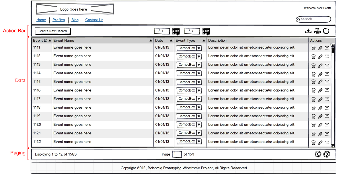
To make understanding and building this data table a bit easier to follow, I have divided it visually into its core sections: Action Bar, Data table, and Paging.
Let's take a closer look at each section and re-create them in your wireframe project.
The action bar is a control mechanism created for this exercise. It is not mandatory for the data table design, but it is something I often add to data tables as they allow for an element of control over the data and added user functionality. For example, you will notice a button in the Action Bar called Create New Record. Upon clicking on it, a popup form might appear allowing you to add data to the table on the fly. Other features include a calendar mechanism for doing a from/to search for data, and some basic tools: download, print, and refresh.
Let's recreate the action bar by performing the following steps:
- Place a Rectangle/Canvas/Panel widget on the canvas.
- Set Size:
1062x44. - Set Pos:
79,97. - Place a Button widget.
- Set Size:
128x27. - Set Pos:
91,107. - Place two Date Chooser/Date Picker widgets.
- Group them.
- Set Pos:
509,107.
For now, perform the following steps:
- Place three Icon widgets on the canvas roughly in the area where they will sit, as per the previous figure.
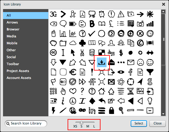
- Double-click on the first Icon widget to open the Icon Library.
- Be sure that the icon size slider, located at the bottom of the library window, is set to S for small.
- Double-click on the Download icon, as highlighted in the next image, or click on the Select button to place it on the canvas, as shown in the following screenshot:
- Repeat the steps mentioned earlier for the remaining two icons.
With the three icons in place, select them all and top align them to each other, using the Property Inspector's align tools.
Compare your work to the following sample image:
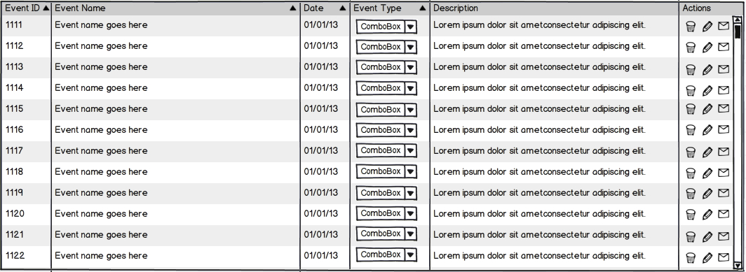
Now I want to give you an opportunity to build this next section on your own, as shown in the following screenshot:
However, if you get stuck, following are a few important things to help guide you:
- Bring the Data Table into edit mode by double-clicking on it.
- Replace the coordinates in the bottom row with
{5L, 25, 5, 8, 25, 5},which will create six columns. - Type this text into the top row to create your header:
Event ID, Event Name, Date, Event Type, Description, Actions. - Re-type the text across the second row, as shown in the example above.
- Leave the fourth column, Event Type, empty.
This space is reserved for the ComboBox widget. To make it empty, add a comma in edit mode specifying the fourth column, but leave it blank, as shown in the following screenshot:

The sixth column, Actions, will also remain empty to make room for the three Image widgets that you will place there. There is no need to add a comma to create this column as you already specified its width using the coordinates in the second step.
Tip
By the way, that funny looking text you see in the Description column, Lorem ipsum dolor sit ametconsectetur adipiscing elit, is referred to as greek or dummy text. It is used in wireframing to show what text will look like without having to type any real content. Rather than trying to retype it, visit http://www.lipsum.com/ and grab some of your own dummy text.
With the text in the second row complete, copy and paste what you typed to create a total of 12 rows.
Once that is done, perform the following steps:
- Click outside the table to leave edit mode.
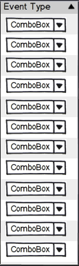
- Place a Combo Box widget into the empty space of the fourth column, Event Type.
- Copy and paste it to fill in the other empty spaces below it and left align them to each other, as shown in the following screenshot:
- Place three Icon widgets over the sixth column, Actions.
- Double-click on each to open the Icon library and place the images.
- Set the image size slider to XS for extra small.

- Top-align all three images to each other, and group them.
- Copy and paste the grouped icons to fill in the other empty spaces in the column, and left-align them to each other.
So does your data table match the original image? If so, great! If not, no worries! Just keep at it until it does.
The final piece of this data table puzzle is the footer, which I call the paging bar. Paging is a way to view multiple pages of data without ever leaving the page, but more on that in a moment.
For now, let's recreate the paging bar by performing the following steps:
- Place a Rectangle/Canvas/Panel widget on the canvas.
- Set Size:
1062x44. - Set Pos:
79,530. - Place a Label/String of Text widget and type:
Displaying 1 to 12 of 1583. - Set Pos:
91,540.
To create the middle portion of the paging bar, I used a combination of a Label/String of Text widget and a Rectangle widget, as shown in the following screenshot:
If this were a coded interface, this functionality would give the user the ability to type a page number into the field, press Enter and go directly to that page's data.
Here's how to create it in Balsamiq. Perform the following steps:
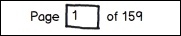
- Place a Label/String of Text widget in the footer and type:
Page of 159. Leave some space for the rectangle widget, as shown. - Set Pos:
533,540. - Place a Text Input/Text Field widget on the canvas.
- Double-click the widget and type the number
1inside the text field. - Set Size:
35x27. - Place the Text Input widget in the empty space.
Lastly, you will need two Icon widgets to create the paging buttons. These buttons would allow the user to click through multiple pages of data while staying on the same page. The only thing changing would be the content in the data table.
To place the paging buttons, perform the following steps:
- Place two Icon widgets on the paging bar.
- Double-click on one of the widgets to open the Icon Library.
- Locate the button image, otherwise known as Circle >, Next, Play and place it on the canvas, as shown in the following screenshot:
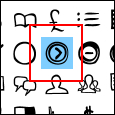
- With the image selected, click on the Rotate 90° tool in the Property Inspector.
This button will duplicate the image and flip it in the opposite direction. In terms of our design, you now have a back and next button to review page after page of data.

- Select both buttons and top-align them to each other.
- Group them.
- Set Pos:
1068,538.
That was a lot of work, but if you followed along then I am sure your finished wireframe looks great. This was truly an exercise to test your ability to be as detailed as possible. Hopefully, you enjoyed the process, because with Balsamiq and wireframing in general, attention to detail is the key to great results.