
Maybe it's a better idea not to present boring stuff at all!
But, what we mean here is the way data usually is presented is very boring and there is a better way to do it.
In this project, you will learn how to present data in a much better way than you probably used to till now. In this project, our challenge is to make data visually attractive.
Our starting point is an Excel sheet with data. First, we'll show you what most people do and why that doesn't work.
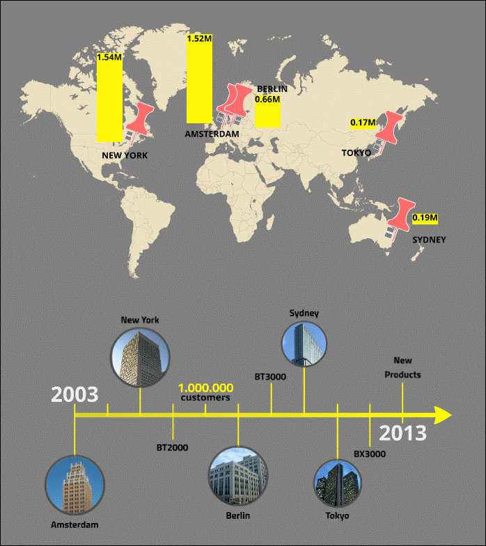
Then, we'll show you what you can do to improve your graphs and make your data visually more attractive. We'll also show how you can visualize other kind of data, such as locations, chronological events, and pros and cons, as shown in the following screenshot:
Finally we'll put it all together in one prezi.
Everyday, a lot of boring presentations are presented. Especially when it comes to financial data, for a lot of people it's not easy to make it look attractive. Lots of presentations are full of tables and graphs with too much information; information that can't be read because it's displayed too small, and information that doesn't matter at that moment.
In this project, we'll teach you how you can turn boring tables and graphs with data into something interesting and good looking. The data should support your story, not kill it.