
The last step in our seven-step workflow is defining all the design issues for our presentation.
Find out if there's a corporate brand. Think about logo, colors, and fonts. Maybe a style guide is available.
If there's a corporate style guide available, find out whether you have to use it and how strict this is. Depending on the type of presentation, you might be allowed not to follow the style guide strictly.
This is especially important for fonts. You can't implement fonts in Prezi yourself. If you can't use the fonts available on Prezi, you have to ask Prezi.com to develop a corporate template. This is not free.
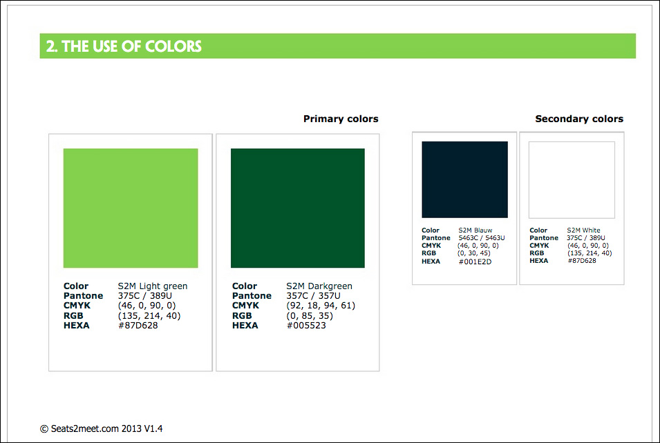
The company we are developing our prezi for has a style guide. You can see a screenshot of a page from this guide in the next screenshot and you can download the colored version of the workbook from www.prezihotshot.com.
The basic font used for Seats2meet.com is Tahoma. We don't have this font available in Prezi. So, we searched for a font in Prezi that fits best. Our choice is PT Sans for body text and Open Sans Bold for the title text. We only need two fonts.
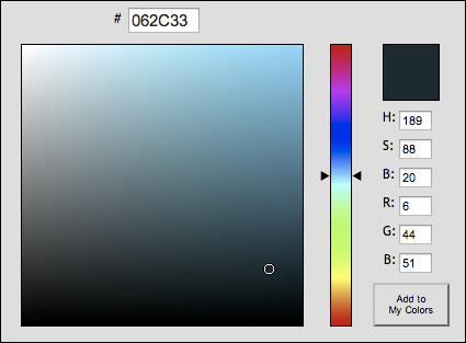
The basic color used on the website of Seats2meet.com is #062C33. This is a very dark blue. In www.colorpicker.com, we translated this color to RGB value so that we can use it in Prezi. The RGB value is 6, 44, 51 as shown in the next screenshot. The style guide mentions other colors too. However, we don't use a lot of text in our prezi and one dark color is enough for our presentation.
We got the logo of Seats2meet.com as an EPS (Encapsulated PostScript) file and that's perfect. Logos should be vector images and we can transform the EPS to SWF to get a very sharp image in Prezi.
If for some reason, the organization you are working for doesn't have the logo in the EPS or (Adobe Illustrator) AI format, use a high resolution JPG or PNG. Make sure it's large enough; otherwise, it will look very ugly in your presentation. Never ever use a logo from the top-left corner of a company's website, as that's way too small. The logo should have a width or height of at least 1000 pixels. However, a vector-based format is recommended for a logo. More about vector-based formats is given in the following information box:
Note
Prezi is designed in Flash and Flash is based on vectors. The main advantage of vector images is that no matter how far you zoom in, the image is always sharp. Typical vector images are logos and illustrations. Vector images are usually made in Adobe Illustrator and will have AI or EPS extensions.
It is possible to convert a vector image to a raster (pixel) image, but not the other way around. So, if you want a really sharp logo in your prezi, use a vector image.
We are lucky. Seats2meet.com has nice graphics available for our prezi. We got them as EPS files for our presentation.
We didn't have an office building as image yet, but Prezi has nice symbols in the library, and there's one available. It perfectly fits our needs.
In the last step of our workflow, we defined the design issues for our presentation, such as the logo, what colors should be used, and whether there are specific fonts that need to be used. Nowadays, a lot of companies have a corporate style guide that has to be used as a basis for the presentation.