
Everyone can create a graph (at least we think everyone can), but how can you create a really great graph? We'll show you in this task.
So, what makes a great graph? We think a great graph is a graph that contains just enough information (less is more!) and is visually attractive.
Let's create a graph to compare the total sales volumes of 2012 with the total sales volumes of 2013. We used Microsoft Excel for this. First, we selected the table we want to convert to a graph. Then, we chose the Charts tab, the type we wanted (Line), and the subtype of Line Charts. We chose the most simple line chart. Excel did the rest for us and created a nice line chart.
However, we can do better than that. When you have a good look at the chart, you can see that the numbers on the left-hand side won't be readable in a large screen. We could make them bigger and abbreviate them to 1.2M instead of 1,200,000. However, if we want to compare the numbers of 2012 with 2013 and see which quarters were worse and which quarters were better, we don't need the numbers. Then, we only need the red and blue lines. Depending on which line is above the other, we can easily see which quarter was the best.
We are not saying that you always have to use only the lines of the graph in your presentation. It depends on what you want to communicate. Think about this very carefully.
It also depends on what you will say when you present this graphs. If you don't want to say anything and let the audience figure out themselves what the graph means, you can add some details. However, usually you will explain to the audience what they see, so the graph can be very simple and plain.
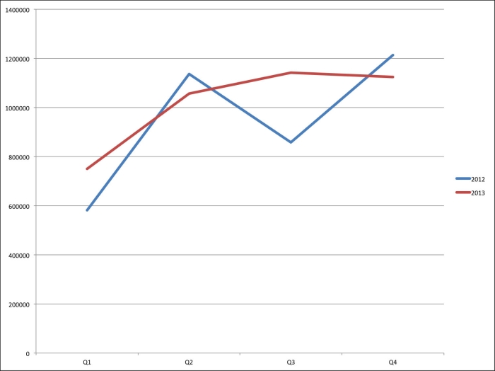
A standard Excel graph
The improved graph will look like the following screenshot:
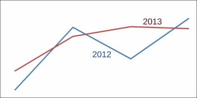
A minimalized graph with numbers added in Prezi
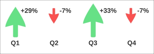
There's another way to use the numbers of the sales volumes of 2012 and 2013. If you want to show the differences between the four quarters, you can use the absolute numbers or the percentages in combination with an up or down arrow.
The next screenshot gives the same information but it looks very different. We used green arrows when the sales volumes increased and red arrows when they decreased. We also matched the size of the arrows with the size of the increase or decrease.
The next screenshot was only for the total sales volumes, but you could create these numbers for the separate locations as well.
Finally, we want to share a very effective use of Prezi shapes to create bar charts. We'll show you how you can do this. Navigate to Insert | Symbols & shapes | Shapes. Drag one of the rectangles to the canvas, select the rectangle and duplicate it five times with the Ctrl/Command + D keys, select one rectangle, and drag the top of the rectangle to give it the desired length. Repeat this for the other rectangles.
You can change the most important rectangle to a different color, and you can also add some numbers or some other information. Make sure you only add important information as shown in the next screenshot:

It's easy to create a graph, but it takes a bit more time to first investigate what you exactly want to tell and then find out how you are going to show it. Make sure you only show what you want to tell. So, leave out the details from the graph to have more focus. Fewer details are easier to understand for your audience.