
In this task, we'll show you what most people do to visualize data and why that doesn't work.
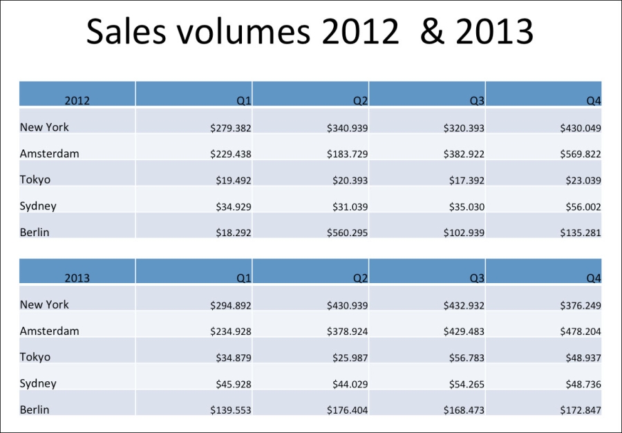
To have data to work with, we put some financial and user data in an Excel sheet.
Data usually consists of lots and lots of numbers. You wouldn't be able to understand the data in one glance. You have to analyze the data, combine it, and compare it. You have to look for the differences and similarities.
A lot of people find this very difficult and if you have to do it during a presentation, it's even worse. The data might not be boring at all, but the way of presenting is boring because it's too hard to find out what those numbers mean. Consider the following screenshot:
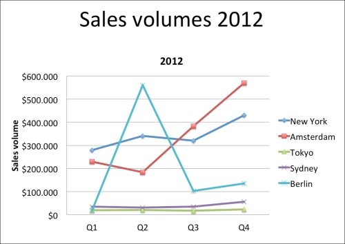
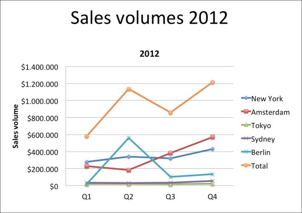
Numbers are boring. That's why people often use graphs. Graphs come in many styles such as line charts and bar charts.
With Excel, it's very easy to convert a table with data into a nice graph. The next two images represent sales volumes of 2012. The second graph also includes the total sales per quarter. This gives you new information and could be very interesting, but it also gives you a different graph. These kinds of decisions are very important and you should think about it very carefully because this can make a big difference in the way the audience interprets the information.
In the two next two screenshots, we will show the sales volumes of 2012, but maybe it's more interesting to compare the total sales volume of 2012 with the total sales volumes of 2013.
Maybe it's even more interesting to compare the total sales volumes of the different locations.
It's not just about the numbers, but we have to actually think very carefully about them and how they can be presented. Think really carefully about what you want to show and then decide how you want to show it.
Maybe it's time to rethink your data. Of course, you have to look at the story you want to tell your audience and how can the numbers help you with this?
You don't have to show all the numbers. You only want to show the numbers that add value to your story or explain your story. You can put all the other numbers in the handout.
In this task, we explained that just numbers are very boring and it's a very good idea to convert these numbers into a graph. You can use all kind of graphs, but it's very important to decide what you want to show and how you want to show it. That's why you have to rethink your data and have a (new) look at the story you want to share. What do you want to say actually? How can the numbers help you with it?
It's not very difficult to create a graph. However, it's a challenge to create a great graph.