
Bar is represented with the ![]() icon.
icon.
The Bar is probably the most common and useful Mark type. It's perfect to compare values between multiple categories. When you don't know how to visualize your data, start with a Bar!
Here's an example using a Bar:
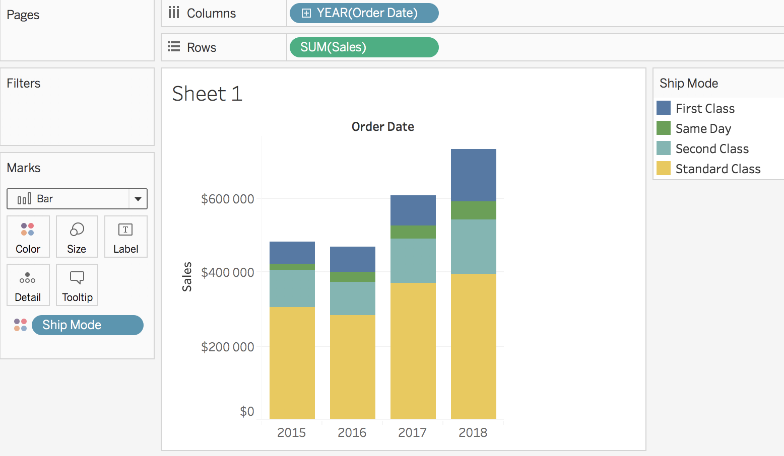
In this screenshot, you can easily see that 2018 is the best year and 2016 the worst in term of sales. You can also see that the Standard Class is the one that brings in the most sales and Same Day the least.
Let's see how Lines help with your analysis.