
Area is represented with the ![]() icon.
icon.
The Area chart is great to see the global trend. However, it's difficult to see the specific evolution of each value. Here's an example visualization using Area:
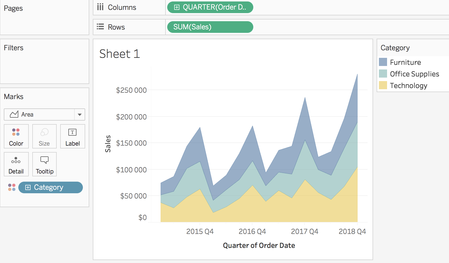
In the preceding screenshot, you can see how, for every year, the best quarter is always the fourth one and the worst quarter is always the first one. For a specific quarter, you can see the contribution of each category. However, as with the Bar chart, it's difficult to see the evolution of one particular category (except for the bottom one).
The next Mark type has nothing in common with the previous one; let's talk about Square.