
Tableau can be used to answer business questions easily and visually. In the section, we'll explore our data to find insights. For this example, we use the Sample - Superstore dataset again. If you are starting here, please refer to the preceding Connect to data section. If you're continuing from the previous exercise, create a new Worksheet.
Let's start by building a scatterplot. It's a visualization that allows you to analyze two Measures at the same time:
- Double-click on Profit then on Quantity. You should see one mark that shows the sum of sales and quantity:

Are there unprofitable sub-categories?
- Drag and drop Sub-Category to Label. You should see now one mark per Sub-Category with, for some, their label:

Supplies, Bookcases, and Tables are unprofitable sub-categories. Now that you have answered your first question, you have two options: be happy because that's all you wanted to know, or go deeper. Let's try the second option.
- Select the three nonprofitable sub-categories and click on Keep Only:

You can see that Sub-Category has been added to the Filters shelf. Let's continue with another question: are all the States unprofitable?
- Drag and drop State over Sub-Category. It replaces the existing label, Sub-Category, with the new one, State:

You can see that there are 11 unprofitable states. The worst one is Pennsylvania. Let's take a closer look at it.
- Click on Pennsylvania, then on Keep only. State has been added to Filter and, as in the beginning, there is only one mark left.
Let's answer one last question: are all the clients unprofitable in Pennsylvania?
- Drag and drop Customer Name over State:
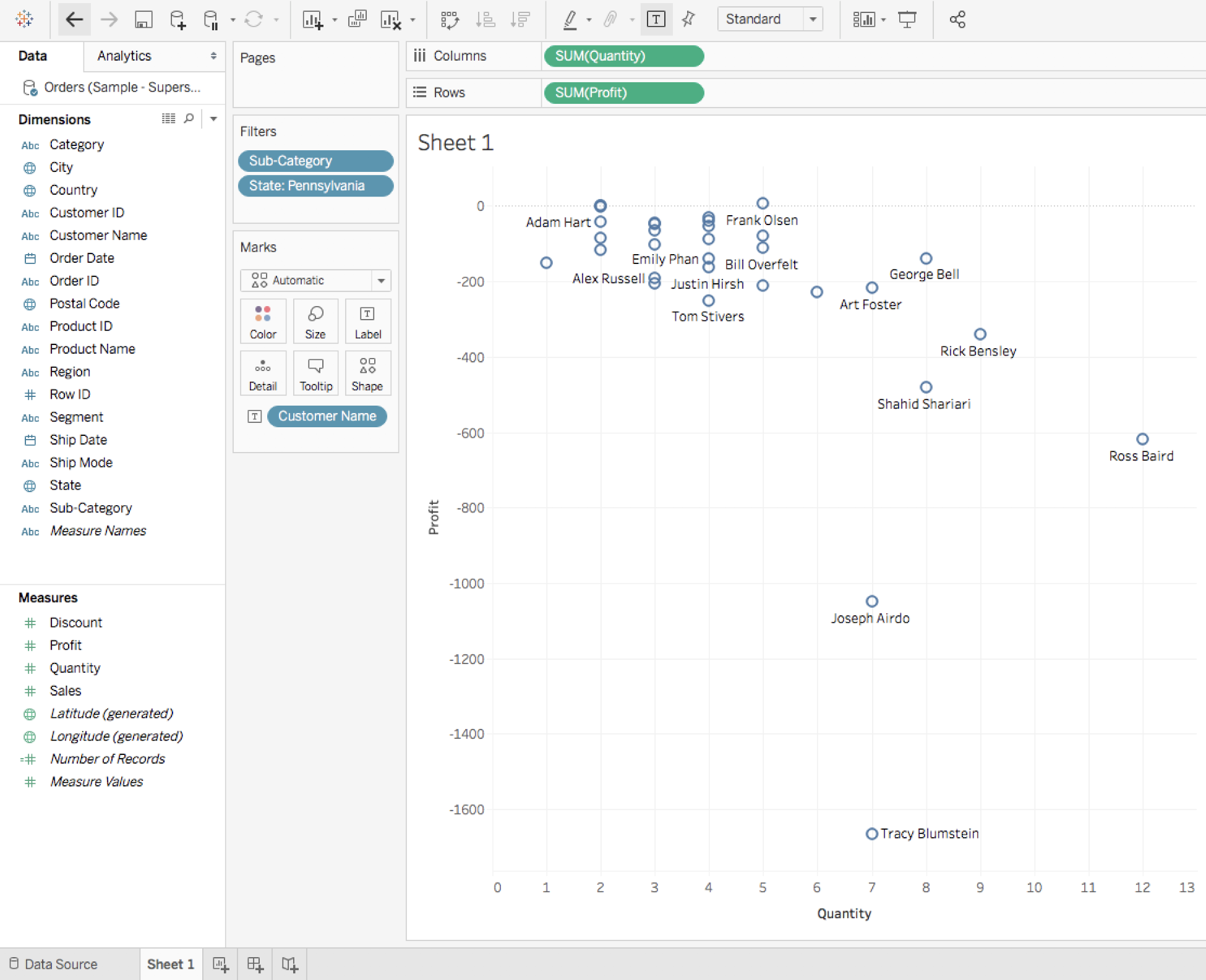
You now see all the customers who purchased a product in one the previously-selected sub-categories in Pennsylvania. Only two of them are profitable (with meager profits); the 30 other customers are unprofitable.
If you want to have an even more in-depth analysis, right-click somewhere on the View (but not on a mark) and click on View Data...:

This opens a new window with the following:
- On the first tab, a Summary table of the visualization.
- On the second tab, the Full Data with all the columns and rows used by Tableau to generate the visualization:

In the top left, you can export the data in CSV format if you want to share it.
As you can see, we were able to answer questions, and go deeper into the analysis, all by staying on one Worksheet. By using the power of Tableau to visualize data, exploration is straightforward and often looks similar to a game.
Whether to create Dashboards or to answer questions, I hope that this chapter has given you the desire to continue to discover all the great functionalities Tableau has to offer.