
Chapter 5: Data Visualization
Being able to visualize data is the backbone of data analysis. The area of data visualization is very exciting, as there are endless possibilities for novelty and creativity in drawing visualizations that tell better stories about your data. However, the core mechanisms of even the most innovative graphs are similar. In this chapter, we will cover these fundamental mechanisms of visualizations that give life to the data and allow us to compare, analyze, and see patterns in it.
As you will learn these fundamental mechanisms, you will also be developing a better backbone/skillset for your data preprocessing goals. If you can fully understand the connection between the data and its visualizations, you will be more effective at preprocessing data for effective visuals. In this chapter, you will work with the data that I have already preprocessed, but in later chapters, we will cover the concepts and techniques that lead to these preprocessed datasets.
This chapter will cover the following main topics:
- Summarizing a population
- Comparing populations
- Investigating the relationship between two attributes
- Adding visual dimensions
- Showing and comparing trends
Technical requirements
You will be able to find the codes and dataset for this chapter in the book's GitHub repository in the Chapter05 folder:
https://github.com/PacktPublishing/Hands-On-Data-Preprocessing-in-Python
Summarizing a population
You can use simple tools such as the histogram, boxplot, or bar chart to visualize the variations in the values of one column of a dataset across the populations of the data object. These visualizations are immensely useful, as they help you to see the values of one attribute at a glance.
One of the most common reasons for using these visuals is to familiarize yourself with a dataset. The term getting to know your data is famous among data scientists and is said time and again to be one of the most necessary steps for successful data analytics and data preprocessing.
What we mean by getting to know a dataset is understanding and exploring the statistical information for each attribute of the dataset. That is, we want to know what types of values each attribute has and how the values vary across the population of the datasets.
For this purpose, we use data visualization tools to summarize the data object population per attribute. Numerical and categorical attributes require different tools for each type of attribute. For numerical attributes, we can use either the histogram or boxplot to summarize the attribute, whereas for categorical attributes, it is best to use bar charts. The following examples walk you through how this can be done all at once for any dataset.
Example of summarizing numerical attributes
Write some code that does the following:
- Reads the adult.csv dataset into the adult_df pandas DataFrame
- Creates a histogram and boxplots for the numerical attributes of adult_df
- Saves the figure for each attribute with a 600 mpi resolution in a separate file
Give the preceding example a try before looking at the following code:
- First, we will import the modules that we will use throughout this chapter:
import pandas as pd
import matplotlib.pyplot as plt
import numpy as np
- Then, we start working on the problem:
adult_df = pd.read_csv('adult.csv')
numerical_attributes = ['age', 'fnlwgt', 'education-num', 'capitalGain', 'capitalLoss', 'hoursPerWeek']
for att in numerical_attributes:
plt.subplot(2,1,1)
adult_df[att].plot.hist()
plt.subplot(2,1,2)
adult_df[att].plot.box(vert=False)
plt.tight_layout()
plt.show()
plt.savefig('{}.png'.format(att), dpi=600)
When you run this code, the Jupyter notebook will show you all 12 charts. Each numerical attribute will have one histogram and one boxplot. The code will also save a .png file on your computer for each attribute that saves the histogram and boxplot of the attribute. For example, the following figure shows the education-num.png file that was saved on my computer after running the preceding code:
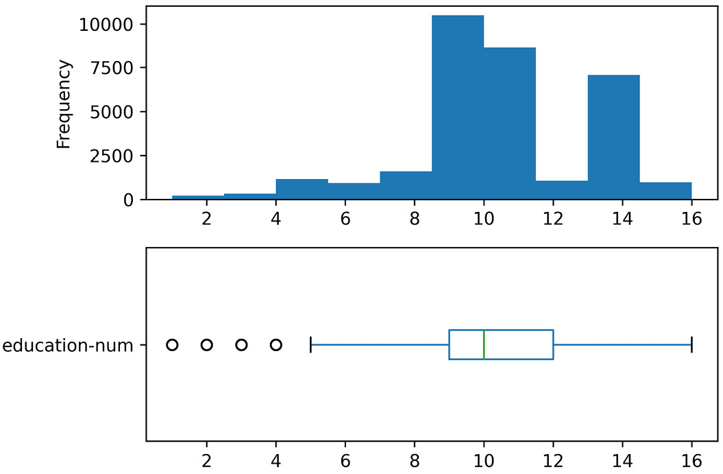
Figure 5.1 – education-num.png
Where Are the Files on My Computer?
If you have difficulty finding the files on your computer, you need to understand the difference between an absolute file path and a relative file path. The absolute file path includes the root element and the complete directory path. However, the relative path is given with an understanding that you are already in a specific directory.
In the preceding code, we did not include the root element in the file path when using plt.savefig(), so Python correctly read this as a relative path and assumed that you want the files to be saved in the same directory as the one you have in your Jupyter notebook file.
In this example, you saw the application of boxplots and histograms to summarize the numerical attributes of a dataset. Now, let's look at another example that shows you similar steps for categorical attributes. For categorical attributes, we always use bar charts.
Example of summarizing categorical attributes
Write some code that does the following:
- Creates bar charts for the categorical attributes of adult_df
- Saves the figure for each attribute with a 600 mpi resolution in a separate file
Give the preceding example a try before looking at the following code:
categorical_attributes = ['workclass', 'education', 'marital-status', 'occupation', 'relationship', 'race', 'sex','nativeCountry','income']
for att in categorical_attributes:
adult_df[att].value_counts().plot.barh()
plt.title(att)
plt.tight_layout()
plt.savefig('{}.png'.format(att), dpi=600)
plt.show()
When you run this code, the Jupyter notebook will show you all nine charts. Each categorical attribute will have one bar chart. The code will also save a .png file on your computer for each attribute that saves the bar chart of the attribute. For example, the following figure shows the education.png file that was saved on my computer after running the preceding code:
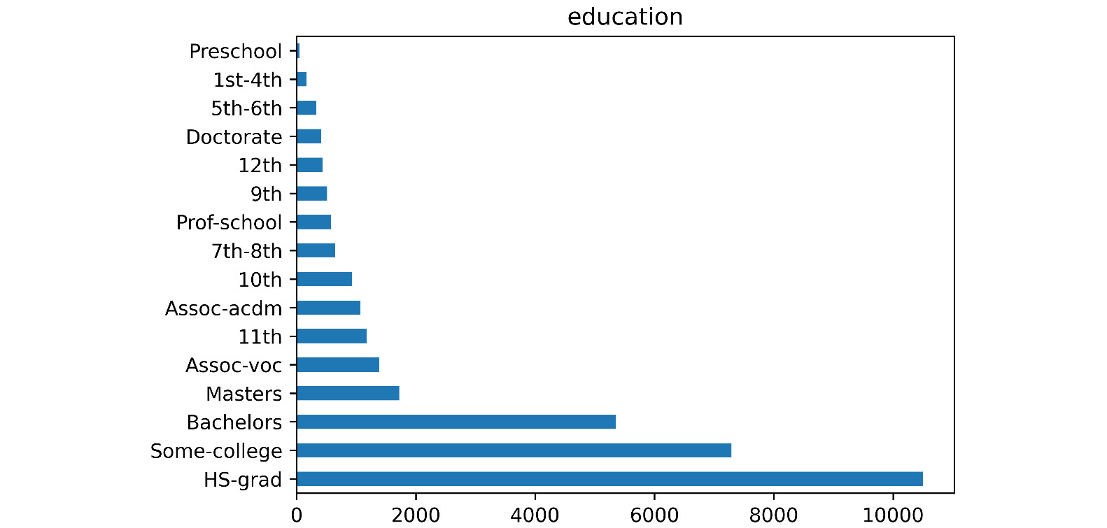
Figure 5.2 – education.png
Good Practice Advice
Technically, you could also use a pie chart to summarize a categorical attribute. However, I advise against it. The reason is that pie charts are not as easily digested by our human brains as bar charts. It has been shown we do much better in appreciating differences in length than the difference in chunks of pies.
So far, you were able to create visualizations that are meant to summarize a population. There are other advantages of being able to do this. Now that we can create these visualizations, we can also create more than one of them and put them next to one another for comparison. The next section will teach you how to do this.
Comparing populations
Putting these kinds of summarizing visualizations of different populations next to one another will be useful to create visuals that help us compare those populations. This can be done with histograms, boxplots, and bar charts. Let's see how this is done using the following three examples.
Example of comparing populations using boxplots
Write some code that creates the following two boxplots next to one another:
- A boxplot of education-num for data objects with an income value that is <=50K
- A boxplot of education-num for data objects with an income value that is >50K
Give the preceding example a try on your own before looking at the following code:
income_possibilities = adult_df.income.unique()
for poss in income_possibilities:
BM = adult_df.income == poss
plt.hist(adult_df[BM]['education-num'], label=poss, histtype='step')
plt.boxplot(dataForBox_dic.values(),vert=False)
plt.yticks([1,2],income_possibilities)
plt.show()
Once you run this code, the Jupyter notebook will display the following figure:
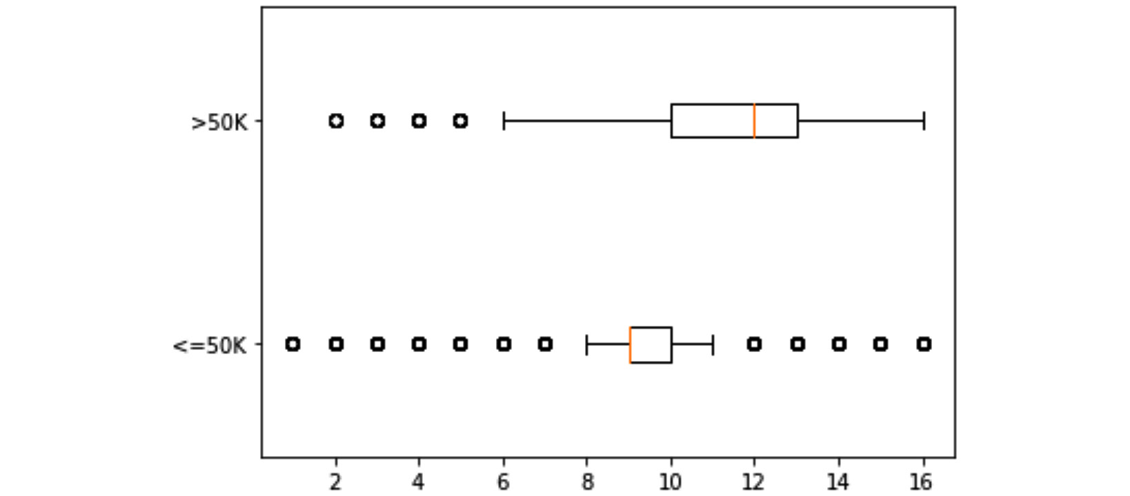
Figure 5.3 – Boxplots of education-num for two populations of income <=50K and >50K
Let's first go through the code before discussing the preceding visual. To completely understand the functioning of the preceding code, you will need to understand three concepts:
- The code first loops through all the populations that we want to be included in the visual. Here, we have two populations: data objects with an income <=50K and data objects with an income >50K. In each iteration of the loop, the code uses Boolean masking to extract each specific population from adult_df.
- The code uses dataForBox_dic, which is a dictionary data structure, as a placeholder. On each iteration of the loop, the code adds a new key and its specific value. In the case of this code, there are two iterations. The first iteration adds '<=50K ' as the first key and all the education-num values of the specific population as the value of the key. All those values are assigned to each key as a Pandas Series. On the second iteration, the code does the same thing for '>50K '.
- After the loop is completed, the dataForBox_dic is full with the necessary data, so plt.boxplot() can be applied to create the visuals with two boxplots. The reason that dataForBox_dic.values() is passed instead of dataForBox_dic is that plt.boxplot() requires the dictionary that is passed for drawing only has strings as keys and lists of numbers as values of the keys. Add print(dataForBox_dic) and print(dataForBox_dic.values()) before and after the loop to see all these differences on your own.
Now, let's bring our attention to the merit of the output of the preceding code, which is shown in Figure 5.3. As you can see, the visual clearly tells the story of how education is important for higher income.
Example of comparing populations using histograms
Write some code that creates the following two histograms in the same plot:
- A histogram of education-num for data objects with an income value that is <=50K
- A histogram of education-num for data objects with an income value that is >50K
Give the preceding example a try on your own before looking at the following code:
income_possibilities = adult_df.income.unique()
for poss in income_possibilities:
BM = adult_df.income == poss
plt.hist(adult_df[BM]['education-num'], label=poss, histtype='step')
plt.legend()
plt.show()
Once you run this code, the Jupyter notebook will display the following figure:

Figure 5.4 – Histograms of education-num for two populations of income <=50K and >50K
The code for creating histograms is less complicated than the code for creating boxplots. The major difference is that for histograms, you do not need to use a placeholder to prepare the data for plt.boxplot(). With plt.hist(), you can just call it as many times as you need and Matplotlib will put these visuals on top of one another. The code, however, uses two of the plt.hist() properties: label=poss and histtype='step'. The following explains the necessity of both:
- label=poss is added to the code so that plt.legend() can add the legends to the visual. Remove label=poss from the code and study the warning that running the update code gives you.
- histtype='step' is setting the type of histogram. There are two different histograms that you can choose from: 'bar' or 'step'. Change histtype='step' to histtype='bar' and run the code to see the difference between them.
The following figure is created by using plt. subplot() to put Figure 5.3 and Figure 5.4 together. I have not shared the code here, so challenge yourself to create it before reading on:
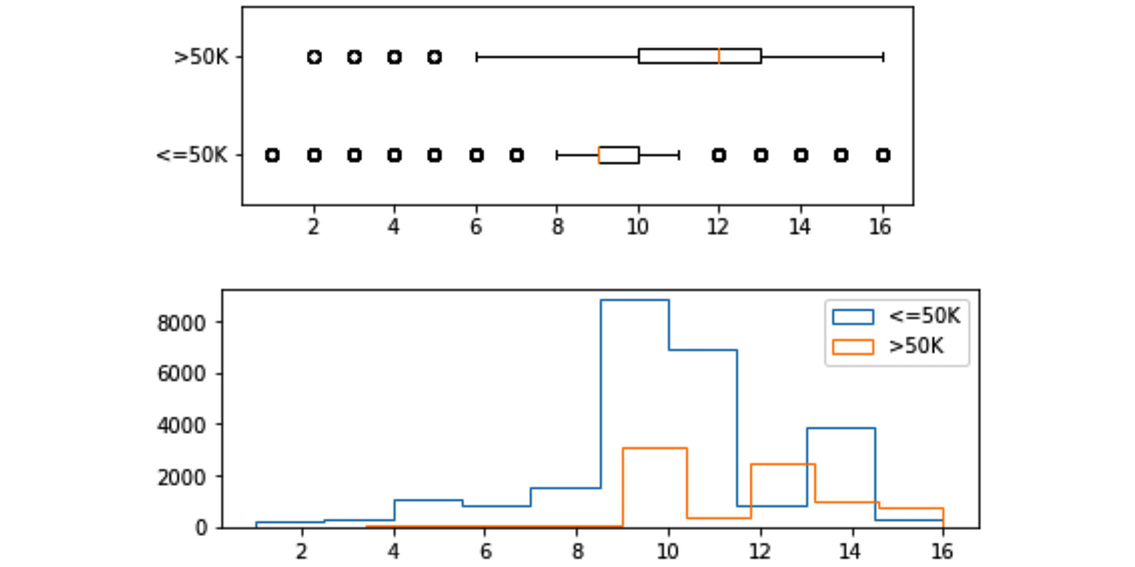
Figure 5.5 – Histograms and boxplots of education-num for two populations of income <=50K and >50K
These two visuals next to one another can help us see the differences and similarities between the two populations easily, and that is the value we get from creating them and meaningfully organizing them together.
So far, we have learned how to compare populations that are described by numerical attributes. Now, let's look at an example that will teach us how we can compare populations that are described by categorical attributes. For this purpose, we will use bar charts.
Example of comparing populations using bar charts
Create a visualization that uses bar charts to compare the categorical attribute race for the two following populations:
- Data objects with an income value that is <=50K
- Data objects with an income value that is >50K
Give this a try on your own before reading on.
You can do this in six different but meaningful ways. Let's go through all of the possible ways that this can be done.
The first way of solving the problem
The following screenshot shows the code and its output for the first way. In this way of solving the problem, we have used plt.subplot() to put the bar charts of the two populations on top of one another:
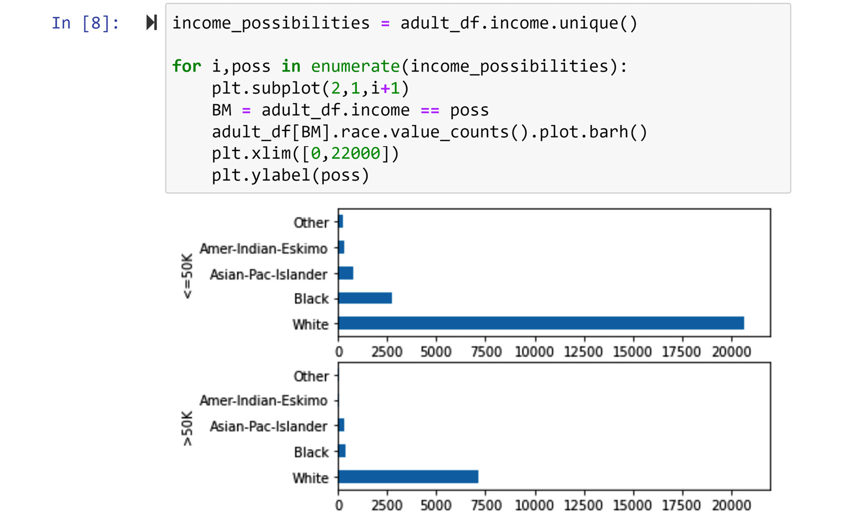
Figure 5.6 – The first way of solving the problem (screenshot of the code and its output)
While this way of solving the problem is legitimate and valuable, bar chats are capable of fusing the chart of the two populations at different levels. The five other ways show these levels.
The second way of solving the problem
The following screenshot shows the code and its output for the second way. In this way of coding it, we have merged the two visuals we saw in Figure 5.6 and we only have one bar chart that contains all the information. However, this merging has come at the price of having to make the y-ticks of the chart more complicated. Take a moment to compare Figure 5.6 and Figure 5.7 before reading on:
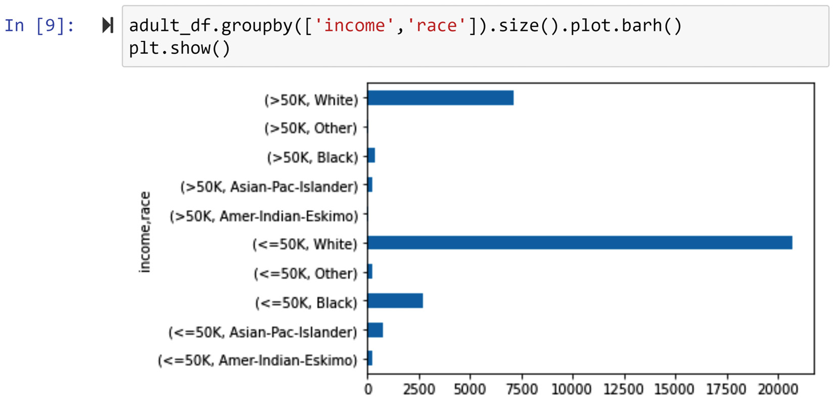
Figure 5.7 – The second way of solving the problem (screenshot of the code and its output)
So far, we have managed to somewhat fuse the bar charts of the two populations. Let's take another step by using a legend and colors to make the resulting chart a bit stronger.
The third way of solving the problem
The following screenshot shows the code and its output for the third way. In this way, we have used a legend and different colors to represent each possibility under the race attribute. Compared to the fusion in Figure 5.7, the fusion in the following figure is more effective:
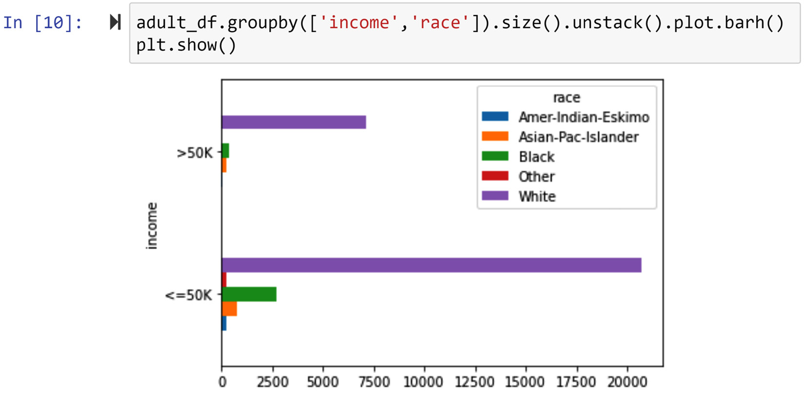
Figure 5.8 – The third way of solving the problem (screenshot of the code and its output)
While the comparison of the two populations based on income is possible with all three preceding figures, the comparison of each possibility of the race attribute is not easily done. The next three ways of solving this problem will highlight visualizations that make that easier.
The fourth way of solving the problem
The following screenshot shows the code and its output for the fourth way. In this approach, we have coded the visual so that the two possibilities of the income attribute are next to one another for each possibility of the race attribute. This way allows us to compare both income group populations (income <=50K and income >50K) against each race attribute.
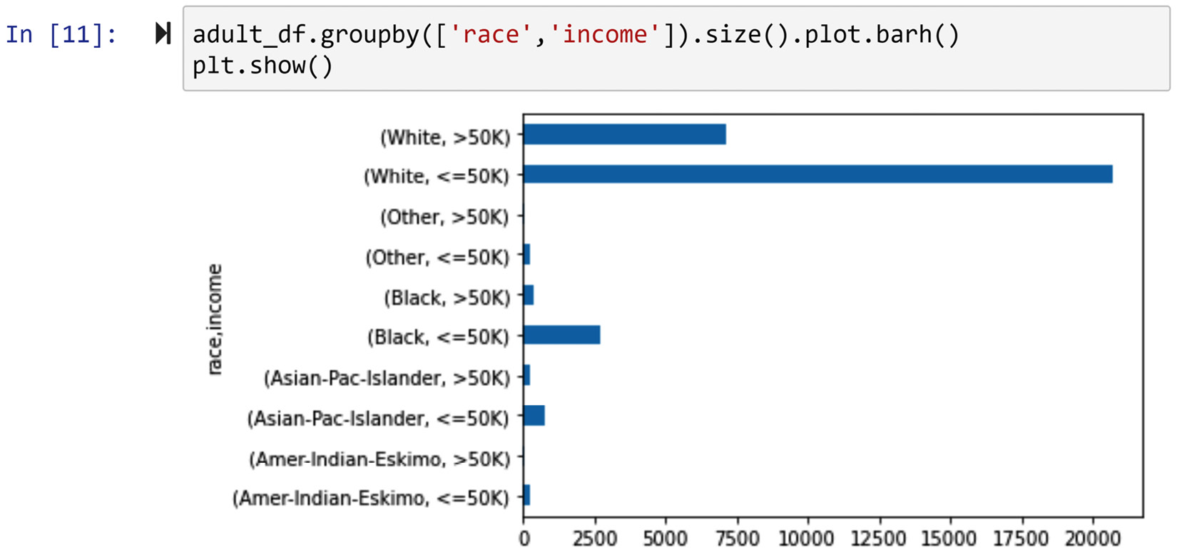
Figure 5.9 – The fourth way of solving the problem (screenshot of the code and its output)
The fusion level of the preceding visual can be improved, and the next way of solving this problem will do this.
The fifth way of solving the problem
The following screenshot shows the code and its output for the fifth way. The only difference between this and the previous way is the use of a legend and colors to make the visual more presentable and neater. Without reservations, we can claim that Figure 5.10 is more effective in solving this problem than Figure 5.9. Why?
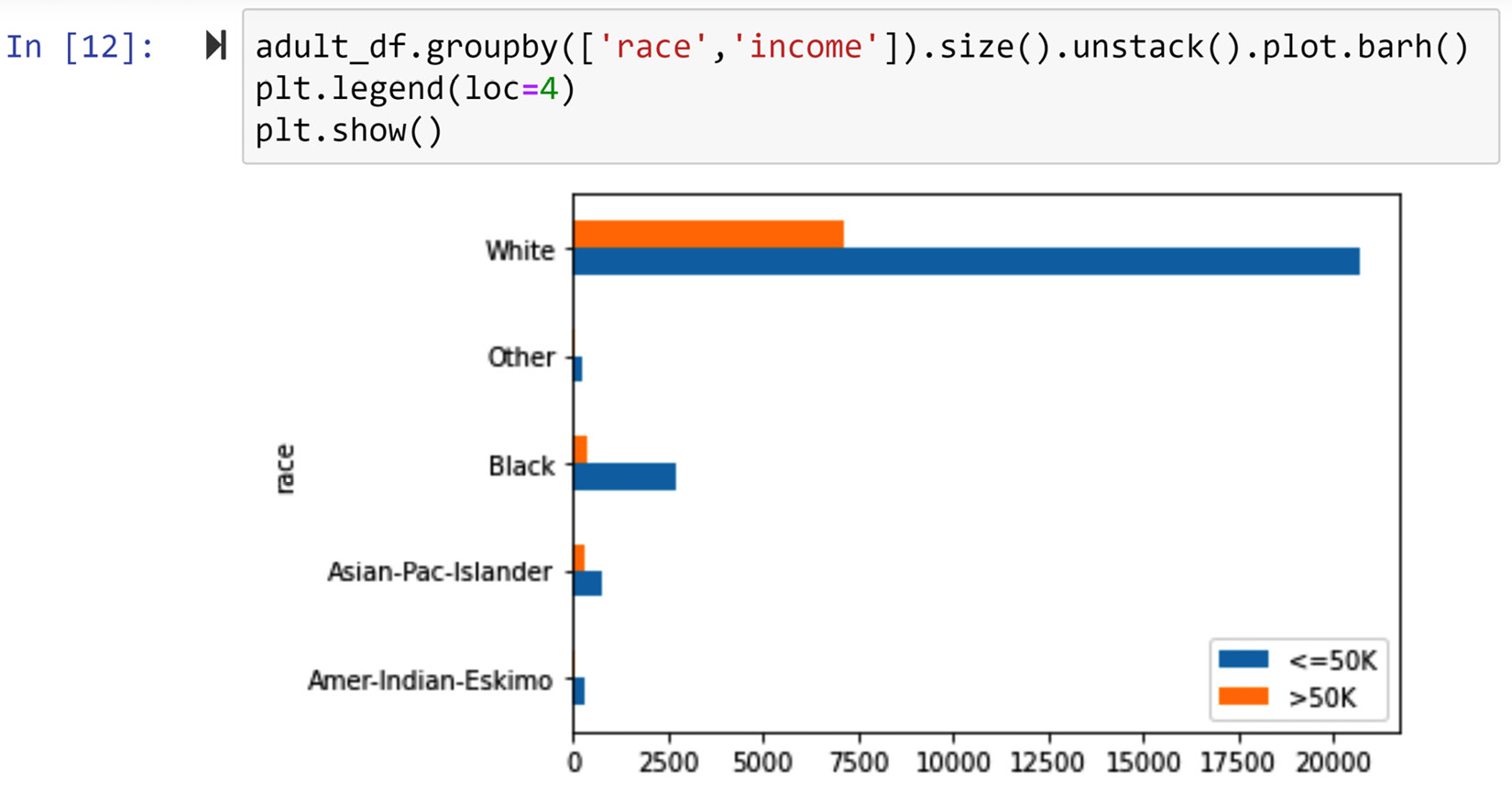
Figure 5.10 – The fifth way of solving the problem (screenshot of the code and its output)
The last way of presenting this data is to stack the two bars under each race category, instead of having them next to one another. The next way of solving the problem will show how that can be done.
The sixth way of solving the problem
The following screenshot shows the code and its output for the sixth way. The visual created from this code is called a stacked bar chart.
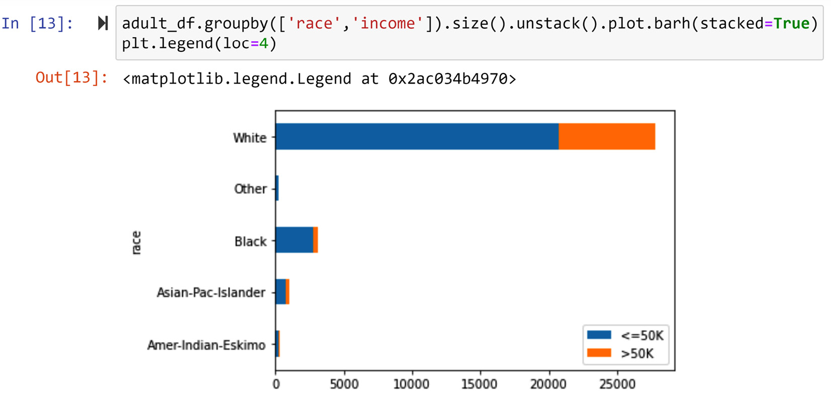
Figure 5.11 – The sixth way of solving the problem (screenshot of the code and its output)
We prefer a stacked bar chart to a typical bar chart when we know the total number of data objects under each possibility is more important than the comparison between populations. In this case, as we are creating this visual to compare the two income group populations, using a stacked bar chart is not very wise.
So far in this chapter, we have learned how we can summarize and compare populations of data objects based on one attribute. Next, we are going to learn how we can see if two or more attributes have specific relationships with one another.
Investigating the relationship between two attributes
The best way to investigate the relationships between attributes visually is to do it in pairs. The tools we use for investigating the relationship between a pair of attributes depends on the type of attributes. In what follows, we will cover these tools based on the following pairs: numerical-numerical, categorical-categorical, and categorical-numerical.
Visualizing the relationship between two numerical attributes
The best tool for portraying the relationship between two numerical attributes is the scatter plot. In the following example, we will use a tool called scatter matrix that creates a matrix of scatterplots for a dataset with numerical attributes.
Example of using scatterplots to investigate relationships between numerical attributes
In this example, we will use a new dataset, Universities_imputed_reduced.csv. This dataset's definition of data objects is Universities in the USA, and these data objects are described using the following attributes: College Name, State, Public/Private, num_appli_rec, num_appl_accepted, num_new_stud_enrolled, in-state tuition, out-of-state tuition, % fac. w/PHD, stud./fac. Ratio, and Graduation rate. The naming of these attributes is very intuitive and does not need further description.
To practice, apply the techniques that you have learned so far to get to know this new dataset before reading on. It will help your understanding immensely.
The following code uses the pariplot() function of the seaborn module to create a scatter plot for every pair combination of the numerical attributes in the uni_df DataFrame. If you have never used the seaborn module before, you need to install it first. How to install seaborn is shown in Chapter 4, Databases, in the Statistical meaning of the word pattern section:
import seaborn as sns
uni_df = pd.read_csv('Universities_imputed_reduced.csv')
sns.pairplot(uni_df)
After running the preceding code, the Jupyter notebook will show you Figure 5.12. Using this figure, you can investigate the relationship between any two attributes in uni_df. For instance, you can see that there is a strong relationship between num_appl_accepted and num_new_stud_enrolled, which makes sense. As the number of accepted applications increases, we would expect the number of new enrollments to increase.
Furthermore, by studying the last column or the last row of the scatter matrix in the following figure, you can study the relationship between graduation and all the other attributes one by one. After doing so, you can see that, surprisingly and interestingly, the graduation rate attribute's strongest relationship is with in-state tuition and out-of-state tuition. Interestingly, graduation does not have a strong relationship with other attributes, such as num_new_stud_enrolled, % fac. w/PHD, and stud./fac. Ratio.
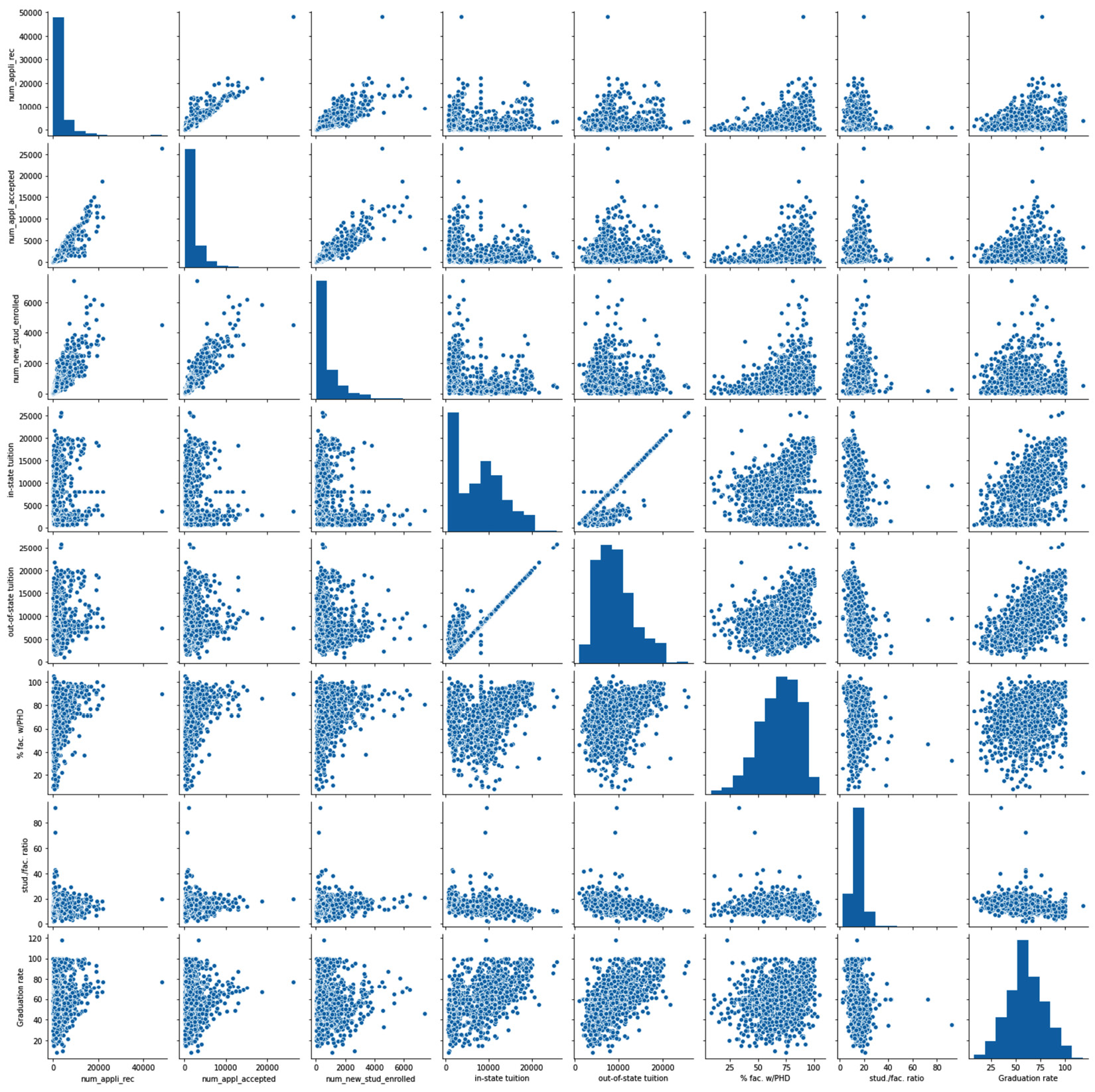
Figure 5.12 – Scatter matrix of the uni_df DataFrame
Now that we have practiced making visuals to investigate the relationship between numerical attributes, next, we will do the same for categorical attributes.
Visualizing the relationship between two categorical attributes
The best visual tool for examining the relationship between two categorical attributes is the color-coded contingency table. A contingency table is a matrix that shows the frequency of data objects in all the possible value combinations of two attributes. While you could create a contingency table for numerical attributes, doing so in most cases will not lead to effective visualizations; contingency tables are almost always used for categorical attributes.
Example of using a contingency table to examine the relationship between two categorical (binary) attributes
In this example, we are interested to see if there is a relationship between two categorical attributes, sex and income, among the data objects in adult_df. To examine this relationship, we will use a contingency table. The following screenshot shows how this can be done using the pd.crosstab() pandas function. This function gets two attributes and outputs the contingency table for them:
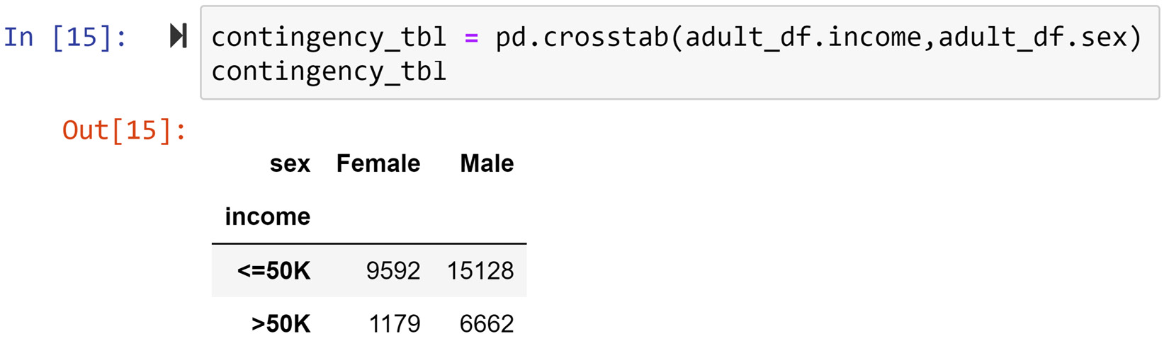
Figure 5.13 – The code and output of creating a contingency table for two categorical attributes, adult_df.sex and adult_df.income
You can see in the outputted contingency table in the preceding screenshot that, while around 11% of female data objects have an income >50K, around 30% of male data objects have an income >50K. To derive such conclusions from a contingency table we normally do some simple calculations, such as the one we did just now; we calculated the relative percentages of the income totals for each gender. However, we could color code the contingency table so that these extra steps are not be needed. The following screenshot displays a two-step process for doing this by using the sns.heatmapt() function from the seaborn module:
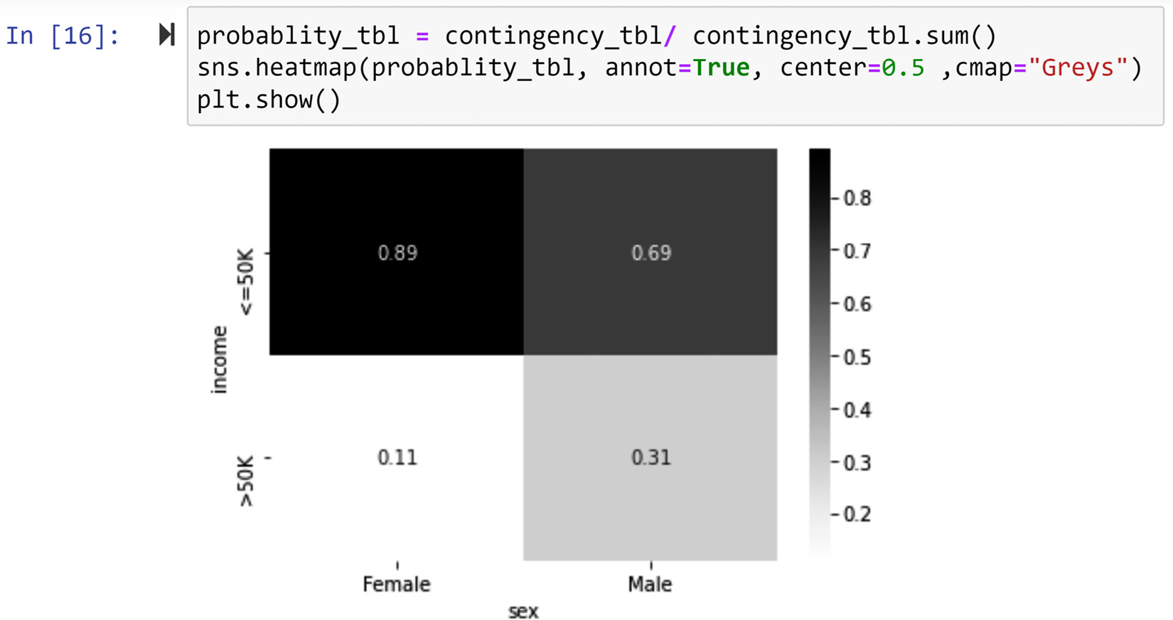
Figure 5.14 – Transforming the contingency table from Figure 5.13 into a heatmap
The two steps to create the color-coded contingency table from the original contingency table are as follows:
- Create a probability table from the contingency table by dividing the values of each column by the sum of all the values in the column.
- Use sns.heatmap() to create the color-coded contingency table. Apart from inputting the calculated probability table (probablity_tbl) from the previous step, three more inputs are added: annot=True, center=0.5, and cmap="Greys". Remove them one by one and run the same code shown in the preceding screenshot to understand what each addition does.
Now, by simply looking at the color-coded contingency table in the preceding screenshot, we can see that while among both males and females, more data objects earn <=50K, data objects that are male are more likely to earn >50K than female data objects. Therefore, we can conclude that sex and income do have a meaningful and visualizable relationship with one another.
This example examines the relationship between two binary attributes. When the attributes are not binary, the steps we take to create a color-coded contingency table are identical. Let's see this in an example.
Example of a using contingency table to relationship between two categorical (non-binary) attributes
Create a visualization that examines the relationship between the race and occupation attributes for the data objects in adult_df.
Give this a try on your own before reading on.
The following screenshot displays the code and the correct output for this example:
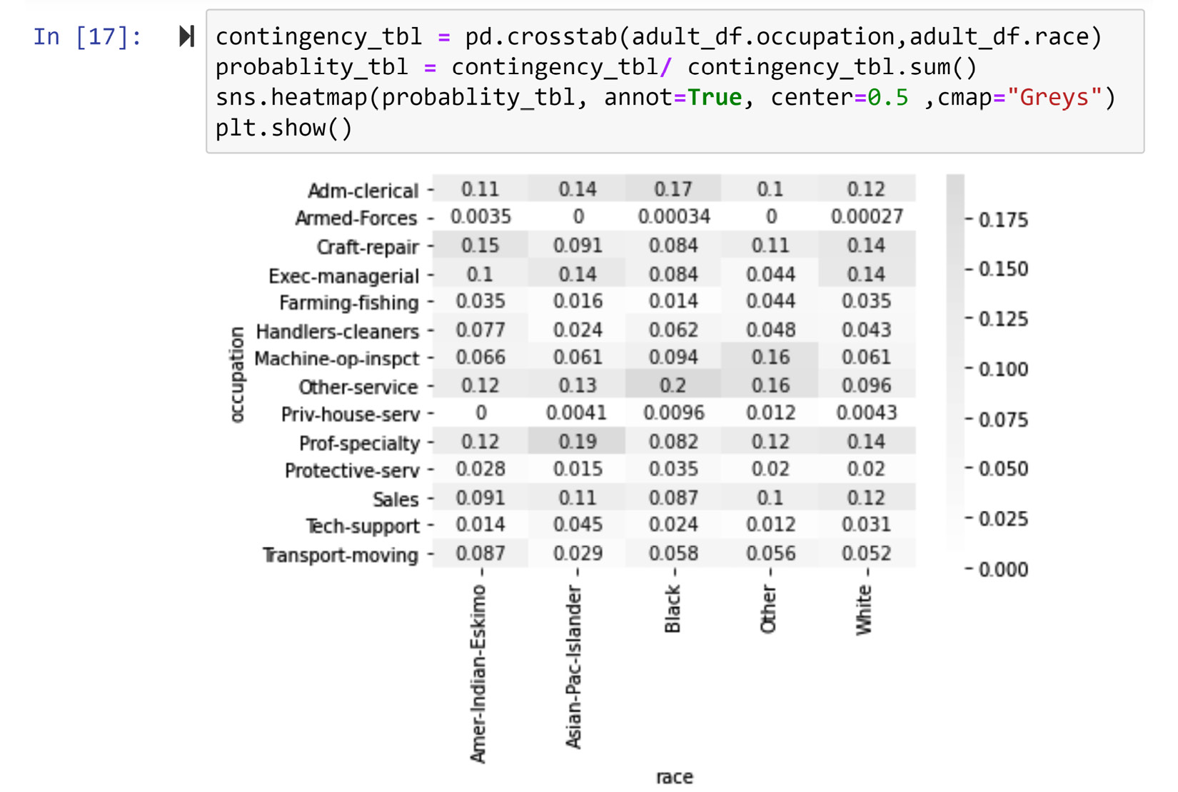
Figure 5.15 – Creating a contingency heatmap for the two categorical attributes, adult_df.race and adult_df.occupation
In the color-coded table, you can clearly see the following patterns:
- Data objects with the race attribute value of white are more likely to have the occupation attribute values of Craft-repair, Exec-managerial, or Prof-specialty
- Data objects with the race attribute value of black are more likely to have the occupation attribute values of Adm-clerical and Other-service
- Data objects with the race attribute value of Asian-Pac-Islander are more likely to have the occupation attribute value of Prof-specialty
- Data objects with the race attribute value of Amer-Indian-Eskimo are more likely to have the occupation attribute value of Craft-repair.
Again, using the contingency table we can see that there is a visualizable and meaningful relationship between race and occupation among the data object in adult_df.
So far, we have learned how to visualize the relationships between pairs of attributes of the same type, namely, numerical-numerical and categorical-categorical. Next, we will tackle visualizing the relationship for the non-matching pairs, specifically, numerical-categorical.
Visualizing the relationship between a numerical attribute and a categorical attribute
What makes this situation more challenging is obvious: the types of the attributes are different. To be able to visualize the relationship between a categorical attribute and a numeric attribute, one of the attributes has to be transformed into the other type of attribute. Almost always, it is best to transform the numerical attribute into a categorical one, and then use a contingency table to examine the relationship between the two attributes. The following example shows how this can be done.
Example of examining the relationship between a categorical attribute and a numerical attribute
First, create a visualization that examines the relationship between the race and age attributes for the data objects in adult_df.
The Age attribute is numerical and the race attribute is categorical. So first, we need to transform age into a categorical attribute. Then, we can use a contingency table to visualize their relationship. The following screenshot shows these steps:
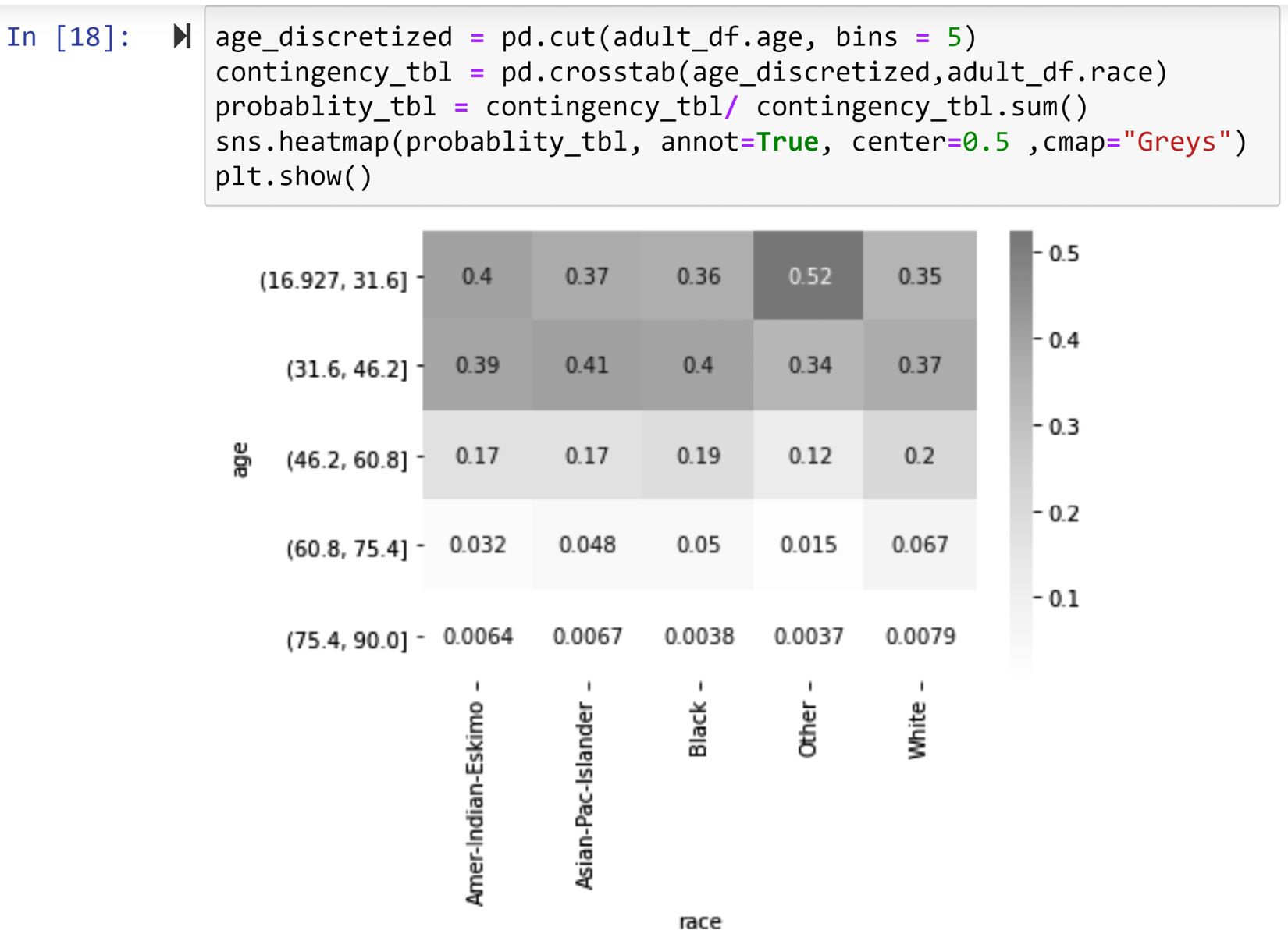
Figure 5.16 – Creating a contingency heatmap for a categorical attribute (adult_df.race) and a numerical attribute (adult_df.age)
The solution showed in the preceding screenshot has the following three steps:
- Use the pd.cut() pandas function to transform adult_df.age into a categorical attribute with five possibilities. Choosing 5 bins is arbitrary, but it is a good number unless there are good reasons to group the data into a different number of bins. Discretization is what we call the transformation of a numerical attribute into a categorical one; that is why we have used age_discretized as the name for the transformed adult_df.age attribute.
- Create a contingency table for age_discretized and adult_df.race using the pd.crosstab() pandas function.
- Create a probability table using the contingency table created in the previous step and then use sns.heatmap() to create the color-coded contingency table.
The output visual shows that there is a meaningful and visualizable relationship between the two attributes. Specifically, the data objects that have other for the race attribute are younger than the data objects where the race attributes are white, black, asian-Pac-Islander, and Amer-Indian-Eskimo.
This example demonstrated the common scenario where the numerical attribute will be transformed into a categorical attribute to examine its relationship with another categorical attribute. While this is will be the best way to go about this in almost all cases, there are cases where it is advantageous to transform the categorical attribute into a numerical one. The following example shows a rare situation where this transformation is preferred.
Another example of examining the relationship between a categorical attribute and a numerical attribute
First, create a visualization that examines the relationship between the education and age attributes for the data objects in adult_df.
Again, we have a categorical attribute and a numerical attribute. However, this time, the categorical attribute has two characteristics that make it possible for us to choose the less common way to approach this situation. These two characteristics are as follows:
- Education is an ordinal categorical attribute and not a nominal categorical attribute.
- The attribute can be made into a numeric attribute with a few reasonable assumptions.
The default method to transform an ordinal attribute to a numerical one is ranking transformation. For instance, you can perform a ranking transformation on the education attribute and replace each of the possibilities under adult_df.education with an integer number. Interestingly, the adult_df dataset already has another attribute that is the rank transformation of the education attribute, and that transformed attribute is called education-num. The following figure shows the one-to-one relationship between these two attributes:

Figure 5.17 – The one-to-one relationship between the education and education-num attributes in adult_df
You can see the relationship between the two attributes portrayed in the preceding figure yourself by running the following code:
adult_df.['education','education-num']).size()
When you run this code, you will see that the .groupy() function does not split per possibilities of education-num for education; the reason for this is that there is a one-to-one relationship between these two attributes.
Now that we have the numerical version of the education attribute, we can use a scatter plot to visualize the relationship between education and age. The following screenshot shows the code and the visualization:
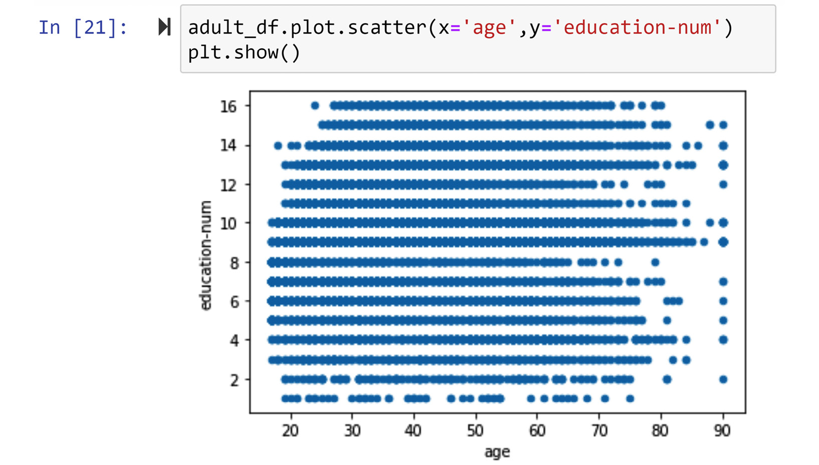
Figure 5.18 – Creating a scatter plot for a categorical attribute (adult_df.education) and a numerical attribute (adult_df.age)
Using the visualized relationship, we can see that the two attributes, age and education, are not related. For the sake of practice, let's also do this analysis the other way around; let's discretize age and create a contingency table to see if we will get to the same conclusion. The following screenshot shows the code and the output visual for this analysis:
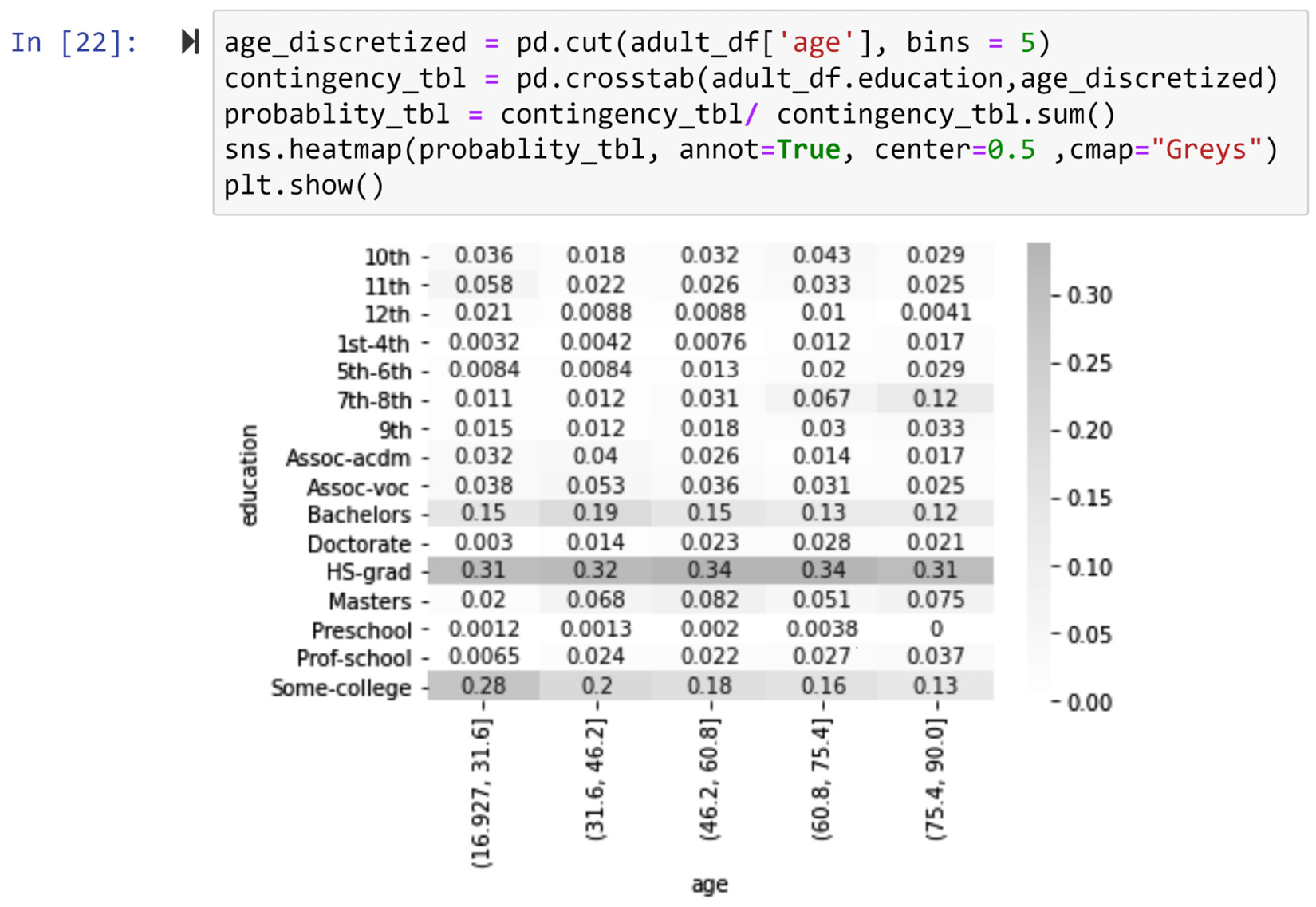
Figure 5.19 – Creating a contingency heatmap for a categorical attribute (adult_df.education) and a numeric attribute (adult_df.age)
We can see that this visual also gives the impression that the two attributes, age and education, are not related to one another.
So far in this chapter, we have learned how to summarize a population, compare populations, and just now, we learned how to visualize the relationship between all kinds of attributes. Now, let's begin another data visualization aspect – next, we will learn about adding dimensions to our visualizations.
Adding visual dimensions
The visualizations that we have created so far have only two dimensions. When using data visualization as a way to tell a story or share findings, there are many good reasons not to add too many dimensions to your visuals. For instance, visuals that have too many dimensions may overwhelm your audience. However, when the visuals are used as exploratory tools to detect patterns in the data, being able to add dimensions to the visuals might be just what a data analyst needs.
There are many ways to add dimensions to a visual, such as using color, size, hue, line styles, and more. Here, we will cover the three most applied approaches by adding dimensions using color, size, and time. In this case, we will show adding the dimensions for the case of scatter plots, but the techniques shown can be easily extrapolated to other visuals if applicable. The following example demonstrates how adding extra dimensions to the scatter plot could be of significant value.
Example of a five-dimensional scatter plot
Use WH Report_preprocessed.csv to create a visualization that shows the interaction of the following five columns in this dataset:
- Healthy_life_expectancy_at_birth
- Log_GDP_per_capita
- Year
- Continent
- Population
To solve this problem, we are going to have to do it step by step. So, please stay with me throughout.
The dataset we use for this example is taken from The World Happiness Report, which includes the data of 122 countries from 2010 to 2019. Before starting to engage with the solutions given for this example, take some time and familiarize yourself with the dataset.
Advice for Better Learning
As we learn more and more complex analyses, algorithms, and code, we may not have space in these pages to get to know every new dataset we cover in the book. Every time a new dataset is introduced throughout this book, I strongly recommend that you take the steps that were laid out in the Pandas functions to explore a DataFrame section in Chapter 1, Review of the Core Modules NumPy and Pandas. Of course, this applies here. Take the time to get to know the WH Report_preprocessed.csv dataset before reading on.
The following code uses plt.subplot() and plt.scatter() to bring three dimensions together: Healthy_life_expectancy_at_birth, Log_GDP_per_capita, and year:
country_df = pd.read_csv('WH Report_preprocessed.csv')
plt.figure(figsize=(15,8))
year_poss = country_df.year.unique()
for i,yr in enumerate(year_poss):
BM = country_df.year == yr
X= country_df[BM].Healthy_life_expectancy_at_birth
Y= country_df[BM].Log_GDP_per_capita
plt.subplot(2,5,i+1)
plt.scatter(X,Y)
plt.title(yr)
plt.xlim([30,80])
plt.ylim([6,12])
plt.show()
plt.tight_layout()
The output of the preceding code is shown in Figure 5.20. The visual manages to achieve the following important things:
- The figure visualizes the three dimensions all at once.
- The figure shows the upward and rightward movement of the countries in both X and Y dimensions. This movement has the potential to tell the story of global success improving on both dimensions, Healthy_life_expectancy_at_birth and Log_GDP_per_capita.
However, the visual is choppy and sloppy at showing the movement of the countries in the years between 2010 and 2019, so we can do better.
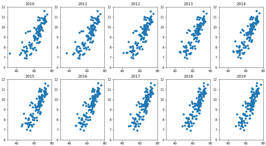
Figure 5.20 – One figure with three dimensions of the WH Report_preprocessed.csv dataset
Now, we want to improve the preceding figure by seamlessly incorporating time in one visual instead of having to use subplots. The following figure (Figure 5.21) shows our end goal in this segment. The figure is interactive, and by sliding the control bar on the top widget, we can change the year for the visual and therefore see the movement of countries under the two dimensions of Healthy_life_expectancy_at_birth and Log_GDP_per_capita. Of course, we cannot do that on paper, but I will share the code that can make this happen right here. But, we have to do this in two steps:
- Create a function that outputs the relevant visual for the inputted year.
- Use new modules and programing objects to create the slide bar.
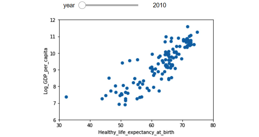
Figure 5.21 – One figure with three dimensions of the WH Report_preprocessed.csv dataset using a slide bar widget
The following code creates the function that we need for the interactive visual:
def plotyear(year):
BM = country_df.year == year
X= country_df[BM].Healthy_life_expectancy_at_birth
Y= country_df[BM].Log_GDP_per_capita
plt.scatter(X,Y)
plt.xlabel('Healthy_life_expectancy_at_birth')
plt.ylabel('Log_GDP_per_capita')
plt.xlim([30,80])
plt.ylim([6,12])
plt.show()
After creating this function and before moving forward, put the function in use by calling it a few times – for instance, run plotyear(2011), plotyear(2018), and plotyear(2015). If everything is working well, you'd get a new scatter plot on every run.
After you have a well-functioning plotyear(), writing and running the following code gives you the interactive visual showed in the preceding figure (Figure 5.21). To create this interactive visual, we have used the interact and widgets programming objects from the ipywidgets module:
from ipywidgets import interact, widgets
interact(plotyear,year=widgets.IntSlider(min=2010,max=2019,step=1,value=2010))
After you have managed to create the interactive visual, go ahead and put the control bar to use and enjoy the upward movement of the countries. Before your eyes, you will see the history of global success from 2010 to 2019.
The fourth dimension
So far, we have only been able to include three dimensions in our visuals: Healthy_life_expectancy_at_birth, Log_GDP_per_capita, and year. We have two more dimensions to go.
We used a scatter plot to include the first two dimensions, and we used the time to include the third dimension, year. Now, let's use color to include the fourth dimension, Continent.
The following code adds color to what we've already built. Pay close attention to how a for loop has been used to iterate over all the continents and add the data of each continent one by one to the visual and thus separate them:
Continent_poss = country_df.Continent.unique()
colors_dic={'Asia':'b', 'Europe':'g', 'Africa':'r', 'South America':'c', 'Oceania':'m', 'North America':'y', 'Antarctica':'k'}
def plotyear(year):
for cotinent in Continent_poss:
BM1 = (country_df.year == year)
BM2 = (country_df.Continent ==cotinent)
BM = BM1 & BM2
X = country_df[BM].Healthy_life_expectancy_at_birth
Y= country_df[BM].Log_GDP_per_capita
plt.scatter(X,Y,c=colors_dic[cotinent], marker='o', linewidths=0.5, edgecolors='w', label=cotinent)
plt.xlabel('Healthy_life_expectancy_at_birth')
plt.ylabel('Log_GDP_per_capita')
plt.xlim([30,80])
plt.ylim([6,12])
plt.legend()
plt.show()
interact(plotyear,year=widgets.IntSlider(min=2010,max=2019,step=1,value=2010))
After successfully running the preceding code, you will get another interactive visual. The following figure shows the visual when the year control bar is set to 2015.
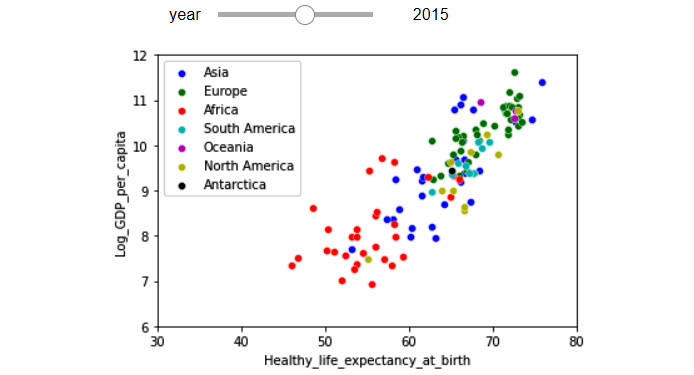
Figure 5.22– One figure with four dimensions of the WH Report_preprocessed.csv dataset using a slide bar widget and color
Contemplating and interacting with the preceding visual not only adds extra dimensions to the visual before our eyes, but it also adds further dimensions to the story we have been developing. We can see the clear disparity between the continents in the world, but also, we see the same upward movement to a higher GDP and life expectancy for all countries.
The fifth dimension
So far, we have only been able to include the following four dimensions in one visual: Healthy_life_expectancy_at_birth, Log_GDP_per_capita, year, and Continent. Now, let's add the fifth dimension, which is population, using the size of the markers to represent this. The following code adds the dimension of the population as the size of the markers:
Continent_poss = country_df.Continent.unique()
colors_dic={'Asia':'b', 'Europe':'g', 'Africa':'r', 'South America':'c', 'Oceania':'m', 'North America':'y', 'Antarctica':'k'}
country_df.sort_values(['population'],inplace = True, ascending=False)
def plotyear(year):
for cotinent in Continent_poss:
BM1 = (country_df.year == year)
BM2 = (country_df.Continent ==cotinent)
BM = BM1 & BM2
size = country_df[BM].population/200000
X = country_df[BM].Healthy_life_expectancy_at_birth
Y= country_df[BM].Log_GDP_per_capita
plt.scatter(X,Y,c=colors_dic[cotinent], marker='o', s=size, inewidths=0.5, edgecolors='w', label=cotinent)
plt.xlabel('Healthy_life_expectancy_at_birth')
plt.ylabel('Log_GDP_per_capita')
plt.xlim([30,80])
plt.ylim([6,12])
plt.legend(markerscale=0.5)
plt.show()
interact(plotyear,year=widgets.IntSlider(min=2010,max=2019,step=1,value=2010))
After successfully running the preceding code, you will get another interactive visual. The following figure shows the visual when the year control bar is set to 2019.
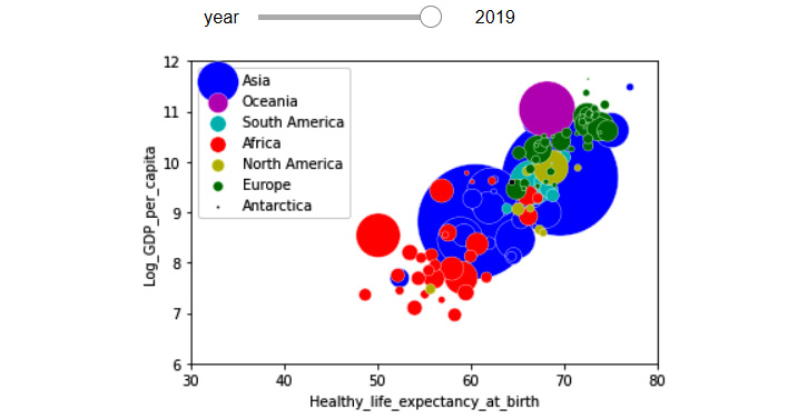
Figure 5.23 – One figure with five dimensions of the WH Report_preprocessed.csv dataset, using a slide bar widget, color, and size
There are three parts of the preceding code that might be confusing for you. Let's go over them together:
country_df.sort_values(['population'], inplace = True, ascending=False)
The preceding code is included so the countries with higher populations are added to the visual first, therefore, their markers will go to the background and will not cover up the countries with lower populations.
size = country_df[BM].population/200000
The preceding code is added to scale down the big population numbers for creating the visual. The number was found purely after some trial and error.
plt.legend(markerscale=0.5)
The markerscale=0.5 is added to scale the markers shown in the legend, as without this they would be too big. Remove markerscale=0.5 from the code to see this for yourself.
Voila! We are done. We were able to learn how to create a five-dimensional scatter plot.
So far in this chapter, you have been able to learn useful visualization techniques and concepts, such as summarizing and comparing populations, investigating the relationships between attributes, and adding visual dimensions. Next, we will cover how we can use Python to display and compare trends in data.
Showing and comparing trends
Trends can be visualized when the data objects are described by attributes that are highly related to one another. A great example of such datasets is time series data. Time series datasets have data objects that are described by time attributes and with an equal duration of time between them. For instance, the following dataset is a time series dataset that shows the daily closing prices of Amazon and Apple stocks for the first 10 trading days of 2020. In this example, you can see that all of the attributes of the dataset have a time nature and they have an equal duration of a day between them:
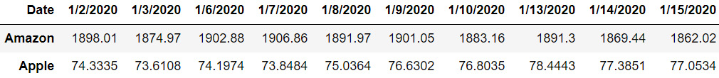
Figure 5.24 – Time series data example (daily stock prices of Amazon and Apple)
The best way to visualize time series data is using line plots. Figure 2.9 from Chapter 2, Review of Another Core Module – Matplotlib, is a great example of using line plots to show and compare trends.
Line plots are very popular in stock market analysis. If you search for any stock ticker, you will see that Google will show you a line plot of the price trends. It also gives you the option to change the duration of time over which you want the line plot to visualize the price trends. Give this a try – for example, try some searches: Amazon stock, Google stock, and Walmart stock.
Line plots are popular in stock market analysis; however, they are very useful in other areas, too. Any dataset that has time series data could potentially take advantage of line plots for showing trends. The following example illustrates another instance of applying line lots to visualize and compare trends.
Example of visualizing and comparing trends
Use WH Report_preprocessed.csv to create a visualization that shows and compares the trend of the Perceptions_of_corruption attribute for all continents between the years 2010 and 2019. To be clear, we want the data for only the two years – 2010 and 2019.
Give this example a try before reading on.
This example can be easily solved by all the programming and visualization tools that we have learned so far. The following code creates the requested visualization:
country_df = pd.read_csv('WH Report_preprocessed.csv')
continent_poss = country_df.Continent.unique()
byContinentYear_df = country_df.groupby(['Continent','year']).Perceptions_of_corruption.mean()
Markers_options = ['o', '^','P', '8', 's', 'p', '*']
for i,c in enumerate(continent_poss):
plt.plot([2010,2019], byContinentYear_ df.loc[c,[2010,2019]], label=c, marker=Markers_options[i])
plt.xticks([2010,2019])
plt.legend(bbox_to_anchor=(1.05, 1.0))
plt.title('Aggregated values per each continent in 2010 and 2019')
plt. label('Perceptions_of_corruption')
plt.show()
Before going over the different parts of this code, let's enjoy seeing, analyzing, and appreciating the story the following visual tells us. These are the following five points that the visual clearly shows:
- For most continents, namely, Africa, North America, Asia, and Europe, Perceptions_of_corruption have declined.
- Between all these improving continents, Europe has had the fastest decrease in Perceptions_of_corruption.
- Asia has had a faster improvement than North America, thereby placing Asia in a better place than North America in 2019 compared to 2010.
- The two continents that have had an increase in Perceptions_of_corruption are South America and Antarctica.
- The Perceptions_of_corruption values for Oceania have not changed, and because of that, the continent has achieved the status of having the lowest Perceptions_of_corruption among all continents.
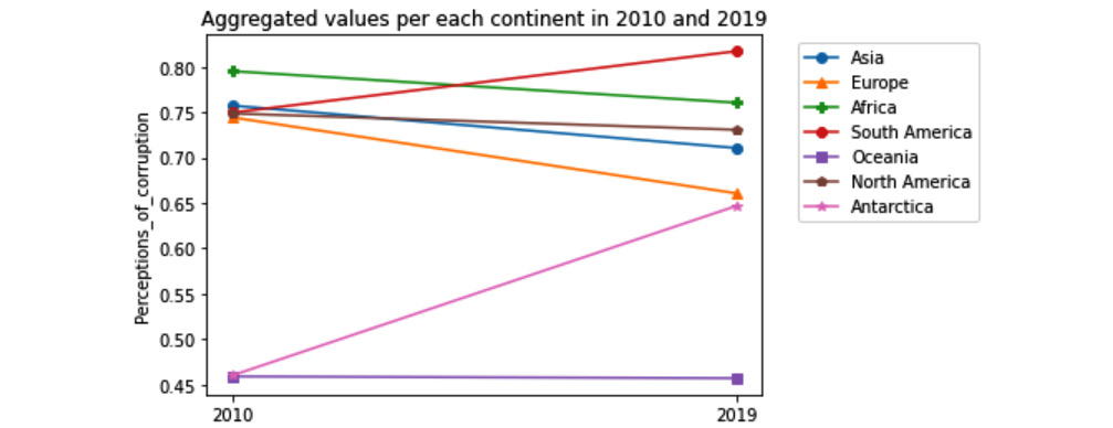
Figure 5.25 – Line plot comparing Perceptions_of_corruption across different continents in 2010 and 2019
Now, let's go through different elements of the preceding code:
- The following line of code groups the data based on the two attributes, Continent and year, and then calculates the aggregate function .mean() for the Perceptions_of_corruption attribute. The result of this grouping is recorded in byContinentYear_df, which is a DataFrame.
byContinentYear_df = country_df.groupby(['Continent','year']).Perceptions_of_corruption.mean()
The rest of the solution uses numbers in this DataFrame to draw different elements of the visual. Separately, run print(byContinentYear_df) to see this. That will help your understanding of the solution.
- To better separate the continents, the code has used markers. First, the code creates a list of possible markers for later use. The following line of code has done this: Markers_options = ['o', '^','P', '8', 's', 'p', '*']. Then, within the loop through all the continents and when each line is introduced using the plt.plot() function, the code uses marker=Markers_options[i] to assign one of those possible markers.
- The code has incorporated box_to_anchor=(1.05, 1.0) for plt.legend() to place the legend box outside the visual. Change the numbers a few times and run the code to see how this functionality of Matplotlib works.
Now, we are completely done with this example. We first appreciated the visual's storytelling values, then we also discussed each important element of the code we used to create the visual.
Summary
Congratulations on your excellent progress in this chapter. Together, we learned the fundamental data visualization paradigms, such as summarizing and comparing populations, examining the relationships between attributes, adding visual dimensions, and comparing trends. These visualization techniques are very useful in effective data analytics.
All of the data we used in this chapter had been cleaned and preprocessed so we could focus on learning the visualization goals of data analytics. Now that you are on your way toward learning about effective data preprocessing in the next chapters, this deeper understanding of data visualization will help you become more effective in data preprocessing, and in turn, become more effective in data visualization and analytics.
In the next two chapters, we will continue learning about other data analytics goals, namely, prediction, classification, and clustering, before we start introducing effective preprocessing techniques.
Before moving forward and starting your journey in understanding those goals, spend some time on the following exercises to practice what you have learned.
Exercise
- In this exercise, we will be using Universities_imputed_reduced.csv. Draw the following visualizations:
a) Use boxplots to compare the student/faculty ratio (stud./fac. ratio) for the two populations of public and private universities.
b) Use a histogram to compare the student/faculty ratio (stud./fac. ratio) for the two populations of public and private universities.
c) Use subplots to put the results of a) and b) on top of one another to create a visual that compares the two populations even better.
- In this exercise, we will continue using Universities_imputed_reduced.csv. Draw the following visualizations:
a) Use a bar chart to compare the private/public ratio of all the states in the dataset. In this example, the populations we are comparing are the states.
b) Improve the visualizations by sorting the states on the visuals based on the total number of universities they have.
c) Create a stacked bar chart that shows and compares the percentages of public and private schools across different states.
- For this example, we will be using WH Report_preprocessed.csv. Draw the following visualizations:
a) Create a visual that compares the relationship between all the happiness indices.
b) Use the visual you created in a) to report the happiness indices with strong relationships and describe those relationships.
c) Confirm the relationships you found and described by calculating their correlation coefficients and adding these new pieces of information to your description to improve them.
- For this exercise, we will continue using WH Report_preprocessed.csv. Draw the following visualizations:
a) Draw a visual that examines the relationship between two attributes, Continent and Generosity.
b) Based on the visual, is there a relationship between the two attributes? Explain why.
- For this exercise, we will be using whickham.csv. Draw the following visualizations:
a) What is the numerical attribute in this dataset? Draw two different plots that summarize the population of data objects for the numerical attribute.
b) What are the categorical attributes in this dataset? Draw a plot per attribute that summarizes the population of the data object for each attribute.
c) Draw a visual that examines the relationship between outcome and smoker. Do you notice anything surprising about this visualization?
d) To demystify the surprising relationship you observed on c), run the following code, and study the visual it creates:
person_df = pd.read_csv('whickham.csv')
person_df['age_discretized'] = pd.cut(person_df.age, bins = 4, labels=False)
person_df.groupby(['age_discretized','smoker']).outcome.value_counts().unstack().unstack().plot.bar(stacked=True)
plt.show()
Using the visual that was created for the preceding code, explain the surprising observation made for c).
e) How many dimensions does the visual that was created for d) have? How did we manage to add dimensions to the bar chart?
- For this exercise, we will be using WH Report_preprocessed.csv.
a) Use this dataset to create a five-dimensional scatter plot to show the interactions between the following five attributes: year, Healthy_life_expectancy_at_birth, Social_support, Life_Ladder, and population. Use a control bar for year, marker size for population, marker color for Social_support, the x-axis for Healthy_life_expectancy_at_birth, and the y-axis for Life_Ladder.
b) Interact with and study the visual you created for a) and report your observations.
- For this exercise, we will continue using WH Report_preprocessed.csv.
a) Create a visual that shows the trend of change for the Generosity attribute for all the countries in the dataset. To avoid making the visual overwhelming, use a gray color for the line plots of all the countries, and don't use a legend.
b) Add three more line plots to the previous visual using a blue color and a thicker line (linewidth=1.8) for the three countries, United States, China, and India. Work out the visual so it only shows you the legend of these three countries. The following screenshot shows the visual that is being described:
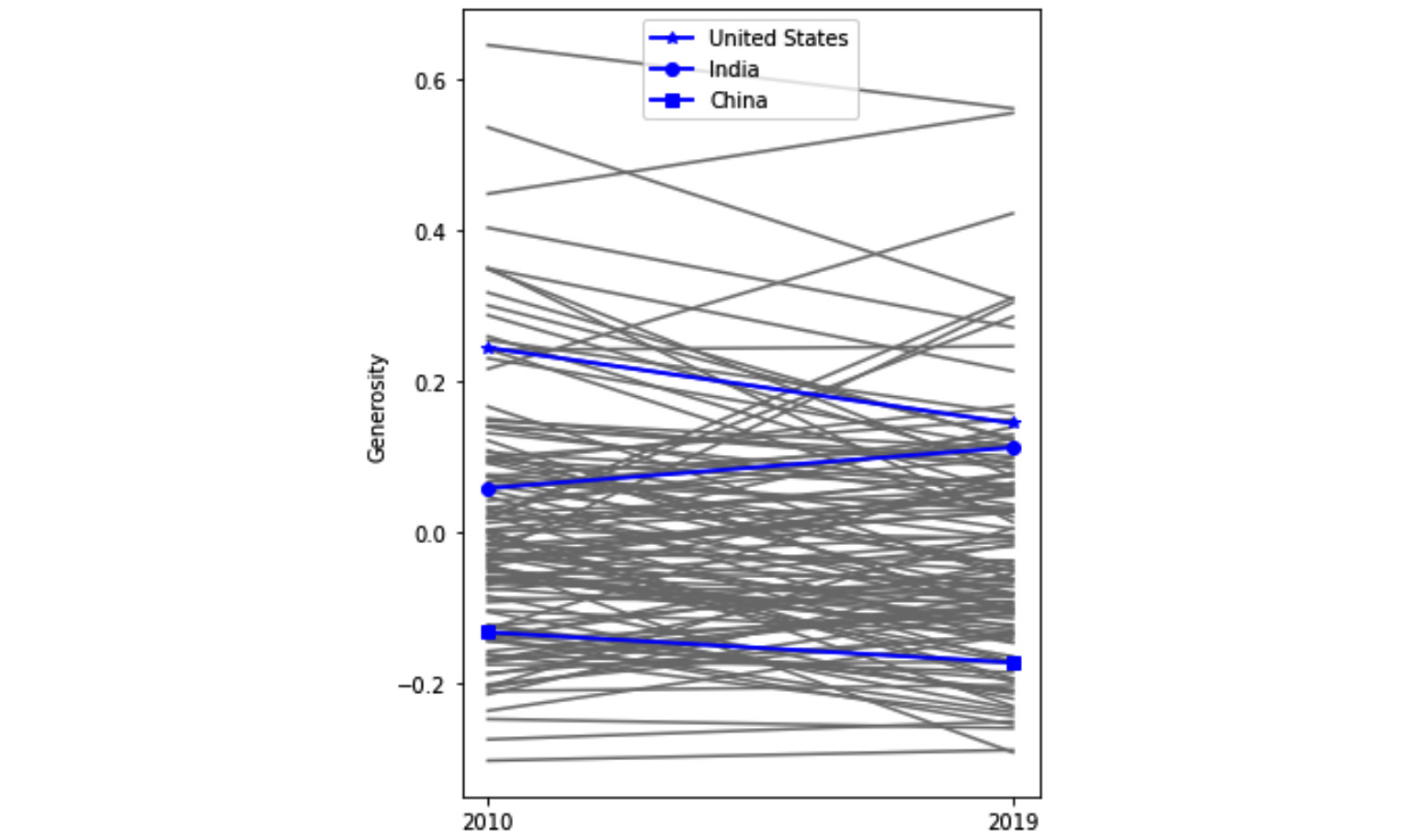
Figure 5.26 – Line plot comparing Generosity across all countries in 2010 and 2019 with an emphasis on the United States, India, and China
c) Report your observations from the visual. Make sure to refer to all of the line plots (gray and blue) in your observations.