
Chapter 11: Data Cleaning Level III – Missing Values, Outliers, and Errors
In level I, we cleaned up the table without paying attention to the data structure or the recorded values. In level II, our attention was to have a data structure that would support our analytic goal, but we still didn't pay much attention to the correctness or appropriateness of the recorded values. That is the objective of data cleaning level III. In data cleaning level III, we will focus on the recorded values and will take measures to make sure that three matters regarding the values recorded in the data are addressed. First, we will make sure missing values in the data have been detected, that we know why this has happened, and that appropriate measures have been taken to address them. Second, we will ensure that we have taken appropriate measures so that the recorded values are correct. Third, we will ascertain that the extreme points in the data have been detected and appropriate measures have been taken to address them.
Level III data cleaning is similar to level II in its relationship to data analytic goals and tools. While level I data cleaning can be done in isolation without having an eye on data analytics goals and tools, levels II and III data cleaning must be done while we are informed by the analytic goals and tools. In examples 1, 2, and 3 in the previous chapter, we experienced how level II data cleaning was performed for analytic tools. The examples in this chapter are also going to be very well connected to analytical situations.
In this chapter, we're going to cover the following main topics:
- Missing values
- Outliers
- Errors
Technical requirements
You will be able to find all of the code and the datasets that are used in this book in a GitHub repository exclusively created for this book. To find the repository, click on this link: https://github.com/PacktPublishing/Hands-On-Data-Preprocessing-in-Python. In this repository, you will find a folder titled Chapter11, from where you can download the code and the data for better learning.
Missing values
Missing values, as the name suggests, are values we expect to have but we don't. In the simplest terms, missing values are empty cells in a dataset that we want to use for analytic goals. For example, the following screenshot shows an example of a dataset with missing values—the first and third students' grade point average (GPA) is missing, the fifth student's height is missing, and the sixth student's personality type is missing:
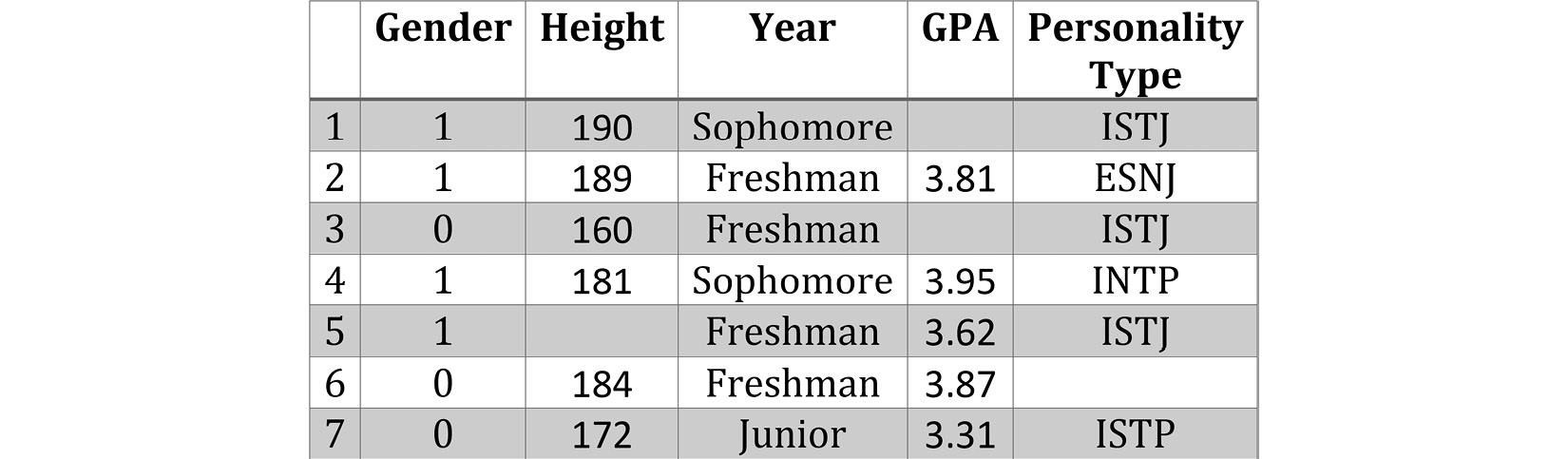
Figure 11.1 – A dataset example with missing values
In Python, missing values are not presented with emptiness—they are presented via NaN, which is short for Not a Number. While the literal meaning of Not a Number does not completely capture all the possible situations for which we have missing values, NaN is used in Python whenever we have missing values.
The following screenshot shows a pandas DataFrame that has read and presented the table represented in Figure 11.1. After comparing the two screenshots, you will see that every cell that is empty in Figure 11.1 has NaN in Figure 11.2.
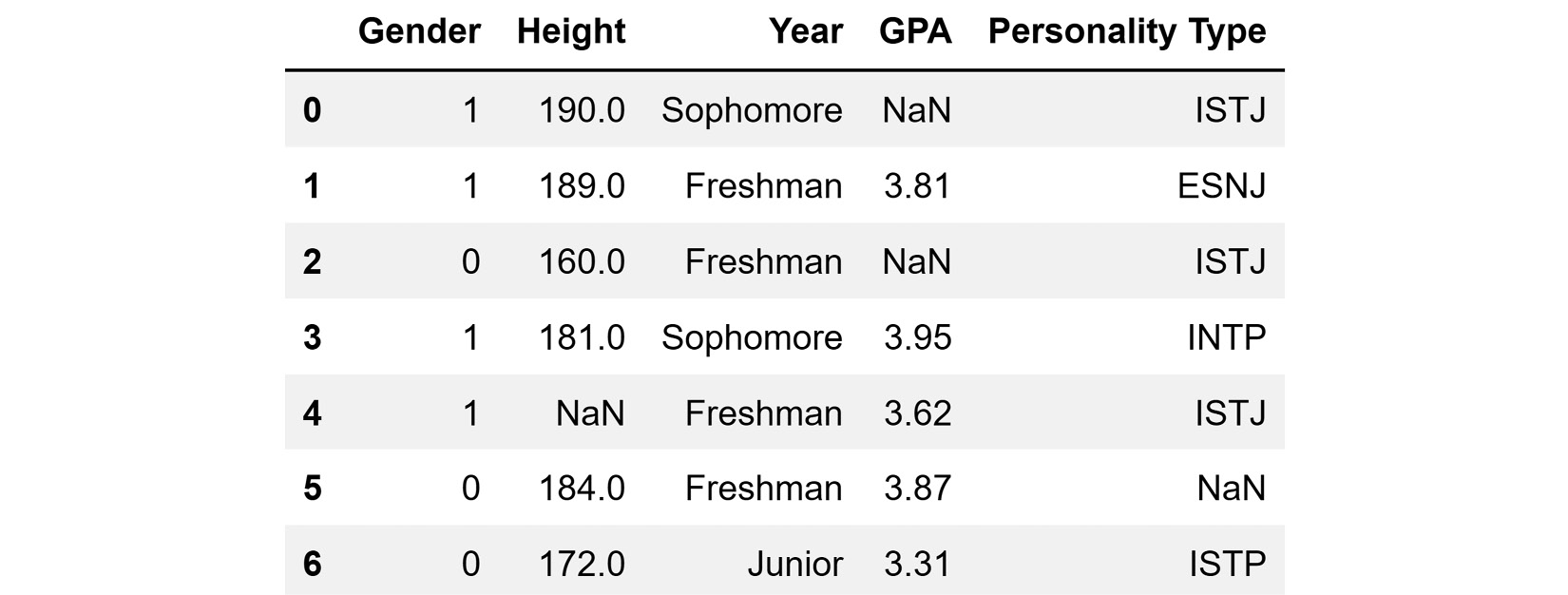
Figure 11.2 – A dataset example with missing values presented in pandas
We now know what missing values are and how they are presented in our analytic environment of choice, Python. Unfortunately, missing values are not always presented in a standard way; for example, having NaN on a pandas DataFrame is a standard way of presenting missing values. However, someone who did not know any better may have used some internal agreements to present missing values with an alternative such as MV, None, 99999, and N/A. If missing values are not presented in a standard way, the first step of dealing with them is to rectify that. In such cases, we detect the values that the author of the dataset meant as missing values and replace them with np.nan.
Even if missing values are presented in the standard way, detecting them might sometimes be as easy as just eyeballing the dataset. When the dataset is large, we cannot rely on eyeballing the data to detect and understand missing values. Next, we will turn our attention to how we can detect missing values, especially for larger datasets.
Detecting missing values
Every Pandas DataFrame comes with two functions that are very useful in detecting which attributes have missing values and how many there are: .info() and .isna(). The following example shows how these functions can be used to detect whether a dataset has missing values and how many values are missing.
Example of detecting missing values
The Airdata.csv air quality dataset comprises hourly recordings of the year 2020 from three locations. The dataset—apart from NO2 readings for three locations A, B, and C—has DateTime, Temperature, Humidity, Wind_Speed, and Wind_Direction readings. The following screenshot shows the code that reads the file into the air_df DataFrame and shows the first and last few rows of the dataset:
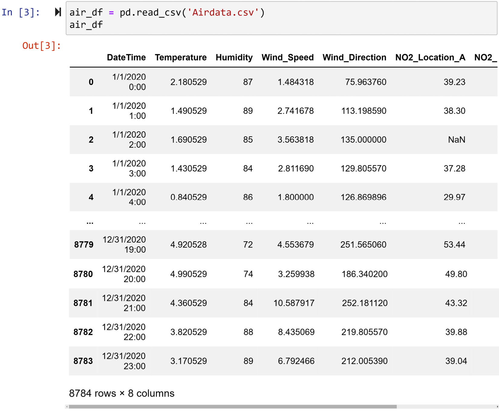
Figure 11.3 – Reading Airdata.csv into air_df
The first method we can use to detect whether any columns of the data have any missing values is to use the .info() function. The following screenshot showcases the application of this function on air_df:
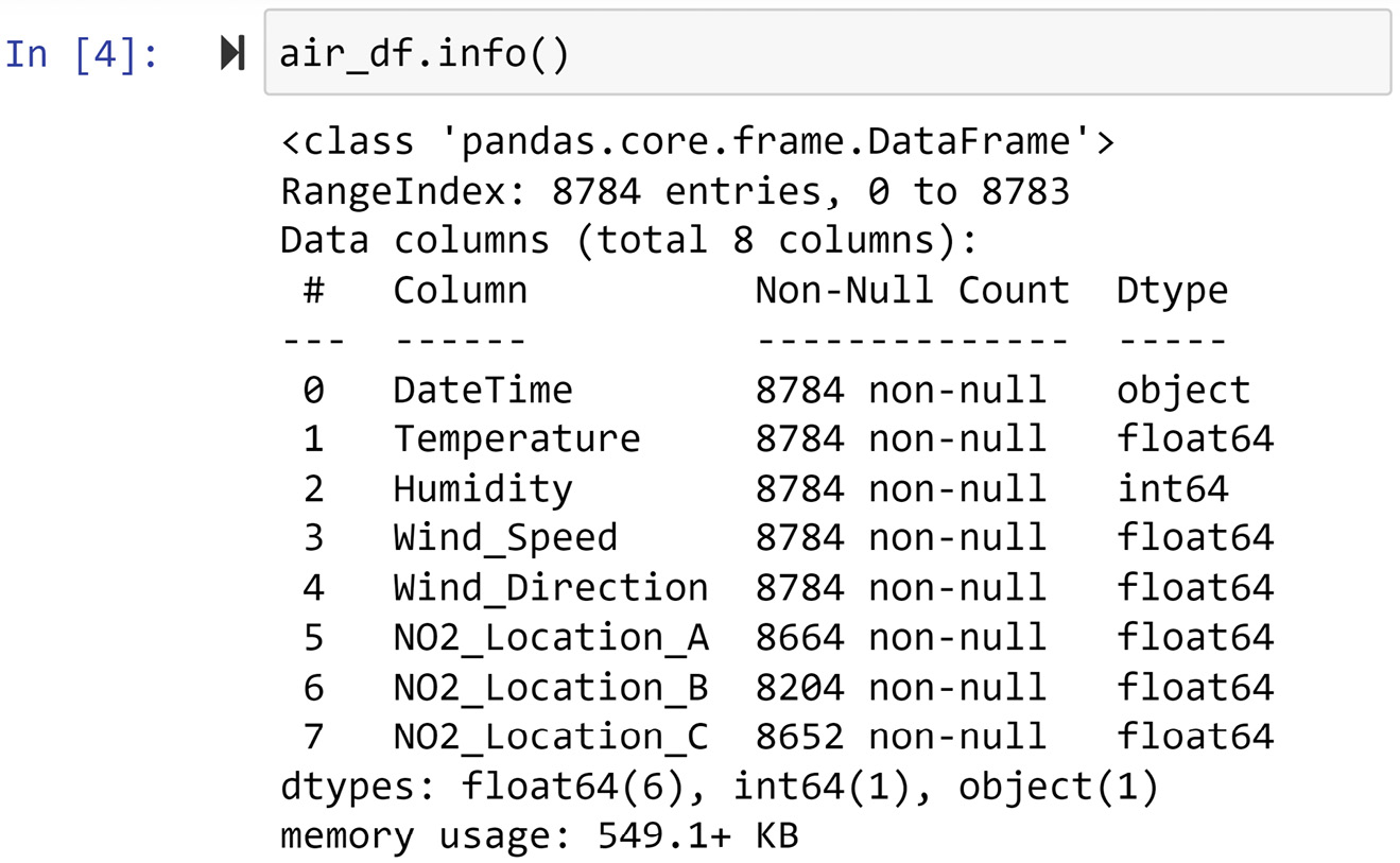
Figure 11.4 – Using .info() to detect missing values in air_df
As you can see in the preceding screenshot, air_df has 8784 rows (entries) of data, but the NO2_Location_A, NO2_Location_B, and NO2_Location_C columns have fewer non-null values, and that means these attributes have missing values.
A second method to figure out which attributes have missing values is to use the .isnan() function of Pandas Series. Both Pandas DataFrames and Pandas Series have the .isnan() function, and it outputs the same data structure with all the cells filled with Booleans indicating whether the cell is NaN. The following screenshot uses the .isnan() function to count the number of NaN entries in each attribute of air_df:
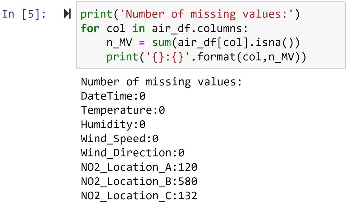
Figure 11.5 – Detecting missing values in air_df
In the preceding screenshot, we see that the NO2 readings in all three locations have missing values. This only confirms the detection of missing values we performed in Figure 11.4 using the .info() function.
Now that we know how to detect missing values, let's turn our attention to understanding what could have caused these values to be missing. In our quest to deal with missing values, we first and foremost need to know why this has happened. In the next subchapter, we will focus on which situations cause missing values.
Causes of missing values
There can be a wide range of reasons as to why missing values may occur. As we will see in this chapter, knowing why a value is missing is the most important piece of information that enables us to handle missing values effectively. The following list provides the most common reasons why values may be missing:
- Human error.
- Respondents may refuse to answer a survey question.
- The person taking the survey does not understand the question.
- The provided value is an obvious error, so it was deleted.
- Not enough time to respond to questions.
- Lost records due to lack of effective database management.
- Intentional deletion and skipping of data collection (probably with fraudulent intent).
- Participant exiting in the middle of the study.
- Third-party tampering with or blocking data collection.
- Missed observations.
- Sensor malfunctions.
- Programing bugs.
When working with data as a data analyst, sometimes all you have is the data and you do not have anyone to whom you can ask questions about the data. So, the important thing here would be to be inquisitive about the data and imagine what could be the reasons behind the missing values. Committing the preceding list to memory and understanding these reasons will be beneficial to you when you have to guess what could have caused missing values.
It goes without saying that if you have access to someone who knows about the data, the best course of action on finding out the causes of missing values is to ask the informant.
Regardless of what caused missing values, from a data analytic perspective, we can categorize all the missing values into three types. Understanding these types will be very important in deciding how missing values should be addressed.
Types of missing values
One missing value or a group of missing values in one attribute could fall under one of the following three types: missing completely at random (MCAR), missing at random (MAR), and missing not at random (MNAR). There is an ordinal relationship between these types of missing values. Moving from MCAR to MNAR, the missing values become more problematic and harder to deal with.
MCAR is used when we do not have any reason to believe the values are missing due to any systematic reasons. When a missing value is classed as MCAR, the data object that has a missing value could be any of the data objects. For instance, if an air quality sensor fails to communicate with its server to save records due to random fluctuations in the internet connection, the missing values are of the MCAR type. This is because internet connection issues could have happened for any of the data objects, but it just happened to occur for the ones it did.
On the other hand, we have MAR when some data objects in the data are more likely to have missing values. For instance, if a high wind speed sometimes causes a sensor to malfunction and renders it unable to give a reading, the missing values that have happened in the high wind are classed as MAR. The key to understanding MAR is that the systematic reason that leads to having missing values does not always cause missing values but increases the tendency of the data objects to have missing values.
Lastly, MNAR happens when we know exactly which data object will have missing values. For instance, if a power plant that tends to emit too much air pollutant tampers with the sensor to avoid paying a penalty to the government, the data objects that are not collected due to this situation would be classed as MNAR. MNAR missing values are the most problematic ones, and figuring out why they happen and stopping them from happening is often the priority of a data analytic project.
Next, we will learn how we can use data analytic tools to diagnose the types of missing values. In the following section, we will see an example that showcases the three types of missing values.
Diagnosis of missing values
An attribute with missing values has, in fact, the information of two variables: itself, and a hidden attribute. The hidden attribute is a binary attribute whose value is one when there is a missing value, and zero otherwise. To figure out the types of missing values (MCAR, MAR, and MNAR), all we need to do is to investigate whether there is a relationship between the hidden binary variable of the attribute with missing values and the other attributes in the dataset. The following list shows the kinds of relationships we would expect to see based on each of the missing value types:
- MCAR: We don't expect the hidden binary variable to have a meaningful relationship with the other attributes.
- MAR: We expect a meaningful relationship between the hidden binary variable and at least one of the other attributes.
- MNAR: We expect a strong relationship between the hidden binary variable and at least one of the other attributes.
The following subsections showcase three situations with different types of missing values, and we will use our data analytic toolkit to help us diagnose them.
We will continue using the air_df dataset that we saw earlier. We saw that NO2_Location_A, NO2_Location_B, and NO2_Location_C have 120, 560, and 176 missing values, respectively. We will tackle diagnosing missing values under each column one at a time.
Diagnosing missing values in NO2_Location_A
To diagnose the types of missing values, there are two methods at our disposal: visual and statistical methods. These diagnosis methods must be run for all of the attributes in the dataset. There are four numerical attributes in the data: Temperature, Humidity, Wind_Direction, and Wind_Speed. There is also one DateTime attribute in the data that can be unpacked into four categorical attributes: month, day, hour, and weekday. The way we need to run the analysis is different for numerical attributes than for categorical attributes. So, first, we will learn about numerical attributes, and then we will turn our attention to categorical attributes.
Let's start with the Temperature numerical attribute. Also, we'll first do the diagnosis visually and then we will do it statistically.
Diagnosing missing values based on temperature
The visual diagnosis is done by comparing the temperature values for the two populations: first, data objects with missing values for NO2_Location_A, and second, data objects with no missing values for NO2_Location_A. In Chapter 5, Data Visualization, under Comparing populations, we learned how we use data visualizations to compare populations. Here, we will use those techniques. We can either use a boxplot or histogram to do this. Let's use both—first, a boxplot, and then a histogram.
The following screenshot shows the code and the boxplot that compares the two populations. The code is very similar to what we learned in Chapter 5, Data Visualization, so we will just discuss the implications of the visualizations.
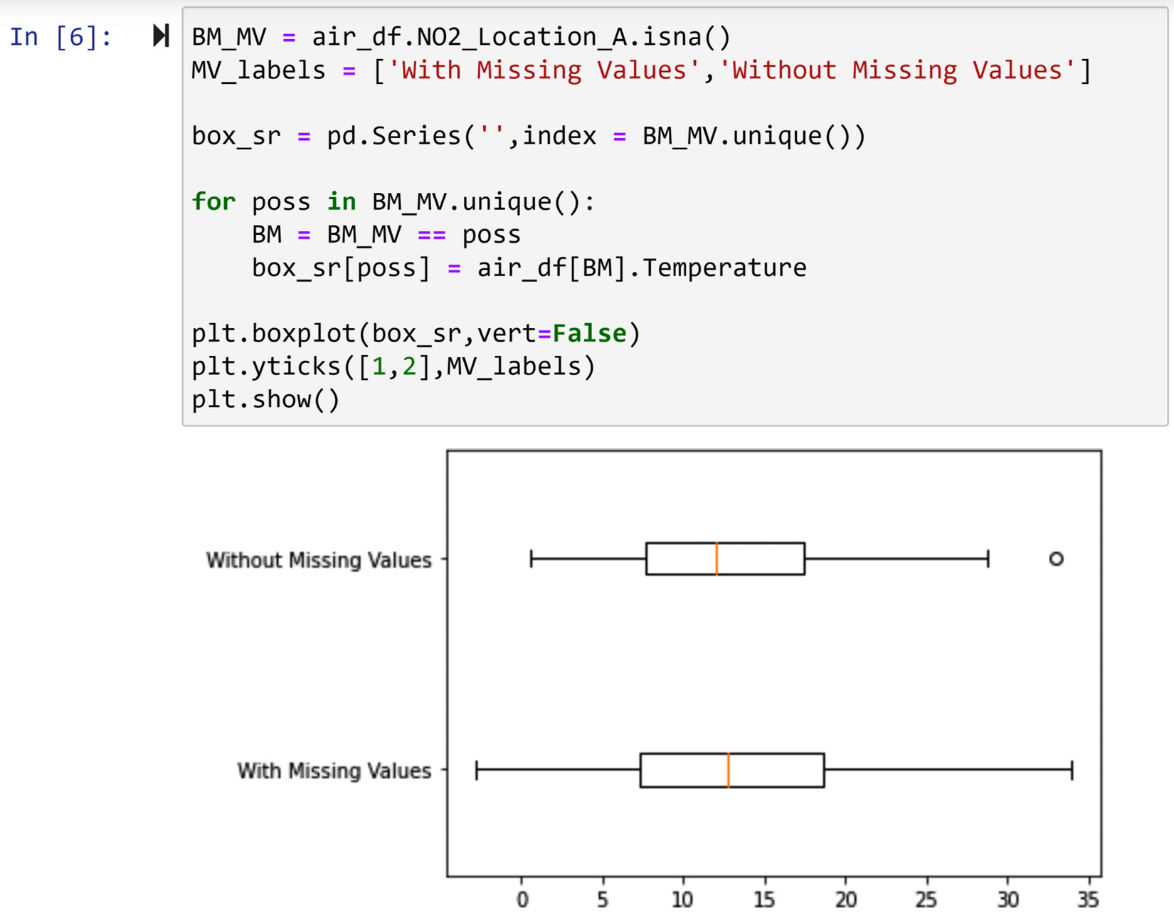
Figure 11.6 – Code for the diagnosis of missing values in NO2_Location_A using the boxplots of temperature
Looking at the boxplot in the preceding screenshot, we can see that the value of Temperature does not meaningfully change between the two populations. That shows that a change in Temperature could not have caused or influenced the occurrence of missing values under NO2_Location_A.
We could also have done this analysis using a histogram. This was also shown in Chapter 5, Data Visualization, under Comparing populations. The following screenshot shows the code to create a histogram and compare the two populations:
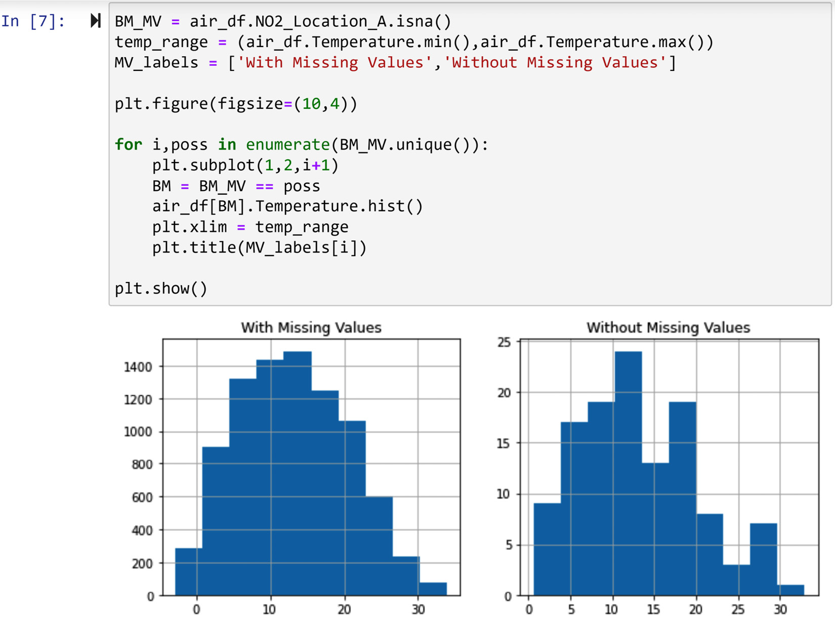
Figure 11.7 – The code for the diagnosis of missing values in NO2_Location_A using the histogram of temperature
The preceding screenshot confirms the same conclusion we arrived at when using boxplots. As we do not see a significant difference between the two populations, we conclude that the value of Temperature could not have influenced or caused the occurrence of missing values.
Lastly, we would also like to confirm this using a statistical method: a two-sample t-test. The two-sample t-test evaluates whether the value of a numerical attribute is significantly different among the two groups. The two groups here are the data objects having missing values under NO2_Location_A and the data objects without missing values under NO2_Location_A.
In short, the two-sample t-test hypothesizes that there is no significant difference between the attributes' value among the two groups and then calculates the probability of the data turning out the way it has if the hypothesis is correct. This probability is called the p-value. So, if the p-value is very small, we have meaningful evidence to suspect the hypothesis of the two-sample t-test could have been wrong.
We can easily do any hypothesis testing using Python. The following screenshot uses the ttest_ind function from the scipy.stats module to do a two-sample t-test:
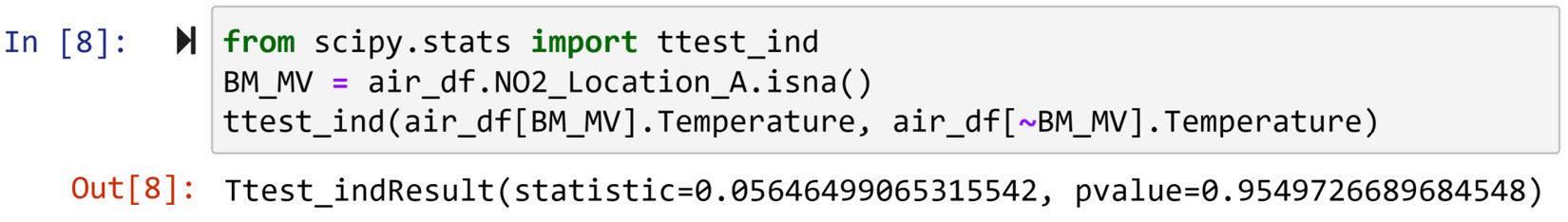
Figure 11.8 – Using t-test to evaluate whether the value of temperature is different in NO2_Location_A between data objects with missing values and without missing values
As you can see in the previous screenshot, to use the ttest_ind() function, all we need to do is to pass the two groups of numbers.
The p-value of the t-test is very large—0.95 out of 1, which means we do not have any reason to suspect the value of Temperature can be meaningfully different between the two groups. This conclusion confirms the one that we arrived at using boxplots and histograms.
Here, we showcased the code for diagnosing missing values based on only one numerical attribute. The code and analysis for the rest of the numerical attributes are similar. Now that you know how to do this for one numerical attribute, we will next create a code that outputs all we need for missing value diagnosis using numerical attributes.
Diagnosing missing values based on all the numerical attributes
To do a complete diagnosis of missing values, a similar analysis to what we did for the Temperature attribute needs to be done for all of the attributes. While each part of the analysis is simple to understand and interpret, the fact that the diagnosis analysis has many parts begs a very organized way of coding and analysis.
To do this in an organized way, we will first create a function that performs all of the three analyses that we showed can be done for Temperature. Apart from the dataset, the function takes the name of the numerical attribute we want to perform the analysis and the Boolean mask that is True for the data objects with missing values and False for the data object without missing values. The function outputs boxplots, a histogram, and the p-value of the t-test for the inputted attribute. The code in the following screenshot shows how this function is created. The code is rather long; if you'd like to copy it, please find it in the Ch 11 Data Cleaning Level III – missing values, outliers, and errors folder in the dedicated GitHub repository for this book.
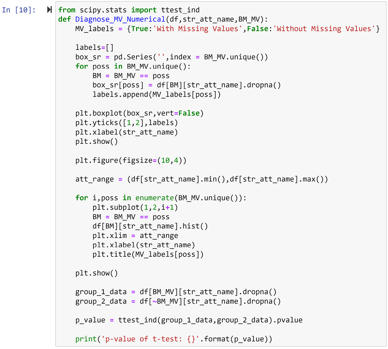
Figure 11.9 – Creating a Diagnose_MV_Numerical() function for diagnosing missing values based on numerical attributes
Simply put, the previous code is a parameterized and combined version of the code presented in Figure 11.6, Figure 11.7, and Figure 11.8. After running the preceding code, which creates a Diagnose_MV_Numerical() function, running the following code will run this function for all of the numerical attributes in the data, and it allows you to investigate whether the missing values of NO2_Location_A happen due to any systematic reasons that are linked to numerical attributes in the dataset.
numerical_attributes = ['Temperature', 'Humidity', 'Wind Speed', 'Wind Direction']
BM_MV = air_df.NO2_Location_C.isna()
for att in numerical_attributes:
print('Diagnosis Analysis of Missing Values for {}:'. format(att))
Diagnose_MV_Numerical(air_df,att,BM_MV)
print('- - - - - - - - - - divider - - - - - - - - - ')
Running the preceding code will produce four diagnosis reports, one for each of the numerical attributes. Each report has three parts: diagnosis using boxplots, diagnosis using a histogram, and diagnosis using a t-test.
Studying the ensuing reports from the preceding code snippet shows that the tendency of the missing value under NO2_Location_A does not change based on values of either numerical attribute in the data.
Next, we will do a similar coding and analysis for categorical attributes. Like what we did for numerical attributes, let's do a diagnosis for one attribute first, and then we will create code that can output all the analysis we need all at once. The first attribute that we will do the diagnosis for is weekday.
Diagnosing missing values based on weekday
You may be confused that the air_df dataset does not have a categorical attribute named weekday, and you would be right, but unpacking the air_df.DataTime attribute can give us the following attributes: weekday, day, month, and hour.
If you are thinking that sounds like level II data cleaning, you are absolutely right. To be able to do level III data cleaning more effectively, we need to do some level II data cleaning first. The following code performs the described level II data cleaning:
air_df.DateTime = pd.to_datetime(air_df.DateTime)
air_df['month'] = air_df.DateTime.dt.month
air_df['day'] = air_df.DateTime.dt.day
air_df['hour'] = air_df.DateTime.dt.hour
air_df['weekday'] = air_df.DateTime.dt.day_name()
After running the preceding code and before reading on, check the new state of air_df and study the new columns that are added to it. You will see that the month, day, hour, and weekday categorical attributes are unpacked into their own attributes.
Now that this data cleaning level II is done, we can perform a diagnosis of missing values in the air_df.NO2_Location_A column based on the weekday categorical attribute. As we saw in Chapter 5, Data Visualization, a bar chart is a data visualization technique to compare populations based on a categorical attribute. The following screenshot shows a modification of what we learned in Chapter 5, Data Visualization, under the heading Example of comparing populations using bar charts, the first way, for this situation:
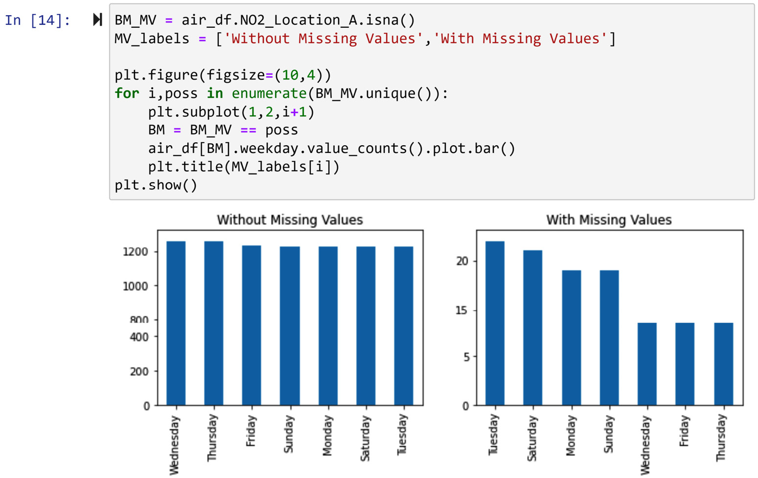
Figure 11.10 – Using a bar chart to evaluate whether the value of weekday is different between data objects in NO2_Location_A with missing values and without missing values
Looking at the preceding screenshot, we can see that the missing values could have happened randomly and we don't have a meaningful trend to believe there is a systematic reason for the missing values happening due to a change of the value of airt_df.weekday.
We can also do a similar diagnosis using a chi-square test of independence statistical test. In short and for this situation, this test hypothesizes that there is no relationship between the occurrence of missing values and the weekday attribute. Based on this hypothesis, the test calculates a p-value that is the probability of the data we have happening if the hypothesis is true. Using that p-value, we can decide whether we have any evidence to suspect a systematic reason for missing values.
What Is a P-Value?
This is the second time we are seeing the concept of a p-value in this chapter. A p-value is the same concept across all statistical tests and it has the same meaning. Every statistical test hypothesizes something (which is called a null hypothesis), and the p-value is calculated based on this hypothesis and the observations (data). The p-value is the probability that the data that has already happened is happening if the null hypothesis is true.
A popular rule of thumb for using p-value is to employ the famous 5% significance level. A 0.05 significance level denotes that if the p-value turns out to be larger than 0.05, then we don't have any evidence to suspect the null hypothesis is not correct. While this is a fairly good rule of thumb, it is best to understand the p-value and then complement the statistical test with data visualization.
The following screenshot shows a chi-square test of independence being performed using chi2_contingency() from scipy.stats. The code first uses pd.crosstab() to create a contingency table that is a visualization tool, to investigate the relationship between two categorical attributes (this was covered in the Visualizing the relationship between two categorical attributes section in Chapter 5, Data Visualization). Then, the code passes contigency_table to the chi2_contingency() function to perform the test. The test outputs some values, but not all of them are useful for us. The p-value is the second value, which is 0.4127.
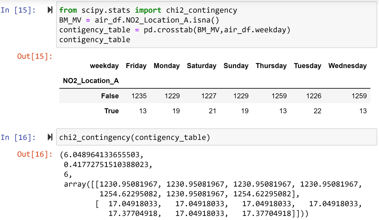
Figure 11.11 – Using the chi-square test of independence to evaluate whether the value of weekday is different between data objects in NO2_Location_A with missing values and without missing values
Having a p-value of 0.4127 confirms the observation we made under Figure 11.10, which is that there is no relationship between the occurrence of missing values in air_df.NO2_Location_A and the value of weekday, and the fact that the missing values happened the way they did could have just been a random chance.
Here, we showcased the code for diagnosing missing values based on only one categorical attribute. The code and analysis for the rest of the categorical attributes are similar. Now that you know how to do this for one numerical attribute, we will next create a code that outputs all we need for missing value diagnosis using categorical attributes.
Diagnosing missing values based on all the categorical attributes
To do a complete diagnosis of missing values, a similar analysis to what we did for the Weekday attribute needs to be done for all of the other categorical attributes. To do this in an organized way, we will first create a function that performs the two analyses that we showed can be done for Weekday. Along with the dataset, the function takes the name of the categorical attribute we want to perform the analysis and the Boolean mask, which is True for the data objects with missing values and False for the data objects without missing values. The function outputs bar charts, and the p-value of the chi-squared test of independence for the inputted attribute. The following code snippet shows how this function is created:
from scipy.stats import chi2_contingency
def Diagnose_MV_Categorical(df,str_att_name,BM_MV):
MV_labels = {True:'With Missing Values', False:'Without Missing Values'}
plt.figure(figsize=(10,4))
for i,poss in enumerate(BM_MV.unique()):
plt.subplot(1,2,i+1)
BM = BM_MV == poss
df[BM][str_att_name].value_counts().plot.bar()
plt.title(MV_labels[poss])
plt.show()
contigency_table = pd.crosstab(BM_MV,df[str_att_name])
p_value = chi2_contingency(contigency_table)[1]
print('p-value of Chi_squared test: {}' .format(p_value))
The preceding code snippet is a parameterized and combined version of the code presented in Figure 11.10 and Figure 11.11. After running the preceding code, which creates a Diagnose_MV_Categorical() function, running the following code will run this function for all of the categorical attributes in the data, and it allows you to investigate whether the missing values of NO2_Location_A happen due to any systematic reasons that are linked to the categorical attributes in the dataset:
categorical_attributes = ['month', 'day','hour', 'weekday']
BM_MV = air_df.NO2_Location_A.isna()
for att in categorical_attributes:
print('Diagnosis Analysis for {}:'.format(att))
Diagnose_MV_Categorical(air_df,att,BM_MV)
print('- - - - - - - - - - divider - - - - - - - - - ')
When you run the preceding code, it will produce four diagnosis reports, one for each of the categorical attributes. Each report has two parts, as follows:
- Diagnosis using a bar chart
- Diagnosis using a chi-squared test of independence
Studying the reports shows that the tendency of the missing value under NO2_Location_A does not change based on values of either categorical attribute in the data.
Combined with what we learned for numerical attributes earlier in this subchapter and what we just learned about categorical attributes, we do see that none of the attributes in the data—namely, Temperature, Humidity, Wind_Speed, Wind_Direction, weekday, day, month, and hour—may have influenced the tendency of missing values. Based on all the diagnoses that we ran for the missing values, we conclude that missing values in NO2_Location_A are of the MCAR type.
Now that we have been able to determine the missing values of NO2_Location_A, let's also run the diagnosis that we learned so far for the missing values of NO2_Location_B and NO2_Location_C. We will do so in the following two subsections.
Diagnosing missing values in NO2_Location_B
To diagnose missing values in NO2_Location_B, we need to do exactly the same analysis we did for NO2_Location_A. The coding part is very easy as we have already done this, for the most part. The following code uses the Diagnose_MV_Numerical() and Diagnose_MV_Categorical() functions that we already created to run all needed diagnoses in order to figure out which types of missing values happen under NO2_Location_B:
categorical_attributes = ['month', 'day','hour', 'weekday']
numerical_attributes = ['Temperature', 'Humidity', 'Wind_Speed', 'Wind_Direction']
BM_MV = air_df.NO2_Location_B.isna()
for att in numerical_attributes:
print('Diagnosis Analysis for {}:'.format(att))
Diagnose_MV_Numerical(air_df,att,BM_MV)
print('- - - - - - - - - divider - - - - - - - - ')
for att in categorical_attributes:
print('Diagnosis Analysis for {}:'.format(att))
Diagnose_MV_Categorical(air_df,att,BM_MV)
print('- - - - - - - - - divider - - - - - - - - - ')
When you run the preceding code, this produces a long report that investigates whether the tendency of missing values happening may have been influenced by the values of any of the categorical or numerical attributes.
After studying the report, you can see that there are a couple of attributes that seem to have a meaningful relationship with the occurrence of missing values. These attributes are Temperature, Wind_Speed, Wind_Direction, and month. The following screenshot shows a diagnosis analysis for Wind_Speed that has the strongest relationship with the missing values:
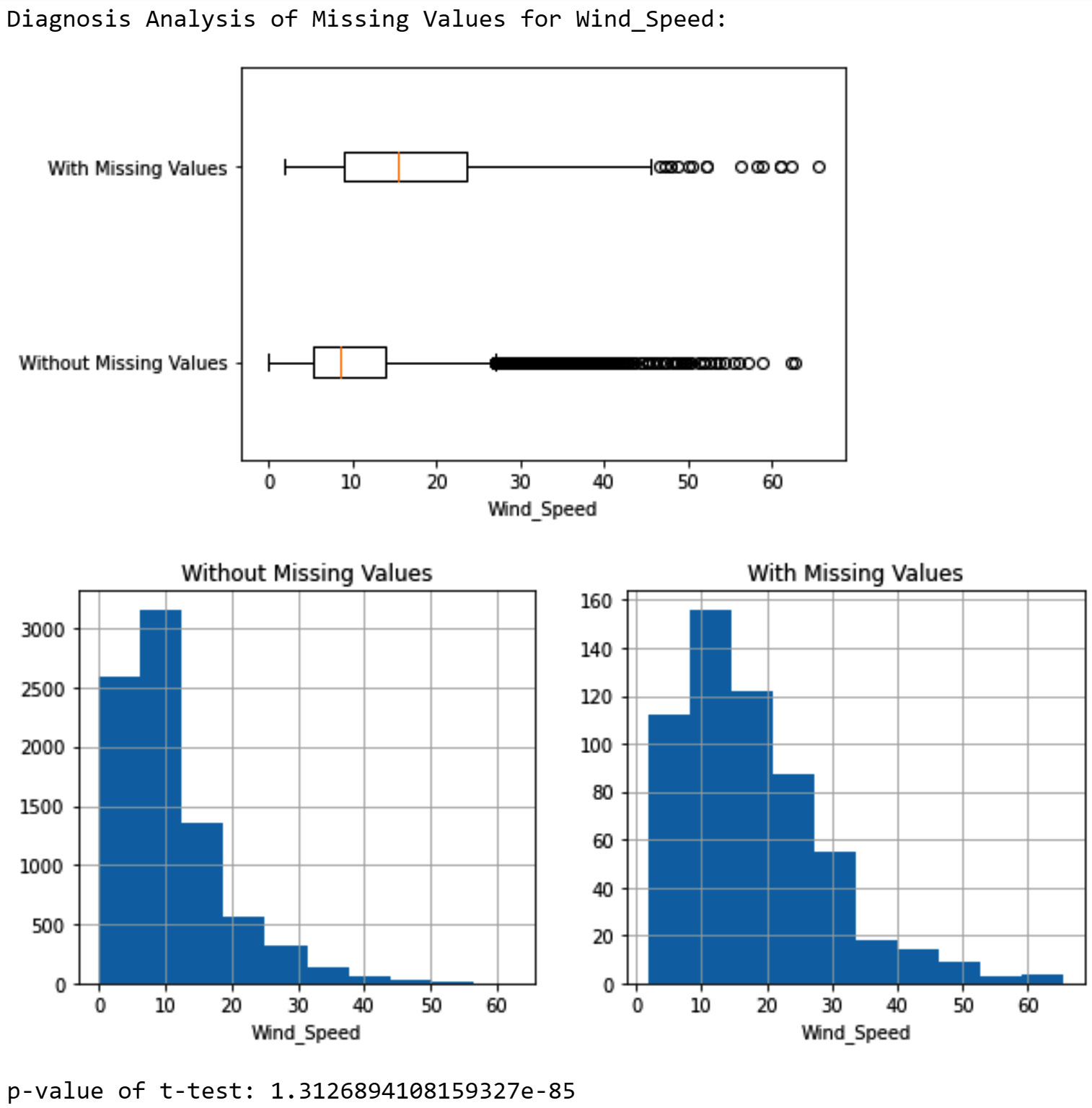
Figure 11.12 – Diagnosis of missing values in NO2_Location_B based on the Wind_Speed attribute
In the preceding screenshot, you can see all three analytic tools are showing that there is a significant difference in the value of Wind_Speed between data objects that have missing values under NO2_Location_B and data objects that don't have missing values. In short, a higher Wind_Speed value tends to increase the chance of NO2_Location_B having missing values.
After this diagnosis, the results were shared with the company that sold us the air quality sensor. Here is the email that was sent to the company:
After a few days, we received the following email:
There we have it—now we know why some of the missing values under NO2_Location_B occurred. As we know, the value of Temperature can cause an increase in the occurrence of missing values, so we can conclude that the missing values under NO2_Location_B are of the MAR type.
A good question to ask here is that if a high Wind_Speed value is a culprit for the missing values, how come the missing values also showed meaningful patterns with Temperature, Wind_Direction, and month? The reason is that Wind_Speed has a strong relationship with Temperature, Wind_Direction, and month. Use what you learned in Chapter 5, Data Visualization, in the Investigating the relationship between two attributes section, to put this into an analysis. Due to those strong relationships, it may look as though the other attributes also influence the tendency of missing values. We know that is not the case from our communication with the manufacturer of the sensor.
So far, we have been able to diagnose missing values under NO2_Location_A and NO2_Location_B. Next, we will perform a diagnosis for NO2_Location_C.
Diagnosing missing values in NO2_Location_C
We only need to change one line in the code for the diagnosis of missing values in NO2_Location_B so that we can diagnose missing values in NO2_Location_C. You need to change the third line of code from BM_MV = air_df.NO2_Location_B.isna() to BM_MV = air_df.NO2_Location_C.isna(). Once that change is applied and the code is run, you will get a diagnosis report based on all the categorical and numerical attributes in the data. Try to go through and interpret the diagnosis report before reading on.
The diagnosis report shows a relationship between the tendency of missing values and most of the attributes—namely, Temperature, Humidity, Wind_Speed, day, month, hour, and weekday. However, the relationship with the weekday attribute is the strongest. The following screenshot shows a missing value diagnosis based on weekday. The bar chart in the screenshot shows that the missing values happen exclusively on Saturdays. The p-value of the chi-square test is very small.
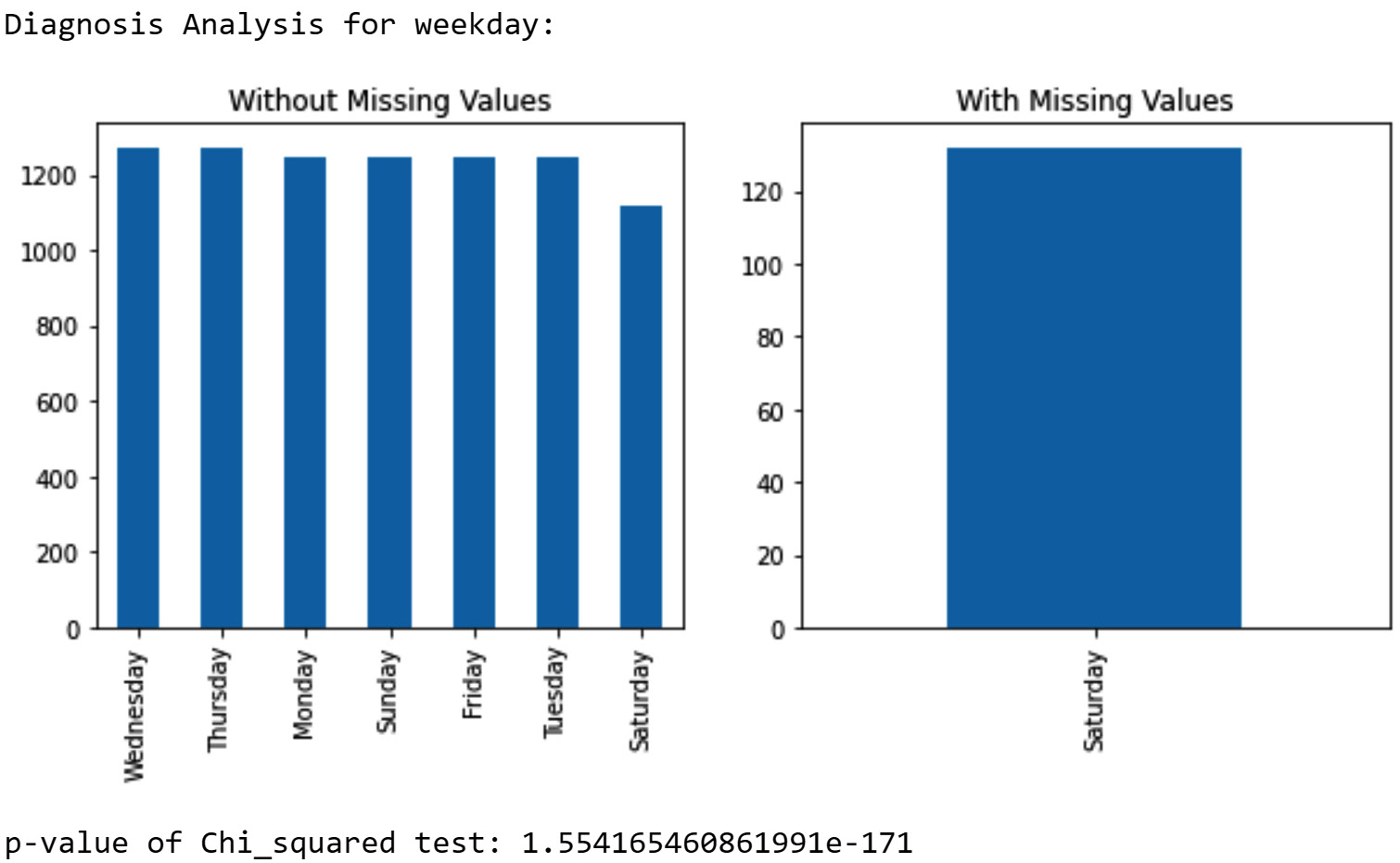
Figure 11.13 – Diagnosis of missing values in NO2_Location_C based on the weekday attribute
The diagnosis based on hour and day also shows meaningful patterns (the diagnosis report for the hour and day attributes is not printed here, but please look at the report you just created). The missing values happen equally only when the value of the hour attribute is 10, 11, 12, 13, 14, 15, 16, 17, 18, 19, and 20, or when the value of the day attribute is 25, 26, 27, 28, and 29. From these reports, we can deduce that the missing values happen predictably on the last Saturday of every month from 10 A.M. to 8 P.M. That is the pattern we see in the data, but why?
After letting the local authority of location C know, it turned out that a group of employees at the power plant in location C had been taking advantage of the resources of the power plant to engage in the mining of various cryptocurrencies. This abuse of resources had happened only on the last Saturday of the month as the power plant in question had a complete day off for regular and preventive maintenance. As this group of employees had been under a lot of stress to cover their tracks and avoid getting caught, they had decided to tamper with the sensor that had been put in place to regulate the air pollution from the power plant. Little did they know that tampering with data collection leaves a mark on the dataset that is not easily hidden from the eyes of a high-quality data analyst such as yourself.
This last piece of information and the diagnosis brings us to the conclusion that the missing value in NO2_Location_C is an MNAR value. Such values are missed due to a direct reason as to why the data was being collected in the first place. A lot of times when a dataset has a significant number of MNAR missing values, the dataset becomes worthless and cannot be of value in meaningful analytics. A very first step in dealing with MNAR missing values is to prevent them from happening ever again.
After learning how to detect and diagnose missing values, now is the perfect time to discuss dealing with missing values. Let's get straight to it.
Dealing with missing values
As shown in the following list, there are four different approaches to dealing with missing values:
- Keep them as is.
- Remove the data objects (rows) with missing values.
- Remove the attributes (columns) with missing values.
- Estimate and impute a value.
Each of the previous strategies could be the best strategy in different circumstances. Regardless, when dealing with missing values, we have the following two goals:
- Keeping as much data and information as possible
- Introducing the least possible amount of bias in our analysis
Simultaneously achieving these two goals is not always possible, and a balance often needs to be struck. To effectively find that balance in dealing with missing values, we need to understand and consider the following items:
- Our analytic goals
- Our analytic tools
- The cause of the missing values
- The type of the missing values (MCAR, MAR, MNAR)
In most situations when there is sufficient understanding of the preceding items, the best course of action in dealing with missing values shows itself to you. In the following subsection, we will first describe each of the four approaches in dealing with missing values, and then we will put what we learn into practice, with some examples.
First approach – Keep the missing value as is
As the heading suggests, this approach keeps the missing value as a missing value and enters the next stage of data preprocessing. This approach is the best way to deal with missing values in the following two situations.
First, you would use this strategy in cases where you will be sharing this data with others and you are not necessarily the one who is going to be using it for analytics. In this way, you will allow them to decide how they should deal with missing values based on their analytics needs.
Second, if both data analytic goals and data analytic tools you will be using can seamlessly handle missing values, keep as is is the best approach. For instance, the K-Nearest Neighbors (KNN) algorithm that we learned about in Chapter 7, Classification, can be adjusted to deal with missing values without having to remove any data objects. As you remember, KNN calculates the distance between data objects to find the nearest neighbors. So, every time the distance between a data object with missing values and other data objects is being calculated, a value will be assumed for the missing values. The assumed values will be selected in such a way that the assumed values will not help, so the data object with the missing value will be selected. In other words, a data object with missing values will be selected as one of the nearest neighbors only if its non-missing values show a very high level of similarity that cancels out the negative effect of the assumed values for the missing values.
You can see that if the KNN is adjusted in this way, then it would be best if we kept the missing values as is so as to meet both of the listed goals in dealing with missing values: keeping as much information as possible and avoiding the introduction of bias in the analysis.
While the described modification to the KNN algorithm is an accepted approach in the literature, it is not guaranteed that every analytic tool that features KNN has incorporated the described modification so that the algorithm can deal with missing values. For instance, KNeighborsClassifier that we used from the sklearn.neighbors module will give you an error if the dataset has missing values. If you are planning to use this analytics tool, then you cannot use a keep as is approach and have to use one of the other approaches.
Second approach – Remove data objects with missing values
This approach must be selected with great care because it can work against the two goals of successfully dealing with missing values: not introducing bias into the dataset, and not removing valuable information from the data. For instance, when the missing values in a dataset are of the type MNAR or MAR, we should refrain from removing data objects with missing values. That is because doing so means that you are removing a meaningfully distinct part of the population in the dataset.
Even if the missing values are of type MCAR, we should first try to find other ways of dealing with missing values before turning toward removing data objects. Removing data objects from a dataset should be considered as a last resort when there are no other ways to deal with missing values.
Third approach – Remove the attributes with missing values
When most of the missing values in a dataset come from one or two attributes, we might consider removing the attributes as a way of dealing with missing values. Of course, if the attribute is a key attribute without which you cannot proceed with the project, facing too many missing values in the key attribute means the project is not doable. However, if the attributes are not absolutely essential to the project, removing the attributes with too many missing values might be the right approach.
When the number of missing values in one attribute is large enough (roughly more than 25%), estimating and inputting missing values becomes meaningless, and letting go of the attribute is better than estimating missing values.
Fourth approach – Estimate and impute missing values
In this approach, we would use our knowledge, understanding, and analytic tools to fill missing values. The term imputing captures the essence of what this does to a dataset—we put value instead of missing value while knowing that this could cause bias in our analysis. If the missing values are of the MCAR or MAR type and the analytic we have chosen cannot process the dataset with missing values, imputing the missing values might be the best approach.
There are four general methods to estimate a replacement for missing values. The following list outlines these methods:
- Impute with the general central tendency (mean, median, or mode). This is better for MCAR missing values.
- Impute with the central tendency of a more relevant group of data to the missing values. This is better for MAR missing values.
- Regression analysis. Not ideal, but if we have to proceed with a dataset that has MNAR missing values, this method is better for such a dataset.
- Interpolation. When the dataset is a time series dataset and the missing values are of the MCAR type.
A common misconception about the process of estimation and imputation is that we want to impute missing values with the most accurate replacements. That is not correct at all. When imputing, we do not aim to best predict the value of missing values but to impute with values that would create the least amount of bias for our analysis. For instance, for clustering analysis, if a dataset has MCAR missing values, imputing with the whole-population central tendency is the best way to go. The reason is that the central tendency value will act as a neutral vote in the process of grouping the data objects, and if the data objects with missing values are pushed to be a part of one cluster, this is not due to the imputed value.
Now that we have had a chance to understand the different approaches to dealing with missing values, let's put things together and see a step-by-step decision-making process in selecting the right strategy.
Choosing the right approach in dealing with missing values
The following diagram summarizes what we have discussed in dealing with missing values so far. The diagram shows that the selection of the right approach in dealing with missing values must be informed from four items: analytic goals, analytic tools, the cause of missing values, and the type of missing values (MCAR, MAR, MNAR).
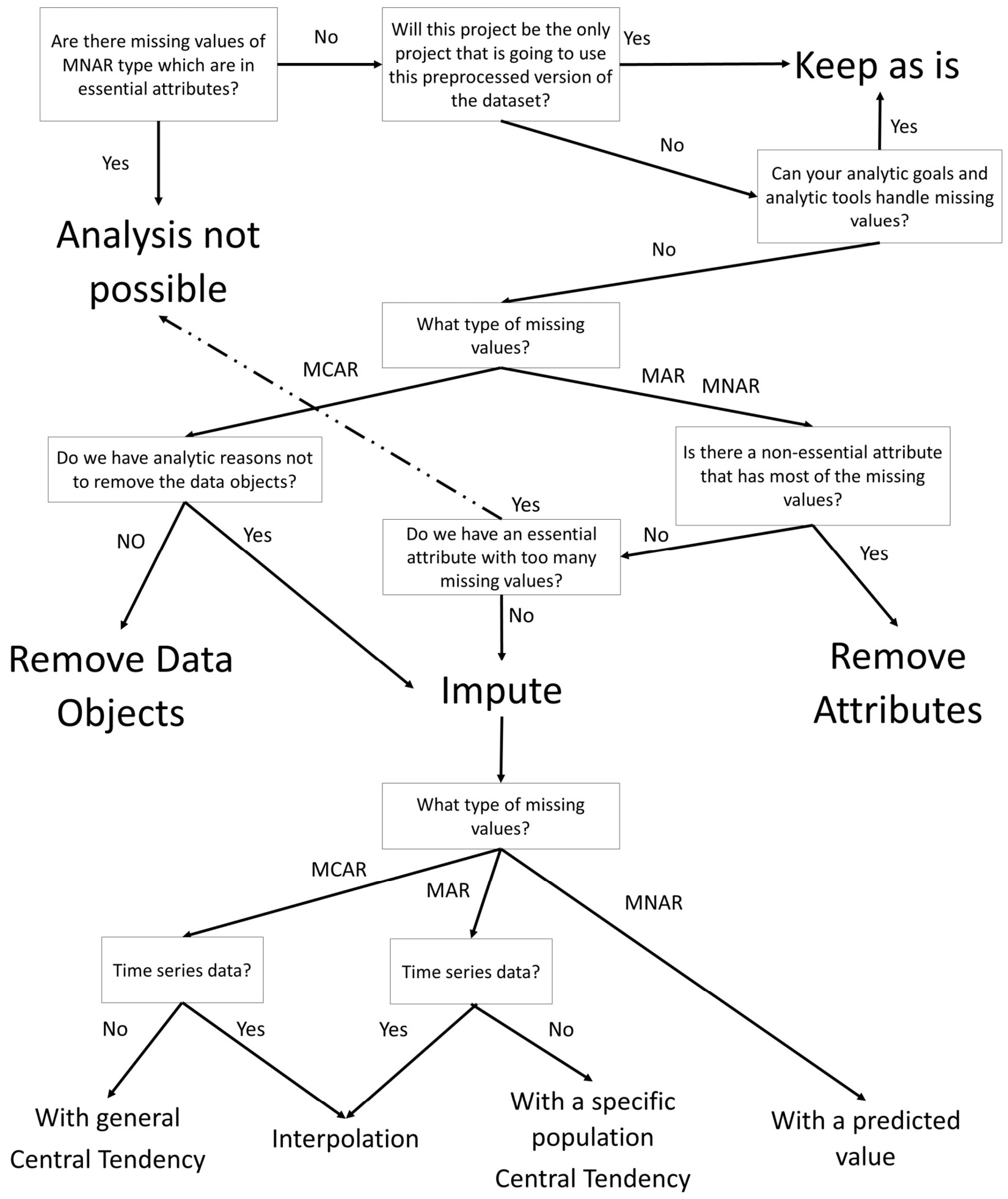
Figure 11.14 – Diagram for choosing approaches and methods for dealing with missing values
Now, let's put what we have learned so far into practice and see some examples.
Example 1
Using air_df, whose missing values we detected and diagnosed earlier in this chapter, we would like to draw a bar chart that shows the average NO2 per hour value in Location A.
If you remember, the missing values in air_df.NO2_Location_A are of the MCAR missing value type. Since the missing values are not of the MNAR type and a bar chart can easily handle missing values, the strategy we chose to deal with the missing values will be to keep them as it is. The following screenshot shows the code and the bar chart that it creates:
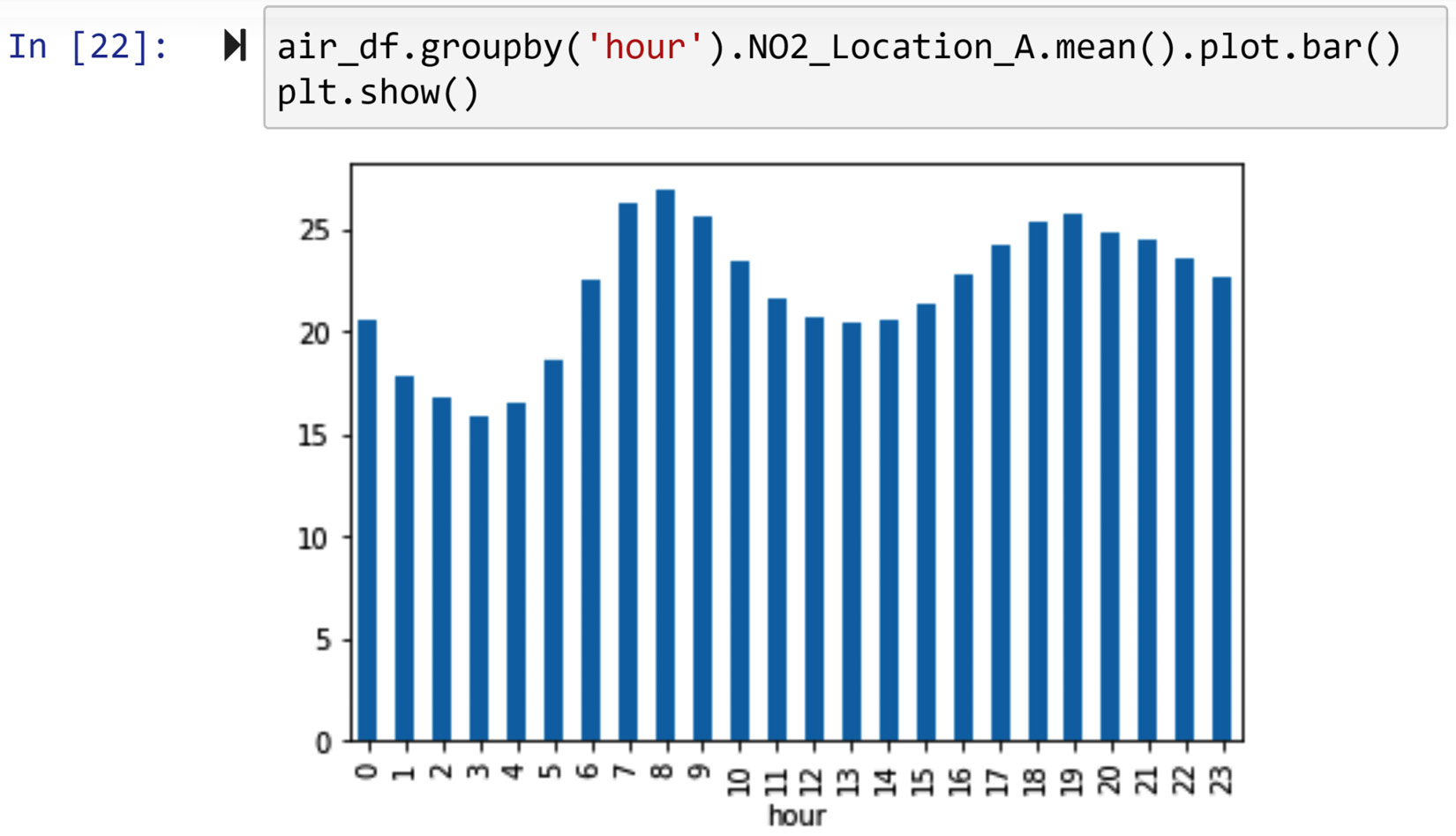
Figure 11.15 – Dealing with missing values of NO2_Location_A to draw an hourly bar chart
In the preceding screenshot, you observed that the .groupby() and .mean() functions were able to handle missing values. When the data is aggregated and the number of missing values is not significant, the aggregation of the data handles the missing values without imputation. In fact, the .mean() function ignores the existence of attributes with missing values and calculates the mean based on data objects that have a value.
Example 2
Using air_df, whose missing values we detected and diagnosed earlier in this chapter, we would like to draw a line chart that compares the NO2 variation of the first day of each month in Location A.
We know that the missing values in air_df.NO2_Location_A are of the MCAR type; however, assume that we don't know if a line plot can handle the missing values or not. So, let's give it a try and see if the keep as is strategy will work. The following screenshot shows the line plot we need without dealing with the missing values:
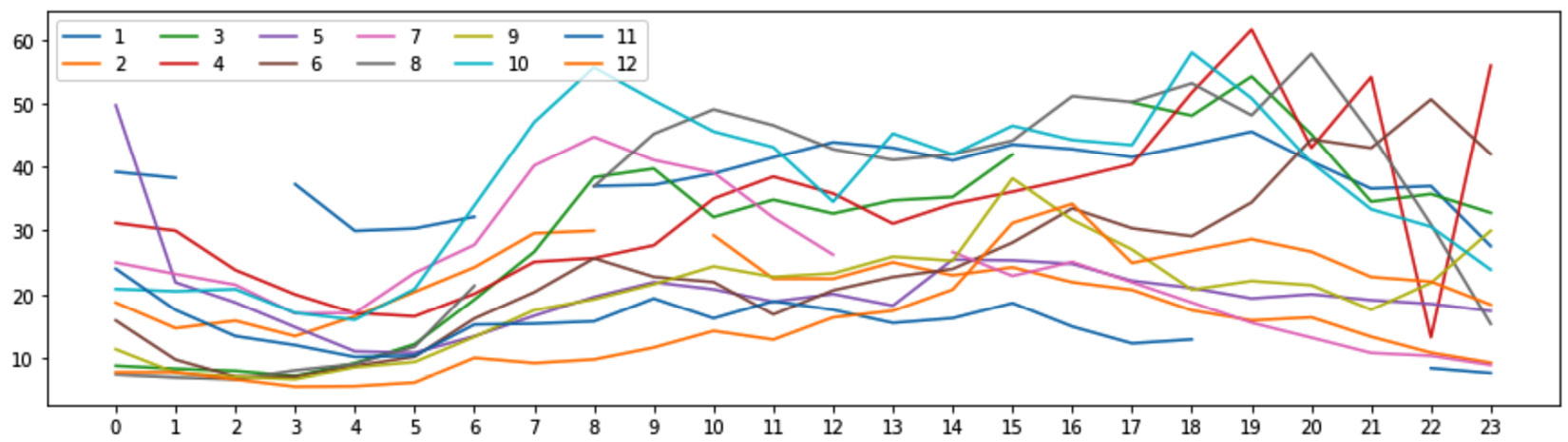
Figure 11.16 – Daily line plot of NO2_Location_A for the first day of every month
In the preceding screenshot, we see that the line plots are cut in between due to the existence of missing values. If the figure meets our analytic need, then we are done and there is no need to do anything further. However, if we would like to deal with the missing values and remove the empty spots in the line plots, we would need to use interpolation as the missing values are of the MCAR type and the data is time series data. The following code snippet shows how to deal with the missing values and then draw complete line plots:
NO2_Location_A_noMV = air_df.NO2_Location_A.interpolate(method='linear')
month_poss = air_df.month.unique()
hour_poss = air_df.hour.unique()
plt.figure(figsize=(15,4))
for mn in month_poss:
BM = (air_df.month == mn) & (air_df.day ==1)
plt.plot(NO2_Location_A_noMV[BM].values, label=mn)
plt.legend(ncol=6)
plt.xticks(hour_poss)
plt.show()
The preceding code snippet uses the .interploate() function to impute the missing values. When method='linear' is used, the function imputes with the average of the data points before and after it. In our eyes, it will appear as though the empty spots are connected with a ruler. Run the preceding code and compare its output with Figure 11.16.
Example 3
Using air_df, we would like to draw a bar chart that compares the average NO2 per hour value in Location A and Location B.
We remember that the missing values in air_df.NO2_Location_A are of the MCAR type and that those in air_df.NO2_Location_B are of the MAR type. As neither of the attributes has MNAR missing values and the bar chart can handle missing values, we can use a keep as is strategy. The following screenshot shows the code needed to create a bar chart for this situation:
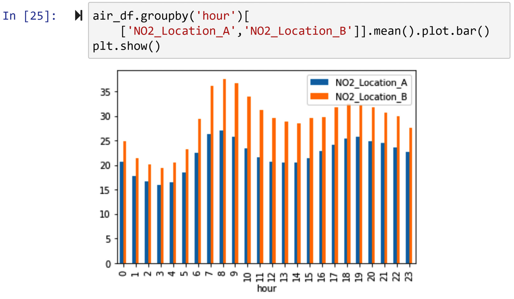
Figure 11.17 – Dealing with missing values of NO2_Location_A and NO2_Location_B to draw an hourly bar chart
Example 4
Using air_df, we would like to draw a bar chart that compares the average NO2 per hour value in Location A, Location B, and Location C.
We remember that the missing values are of types MCAR, MAR, and MNAR, respectively, in NO2_Location_A, NO2_Location_B, and NO2_Location_C. As we mentioned, dealing with MCAR and MAR missing values is much easier than dealing with MNAR missing values. For MCAR and MAR, we already saw that we can use a keep as is strategy.
For MNAR, we need to answer the question: Are the MNAR missing values essential attributes? Answering this question requires a deep understanding of the analytic goals. In two different analytic situations, we may have to deal with the missing values differently.
In one analytic situation, a bar chart is requested from an air pollution regulatory government body. In this situation, we cannot move past the MNAR missing values in NO2_Location_C, and instead of sending them what they have requested, we need to reject their request and instead inform the regulatory body about the existence of missing values. This is because a bar chart would be misleading, as the missing values are due to data tampering, with the intention of downplaying air pollution data.
In another situation, a bar chart is requested from a researcher who would like to investigate general air pollution in different regions. In this situation, even though the missing values are of the MNAR type, the systematic reason behind them is not essential to our analytic goals. Therefore, we can use a keep as is strategy for all three columns. Creating a bar chart is very similar to what we did in Figure 11.17. Running air_df.groupby('hour')[['NO2_Location_A', 'NO2_Location_B', 'NO2_Location_C']].mean().plot.bar() will create the requested visual.
Example 5
We would like to use the kidney_disease.csv dataset to classify between the cases of chronic kidney disease (CKD) and those cases that are not CKD. The dataset shows the data of 400 patients and has 5 independent attributes—namely, red blood cells (rc), serum creatinine (sc), packed cell volume (pcv), specific gravity (sg), and hemoglobin (hemo). Of course, the dataset also has a dependent attribute named diagnosis whereby the patients are labeled with either CKD or not CKD. Decision Tree is the classification algorithm we would like to use.
In our initial look at the dataset, we notice that the dataset has missing values, and after using the code we learned under Detecting missing values, we conclude that the number of missing values for rc, sc, pcv, sg, and hemo are 131, 17, 71, 47, and 52, respectively. This means the percentage of missing values under rc, sc, pcv, sg, and hemo is 32.75%, 4.25%, 17.75%, 11.75%, and 13%, respectively.
Use what you've learned in this chapter to confirm the information in the previous paragraph before reading on.
When the number of missing values are across different attributes and are high (more than 15%), it might be the case that most of the missing values happen for the same data objects, and that could be very problematic for our analysis. So, before moving to the diagnosis of missing values for each attribute, let's use the heatmap() function from the seaborn module to visualize missing values across the dataset. The following screenshot shows the code and the heatmap it produces:
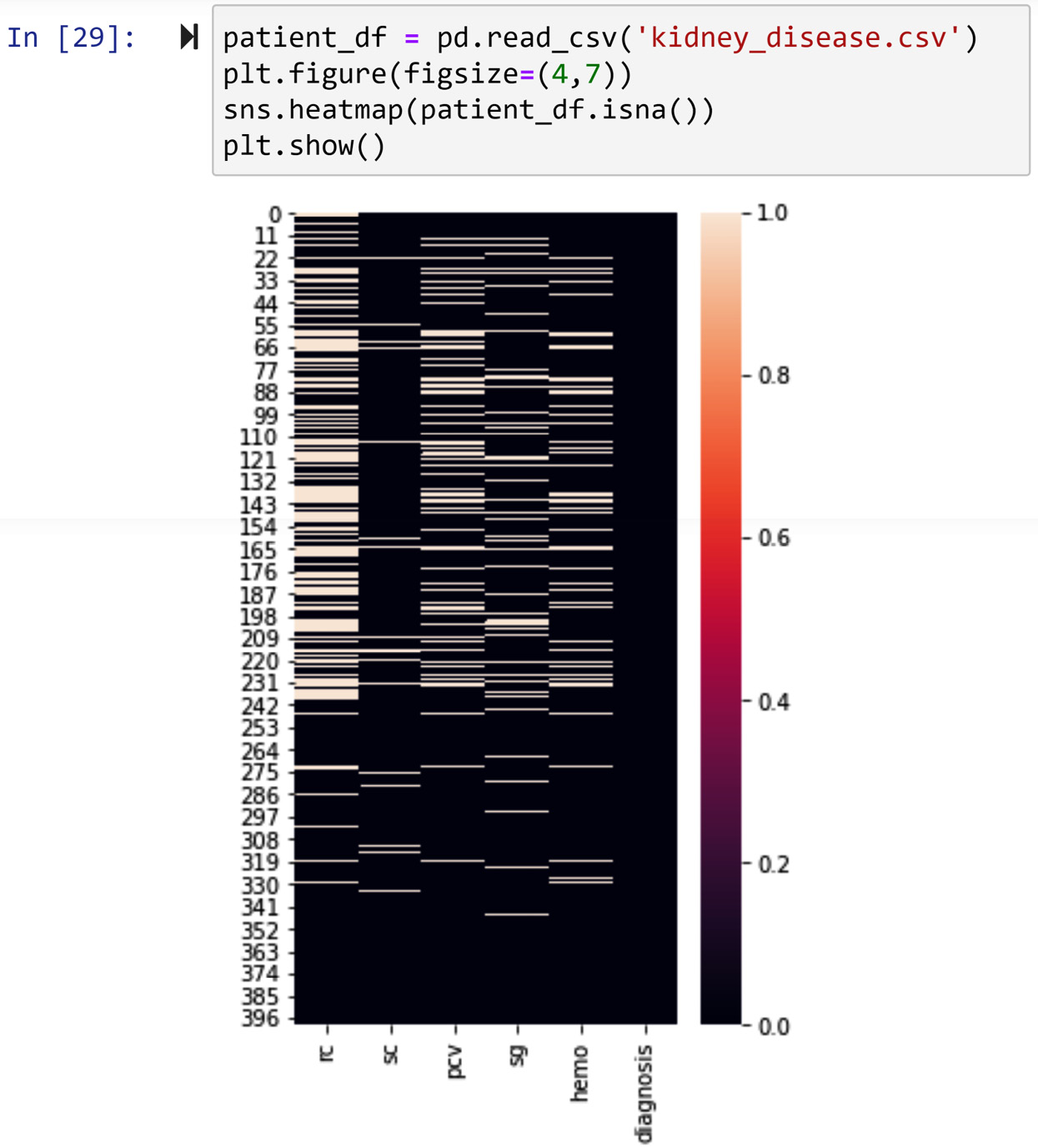
Figure 11.18 – Using seaborn to visualize missing values in kidney_disease.csv
The heatmap in the preceding screenshot shows that the missing values are somewhat scattered across the data objects, and it is certainly not the case that the missing values under different attributes are only from specific data objects.
Next, we turn our attention to the missing value diagnosis per attribute. After performing what we've learned in this chapter, we can conclude that the missing values of the sc attribute are of the type MCAR, and the missing values of rc, pcv, sg, and hemo are of the type MAR. The tendency of all of the MAR missing values is highly linked to the diagnosis dependent attribute.
Use what you've learned in this chapter to confirm the information in the previous paragraph before reading on.
Now that we have a better idea of the types of missing values, we need to turn our focus to the essence of analytic goals and tools. We want to perform classification using the Decision Tree algorithm. When we want to deal with missing values, before using the dataset in an algorithm, we need to first consider how the algorithm uses the data and then try to choose a strategy that simultaneously optimizes the two goals of dealing with missing values. Let's remind ourselves of the two goals of dealing with missing values, as follows:
- Keeping as much data and information as possible
- Introducing the least possible amount of bias in our analysis
We know that Decision Tree is not inherently designed to deal with missing values, and the tool we know for the Decision Tree algorithm—the DecisionTreeClassifier() function from the sklearn.tree module—will give an error if the input data has missing values. Knowing that will tell us that a keep as is strategy is not an option.
We also just realized that the tendency of some of the missing values can be a predictor of the dependent attribute. This is important because if we were to impute the missing values, that would remove this valuable information from the dataset; the valuable information is that the missing values of some of the attributes (the MAR ones) predict the dependent attribute. Therefore, regardless of the imputation method that we will use, we will add a binary attribute to the dataset for every attribute with MAR missing values that describes whether the attribute had a missing value. These new binary attributes will be added to the independent attributes of the classification task to predict the diagnosis dependent attribute.
The following code snippet shows these binary attributes being added to the patient_df dataset:
patient_df['rc_BMV'] = patient_df.rc.isna().astype(int)
patient_df['pcv_BMV'] = patient_df.pcv.isna().astype(int)
patient_df['sg_BMV'] = patient_df.sg.isna().astype(int)
patient_df['hemo_BMV'] = patient_df.hemo.isna().astype(int)
Run the preceding lines of code first and study the state of patient_df before reading on.
Let's now turn our attention to imputing missing values. If you do not remember how the Decision Tree algorithm goes about the task of classification, please go back to Chapter 7, Classification, to jog your memory before reading on. The Decision Tree algorithm consecutively splits data objects into groups based on the value of the attributes, and when the data objects have values that are larger than or smaller than the central tendencies of the attribute, they are more likely to be classified with a specific label. Therefore, by imputing with the central tendency of the attributes, we will not introduce a bias into the dataset, so the imputed value will not cause the classifier to predict one label over the other more often.
Thus, we have concluded that imputing with the central tendency of attributes is a reasonable way to address missing values. The question that we now need to answer is: Which central tendency should we use—median or mean? The answer to that question is that the mean is better if the attribute does not have many outliers.
After investigating the boxplots of the attributes with missing values, you will see that sc has too many outliers, and the rest of the attributes are not highly skewed. Therefore, the following code snippet shows the missing values of patient_df.sc being imputed with patient_df.sc.median(), and the rest of the attributes with missing values with their means:
patient_df.sc.fillna(patient_df.sc.median(),inplace=True)
patient_df.fillna(patient_df.mean(),inplace=True)
The preceding code snippet uses the .fillna() function, which is very useful when imputing missing values. After running the preceding code, recreate the heatmap shown in Figure 11.18 to see the state of missing values in your data.
Phew! The detection of, diagnosis of, and dealing with missing values have now been completed. The dataset is now preprocessed for the classification task. All we need to do is use the code we learned from Chapter 7, Classification, to run the Decision Tree algorithm. The following code snippet shows the modified code from Chapter 7, Classification, for this analytic situation:
from sklearn.tree import DecisionTreeClassifier, plot_tree
predictors = ['rc', 'sc', 'pcv', 'sg', 'hemo', 'rc_BMV', 'pcv_BMV', 'sg_BMV', 'hemo_BMV']
target = 'diagnosis'
Xs = patient_df[predictors]
y= patient_df[target]
classTree = DecisionTreeClassifier(min_impurity_decrease= 0.01, min_samples_split= 15)
classTree.fit(Xs, y)
The preceding code snippet creates a Decision Tree model and trains it using the data we've preprocessed. Pay attention to the fact that min_impurity_decrease= 0.01 and min_samples_split= 15 are hyperparameters of the Decision Tree algorithm that are adjusted using a process of tuning.
The following code snippet uses the classTree trained decision tree model to visually draw its tree for analysis and use:
from sklearn.tree import plot_tree
plt.figure(figsize=(15,15))
plot_tree(classTree, feature_names=predictors, class_names=y.unique(), filled=True, impurity=False)
plt.show()
Successfully running the preceding code will create the following output:
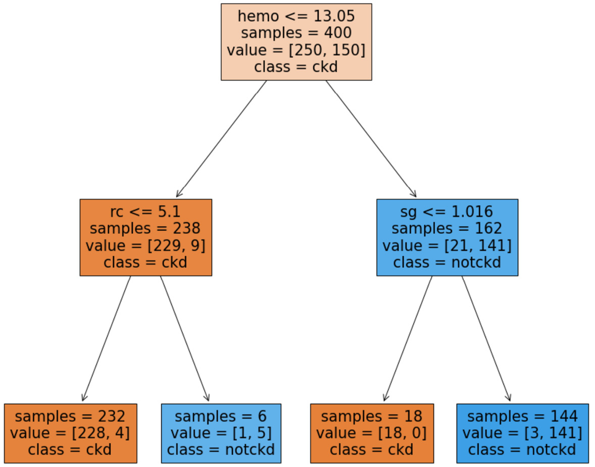
Figure 11.19 – Trained decision tree for the preprocessed kidney_disease.csv data source
We can now use the preceding decision tree to make decisions regarding incoming patients.
You've made excellent progress so far in this chapter. You are now capable of detecting, diagnosing, and dealing with missing values from both a technical and an analytic standpoint. Next in this chapter, we will discuss the issue of extreme points and outliers.
Outliers
Outliers, a.k.a. extreme points, are data objects whose values are too different than the rest of the population. Being able to recognize and deal with them is important from the following three perspectives:
- Outliers may be data errors in data and should be detected and removed.
- Outliers that are not errors can skew the results of analytic tools that are sensitive to the existence of outliers.
- Outliers may be fraudulent entries.
We will first go over the tools we can use to detect outliers, and then we will cover dealing with them based on the analytic situation.
Detecting outliers
The tools we use for detecting outliers depend on the number of attributes involved. If we are interested in detecting outliers only based on one attribute, we call that univariate outlier detection; if we want to detect them based on two attributes, we call that bivariate outlier detection; and finally, if we want to detect outliers based on more than two attributes, we call that multivariate outlier detection. We will cover the tools we can use for outlier detection for each of these mentioned categories. We will also cover detecting outliers for time series data as there are better tools for this.
Univariate outlier detection
The tools we will use for univariate outlier detection depend on the attribute's type. For numerical attributes, we can use a boxplot or the [Q1-1.5*IQR, Q3+1.5*IQR] statistical range. The concept of outliers does not have much meaning for a single categorical attribute, but we can use tools such as a frequency table or a bar chart.
The following two examples feature univariate outlier detection. In these examples, we will use responses.csv and columns.csv files. The two files are used to record the date of a survey conducted in Slovakia. To access the data on Kaggle, use this link: https://www.kaggle.com/miroslavsabo/young-people-survey.
The dataset uses two files to keep the records due to a level I data cleaning reason— intuitive and codable attribute names. The columns.csv file keeps the codable attribute titles and their complete titles, and the file responses.csv has a table of data objects (survey responses) whose attributes are named using the codable titles.
The following screenshot shows the reading of these two files into Pandas DataFrames and the first two rows of both DataFrames:
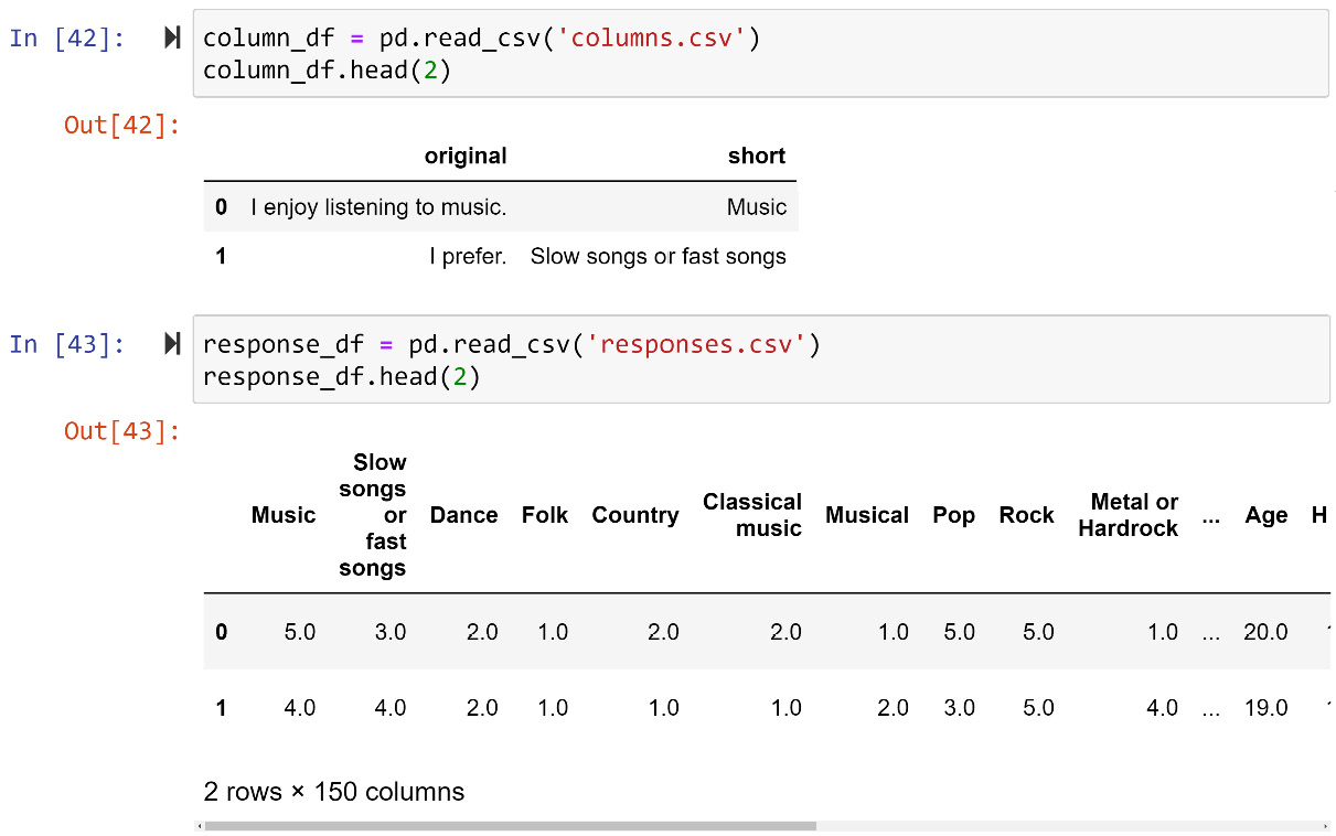
Figure 11.20 – Reading responses.csv and columns.csv into response_df and column_df and showing them
Now, let's look at the first example of univariate outlier detection across one numerical attribute.
Example of detecting outliers across one numerical attribute
In this example, we would like to detect outliers in the response_df.Weight numerical attribute. There are two ways we can go about this; both ways will lead to the same conclusion. The first way is visual; we will use a boxplot. The following screenshot shows the code for creating a boxplot for response_df.Weight:
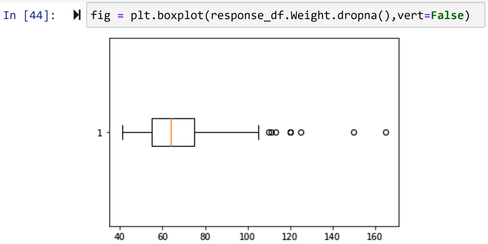
Figure 11.21 – Creating a boxplot for response_df.Weight
The circles that come before the lower cap and and after the upper cap represent data objects in the data that are statistically too different from the rest of the numbers. These circles are called fliers in the context of boxplot analysis.
There are different ways we can access the data objects that are fliers in a boxplot. First, we can do this visually. We can see that the fliers have a Weight value larger than 105, so we can use a Boolean mask to filter out these data objects. Running response_df[response_df.Weight>105] will list the outliers presented in the preceding screenshot.
Second, we can access the fliers directly from the boxplot itself. If you pay attention to the preceding screenshot, you will notice that for the first time in this book, the output of a plot function—in this case, plt.boxplot()—is assigned to a new variable—in this case, fig. The reason for this is that up until now, the end goal of data visualization was the visualization itself, and we did not need to access the details of the visualization. However, here, we would like to access the fliers and find out their values to avoid possible visual mistakes.
We can access all aspects of every Matplotlib visualization similarly. If you run print(fig) and study its results, you will see that fig is a dictionary whose keys are different elements of the visualization. As the visualization in this case is a boxplot, the elements are caps, whiskers, fliers, boxes, and median. Each key is associated with a list of one or multiple matplotlib.lines.Line2D programming objects. This is a programing object that Matplotlib uses in its internal processes, but here we want to use this to give us the values of the fliers. Each matplotlib.lines.Line2D object has the .get_data() function that gives you values that are shown on the plot. For instance, running fig['fliers'][0].get_data() gives you the weight values that are shown as fliers in Figure 11.21.
We didn't need to use a boxplot to find outliers. A boxplot itself uses the following formulas to calculate the upper cap and lower cap of the boxplot. Q1 and Q3 are the first and third quarters of the data:
![]()
![]()
![]()
Anything that is not between the upper cap and the lower cap will be marked as outliers. The following code uses the .quantile() function and the preceding formulas to output the outliers:
Q1 = response_df.Weight.quantile(0.25)
Q3 = response_df.Weight.quantile(0.75)
IQR = Q3-Q1
BM = (response_df.Weight > (Q3+1.5 *IQR)) | (response_df.Weight < (Q1-1.5 *IQR))
response_df[BM]
Using any of the two methods we covered in this example, you will realize that there are nine data objects whose Weight values are statistically too different from the rest of the data objects. The Weight values for these outliers are 120, 110, 111, 120, 113, 125, 165, 120, and 150. Make sure to confirm this using both methods before reading on.
Next, we will see an example that showcases detecting outliers based on one categorical attribute.
Example of detecting outliers across one categorical attribute
In this example, we would like to detect the outliers in the response_df.Education categorical attribute. For detecting outliers across one categorical attribute, we can use a frequency table or a bar chart. As we learned in Chapter 5, Data Visualization, you may run response_df.Education.value_counts() to get a frequency table, and running response_df.Education.value_counts().plot.bar() will create a bar chart. Run both lines of code to confirm that the data object whose Education value is doctorate degree is an outlier across this one categorical attribute.
We are now equipped with the tools for univariate outlier detection. Let's turn our attention to bivariate outlier detection.
Bivariate outlier detection
As univariate outlier detection was across only one attribute, bivariate outlier detection is across two attributes. In bivariate outlier detection, outliers are data objects whose combination of values across the two attributes is too different from the rest. Similar to univariate outlier detection, the tools we will use for bivariate outlier detection depend on the attributes' type. For numerical-numerical attributes, it is best to use a scatterplot; for numerical-categorical attributes, it is best to use multiple boxplots; and for categorical-categorical attributes, the tool we use is a color-coded contingency table.
Each of the following three examples features one of the three possible paired combinations of categorical and numerical attributes.
Example of detecting outliers across two numerical attributes
In this example, we would like to detect outliers when they are described by two numerical attributes, response_df.Height and response_df.Weight. When detecting outliers across two numerical attributes, it is best to use a scatterplot. Running response_df.plot.scatter(x='Weight', y='Height') will result in the following output:
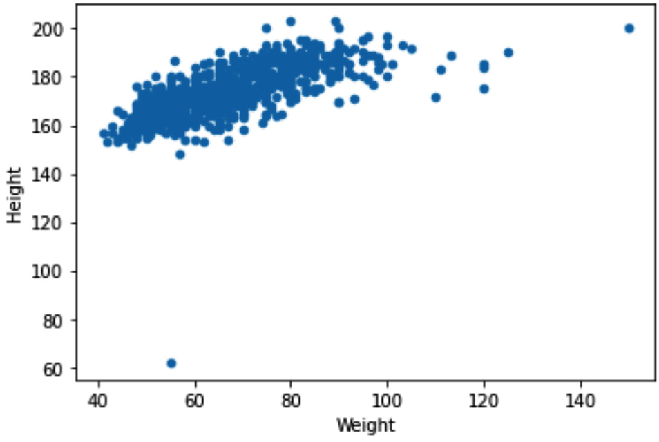
Figure 11.22 – Scatterplot to detect outliers across response_df.Weight and response_df.Height
Based on the preceding screenshot, we can clearly see two outliers, one with a Weight value larger than 120, and one with a Height value smaller than 70. To filter out these two outliers, we can use a Boolean mask. The following code snippet shows how this can be done:
BM = (response_df.Weight>130) | (response_df.Height<70)
response_df[BM]
When the preceding code is run, you will see three data objects. If you check the Height and Weight values of these data objects, you will see one of them has a missing value for Height and therefore is not shown on the scatterplot.
This example featured a bivariate outlier detection when two attributes are numerical. The next example will be a bivariate outlier detection when two attributes are categorical.
Example of detecting outliers across two categorical attributes
In this example, we want to detect outliers across two categorical attributes, response_df.God and response_df.Education. As the two attributes are categorical, it is best to use a contingency table to detect outliers. Running pd.crosstab(response_df['Education'],response_df['God']) will create a contingency table. To help see the outliers, you can turn the table into a heatmap by using .heatmap() from the seaborn module. The code shown in the following snippet will create a heatmap from the contingency table:
cont_table = pd.crosstab(response_df['Education'], response_df['God'])
sns.heatmap(cont_table,annot=True, center=0.5 ,cmap="Greys")
The following screenshot shows the heatmap that the preceding code will produce:
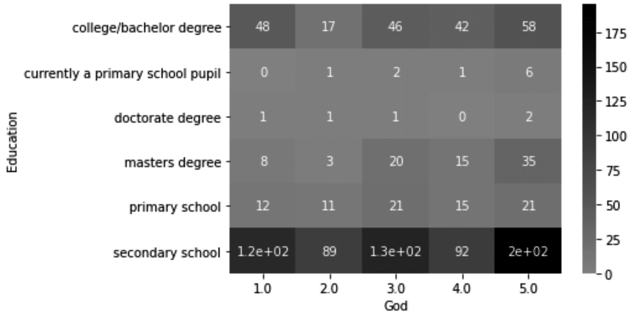
Figure 11.23 – Color-coded contingency table to detect outliers across response_df.God and response_df.Education
From the preceding screenshot, we can see that there are cases of one data object that have some combinations of values across response_df.God and response_df.Education. To filter out these outliers, we can also use a Boolean mask, but as there will be a lot of typing due to the values of the categorical attributes, we might be better off using another Pandas DataFrame function. The .query() function, as its name suggests, can also help us perform filtering of a DataFrame based on the values of the attributes. Run the following lines of code one at a time to filter out each of the data objects we spotted as outliers:
- response_df.query('Education== "currently a primary school pupil" & God==2')
- response_df.query('Education== "currently a primary school pupil" & God==4')
- response_df.query('Education== "doctorate degree" & God==1')
- response_df.query('Education== "doctorate degree" & God==2')
- response_df.query('Education== "doctorate degree" & God==3')
In this example, we covered categorical-categorical bivariate outlier detection. In the example preceding this, we covered numerical-numerical bivariate outlier detection. Next, we will feature numerical-categorical bivariate outlier detection.
Example of detecting outliers across two attributes – one categorical and the other numerical
In this example, we want to detect outliers across two attributes, response_df.Education and response_df.Age. Pay attention to the fact that response_df.Education is categorical and response_df.Age is numerical. When performing bivariate outlier detection across one numerical and one categorical attribute, we use multiple boxplots. In essence, we will create one boxplot across the numerical attribute for each of the categories of the categorical attribute. Running sns.boxplot(x=response_df.Age,y=response_df.Education) will create the following boxplot that can be used for outlier detection:
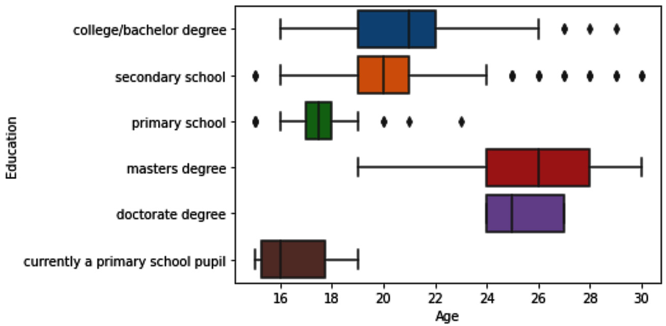
Figure 11.24 – Multiple boxplots to detect outliers across response_df.Age and response_df.Education
This is the first time we are using sns.boxplot() in this book. We did learn how we would be able to do this using Matplotlib in Chapter 5, Data Visualization. Try to recreate the boxplot using Matplotlib before reading on. You will see that using the seaborn function is significantly easier.
Looking at the multiple boxplots, we can see that we have some fliers for Education categories: college/bachelor degree, secondary school, and primary school. To filter out the outliers, we can use Boolean masks or the query() function. The following code shows how we can create one Boolean mask to include all the fliers:
BM1 = (response_df.Education=='college/bachelor degree') & (response_df.Age>26)
BM2 = (response_df.Education == 'secondary school') & ((response_df.Age>24) | (response_df.Age<16))
BM3 = (response_df.Education == 'primary school') & ((response_df.Age>19) | (response_df.Age<16))
BM = BM1 | BM2 | BM3
response_df[BM]
So far, we have managed to learn how to perform univariate and bivariate outlier detection. Next, we will cover multivariate outlier detection.
Multivariate outlier detection
Detecting outliers across more than two attributes is called multivariate outlier detection. The best way to go about multivariate outlier detection is through clustering analysis. The following example features a case of multivariate outlier detection.
Example of detecting outliers across four attributes using clustering analysis
In this example, we would like to see whether we have outliers based on the following four attributes: Country, Musical, Metal or Hardrock, and Folk. If you check the complete description of these attributes on columns_df, you will realize these attributes describe the liking level of data objects for each of four kinds of music. As mentioned, the best way to perform multivariate outlier detection is through cluster analysis. In Chapter 8, Clustering Analysis, we learn about the K-Means algorithm, and here, we will use it to see whether we have outliers.
If K-Means groups one data object or only a handful of data objects in one cluster, that will be our clue that there are multivariate outliers in our data. If you remember, the one big weakness of the K-Means algorithm is that the number of clusters, k, must be specified. To ensure the K-Means algorithm's weakness will not stand in the way of effective outlier detection and to give the analysis the best chance of success, we will use different k values: 2, 3, 4, 5, 6, and 7. We need to do this in multiple steps, as follows:
- First, we will create an Xs attribute, which includes the attributes we want to be used for clustering analysis. The following code snippet shows how this is done:
dimensions = ['Country', 'Metal or Hardrock', 'Folk', 'Musical']
Xs = response_df[dimensions]
- Second, we need to check whether there are any missing values. You may use Xs.info() for the quick detection of missing values.
- If there are missing values, we need to do a similar analysis to what we did in Figure 11.18 to check whether all the missing values are from one of the data objects. If that is the case, the fact that one data object has more than two missing values could be a reason for concern. However, if the missing values seem to be happening randomly across Xs, we may impute them with Q3+1.5*IQR.
Why not impute them with a central tendency? The reason we don't is that we would decrease the likelihood of a data object with a missing value being detected as outliers if we imputed with a central tendency. We don't want to help a data object that has the potential to be an outlier with our missing value imputation.
In this case, the missing values are spread across the data objects and the dimensions of Xs. So, we can use the following line of code to impute the missing values with Q3+IQR*1.5:
Q3 = Xs.quantile(0.75)
Q1 = Xs.quantile(0.25)
IQR = Q3 - Q1
Xs = Xs.fillna(Q3+IQR*1.5)
- Next, of course, we will not forget to standardize the dataset using Xs = (Xs - Xs.min())/(Xs.max()-Xs.min()).
- Lastly, we can use a loop to perform clustering analysis for different Ks and report its results. The following line of code shows how this can be done:
from sklearn.cluster import KMeans
for k in range(2,8):
kmeans = KMeans(n_clusters=k)
kmeans.fit(Xs)
print('k={}'.format(k))
for i in range(k):
BM = kmeans.labels_==i
print('Cluster {}: {}'.format(i,Xs[BM].index. values))
print('--------- Divider ----------')
Once the preceding code is successfully run, you can scroll through its prints to see that under none of the Ks, has K-Means grouped one data object or a handful of data objects in one cluster. This will allow us to conclude that there is no multivariate outlier in Xs.
Time series outlier detection
Outliers in time series data are best detected using line plots, the reason being that between consecutive records of a time series there is a close relationship, and using the close relationship is the best way to check the correctness of a record. All you need is to evaluate the value of the record against its closest consecutive records, and that is easily done using line plots. We will see an example of time series outlier detection in this chapter—please see the example under Detecting systematic errors toward the end of this chapter.
Now that we have covered all the three possible outlier detections—univariate, bivariate, and multivariate—we can turn our attention to dealing with outliers.
Dealing with outliers
When we have detected outliers in a dataset we want to analyze, we also need to effectively deal with outliers. The following list highlights the four approaches we can use to deal with outliers:
- Do nothing
- Replace with the upper cap or lower cap
- Perform a log transformation
- Remove data objects with outliers
Next, we will talk more about each of the preceding approaches.
First approach – Do nothing
Although it may not feel like this, especially after going through so many hoops to detect outliers, do nothing is the best strategy in most analytic situations. The reason for this is that most analytic tools we use can easily handle outliers. In fact, if you know the analytic tools you want to use can handle outliers, you might not perform outlier detection in the first place. However, outlier detection itself may be the analytic you need, or the analytic tool you need to use is prone to outliers.
The table shown in the following screenshot lists all the analytic tools/goals we have covered in this book and specifies the best approach for dealing with outliers:
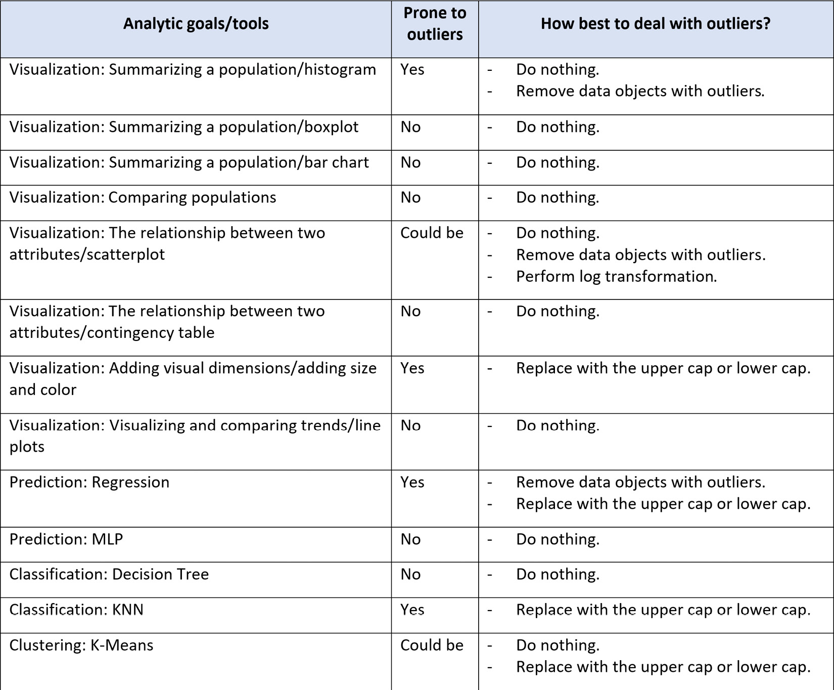
Figure 11.25 – Summary table of analytic goals and tools and the best way to deal with outliers if they exist
As you can see in Figure 11.25, in most analytic situations, it will be better to adopt the first approach: do nothing. Now, let's continue and learn about the next approaches.
Second approach – Replace with the upper cap or the lower cap
Applying this approach may be wise when the following criteria are met:
- The outlier is univariate.
- The analytic goals and/or tools are sensitive to outliers.
- We do not want to lose information by removing data objects.
- An abrupt change of value will not lead to a significant change in the analytic conclusions.
If the criteria are met, in this approach the outliers are replaced with the correct upper or lower cap. The upper and lower caps are statistical concepts we discussed earlier in this chapter in the Univariate outlier detection section. They are also an essential part of any boxplot. We replace the univariate outliers that are too much smaller than the rest of the data object with the lower cap of the Q1-1.5*IQR attribute, and replace the univariate outliers that are too much larger than the rest of the data objects with the upper cap of the Q3+1.5*IQR attribute.
Third approach – Perform a log transformation
This approach is not just a method to deal with outliers but is also an effective data transformation technique that we will cover in the relevant chapter. As a method to deal with outlier detection, it is only applicable in certain situations. When an attribute follows an exponential distribution, it is only typical for some of the data objects to be very different from the rest of the population. In those situations, applying a log transformation will be the best approach.
Fourth approach – Remove data objects with outliers
When the other methods are not helpful or possible, we may be reduced to removing the data objects with the outliers. This is our least favorite approach and should only be used when absolutely necessary. The reason that we would like to avoid this approach is that the data is not incorrect; the values of the outliers are correct but happen to be too different from the rest of the population. It is our analytic tool that is incapable of dealing with the actual population.
Pay Attention!
As to when and whether you should adopt the approach of removing data objects due to being outliers, I would like to share with you an important word of advice. First, only apply this approach to the preprocessed version of the dataset that you've created for the specific analysis and not to the source data. The fact that this analysis needed the data objects with outliers to be removed does not mean all the analysis will need that. Second, make it a priority to inform the audience of the resulting analytic as they will be aware of this invasive approach in dealing with outliers.
Now that we know all four approaches in dealing with outliers, let's spend some time going over a summary of how best we should go about selecting the best one.
Choosing the right approach in dealing with outliers
The selection of the right approach in dealing with outliers must be informed from analytic goals and analytic tools. As shown in Figure 11.25, in most situations, the best way to deal with outliers is using a do nothing approach. When and if the other approaches are necessary, make sure to only apply them to the preprocessed version of the data you are creating for your analytics and refrain from changing the source dataset.
We now know everything we need to know about dealing with outliers, so let's see a couple of examples to put what we learned into practice.
Example 1
We earlier saw that the response_df.Weight attribute has some outliers. We would like to use a histogram to draw the distribution of the population across this attribute.
As our analytic end goal is to visualize the population distribution, the existence of outliers might consume some visualization space, and therefore removing them can open the visualization space.
The following code snippet and its output show how to create both histogram versions for response_df.Weight, one with outliers and the other without them:
response_df.Weight.plot.hist(histtype='step')
plt.show()
BM = response_df.Weight<105
response_df.Weight[BM].plot.hist(histtype='step')
plt.show()
The preceding code will produce the following output:
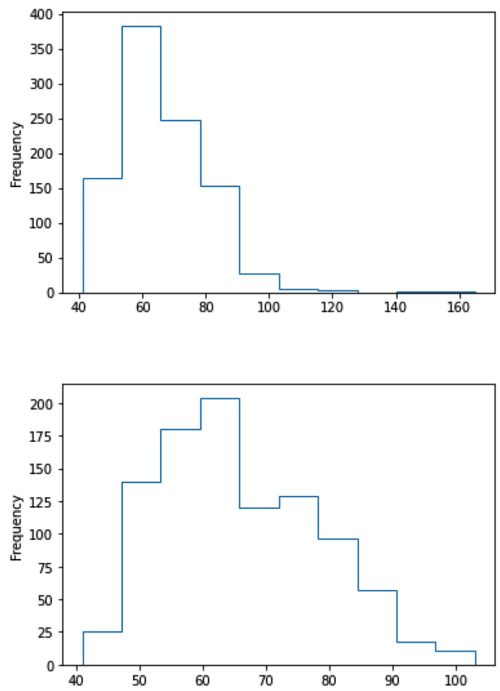
Figure 11.26 – Histogram of response_df.Weight featuring two different approaches in dealing with outliers
In the previous screenshot, from an analytic perspective, you may imagine situations where either visual would be more appropriate. For instance, if we are interested in seeing the frequency changes where most of the population is between 40 and 100, then a histogram without outliers would be better. On the other hand, if a true representation of the population is our end goal, then a histogram with outliers would be ideal.
In the previous screenshot, from a data preprocessing perspective, pay attention to the fact that to create a histogram without outliers, we did not edit response_df but created a DataFrame on the fly just for the purpose of creating a histogram without outliers.
Now, let's consider another example.
Example 2
We would like to visualize the relationship between two attributes, response_df.Height and response_df. Weight. As the two attributes are both numerical, we do know the best way to visualize this relationship is a scatterplot. We also would like to include a linear regression (LR) line in the visualization so as to augment its analytic values.
We have been told that LR is prone to outliers. Let's use this opportunity to learn why. We will first adopt a do nothing approach and create a visualization to see what would happen if there were outliers in the data for regression analysis.
The following screenshot shows the application of the .regplot() function from the seaborn module to create a scatterplot visualization:
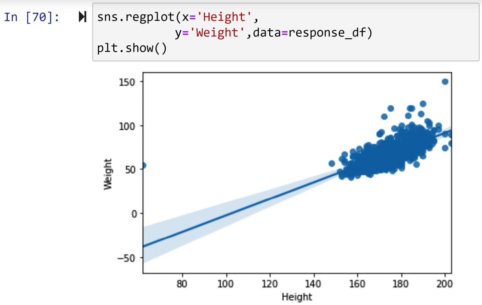
Figure 11.27 – Scatterplot to visualize the relationship between response_df.Height and response_df.Weight without dealing with outliers
You can see in the preceding screenshot that the outliers we detected in Figure 11.22 are consuming the visualization space and do not allow the relationship to show itself fully.
However, the following screenshot shows the code that removes the outliers at the last step of the visualization:
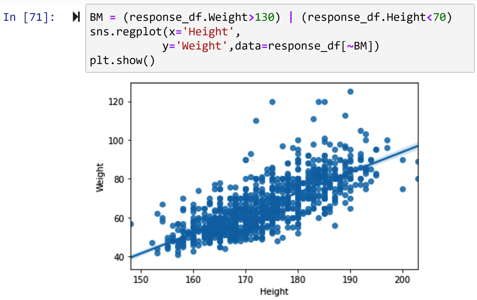
Figure 11.28 – Scatterplot to visualize the relationship between response_df.Height and response_df.Weight after dealing with outliers
Comparing the last two screenshots, we can see how removing the two outliers allows the visualization to show the relationship between the two variables much better. You can see in the preceding screenshot how higher Height values can lead to higher Weight values.
Example 3
In this example, we would like to use regression to capture the linear relationship between Weight, Height, and Gender to predict Weight, which we saw in the previous example. In other words, we would like to find the β0 and β1 values in the following equation:
![]()
As we saw in Figure 11.25, regression analysis is sensitive to outliers. We also observed in Figure 11.28 that both Weight and Height have outliers. We also need to check whether Gender has any outliers.
This is going to be a long example, so please bear with me throughout. In this example, we will go over the following steps, one by one:
- Dealing with missing values
- Detecting univariate outliers and dealing with them
- Detecting bivariate outliers and dealing with them
- Detecting multivariate outliers and dealing with them
- Applying LR
Let's start with the first step.
Dealing with missing values
However, before doing that, we will first need to deal with the missing values in these three attributes, as LinearRegression from sklearn.linear_model gives an error when the input data has missing values. The following code snippet shows how we would start preprocessing the data for this example:
select_attributes = ['Weight','Height','Gender']
pre_process_df = pd.DataFrame(response_df[select_attributes])
pre_process_df.info()
After running the previous code, you will be able to see that Weight and Height have 20 missing values, and Gender has 6 missing values. Assume that we know that the missing values are of the MCAR type.
To deal with missing values for regression analysis, we cannot use a keep as is strategy, as the tool we plan to use cannot handle outliers. Imputing values will not be a good option either as this will create bias in the data. Therefore, the only doable option that remains is dropping the data objects. The following line of code uses the .dropna() function to remove the data objects with missing values:
pre_process_df.dropna(inplace=True)
After running this code, rerun pre_process_df.info() to confirm that pre_process_df does not have missing values anymore.
Now that we are certain there are no missing values in pre_process_df, we can turn our attention to detecting and dealing with outliers, as LR is prone to outliers. We need to detect whether the data has univariate, bivariate, or multivariate outliers. In the following subsections, we will do this one step at a time.
Detecting univariate outliers and dealing with them
The following screenshot shows the code that has created boxplots for the numerical attributes and a bar chart for the categorical attribute in this example:
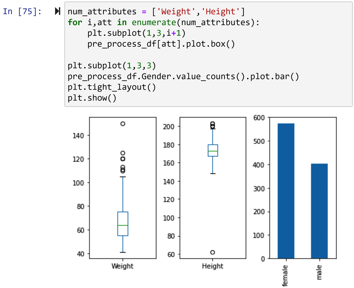
Figure 11.29 – Drawing boxplots of the numerical attributes and a bar chart of the categorical attribute in the example
In the preceding screenshot, we can see that both Height and Weight have outliers, but Gender does not. So, before moving on to the LR analysis, we need to deal with the outliers. As suggested by Figure 11.25, we can use one of the following two approaches in dealing with outliers:
- Remove these data objects
- Replace them with their statistical upper cap or lower cap
But which approach is better? When the data objects are univariate outliers, it is better to use the second approach, as replacing the statistical upper or the lower cap will help to keep the data objects and at the same time mitigate the negative effect of the data object with the outliers.
On the other hand—and this also applies generally—when the data objects are bivariate or multivariate outliers, it would be better to remove them. This is because these outliers will not allow the regression model to capture the patterns among the non-outlier data objects. In the special case of bivariate outliers whereby the pair of attributes is categorical-numerical, it might also be sensible to replace the outlier values with the upper or lower caps of the specific population.
So, let's first deal with the univariate outliers by replacing them with the statistical lower and upper caps. The following code replaces the fliers of pre_process_df.Weight with the statistical upper cap of the attribute:
Q3 = pre_process_df.Weight.quantile(0.75)
Q1 = pre_process_df.Weight.quantile(0.25)
IQR = Q3 - Q1
upper_cap = Q3+IQR*1.5
BM = pre_process_df.Weight > upper_cap
pre_process_df.loc[pre_process_df[BM].index,'Weight'] = upper_cap
After running the previous code, run pre_process_df.Weight.plot.box() to see that the outliers are taken care of. Also, pay attention to two matters before moving on to replace the flier in pre_process_df.Height, as follows:
- First, by looking at Figure 11.29, you will realize that pre_process_df.Weight only has fliers that are larger than the statistical upper cap of the attribute. That is why in the previous code, we don't have any replacement with the statistical lower cap of the attribute. This will change when we do the same procedure for pre_process_df.Height.
- Second, we could have the boxplot itself extract the statistical upper caps and lower caps of the attribute, but instead, we use the formulas Q1-1.5*IQR and Q3+1.5*IQR, respectively, to calculate the statistical lower and upper caps. This is because we don't want to waste computational resources by having the computer draw unnecessarily when we have the formula to calculate it ourselves.
Next, we will do the same procedure for pre_process_df.Height to deal with the univariate outliers. The following code shows how this is done:
Q3 = pre_process_df.Height.quantile(0.75)
Q1 = pre_process_df.Height.quantile(0.25)
IQR = Q3 - Q1
lower_cap = Q1-IQR*1.5
upper_cap = Q3+IQR*1.5
BM = pre_process_df.Height < lower_cap
pre_process_df.loc[pre_process_df[BM].index,'Height'] = lower_cap
BM = pre_process_df.Height > upper_cap
pre_process_df.loc[pre_process_df[BM].index,'Height'] = upper_cap
After running the previous code successfully, run pre_process_df.Weight.plot.box() to check the state of the outliers.
Now that the univariate outliers are taken care of, let's see whether we have bi- or multivariate outliers.
Detecting bivariate outliers and dealing with them
Running pre_process_df.plot.scatter(x='Height', y='Weight') will show that we don't have bivariate outliers based on the Height and Weight numerical attributes. However, running the following code will tell us that we do have bivariate outliers under Height and Gender, and under Weight and Gender:
plt.subplot(1,2,1)
sns.boxplot(y=pre_process_df.Height, x=pre_process_df.Gender)
plt.subplot(1,2,2)
sns.boxplot(y=pre_process_df.Weight, x=pre_process_df.Gender)
plt.tight_layout()
Running the preceding code successfully will create the following output:
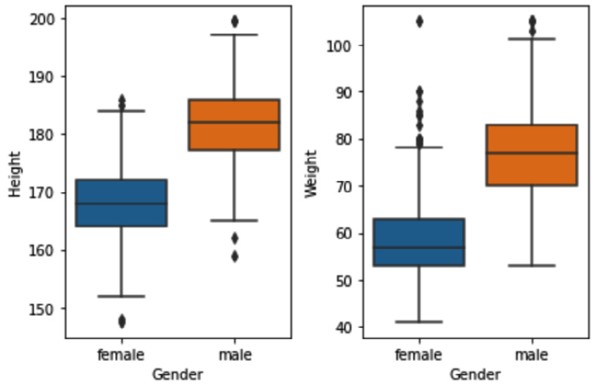
Figure 11.30 – Multiple boxplots to investigate bivariate outliers under numerical-categorical attributes for Height-Gender and Weight-Gender
Given the recognized bivariate outliers in the preceding screenshot, we will need to deal with them. As these outliers are bivariate in a pair of categorical-numerical attributes, we may be replacing them with the specific population's upper or lower caps.
The following code replaces the outliers for the attribute pairs of Height-Gender:
for poss in pre_process_df.Gender.unique():
BM = pre_process_df.Gender == poss
wdf = pre_process_df[BM]
Q3 = wdf.Height.quantile(0.75)
Q1 = wdf.Height.quantile(0.25)
IQR = Q3 - Q1
lower_cap = Q1-IQR*1.5
upper_cap = Q3+IQR*1.5
BM = wdf.Height > upper_cap
pre_process_df.loc[wdf[BM].index,'Height'] = upper_cap
BM = wdf.Height < lower_cap
pre_process_df.loc[wdf[BM].index,'Height'] = lower_cap
Very similar code will replace the outliers for the attribute pairs of Weight-Gender, as illustrated here:
for poss in pre_process_df.Gender.unique():
BM = pre_process_df.Gender == poss
wdf = pre_process_df[BM]
Q3 = wdf.Weight.quantile(0.75)
Q1 = wdf.Weight.quantile(0.25)
IQR = Q3 - Q1
lower_cap = Q1-IQR*1.5
upper_cap = Q3+IQR*1.5
BM = wdf.Weight > upper_cap
pre_process_df.loc[wdf[BM].index,'Weight'] = upper_cap
BM = wdf.Weight < lower_cap
pre_process_df.loc[wdf[BM].index,'Weight'] = lower_cap
After running the preceding codes successfully, running the code shown in the following screenshot, which is the same code as under Detecting bivariate outliers and dealing with them, will show us that the bivariate outliers are taken care of:

Figure 11.31 – Checking the state of bivariate outliers under numerical-categorical attributes for Height-Gender and Weight-Gender
Next, we will need to see whether there are any multivariate outliers, and if there are, we will see how we can deal with them.
Detecting multivariate outliers and dealing with them
To detect multivariate outliers, the standard method is to use clustering analysis; however, when two of the three attributes are numerical and the other is categorical, we can do outlier detection using a specific visualization technique.
The following code creates a scatterplot of Height and Weight for each possibility of the Gender categorical attribute:
Cat_attribute_poss = pre_process_df.Gender.unique()
for i,poss in enumerate(cat_attribute_poss):
BM = pre_process_df.Gender == poss
pre_process_df[BM].plot.scatter(x='Height',y='Weight')
plt.title(poss)
plt.show()
Running the preceding code will create the following visualization:
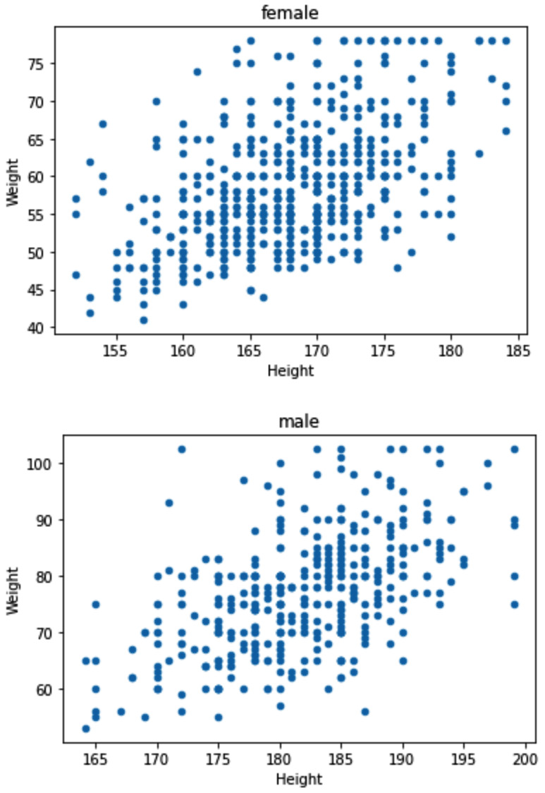
Figure 11.32 – Scatterplots of the numerical attributes per the possibilities of the Gender attribute
Based on the preceding screenshot, we can conclude that there are no multivariate outliers in the data. If there were any, the only choice we would have would be to remove them, as outliers can negatively impact LR performance. Also, as mentioned before, replacing the outliers with upper and lower caps is not an option for multivariate outliers.
After dealing with the outliers and the missing values, we are finally ready to use LR to estimate the relationship between Height, Gender, and Weight to predict Weight.
Applying LR
Before applying LR to pre_process_df, we need to take another preprocessing step. Pay attention to the fact that the Gender attribute is categorical and not numerical, and LR can only work with numbers. So, the following code performs the data transformation so that the attribute is binary coded:
pre_process_df.Gender.replace({'male':0,'female':1},inplace=True)
The following code prepares the independent and dependent attributes, respectively, in data_X and data_Y, and then uses LinearRegression() from sklearn.linear_model to fit the preprocessed data into the model:
from sklearn.linear_model import LinearRegression
X = ['Height','Gender']
y = 'Weight'
data_X = pre_process_df[X]
data_y = pre_process_df[y]
lm = LinearRegression()
lm.fit(data_X, data_y)
If the preceding code runs successfully, then we can run the code in the following screenshot to access the estimated β values from the fitted lm value:
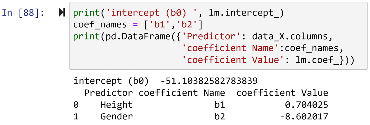
Figure 11.33 – Extracted β values from the train lm value
Therefore, the following equation can be driven from the output in the preceding screenshot. The equation can now predict the individual Weight value based on their Height and Gender values:
![]()
For instance, my height is 189 centimeters (cm) and my gender is male (0). Using the following equation, my weight can be predicted to be 82.895:
![]()
That's pretty good, but my current weight is 86 kilograms (kg), so there is an error of around 4 kg.
Example 4
In this example, we would like to repeat the previous example, but this time, we would like to use a multilayer perceptron (MLP) to predict weight based on gender and height.
The data preprocessing difference between this example and the previous one is that MLP is resilient toward outliers, and we don't need to worry about the dataset having outliers. However, we do need to take care of missing values and also binary code for the Gender attribute. The following code recreates pre_process_df, deals with missing values, and performs the binary coding transformation of the Gender attribute:
select_attributes = ['Weight','Height','Gender']
pre_process_df = pd.DataFrame(response_df[select_attributes])
pre_process_df.dropna(inplace=True)
pre_process_df.Gender.replace({'male':0,'female':1},inplace=True)
After running the preceding code, pre_process_df is ready to be used for MLP. The following code prepares the independent and dependent attributes, respectively, in data_X and data_Y, and then uses MLPRegressor() from sklearn.linear_model to fit the preprocessed data into the model:
from sklearn.neural_network import MLPRegressor
X = ['Height','Gender']
y = 'Weight'
data_X = pre_process_df[X]
data_y = pre_process_df[y]
mlp = MLPRegressor(hidden_layer_sizes=5, max_iter=2000)
mlp.fit(data_X, data_y)
Once the preceding code is run successfully, we can use the trained mlp attribute to perform predictions. The following code snippet shows how to extract the prediction of my Weight value based on my Height and Gender values using mlp:
newData = pd.DataFrame({'Height':189.5,'Gender':0}, index=[0])
mlp.predict(newData)
The prediction I received the last time I ran the preceding code was 80.0890. You will remember that MLP is a random variable and that every time it is run, we expect a new result. Anyhow, as my weight is 86, mlp is about 6 kg out. Does this mean that lm (previous example) is a predictor compared to mlp? Not necessarily—after all, I am only one data point. More test data is needed to make that determination.
Let's look at another example that features dealing with outliers for the purpose of applying clustering analysis, before moving on to the next item.
Example 5
In this example, we would like to use chicago_population.csv. The data objects in this dataset are communities in Chicago. These data objects are described by the following attributes:
- population: The population of the community
- income: The median income of the community
- latino: The percentage of Latinos in the population
- black: The percentage of blacks in the population
- white: The percentage of whites in the population
- asian: The percentage of Asians in the population
- other: The percentage of other races in the population
The mayor of Chicago would like to assign 5 communication liaisons for these 77 communities. The data analyst in the office suggests employing K-Means clustering to group the communities into five groups and assigning the appropriate liaisons based on the characteristics of clustered groups.
First, we will read the file into the community_df pandas DataFrame and check whether there are missing values in the dataset. The following code shows how this is done:
community_df = pd.read_csv('chicago_population.csv')
community_df.info()
Reading the output of the previous code will show us that there are no missing values in community_df. Next, we will need to detect outliers and deal with them.
Detecting univariate outliers and dealing with them
The following code uses sns.boxplot() to create boxplots of all the numerical attributes:
numerical_atts = ['population', 'income', 'latino', 'black', 'white', 'asian','other']
plt.figure(figsize=(12,3))
for i,att in enumerate(numerical_atts):
plt.subplot(1,len(numerical_atts),i+1)
sns.boxplot(y=community_df[att])
plt.tight_layout()
plt.show()
Running the preceding code will create the following output:
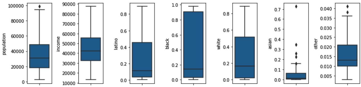
Figure 11.34 – Boxplots of all the numerical attributes in community_df
In the preceding screenshot, we can see we have some univariate outliers in the population, asian, and other attributes.
As we are using K-Means to cluster the communities into five homogenous groups to assign communication liaisons, the best way to deal with the outliers is to replace them with statistical lower or upper caps. We don't want the extreme values of the outliers to impact the results of the clusters.
Please pay attention to the fact this is not the only or the best way to deal with outliers before applying cluster analysis. If we use clustering analysis to find out the inherent pattern in the data, then the best way to deal with the outliers is to do nothing.
The following code uses similar code to what we used under Example 3 to filter the outliers and then replace them with the appropriate cap. Notice that this code is a bit smarter than what we saw in Example 3, as the process of dealing with the outliers is parameterized in one loop:
pre_process_df = community_df.set_index('name')
candidate_atts = ['population','asian','other']
for att in candidate_atts:
Q3 = pre_process_df[att].quantile(0.75)
Q1 = pre_process_df[att].quantile(0.25)
IQR = Q3 - Q1
lower_cap = Q1-IQR*1.5
upper_cap = Q3+IQR*1.5
BM = pre_process_df[att] < lower_cap
candidate_index = pre_process_df[BM].index
pre_process_df.loc[candidate_index,att] = lower_cap
BM = pre_process_df[att] > upper_cap
candidate_index = pre_process_df[BM].index
pre_process_df.loc[candidate_index,att] = upper_cap
After running the preceding code, the univariate outliers will have been replaced with the appropriate statistical cap.
Detecting bivariate and multivariate outliers and dealing with them
It adds no value to detect bivariate and multivariate outliers as the only strategy we can use for them at this stage is to do nothing—we cannot replace them with the upper or lower caps as there is more than one numerical attribute; neither can we remove the data objects as we need all the data objects to be in at least one of the clusters. Therefore, the current state of pre_process_df is the best possible it can be for the clustering analysis.
As the data preprocessing is complete, the only remaining step in this example is to perform clustering. That is what we will do next.
Applying K-Means
The following code snippet shows the adjusted version of the code for K-Means clustering from Chapter 8, Clustering Analysis:
From sklearn.cluster import Kmeans
dimensions = ['population', 'income', 'latino', 'black', 'white', 'asian','other']
Xs = pre_process_df[dimensions]
Xs = (Xs – Xs.min())/(Xs.max()-Xs.min())
kmeans = Kmeans(n_clusters=5)
kmeans.fit(Xs)
Once the preceding code is run successfully, clusters are formed. The following screenshot shows the code we can use to extract the clusters and the code's output:

Figure 11.35 – Extracting the clusters of data objects in community_df
We can also perform centroid analysis for the clusters that were just formed. The code for centroid analysis was presented in Chapter 8, Clustering Analysis, in the Using K-Means to cluster a dataset with more than two dimensions section. Find the code and adjust it to confirm the following heatmap as a result of centroid analysis. Note that as K-Means is a random algorithm, we do expect the heatmap to be different. At the same time, we expect the patterns that emerge from the data to be similar:
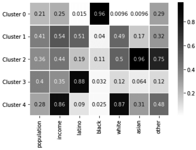
Figure 11.36 – Centroid analysis of the formed clusters
We can see in the preceding screenshot that the communities in each cluster are distinctively different, and this result will be tremendously helpful in assigning communication liaisons.
So far in this chapter, we have covered and seen examples of how to detect and deal with missing values and outliers. Next, we will turn our attention to detecting errors and dealing with them in the dataset.
Errors
Errors are an inevitable part of any data collection and measurement. The following formula best captures this fact:
![]()
The True Signal is the reality we are trying to measure and present in the form of Data, but due to the incapability of our measurement system or data presentation, we cannot capture the True Signal. Therefore, Error is the difference between the True Signal and the recorded Data.
For instance, let's say we have purchased seven thermometers and we would like to accurately calculate the room temperature using these seven thermometers. At a given point in time, we take the following readings from them:
Figure 11.37 – Seven thermometers' readings
Looking at the preceding screenshot, what would you say the temperature of the room—the True Signal—is? The answer is that we cannot measure or capture the True Signal—in this case, the exact temperature of the room. With seven thermometers, we may have been able to come to a more accurate reading, but we cannot eliminate error.
Types of errors
There are two types of errors: random errors and systematic errors. The biggest distinction between these two types of errors is that random errors are not avoidable, but systematic errors are.
Random errors happen due to unavoidable inconsistencies and the limitations of our measurement equipment. What we saw in the seven thermometers example was a case of random errors. Another example is random errors that happen when measuring people's opinions using surveys due to unavoidable miscommunications and misunderstandings.
On the other hand, systematic errors are avoidable inconsistencies that happen because of a problem that persists throughout the entire data collection. Systematic errors happen on top of random errors, meaning random errors are always present. For example, if an uncalibrated thermometer is used for measuring a room temperature, we have random errors due to the incapability of the device in capturing the true signal, and we also have a systematic error due to failing to calibrate the thermometer before the act of measuring.
Dealing with errors
We will deal with errors differently based on their types. Random errors are unavoidable and, at best, we may be able to mitigate them using smoothing or aggregation. These are techniques that we will cover in one of the future chapters: Data Massaging and Transformation.
However, systematic errors are avoidable, and once recognized, we should always take the following steps in dealing with them:
- Adjust and improve the data collection so that systematic errors will not happen in the future.
- Try to use other data resources if available to find the correct value, and if there are none, we will regard the systematic error as a missing value.
From the second step onward, you would deal with systematic errors as missing values. That is great, as we have already covered values and have got many powerful tools and techniques in dealing with missing values.
Detecting systematic errors
Detecting systematic errors is not very easy, and it is likely that they go unnoticed and negatively influence our analysis. The best chance we have in detecting systematic errors is the techniques we learned in the Detecting outliers section. When outliers are detected and there is no explanation why the value of the outliers are correct, then we can conclude that outliers are systematic errors. The following example will help to shed light on this distinction.
Example of systematic errors and correct outliers
In this example, we would like to analyze CustomerEntries.xlsx. The dataset contains about 2 months of customer-visiting data from a local coffee shop between October 1, 2020, and November 24, 2020. The goal of the analysis is to profile the hours of the day to see at which times and days peak customer visits happen.
The following screenshot shows the code to read the file into the hour_df pandas DataFrame and the use of the .info() function to evaluate the state of the dataset in terms of the missing values:
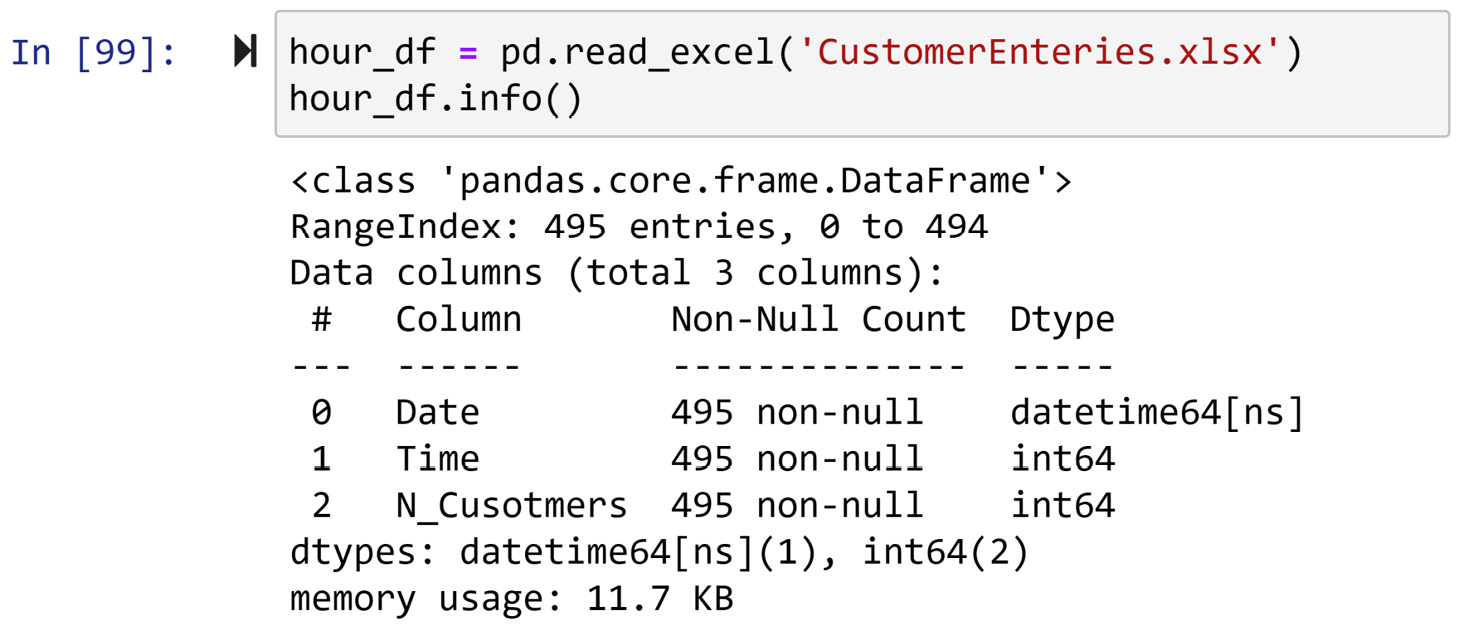
Figure 11.38 – Reading CustomerEntries.xlsx into hour_df and using .info() function to check outliers
We can see in the preceding screenshot that the dataset does not have missing values. Next, we will turn our attention to checking for outliers. As the dataset is essentially a time series, it is best to use a line plot to see whether there are any outliers. The following screenshot shows the output of running hour_df.N_Customers.plot() to create a line plot:
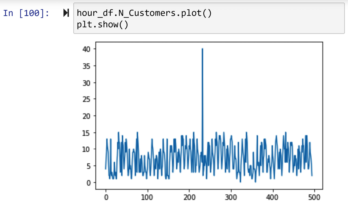
Figure 11.39 – Drawing a line plot of hour_df.N_Customers to check for outliers
In the preceding screenshot, we can see we have a clear case of an outlier between the 200 and 300 indexes. Running hour_df[hour_df.N_Customers>20] will reveal that the outlier happens in index 232, which is timestamped 2020-10-26 at 16.
To check whether this outlier is a case of a systematic error or not, we investigate using our other sources and we realize that nothing out of the ordinary had happened during that day, and this record could simply be a manual data entry error. This shows us that this is a systematic error, and therefore we need to take the following two steps in dealing with systematic errors:
- Step 1: We inform the entity who is in charge of data collection about this mistake and ask them to take appropriate measures to prevent such a mistake from happening in the future.
- Step 2: If we do not have ways to find the correct value using other resources within a reasonable time and effort, we regard the data entry as a missing value and replace it with np.nan. The following code can take care of that:
err_index = hour_df[hour_df.N_Cusotmers>20].index
hour_df.at[err_index,'N_Customers']=np.nan
After successfully running the previous code, you should rerun hour_df.N_Customers.plot() to check the status of day_df regarding outliers. The following screenshot shows the new line plot:
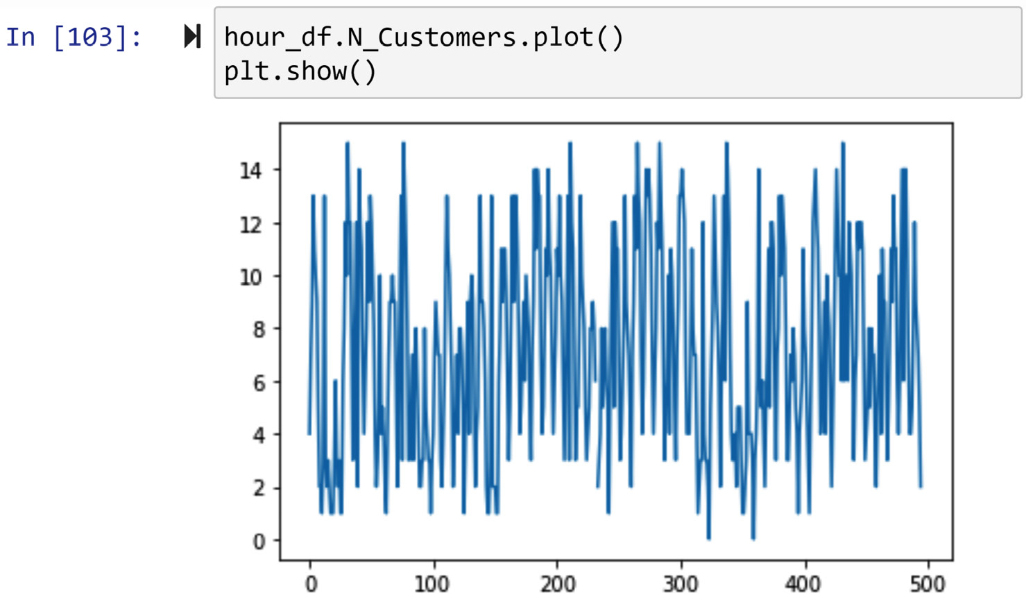
Figure 11.40 – Drawing a line plot of hour_df.N_Customers to check for outliers after dealing with the systematic error
You can see in the preceding screenshot that we do not see a univariate outlier anymore.
Although the time series looks like a univariate dataset, it is not univariate and we can always perform level II data cleaning to unpack new columns such as month, day, weekday, hour, and minute. In this dataset, time and data have already been separated, so we can perform the following bivariate outlier detection.
As you remember, the best way to perform bivariate outlier detection for a pair of numerical-categorical attributes is to use multiple boxplots. The following screenshot shows the output of sns.boxplot(y=hour_df.N_Customers, x=hour_df.Time), which are multiple boxplots we need to see whether there are bivariate outliers for the N_Customers and Time attributes:
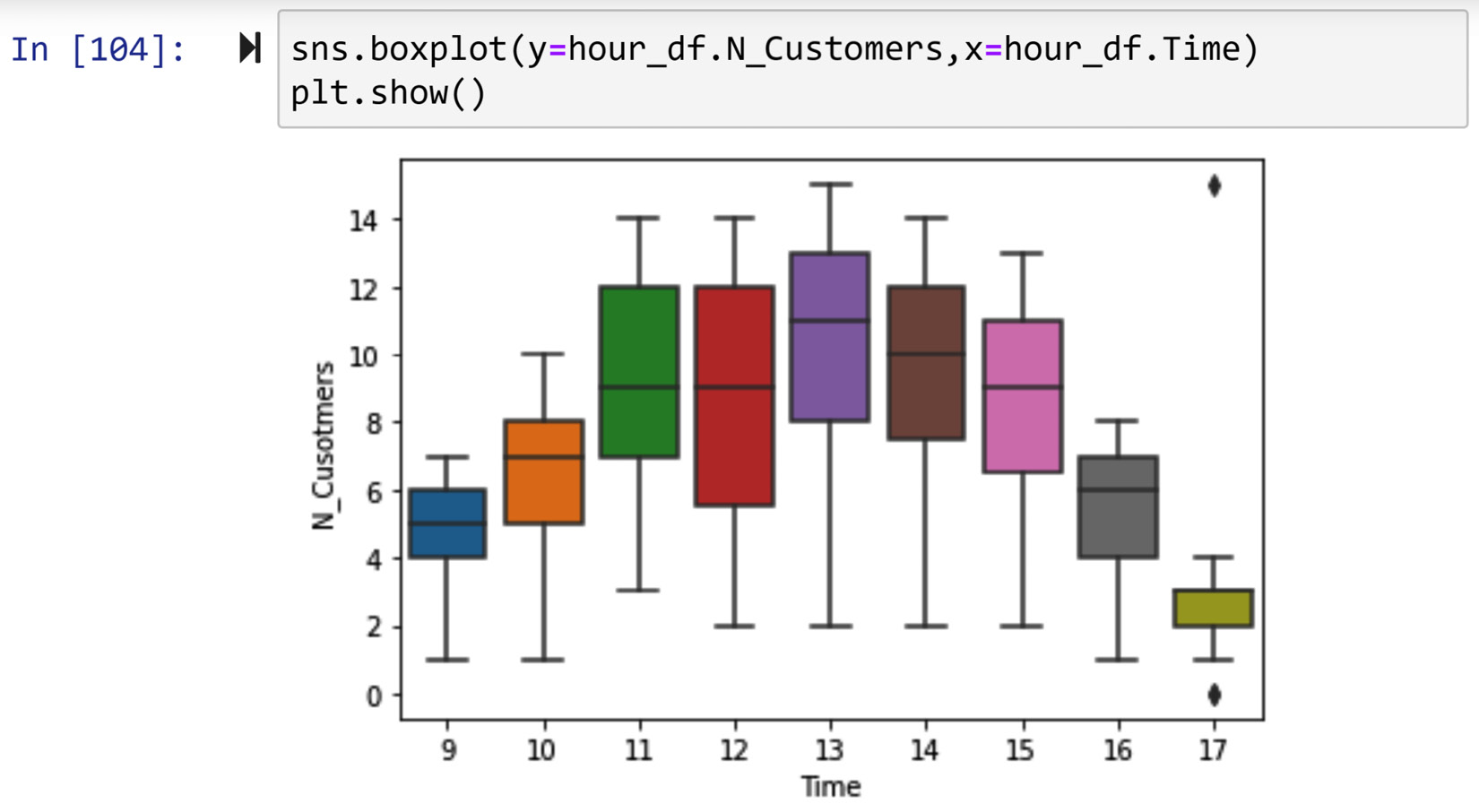
Figure 11.41 – Drawing multiple boxplots for the N_Customers and Time attributes to check for bivariate outliers
Looking at the preceding screenshot, we do see that we have two other outliers that could be systematic errors. The first one is the smallest value of N_Customers, which is zero, under the Time value of 17. The value is consistent with the rest of the data. The Time value of 17 (or 5 P.M.) seems to be getting the least number of customers, and we can imagine occasionally having no customers at that hour.
However, the second flier at the same hour (5 P.M.) seems more troubling. After running hour_df.query("Time==17 and N_Customers>12"), which filters the flier, we can see the outlier has happened on November 17, 2020. After investigation, it turns out that on November 17, 2020 at 4:25, a biking club made a half hour stop for refreshment, which was out of the ordinary for the store. Therefore the data entry was not erroneous and just a correct outlier.
After preprocessing hour_df, it now has a missing value (the systematic error that was replaced with np.nan) and two bivariate outliers. Knowing this, we allow ourselves to enter that last step: the analysis.
Drawing a bar chart that shows and compares the central tendency of N_Customers per working hour of the coffee shop (Time) will be the visualization we need for this analysis. The prescribed bar chart can easily deal with missing values as per the aggregation of the data to calculate the central tendencies. As we have outliers in the dataset, we chose to use median over mean as the central tendency for this analysis. Running the following line of code will create the described bar chart:
hour_df.groupby('Time').N_Customers.median().plot.bar()
As you experienced during this example, the techniques that we use for detecting and dealing with systematic errors are already covered under the subsection on missing values and outliers. In a nutshell, when we don't find any support to believe an outlier is a correct value, we regard this as a systematic error and consequently a missing value.
Summary
Congratulations on your learning in this chapter. This chapter covered data cleaning level III. Together, we learned how to detect and deal with missing values, outliers, and errors. This may sound like too short of a summary for such a long chapter, but as we saw, detection, diagnosis, and dealing with each of the three issues (missing values, outliers, and errors) can have many details and delicacies. Finishing this chapter was a significant achievement, and now you know how to detect, diagnose, and deal with all of these three possible issues you may encounter when working with a dataset.
This chapter concludes our three-chapter-long data cleaning journey. In the next chapter, we move to another important data preprocessing area, and that is data fusion and integration. Before moving on to the next chapter, spend some time working on the following exercises to solidify your learnings.
Exercises
- In this exercise, we will be using Temperature_data.csv. This dataset has some missing values. Do the following:
a) After reading the file into a pandas DataFrame, check whether the dataset is level I clean, and if not, clean it. Also, describe the cleanings (if any).
b) Check whether the dataset is level II clean, and if not, clean it. Also, describe the cleanings (if any).
c) The dataset has missing values. See how many, and run a diagnosis to see which types of missing values they are.
d) Are there any outliers in the dataset?
e) How should we best deal with missing values if our goal is to draw multiple boxplots that show the central tendency and variation of temperature across the months? Draw the described visualization after dealing with the missing values.
- In this exercise, we are going to use the Iris_wMV.csv file. The Iris dataset includes 50 samples of 3 types of iris flowers, totaling 150 rows of data. Each flower is described by its sepal and petal length or width. The PetalLengthCm column has some missing values.
a) Confirm that PetalLengthCm has five missing values.
b) Figure out the types of missing values (MCAR, MAR, MNAR).
c) How would you best deal with missing values if your end goal was to draw the following visualization? Comment on all four different approaches of dealing with missing values in this chapter, citing why the approach would or wouldn't be appropriate:
Figure 11.42 – Exercise 2
d) Draw the preceding screenshot twice, once after adopting a keep as is approach, and once after adopting an imputing with the central tendency of the appropriate iris species approach. Compare the two outputs and comment on their differences.
- In this exercise, we will be using imdb_top_1000.csv. More information about this dataset may be found at this link: https://www.kaggle.com/harshitshankhdhar/imdb-dataset-of-top-1000-movies-and-tv-shows. Perform the following steps for this dataset:
a) Read the file into movie_df, and list the level I data cleaning steps that the dataset needs. Implement the listed items, if any.
b) We want to employ a Decision Tree Classification algorithm using the following columns to predict IMDB_rating values: Certificate, Runtime, Genre, and Gross. For this analytic goal, list the level II data cleanings that need to be done, and then implement them.
c) Does the dataset have issues regarding missing values? If yes, which types are they, and how best should we deal with them given the listed data analytic goals in b)?
d) Use the following function from sklearn.tree to create RegressTree, which will be a prediction model that can predict IMDB_rating values using Certificate, Runtime, Genre, and Gross attributes: DecisionTreeRegressor(max_depth=5, min_impurity_decrease=0, min_samples_split=20, splitter='random'). The tuning parameters have been set for you so that the DecisionTreeRegressor algorithm can perform better. Once the model is trained, draw the trained tree and check whether the Gross attribute is used for the prediction of IMDB_rating values.
e) Run the following code and then explain what summary_df is:
dt_predicted_IMDB_rating = RegressTree.predict(Xs)
mean_predicted_IMDB_rating = np.ones(len(y))*y.mean()
summary_df = pd.DataFrame({'Prediction by Decision Tree': dt_predicted_IMDB_rating, 'Prediction by mean': mean_predicted_IMDB_rating, 'Actual IMDB_rating': y})
f) Run the following code and explain the visualization it creates. What can you learn from the visualization?
summary_df['Decision Tree Error'] = abs(summary_df['Prediction by Decision Tree']- summary_df['Actual IMDB_rating'])
summary_df['Mean Error'] = abs(summary_df['Prediction by mean'] - summary_df['Actual IMDB_rating'])
plt.figure(figsize=(2,10))
table = summary_df[['Decision Tree Error','Mean Error']]
sns.heatmap(table, cmap='Greys')
- In this exercise, we will be using two CSV files: responses.csv and columns.csv. The two files are used to record the data of a survey conducted in Slovakia. To access the data on Kaggle, use this link: https://www.kaggle.com/miroslavsabo/young-people-survey. Perform the following exercises for this data source:
a) Are there respondents in this survey that are suspected to be outliers based on their age? How many? List them in a separate DataFrame.
b) Are there respondents in this survey that are suspected to be outliers based on their level of liking for country and hard rock music? How many? List them in a separate DataFrame.
c) Are there respondents in this survey that are suspected to be outliers based on their body mass index (BMI) or education level? How many? List them in a separate DataFrame. BMI can be calculated using the following formula:

The weight has to be in kg and height in meters (m) for the preceding formula. In the dataset, weight is recorded in kg but height is recorded in cm and has to be transformed to m.
d) Are there respondents in this survey that are suspected to be outliers based on their BMI and age? How many? List them in a separate DataFrame.
e) Are there respondents in this survey that are suspected to be outliers based on their BMI and gender? How many? List them in a separate DataFrame.
- One of the most common approaches for fraud detection is using outlier detection. In this exercise, you will use creditcard.csv from https://www.kaggle.com/mlg-ulb/creditcardfraud to evaluate the effectiveness of outlier detection for credit card fraud detection. Note that most of the columns in this data source are processed values to uphold data anonymity. Perform the following steps:
a) Check the state of the dataset for missing values and address them, if any.
b) Using the Class column, which shows whether a transaction has been fraudulent or not, find out what percentage of the transactions in the dataset are fraudulent.
c) Using data visualization or the appropriate statistical set (and, if necessary, both), specify which univariate outliers have a relationship with the Class column—in other words, if the values of this column are outliers, then we may suspect fraudulent activity. Which statistical test is appropriate here?
d) First, use the K-Means algorithm to group the transactions into 200 clusters by the attributes that were found to have a relationship with the Class column in part c). Then, filter out the members of the clusters with fewer than 50 transactions. Do any of them contain significantly fraudulent transactions?
e) If there are any clusters with significant fraudulent transactions, perform centroid analysis for them.
- In Chapter 5, Data Visualization, and Chapter 8, Clustering Analysis, we used WH Report_preprocessed.csv, which is the preprocessed version of WH Report.csv. Now that you have learned numerous data preprocessing skills, you will be preprocessing the dataset yourself. Proceed as follows:
a) Check the status of the dataset for missing values.
b) Check the status of the dataset for outliers.
c) We would like to cluster the countries based on their happiness indices over the years. Based on these analytic goals, address the missing values.
d) Based on the listed goal in part c), address the outliers.
e) Does the data need any level I or level II data cleaning before clustering is possible? If any, prepare the dataset for K-Means clustering.
f) Perform K-Means clustering to separate the countries into three groups, and do all the possible analytics that we do when clustering.
- Specify whether the following items describe random errors or systematic errors:
a) The data has these types of errors as the thermometer that the lab has purchased can give precise readings to one-thousandth of a degree.
b) The data has these types of errors as the survey records were gathered by five different surveyors who attended five rigorous training sessions.
c) The data has these types of errors because when asking for salary questions in a survey, there were no options such as I would not like to share.
d) The data has these types of errors because the cameras were tampered with so that the robbery would not be recorded.
- Study Figure 11.14 one more time and run the first three exercises by this diagram, noting down the path that led to your decisions regarding the missing values. Did you take steps in dealing with missing values that were not listed in this diagram or this chapter? Would it be better to have a more complex diagram so every possibility would be included, or not? Why or why not?
- Explain why the following statement is incorrect: a row may have a significant number of MCAR missing values.