
Chapter 15: Case Study 1 – Mental Health in Tech
In this chapter and the two upcoming ones, we are going to put the skills that we have picked up in the course of this book into practice. For this case study, we are going to use data collected by Open Sourcing Mental Illness (OSMI) (https://osmihelp.org/), which is a non-profit corporation dedicated to raising awareness, educating, and providing resources to support mental wellness in the tech and open source communities. OSMI conducts yearly surveys that "aim to measure attitudes towards mental health in the tech workplace and examine the frequency of mental health disorders among tech workers." These surveys are accessible to the public for participation and can be found at https://osmihelp.org/research.
In this chapter, we're going to learn about mental health in tech case study by covering the following:
- Introducing the case study
- Integrating the data sources
- Cleaning the data
- Analyzing the data
Technical requirements
You will be able to find all of the code and the dataset that is used in this book in a GitHub repository exclusively created for this book. To find the repository, click on this link: https://github.com/PacktPublishing/Hands-On-Data-Preprocessing-in-Python. You can find this chapter's materials in this repository and can download the code and the data for better learning.
Introducing the case study
Mental health disorders such as anxiety and depression are inherently detrimental to people's well-being, lifestyles, and ability to be productive in their work. According to Mental Health America, over 44 million adults in the US have a mental health condition. The mental health of employees in the tech industry is of great concern due to the competitive environments often found within and among these companies. Some employees at these companies are forced to work overtime simply to keep their jobs. Managers of these types of companies have good reason to desire improved mental health for their employees because healthy minds are productive ones and distracted minds are not.
Managers and leaders of tech and non-tech companies must make difficult decisions regarding whether or not to invest in the mental health of their employees and, if so, to what degree. There is plenty of evidence that poor mental health can have a negative impact on workers' well-being and productivity. Every company has a finite amount of funds that it can invest in the physical health of its employees, let alone mental health. Knowing where to allocate resources is of great importance.
This serves as a general introduction to this case study. Next, we will discuss a very important aspect of any data analysis – who is the audience of our results?
The audience of the results of analytics
Always, the main audience of the results of any analytics is decision-makers; however, it is important to be clear about who exactly are those decision-makers. In real projects, this should be obvious, but here in this chapter of the book, as our goal is to practice, we need to imagine a specific decision-maker and tailor our analysis for them.
The decision-makers that we will focus on are the managers and the leaders of tech companies who are in charge of making decisions that can impact the mental health of their employees. While mental health should be looked at as a priority, in reality, managers have to navigate a decision-making environment that has many competing priorities, such as organizational financial health, survival, profit maximization, sales, and customer service, as well as economic growth.
For instance, the following simple visualization created by OSMI (available at https://osmi.typeform.com/report/A7mlxC/itVHRYbNRnPqDI9C) tells us that while mental health support in tech companies is not terrible, there remains a large gap for improvement:

Figure 15.1 – A simple visualization from the 2020 OSMI mental health in tech survey
Our goal in this case study is to dig a bit deeper than the basic report provided by OSMI and see the interactions between more attributes, which can be informative and beneficial to the described decision-makers.
Specifically, for this case study, we will try to answer the following Analytic Questions (AQs) that can inform the described decision-makers about the attitude and importance of mental health in their employees:
- AQ1: Is there a significant difference between the mental health of employees across the attribute of gender?
- AQ2: Is there a significant difference between the mental health of employees across the attribute of age?
- AQ3: Do more supportive companies have healthier employees mentally?
- AQ4: Does the attitude of individuals toward mental health influence their mental health and their seeking of treatments?
Now that we are clear about how we are analyzing this data and what AQs we want to answer, let's roll up our sleeves and start getting to know the source of the data.
Introduction to the source of the data
OSMI started conducting the mental health in tech survey in 2014, and even though the rate of participation in their surveys has dwindled over the years, they have continued collecting data until now. At the time of developing this chapter, the raw data for 2014 and 2016 to 2020 is accessible at https://osmihelp.org/research.
Get to Know the Sources of Data
Go ahead and download the raw data from 2014 to the most recent version, and use the tools you've picked up in your journey in this book to get to know these files. Continue reading once you have a good grasp of these datasets.
At the time of developing this chapter, only six raw datasets from 2014, 2016, 2017, 2018, 2019, and 2020 were collected and available. Only the five datasets from 2016 to 2020 are used in this chapter, so there is continuity in the data.
As we move along in this chapter, feel free to add the most recent versions, if they are available at the listed address, and update the code accordingly.
Now, let's get started. We will have to start with data integration and then data cleaning.
Attention!
You are going to experience a shift in the way code is represented in this chapter. From Chapter 1 to Chapter 14, almost all of the code that was used for analytics and preprocessing was shared both during the chapter and also in a dedicated file in the GitHub repository. However, in this chapter, and in the following two chapters, Chapters 16, Case Study 2 – Predicting COVID Hospitalization, and Chapter 17, Case Study 3 – United States Counties Clustering Analysis, the code will be presented mainly in the dedicated file for this chapter in the GitHub repository. So, while studying this chapter, make sure you also have the code in the GitHub repository handy so that you can go back and forth and learn.
Integrating the data sources
As discussed, five different datasets need to be integrated. After having seen these five datasets that collected data of OSMI mental health in tech surveys across five different years, you will realize that the survey throughout the years has undergone many changes. Also, while the collected datasets are about mental health in tech, the wordings of the questions and sometimes the nature of these questions have changed. Therefore, the figurative funnel in the following figure serves two purposes. First, it lets the parts of the data from each dataset come through that are common among all six datasets. Second, the funnel also filters out the data that is not relevant to our AQs:
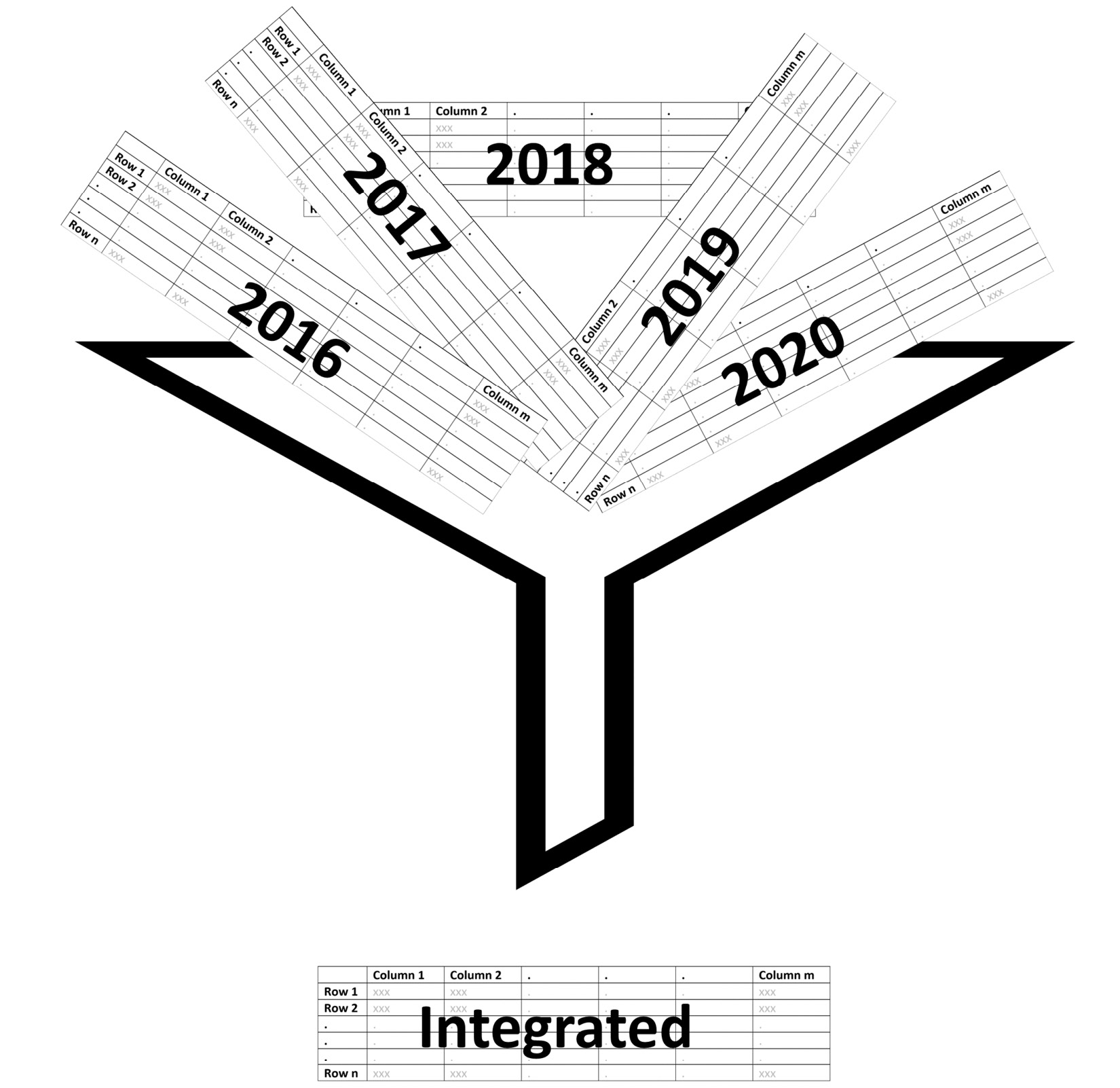
Figure 15.2 – The schematic of the integration of five datasets into one
While the preceding figure makes the integration of these five datasets seem simple, there are meaningful challenges ahead of us. The very first one is knowing what the common attributes are among all these five datasets if there is no consistent wording among them. Do we need to do it manually? While that is certainly one way of doing it, it would be a very long process. We can use SequenceMatcher from the difflib module to find the attributes that are similar to one another.
After doing the filtering based on what is common among all five datasets, we still need to only keep the attributes that are relevant to our AQs. The following list is the collection of the attributes that are both common among all five datasets and are relevant to our AQs. To make cleaner-looking data, each long attribute name that is a question on the survey has been assigned a name. These names are used to create an attribute dictionary, Column_dict, so the attribute names are codable and intuitive, and the complete questions are also accessible:
- SupportQ1: Does your employer provide mental health benefits as part of healthcare coverage?
- SupportQ2: Has your employer ever formally discussed mental health (for example, as part of a wellness campaign or other official communication)?
- SupportQ3: Does your employer offer resources to learn more about mental health disorders and options for seeking help?
- SupportQ4: Is your anonymity protected if you choose to take advantage of mental health or substance abuse treatment resources provided by your employer?
- SupportQ5: If a mental health issue prompted you to request medical leave from work, how easy or difficult would it be to ask for that leave?
- AttitudeQ1: Would you feel comfortable discussing a mental health issue with your direct supervisor(s)?
- AttitudeQ2: Would you feel comfortable discussing a mental health issue with your coworkers?
- AttitudeQ3: How willing would you be to share with friends and family that you have a mental illness?
- SupportEx1: If you have revealed a mental health disorder to a client or business contact, how has this affected you or the relationship?
- SupportEx2: If you have revealed a mental health disorder to a coworker or employee, how has this impacted you or the relationship?
- Age: What is your age?
- Gender: What is your gender?
- ResidingCountry: What country do you live in?
- WorkingCountry: What country do you work in?
- Mental Illness: Have you ever been diagnosed with a mental health disorder?
- Treatment: Have you ever sought treatment for a mental health disorder from a mental health professional?
- Year: The year that the data was collected.
After removing the other attributes, renaming the long attribute names with their key in the dictionary, the five datasets can be easily joined using the pd.concat() pandas function. I have named the integrated DataFrame in_df.
Cleaning the data
While going about data integration, we took care of some level I data cleaning as well, such as the data being in one standard data structure and the attributes having codable and intuitive titles. However, because in_df is integrated from five different sources, the chances are that different data recording practices may have been used, which may lead to inconsistency across in_df.
For instance, the following figure shows how varied data collection for the Gender attribute has been:

Figure 15.3 – The state of the Gender attribute before cleaning
We need to go over every attribute and make sure that there is no repetition of the same possibilities in a slightly different wording due to varying data collection or misspellings.
Detecting and dealing with outliers and errors
As our AQs are only going to rely on data visualization for answers, we don't need to detect outliers, as our addressing them would be adopting the "do nothing" strategy. However, as we use outlier detection to also find possible systematic errors in the data, we can visualize all of the attributes in the data and spot inconsistencies, and then fix them.
The following figure shows the box plot and histogram of the Age attribute, and we can see there are some mistaken data entries. The two unreasonably high values and the one unreasonably low value were changed to NaN:
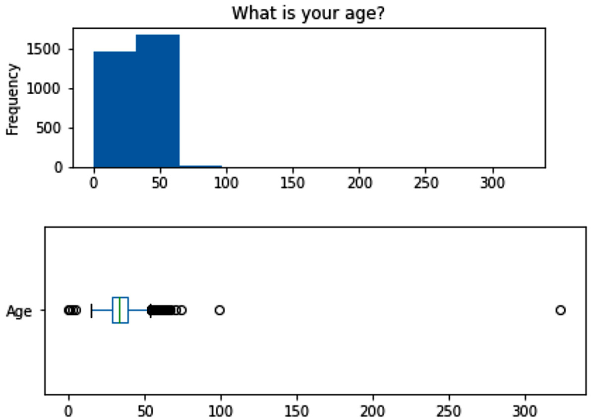
Figure 15.4 – The box plot and histogram of the Age attribute before cleaning
After the prescribed transformation, the box plot changed to more healthy-looking data distribution, as shown in the following figure. There are still some fliers in the data, but, after further investigation of these entries, it was concluded these values are correct, and the individuals who responded to the survey just happened to be older than the rest of the respondent population:
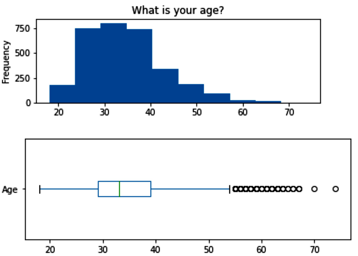
Figure 15.5 – The box plot and histogram of the Age attribute after cleaning
The visualization of another two attributes showed that they need our attention – ResidingCountry and WorkingCountry. The following figure shows the bar chart of the WorkingCountry attribute. The visuals of the two attributes are very similar, which is why we have shown only one of them:
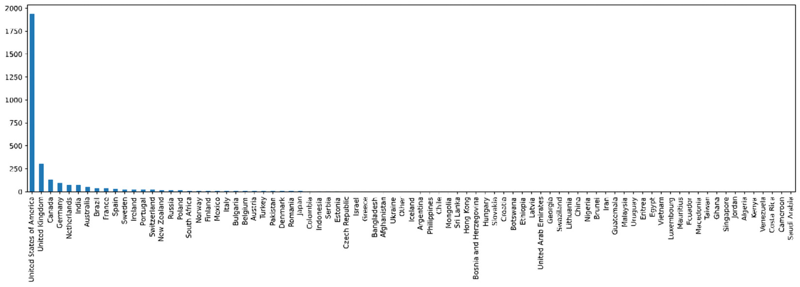
Figure 15.6 – The box plot and histogram of the WorkingCountry attribute before transformation
Considering the bar charts of these two attributes, we do know that the issue with this data is not mistaken data entries; however, the fact that there are just more data entries from the US than the other countries is not because the US only has tech companies, but, at a guess, because the survey participation was more encouraged in the US. To deal with this situation, the best way is to focus our analysis on the US respondents instead of the whole data. Therefore, we remove all the rows, except for the ones that have United States of America under both WorkingCountry and ResidingCountry.
After implementing this data transformation, the values under WorkingCountry and ResidingCountry will only have one possible value; therefore, they are not adding any information to the population of the transformed dataset. The best way to move forward would be to remove these two attributes.
Next, let's deal with the missing values in the dataset.
Detecting and dealing with missing values
After investigation, we realize that except for AttitudeQ3, Age, Gender, Mental Illness, Treatment, and Year, the rest of the attributes do have missing values. The first thing we check is to make sure the missing values are all from the same data objects. The following figure was created so that we can see the assortment of missing values across the population of the dataset:
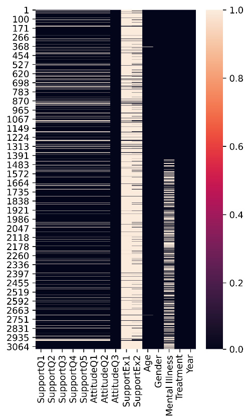
Figure 15.7 – Assortment of missing values across the population of the dataset
Considering the preceding figure, the answer to our wondering is yes, some data objects have missing values on more than one attribute. The missing values for the attributes from SupportQ1 to AttitudeQ3 are from the same data objects. However, the preceding figure brings our attention to the fact that the missing values under SupportEx1 and SupportEx2 are much more troublesome, as the majority of the data objects have missing values under these two attributes. The best way of moving forward in these situations is to forego having these attributes. So these two attributes have been removed from the analysis.
Now, let's bring our attention back to the common missing values among the data objects for the attributes from SupportQ1 to AttitudeQ3.
The common missing values in attributes from SupportQ1 to AttitudeQ3
We need to diagnose these missing values to figure out what type they are before we can deal with them. After running the diagnosis, we can see these missing values have a relationship with the Age attribute. Specifically, the older population in the dataset has left these questions unanswered. Therefore, we can conclude that these missing values are of the Missing At Random (MAR) type. We will not deal with these missing values here because our decision regarding them depends on the analysis. However, we'll keep in mind that these missing values are of the MAR type.
Next, let's diagnose the missing values on the other attributes – next stop: the Mental Illness attribute.
The missing values in the MentalIllness attribute
The Mental Illness attribute has 536 missing values. The missing value ratio is significant at 28%. To investigate why these missing values happen, we compare the pattern of the occurrence of these missing values with the distribution of the whole data. In other words, we diagnose these missing values, and after the diagnosis, it will become apparent that missing values under this attribute are closely connected with the Age, Treatment, and Year attributes. It is apparent that these missing values are also of the MAR type, and we will not deal with them before the analysis.
Lastly, we need to address the three missing values in the Age attribute.
The missing values in the Age attribute
The Age attribute has three missing values. These are missing values that were imputed from the extreme point analysis. We decided these attributes were mistake data entries. As we know where they come from and that there are only three of them, we can assume that they are of the Missing Completely At Random (MCAR) type.
Now that the dataset is clean and integrated, let's move our attention to the analysis part.
Analyzing the data
As we have seen in our journey in this book, data preprocessing is not an island and the best data preprocessing is done by being informed about the analytics goals. So we will continue preprocessing the data as we go about answering the four questions in this case study. Let's progress in this subsection one AQ at a time.
Analysis question one – is there a significant difference between the mental health of employees across the attribute of gender?
To answer this question, we need to visualize the interaction between three attributes: Gender, Mental Illness, and Treatment. We are aware that the Mental Illness attribute has 536 missing MAR values and those missing values have a relationship with the Treatment attribute. However, as the goal of the analysis is to see the mental health across Gender, we can avoid interacting with Treatment and Mental Illness and bring the focus of our analysis to the interaction of the Gender attribute with both of these two attributes. With this strategy, we can adopt the do-nothing approach for the missing values in Mental Illness.
Using the skills that we have picked up in the course of our learning in this book, we can come up with the following two bar charts that meaningfully show the interactions in the data that can help us answer this AQ:
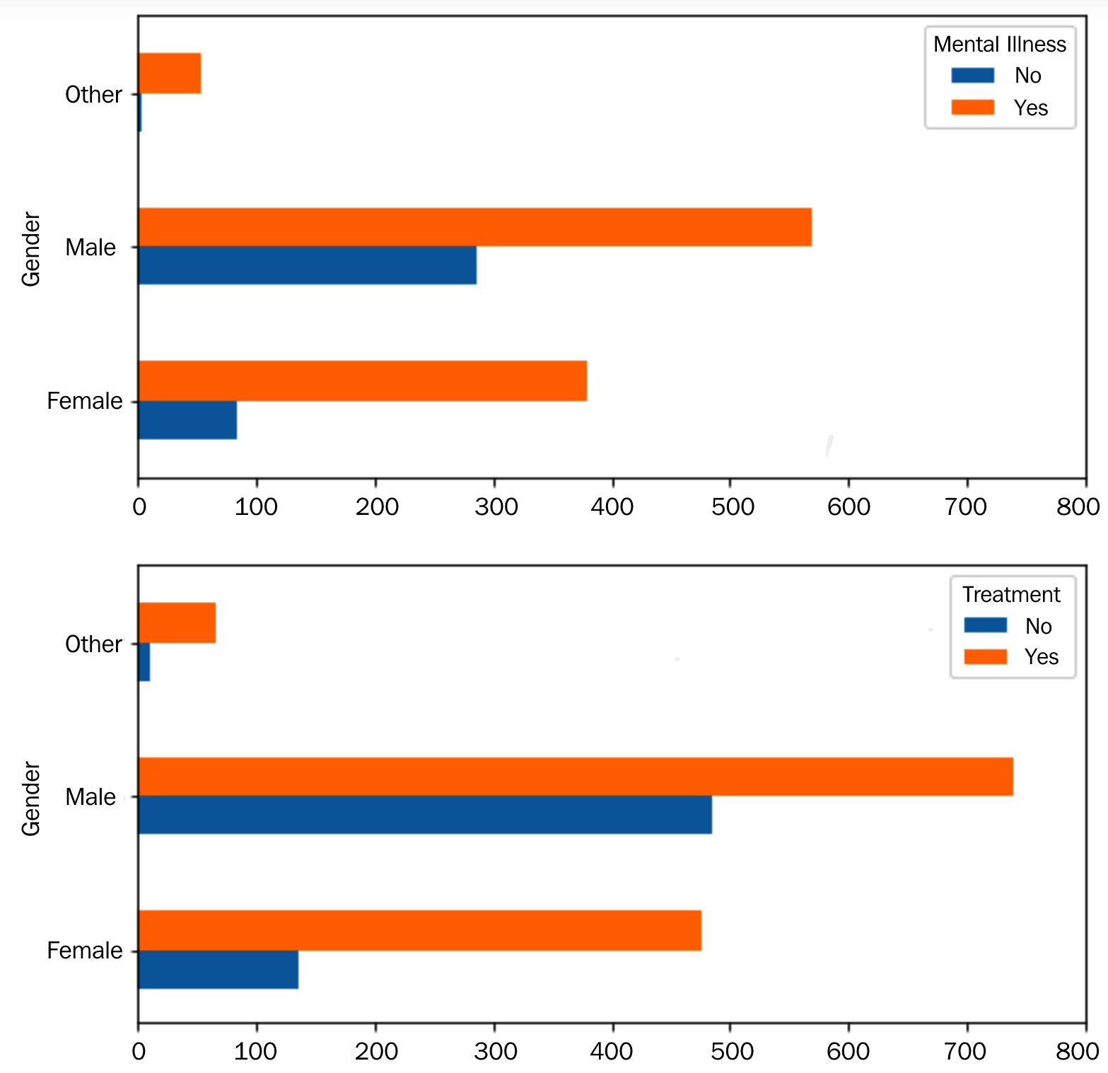
Figure 15.8 – Bar charts for AQ1
The preceding figure shows that the Gender attribute does have a meaningful impact on the mental health of tech employees. So the answer to this question is yes. However, while the ratio of not having a mental illness compared to having a mental illness is higher for Male than Female, there is also a much higher "never having sought professional mental health help" ratio among Male. These observations suggest that there is a population of male employees in tech that are not aware of their mental health and have never sought professional help. Based on these observations, it should be recommended to target male employees for mental health awareness.
Another important observation from the preceding figure is that there seem to be many more mental health concerns for the individuals who have not chosen Male or Female for their gender. However, the preceding figure does not show what the difference is because this segment of the population has much smaller data objects than Male and Female. Therefore, to tease out the portion of these individuals with mental health concerns and compare them with the other two subpopulations, the following two heat maps were created:
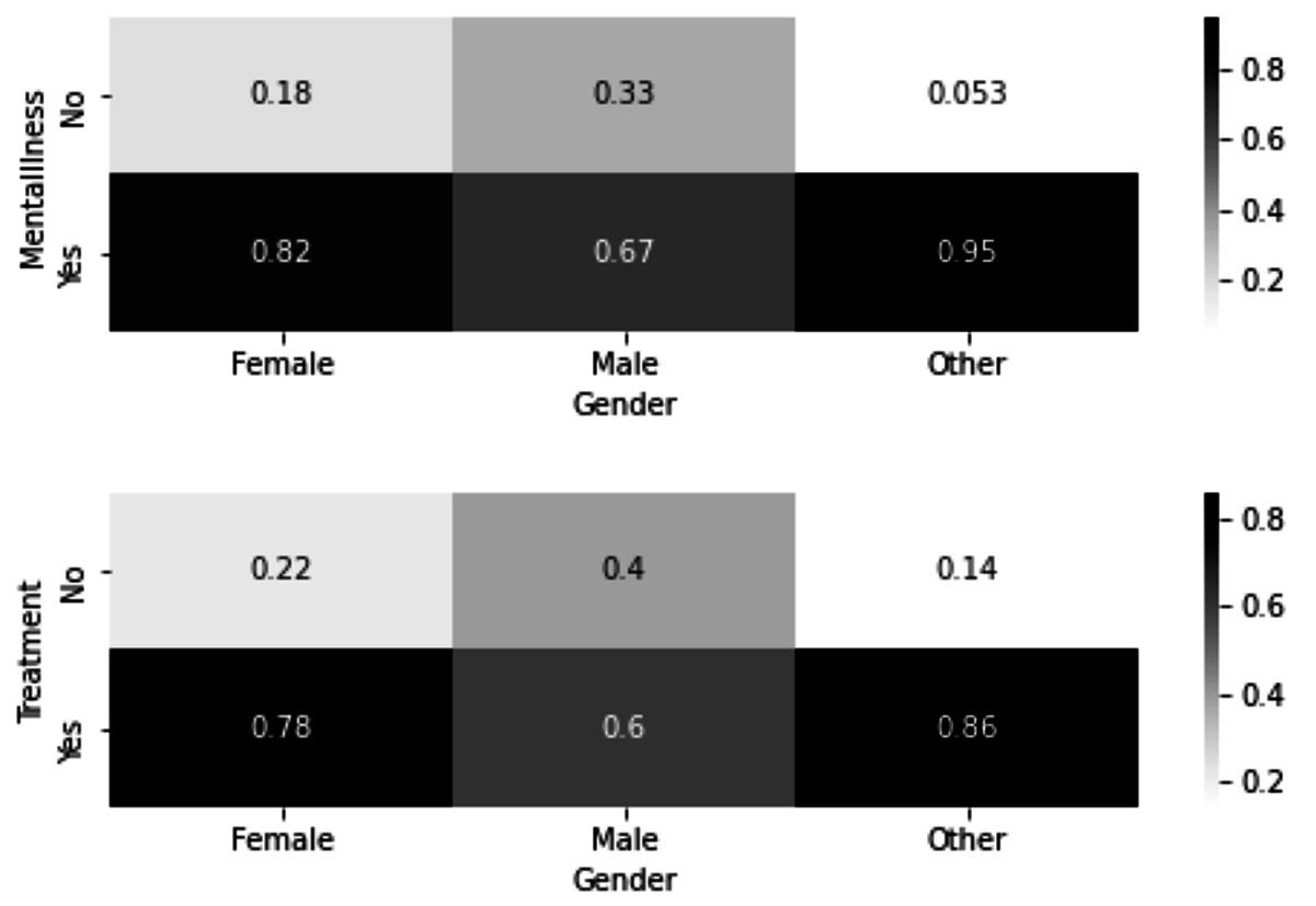
Figure 15.9 – Heat maps for AQ1
In the preceding figure, we can see that indeed the subpopulation that did not identify as Male or Female has a much larger percentage of people with mental illnesses than the other two populations. However, we can that see this population, similar to the population of Female, has a higher percentage of having sought treatment.
Now, let's discuss AQ2.
Analysis question two – is there a significant difference between the mental health of employees across the Age attribute?
To answer this question, we need to visualize the interaction between three attributes: Age, Mental Illness, and Treatment. We are aware that the Mental Illness attribute has 536 missing MAR values and those missing values have a relationship with the Treatment and Age attributes. Moreover, we are aware that Age has three missing MCAR values.
Dealing with the missing MCAR values is simple, as we know these missing values are completely random. However, we cannot adopt the approach of leaving them as they are because to be able to visualize these relationships, we need to transform the Age attribute from categorical to numerical. Therefore, for this analysis, we have removed the data objects with missing values under the Age attribute.
We cannot take the same approach we took in AQ1 to deal with the missing MAR values of Mental Illness because this attribute has a relationship with both the Age and Treatment attributes. Therefore here we have added a third category to Mental Illness – MV-MAR. The following figure shows the bar charts that visualize the relationships that we are interested in investigating:

Figure 15.10 – Bar chart for AQ2
Studying the preceding figure, we can see that there seem to be some patterns in the data; however, they are not as pronounced as they were under AQ1, so before discussing these patterns, let's see whether these patterns are significant statistically. We can use the chi-square test of association for this purpose. As seen in Chapter 11, Data Cleaning Level III – Missing Values, Outliers, and Errors, the scipy.stats module has this test packaged in the chi2_contingency function.
After calculating the p-values of the test for both bar charts in the preceding figure, we come to 0.0022 and 0.5497 respectively. This tells us that there are no significant patterns in the second bar chart, but the patterns in the first bar chart are significant. Using this information, we can conclude that while age does have an impact on mental health concerns, it does not impact the behavior of individuals in seeking treatment.
Moreover, the significant pattern in the first bar chart tells us that as the Age attribute increases, the answer no to the question "Have you ever been diagnosed with a mental health disorder?" also increases. Surprisingly, the answer yes to the same question also increases. It is surprising because we would expect these two to counteract with one another. The reason for this surprising observation is also shown in this bar chart; as the age increases, the number of individuals who have not answered the question has also increased. This could be because older individuals do not have as much trust in the confidentiality of the data collection.
The conclusion that is drawn from this observation is that older tech employees may need to build more trust for them to open up about their mental health concerns than younger employees.
Next, we will discuss AQ3.
Analysis question three – do more supportive companies have mentally healthier employees?
To answer this question, we first need to perform some data transformation, specifically attribute construction. We have constructed thePerceivedSupportScore attribute, which is a column that indicates how supportive the participant's employer is of mental health. The SupportQ1, SupportQ2, SupportQ3, SupportQ4, and SupportQ5 attributes were used to calculate SupportScore. The +1 or +0.5 values were added to PerceivedSupportScore where the answers to these attributes indicated support, whereas the -1 or -0.5 values were subtracted from PerceivedSupportScore where the answers to these attributes indicated a lack of support. For instance, for SupportQ5, the +1, +0.5, -0.5, -0.75, and -1 values were added/subtracted respectively for Very easy, Somewhat easy, Somewhat difficult, Somewhat difficult, and Very difficult. The question that SupportQ5 asked was "If a mental health issue prompted you to request medical leave from work, how easy or difficult would it be to ask for that leave?"
The following figure shows the histogram of the newly constructed column:
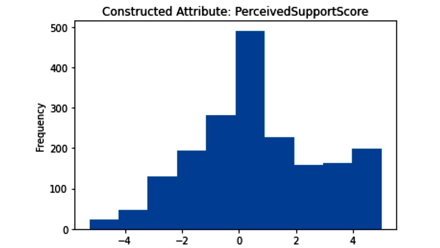
Figure 15.11 – Histogram of the newly constructed attribute for AQ3
We certainly do not forget that all of the ingredients of the newly constructed SupportQ1 and SupportQ2 attributes have 228 missing MAR values. These missing MAR values showed a relationship with the Age attribute. As for answering AQ3, we need to visualize the relationship between the newly constructed attribute and the Mental Illness and Treatment attributes; we can adapt the approach of "leaving as is" for these missing values. The reason is that neither the Mental Illness attribute nor the Treatment attribute influenced the missing values on the ingredient attributes.
Before doing the visualization, as the newly constructed attribute is numerical and both Mental Illness and Treatment are categorical, we need to first discretize the attribute. Scores higher than 1 were labeled as Supportive and scores lower than -0.5 were labeled as Unsupportive. The results are presented in the following bar chart:
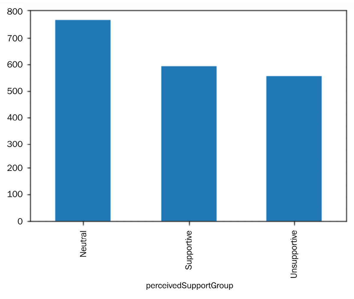
Figure 15.12 – Bar chart of the newly constructed attribute after discretization for AQ3
The following figure shows the interaction between the three Mental Illness, Treatment, and pereceivedSupportGroup attributes. As a visualization with three dimensions is going to be somewhat overwhelming, we can make a strategic decision to only include the two extreme categories, Supportive and Unsupportive, and leave out Neutral:
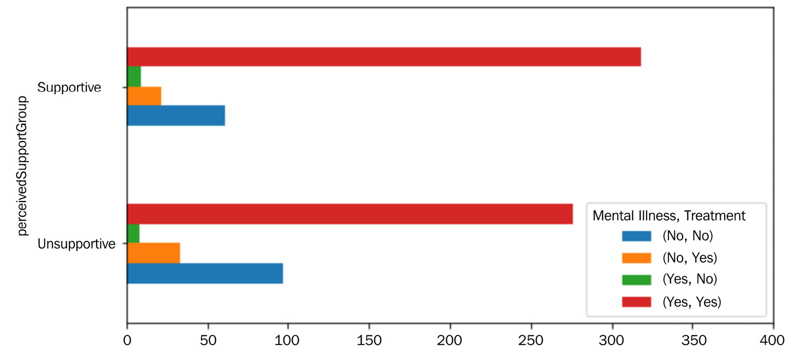
Figure 15.13 – Bar chart for AQ3
Studying the patterns shown in the preceding figure, we realize that perceivedSupportScore influences the employee's behavior in seeking professional help for mental health concerns. The number of respondents that have answered Yes to both "Have you ever been diagnosed with a mental health disorder?" and "Have you ever sought treatment for a mental health disorder from a mental health professional?" questions is significantly higher in the Supportive category. Likewise, the number of respondents that have answered No to both questions is significantly lower in the Supportive category.
Based on these observations, we can recommend investing in creating trust and employees' perception of support in tech companies.
Next, we will address the last AQ.
Analysis question four – does the attitude of individuals toward mental health influence their mental health and their seeking of treatments?
Similar to AQ3, to answer this question, we first need to construct a new attribute; AttitudeScore will be a column that indicates the participant's attitude toward sharing mental health issues. The AttitudeQ1, AttitudeQ2, and AttitudeQ3 attributes are used to construct AttitudeScore. The +1 or +0.5 values were added to AttitudeScore where the answers to these attributes indicated openness, whereas the -1 or -0.5 values were subtracted from AttitudeScore where the answers to these attributes indicated a lack of openness. For instance, for AttitudeQ3, the +1, +0.5, -0.5, and -1 values were added/subtracted respectively for Very open, Somewhat open, Somewhat not open, and Not open at all; the question that AttitudeQ3 asked was "Would you feel comfortable discussing a mental health issue with your coworkers?"
The following figure shows the histogram of the newly constructed attribute:
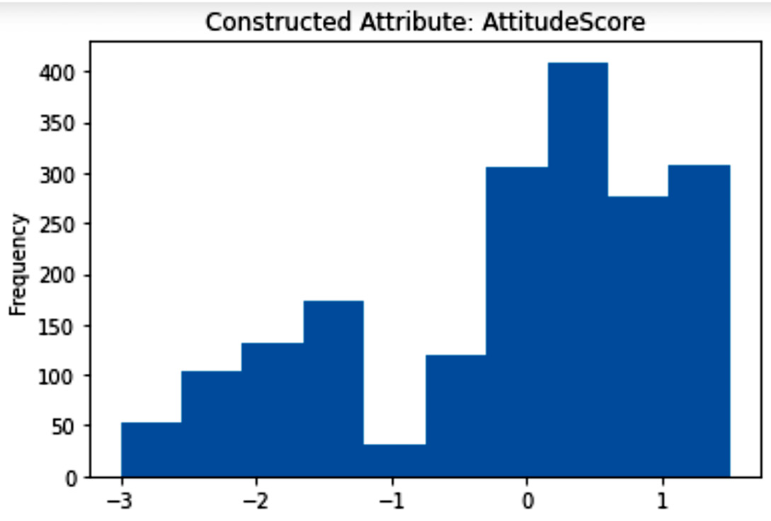
Figure 15.14 – Histogram of the newly constructed attribute for AQ4
Similar to perceivedSupportScore in AQ3, before doing the visualization, as the newly constructed attribute is numerical and both Mental Illness and Treatment are categorical, we need to first discretize the attribute. Scores higher than 0.5 were labeled as OpenAttitude, scores lower than -0.5 were labeled as ClosedAttitude, and scores between -0.5 and 0.5 were labeled as Neutral. The results are presented in the following bar chart:
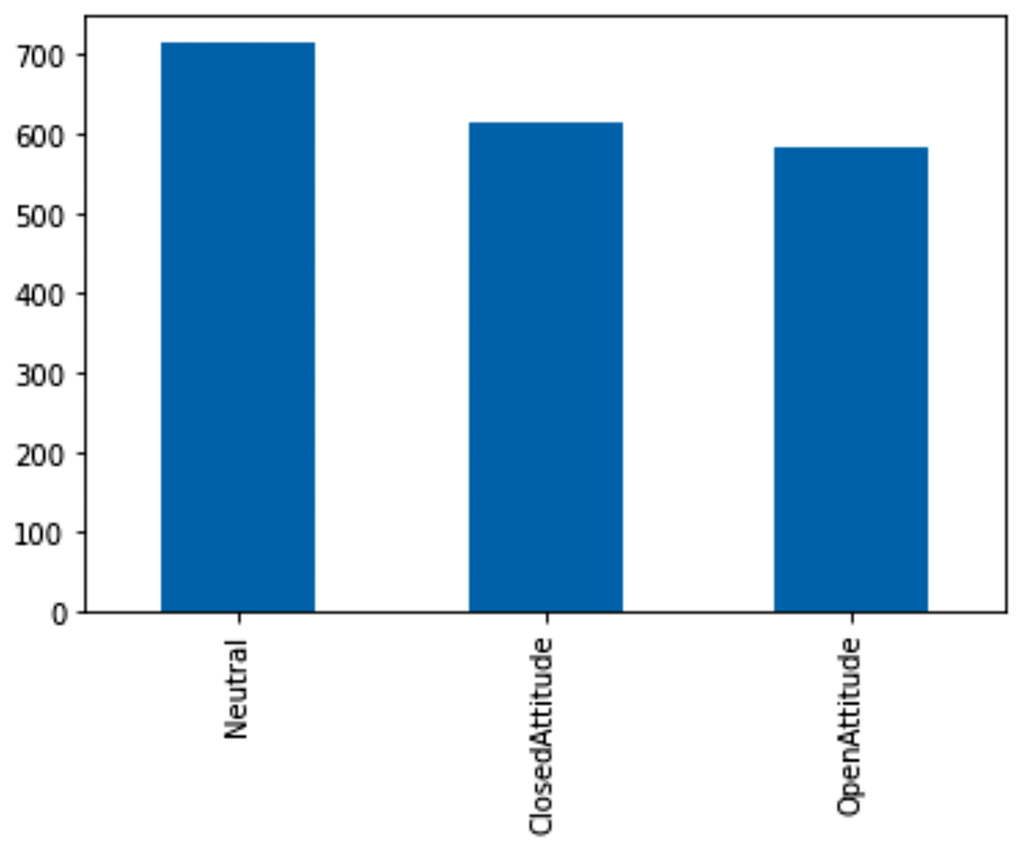
Figure 15.15 – Bar chart of the newly constructed attributes after discretization for AQ4
The following stacked bar chart is created to show the interaction between the three MentalIllness, Treatment, and attitudeGroup attributes. We use a similar strategy to the one used in Figure 15.13 to avoid overwhelming our sensory faculty:
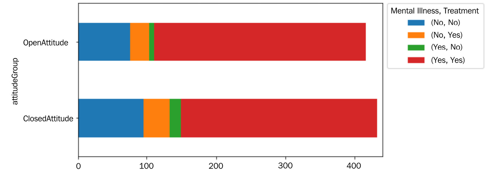
Figure 15.16 – Stacked bar chart for AQ4
The preceding visualization provides an answer for AQ4. There seems to be a meaningful improvement in employees seeking treatment if they have an open attitude toward sharing mental health issues. These observations suggest that tech companies should see the education of employees in their attitude toward mental health as a sensible investment option.
Summary
In this chapter, we got to practice what we have learned during our journey in this book. We did some challenging data integration and data cleaning to prepare a dataset for analysis. Furthermore, based on our analytics goals, we performed specific data transformations so that the visualization that answers our AQs becomes possible and, at times, more effective.
In the next chapter, we will practice data preprocessing on another case study. In this case study, the general goal of the analysis was data visualization; however, the preprocessing in the next case study will be done to enable predictive modeling.