Chapter 8: Clustering Analysis
Finally, you have made your way to the last chapter of the second part of this book. Clustering analysis is another useful and popular algorithmic pattern recognition tool. When performing classification or prediction, the algorithms find the patterns that help create a relationship between the independent attributes and the dependent attribute. However, clustering does not have a dependent attribute, so it does not have an agenda in pattern recognition. Clustering is an algorithmic pattern recognition tool with no prior goals. With clustering, you can investigate and extract the inherent patterns that exist in a dataset. Due to these differences, classification and prediction are called supervised learning, while clustering is known as unsupervised learning.
In this chapter, we will use examples to fundamentally understand clustering analysis. Then, we will learn about the most popular clustering algorithm: K-Means. We will also perform some K-Means clustering analysis and examine the clustering output using centroid analysis.
In this chapter, we will cover the following topics:
- Clustering model
- K-Means algorithm
Technical requirements
You can find all the code and the dataset for this book in this book's GitHub repository. To find the repository, go to https://github.com/PacktPublishing/Hands-On-Data-Preprocessing-in-Python. You can find Chapter08 in this repository and download the code and the data for ease of learning.
Clustering model
Since you've already learned how to perform prediction and classification tasks in data analytics, in this chapter, you will learn about clustering analysis. In clustering, we strive to meaningfully group the data objects in a dataset. We will learn about clustering analysis through an example.
Clustering example using a two-dimensional dataset
In this example, we will use WH Report_preprocessed.csv to cluster the countries based on two scores called Life_Ladder and Perceptions_of_corruption in 2019.
The following code reads the data into report_df and uses Boolean masking to preprocess the dataset into report2019_df, which only includes the data of 2019:
report_df = pd.read_csv('WH Report_preprocessed.csv')
BM = report_df.year == 2019
report2019_df = report_df[BM]
The result of the preceding code is that we have a DataFrame, reprot1019_df, that only includes the data of 2019, as requested by the prompt.
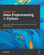
Since we only have two dimensions to perform the clustering, we can take advantage of a scatterplot to visualize all the countries in relation to one another based on the two attributes in question: Life_Ladder and Perceptions_of_corruption.
The following code creates the scatterplot in two steps:
- Create the scatterplot as we learned about in Chapter 5, Data Visualization.
- Loop over all the data objects in report2019_df and annotate each point in the scatterplot using plt.annotate():
plt.figure(figsize=(12,12))
plt.scatter(report2019_df.Life_Ladder, report2019_df.Perceptions_of_corruption)
for _, row in report2019_df.iterrows():
plt.annotate(row.Name, (row.Life_Ladder, row.Perceptions_of_corruption))
plt.xlabel('Life_Ladder')
plt.ylabel('Perceptions_of_corruption')
plt.show()
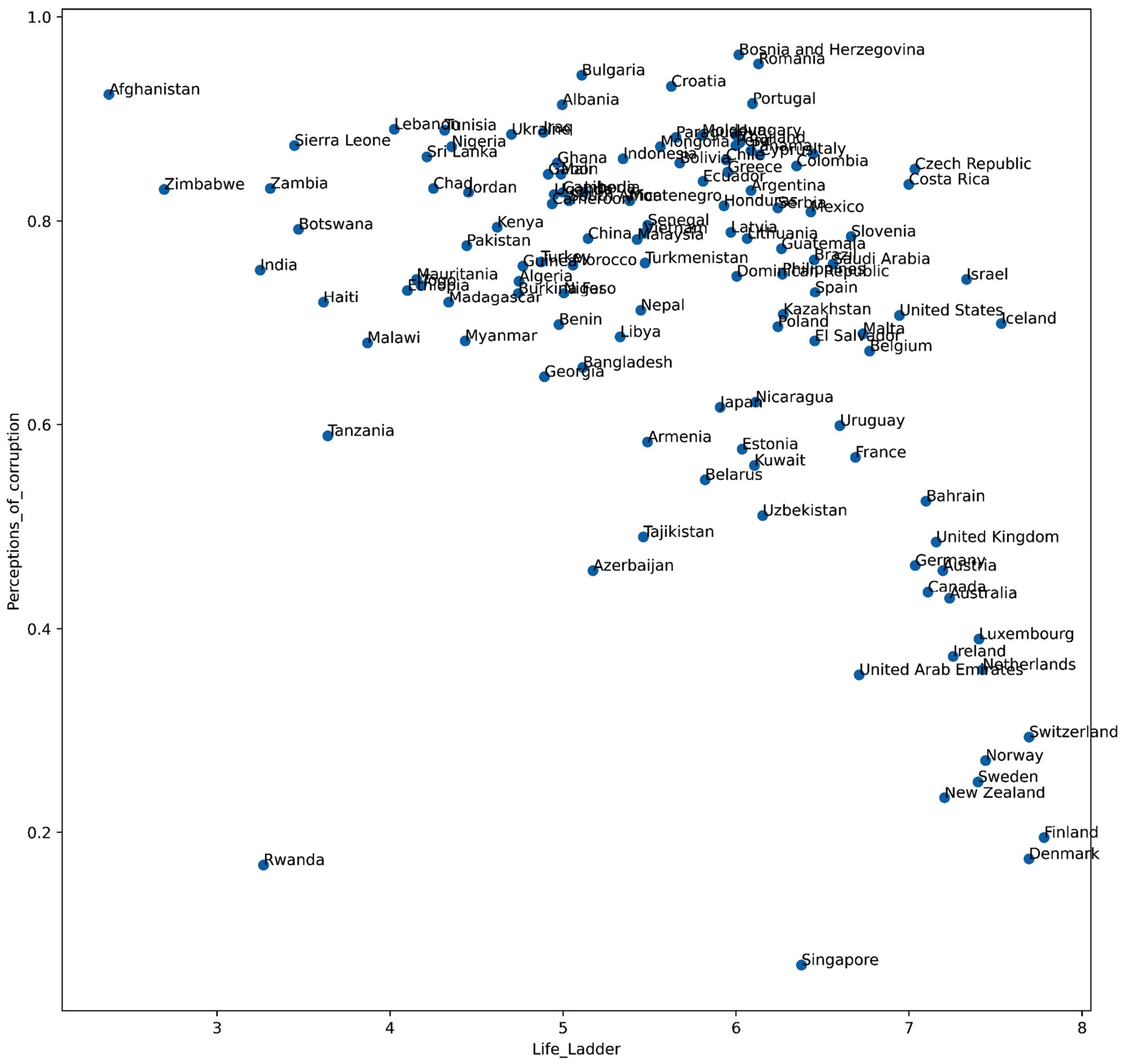
Figure 8.1 – Scatterplot of countries based on two happiness indices called Life_Ladder and Perception_of_corruption in 2019
As the data only has two dimensions, we can just look at the preceding figure and see the groups of countries that have more similarities to one another based on Life_Ladder and Perceptions_of_corruption. For instance, the following figure depicts the groups of countries based on the preceding scatterplot. The countries that are within the boundaries of more than one cluster should be assigned to one of the clusters.
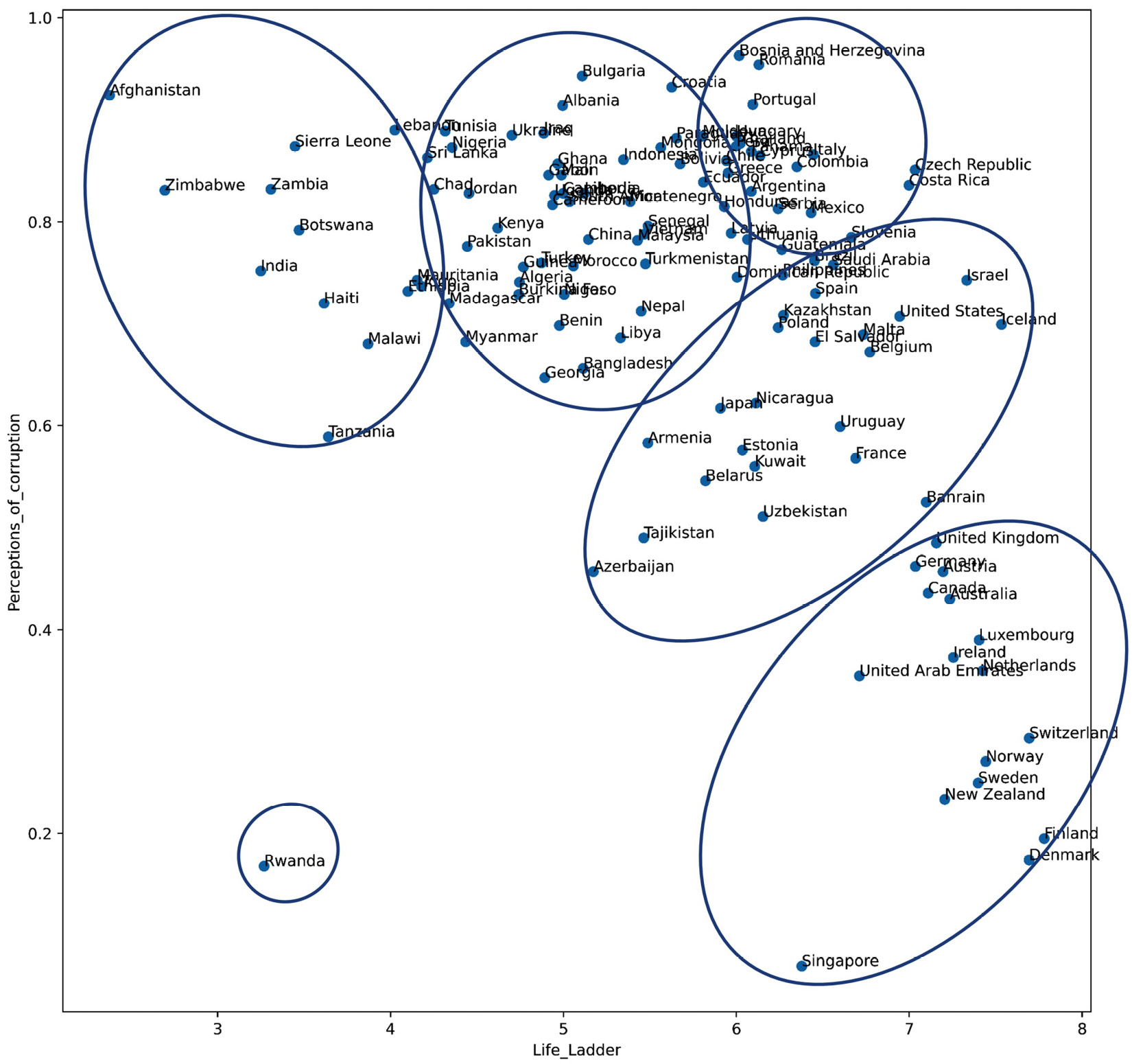
Figure 8.2 – Scatterplot and clustering of countries based on two happiness indices called Life_Ladder and Perceptions_of_corruption in 2019
Here, we see that we can meaningfully group all of the countries in the dataset into six clusters. One of the clusters only has one data object, indicating that the data object is an outlier based on the Life_Ladder and Perceptions_of_corruption attributes.
The key term here is meaningful clusters. So, let's use this example to understand what we mean by meaningful clusters. The six clusters shown in the preceding figure are meaningful for the following reasons:
- The data objects that are in the same clusters have similar values under Life_Ladder and Perceptions_of_corruption.
- The data objects that are in different clusters have different values under Life_Ladder and Perceptions_of_corruption.
In summary, meaningful clustering means that the clusters are grouped in such a way that the members of the same clusters are similar, while the members of different clusters are different.
When we cluster in two dimensions, meaning that we only have two attributes, the task of clustering is simple, as shown in the preceding example. However, when the number of dimensions increases, our ability to see patterns among the data using visualization either decreases or becomes impossible.
For instance, in the following example, we will learn about the difficulty of visual clustering when we have more than two attributes.
Clustering example using a three-dimensional dataset
In this example, we will use WH Report_preprocessed.csv. Try to cluster the countries based on the three happiness indexes, called Life_Ladder, Perceptions_of_corruption, and Generosity, in 2019.
The following code creates a scatterplot that uses color to add a third dimension:
plt.figure(figsize=(12,12))
plt.scatter(report2019_df.Life_Ladder, report2019_df.Perceptions_of_corruption, c=report2019_df.Generosity,cmap='binary')
plt.xlabel('Life_Ladder')
plt.ylabel('Perceptions_of_corruption')
plt.show()
Running the preceding code will create the following figure. The following figure visualizes Life_Ladder as the x dimension, Perceptions_of_corruption as the y dimension, and Generosity as color. The lighter the markers, the lower the Generosity score, while the darker the markers the higher the Generosity score:
Figure 8.3 – Scatterplot of countries based on three happiness indices called Life_Ladder, Perceptions_of_corruption, and Generosity in 2019
Try to use the preceding visualizations to find the meaningful clusters of data objects based on the three attributes all at once. This task will be overwhelming for us as our brains aren't good at performing tasks where we need to process more than two dimensions at once.
The preceding figure does not include the names of the countries because even without them, we have difficulty using this figure for clustering. Adding the country label would only overwhelm us further.
The purpose of this example was not to complete it, but the conclusion we arrived at is very important: we need to rely on tools other than data visualization and our brains to perform meaningful clustering when the data has more than two dimensions.
The tools that we use for higher-dimensional clustering are algorithms and computers. There are many different types of clustering algorithms with various working mechanisms. In this chapter, we will learn about the most popular clustering algorithm: K-Means. This algorithm is simple, scalable, and effective for clustering.
K-Means algorithm
K-Means is a random-based heuristic clustering algorithm. Random-based means that the output of the algorithm on the same data may be different on every run, while heuristic means that the algorithm does not reach the optimal solution. However, from experience, we know that it reaches a good solution.
K-Means clusters the data objects using a simple loop. The following diagram shows the steps that the algorithm performs, as well as the loop that heuristically finds the clusters in the data:
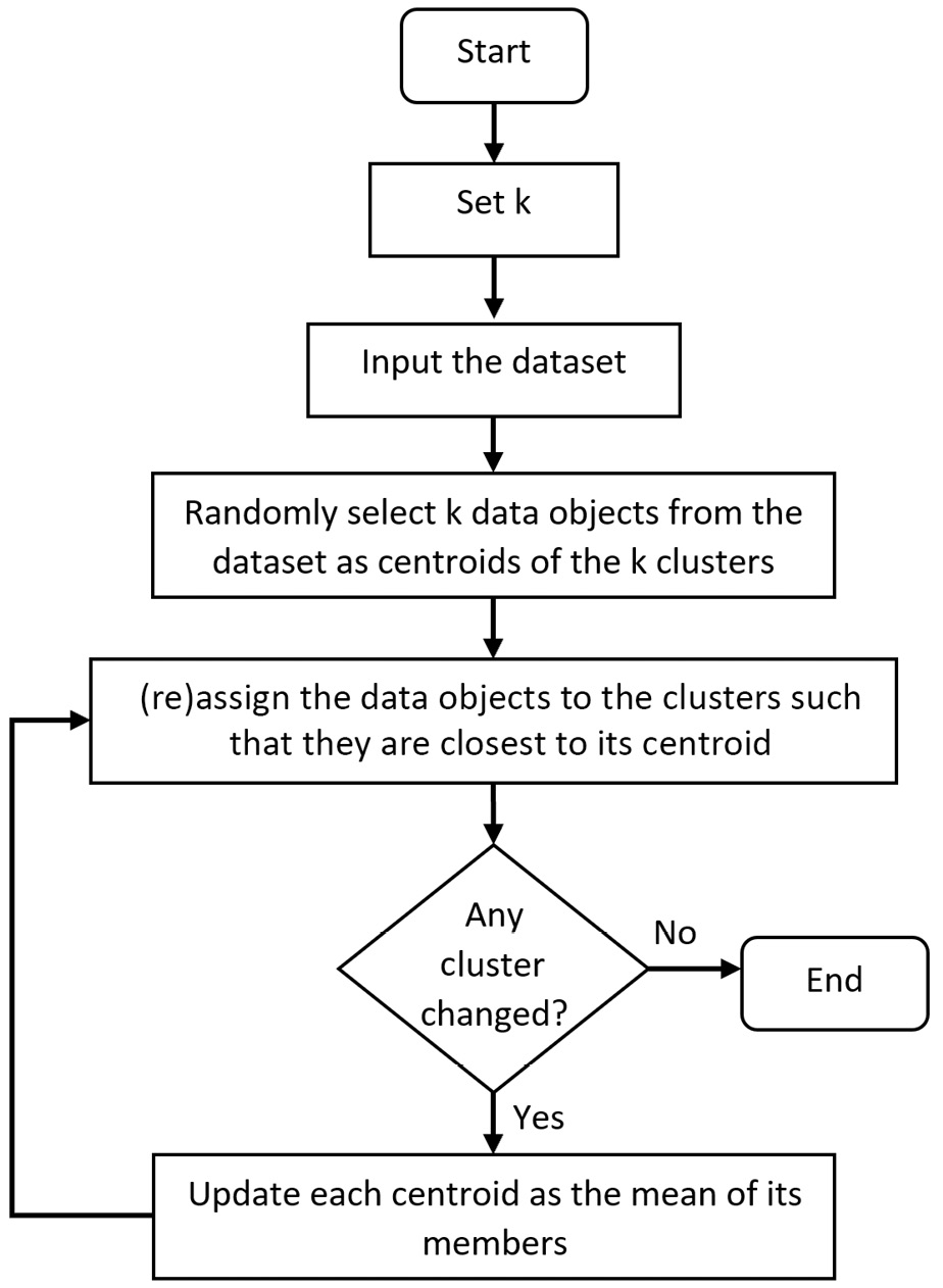
Figure 8.4 – K-Means flowchart
As we can see, the algorithm starts by randomly selecting k data objects as the cluster centroids. Then, the data objects are assigned to the cluster that is closest to its centroid. Next, the centroids are updated via the mean of all the data objects in the clusters. As the centroids are updated, the data objects are reassigned to the cluster that is closest to its centroid. Now, as the clusters are updated, the centroids will be updated as the mean of all the new data objects in the clusters. These last two steps keep occurring until there is no change in the cluster after updating the centroids. Once this stability has been reached, the algorithm terminates.
From a coding perspective, applying K-means is very similar to applying any of the other algorithms that we have learned about so far. The following example shows how we could have reached a similar result we reached using visualization. See Figure 8.2 for more information.
Using K-Means to cluster a two-dimensional dataset
Earlier in this chapter, we grouped the countries into six clusters using Life_Ladder and Perception_of_corruption. Here, we would like to confirm the same clustering using K-Means.
The following code uses the KMeans function from the sklearn.cluster module to perform this clustering:
from sklearn.cluster import KMeans
dimensions = ['Life_Ladder','Perceptions_of_corruption']
Xs = report2019_df[dimensions]
kmeans = KMeans(n_clusters=6)
kmeans.fit(Xs)
The preceding code performs KMeans clustering in four lines:
- dimensions = ['Life_Ladder','Perceptions_of_corruption']: This line of code specifies the attributes of the data we want to use for clustering.
- Xs = report2019_df[dimensions]: This line of code separates the data we want to use for clustering.
- kmeans = KMeans(n_clusters=6): This line of code creates a K-Means model that is ready to cluster input data into six clusters.
- kmeans.fit(Xs): This line of code introduces the dataset we want to be clustered to the model we created in the previous step.
When we run the preceding code successfully, almost nothing happens. However, clustering has been performed, and the cluster membership of every row can be accessed using kmeans.labels_. The following code uses a loop, kmeans.labels_, and Boolean masking to print the members of each cluster:
for i in range(6):
BM = kmeans.labels_==i
print('Cluster {}: {}'.format( i,report2019_df[BM].Name.values))
The following screenshot puts the two preceding codes together and shows the output of the code as well. After running the code, you will probably get a different output from the one shown in the following screenshot. If you run the same code a few times, you will get a different output every time.
The reason for this inconsistency is that K-Means is a random-based algorithm. Please refer to the K-Means flowchart shown in Figure 8.4: K-Means starts by randomly selecting k data objects as the initial centroids. As this initialization is random, the outputs are different from one another.
Even though the outputs are different, the same countries are grouped under the same cluster each time. For instance, notice that the United Kingdom and Canada are in the same cluster every time. This is reassuring; it means that K-Means finds the same pattern in the data, even though it follows a random procedure:

Figure 8.5 – K-Means clustering based on two happiness indices called Life_Ladder and Perception_of_corruption in 2019 – Original data
Now, let's compare the clusters we found using K-Means (Figure 8.5) and the clusters we found using visualization (Figure 8.2). These clusters are different, even though the data that was used for clustering was the same. For instance, while Rwanda was an outlier in Figure 8.2, it is the member of a cluster in Figure 8.5. Why is this happening? Give this question some thought before reading on.
The following code will output a visual that can help you answer this question:
plt.figure(figsize=(21,4))
plt.scatter(report2019_df.Life_Ladder, report2019_df.Perceptions_of_corruption)
for _, row in report2019_df.iterrows():
plt.annotate(row.Name, (row.Life_Ladder, row.Perceptions_of_corruption), rotation=90)
plt.xlim([2.3,7.8])
plt.xlabel('Life_Ladder')
plt.ylabel('Perceptions_of_corruption')
plt.show()
This code will produce the following output:
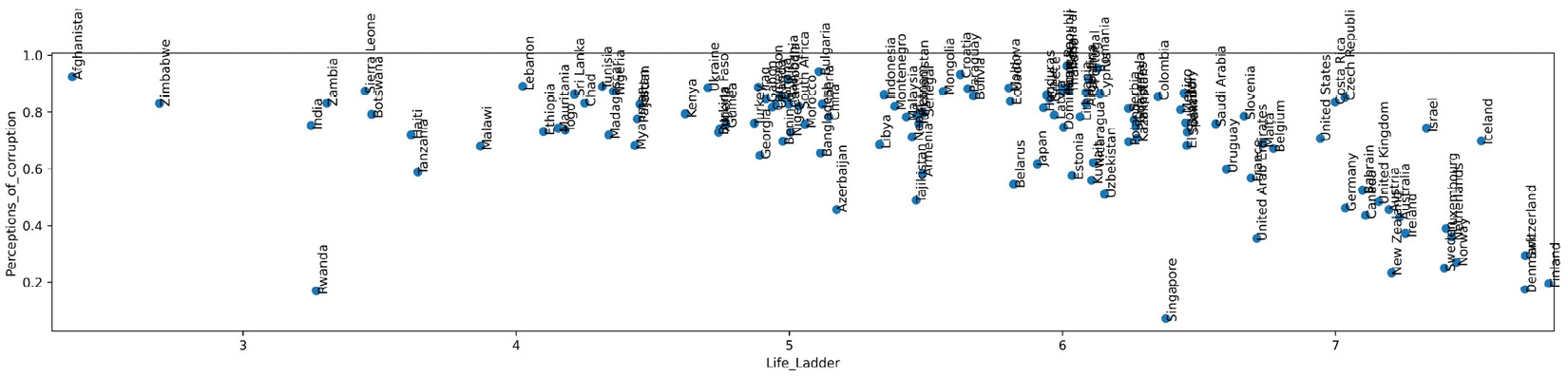
Figure 8.6 – The resized version of Figure 8.1 and Figure 8.2
The only difference between the preceding output and Figure 8.1 and Figure 8.2 is that in the preceding output, the numerical scale of Life_Ladder and Perceptions_of_corruption has been adjusted to be the same.
Matplotlib automatically scaled both dimensions of Figure 8.1 and Figure 8.2 – Life_Ladder and Perceptions_of_corruptions – so that they appear to have a similar visual range. This can be seen if you pay attention to the amount of visual space between 3 and 4 on the Life_Ladder dimension, and then compare that to the amount of visual space between 0.2 and 0.4 on the Perceptions_of_corruption dimension. So, we can see that while the amounts of visual space are equal, the numerical values that represent them are very different. This realization answers the question that was raised earlier: why is the clustering outcome of Figure 8.5 entirely different from the one we detected visually in Figure 8.2? The answer is that the two clusterings are not using the same data. The clustering represented in Figure 8.2 uses a scaled version of the data, while the clustering represented in Figure 8.5 (K-Means clustering) uses the original data.
Now, a second question we need to answer is, which clustering output should we use? Let me help you come to the right answer. When we want to cluster our data objects using two dimensions, Life_Ladder and Perceptions_of_corruption, how much weight do we want each dimension to play in the result of the clustering? Don't we want both attributes to play an equal role? Yes, that is the case. So, we want to choose the clustering that has given both dimensions equal importance. Since K-Means clustering used the original data without scaling it, the fact that Life_Ladder happened to have larger numbers influenced K-Means to prioritize Life_Ladder over Perceptions_of_corruption.
To overcome this challenge, before applying K-Means or any other algorithm that uses the distance between data objects as an important deciding factor, we need to normalize the data. Normalizing the data means the attributes are rescaled in such a way that all of them are represented in the same range. For instance, as you may recall, we normalized our datasets before applying KNN in the previous chapter for the same reason.
The following screenshot shows the code and the clustering output when the dataset is normalized before using K-Means. In this code, Xs = (Xs - Xs.min())/(Xs.min()-Xs.max()) is used to rescale all the attributes in Xs to be between zero and one. The rest of the algorithm code is the same as the code we tried earlier in this chapter. Now, you can compare the clustering outcome in the following screenshot and the one shown in Figure 8.2 to detect that the two ways of clustering are achieving almost the same results:
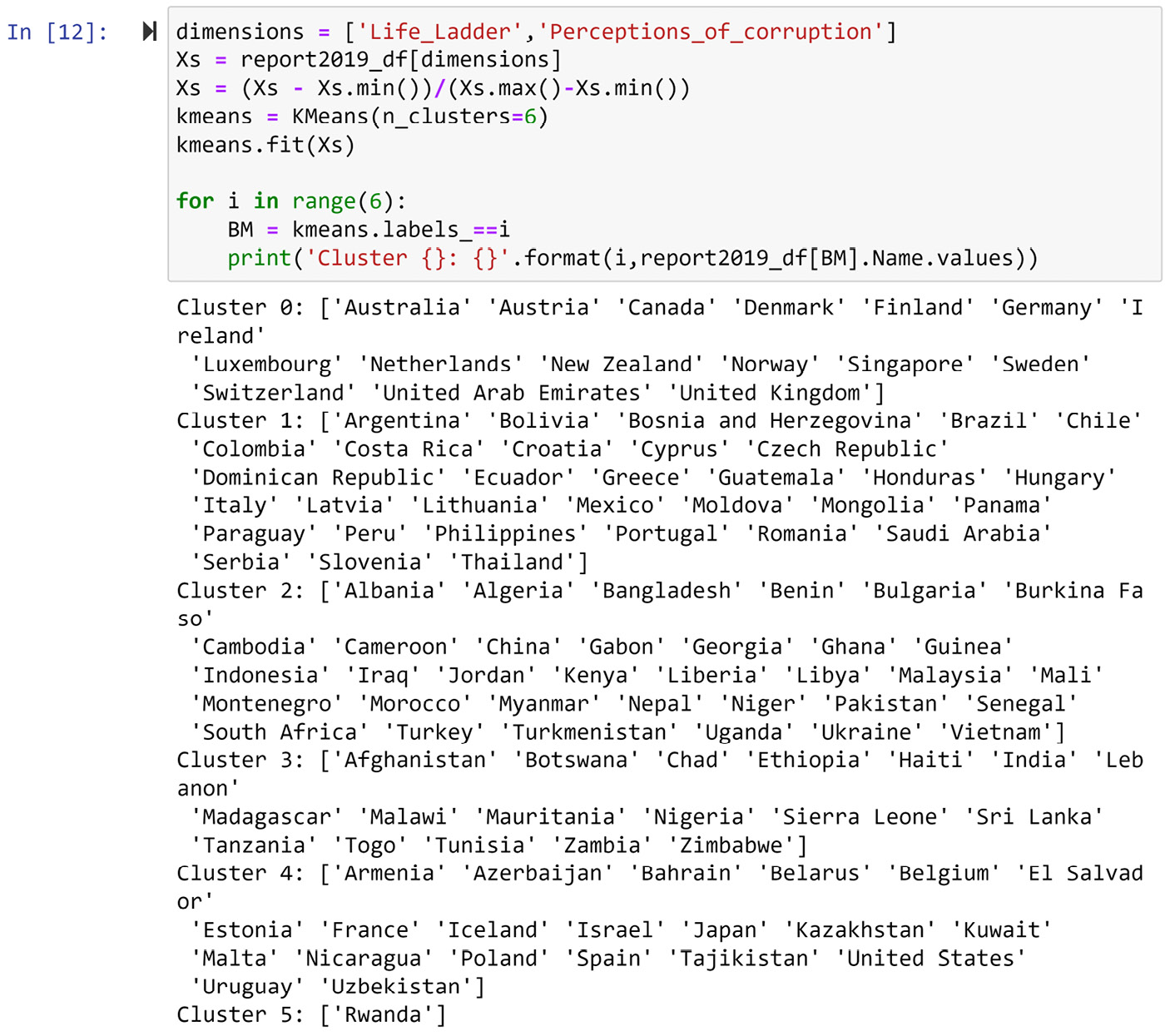
Figure 8.7 – K-Means clustering based on two happiness indices called Life_Ladder and Perceptions_of_corruption in 2019 – Normalized data
In this example, we saw how K-Means, when applied correctly, can produce a meaningful clustering compared to what we had reached using data visualization. However, the K-Means clustering in this example was applied to a two-dimensional dataset. In the next example, we will see that, from a coding perspective, there is almost no difference between applying K-Means to a two-dimensional dataset and applying the algorithm to a dataset with more dimensions.
Using K-Means to cluster a dataset with more than two dimensions
In this section, we will use K-Means and form three meaningful clusters of countries in report2019_df based on all the Life_Ladder, Log_GDP_per_capita, Social_support, Healthy_life_expectancy_at_birth, Freedom_to_make_life_choices, Generosity, Perceptions_of_corruption, Positive_affect, and Negative_affect happiness indices.
Go ahead and run the following code; you will see that it will form three meaningful clusters and print out the members of each cluster:
dimensions = [ 'Life_Ladder', 'Log_GDP_per_capita', 'Social_support', 'Healthy_life_expectancy_at_birth', 'Freedom_to_make_life_choices', 'Generosity', 'Perceptions_of_corruption', 'Positive_affect', 'Negative_affect']
Xs = report2019_df[dimensions]
Xs = (Xs - Xs.min())/(Xs.max()-Xs.min())
kmeans = KMeans(n_clusters=3)
kmeans.fit(Xs)
for i in range(3):
BM = kmeans.labels_==i
print('Cluster {}: {}' .format(i,report2019_df[BM].Name. values))
Here, the only difference between the preceding code and the code presented in Figure 8.7 is the first line, where the dimensions of the data are selected. After this, the code is the same. The reason for this is that K-Means can handle as many dimensions as inputted.
How Many Clusters?
Choosing the number of clusters is the most challenging part of performing a successful K-Means clustering analysis. The algorithm itself does not accommodate finding out how many meaningful clusters are in the data. Finding the meaningful number of clusters in the data is a difficult task when the dimensions of the data increase.
While there is no one perfect solution to go about finding the meaningful number of clusters in a dataset, there are a few different approaches you can adopt. In this book, we will not cover this aspect of clustering analysis as we know enough about clustering analysis to perform effective data preprocessing.
So far, we have learned how to use K-Means to form meaningful clusters. Next, we are going to learn how to profile these clusters using centroid analysis.
Centroid analysis
Centroid analysis, in essence, is a canonical data analytics task that is done once meaningful clusters have been found. We perform centroid analysis to understand what formed each cluster and gain insight into the patterns in the data that led to the cluster's formation.
This analysis essentially finds the centroids of each cluster and compares them with one another. A color-coded table or a heatmap can be very useful for comparing centroids.
The following code finds the centroids using a loop and Boolean masking and then uses the sns.heatmap() function from the seaborn module to draw the color-coded table.
The following code must be run once you've run the preceding code snippet:
import seaborn as sns
clusters = ['Cluster {}'.format(i) for i in range(3)]
Centroids = pd.DataFrame(0.0, index = clusters, columns = Xs.columns)
for i,clst in enumerate(clusters):
BM = kmeans.labels_==i
Centroids.loc[clst] = Xs[BM].median(axis=0)
sns.heatmap(Centroids, linewidths=.5, annot=True, cmap='binary')
plt.show()
The preceding code will output the following heatmap:
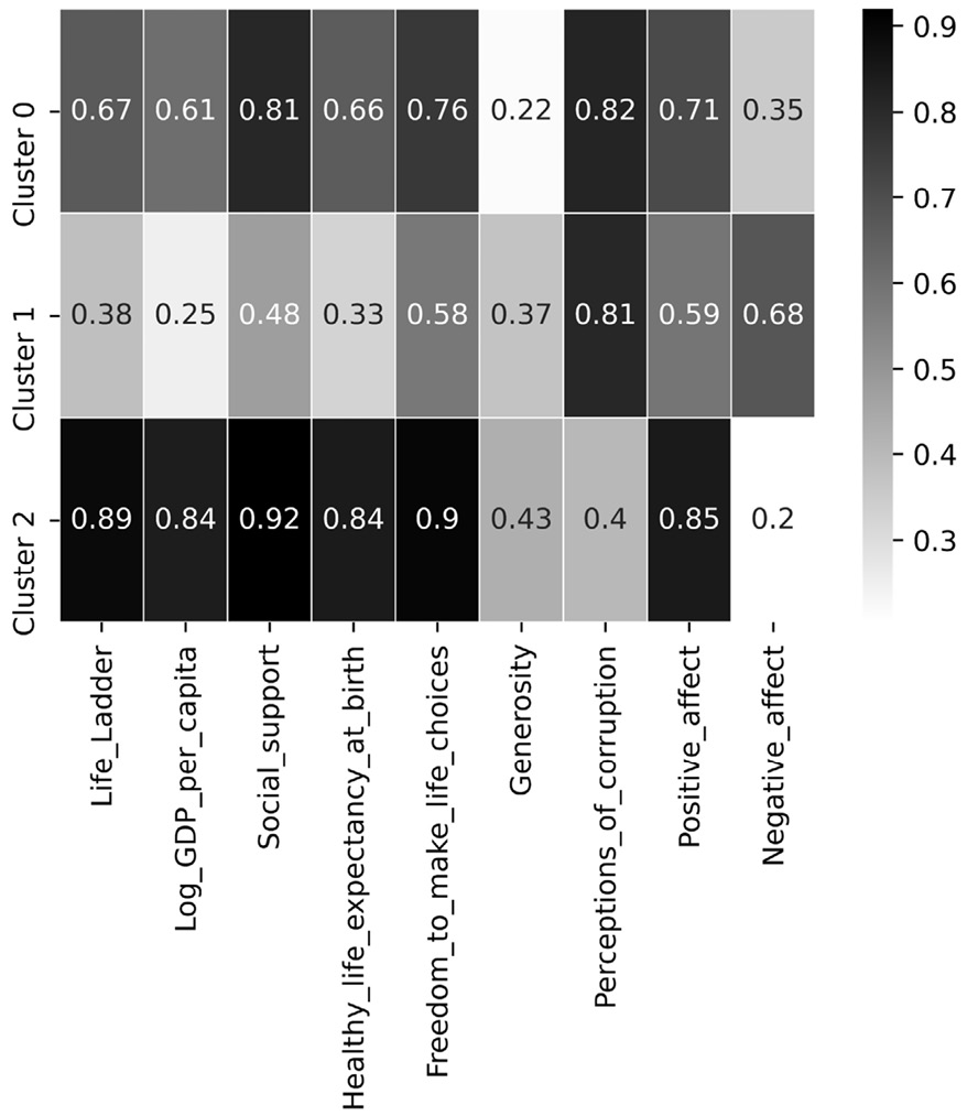
Figure 8.8 – Using sns.heatmap() to perform centroid analysis
Before we analyze the preceding heatmap, allow me to give you a heads up. As K-Means is a random-based algorithm, your output may be different to the one printed here. We would expect to see the same patterns emerge from the data, but the cluster names might be different.
In the preceding heatmap, we can see that Cluster 0 has the best happiness scores among all the clusters, so we may label this cluster as Very Happy. On the other hand, Cluster 2 is second best in every index except for Generosity and Perception_of_corruption, so we will label this cluster Happy but Crime-ridden. Finally, Cluster 1 has the lowest value for almost all of the happiness indices, but Geneoristy has a close second rank among all the centroids; we will call this cluster Unhappy but Generous.
Summary
Congratulations on your excellent progress in this chapter and this book! By finishing this chapter, you have also finished the second part of this book. In this chapter, we learned about clustering analysis and some techniques we can use to perform it. In this part of this book, we learned about the four most in-demand data analytics goals: data visualization, prediction, classification, and clustering.
In the first part of this book, you learned about data and databases, as well as programming skills that allow you to effectively manipulate data for data analytics. In the second part, which is the one you just finished, you learned about the four most important data analytics goals and learned how they can be met using programming.
Now, you are ready to take on the next challenge: learning how to effectively preprocess data for the data analytics goals you just learned about in the second part of this book using your programming skills, your fundamental understanding of data, and your appreciation of data analytics goals.
In the next part of this book, we will start our journey of data preprocessing. The next part of this book is comprised of data cleaning, data fusion and integration, data reduction, and data massaging and transformation. These processes are the pieces of a puzzle that, when put together appropriately and effectively, improve data preprocessing and improve the quality of data analytics.
Before you move on and start your journey on data cleaning, spend some time on the following exercises and solidify what you've learned.
Exercises
- In your own words, answer the following two questions. Use 200 words (at most) to answer each question:
a) What is the difference between classification and prediction?
b) What is the difference between classification and clustering?
- Consider Figure 8.6 regarding the necessity of normalization before performing clustering analysis. With your new appreciation for this process, would you like to change your answer to the first exercise question from the previous chapter?
- In this chapter, we used WH Report_preprocessed.csv to form meaningful clusters of countries using 2019 data. In this exercise, we want to use the data from 2010-2019. Perform the following steps to do this:
a) Use the .pivot() function to restructure the data so that each combination of the year and happiness index has a column. In other words, the data of the year is recorded in long format, and we would like to change that into wide format. Name the resulting data pvt_df. We will not need the Population and Continent columns in pvt_df.
b) Normalize pvt_df and assign it to Xs.
c) Use K-Means and Xs to find three clusters among the data objects. Report the members of each cluster.
d) Use a heatmap to perform centroid analysis. As there are many columns for this clustering, you may have to resize the heatmap so that you can use it for analysis. Make sure you've named each cluster.
- For this exercise, we will be using the Mall_Customers.xlsx dataset to form four meaningful clusters of customers. The following steps will help you do this correctly:
a) Use pd.read_excel() to load the data into customer_df.
b) Set CustomerID as the index of customer_df and binary code the Gender column. This means replacing Male values with 0 and Female values with 1.
c) Clean the names of the columns by using the following names: Gender, Age, Annual_income, and Spending_score.
d) Normalize customer_df and load it into the Xs variable.
e) Use K-Means and Xs to find four clusters among the data objects. Report the members of each cluster.
f) Use a heatmap to perform centroid analysis. Make sure you've named each cluster.
g) Why did we binary code the Gender attribute in Step b?