
Chapter 17: Case Study 3: United States Counties Clustering Analysis
This chapter is going to provide another excellent learning opportunity to showcase the process of data preprocessing for high-stakes clustering analysis. We will practice all the four major steps of data preprocessing in this chapter—namely, data integration, data reduction, data transformation, and data cleaning. In a nutshell, in this part of the book, we are going to form meaningful groups of United States (US) counties based on different sources of information and data. By the end of this chapter, we are going to have a much better understanding of the different types of counties that are in the US.
In this chapter, we're going to extract information from this case study using the following main subchapters:
- Introducing the case study
- Preprocessing the data
- Analyzing the data
Technical requirements
You will be able to find all of the code and the dataset that is used in this book in a GitHub repository exclusively created for this book. To find the repository, click on this link: https://github.com/PacktPublishing/Hands-On-Data-Preprocessing-in-Python/tree/main/Chapter17. In this repository, you will find Chapter17 folder from which you can download the code and the data for better learning.
Introducing the case study
During the 2020 US presidential election, the world and America alike were reminded that where an individual lives can best predict what they will decide for their future (that is, how they vote). This may be a sobering realization at an individual level, but this is a billion-dollar understanding for national businesses such as Starbucks, Walmart, and Amazon. Furthermore, for federal, state, and local politicians, this realization can be monumentally useful both at election time and when drafting legislation.
All these benefits may be available to these entities if they are capable of doing meaningful locational analyses of groups of people. In this case study, we are going to analyze the differences and the similarities between US counties. In the following screenshot, we can see that the US has many counties; there are 3,006, to be exact. The color-coded map shows the county-level relative population density:
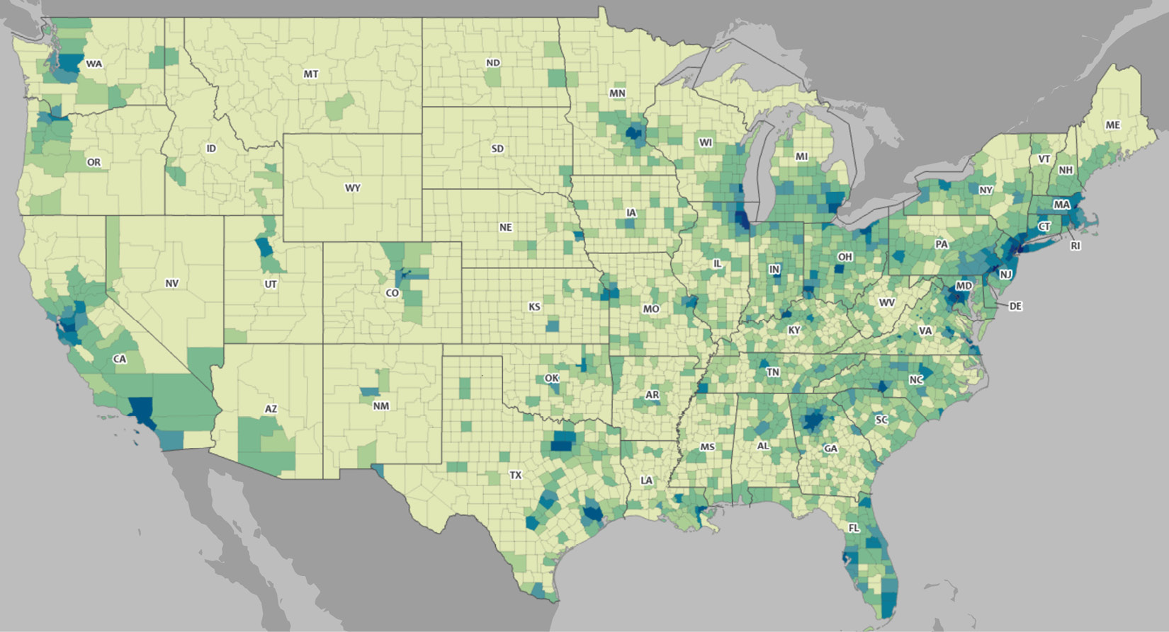
Figure 17.1 – US demographic data map at a county level
Note!
The source of the US demographic data map at a county level can be found at the following link: https://mtgis-portal.geo.census.gov/arcgis/apps/MapSeries/index.html?appid=2566121a73de463995ed2b2fd7ff6eb7.
What is the first step in being able to meaningfully analyze the differences and similarities between all the counties shown in the preceding screenshot? The answer is, of course, data preprocessing. I hope you didn't hesitate to give this answer at this point in the book.
In this chapter, specifically, we are going to integrate a few sources of data, and then perform the necessary data reduction and data transformation before the analysis. There will be lots of data cleaning that needs to be done across different steps of data preprocessing; however, at this point in your learning about data preprocessing, your skillset for data cleaning should have sufficiently developed that you will not need reminding to recognize these steps.
Now that we have a general understanding of this case study, let's get to know the datasets that will be used for this clustering analysis.
Introduction to the source of the data
We will use the following two sources of data to create a dataset that allows us to perform county clustering analysis:
- The four files Education.xls, PopulationEstimates.xls, PovertyEstimates.xls, and Unemployment.xlsx from the US Department of Agriculture Economic Research Service (USDA ERS) (https://www.ers.usda.gov/data-products/county-level-data-sets/)
- US election results from Massachusetts Institute of Technology (MIT) election data (https://dataverse.harvard.edu/dataset.xhtml?persistentId=doi:10.7910/DVN/VOQCHQ)
Across the preceding two sources, we've got five different files that we need to integrate. The files from the first source are easily downloaded; however, the one file from the second source will need to be unzipped after being downloaded. After downloading dataverse_files.zip file from the second source, and unzipping it, you will get countypres_2000-2020.csv, which is the file we want to use.
We will eventually integrate all this data into a county_df pandas DataFrame; however, we will need to read them into their own Pandas DataFrames first and then go about the data preprocessing. The following list shows the names we will use for those Pandas DataFrames per file:
- Education.xls: edu_df
- PopulationEstimates.xls: pop_df
- PovertyEstimates.xls: pov_df
- Unemployment.xlsx: employ_df
- countypres_2000-2020.csv: election_df
Attention!
I highly encourage you to open each of these datasets on your own and scroll through them to get to know them before continuing to read on, as this will enhance your learning.
Now that we know the data sources, we need to go through some meaningful data preprocessing before we get to the data analytics part. Let's dive in.
Preprocessing the data
The very first step in preprocessing for clustering analysis is to be clear about which data objects will be clustered, and that is clear here: counties. So, at the end of the data preprocessing, we will need to have a dataset whose rows are counties, and with columns based on how we want to group the counties. As shown in the following screenshot, which is a summary of the data preprocessing that we will perform during this chapter, we will get to county_df, which has the characteristics that were just described.
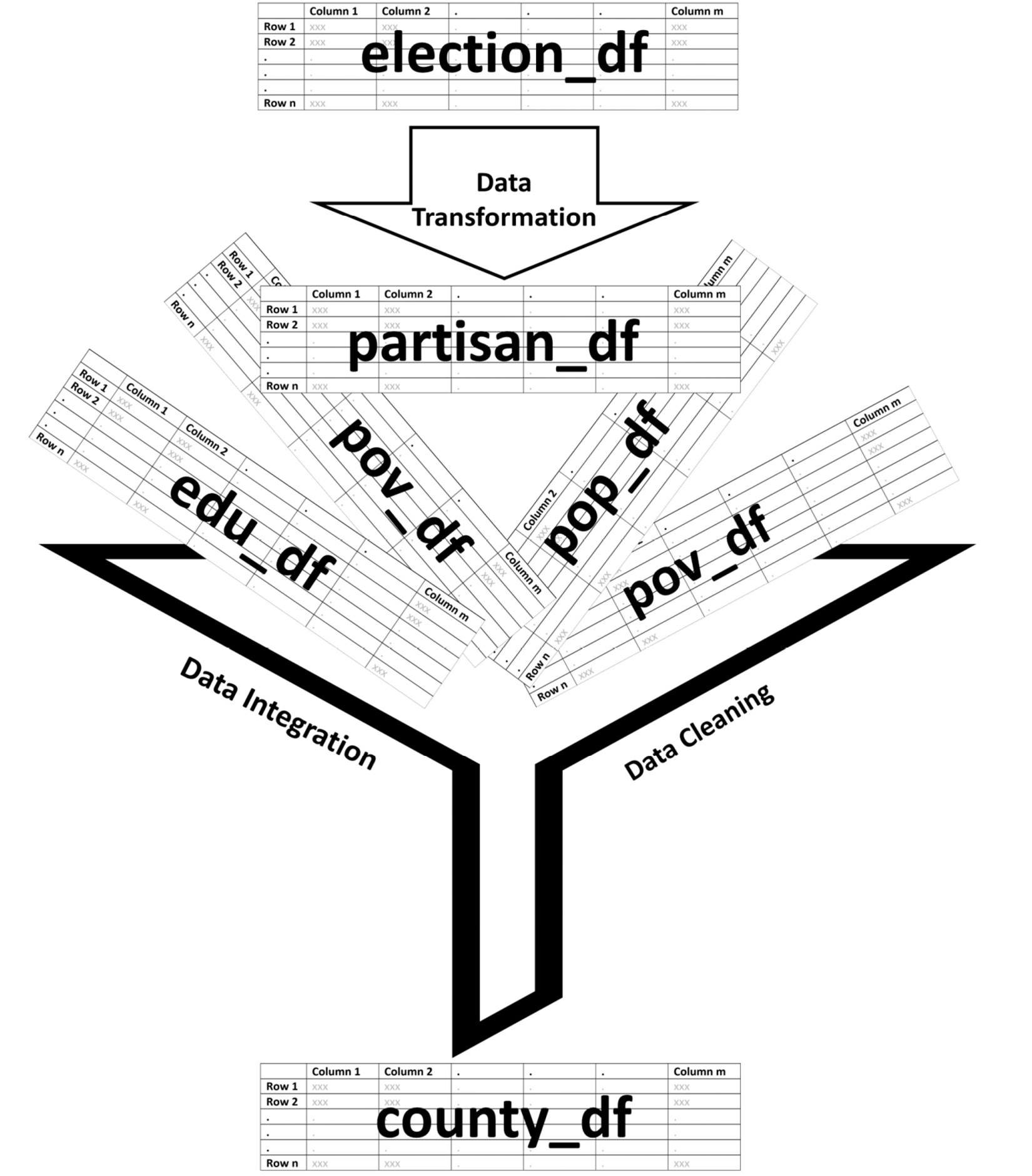
Figure 17.2 – Schematic of the data preprocessing
As shown in the preceding summarizing screenshot, we will first transform election_df into partisan_df, and then integrate the partisan_df, edu_df, pov_df, pop_df, and employ_df DataFrames. Of course, there will be more detail to all of these steps than the preceding screenshot shows; however, this serves as a great summary and a general map for our understanding.
Let's roll up our sleeves, then. We will start by transforming election_df into partisan_df.
Transforming election_df to partisan_df
With a first glance at the election_df dataset, we should realize that the definition of data objects for this dataset is not counties, and instead, it is the county-candidate-election-mode in each presidential election. While counties are indeed a part of the definition, we only need to have county as the definition of the data object. This very fact can be our guiding principle in the data transformation process.
Let's work our way back from mode to county. Mode refers to the different ways that individuals had been able to participate in the election. By recognizing the fact that election_df also has the mode of 'TOTAL', which is the sum of all the other modes, we can simply drop all the other rows that have modes other than 'TOTAL' to simplify the definition of data objects to county-candidate-election.
To simplify from county-candidate-election to county for the definition of data objects, we will first use attribute construction, and then functional data analysis (FDA).
Constructing the partisanism attribute
The partisanism attribute is meant to capture the level of uniformity in individuals' votes in electing a democrat or a republican in each election. The following formula shows how this constructed attribute can be calculated:

If a county in an election has a large positive partisanism value, it shows the county in that election has swung largely toward republicans; if it has a large negative value, it shows a great swing toward democrats.
The following screenshot shows a small portion of the partisanElection_df DataFrame, which is the result of calculating a partisan value for each election and county:
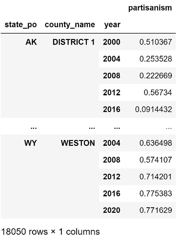
Figure 17.3 – A portion of partisanElection_df
By constructing the new partisanism attribute and calculating it for every county and election, we managed to move from the definition of data objects being county-candidate-election to county-election. Next, we will use FDA to have the definition of data objects as only county.
FDA to calculate the mean and slope of partisanism
Looking at Figure 17.3, you may notice that we have the partisanism value of presidential elections 2000, 2004, 2008, 2012, 2016, and 2020 for every county—in other words, for every county, we have a time series of partisanism values. Therefore, instead of having to deal with 6 values, we can use FDA to calculate the mean and slope of partisanism across elections over 20 years.
After doing this FDA transformation and creating a partisan_df DataFrame whose definition of data objects is county, we will make sure to also perform a necessary data cleaning step. Specifically, we will transform the County_Name column so that its characters are presented in lowercase. This data cleaning is performed for future data integration purposes. As the name of counties may have been written in different formats that are understandable for human comprehension but not for a computer, we thus need to make sure the county names are all in lowercase in all of the data sources so that the data integration will go smoothly.
The following screenshot shows the partisan_df attribute:
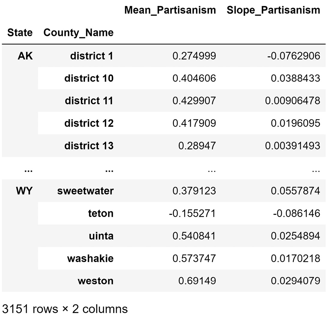
Figure 17.4 – A portion of partisan_df
Note that the definition of data objects for the DataFrame shown in Figure 17.4 is county. If you go back to the beginning of this subchapter (Transforming election_df to partisan_df), our goal was to transform the election_df dataset, whose definition of data objects is county-candidate-election-mode, into partisan_df. We saw that the definition of data objects for partisan_df is county.
Next, we will perform the necessary data cleaning on edu_df, employ_df, pop_df, and pov_df.
Cleaning edu_df, employ_df, pop_df, and pov_df
To take another step toward the preprocessed county_df dataset, we will need to perform some data cleaning on edu_df, employ_df, pop_df, and pov_df. The steps will be very similar for all these datasets. These include removing unwanted columns, transforming the index attributes, and renaming the attribute titles for brevity and intuitiveness.
Data integration
By the time we arrive at this step, the hardest part of data integration—preparing the DataFrames for integration—has already been done. Because we took our time preparing each one of the DataFrames, doing the data integration is as simple as one line of code, as shown in the following snippet:
county_df = pop_df.join(edu_df).join(pov_df).join(employment_df).join(partisan_df)
Once the code is successfully run, we will get the following DataFrame that is almost ready for analysis:

Figure 17.5 – A portion of preprocessed county_df
Now, we need to perform the next important data preprocessing steps: Level III data cleaning—missing values, errors, and outliers.
Data cleaning level III – missing values, errors, and outliers
After investigation, we realize that there are a handful of missing values under seven out of eight of the attributes in county_df. If this were a real government project, these missing values would need to be tracked down before we moved forward with the analysis; however, as this is practice analysis and there are not too many missing values, we adopt a strategy of dropping the missing values.
Furthermore, when investigating outliers, we will see that all of the attributes in county_df have fliers in their boxplots. However, the extreme values under the Population and UnemploymentRate attributes are too different than the rest of the population, so much so that the extreme values can easily impact the clustering analysis. To mitigate their impact, we will use log transformation on these two attributes.
Regarding the possibility of having errors in the data, there are two matters we need to pay attention to, as follows:
- First, as all of the attributes do have actual extreme values, our tools for possibly detecting univariate errors become ineffective.
- Second, the clustering analysis that we will be doing eventually will show us the outliers, and at that point, we can investigate whether those outliers are possible errors.
One last data preprocessing step and we will then be set for the analysis—we need to check for data redundancy.
Checking for data redundancy
Data redundancy is very possible for county_df as we have brought together different sources of data to create this dataset. As clustering analysis is very prone to be heavily impacted by data redundancy, this step becomes very important. We will use two effective tools for this goal: a scatter matrix and correlation analysis.
The following screenshot shows a scatter matrix, which is very useful for seeing the possible relationship between the attributes and assessing whether the assuming linear relationship between the attributes is reasonable:
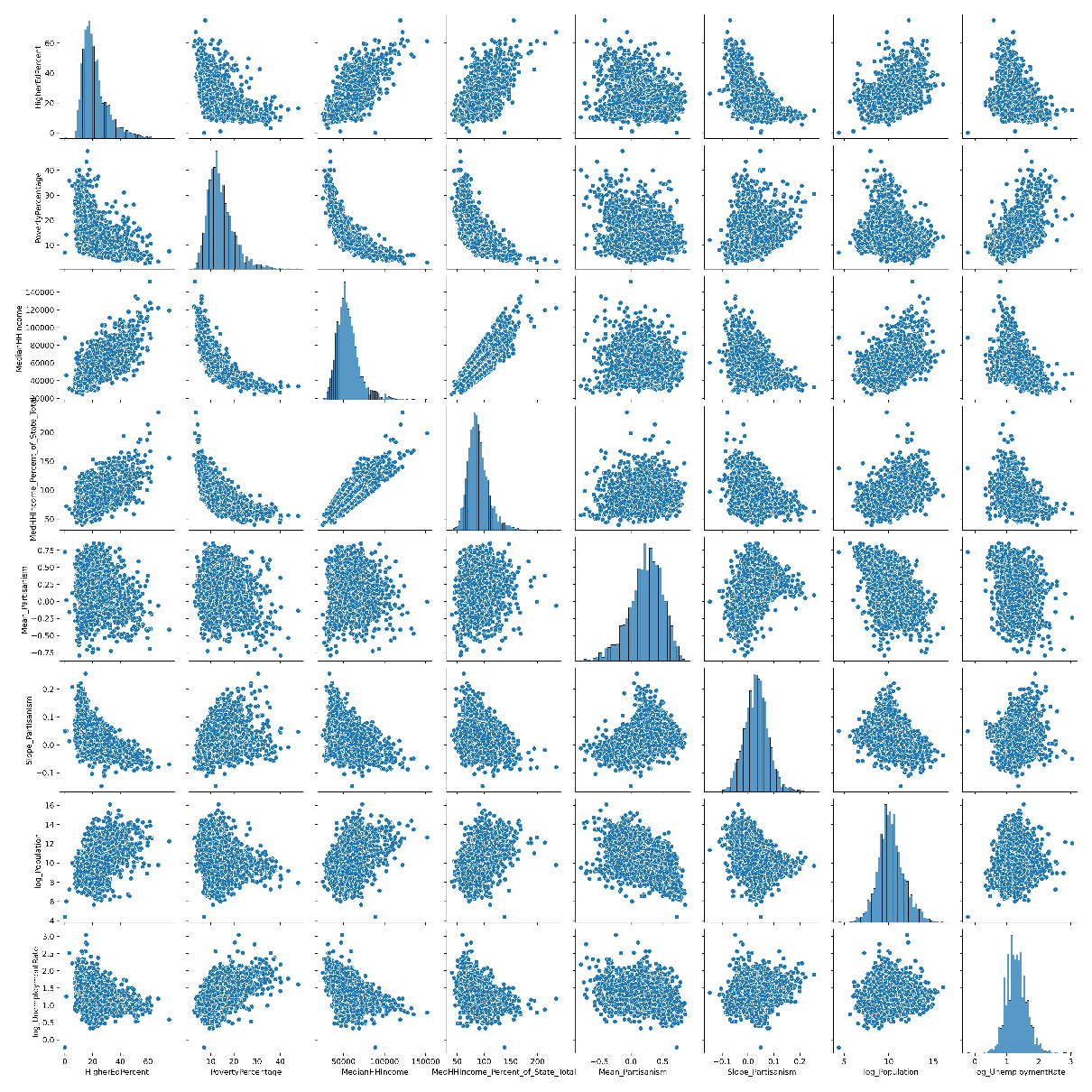
Figure 17.6 – Scatter matrix of county_df
In the preceding screenshot, we can see that while there is somewhat of a non-linear relationship between PovertyPercentage and MedianHHIncome, assuming a linear relationship between the rest of the attributes does sound reasonable.
The following screenshot shows a correlation matrix of county_df:

Figure 17.7 – Correlation matrix of county_df
We can see in the preceding screenshot that MedianHHIncome has a strong relationship with PovertyPercentage and MedianHHIncome_Percent_of_State_Total. This is a concerning data redundancy for clustering analysis as there seems to be a repetition of information in these three attributes. To rectify this, we will remove MedianHHIncome from the clustering analysis.
Now, we are set to begin the analysis part of this case study.
Analyzing the data
In this part, we will do two types of unsupervised data analysis. We first use principal component analysis (PCA) to create a high-level visualization of the whole data. Next, after having been informed how many clusters are possibly among the data objects, we will use K-Means to form the clusters and study them. Let's start with PCA.
Using PCA to visualize the dataset
As we already know, PCA can transform the dataset, so most of the information is presented in the first few principal components (PCs). Our investigation showed that the majority of relationships between the attributes, including county_df, is linear, which is allowing us to be able to use PCA; however, we won't forget about the few non-linear relationships as we move ahead with PCA, and we will not rely too much on the results of the PCA.
The following screenshot shows a three-dimensional (3D) scatterplot of PC1, PC2, and PC3. PC1 and PC2 are visualized using the x and y axes, whereas PC3 is visualized using color. From the PCA analysis, we learned that PC1 to PC3 account for almost 80% of the variations in the whole data, so the following screenshot is illustrating 80% of the information in the data. To get a better insight into what we see in this scatterplot, the counties that are at the extreme end of PC1 and PC2 are annotated.
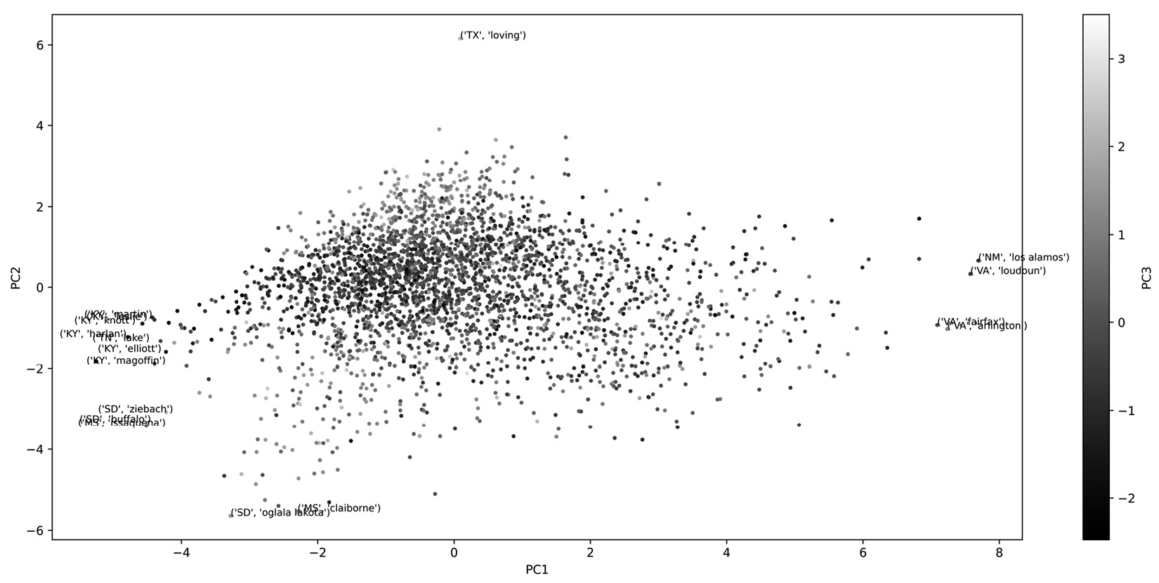
Figure 17.8 – 3D scatterplot of PC1, PC2, PC3 PCA for transformed county_df
Now, let's look at our K-Means clustering analysis. Pay attention to the fact that we standardize the data before performing PCA and normalize the data before performing clustering analysis.
K-Means clustering analysis
After our investigation of Figure 17.8, which shows a 3D scatterplot of the PCs and some computational experimentations, we will conclude that the best K value for K-Means clustering is 5. The computational experimentation method to find K is not covered in this book; however, the code that is used for this step is included in the file dedicated to this chapter in the book's GitHub repository.
The following screenshot shows the result of the K-Means clustering (K=5) using PC1 and PC2. This screenshot is advantageous for two reasons—first, we can see the relationship between the clusters, and second, the dispersion between the members of the clusters is depicted.
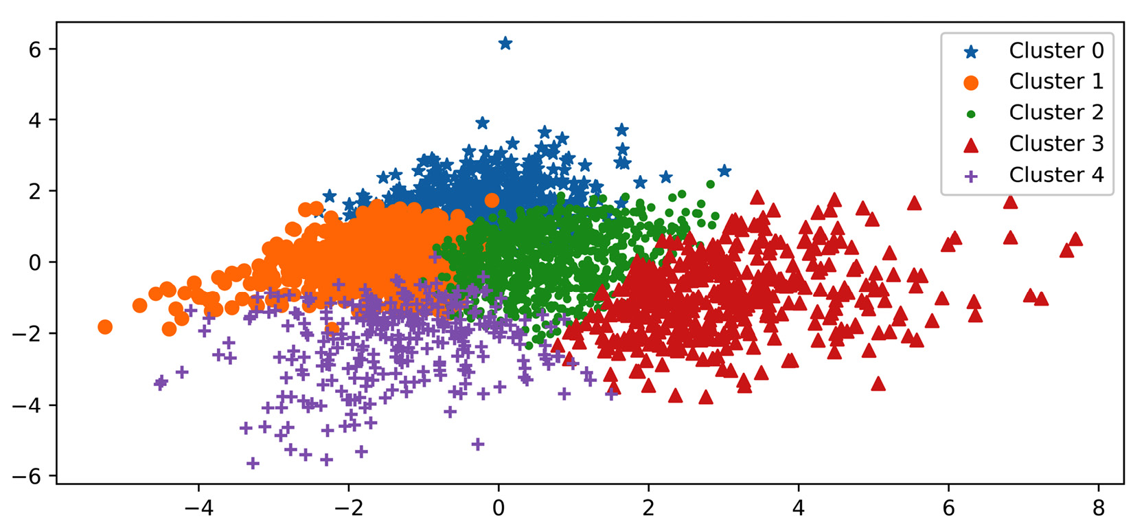
Figure 17.9 – Visualization of the result of clustering county_df using PC1 and PC2
To understand the patterns among the data objects and also know more about the relationship between the clusters, we can view the following centroid analysis using heatmaps:
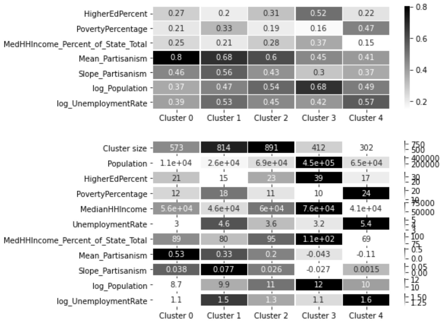
Figure 17.10 – Heatmaps of the clusters' centroid for centroid analysis
From studying Figure 17.9 and Figure 17.10, we can see the following patterns and relationships:
- Clusters 0, 1, and 2 are Republican-leaning, and clusters 3 and 4 are Democrat-leaning.
- Cluster 2 is the one that has the most in common with all the rest of the clusters. This cluster is the best characterized to be the most moderate and affluent among all the Republican-leaning counties.
- Cluster 0 only has a relationship with clusters 2 and 3 and is completely cut off from clusters 4 and 5, which are the only Democrat-leaning clusters. This cluster is best characterized by the most Republican-leaning cluster with the lowest unemployment rate and population among all the clusters.
- Cluster 1 has a relationship with all the clusters except cluster 3. This cluster is best characterized as having the lowest HigherEdPercent value among all the clusters, and the lowest MedianHHIncome and highest PovertyPercentage and UnemploymentRate values among the Republican-leaning clusters.
- Another interesting pattern about cluster 1 is that this cluster has the fastest movement toward becoming more Republican-leaning among all the clusters.
- Cluster 4, which is a Democrat-learning cluster, has more in common with two Republican-leaning clusters, clusters 1 and 2. This cluster is best characterized as having the highest PovertyPercentage and UnemploymentRate values and the lowest MedianHHIncome value among all clusters.
- Another interesting pattern about cluster 4 is that while this cluster is the most Democrat-leaning cluster, it is the only cluster that has been moving in the opposite direction in terms of partisanism.
- Cluster 3 has more of a relationship with cluster 2, which is a Republican-leaning cluster, than cluster 4, which is the only other Democrat-leaning cluster. Among all the clusters, this cluster seems to be a unique one. This cluster is best characterized by the highest Population and HigherEdPercent values and the lowest PovertyPercentage value.
- Another interesting pattern about cluster 3 is that it is the only cluster that has a movement toward becoming more Democrat-leaning; however, its movement is the slowest among all the clusters:
Well done! We were able to complete the clustering analysis and visualize very interesting and meaningful patterns. What enabled this visualization was partly the existence of great tools such as PCA and K-Means; however, what made this analysis happen was our ingenuity during the data preprocessing step that allowed us to create a dataset that would lead to the presented meaningful outcome.
Summary
In this chapter, we got to experience the essential role of effective data preprocessing in enabling us to perform meaningful clustering analytics. Furthermore, we got to practice different kinds and types of data cleaning, data reduction, data integration, and data transformation situations.
This was the last case study that we have in this book. The next and final chapter will provide some directions for more learning and some practice case studies.