Chapter 2: Review of Another Core Module – Matplotlib
Matplotlib is our go-to module for creating visualizations from data. Not only can this module draw many different plots, but it also gives us the capability to design and tailor the plots to our needs. Matplotlib will serve our data analytics and data preprocessing journey by providing a great number of functions for effective visualizations.
Before we start reviewing this valuable module, I would like to let you know that this chapter is not meant to be a comprehensive teaching guide for Matplotlib, but rather a collection of concepts, functions, and examples that will be invaluable as we cover data analytics and data preprocessing in future chapters.
We have actually started using this module in the previous chapter. The Pandas plot functions that we introduced in Chapter 1, Review of the Core Modules of NumPy and Pandas, under the Pandas functions to explore a DataFrame are section, actually Matplotlib visuals that Pandas uses internally.
In this chapter, I will first introduce the main plots that Matplotlib can draw. Following that, I will cover some design and altering functionalities of the visuals. Then, we will learn about the invaluable subplotting capability of Matplotlib that will allow us to create more complex and effective visualizations.
The following topics will be covered in this chapter:
- Main plots
- Modifying the visuals
- Subplots
- Resizing visuals and saving them
Technical requirements
You will be able to find all of the code and the dataset that is used in this chapter in this book's GitHub repository:
https://github.com/PacktPublishing/Hands-On-Data-Preprocessing-in-Python
Each chapter in this book will have a folder that contains all of the code and datasets used.
Drawing the main plots in Matplotlib
Drawing visuals with Matplotlib is easy. All you need is the right input and a correct understanding of the data. The main five visuals that we use in Matplotlib to draw are histograms, boxplots, bar charts, line plots, and scatterplots. Let's introduce them with the following examples.
Summarizing numerical attributes using histograms or boxplots
We already draw histograms using Pandas, which we learned about in the Pandas functions to explore a DataFrame section in the previous chapter. However, the same plot can also be drawn using Matplotlib. The following screenshot shows the best and most common way to import Matplotlib. There are two points here:
- First, you want to use the plt alias, as everyone else uses that.
- Second, you want to import matplotlib.pyplot instead of just matplotlib, as everything we will need from matplotlib is under .pyplot.
The second chunk of code in the following screenshot shows how easy it is to draw a histogram using Matplotlib. All you need to do is input the data you want to be plotted into plt.hist(). The last line of code, plt.show(), is what I always add to force Jupyternotebook to only show the plot I want without the rest of the outputs that come with the plot. Run plt.hist(adult_df.age) by itself to see the difference.
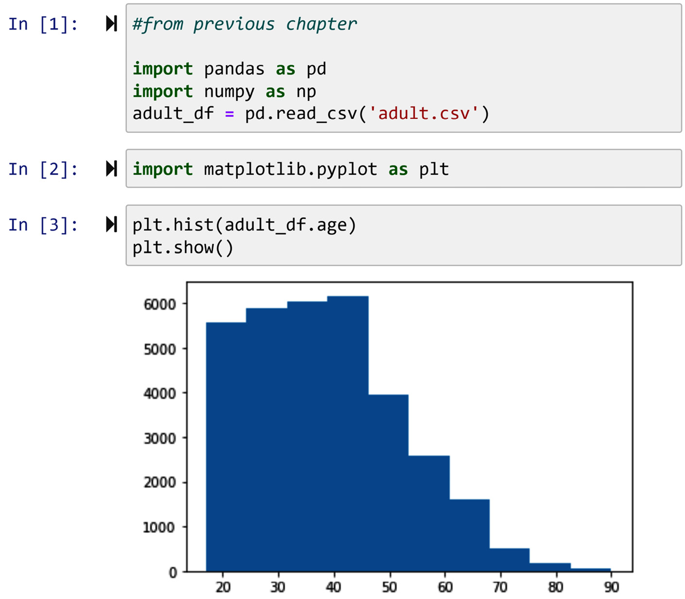
Figure 2.1 – Drawing the histogram of adult_df.age using Matplotlib
The following screenshot, in turn, shows the boxplot of the same data using plt.boxplot(). I have also requested the boxplot to be drawn horizontally by specifying vert=False so the boxplot and the preceding histogram can be compared visually.
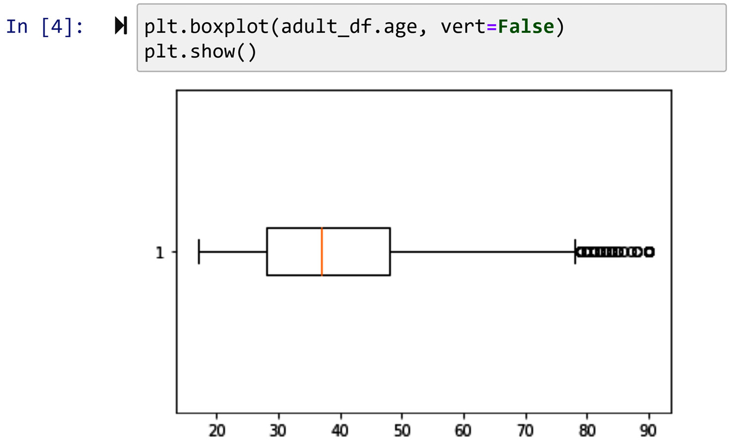
Figure 2.2 – Drawing the box plot of adult_df.age using Matplotlib
So far, we've learned two of the main plots of the Matplotlib module. Next, we will cover the line plot.
Observing trends in the data using a line plot
A line plot, not exclusively, but very often, is applied to time series data to show trends. A great example of time series data is stock prices. For instance, the stock price of the company Amazon changes minute by minute, and if someone is interested to see the trend of changes in these stock prices, they can use a line plot to do that.
We are going to use Amazon and Apple stock prices to showcase the application of line plots in illustrating trends. The following code shows the loading of that data with the Amazon Stock.csv and Apple Stock.csv files using the pd.read_csv() function. These files contain the stock prices of Amazon and Apple from 2000 to 2020:
amz_df = pd.read_csv('Amazon Stock.csv')
apl_df = pd.read_csv('Apple Stock.csv')
The following screenshot shows us using the plt.plot() function to draw the line plot of the closing prices of the stocks:
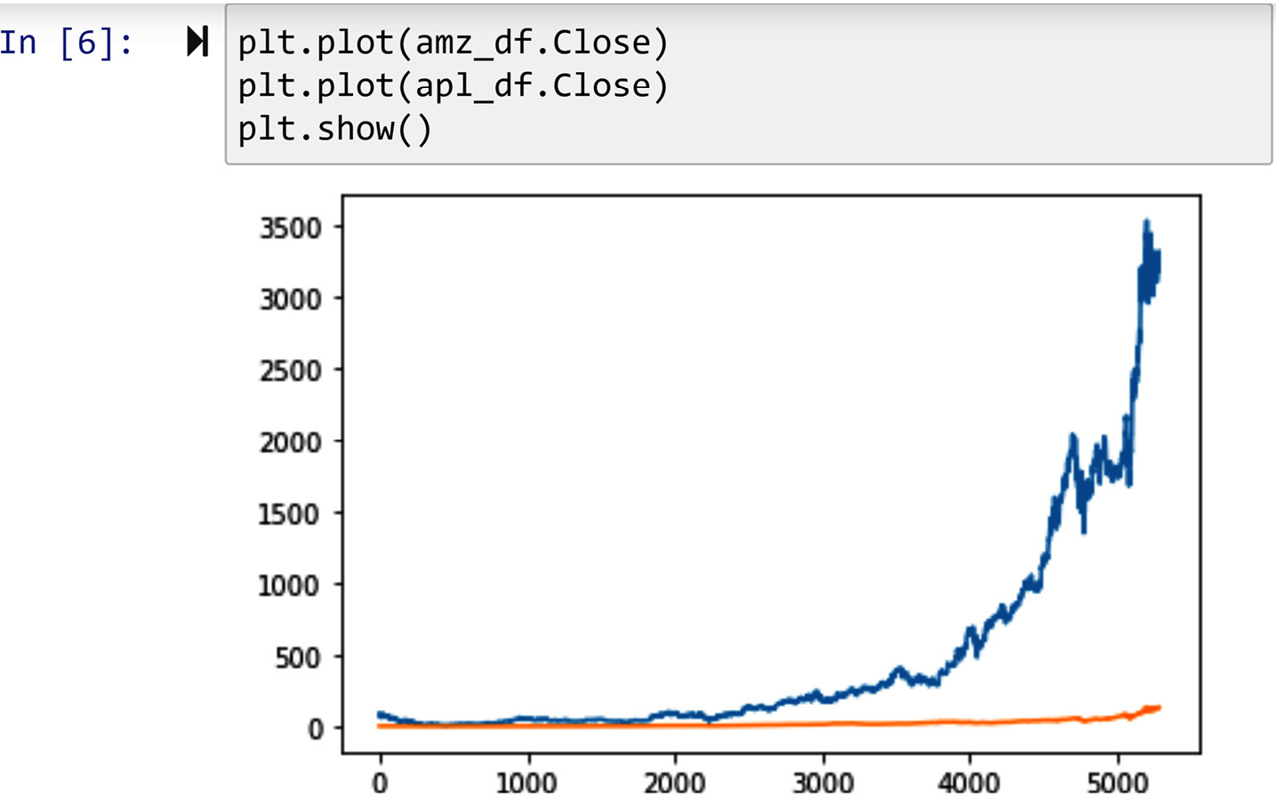
Figure 2.3 – Drawing the line plots of Amazon and Apple stock trends
Next, we are going to learn about scatterplots.
Relating two numerical attributes using a scatterplot
Scatterplots can be drawn using the plt.scatter() function. This function is great for examining the relationship between numerical attributes. For instance, the following screenshot shows us the relationship between the prices of Amazon and Apple stocks in the years from 2000 to 2020. Each dot in this scatterplot represents one trading day from 2000 to 2020.
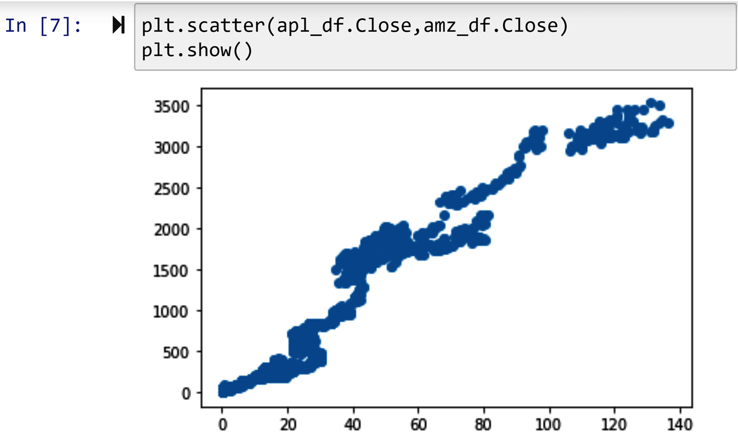
Figure 2.4 – Drawing the scatterplots of Amazon and Apple stock trends
So far in this chapter, we have been introduced to the main plots of Matplotlib and their analytics functionalities. Next, we will learn how to edit the visuals in simple but effective ways.
Modifying the visuals
The Matplotlib module is great at allowing you to modify the plots so that they serve your needs. The first thing you need before modifying a visual is to know the name of the part of the visual that you are intending to modify. The following figure shows you the anatomy of these visuals and is a great reference to find the name of the part you intend to modify.
In the following examples, we will see how to modify the title and markers of the visuals, and the labels and the ticks of the axes of the visuals. These are the most frequent modifications that you will need. If you found yourself in situations where you need to modify other parts too, how you would go about those are very similar, and so long as you know the name of what you plan to modify, you are one Google search away from finding how it is done.

Figure 2.5 – Anatomy of Matplotlib visuals
Adding a title to visuals and labels to the axis
To modify any part of a Matplotlib visual, you need to execute a function that can do the modifying trick. For instance, to add a title to a visual, you need to use plt.title() after a visual is executed. Also, to add a label to the x axis or the y axis, you can employ plt.xlabel() or plt.ylabel().
The following screenshot shows the application of plt.title() and plt.ylabel() to add a title to the visual and add a label to the y axis respectively:
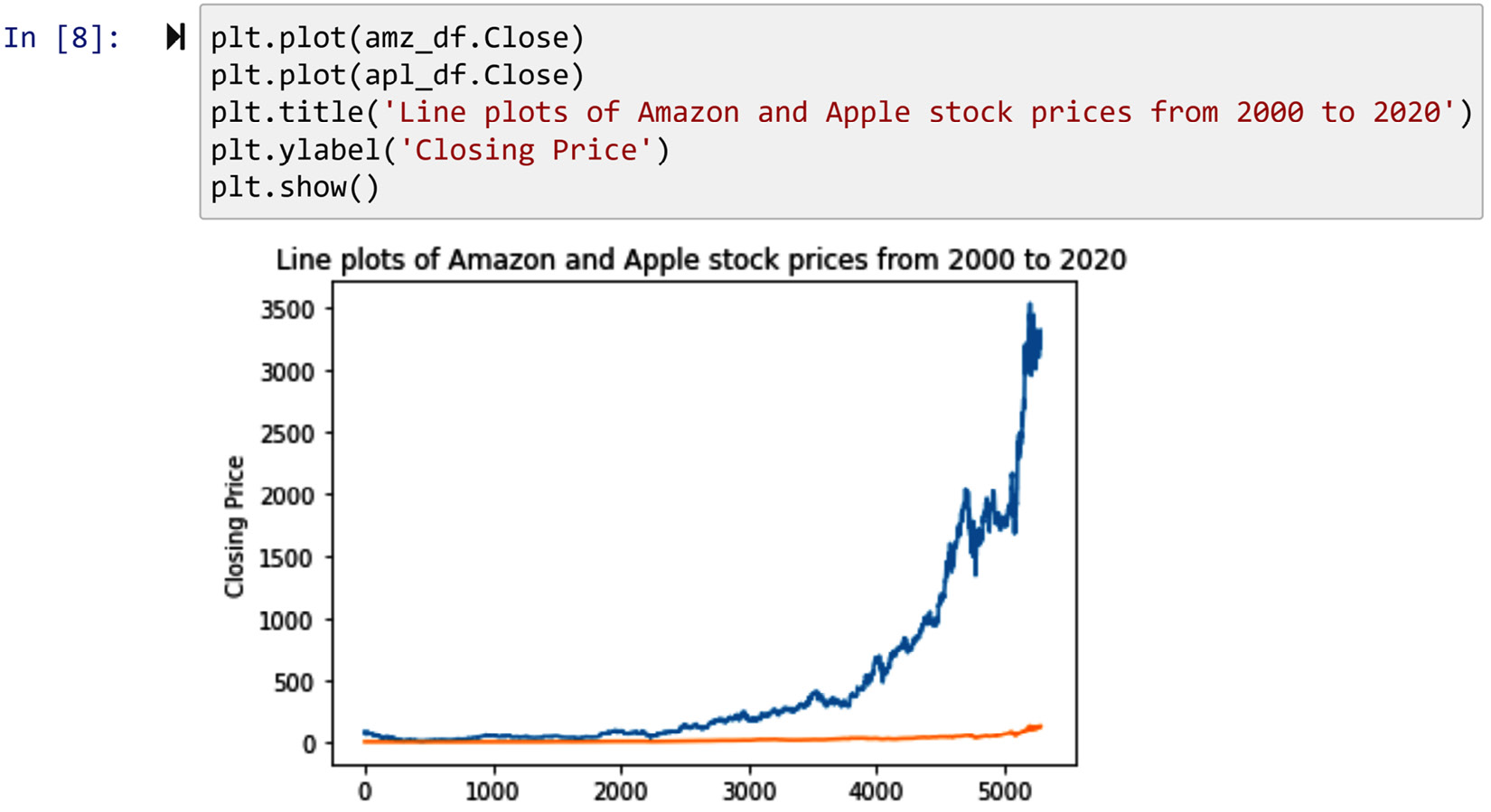
Figure 2.6 – Example of adding a title and label to a Matplotlib visual
Having learned how to add titles and labels, we will now turn our attention to learn how to add and modify legends.
Adding legends
For adding legends to a Matplotlib visual, there are two steps:
- First, you need to add a relevant label as you introduce each segment of the data to Matplotlib.
- Second, after executing the visuals, you need to execute plt.legend().
The following screenshot depicts how these two steps are taken to add a legend to the line plot:
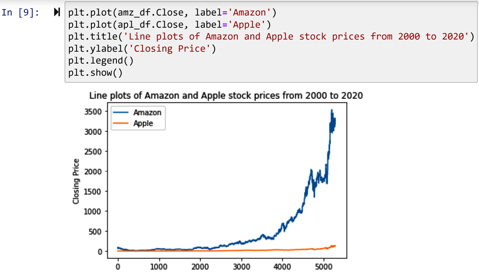
Figure 2.7 – Example of adding a legend to a Matplotlib visual
Next, we will learn about how to edit the xticks or the yticks.
Modifying ticks
Modifying the ticks is perhaps the most complex of all modifications of Matplotlib visuals. Let's discuss how this is done as it pertains to a line plot, and you can extrapolate that to the other visuals easily.
You need to know a little about the workings of the plt.plot() function before you can successfully modify the ticks. When a line plot is first introduced, you either explicitly introduce the x axis to the plt.plot()function, or the function assumes integer values starting from zero to the number values inputted for plotting minus one. As we did not explicitly introduce the x values in the past couple of line plots (see previous), the plt.plot() function has assumed the integer values for the x axis. However, pay attention to the outputted visuals where only x values of 0, 1000, 2000, 3000, 4000, and 5000 are being represented.
The following screenshot shows how instead of representing all the trading days with six integers, you could represent them with as many as you want. The integers you want to be represented in the ticks are simply introduced to the plt.xticks() function. Also, you can use the property rotation to change the angle of the ticks, so they are more legible.
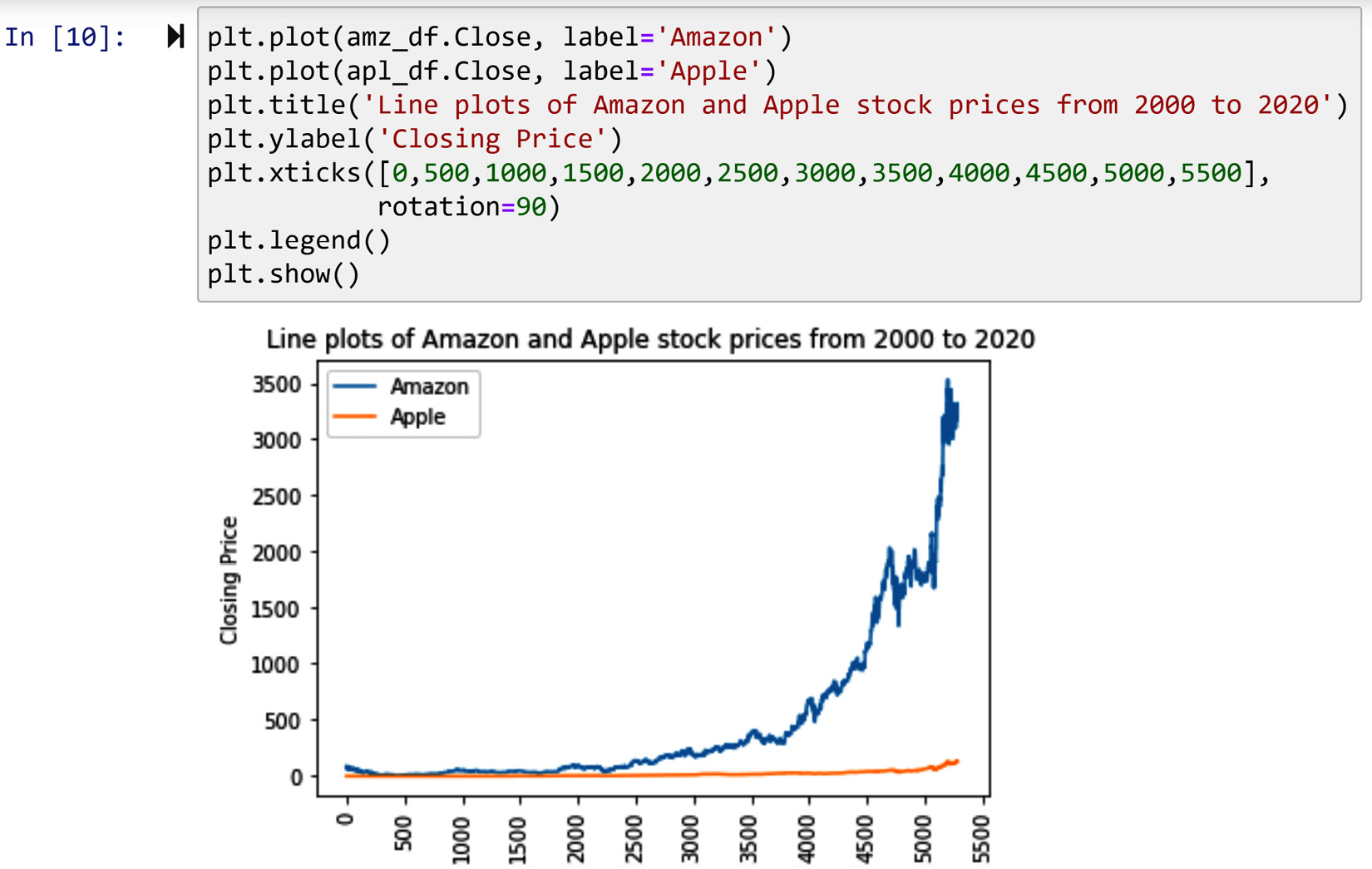
Figure 2.8 – Example of modifying the ticks of a Matplotlib visual – level 1
How about if we want to re-represent these integers that represent trading days with their trading day's actual dates? This can easily be done using the plt.xticks() function. After introducing the integers that you want to be represented, you need to also introduce the replacing counterparts of these integers to the function.
The code in the following screenshot provides an example of how this can be done:
- First, the integers that we want represented are inputted as np.arange(0,len(amz_df),250). Pay attention to the fact that instead of typing the integers, the code has used the np.arange() function to produce those integers. Run np.arange(0,len(amz_df),250) separately and study the output.
- Second, the replacing counterparts, which are the dates of these trading days, are also introduced to plt.xticks(). They are introduced using the column Date in amz_df. The amz_df.Date[0:len(amz_df):250] code ensures that the replacing representations are their relevant counterparts in the integer representation. Pay attention – we have used amz_df, as we know the column date for amz_df and apl_df are identical.
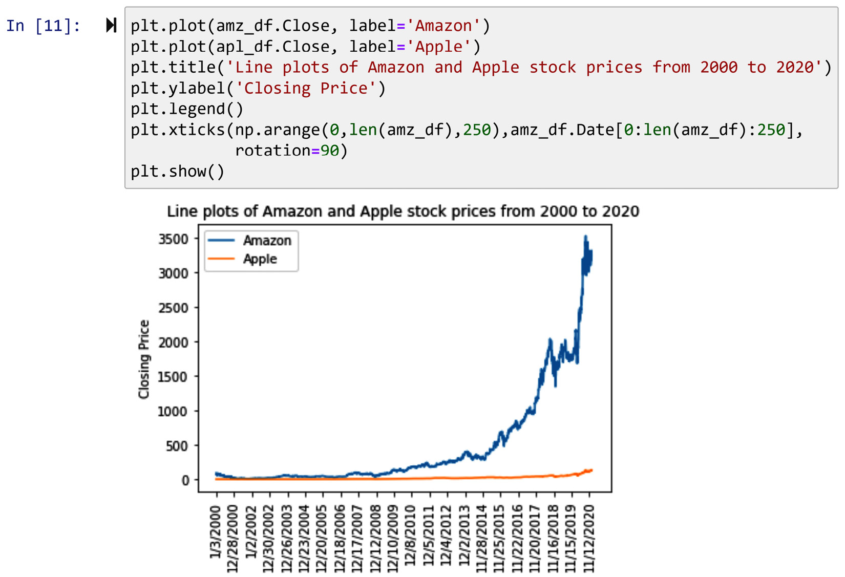
Figure 2.9 – Example of modifying the ticks of a Matplotlib visual – level 2
Pay attention to the fact that the number 250 in the preceding code had been reached by trial and error. We were looking for an increment that would not make the xticks too crowded or too sparse. Try running the code with alternative increments and study the behavior of the visual.
Modifying markers
The only visuals that we presented here that use markers are scatterplots. To modify the color and the shape of the markers, all you need to do is specify them when executing plt.scatter(). This function takes two inputs that it uses to draw the visual the way you would like. The marker input takes the shape of the marker you intend to draw, and the color input takes its color. The following screenshot shows how to change the default blue dots of Matplotlib scatterplots to green crosses by inputting marker='x' and color='green'. You cannot see the change of the colors in print as the book is printed in grayscale, but you will see the change in color if you try out the code yourself. The code also shows another example of using plt.title(), plt.xlabel(), and plt.ylabel() to modify the title of the visual and the labels of its axes.
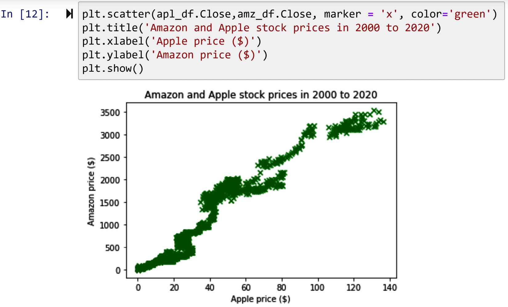
Figure 2.10 – Example of modifying the markers in a Matplotlib visual
There are many marker shapes and marker color options that you can use. To study these options, visit the following web pages from the Matplotlib official website:
- Markers: https://matplotlib.org/stable/api/markers_api.html
- Colors: https://matplotlib.org/stable/gallery/color/named_colors.html
So far, we have learned how to create visuals and modify them using Matplotlib. Next, we will learn another useful function that allows us to organize multiple visuals next to one another.
Subplots
Drawing a subplot can be a very useful data analytics and data preprocessing tool. We use subplots when we want to populate more than one visual and organize them next to one another in a specific way.
The following screenshot shows an example of subplotting. The logic of creating subplots in Matplotlib is unique and interesting. To draw a subplot, you first need to plan and decide the number of visuals you intend to have and their matrix-like organization. For instance, the following example has two visuals, and the visuals are organized in a matrix with two rows and one column. Once you know that, you can start coding.
Let's do this together step by step:
- The logic of Matplotlib subplots is that you use a line of code to announce you are about to start giving the code for each specific visual. The plt.subplot(2,1,1) line says that you want to have a subplot with two rows and one column, and you are about to run the code for the first visual.
- Once you are done with the first visual, you run another plt.subplot(), but this time you announce your intention to start another visual. For instance, by running plt.subplot(2,1,2), you are announcing that you are done with the first visual, and you are about to start introducing the second visual.
Pay attention to the fact that the first two inputs of plt.subplot() stay the same throughout subplotting, as they specify the matrix-like organization of the subplots and they should be the same throughout.
The plt.tight_layout() function is best used after you are done with all the visuals and are about to show the whole subplots. This function makes sure that each visual fits within its own boundaries and there are no overlaps. Run the following code block without plt.tight_layout() and study the differences:
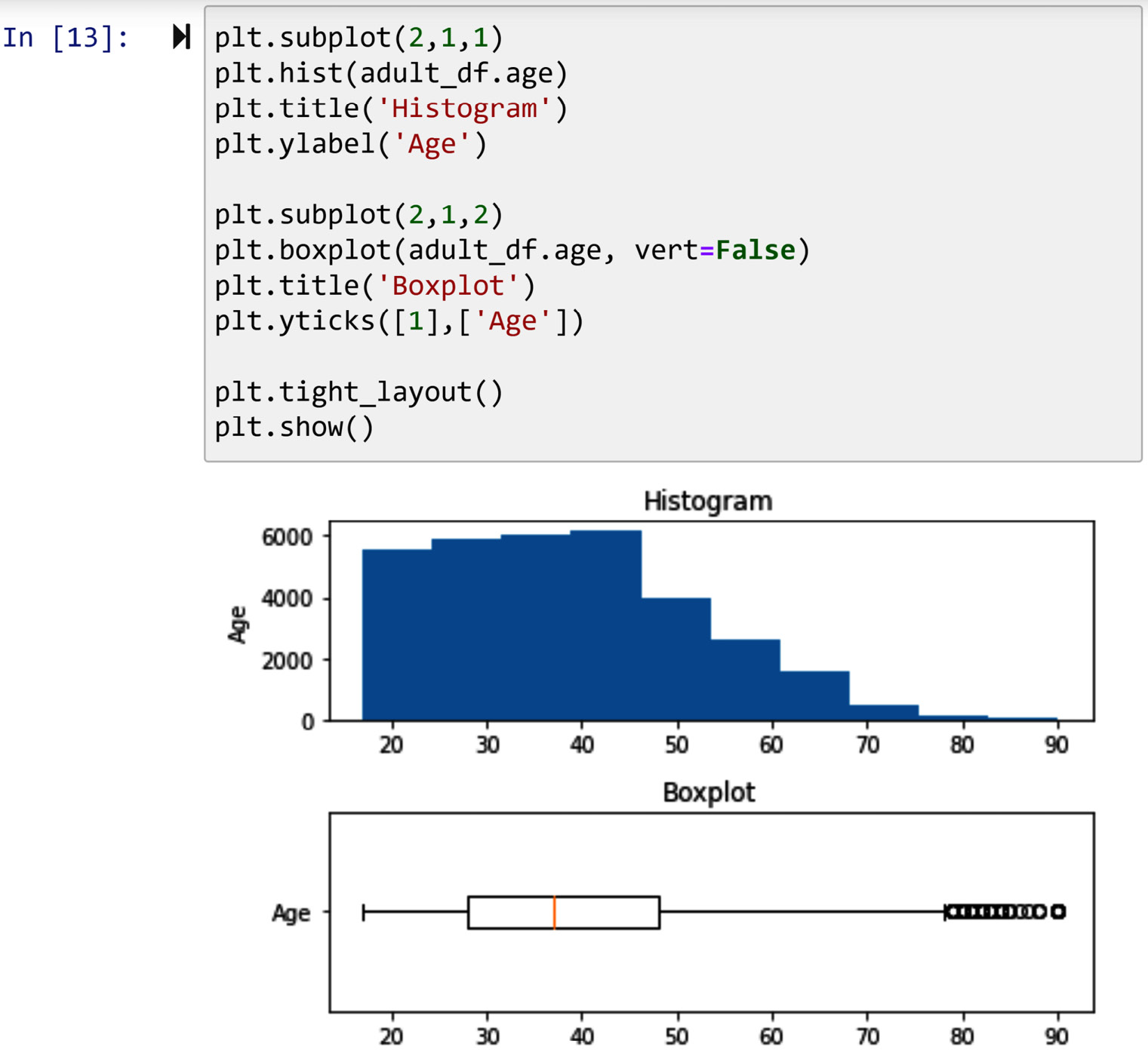
Figure 2.11 – Example of using subplots
So far, we have learned how to draw and design the visuals and then modify them. However, we have yet to learn how to resize them so we can fit them for our needs. Next, we will learn how to resize and save them on our computers.
Resizing visuals and saving them
It is very simple to save Matplotlib visuals with any resolution that you would like. However, before adjusting the resolution and saving the visuals, you might want to resize the visual. Let's first take a look at how we can resize the visuals and then see how we can save the visuals with specific resolutions.
Resizing
Matplotlib uses a default visual size (6x4 inches) for all its visual output, and from time to time, you may want to adjust the size of the visuals (especially if you have subplots as you may need a larger output). To adjust the visual size, the easiest way is to run plt.figure(figsize=(6,4)) before starting to request any visuals. Of course, adding the mentioned code will not change the size as the inputted values are the same as the Matplotlib default size. To observe the difference, add plt.figure(figsize=(9,6)) to the code in the previous screenshot and run it to study the differences. Also, change the values a few times to find the values that work best for you.
Saving
All you need to use to save and adjust the resolution of the output figures is the plt.savefig() function. This function takes the name of the file you would like to create for saving the visual and also its resolution in terms of dots per inch (DPI). The higher the DPI value of a figure, the higher its resolution. For instance, running plt.savefig('visual.png',dpi=600) saves the visual in a file named visual.png in your computer under the same directory where your Jupyter Notebook file is located. Of course, the DPI resolution of the saved visual will be 600.
Example of Matplotilb assisting data preprocessing
A great way to get to know a new dataset is to visualize its columns. The numerical columns are best visualized using either histograms or boxplots. However, the combination of the two is the best, especially when the boxplot is drawn vertically. Use the subplot function of Matplotlib to draw the histogram and boxplot of all the numerical columns of adult_df in a 2x5 matrix-like visual. Make sure that the histogram and the boxplot of each column are in the same subplot column. Also, save the visual in a file named ColumnsVsiaulization.png with a resolution of 900 DPI.
The following code shows the solution for this example:
Numerical_colums = ['age', 'education_num', 'capitalGain', 'capitalLoss', 'hoursPerWeek']
plt.figure(figsize=(20,5))
for i,col in enumerate(Numerical_colums):
plt.subplot(2,5,i+1)
plt.hist(adult_df[col])
plt.title(col)
for i,col in enumerate(Numerical_colums):
plt.subplot(2,5,i+6)
plt.boxplot(adult_df[col],vert=False)
plt.yticks([])
plt.tight_layout()
plt.savefig('ColumnsVsiaulization.png', dpi=900)
After running the code, if it is successfully executed, check the directory that your Jupyter Notebook file is in, and the ColumnsVisualization.png file must be added there. Open the file and enjoy the high-quality visual that was created by Matplotlib.
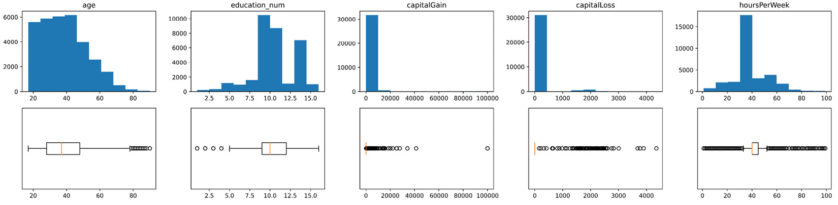
Figure 2.12 – Histogram and boxplot of the numerical attributes of adult_df
Congratulations on successfully finishing this chapter! Now you are equipped with visualization tools that will prove very handy for data analytics and data preprocessing.
Summary
In this chapter, you learned how to create the five main Matplotlib visuals and design them for your needs. You also learned how to create more complex visuals by organizing them in one visual using the Matplotlib subplot functionality. Ultimately, you also learned how to resize the visuals and save them with your desired resolution for later use.
In the next chapter, you will be given some essential lessons about data, along with concepts that are necessary for successful data preprocessing. However, before moving on to the next chapter, take some time and solidify and improve your learning using the following exercises.
Exercises
- Use adult.csv and Boolean masking to answer the following questions:
a. Calculate the mean and median of education-num for every race in the data.
b. Draw one histogram of education-num that includes the data for each race in the data.
c. Draw a comparative boxplot that compares the education-num for each race.
d. Create a subplot that puts the visual from b) on top of the one from c).
- Repeat the analysis on 1, a), but this time use the groupby function.
a. Compare the runtime of using Boolean masking versus groupby (hint: you can import the module time and use the .time() function).
- If you have not already done so, solve Exercise 4 in the previous chapter. After you have created pvt_df for Exercise 4, run the following code:
import seaborn as sns
sns.pairplot(pvt_df)
The code outputs what is known as a scatter matrix. This code takes advantage of the Seaborn module, which is another very useful visualization module. To practice subplots and resizing, recreate what Seaborn was able to do with sns.pairplot() using Matplotlib (hint: doing this with plt.subplot() might be a bit too challenging for you. First, give it a try and figure out what the challenge is, and then Google plt.subplot2grid()).
Pay attention – if you have never used the Seaborn module before, you may have to install it on your Anaconda first. It is easy – just run the following code in your Jupyter notebook:
conda install seaborn