
Chapter 16: Case Study 2 – Predicting COVID-19 Hospitalizations
This chapter is going to provide an excellent learning opportunity to perform a predictive analysis from scratch. By the end of this chapter, you will have learned a valuable lesson about preprocessing. We will take the COVID-19 pandemic as an example. This is a good case study because there is lots of data available about different aspects of the pandemic such as covid hospitalizations, cases, deaths, and vaccinations.
In this chapter, we're going to cover the following:
- Introducing the case study
- Preprocessing the data
- Analyzing the data
Technical requirements
You will be able to find all of the code examples and the dataset that is used in this chapter in this book's GitHub repository at https://github.com/PacktPublishing/Hands-On-Data-Preprocessing-in-Python/tree/main/Chapter16.
Introducing the case study
As the world started grappling with the ramifications of COVID-19, healthcare systems across the globe started dealing with the new overwhelming burden of caring for the people infected with the disease. For instance, in the US governments, all levels – Federal, State, and local, had to make decisions so they can help the hospitals as they struggled to shoulder the crisis. The good news is that database and data analytics technologies were able to create real value for these decision-makers. For instance, the following figure shows a dashboard that monitors the COVID-19 situation for Los Angeles County in the State of California in the United States. The figure was collected from http://publichealth.lacounty.gov/media/coronavirus/data/index.htm on October 4, 2021.
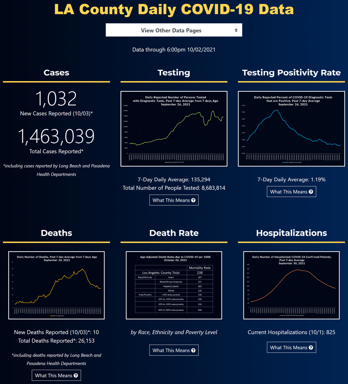
Figure 16.1 – An LA County COVID-19 data dashboard
In this case study, we are going to see an example of data analytics that can be of meaningful value to a local government department. We are going to focus on the government of Los Angeles County (LA), California. This county is the most populated in the US, with approximately 10 million residents. We are going to use historical data to predict the number of patients that will need hospitalization in the near future; specifically, we will create a model that can predict the number of hospitalizations in LA County two weeks from the present moment.
Now that we have a general understanding of this case study, let's get to know the datasets that we will use for our prediction model.
Introducing the source of the data
When we create a prediction model, one of the first things we need to do is to imagine what kind of data can be useful for predicting our target. In this example, our target is the number of hospitalizations. In other words, we want to imagine what the independent attributes could be for predicting this specific dependent attribute.
Go back to Chapter 3, Data – What Is It Really?, and study the DDPA pyramid in Figure 3.2. When we imagine what data resources could be useful for the prediction of our target, we are exploring the base of the DDPA pyramid. The base of the pyramid represents all of the data that is available to us. Not everything is going to be useful at this point, but that is the beginning of the data preprocessing journey. We start by considering what could be useful, and by the end of the process, we should have a suitable dataset that can be useful for pattern recognition.
The following list shows four sources of data that can be useful for predicting hospitalizations:
- Historical data of LA County COVID-19 hospitalizations (https://data.chhs.ca.gov/dataset/covid-19-hospital-data)
- Historical data of COVID-19 Cases and Deaths in LA County (https://data.chhs.ca.gov/dataset/covid-19-time-series-metrics-by-county-and-state)
- Historical data of COVID-19 Vaccinations in LA County (https://data.chhs.ca.gov/dataset/covid-19-vaccine-progress-dashboard-data-by-zip-code)
- The dates of US public holidays (these can be accessed via Google)
You can download the latest versions of these datasets from the provided links. The three datasets that we use in this chapter, covid19hospitalbycounty.csv, covid19cases_test.csv, and covid19vaccinesbyzipcode_test.csv, were collected on October 3, 2021. You must keep this date in mind as you go through this chapter, as the time range of our prediction is an important feature. I strongly encourage you to download the latest version of these files and update the analysis and do some actual predictions. Better yet, if the same datasets are available where you live, do the predictive analysis for your local government.
The fourth data source is a simple one – the US public holidays are, well, public knowledge, and some simple Googling can provide these.
Attention!
I strongly encourage you to open each of these datasets on your own and scroll through them to get to know them before continuing. This will enhance your learning.
Now that we have the datasets, we need to perform some data preprocessing before we get to the data analytics. So, let's dive in.
Preprocessing the data
The very first step in preprocessing data for prediction and classification models is to be clear about how far in the future you are planning to make predictions. As discussed, our goal in this case study is to make a prediction for two full weeks (that is, 14 days) in the future. This is critical to know before we start the preprocessing.
The next step is to design a dataset that has two characteristics:
- First, it must support our prediction needs. For instance, in this case, we want to use historical data to predict hospitalizations in two weeks.
- Second, the dataset must be filled with all of the data we have collected. In this example, the data includes covid19hospitalbycounty.csv, covid19cases_test.csv, covid19vaccinesbyzipcode_test.csv, and the dates of US public holidays.
One of the very first things we will do codewise, of course, is to read these datasets into pandas DataFrames. The following list shows the name we used for the pandas DataFrames:
- covid19hospitalbycounty.csv: day_hosp_df
- covid19cases_test.csv: day_case_df
- covid19vaccinesbyzipcode_test.csv: day_vax_df
Now, let's discuss the steps for designing the dataset, which needs to have the two characteristics we previously described.
Designing the dataset to support the prediction
While designing this dataset to possess the two characteristics that were mentioned earlier, we basically try to come up with possible independent attributes that can have meaningful predictive values for our dependent attribute. The following list shows the independent attributes that we may come up with for this prediction task.
In defining the attributes in the following list, we have used the t variable to represent time. For instance, t0 shows t=0, and the attribute shows information about the same day as the row:
- n_Hosp_t0: The number of hospitalizations at t=0
- s_Hosp_tn7_0: The slope of the curve of hospitalizations for the period t=-7 to t=0
- Bn_days_MajHol: The number of days from the previous major holiday
- av7_Case_tn6_0: The seven-day average of the number of cases for the period t=-6 to t=0
- s_Case_tn14_0: The slope of the curve of cases for the period t=-14 to t=0
- av7_Death_tn6_0: The seven-day average of the number of deaths for the period t=-6 to t=0
- s_Death_tn14_0: The slope of the curve of deaths for the period t=-14 to t=0
- p_FullVax_t0: The percentage of fully vaccinated people at t=0
- s_FullVax_tn14_0: The slope of the curve of the percentage of fully vaccinated people for the period t=-14 to t=0
Note!
A great question to ask about these suggested independent attributes is how did we come up with them. There is no step-by-step process that can guarantee the perfect set of independent attributes, but you can learn the relevant skills to position you for more success.
These independent attributes are the byproduct of the creative mind of a person that has the following characteristics: 1) they understand the prediction algorithms, 2) they know the types of data that are collected, 3) they are knowledgeable about the target attribute and the factors that can influence it, and 4) they are equipped with data preprocessing tools such as data integration and transformation that enable effective data preprocessing.
After reviewing these potential attributes, you realize the importance of functional data analysis (FDA), which we learned about in different parts of this book. Most of these attributes will be the outcome of the FDA for data integration, data reduction, and data transformation.
The dependent attribute (or our target) is also coded similarly as n_Hosp_t14, which is the number of hospitalizations at t=14.
The following figure shows the placeholder dataset that we have designed so that we can fill it up using the data resources we have identified:

Figure 16.2 – The placeholder for the designed dataset
Filling up the placeholder dataset
The following figure tells a simple story of how we will be filling up the placeholder dataset. Of course, the data comes from the four data sources that we have identified; however, the ingenuity and the skills that we need to integrate, transform, reduce, and clean the data so it can fill up the placeholder will come from our knowledge and creativity.
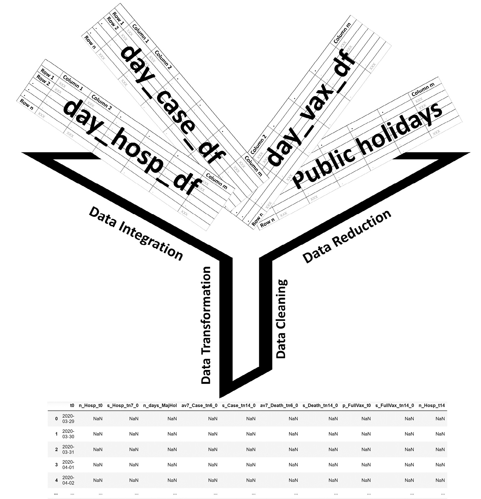
Figure 16.3 – A schematic of filling up the placeholder dataset
Attention!
It is important to remember that we learned about each of the data preprocessing steps in isolation. We first learned about data cleaning, then data integration, and after that data reduction, and at the end came data transformation. However, now that we are starting to feel more comfortable with these stages, there is no need to do these in isolation. In real practice, they can and should be done at the same time very regularly. In this case study, you are seeing an example of this.
So, as shown in the preceding figure, we will be using the data from the four sources to fill the columns, one by one, in the designed placeholder dataset. However, to make the connections between the data sources, some data cleaning is needed. The main priority is to make sure all of the rows in day_hosp_df, day_case_df, day_vax_df, and even the placeholder day_df are indexed with the datetime version of the dates. These dates will provide seamless connections between the data sources. After that, we will use what we have learned in this book to fill the columns in the placeholder day_df DataFrame. The following figure shows the day_df DataFrame rows after having been filled:
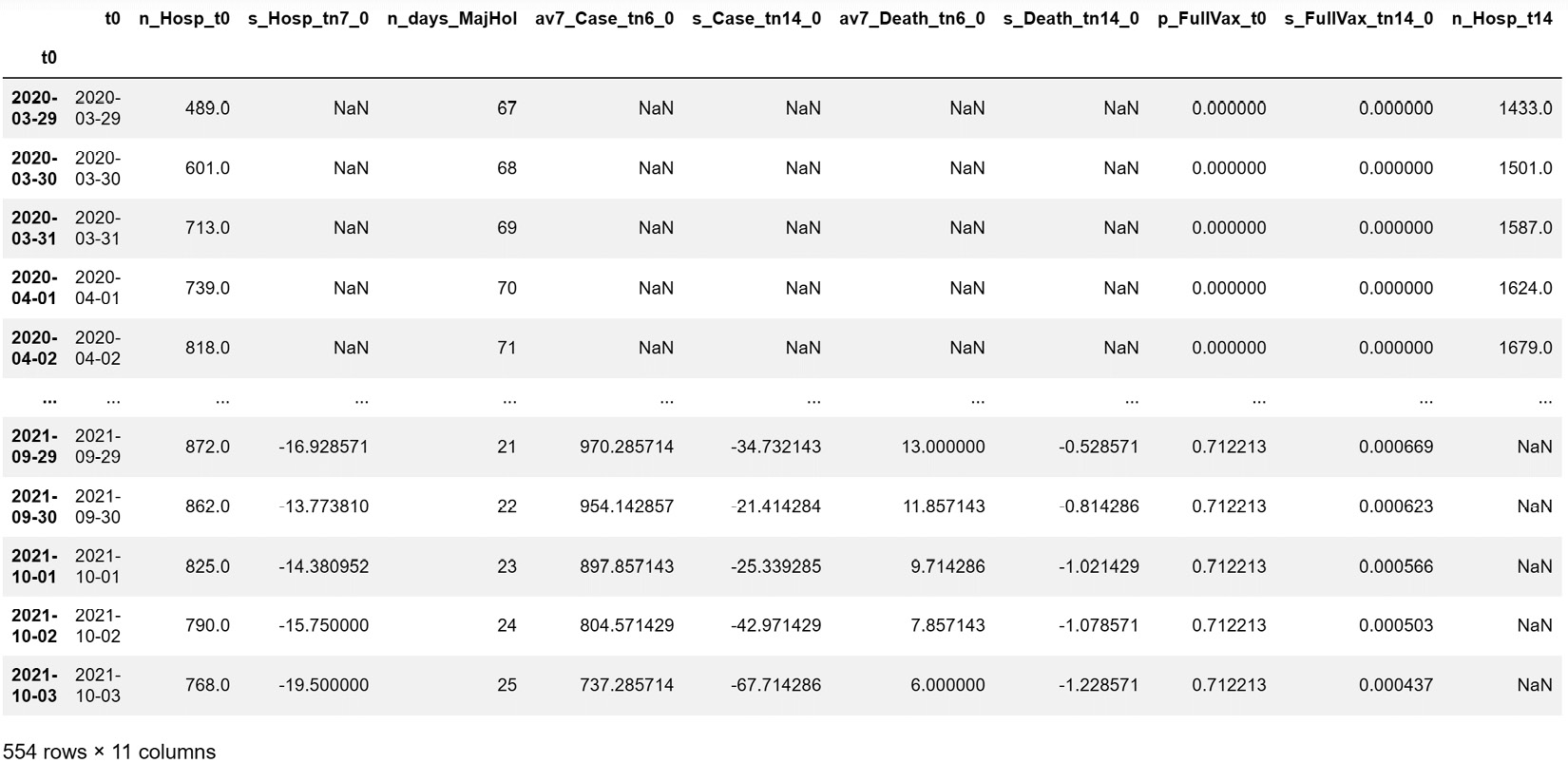
Figure 16.4 – The placeholder dataset after being filled
You may be wondering why some of the rows still contain NaN. That's a great question and I am confident you can figure out the answer on your own. Just go back to the definition of each of these independent attributes we designed earlier. Give this some thought before reading on.
The answer to the question is simple. The reason that there are still NaN values on some of the rows is that we did not have the information in our data sources to calculate them. For instance, let's consider why s_Hosp_tn7_0 is NaN in the 2020-03-29 row. We have to go back to the definition of s_Hosp_tn7_0, which is the slope of the curve of hospitalizations for the period t=-7 to t=0. As 2020-03-29 is t=0 for this row, we will need to have the data of the following dates to calculate s_Hosp_tn7_0, and we don't have them in our data sources:
- t=-1: 2020-03-28
- t=-2: 2020-03-27
- t=-3: 2020-03-26
- t=-4: 2020-03-25
- t=-5: 2020-03-24
- t=-6: 2020-03-23
- t=-7: 2020-03-22
The dataset that we are using in this case study has data from 2020-03-29. This almost always happens when creating a dataset for future prediction with a decision-making gap. The reason we included the 14 days' difference between the sources of data we use for calculating the independent attributes and computing the dependent attribute is for our prediction to have decision-making values. Of course, we can have a more accurate prediction if the decision-making gap is shorter, but at the same time, these predictions will have fewer decision-making values, as they may not allow for the decision-maker to process the situation and make the decision that can have a positive impact.
As you will see in the following sections, we will have to eliminate the rows that contain NaN. But that's okay, as we have enough data for our algorithm to still be capable of finding patterns.
Next, let's see whether the independent attribute we imagined would have predictive values has them. We will do that with supervised dimension reduction during our data preprocessing.
Supervised dimension reduction
In Chapter 13, Data Reduction, we learned a few supervised dimension reduction methods. Here, we want to apply three of them before moving to the data analysis part of the case study. These three methods are linear regression, random forests, and decision trees. Before reading on, make sure to revisit Chapter 13, Data Reduction, to freshen up your understanding of the strengths and weaknesses of each of these methods. The following figures show the results of each of these three methods.
In the following figure, we see that linear regression deems all of the independent attributes significant for the prediction of n_Hosp_t14, except for n_days_MajHol and s_FullVax_tn14_0. Pay attention to the P>|t| column, which shows with the p-value of the test on the null hypothesis that the relevant dependent attribute is not capable of predicting the target in this model. The p-values for all of the other independent attributes – except n_days_MajHol and s_FullVax_tn14_0 – are very small, indicating the rejection of the null hypothesis.

Figure 16.5 – The output of linear regression for supervised dimension reduction
We should remember to take the conclusion from the preceding figure with the caveat that linear regression is only capable of checking the linear relationships for us, and that these two attributes may have non-linear relationships that could be useful in a more complex model.
This is shown in the second supervised dimension reduction method: the random forest. The following figure visualizes the importance that the Random Forest has given to each independent attribute, and we do see, unlike our conclusion we arrive at under Linear Regression, only four independent attributes are among the most important attributes, and the rest has not given any sizable share of importance.
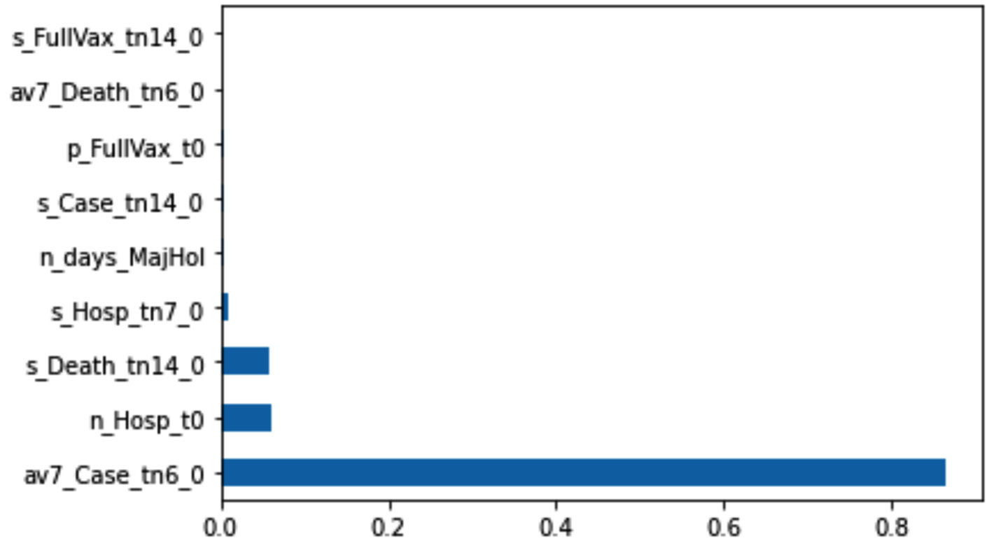
Figure 16.6 – The output of a random forest for supervised dimension reduction
The following figure shows the final decision tree after being tuned for the successful prediction of n_Hosp_t14. The resulting decision tree has many levels, and you will not be able to see the splitting attributes. However, you can see the complete decision tree via the HospDT.pdf file in this book's GitHub repository, or you can create it yourself to investigate it.
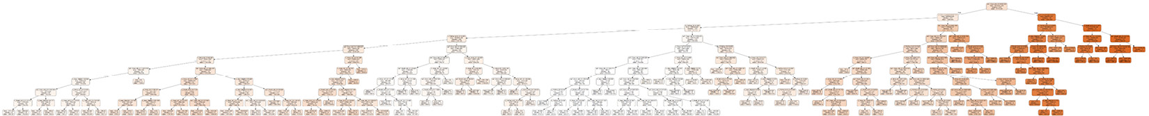
Figure 16.7 – The output of a decision tree for supervised dimension reduction
The data preprocessing is almost done. However, because we are going to use different algorithms in the next section, we will leave some of the last preprocessing steps to be performed immediately before applying each prediction algorithm.
Analyzing the data
Now that the data is almost ready, we get to reap the rewards of our hard work by being able to do what some may consider magic – predict the future. However, our prediction is going to be even better than magic. Our prediction will be reliable, as it is driven by meaningful patterns within historical data.
Throughout this book, we have got to know three algorithms that can handle prediction: linear regression, multilayer perceptrons (MLPs), and decision trees.
To be able to see the applicability of the prediction models, we need to have a meaningful validation mechanism. We haven't covered this in this book, but there is a well-known and simple method normally called the hold-out mechanism or the train-test procedure. Simply put, a small part of the data will not be used in the training of the model, and instead, that small part will be used to evaluate how well the model makes predictions.
Specifically, in this case study, after removing the rows that have any missing values, we have 525 data objects that can be used for prediction. We will use 511 of these data objects for training, specifically, the data objects from 2020-04-12 to 2021-09-04 (which would include 507 data objects). The rest, which are 14 data objects from two weeks of the data (that is, the data objects from 2021-09-05 to 2021-09-18), will be used for testing our models. Using these dates, we will separate our data into train and test sets. We will then train the algorithms using the train set and evaluate them using the test set.
The following figure shows how well the three models – namely linear regression, the decision tree, and the MLP – were able to fit themselves to the training data. With the decision tree and MLP, we should not trust a good fit between the training data and the model, as these algorithms can easily overfit the training data. Therefore, it is important to also see the performance of these algorithms on the test data.
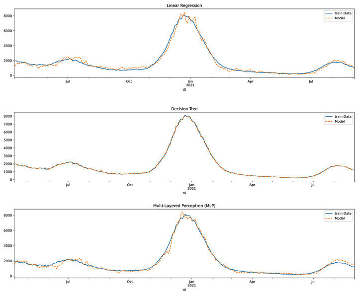
Figure 16.8 – The train dataset versus the fitted model for the linear regression, decision tree, and MLP models
The following figure shows how the trained models were able to predict the test data. The figure also shows what the prediction of actual future values looks like. Remember that this content was created on October 3, 2021.
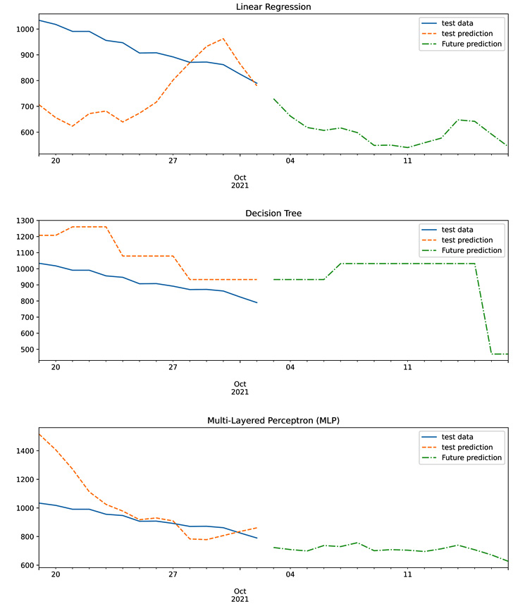
Figure 16.9 – The test data, test prediction, and future prediction of the linear regression, decision tree, and MLP models
Comparing the performance of these three models on the test data is rather difficult due to the way the preceding figure is set up. The following figure shows the prediction of all three models on the test data and also the test data itself in one chart. The following visualization will allow us to find the best algorithm for the job:
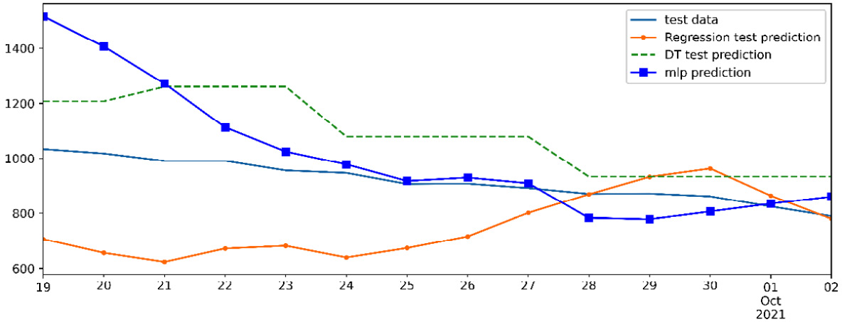
Figure 16.10 – Comparing the performance of the linear regression, decision tree, and MLP models on the test set
In the preceding figure, we can see that while the MLP model performs slightly better than the other two, the three models are largely comparable in performance, and they are all successful.
Well done, we were able to complete the prediction task and also validate it. Let's wrap up this chapter with a summary.
Summary
In this chapter, we got to see the real value of data preprocessing in enabling us to perform predictive analytics. As you saw in this chapter, what empowered our prediction was not an all-singing, all-dancing algorithm – it was our creativity in using what we learned during this chapter to come to a dataset that could be used by standard prediction algorithms for prediction. Furthermore, we got to practice different kinds of data cleaning, data reduction, data integration, and data transformation.
In the next chapter, we will get to practice data preprocessing on another case study. In this case study, the general goal of the analysis was prediction; however, the preprocessing in the next case study will be done to enable clustering analysis.