
Chapter 14: Data Transformation and Massaging
Congratulations, you've made your way to the last chapter of the third part of the book – The Preprocessing. In this part of the book, we have so far covered data cleaning, data integration, and data reduction. In this chapter, we will add the last piece to the arsenal of our data preprocessing tools – data transformation and massaging.
Data transformation normally is the last data preprocessing that is applied to our datasets. The dataset may need to be transformed to be ready for a prescribed analysis, or a specific transformation might help a certain analytics tool to perform better, or simply without a correct data transformation, the results of our analysis might be misleading.
In this chapter, we will cover when and where we need data transformation. Furthermore, we will cover the many techniques that are needed for every data preprocessing situation. In this chapter, we're going to cover the following main topics:
- The whys of data transformation and data massaging
- Normalization and standardization
- Binary coding, ranking transformation, and discretization
- Attribute construction
- Feature extraction
- Log transformation
- Smoothing, aggregation, and binning
Technical requirements
You will be able to find all of the code and the dataset that is used in this book in a GitHub repository exclusively created for this book. To find the repository, go to: https://github.com/PacktPublishing/Hands-On-Data-Preprocessing-in-Python. You can find this chapter in this repository and download the code and the data for better learning.
The whys of data transformation and massaging
Data transformation comes at the very last stage of data preprocessing, right before using the analytic tools. At this stage of data preprocessing, the dataset already has the following characteristics.
- Data cleaning: The dataset is cleaned at all three cleaning levels (Chapters 9–11).
- Data integration: All the potentially beneficial data sources are recognized and a dataset that includes the necessary information is created (Chapter 12, Data Fusion and Integration).
- Data reduction: If needed, the size of the dataset has been reduced (Chapter 13, Data Reduction).
At this stage of data preprocessing, we may have to make some changes to the data before moving to the analyzing stage. The dataset will undergo the changes for one of the following reasons: we will call them necessity, correctness, and effectiveness. The following list provides more detail for each reason.
- Necessity: The analytic method cannot work with the current state of the data. For instance, many data-mining algorithms, such as Multi-Layered Perceptron (MLP) and K-means, only work with numbers; when there are categorical attributes, those attributes need to be transformed before the analysis is possible.
- Correctness: Without the proper data transformation, the resulting analytic will be misleading and wrong. For instance, if we use K-means clustering without normalizing the data, we think that all the attributes have equal weights in the clustering result, but that's incorrect; the attributes that happen to have a larger scale will have more weight.
- Effectiveness: If the data goes through some prescribed changes, the analytics will be more effective.
Now that we have a better understanding of the goals and reasons for data transformation and massaging, let's learn what is the difference between data transformation and data massaging.
Data transformation versus data massaging
There is more similarity between the two terms than difference. Therefore, using them interchangeably would not be incorrect in most situations. Both terms describe changes that a dataset undergoes before analytics for improvement. However, there are two differences that it will be good for us know.
- First, the term data transformation is more commonly used and known.
- Second, the literal meanings of transforming and massaging may be used for drawing a conclusive difference between the two terms.
The term transformation is more general than massaging. Any changes a dataset undergoes can be called data transformation. However, the term massaging is more specific and does not carry the neutrality of transformation, but it carries the meaning of doing more for getting more. Therefore, as the following figure suggests, data massaging can be interpreted as changing the data when we are trying to improve the effectiveness of data analytics, whereas data transformation is a more general term. So, some could argue that all data massaging is also data transformation, but not all data transformation is also data massaging:
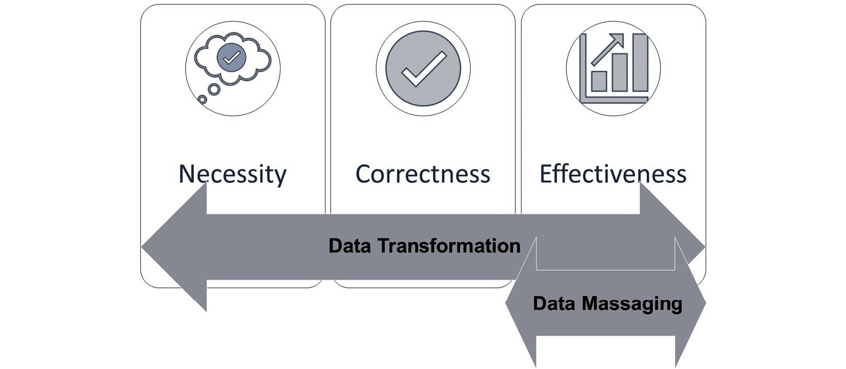
Figure 14.1 – Data transformation versus data massaging
The preceding figure shows the three reasons for data transformation that we discussed earlier: Necessity, Correctness, and Effectiveness. Furthermore, the figure shows that while data transformation is a more general term used to refer to the changes a dataset undergoes before the analysis, data massaging is more specific and can be used when the goal of transforming the dataset is for effectiveness.
In the rest of this chapter, we will cover some data transformation and massaging tools that are commonly used. We will start by covering normalization and standardization.
Normalization and standardization
At different points during our journey in this book, we've already talked about and used normalization and standardization. For instance, before applying K-Nearest Neighbors (KNN) in Chapter 7, Classification, and before using K-means on our dataset in Chapter 8, Clustering Analysis, we used normalization. Furthermore, before applying Principal Component Analysis (PCA) to our dataset for unsupervised dimension reduction in Chapter 13, Data Reduction, we used standardization.
Here is the general rule of when we need normalization or standardization. We need normalization when we need the range of all the attributes in a dataset to be equal. This will be needed especially for algorithmic data analytics that uses the distance between the data objects. Examples of such algorithms are K-means and KNN. On the other hand, we need standardization when we need the variance and/or the standard deviation of all the attributes to be equal. We saw an example of needing standardization when learning about PCA in Chapter 13, Data Reduction. We learned standardization was necessary because PCA essentially operates by examining the total variations in a dataset; when an attribute has more variations, it will have more say in the operation of PCA.
The following two equations show the formula we need to use to apply normalization and standardization. The following list defines the variables used in the equations:
- A: The attribute
- i: The index for the data objects
- Ai: The value of data object i in attribute A
- NA: The normalized version of attribute A
- SA: The standardized version of attribute A


Let's see an example. The following figure shows a small dataset of employees that are described by only two attributes, Salary and GPA. Naturally, the numbers we use for salary are larger than GPA, as you can see in the original attributes, Salary and GPA. The preceding two equations have been used to apply normalization and standardization transformation respectively. The middle table is the normalized version of the dataset showing N_Salary and N_GPA. You can see that after normalization, the transformed versions of the attributes have the same range from zero to one. The right table is the standardized version of the dataset featuring S_Salary and S_GPA. You can see in the standardized version that the standard deviation (STD) of the two attributes are both equal to one:
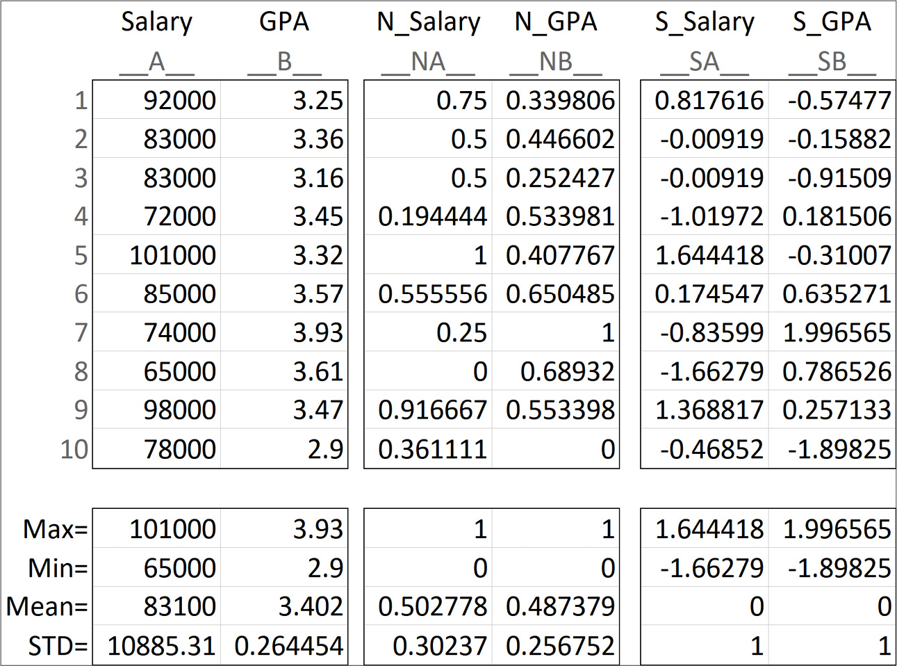
Figure 14.2 – An example of normalization and standardization
Upon further study of the preceding figure, you may observe two interesting trends:
- First, even though the goal of normalization is equalizing the range (Max and Min), the standard deviations (STD) of the normalized attributes have become much closer to one another too.
- Second, even though the goal of standardization is equalizing the standard deviation (STD), the Max and Min values of the two standardized attributes are much closer to one another too.
These two observations are the main reason in many resources standardization and normalization are introduced as two methods that can be used interchangeably. Furthermore, I have seen all too often that the choice of applying standardization or normalization is set in a supervised tuning. That means the practitioner experiments with both normalizing the data and then standardizing it, and then selects the one that leads to better performance on the prime evaluation metric. For instance, if we want to apply KNN on the data, we might see the choice between normalization or standardization of the attribute as a tuning parameter next to K and the subset of the independent attributes (see the Example – finding the best subset of independent attributes for a classification algorithm subsection in the Brute-force computational dimension reduction section in Chapter 13, Data Reduction) and experiment with both to see which one works best for the case study.
Before moving to the next group of data transformation methods, let's discuss whether normalization and standardization fall under data massaging or not. Most of the time, the reason we would apply these two transformations are that without them, the results of our analysis would be misleading. So, the best way to describe the reason behind applying them is correctness; therefore, we cannot refer to standardization or normalization as data massaging.
In the course of this book, we have seen many examples of applying normalization and standardization, so we will skip giving a practical example on these data transformation tools and go straight to the next group of methods: binary coding, ranking transformation, and discretization.
Binary coding, ranking transformation, and discretization
In our analytics journey, there will be many instances in which we want to transform our data from numerical representation to categorical representation, or vice versa. To do these transformations, we will have to use one of three tools: binary coding, ranking transformation, and discretization.
As the following figure shows, to switch from Categories to Numbers, we either have to use Binary Coding or Ranking Transformation, and to switch from numbers to categories, we need to use Discretization:
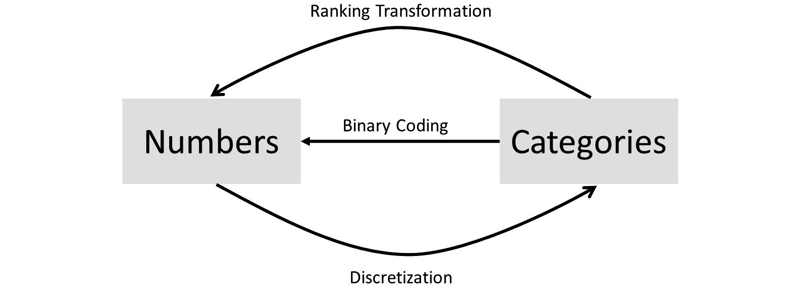
Figure 14.3 – Direction of application for binary coding, ranking transformation, and discretization
One question that the preceding figure might bring to mind is, how do we know which one we choose when we want to move from categories to numbers: binary coding or ranking transformation? The answer is simple.
If the categories are nominal, we can only use binary coding; if they are ordinal, both may be used, but each method has its pros and cons. We will talk about those using examples.
Before moving on to see examples of applying these transformations, let's discuss why we may need these data transformations, in two parts:
- First, why we would transform the data into numerical form
- Second, why we would transform data into categorical form
We generally transform categorical attributes to numerical ones when our analytics tool of choice can only work with numbers. For instance, if we would like to use MLP for prediction and some of the independent attributes are categorical, MLP will not be able to handle the prediction task unless the categorical attributes are transformed into numerical attributes.
Now, let's discuss why we would transform numerical attributes into categorical ones. Most often, this is done because the resulting analytics output will become more intuitive for our consumption. For instance, instead of having to deal with a number that shows the GPA, we may be more comfortable dealing with categories such as excellent, good, acceptable, and unacceptable. This will become the case, especially if we want to use our attention to understand the interactions between attributes. We will see an example of this in a few pages.
Furthermore, in some analytics situations, the types of attributes must be the same. For instance, when we want to examine the relationship between a numerical attribute and a categorical one, we may decide to transform the numerical attribute to a categorical attribute to be able to use a contingency table for the analysis (see Visualizing the relationship between a numerical attribute and a categorical attribute in Chapter 5, Data Visualization).
Now, let's start looking at some examples to understand these transformation tools.
Example one – binary coding of nominal attribute
In Chapter 8, Clustering Analysis, in the Using K-means to cluster a dataset with more than two dimensions section, we did not use the Continent categorical attribute for the clustering analysis using K-means. This attribute indeed has information that can add to the interestingness of our clustering analysis. Now that we have learned about the possibility of transforming categorical attributes into numerical ones, let's try to enrich our clustering analysis.
As the attribute continent is nominal, we only have one choice and that is to use binary coding. In the following code, we will use the pd.get_dummies() pandas function to binary-code the Continent attribute. Before doing that, we need to load the data as we did in Chapter 8, Clustering Analysis. The following code takes care of that:
report_df = pd.read_csv('WH Report_preprocessed.csv')
BM = report_df.year == 2019
report2019_df = report_df[BM]
report2019_df.set_index('Name',inplace=True)
After running the preceding code, we are set to give pd.get_dummies() a try. The following screenshot shows how this function is used and the first five rows of its output. The bc_Continent variable name is inspired by bc, as in binary coded:
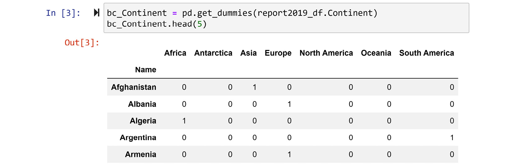
Figure 14.4 – Screenshot of report2019_df.Continent using pd.get_dummies() binary coding
The preceding screenshot shows exactly what binary coding does. For each possible categorical attribute, a binary attribute will be added. The combination of all the binary attributes will present the same information.
Next, we will run a very similar code to what we ran in Chapter 8, Clustering Analysis. Only one part of the following code has been updated, and the updated part is highlighted for your attention:
from sklearn.cluster import KMeans
dimensions = ['Life_Ladder', 'Log_GDP_per_capita', 'Social_support', 'Healthy_life_expectancy_at_birth', 'Freedom_to_make_life_choices', 'Generosity', 'Perceptions_of_corruption', 'Positive_affect', 'Negative_affect']
Xs = report2019_df[dimensions]
Xs = (Xs - Xs.min())/(Xs.max()-Xs.min())
Xs = Xs.join(bc_Continent/7)
kmeans = KMeans(n_clusters=3)
kmeans.fit(Xs)
for i in range(3):
BM = kmeans.labels_==i
print('Cluster {}: {}'.format(i,Xs[BM].index.values))
After running the preceding code successfully, you will see the result of the clustering analysis.
The only noticeable difference between the preceding code and the one we used in Chapter 8, Clustering Analysis, is the addition of Xs = Xs.join(bc_Continent/7), which adds the binary coded version of the Continent attribute (bc_Continent) to Xs after Xs is normalized, and before it is fed into kmeans.fit(). There is another question – why didn't we add bc_Continent without dividing it by 7?
Let's try to dispel all the confusion before moving on to centroid analysis. The reason we added bc_Continent to our code at a specific point in a specific manner is that we wanted to control how much this binary coding would affect our results. If we had added without dividing it by 7, bc_Continent would have dominated the clustering result by clustering the countries mostly based on their continent. To see this impact, remove the division by 7, run the clustering analysis, and create the heatmap of the centroid analysis to see this. Why does this happen? Isn't it obvious? The Continent attribute has information worth only one attribute, and not 7.
Furthermore, if we had added bc_Continent/7 before the normalization, the division by 7 would not be meaningful, as the code we run for normalization, which is Xs = (Xs - Xs.min())/(Xs.max()-Xs.min()), would have canceled out the division by 7.
So, now we understand why we added the binary-coded data the specific way that we did. Now, let's perform the centroid analysis. The following code will create the heatmap for centroid analysis for this specific situation. The code is very similar to any other centroid analysis that we have performed so far in this book but for a small change. Instead of having one heatmap, we will have two – one for the regular numerical attributes and one for the binary-coded attribute. The reason for this twofold visual is that the normalized numerical values are between 0 and 1, and the binary-coded values are between 0 and 0.14; without the separation, the heatmap would only show the normalized numericals, as those values have a larger scale. Run the normal non-separated heatmap and see that for yourself:
clusters = ['Cluster {}'.format(i) for i in range(3)]
Centroids = pd.DataFrame(0.0, index = clusters, columns = Xs.columns)
for i,clst in enumerate(clusters):
BM = kmeans.labels_==i
Centroids.loc[clst] = Xs[BM].mean(axis=0)
plt.figure(figsize=(10,4))
plt.subplot(1,2,1)
sns.heatmap(Centroids[dimensions], linewidths=.5, annot=True, cmap='binary')
plt.subplot(1,2,2)
sns.heatmap(Centroids[bc_Continent.columns], linewidths=.5, annot=True, cmap='binary')
plt.show()
As described, the preceding code will create a twofold heatmap. To compare the results we arrived at in Chapter 8, Clustering Analysis, with what we have arrived at here with the preceding code block, we have put these two results in the following figure for comparison:
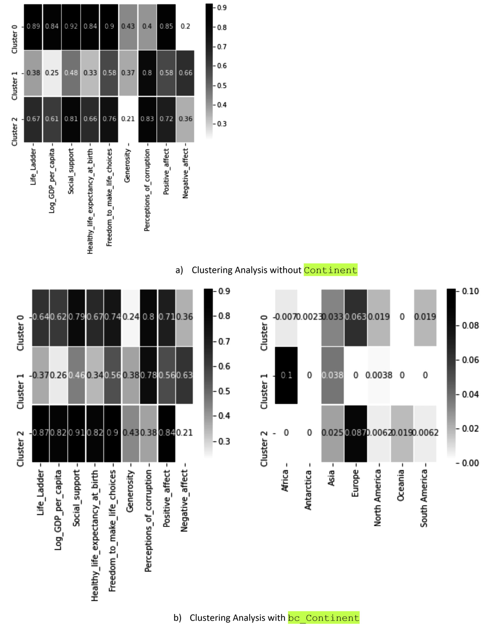
Figure 14.5 – Clustering analysis of countries based on their happiness indices with and without the inclusion of the Continent categorical attribute
The comparison of the heatmaps from the preceding figure clearly shows the successful enrichment of the clustering analysis by the inclusion of a categorical attribute after binary coding. Note that the clustering results of a) and b) in the preceding figure are largely the same, except for Cluster 0 and Cluster 2 having switched places.
Next, let's see an example where our categorical attribute is not nominal but ordinal and see how we should decide between binary coding and ranking transformation.
Example two – binary coding or ranking transformation of ordinal attributes
Transforming ordinal attributes into numbers is a bit tricky. There is no perfect solution; we either have to let go of the ordinal information in the attribute, or assume some information into the data. Let's see what that means in an example.
The following figure shows the transformation of an example ordinal attribute into numbers by three methods: Binary Coding, Ranking Transformation, and Attribute Construction. Spend some time studying this figure before moving on to the next paragraph:
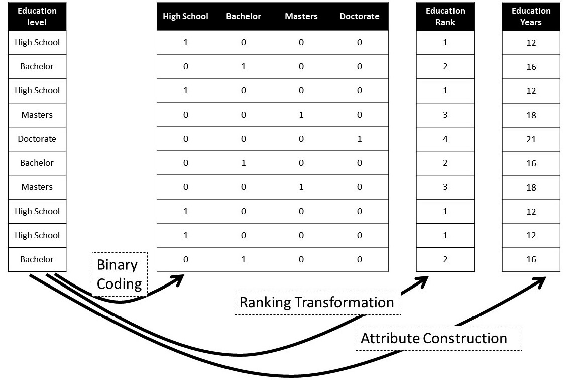
Figure 14.6 – An example showing three ways of transforming an ordinal attribute into numbers
Now, let's discuss why none of the transformations are perfect. In the case of Binary Coding, the transformation has not assumed any information into the result, but the transformation has stripped the attribute from its ordinal information. You see, if we were to use the binary-coded values instead of the original attribute in our analysis, the data does not show the order of the possible values of the attribute. For example, while the binary-coded values make a distinction between High School and Bachelor, the data does not show that Bachelor comes after High School, as we know it does.
The next transformation, Ranking Transformation, does not have this shortcoming; however, it has other cons. You see, by trying to make sure that the order of the possible values is maintained, we had to engage numbers by ranking transformation; however, this goes a little bit overboard. By engaging numbers, not only have we successfully included order in between the possible values of the attribute but we have also collaterally assumed information that does not exist in the original attribute. For example, with the ranking transformed attribute, we are assuming there is one unit difference between Bachelors and High School.
The figure has another transformation, Attribute Construction, which is only possible if we have a good understanding of the attribute. What Attribute Construction tries to fix is the gross assumptions that are added by Ranking Transformation; instead, Attribute Construction uses the knowledge about the original attribute to assume more accurate information into the transformed data. Here, for example, as we know, achieving any of the degrees in the Education Level attribute takes a different number of years of education. So, instead, Attribute Construction uses that knowledge to assume more accurate assumptions into the transformed data.
We will learn more about Attribute Construction in a few pages in this chapter. Now, we want to see an example of transforming numerical attributes into categories.
Example three – discretization of numerical attributes
For this example, let's start from the ending. The following figure shows what discretization can achieve for us. The top plot is a box plot that shows the interaction between three attributes, sex, income, and hoursPerWeek, from adult_df (adult.csv). We had to use a box plot because hoursPerWeek is a numerical attribute. The bottom plot, however, is a bar chart that has the interaction with the same three attributes, except that the hoursPerWeek numerical attribute has been discretized. You can see the magic that the discretization of this attribute has done for us. The bottom plot tells the story of the data far better than the top one:

Figure 14.7 – Example of discretization to show the simplifying benefit of the transformation
Now, let's look at the code that we used to make the two plots happen. The following code creates the top plot using sns.boxplot():
adult_df = pd.read_csv('adult.csv')
sns.boxplot(data=adult_df, y='sex', x='hoursPerWeek',hue='income')
To create the bottom plot, we first need to discretize adult_df.hoursPerWeek. The following code uses the .apply() function to transform the numerical attribute to a categorical attribute with the three possibilities of >40, 40, and <=40:
adult_df['discretized_hoursPerWeek']= adult_df.hoursPerWeek.apply(lambda v: '>40' if v>40 else ('40' if v==40 else '<40'))
A good question here is, why are we using 40 as the cut-off point? In other words, how did we come to use this cut-off? To best answer this question and, in most cases, find the appropriate cut-off point, you'd want to study the histogram of the attribute you intend to discretize. So, you will know the answer to this question after drawing the histogram of adult_df.hoursPerWeek. The following screenshot shows the code and the histogram:
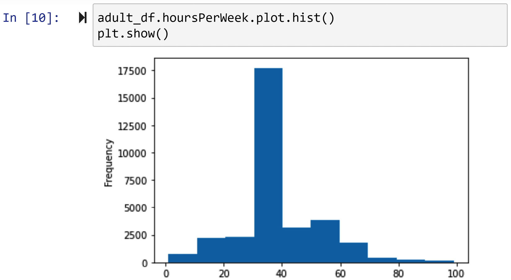
Figure 14.8 – Creating the histogram for adult_df.hoursPerWeek
After discretizing adult_df.hoursPerWeek, running the following code will create the bottom plot in Figure 14.7. The following code is a modified version of the code that we learned in Chapter 5, Data Visualization, under Example of comparing populations using bar charts, which is part of the Comparing populations subsection; this specific code is from The fifth way of solving in the example. We have added [['<40','40', '>40']] to make sure that these values appear in the order that they make the most sense:
adult_df.groupby(['sex','income']).discretized_hoursPerWeek.value_counts().unstack()[['<40','40', '>40']].plot.barh()
This example served well to showcase the possible benefits of discretization. However, there is more to learn about discretization. Next, we will learn about the different types of discretization.
Understanding the types of discretization
While the best tool to guide us through finding the best way to discretize an attribute is a histogram, as we saw in Figure 14.8, there are a few different approaches one might adopt. These approaches are called equal width, equal frequency, and ad hoc.
As the name suggests, the equal width approach makes sure that cut-off points will lead to equal intervals of the numerical attribute. For instance, the following screenshot shows the application of the pd.cut() function to create 5 equal-width bins from adult_df.age:
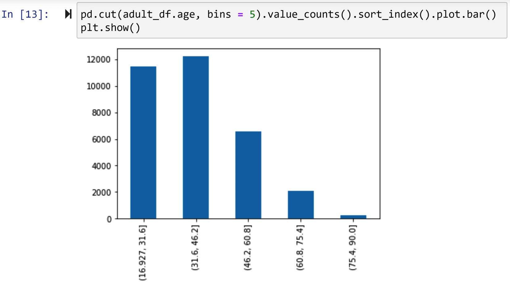
Figure 14.9 – Using pd.cut() to create equal width binning
On the other hand, the equal frequency approach aims to have an equal number of data objects in each bin. For instance, the following screenshot shows the application of the pd.qcut() function to create 5 equal-frequency bins from adult_df.age:
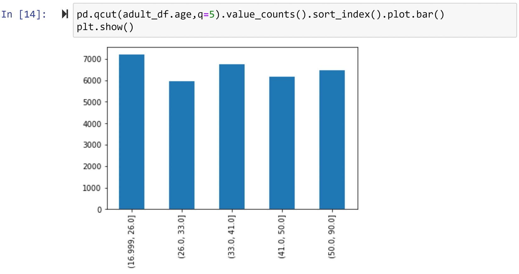
Figure 14.10 – Using pd.qcut() to create equal frequency binning
As you can see in the preceding figure, the absolute equal frequency binning may not be feasible. In these situations, pd.qcut() gets us as close as possible to equal frequency binning.
Lastly, the ad hoc approach prescribes the whereabouts of cut-off points based on the numerical attribute and other circumstantial knowledge about the attribute. For instance, we decided to cut adult_df.hoursePerWeek in Example 3 – discretization of numerical attributes ad hoc after having consulted the histogram of the attribute (Figure 14.8) and the circumstantial knowledge that most employees work 40 hours a week in the US.
In these examples, especially Figure 14.9 and Figure 14.10, one matter we did not talk about is how we got to the number 5 for the number of bins. That's all right, because that is the topic of what we will cover next.
Discretization – the number of cut-off points
When we discretize a numerical attribute with one cut-off point, the discretized attribute will have two possible values. Likewise, when we discretize with two cut-off points, the discretized attribute will have three possible values. The number of possible values resulting from k cut-off points during discretization of a numerical attribute will be k+1.
Simply put, the question we want to answer here is how to find the optimum number for k. There is no bulletproof procedure to follow, so you will get the same answer every time. However, there are a few important guidelines that, when understood and practiced, make finding the right k less difficult. The following lists these guidelines:
- Study the histogram of the numerical attribute you intend to discretize and keep an open mind about what will be the best number of cut-off points.
- Too many cut-off points are not desirable, as one of the main reasons we would like to discretize a numerical attribute is to simplify it for our own consumption.
- Study the circumstantial facts and knowledge about the numerical attribute and see if they can lead you in the right direction.
- Experiment with a few ideas and study their pros and cons.
Before ending our exploration of discretization, I would like to remind you that we've already used discretization in our journey in this book. See the Example of examining the relationship between a categorical attribute and a numerical attribute section in Chapter 5, Data Visualization, for another example of discretization.
A summary – from numbers to categories and back
In this subsection, we learned about the techniques to transform categorical attributes into numerical ones (binary coding, ranking transformation, and attribute construction), and we also learned how to transform numerical attributes into categorical ones (discretization).
Before ending this subsection and moving to learn even more about attribute construction, let's discuss whether any of what we see could be labeled as data massaging. As we discussed in Figure 14.1, anything we are doing in this chapter is indeed data transformation; however, a data transformation can be labeled as data massaging when the transformation has been performed as a way to increase the effectiveness of the analysis. Most of the time when we transform an attribute from categorical to numerical or vice versa, it is done out of necessity; however, in the preceding few pages, there are two instances where the transformation could be labeled as data massaging because we did it for improving effectiveness. It will be your job to figure out which those are in Exercise 2 at the end of the chapter.
Now, let's continue our journey of data transformation – next stop: attribute construction.
Attribute construction
We've already seen an example of this type of data transformation. We saw that we could employ it to transform categorical attributes into numerical ones. As we discussed, using attribute construction requires having a deep understanding of the environment that the data has been collected from. For instance, in Figure 14.6, we were able to construct the Education Years attribute from Education level because we have a pretty good idea of the working of the education system in the environment the data was collected from.
Attribute construction can also be done by combining more than one attribute. Let's see an example and learn how this could be possible.
Example – construct one transformed attribute from two attributes
Do you know what Body Mass Index (BMI) is? BMI is a result of attribute construction by researchers and physicians, who were looking for a healthiness index that takes both the weight and height of individuals into account.
We are going to use 500_Person_Gender_Height_Weight_Index.csv from https://www.kaggle.com/yersever/500-person-gender-height-weight-bodymassindex. Let's first read the data and do some level one data cleaning. The following code does that:
person_df = pd.read_csv('500_Person_Gender_Height_Weight_Index.csv')
person_df.Index = person_df.Index.replace({0:'Extremely Weak', 1: 'Weak',2: 'Normal',3:'Overweight', 4:'Obesity',5:'Extreme Obesity'})
person_df.columns = ['Gender', 'Height', 'Weight', 'Condition']
After running the preceding code, get Python to show you person_df and evaluate its state before reading on.
Next, we will leverage .scatterplot() of the seaborn module (sns) to create a 4D scatter plot. We will use the x axis, y axis, color, and marker style to respectively represent Height, Weight, Condition, and Gender. The following screenshot shows the code and the 4D scatterplot:
Attention
If you are reading the print version of this book, you will not see the colors, which are an essential aspect of the visualization, so make sure to create the visual before reading on.
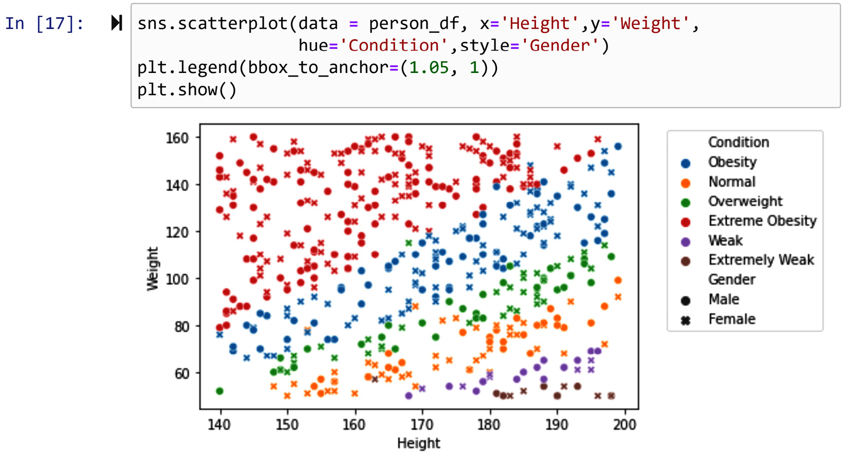
Figure 14.11 – Using sns.scatterplot() to create a 4D visualization of person_df
Our observation from the preceding plot is obvious. The two Height and Weight attributes together can determine a person's healthiness. This is what the researchers and physicians must have seen before having arrived at the BMI formula. BMI is a function that factors in both weight and height to create a healthiness index. The formula is as follows. Be careful – in this formula, weight is in kilograms and height is in meters:
![]()
This begs the question, why this formula? We literally could have used an infinite number of possibilities to come up with a transformed attribute that is driven by both weight and height. So, why this one?
The answer goes back to the most important criteria of being able to apply attribute construction – deep knowledge of the environment from which the data is collected. Therefore, on this one, we have to trust that the researchers and physicians that have chosen this formula did possess such depth of knowledge and appreciation for the human body.
Let's go ahead and construct the new attribute for person_df. The following code uses the formula and the knowledge that the recorded weight and height in person_df are respectively in kilograms and meters to construct person_df['BMI']. Of course, this has been done using the powerful .apply() function:
person_df['BMI'] = person_df.apply(lambda r:r.Weight/((r.Height/100)**2),axis=1)
After constructing the new person_df.BMI attribute, study it a bit, maybe create its histogram and box plot to see its variation. After that, try to create the following figure. Having reached this part of the book, you have all the skills to be able to create it. Anyhow, you have access to the code that has created the visual in the dedicated GitHub repository file of this chapter:
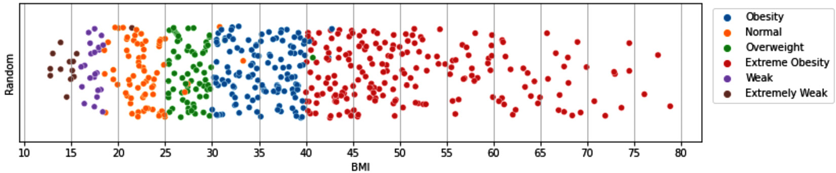
Figure 14.12 – Visualization of interaction between BMI and condition
The preceding figure shows the interaction between the constructed attribute, BMI, and the Condition attribute. The y axis in the preceding scatterplot has been used to disperse the data points so we can appreciate the number of data objects on the x axis (BMI). The trick to make the dispersion effect is to assign a random number to each data object.
In any case, what the interaction between the two attributes shows is the main point; that is, we can almost give out a set of cut-off points that tell us whether a person is healthy or not; BMI smaller than 15 indicates Extremely Weak, BMI between 15 and 19 shows Weak, BMI between 19 and 25 signifies Normal, BMI between 25 and 30 tells us the person is in the Overweight category, BMI between 30 and 40 is a case of Obesity, and finally, BMI larger than 40 is a sign that the person is Extremely Obese. Do a quick Google search to see whether what we've managed to find is the same as what is recommended regarding BMI.
In this example, we managed to construct one attribute by combining two attributes. There are cases where we can construct more than one attribute from a single attribute or source of data. However, while that can also be thought of as attribute construction, in the relevant literature, doing that is referred to as feature extraction. We will look into that next.
Feature extraction
This type of data transformation is very similar to attribute construction. In both, we use our deep knowledge of the original data to drive transformed attributes that are more helpful for our analysis purposes.
In attribute construction, we either come up with a completely new attribute from scratch or combine some attributes to make a transformed attribute that is more useful; however, in feature extraction, we unpack and pick apart a single attribute and only keep what is useful for our analysis.
As always, we will go for the best way to learn what we just discussed – examples! We will see some illuminative examples in this arena.
Example – extract three attributes from one attribute
The following figure shows the transformation of the Email attribute into three binary attributes. Every email ends with @aWebAddress; by looking at the website address providing the email service, we have extracted the three Popular Free Platform, .edu, and Others features. While Email may sound like just a meaningless string as regards being able to derive information about an individual, this example shows a smart feature extraction can derive valuable information from email addresses. For instance, here we can detect individuals who would like to use more popular services. Moreover, we can distinguish the individual that uses emails provided by educational institutions; this shows perhaps they work for academia or they are students:

Figure 14.13 – Feature extraction from the Email attribute
Let's look at another example.
Example – Morphological feature extraction
The following figure shows 100 milliseconds of vibrational signals collected from a car engine for health diagnosis. Furthermore, the figure shows the extraction of three morphological features.
Before getting more into these three features and what they are, let's discuss what the word morphological means. The Oxford English Dictionary defines it as "connected to shape and form." As a feature extraction approach, morphological feature extraction is employing the common shape and form of the data to get to new features.
The following figure serves as an excellent example. We have extracted three morphological features. Simply, in the line plot of the vibration signal, we have counted the number of peaks (n_Peaks), the number of valleys (n_Valleys), and the extent of oscillation during the 100 milliseconds (max_Oscillate):
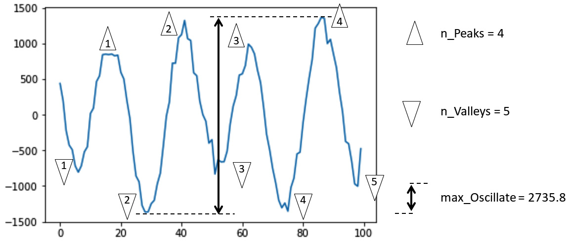
Figure 14.14 – Morphological feature extraction of vibrational signals
The value of doing such feature extraction will show itself when we see them in comparison between a few data objects. The preceding figure is the feature extraction of only one data point. However, the following figure has put together five distinct data points that are from engines with five different states: Healthy, Fault 1, Fault 2, Fault 3, and Fault 4:
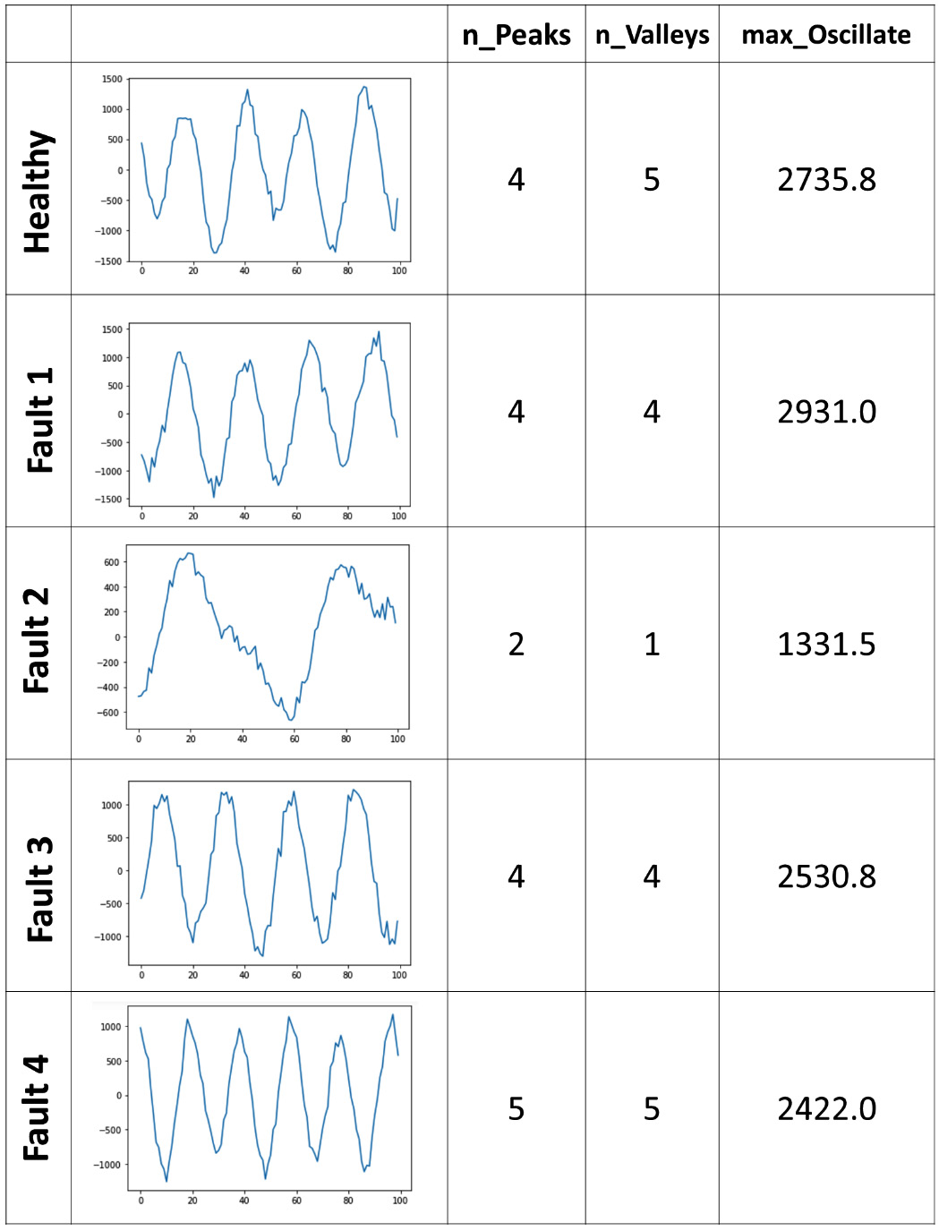
Figure 14.15 – Morphological feature extraction of vibrational signals for five instances of data objects
Contemplating the preceding figure shows us that with simple morphological feature extraction, we might be able to accurately distinguish between different types of fault and the healthy engine. You will have the opportunity to create the classification model after doing morphological feature extraction on similar data in Exercise 5 at the end of this chapter.
In our journey throughout this book, we have already seen other instances of feature extraction without referring to it as such. Next, we are going to discuss those instances and how we had gotten ahead of ourselves.
Feature extraction examples from the previous chapters
In this book, we have dissected data preprocessing into different stages. These stages are Data Cleaning (Chapters 9–11), Data Fusion and Integration (Chapter 12), Data Reduction (Chapter 13), and Data Transformation (this chapter). However, in many instances of data preprocessing, these stages may be done in parallel or at the same time. This is a great achievement from a practical perspective and we should not force ourselves to take apart these stages in practice. We've only discussed these stages separately to aid our understanding, but once you feel more comfortable with them, it is recommended to do that at the same time if it's possible and useful.
That is the reason that we've already seen feature extraction in the other stages of data preprocessing. Let's go over these examples and see why they are both feature extraction and also other things.
Examples of data cleaning and feature extraction
In Chapter 10, Data Cleaning Level II – Unpacking, Restructuring, and Reformulating the Table, during the solution for the Example 1 – Unpacking columns and reformulating the table section, which was cleaning speech_df, a dataset that had a few of President Trump's speeches, we unwittingly performed some feature extraction under the name of unpacking the Content column. The Content attribute had each of the speeches in text, and the solution unpacked these long texts by counting the number of times the vote, tax, campaign, and economy terms had been used.
This is both data cleaning and data transformation (feature extraction). From the perspective of data cleaning, there was so much fluff in the data that we did not need and got in the way of our visualization goals, so we removed the fluff to bring what's needed to the surface. From a data transformation perspective, we extracted four features that were needed for our analysis.
Next, let's see how data reduction and feature extraction are sometimes done at the same time.
Examples of data reduction and feature extraction
In Chapter 13, Data Reduction, we learned two unsupervised dimension reduction techniques. We saw how a non-parametric method (that is, PCA) and a parametric method (that is, FDA) reduced the dimension of country_df, a dataset of countries with 10 years of 9 happiness indices (90 attributes). From a data reduction perspective, the data was reduced by reducing the number of attributes. However, after learning about data transformation and feature extraction, we can see that we transformed the data by extracting a few features.
Almost always any unsupervised dimension reduction effort can also be referred to as feature extraction. More interestingly, this type of data reduction/dimension reduction can also be seen as data massaging, because we are extracting features and reducing the size of the data solely to improve the effectiveness of the analysis.
The gear shift from attribute construction to feature extraction was very smooth as the two data transformations are very similar and, in most cases, we can think of them as data massaging. These two types of data transformation are also very general and can be employed in a wide range of ways, and for their successful implementation, they require the resourcefulness of the analyst. For instance, the analyst must be able to find appropriate functions to use FDA for parametric feature extraction, which requires high-level resourcefulness.
However, the next data transformation technique we will learn is going to be very specific and is only applicable in certain situations. Next, we will learn about log transformation.
Log transformation
We should use this data transformation when an attribute experiences exponential growth and decline across the population of our data objects. When you draw a box plot of these attributes, you expect to see fliers, but those are not mistaken records, nor are they unnatural outliers. Those significantly larger or smaller values come naturally from the environment.
Attributes with exponential growth or decline may be problematic for data visualization and clustering analysis; furthermore, they can be problematic for some prediction and classification algorithms where the method uses the distance between the data objects, such as KNN, or where the method drives its performance based on collective performance metrics, such as linear regression.
These attributes may sound very hard to deal with, but there is a very easy fix for them – log transformation. In short, instead of using the attribute, you calculate the logarithms of all of the values and use them instead. The following figure shows how this transformation looks using the Gross Domestic Product (GDP) data of the world's countries in 2020. The data is retrieved from https://data.worldbank.org/indicator/NY.GDP.MKTP.CD and preprocessed into GDP 2019 2020.csv:
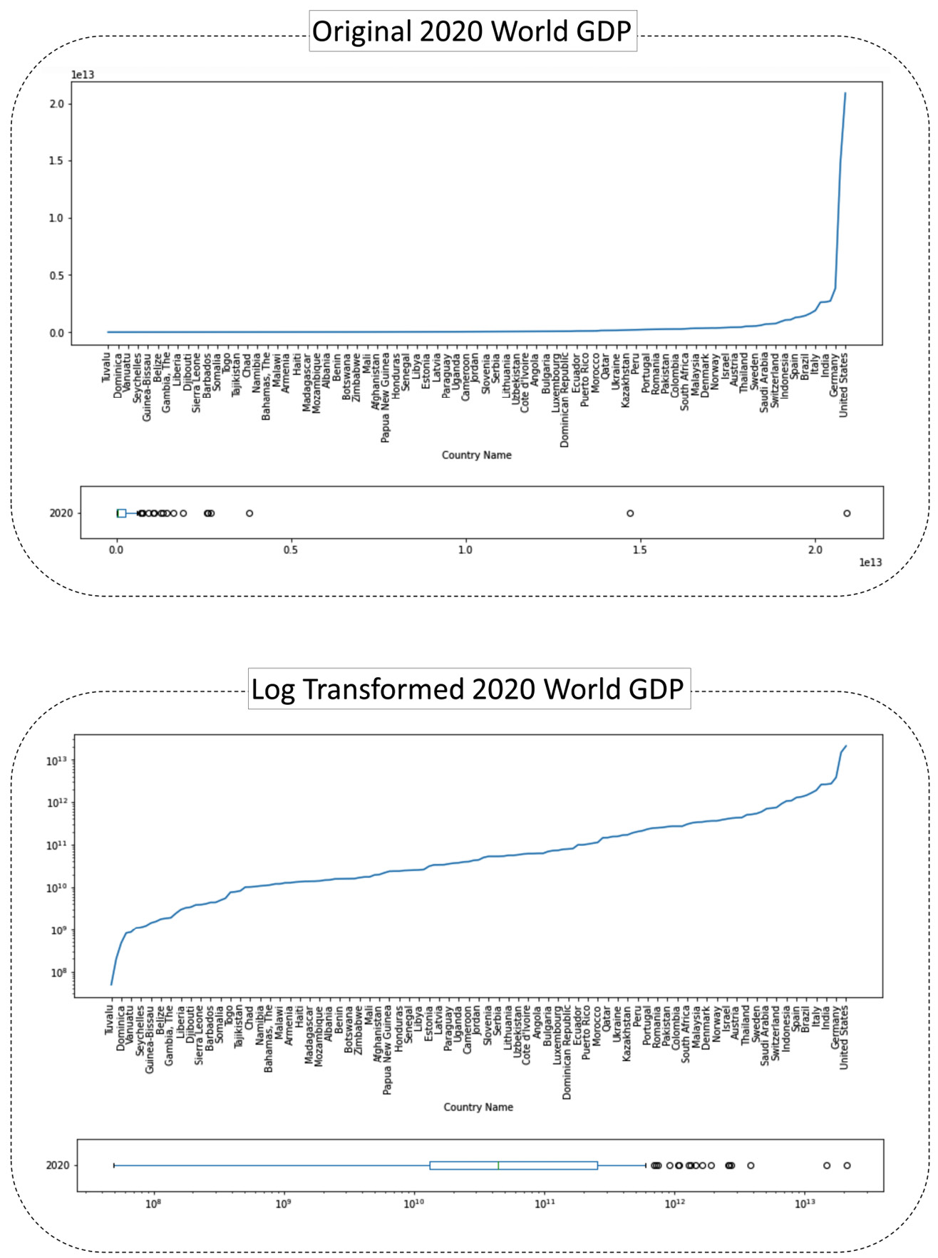
Figure 14.16 – Before and after log transformation – the GDP of the countries in the world
We can see in the preceding figure that the line plot of the original data shoots up; that is what we earlier described as exponential growth. We also see in the box plot of the original data that there are outliers with unrestrictedly high values compared to the rest of the population. You can imagine how these types of outliers can be problematic for our analytics, such as data visualization and clustering analysis.
Now, pay attention to the log-transformed version of the visualization. The data objects still have the same relationships with one another from the perspective of being more or less; however, the exponential growth has been tamped down. We can see in the box plot of the log-transformed data that we still have fliers, but those fliers' values are not unrestrictedly higher.
The preceding figures are created using GDP 2019 2020.csv, and you can find the code that created them in the dedicated GitHub repository file of this chapter.
There are two approaches in applying log transformation – doing it yourself or the working module doing it for you. Let's see these two approaches in the following section.
Implementation – doing it yourself
In this approach, you take matters into your own hands and first add a log-transformed attribute to the dataset and then use that transformed attribute. For example, the following screenshot shows doing the attribute for country_df['2020'].
Pay attention – before running the code presented in the following screenshot, you need to first run the following code that reads the GDP 2019 2020.csv file into country_df:
country_df = pd.read_csv('GDP 2019 2020.csv')
country_df.set_index('Country Name',inplace=True)
After running the preceding code, you can run the code presented in the following screenshot:
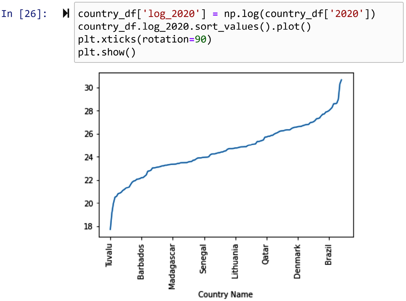
Figure 14.17 – Log transformation – doing it yourself
Next, let's cover the approach of the working module doing it for you.
Implementation – the working module doing it for you
As log transformation is a very useful and well-known data transformation, many modules provide the option for you to use the log transformation. For instance, the code in the following screenshot uses logy=True, which is a property of the .plot() Pandas Series function, to do the log transformation without having to add a new attribute to the dataset:
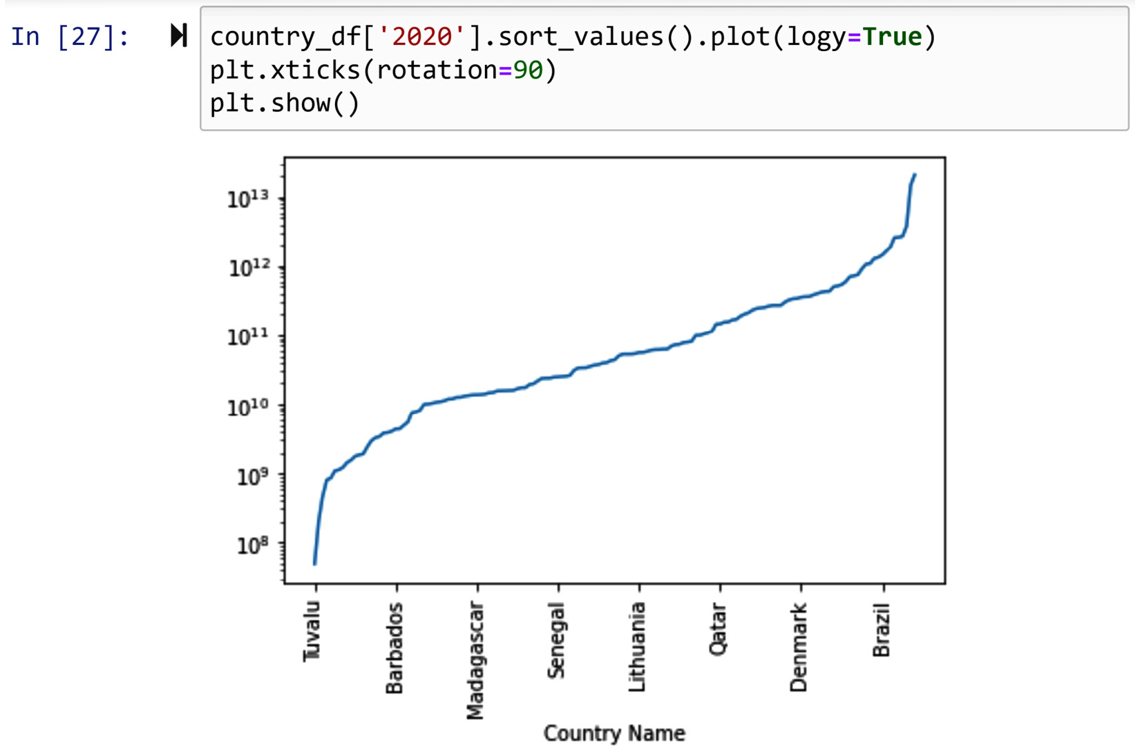
Figure 14.18 – Log transformation – the working module doing it for you
The disadvantage of this approach is that the module you are using may not have this accommodation, or you may not be aware of it. On the other hand, if such accommodation is provided, it makes your code much easier to read.
Furthermore, the result of the working module doing it for you might be even more effective. For instance, compare the y axis in Figure 14.15 with that of Figure 14.16.
Before moving to the next data transformation tools, let me remind you that we have already used log transformation in our data analysis in the course of this book. Remember the WH Report_preprocessed.csv and WH Report.csv datasets, which are the two versions of the World Health Organization reports on the happiness indices of 122 countries? One of the attributes in these datasets is Log_GDP_per_capita. As GDP_per_capita experiences exponential growth, for clustering analysis, we used its log-transformed version.
The next group of data transformation tools is going to be used for dealing with noisy data, and sometimes to deal with missing values and outliers. They are smoothing, aggregation, and binning.
Smoothing, aggregation, and binning
In our discussion about noise in data in Chapter 11, Data Cleaning Level III – Missing Values, Outliers, and Errors, we learned that there are two types of errors – systematic errors and unavoidable noise. In Chapter 11, Data Cleaning Level III – Missing Values, Outliers, and Errors, we discussed how we deal with systematic errors, and now here we will discuss noise. This is not covered under data cleaning, because noise is an unavoidable part of any data collection, so it cannot be discussed as data cleaning. However, here we will discuss it under data transformation, as we may be able to take measures to best handle it. The three methods that can help deal with noise are smoothing, aggregation, and binning.
It might seem surprising that these methods are only applied to time-series data to deal with noise. However, there is a distinct and definitive reason for it. You see, it is only in time-series data, or any data that is collected consistently, consecutively, and with ordered intervals, that we can detect the presence of noise. It is this unique data collection that allows us to be able to detect the existence of noise. In other forms of data collection, we cannot detect the noise, and therefore there will be nothing we can do. Why is that? The answer is in the consistent, consecutive, and ordered intervals. Due to this unique data collection, we can pick apart patterns from noise.
The three methods that can help deal with noise are smoothing, aggregation, and binning. Each of these three methods to deal with noise operate under a specific set of assumptions. In the following three sections, we will first learn about these assumptions and then we will see examples of how they are implemented.
One last word before seeing the sections – strictly speaking, missing values and outliers are types of noise, and if they are non-systematic and a natural part of the data collection, either of these three methods could also be applied to deal with them.
Now, let's look at the smoothing approach in dealing with noise.
Smoothing
The following screenshot uses the Noise_data.csv file, which is 200 milliseconds of vibrational signals collected from a car engine for health diagnosis. The screenshot shows the line plot of these vibrational signals:
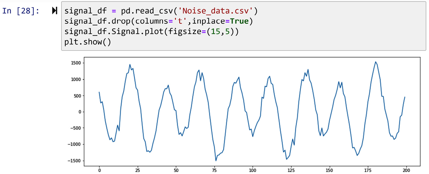
Figure 14.19 – Line plot of Noise_data.csv
In the preceding figure, you can sense what we meant by time-series data allowing us to distinguish between patterns and noise. Now, let's use this data to learn more about smoothing.
By and large, there are two types of smoothing – functional and rolling. Let's learn about each of them one by one.
Functional data smoothing
Functional smoothing is the application of Functional Data Analysis (FDA) for the purpose of smoothing the data. If you need to refresh your memory on FDA, which we covered in Chapter 13, Data Reduction, go back and review it before reading on.
When we used FDA to reduce the size of the data, we were interested in replacing the data with the parameters of the function that simulate the data well. However, when smoothing, we want our data with the same size, but we want to remove the noise. In other words, regarding how FDA is applied, it is very similar to both data reduction and smoothing; however, the output of FDA is different for each purpose. For smoothing, we expect to have the same size data as the output, whereas for data reduction, we expect to only have the parameters of the fitting function.
There are many functions and modules in the space of the Python data analysis environment that use FDA to smooth data. A few of them are savgol_filter from scipy.signal; CubicSpline, UnivariateSpline, splrep, and splev from scipy.Interpolate; and KernelReg from statsmodels.nonparametric.kernel_regression. However, none of these functions works as well as it should, and I believe there is much more room for the improvement of smoothing tools in the space of Python data analytics. For instance, the following figure shows the performance of the .KernelReg() function on part of the data (50 numbers) versus its performance on the whole Noise_data.csv file (200 numbers):
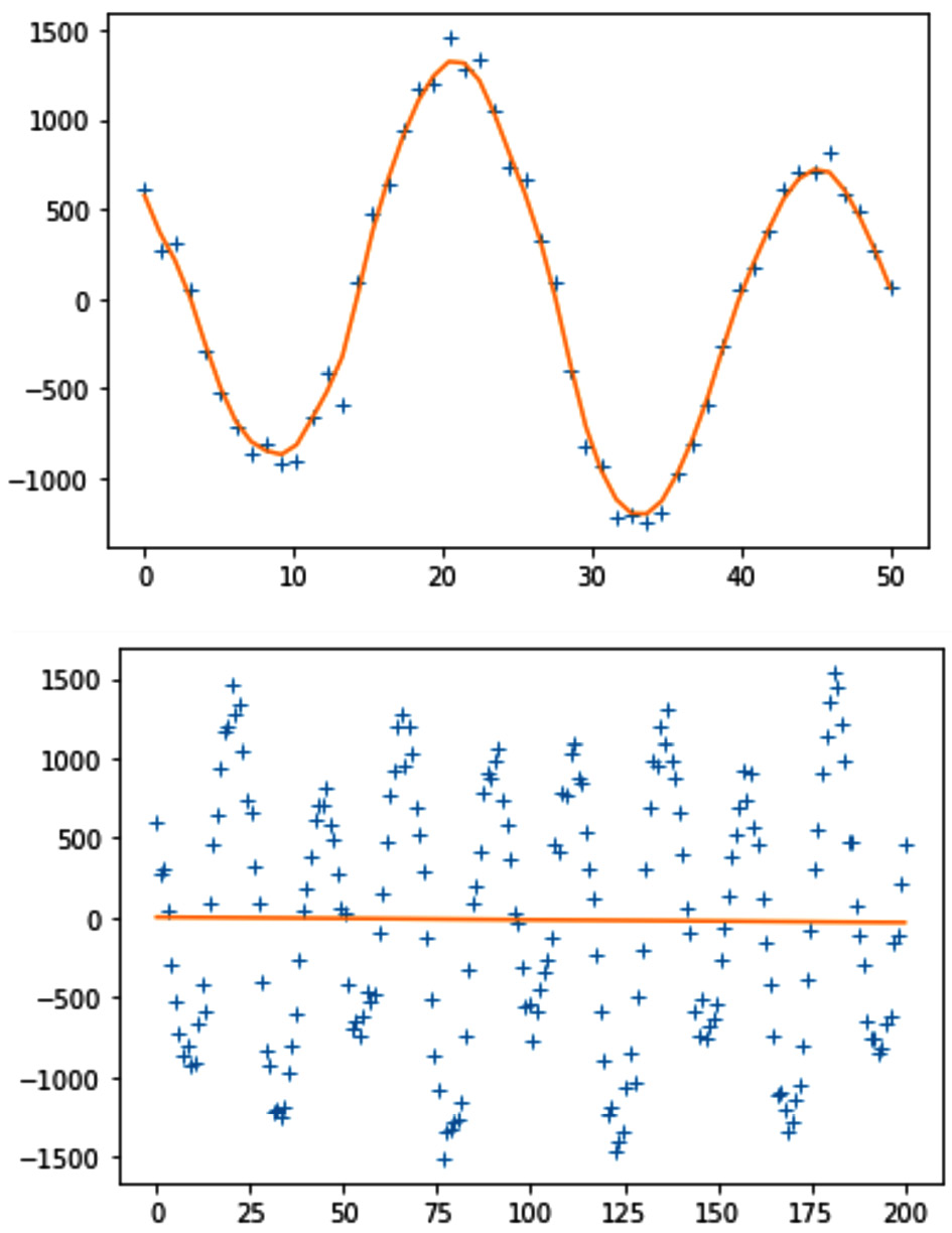
Figure 14.20 – The performance of .KernelReg() on part of signal_df and all of it
We can see in the preceding figure that the .KernelReg()function is successful in part of the data, but it crumbles as the complexity of the data increases.
The code to create each of the plots in the preceding figure is very similar. For instance, to create the top plot, you can use the following code. I am certain you are capable of modifying it to create the bottom one as well:
from statsmodels.nonparametric.kernel_regression import KernelReg
x = np.linspace(0,50,50)
y = noise_df.Signal.iloc[:50]
plt.plot(x, y, '+')
kr = KernelReg(y,x,'c')
y_pred, y_std = kr.fit(x)
plt.plot(x, y_pred)
plt.show()
What was covered here in terms of functional data smoothing can only be looked at as an introduction to this complex data transformation tool. There is a lot that can be said about functional data smoothing, enough for an entire book. However, what you learned here can be a great foundation for you to go off on your own and learn more.
Now, let's bring our attention to rolling data smoothing.
Rolling data smoothing
The biggest difference between functional data smoothing and rolling data smoothing is that functional data smoothing looks at the whole data as one piece and then tries to find the function that fits the data. In contrast, rolling data smoothing works on incremental windows of the data. The following figure shows what rolling calculation and the incremental windows are using in the first 10 rows of singnal_df:

Figure 14.21 – Visual explanation of rolling calculations and the window
In the preceding figure, the width of each window is 5. As shown, the window rolling calculation happens by picking the first 5 data points. After performing the prescribed calculations, the window rolling calculation moves on to the next window by one increment jump.
For instance, the following code uses the .rolling() function of a Pandas DataFrame to calculate the mean of every window of singnal_df in a rolling window calculation where the width of each window is 5. The code also creates a line plot to show how this specific window rolling calculation manages to smooth the data:
signal_df.Signal.plot(figsize=(15,5),label='Signal')
signal_df.Signal.rolling(window=5).mean().plot(label='Moving Average Smoothed')
plt.legend()
plt.show()
After running the preceding code successfully, the following plot will be created. Theoretically, what we just did is called Moving Average Smoothing, which is calculating the moving average of the time-series data:
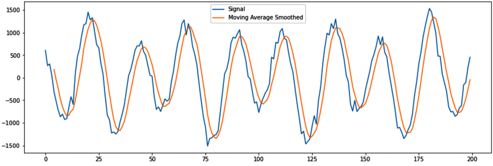
Figure 14.22 – Moving Average Smoothing using window rolling calculations
As you can see, Moving Average Smoothing has smoothed the data pretty nicely, but it has a distinct disadvantage – the data seems to have been shifted. Naively, you may think that you can simply shift the plot a bit to the left and all will be okay. However, the following figure, the first seven rows of Signal and Moving Average Smoothed shows you that a perfect match will never be possible:
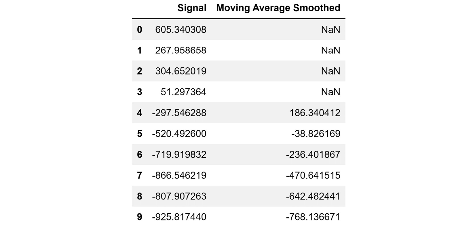
Figure 14.23 – Comparing the Signal and Moving Average Smoothed columns
It is no surprise that the first four values for Moving Average Smoothed are NaN, right? It is due to the nature of rolling window calculations. Always, when the width of windows is k, the first k-1 rows will have NaN.
Rolling window calculations provide the opportunity to use simple or complex calculations to smooth. For instance, you might want to try other time-series methods, such as simple exponential smoothing. The following code uses the mechanism of the rolling window calculations to apply exponential smoothing.
Before running the following code, pay attention to the way the code uses the .rolling() and .apply() functions to implement simple exponential smoothing that was first defined as a function:
def ExpSmoothing(v):
a=0.2
yhat = v.iloc[0]
for i in range(len(v)):
yhat = a*v.iloc[i] + (1-a)*yhat
return yhat
signal_df.Signal.plot(figsize=(15,5),label='Signal')
signal_df.Signal.rolling(window=5).apply(ExpSmoothing).plot(label = 'Exponential Smoothing')
plt.legend()
plt.show()
Running the preceding code creates a figure similar to Figure 14.20, but this time, the smoothed values have used the simple exponential smoothing formulas.
Now, let's bring our attention to the next tool that we will learn to deal with noise – aggregation.
Aggregation
Data aggregation is a specific type of rolling data smoothing. With aggregation, we do not use any window's width, but we aggregate the data points from smaller data objects to wider data objects, for example, from days to weeks, or from seconds to hours.
For example, the following figure shows the line plot of daily COVID-19 cases and deaths, and then its aggregated version – weekly COVID-19 cases and deaths for California and the US:
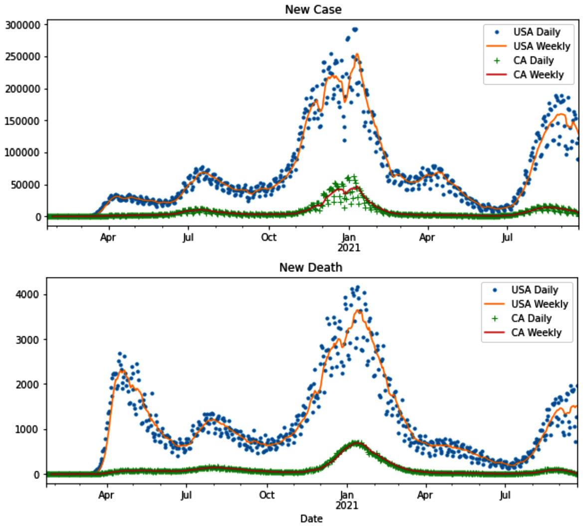
Figure 14.24 – Example of aggregation to deal with noise – COVID-19 new cases and deaths
The operation of aggregating a dataset to create a dataset with a new definition of data objects is not new to us. Through the course of this book, we've seen many examples of it. For instance, see the following items:
- Example 1 – unpacking columns and reformulating the table in Chapter 10, Data Cleaning Level II – Unpacking, Restructuring, and Reformulating the Table – in this example, speech_df was aggregated to create vis_df, whose definition of data objects is speeches in a month.
- Example 1 (challenges 3 and 4) in Chapter 12, Data Fusion and Integration – in this example, we had to aggregate electric_df, whose definition of a data object was the electricity consumption of half an hour, to create a new dataset whose definition of data object was hourly electricity consumption. This was done so electric_df could be integrated with temp_df.
In any case, Exercise 12 will provide the opportunity for you to practice aggregation to deal with noise. You will be able to create Figure 14.24 yourself.
Lastly, we will discuss binning as a method to transform the data to deal with noise.
Binning
It may seem that this is a new method, but binning and discretization are technically the same type of data preprocessing. When the process is done to transform a numerical attribute to a categorical one, it is referred to as discretization, and when it is used as a way to combat noise in numerical data, we call the same data transformation binning.
Another possibly surprising fact is that we have done binning so many times before in this book. Every time we created a histogram, binning was done under the hood. Now, let's raise that hood and see what's happening inside.
The very first histogram we ever created in this book was shown in Figure 2.1 in Chapter 2, Review of Another Core Module – Matplotlib. In that figure, we created the histogram of the adult_df.age attribute. Go back and review the histogram.
The following screenshot shows how it would have looked if we had created the bar chart of adult_df.age, instead of its histogram:
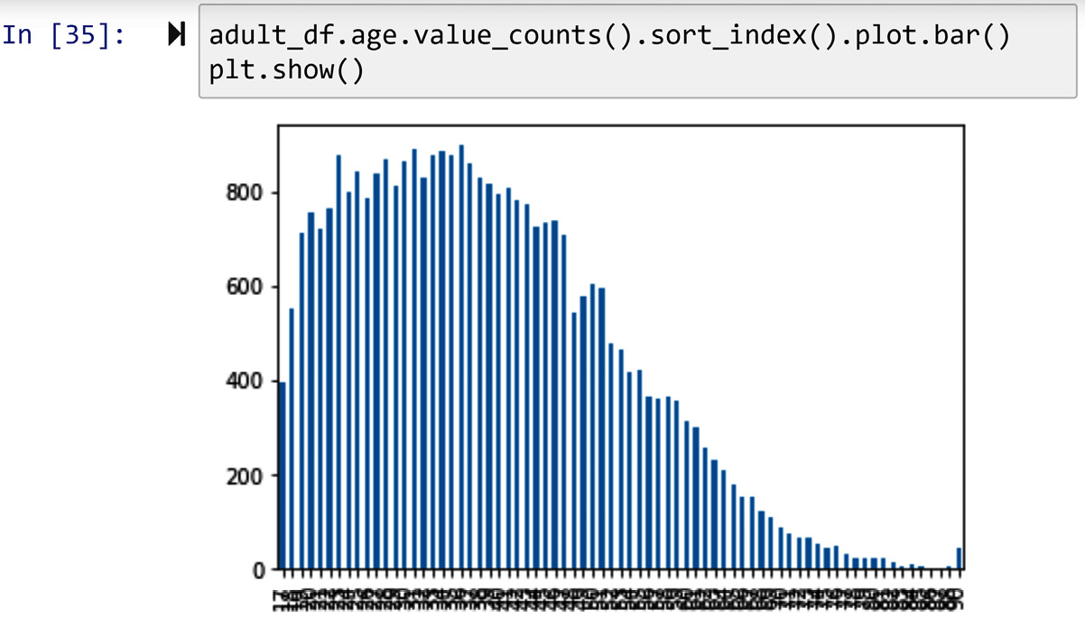
Figure 14.25 – Creating the bar chart of adult_df.age
Comparing the preceding visualization with Figure 2.1 allows us to see the value of the histogram and how it can help us with smoothing the data so that we can get a better understanding of the variation among the population.
We can also create the same shape as the histogram by binning the attribute first and then creating the bar chart. The code in the following screenshot uses the pd.cut() pandas function to bin adult_df.age and then create its bar chart. Compare the bar chart in the following screenshot with Figure 2.1; they are showing the same patterns:
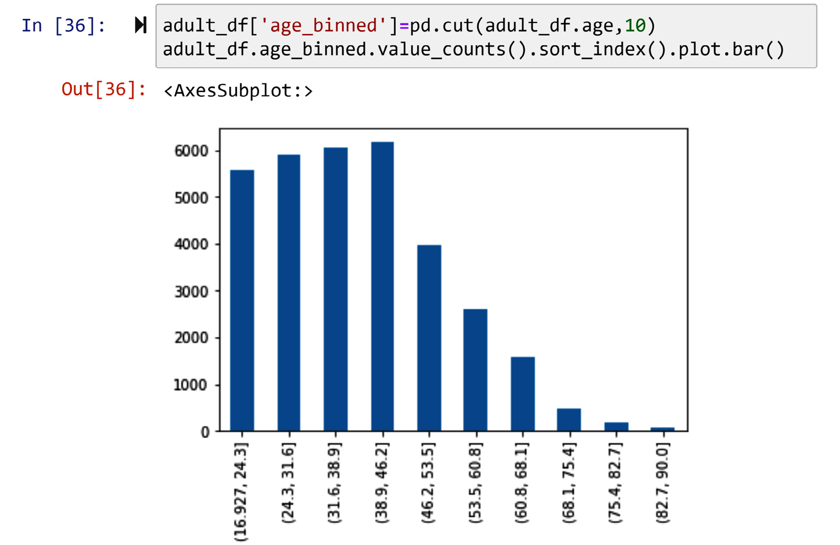
Figure 14.26 – Creating the histogram of adult_df by pd.cut() and .bar() instead of .hist()
If you are concerned about the preceding figure not looking exactly like the one in Figure 2.1, all you need to change is the width of the bar. Replace .bar(width=1) with .bar() in the code of the preceding screenshot and you will manage that.
In this section, we learned three ways to deal with noise in the data: smoothing, aggregation, and binning. We are getting closer to the end of this chapter. Next, we will go over a summary of the whole chapter and wrap up our learning.
Summary
Congratulations to you for completing this chapter. In this chapter, we added many useful tools to our data preprocessing armory, specifically in the data transformation area. We learned how to distinguish between data transformation and data massaging. Furthermore, we learned how to transform our data from numerical to categorical, and vice versa. We learned about attribute construction and feature extraction, which are very useful for high-level data analysis. We also learned about log transformation, which is one of the oldest and most effective tools. And lastly, we learned three methods that are very useful in our arsenal for dealing with noise in data.
By finishing this chapter successfully, you are also coming to the end of the third part of this book – The Preprocessing. By now, you know enough to be very successful at preprocessing data that leads to effective data analytics. In the next part of the book, we will have three case studies (Chapters 15–17), into which we will put our learning from across the book into use and have culminating experience of data preprocessing and effective analytics. We will end the book with Chapter 18, Summary, Practice Case Studies, and Conclusions. This chapter will provide learning opportunities for you to put what you have learned into real use and to start creating your portfolio of data preprocessing and data analytics.
Before all that real, practical, and exciting learning, do not miss out on the learning opportunity that the exercises at the end of this chapter provide.
Exercise
- In your own words, what are the differences and similarities between normalization and standardization? How come some use them interchangeably?
- There are two instances of data transformation done during the discussion of binary coding, ranking transformation, and discretization that can be labeled as massaging. Try to spot them and explain how come they can be labeled that way.
- Of course, we know that one of the ways that the color of a data object is presented is by using their names. This is why we would assume color probably should be a nominal attribute. However, you can transform this usually nominal attribute to a numerical one. What are the two possible approaches? (Hint: one of them is an attribute construction using RGB coding.) Apply the two approaches to the following small dataset. The data shown in the table below is accessible in the color_nominal.csv file:
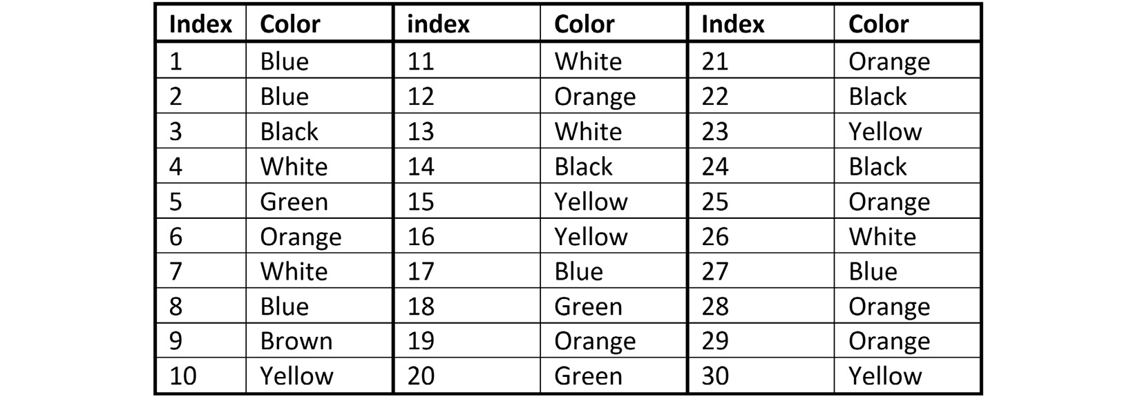
Figure 14.27 – color_nominal.csv
Once after binary codding and once after RGB attribute construction, use the transformed attributes to cluster the 30 data objects into 3 clusters. Perform centroid analysis for both clusterings and share what you learned from this exercise.
- You've seen three examples of attribute construction so far. The first one can be found in Figure 14.6. The other one was in the Example – Construct one transformed attribute from two attributes section, and the last one was the previous exercises. Use these examples to argue whether attribute construction is data massaging or not.
- In this exercise, you will get to work on a dataset collected for research and development. The dataset was used in a recent publication titled Misfire and valve clearance faults detection in the combustion engines based on a multi-sensor vibration signal monitoring to show that high-accuracy detection of engine failure is possible using vibrational signals. To see this article, visit this link: https://www.sciencedirect.com/science/article/abs/pii/S0263224118303439.
The dataset that you have access to is Noise_Analysis.csv. The size of the file is too large and we were not able to include it on the GitHub Repository. Please use this link (https://www.dropbox.com/s/1x8k0vcydfhbuub/Noise_Analysis.csv?dl=1) to download the file. This dataset has 7,500 rows, each showing 1 second (1,000 milliseconds) of the engine's vibrational signal and the state of the engine (Label). We want to use the vibrational signal to predict the state of the engine. There are five states: H – Healthy, M1 – Missfire 1, M2 – Missfire 2, M12 – Missfire 1 and 2, and VC – Valve Clearance.
To predict (classify) these states, we need to first perform feature extraction from the vibrational signal. Extract the following five morphological features and then use them to create a decision tree that can classify them:
a) n_Peaks – the number of peaks (see Figure 14.13)
b) n_Valleys – the number of valleys (see Figure 14.13)
c) Max_Oscilate – the maximum oscillation (see Figure 14.13)
d) Negative_area – the absolute value of the total sum of negative signals
e) Positive_area – the total sum of the positive signals
Make sure to tune the decision tree to come to a final tree that can be used for analysis. After creating the decision tree, share your observations. (Hint: to find n_Peaks and n_Valleys, you may want to use the scipy.signal.find_peaks function.)
- In this chapter, we discussed the possible distinction between data massaging and data transformation. We also saw that FDA can be used both for data reduction and data transformation. Review all of the FDA examples you have experienced in this book (Chapter 13, Data Reduction, and this chapter) and use them to make a case regarding whether FDA should be labeled as data massaging or not.
- Review Exercise 8 in Chapter 12, Data Fusion and Integration. In that exercise, we transformed the attribute of one of the datasets so that the fusion of the two sources became possible. How would you describe that data transformation? Could we call it data massaging?
- In this exercise, we will use BrainAllometry_Supplement_Data.csv from a paper titled The allometry of brain size in mammals. The data can be accessed from https://datadryad.org/stash/dataset/doi:10.5061/dryad.2r62k7s.
The following scatterplot tries to show the relationship between mean body mass and mean brain mass of species in nature. However, you can see that the relationship is not very well shown. What transformation could fix this? Apply it and then share your observations:
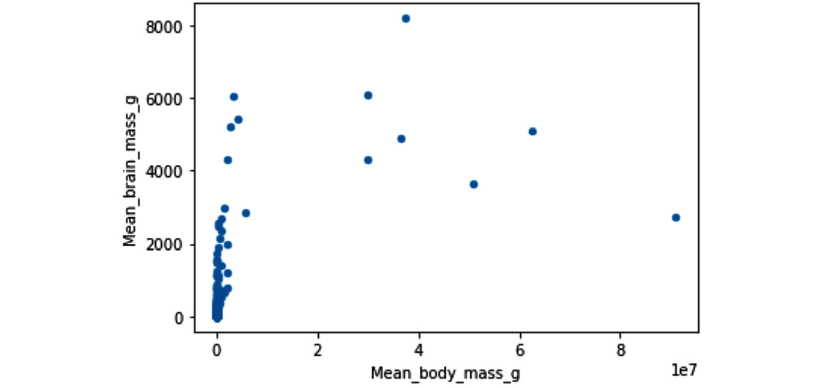
Figure 14.28 – Scatter plot of Mean_body_mass_g and Mean_brain_mass_g
- In this chapter, we learned three techniques to deal with noise: smoothing, aggregation, and binning. Explain why these methods were covered under data transformation and not under data cleaning – level III.
- In two chapters (Chapter 13, Data Reduction, and this chapter) and under three areas of data preprocessing, we have shown the applications of FDA: data reduction, feature extraction, and smoothing. Find examples of the FDA in these two chapters, and then explain how FDA manages to do all these different data preprocesses. What allows FDA to be such a multipurpose toolkit?
- In Figure 14.18, we saw that .KernelReg() on all of signal_df did not perform very well, but it did perform excellently on part of it. How about trying to smooth all of signal_df with a combination of rolling data smoothing and functional data smoothing? To do this, we need to have window rolling calculations with a step size. Unfortunately, the .rolling() Pandas function only accommodates the step size of one, as shown in Figure 14.18. So, take matters into your hands and engineer a looping mechanism that uses .KernelReg() to smooth all of signal_df.
- Use United_States_COVID-19_Cases_and_Deaths_by_State_over_Time.csv to recreate Figure 14.24. You may want to pull the most up-to-date data from https://catalog.data.gov/dataset/united-states-covid-19-cases-and-deaths-by-state-over-time to develop an up-to-date visualization. (Hint: you will need to work with the two new_case and new_death columns.)
- It may seem like that binning and aggregation are the same method; however, they are not. Study the two examples in this chapter and explain the difference between aggregation and binning.