Chapter 13: Data Reduction
We have come to yet another important step of data preprocessing that is not concerned with data cleaning; this is known as data reduction. To successfully perform analytics, we need to be able to recognize situations where data reduction is necessary and know the best techniques and the how-to of their implementation. In this chapter, we will learn what data reduction is. Let's put this another way: we will learn what the data pre-processing steps are that we call data reduction. Furthermore, we will cover the major reasons and objectives of data preprocessing. Most importantly, we will look at a categorized list of data reduction tools and learn what they are, how they can help, and how we can use Python to implement them.
In this chapter, we are going to cover the following main topics:
- The distinction between data reduction and data redundancy
- Types of data reduction
- Performing numerosity data reduction
- Performing dimensionality data reduction
Technical requirements
You can find the code and dataset for this chapter in this book's GitHub repository at https://github.com/PacktPublishing/Hands-On-Data-Preprocessing-in-Python. You can find Chapter13 in this repository and download the code and data for a better learning experience.
The distinction between data reduction and data redundancy
In the previous chapter, Chapter 12, Data Fusion and Data Integration, we discussed and saw an example of the data redundancy challenge. While data redundancy and data reduction have very similar names and their terms use words that have connected meanings, the concepts are very different. Data redundancy is about having the same information presented under more than one attribute. As we saw, this can happen when we integrate data sources. However, data reduction is about reducing the size of data due to one of the following three reasons:
- High-Dimensional Visualizations: When we have to pack more than three to five dimensions into one visual, we will reach the human limitation of comprehension.
- Computational Cost: Datasets that are too large may require too much computation. This might be the case for algorithmic approaches.
- Curse of Dimensionality: Some of the statistical approaches become incapable of finding meaningful patterns in the data because there are too many attributes.
In other words, data redundancy is a characteristic that a dataset may have. This characteristic is about having redundant data in the dataset, so we may have to take some actions. On the other hand, data reduction is a set of actions that we can take to reduce the size of data due to the aforementioned reasons.
When we remove some part of a dataset due to its data redundancy, can we call the removal part data reduction? After all, we are removing and reducing the dataset. In the general sense of the term reduction, yes, the dataset is being reduced, but in the context of data mining, the terms data reduction and data redundancy have specific meanings. And based on those specific meanings, as described previously, the answer to the question is no.
Now that we've learned about the distinction between data redundancy and data reduction, let's learn how to assess the success of a data reduction operation.
The objectives of data reduction
Successful data reduction seeks to achieve the following two objectives at the same time. First, data reduction seeks to obtain a reduced representation of the dataset that is much smaller in volume. Second, it tries to closely maintain the integrity of the original data, which means making sure that data reduction will not lead to including bias and critical information being lost in the data.
As shown in the following diagram, these two objectives can be contradictory and when performing data reduction actions, the two objectives must be taken into consideration at the same time so that one is not overshadowed by the other:

Figure 13.1 – The counterbalancing objectives of data reduction
With these two objectives in mind, we will look at examples of data reduction and how we can ensure both objectives are met. However, before we do that, let's categorize the different methods of data reduction so that we can give our content a nice structure.
Types of data reduction
There are two types of data reduction methods. They are called numerosity data reduction and dimensionality data reduction. As their names suggest, the former performs data reduction by reducing the number of data objects or rows in a dataset, while the latter performs data reduction by reducing the number of dimensions or attributes in a dataset.
In this chapter, we will cover three methods for numerosity reduction and six methods for dimensionality reduction. The following are the numerosity reduction methods we will cover:
- Random Sampling: Randomly selecting some of the data objects to avoid unaffordable computational costs.
- Stratified Sampling: Randomly selecting some of the data objects to avoid the unaffordable computational costs, all the while maintaining the ratio representation of the sub-populations in the sample.
- Random Over/Under Sampling: Randomly selecting some of the data objects to avoid the unaffordable computational costs, all the while creating a prescribed representation of the sub-populations in the sample.
The following are the dimensionality reduction methods we will cover:
- Linear Regression: Using regression analysis to investigate the predictive power of independent attributes to predict a specific dependent attribute
- Decision Tree: Using the decision tree algorithm to investigate the predictive power of the independent attributes to predict a specific dependent attribute
- Random Forest: Using the random forest algorithm to investigate the predictive power of the independent attributes to predict a specific dependent attribute
- Brute-force Computational Dimension Reduction: Computational experimentations to figure out the best subset of independent attributes that leads to the most successful prediction of the dependent attribute
- Principal Component Analysis (PCA): Representing the data by transforming the axes in such ways that most of the variation in the data is explained by the first attributes and the attributes are orthogonal to one another
- Functional Data Analysis (FDA): Representing the data using fewer points using functional representation
Some of these explanations may have gone over your head here. Don't worry; next, we will learn about each of these using analytic examples, so the context of those examples will help you understand all of these techniques.
First, we will look at the three numerosity reduction methods, after which we will cover the dimensionality reduction ones.
Performing numerosity data reduction
When we need to reduce the number of data objects (rows) as opposed to the number of attributes (columns), we have a case of numerosity reduction. In this section, we will cover three methods: random sampling, stratified sampling, and random over/undersampling. Let's start with random sampling.
Random sampling
Randomly selecting some of the rows to be included in the analysis is known as random sampling. The reason we are compelled to accept random sampling is when we run into computational limitations. This normally happens when the size of our data is bigger than our computational capabilities. In those situations, we may randomly select a subset of the data objects to be included in the analysis. Let's look at an example.
Example – random sampling to speed up tuning
In this example, we are using Customer Churn.csv to train a decision tree so that it can predict (classify) what customer will be churning in the future.
Before reading on, please go back and study Example 2 – restructuring the table in Chapter 10, Cleaning Level II – Unpacking, Restructuring, and Reformulating the Table. In that example, we used visualization – specifically, box plots – to figure out which attributes have the potential to give us an insight into the customer's future decisions regarding churning. In this example, we want to do the same thing but this time, we want to take a multi-variate approach where the interactions of these attributes are also considered. This can be done using a well-tuned decision tree algorithm.
In this book, we have not covered the techniques of algorithm tuning. But we'll get a glimpse of them here. One of the standard ways of tuning an algorithm is to take a brute-force approach where we use all the possible combinations of hyperparameters and see which one leads to the best outcome. The following code uses the GridSearchCV() function from sklearn.model_selection to experiment with all the combinations of the listed possibilities for the criterion, max_depth, min_samples_split, and min_impurity_decrease hyperparameters. These hyperparameters are the DecisionTreeClassifier() model's from sklearn.tree:
from sklearn.tree import DecisionTreeClassifier
from sklearn.model_selection import GridSearchCV
y=customer_df['Churn']
Xs = customer_df.drop(columns=['Churn'])
param_grid = { 'criterion':['gini','entropy'], 'max_depth': [10,20,30,40,50,60], 'min_samples_split': [10,20,30,40,50], 'min_impurity_decrease': [0,0.001, 0.005, 0.01, 0.05, 0.1]}
gridSearch = GridSearchCV(DecisionTreeClassifier(), param_grid, cv=3, scoring='recall',verbose=1)
gridSearch.fit(Xs, y)
print(Best score: ', gridSearch.best_score_)
print(Best parameters: ', gridSearch.best_params_)
Run the preceding code before reading on. Upon running this code, it will report that there are 360 candidate models, and each will be fitted three times on different subsets of the input dataset, totaling 1,080 fittings. The 360 model candidate comes from the multiplication of 2,6, 5, and 6, which are the number of possibilities that the preceding code has listed for the mentioned hyperparameters, respectively.
The code will take a while to run. It took my computer, with a CPU speed of 1.3 GHz, around 26 seconds to finish. This may not sound like a very significant amount of time, but the dataset only contains around 3,000 customers. Imagine if the number of customers was 30 million, which is not unimaginable for today's telecommunication companies. Here, this 26 seconds would probably be 26,000 seconds, which is equivalent to 7 hours, just to tune the algorithm. That is no good.
One of the approaches we can take to reduce this amount of time is random sampling. The following code has implemented random sampling by using the pandas DataFrame .sample() function, which takes the number of random samples you'd like from the DataFrame:
customer_df_rs = customer_df.sample(1000, random_state=1)
y=customer_df_rs['Churn']
Xs = customer_df_rs.drop(columns=['Churn'])
gridSearch = GridSearchCV(DecisionTreeClassifier(), param_grid, cv=3, scoring='recall',verbose=1)
gridSearch.fit(Xs, y)
print(Best score: ', gridSearch.best_score_)
print(Best parameters: ', gridSearch.best_params_)
As you can see, first, 1,000 of the data objects have been randomly selected and then the same tuning code has been applied. After running this code, you will see that the amount of time it takes for the code to finish will drop significantly. On my computer, it dropped from 26 seconds to 18 seconds.
What is random_state=1 in the preceding code? This is the ingenious way of sklearn modules controlling randomness for better experimentations. What that means for us is that if you run the preceding code multiple times, even though you have included some randomness in the code, you will get the same result every time. Even better, by assigning the same number to random_state, you can also get the same results that I am getting, even though we are experimenting with randomness.
You won't have to include random_state=1 in your code, but if you have, you will get the following parameters as the best ones: {'criterion': 'entropy', 'max_depth': 10, 'min_impurity_decrease': 0.005, 'min_samples_split': 10}.
Now that we know the optimized hyperparameters, we can use them to draw the decision tree and evaluate the multi-variate patterns that lead to customer churning in this dataset. The following code uses all the data objects to train DecisionTreeClassifier(), which includes the optimized hyperparameters we found earlier, to find the multi-variate relationships between the independent attributes and the dependent attribute; that is, Churn. Once the model has been trained using this data, the code uses graphviz to visualize the trained decision tree. At the end of the code, the extracted graph will be saved in the ChurnDT.pdf file.
Attention!
If you have never used garaphvis on your computer before, you may have to install it first. To install graphvis, all you need to do is run the following one-line piece of code. After successfully running this code, graphvis will be installed on your computer for good.
Run the following one-line piece of code to install graphvis on your computer:
pip install graphviz
After successfully running the following code, you should be able to find the ChurnDT.pdf file in the same folder where you have your Jupyter Notebook file:
from sklearn.tree import export_graphviz
import graphviz
y=customer_df['Churn']
Xs = customer_df.drop(columns=['Churn'])
classTree = DecisionTreeClassifier(criterion= 'entropy', max_depth= 10, min_samples_split= 10, min_impurity_decrease= 0.005)
classTree.fit(Xs, y)
dot_data = export_graphviz(classTree, out_file=None, feature_names=Xs.columns, class_names=['Not Churn', 'Churn'], filled=True, rounded=True, special_characters=True)
graph = graphviz.Source(dot_data)
graph.render(filename='ChurnDT')
The following diagram shows the content of ChurnDT.pdf that will be saved on your computer after running the preceding code successfully:

Figure 13.2 – The trained decision tree showing the multivariate patterns of customer churning in customer_df
As we can see, random sampling is useful when we don't have the computational capability to include all of the data objects. It is debatable if random sampling maintains a good balance of the two counterbalancing objectives of successful data reduction shown in Figure 13.1. Due to its limited computational capabilities, we do need a smaller version of the dataset. By incorporating complete randomness, we give all of the data objects the same chance to be selected, so to some extent, we are maintaining the integrity of the dataset and avoiding introducing any bias by arbitrarily selecting a subset of the dataset.
In this example, we could have maintained the integrity of the dataset better. When it comes to binary classification, most of the time, one of the classes is significantly less frequent. In the case of churn_df, there are 495 Churn=1 cases and 2,655 Churn=0 cases; that is, approximately 15.7% of cases are churn cases and 84.3% are non-churn cases. You can see this by running customer_df.Churn.value_counts(normalize=True).
Now, let's see what happens to these ratios when we take samples from customer_df. The following screenshot shows the ratios of churn and non-churn for three experiments of sampling from customer_df:

Figure 13.3 – Three sampling experiments on churn_df to see the ratios of churn and non-churn in the samples
In the preceding screenshot, we can see that after every three experiments, the ratios do not match the original dataset's. This begs the question, are there sampling methods that make sure these ratios match the original dataset? The answer is yes. One such method is stratified sampling. We will look at this in the next section.
Stratified sampling
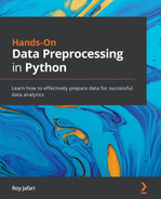
Stratified sampling, also known as proportional random sampling, is a numerosity data reduction method. The similarity between random sampling and stratified sampling is that in both samplings, all the data objects have some chance to be selected in the sample. The distinction is that stratified sampling makes sure that the selected data objects show the same representation of the groups in the original dataset. The distinction between these methods is shown in the following diagram:
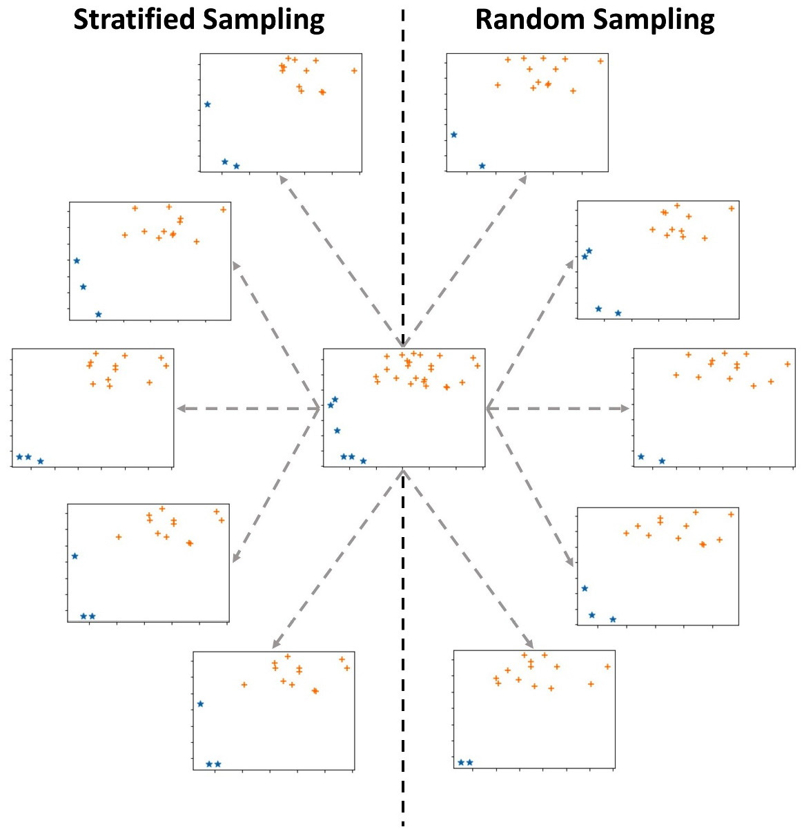
Figure 13.4 – Stratified sampling versus random sampling
The preceding diagram shows a dataset in the middle, five instances of random sampling on the right, and five instances of stratified sampling on the left. The dataset contains 30 data objects: six stars (*) and 24 pluses (+). Each of the 10 samples selects 15 data objects out of the 30 data objects. Before reading on, investigate the preceding diagram and try to figure out the difference between random sampling and stratified sampling.
What jumps out from this diagram is that while all of the stratified samplings have three stars, the instance of random sampling has stars ranging from two to four. This is because stratified sampling has maintained the ratio of the data between the groups, while random sampling does not have such restrictions; 20% (6/30) of the data objects in the original data are stars, while 20% (3/15) of the data objects in the stratified samples are stars. However, such restrictions have not been put in place for the random sampling instance.
Example – stratified sampling for an imbalanced dataset
In the previous example, we saw that customer_df is imbalanced as 15.7% of its cases are churn, while the rest, which is 84.3%, are non-churn. Now, we want to come up with some code that can perform stratified sampling.
The following code will be able to get a stratified sample of customer_df that contains 1000 data objects out of the 3,150 data objects. In the end, the code will print the ratios of churn and non-churn data objects in the sample using .value_counts(normalize=True). Run the code a few times. You will see that even though the process is completely random, it will always lead to the same ratios of churn and non-churn cases:
n,s=len(customer_df),1000
r = s/n
sample_df = customer_df.groupby('Churn', group_keys=False) .apply(lambda sdf: sdf.sample(round(len(sdf)*r)))
print(sample_df.Churn.value_counts(normalize=True))
The preceding code may have gone over your head in terms of its way of using the .groupby() and .apply() functions. This is the first time we have had to use this combination in this book. This is as good an opportunity as any to learn about this combination. When we want a specific set of operations to be performed on multiple subsets of a DataFrame, we will specify the subsets by the.groupby() function first. After this, using the .apply() function opens the door for us to be able to perform operations on those subsets created by .groupby(). Here, sdf stands for Subset DataFrame.
Before moving on to the next section, let's discuss how stratified sampling approaches the two objectives of data reduction presented in Figure 13.1. As we implied previously, stratified sampling puts more effort into the objective of maintaining the integrity of the original data. Of course, when we have different populations in the same dataset and we want to make sure the representation ratios are intact, stratified sampling helps us achieve this goal.
Random over/undersampling
Unlike random sampling and stratified sampling, where the chance of objects being selected in the sample is dictated by the dataset, random over/undersampling due to the needs of analytic gives more or less chance of being selected to certain data objects.
To understand random over/undersampling, let's compare it to stratified sampling. When we perform stratified sampling, we calculate the ratio of the sub-populations based on the important attribute and then perform a controlled random sampling, where the ratios are maintained in the sample. On the other hand, in random over/undersampling, we have a prescribed ratio that we want our sample to have; that is, we decide what ratios we want based on our analytic needs.
To illustrate this, the following diagram compares two instances of stratified sampling from customer_df with two instances of over/undersampling, with a 50-50% (1:1) prescribed ratio between churning and non-churning customers. All the samples contain 500 data objects from the 3,150 data objects in the original dataset. If you study the four samples in the following diagram, you will notice a few patterns. First, you will see that all of them are different, which they should be due to the randomized nature of both sampling methods. Second, you will see that the ratio of churn and non-churn customers in the two instances of over/undersampling has been shifted, as described previously:
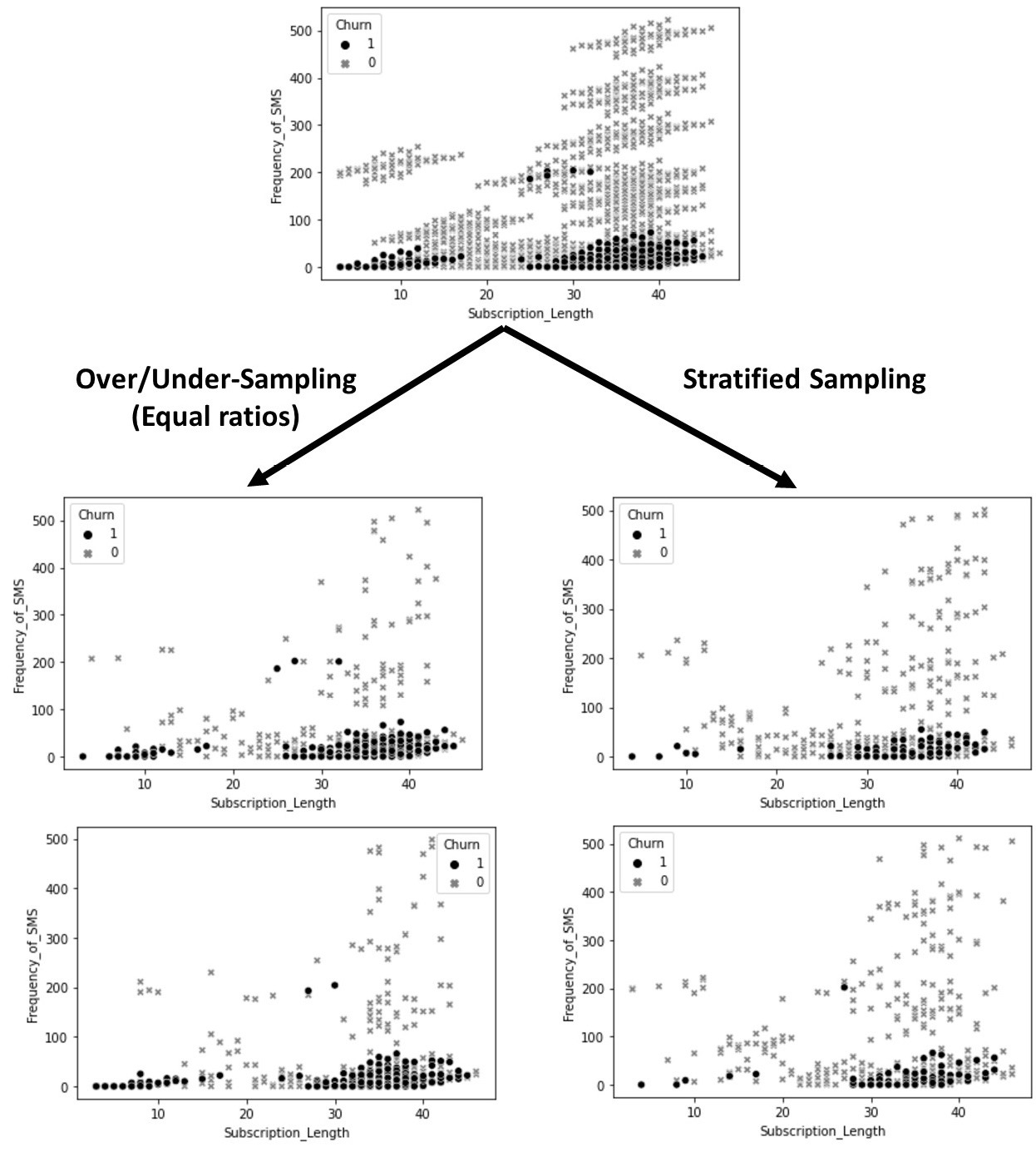
Figure 13.5 – Stratified sampling versus random over/undersampling using customer_df
The most common analytic situation that might require over/undersampling is binary classification using an imbalanced dataset. An imbalanced dataset is a table that has been prepared for classification and its dependent attribute has two characteristics. First, the dependent attribute is binary, meaning that it only has two class labels. Second, there are significantly more of one class label than the other. For example, the customer churn prediction that we discussed earlier in this chapter uses an imbalanced dataset. To check this, you can run customer_df.Churn.value_counts(normalize=True).plot.bar(), which will create a bar chart that shows the frequency of each label in the customer_df.Churn attribute. You will see that there are around five times more cases of 0 (non-churn customers) and cases of 1 (churn customers).
Too Specific to Matter?
Binary classification using an imbalanced dataset might sound too specific to matter. However, the most important classification tasks are binary, and in almost all of them, the dataset is imbalanced. To name a few very common and important examples of binary classification that have to use imbalanced datasets, we can mention online fraud detection, machinery fault detection using sensor data, and automatic disease detection using radiology images.
The reason that we might want to perform over/undersampling is that it has been seen time and again that the classification algorithm, by default, might overemphasize learning from the less frequent class label, and unfortunately, often, the case that matters more for us is the less frequent one. For example, in the example of churn prediction, it is more important for us to recognize who will be churning, rather than who will not be churning. So, when developing an algorithmic solution, we might choose to perform over/undersampling. This is done to give the algorithm a greater opportunity to learn from the less frequent cases.
The code that we use to apply randomly over/undersampling is very similar to and simpler than stratified sampling. The following code will be able to get a sample of customer_df that contains 500 data objects out of the 3,150 data objects. There will be 250 data objects from both the churning and non-churning customers. In the end, the code will print the ratios of the churn and non-churn data objects in the sample using .value_counts(normalize=True). This code is a copy of the preceding code with a few changes; to help you see them, the updated parts are highlighted. Before running the following code, first, compare it with the preceding one to study the changes. Then, run the code a few times. You will see that even though the process is completely random, it will always lead to the same and equal ratios of churn and non-churn cases:
n,s=len(customer_df),500
sample_df = customer_df.groupby('Churn', group_keys=False) .apply(lambda sdf: sdf.sample(250))
print(sample_df.Churn.value_counts(normalize=True))
Before switching gears from numerosity data reduction to dimensionality data reduction, let's discuss how random over/undersampling approaches the two objectives of data reduction presented in Figure 13.1. This approach intentionally disrupts the integrity of the original dataset due to analytic reasons. However, as the sampling is performed randomly, the randomness helps keep the integrity of the dataset to some degree. The fact that we committed to this transgression here is that, at times, random over/undersampling happens both as a data reduction strategy and as a data transformation strategy. This is the mixing that allowed us to do this. As we will learn in the next chapter, data transformation does inflict changes on the data for analytic purposes.
Over/undersampling is more of a data transformation technique, though, at times, it gets mixed with data reduction. Also, from a technical perspective, it is very similar to random sampling and stratified sampling, as we learned about here. As a data transformation technique, oversampling could also mean having repetitions of data objects with the less frequent class label or even having simulated data objects that we would predict having the less frequent class label.
Attention!
We will not discuss over/undersampling beyond this point in this book. This is because successful over/undersampling is highly relevant to the classification algorithm of choice and you could see it as a hyperparameter of any classification algorithm. This means that one algorithm's performance might improve using oversampling, while the other may suffer. Therefore, oversampling is the content that a book with more emphasis on teaching algorithms should cover. In this book, our focus is on data preprocessing.
Now, it is time to switch gear! Dimensionality data reduction, here we come!
Performing dimensionality data reduction
When we need to reduce the number of attributes (columns) as opposed to the number of data objects (rows), we have a case of dimensionality reduction. This is also known as dimension reduction. In this section, we will cover six methods: regression, decision tree, random forest, computational dimension reduction, functional data analysis (FDA), and principal component analysis (PCA).
Before we talk about each of them, we must note that there are two types of dimension reduction methods: supervised and unsupervised. Supervised dimension reduction methods aim to reduce the dimensions to help us predict or classify a dependent attribute. For instance, when we applied a decision tree algorithm to figure out which multi-variate patterns can predict customer churning, earlier in this chapter, we performed a supervised dimensionality reduction. The attributes that did not show up on the tree in Figure 13.2 are not important for predicting (classifying) customer churn.
On the other hand, when dimension reduction is performed without paying attention to the task of prediction or classification, and data reduction is done only to reduce the data size or perhaps data transformation and massaging, then we have unsupervised dimension reduction. If the terms data transformation and data massaging are not familiar to you, don't worry. We will discuss these in the next chapter.
Now, let's look at each of the six methods. I will refrain from mentioning if each method is supervised or unsupervised so that you can think about them on your own. Exercise 4, at the end of this chapter, will ask you to answer that for each method.
Linear regression as a dimension reduction method
We learned about linear regression as a prediction model in Chapter 6, Prediction. Linear regression is a very well-researched and integrated statistical method. As such, the libraries that package this method normally come with many built-in metrics and hypothesis testings that can be very useful for analyzing the dataset. A group of such hypothesis testing is very useful in deciding if each independent attribute is playing a significant role in predicting a dependent attribute.
Therefore, linear regression can be used as a dimension reduction method by looking at the resulting p-value of those hypothesis testings. The p-values that do not show that there is a meaningful relationship between the relevant independent attributes and the dependent attribute can be used as evidence, to help remove those independent attributes from the analysis. Let's look at an example to understand this better.
Example – dimension reduction using linear regression
In this example, we would like to use amznStock.csv, which contains some calculated metrics from the historical data of Amazon stock that's was collected and computed on January 11, 2021, to predict the next day percentage of change of the Amazon stock. The dependent attribute in this dataset is today_changeP. The independent attributes are as follows:
- yes_changeP: Amazon's stock price change in the previous day
- lastweek_changeP: Amazon's stock price change in the previous week
- dow_yes_changeP: Dow Jones change in the previous day
- dow_lastweek_changeP: Dow Jones change in the previous week
- nasdaq_yes_changeP: NASDAQ 100 change in the previous day
- nasdaq_lastweek_changeP: Last week's NASDAQ 100 change in the previous week
I created this dataset on January 11, 2021, to create the YouTube video A Taste of Prediction (https://youtu.be/_z0oHuTnMKc). To find out more about this dataset and the logic behind it, please see the YouTube video.
Now that I am looking at the name of the attributes, I think the attribute names can become much more intuitive. So, let's start by doing some level I data cleaning; that is, creating concise and intuitive attribute titles. The attribute titles are concise but they can be more intuitive.
The following code reads the dataset into amzn_df, sets t as the index of amzn_df, and changes the attribute titles:
amzn_df = pd.read_csv('amznStock.csv')
amzn_df.set_index('t',drop=True,inplace=True)
amzn_df.columns = ['pd_changeP', 'pw_changeP', 'dow_pd_changeP','dow_pw_changeP', 'nasdaq_pd_changeP', 'nasdaq_pw_changeP', 'changeP']
Changing the attribute titles in the previous code followed three simple patterns. The _yes_ title segment, which was meant to represent yesterday, was updated with _pd_, which is meant to present the previous day. Moreover, the _lastweek_ title segment was updated with _pw_, which is meant to present the previous week. Lastly, the today title segment was eliminated from the dependent attribute.
Now, let's bring our attention to dimension reduction using linear regression. To use linear regression as a dimension reduction method, we have to perform linear regression as though we are going to train the prediction model. The following is the linear regression equation for this amzn_df:

To practice and review this, before reading on, refer back to the Example of applying linear regression to perform regression analysis section of Chapter 5, Data Visualization, and estimate the values of the βs in the preceding linear regression equation using LinearRegression() from sklearn.linear_model.
Even though LinearRegression() is a great and stable function to use for linear regression, unfortunately, this function does not include the hypothesis testings that are necessary for applying linear regression as a dimension reduction method. That is why the following code uses the OLS() function, from statsmodels.api, to import a linear regression module that outputs the results of the hypothesis testing we discussed earlier:
import statsmodels.api as sm
Xs = amzn_df.drop(columns=['changeP'], index =['2021-01-12'])
Xs = sm.add_constant(Xs)
y = amzn_df.drop(index =['2021-01-12']).changeP
sm.OLS(y, Xs).fit().summary()
Let's go over a few things about the preceding code that might have become a question for you before we analyze its output:
- Why are we dropping the data object with an index of 2021-01-12? If you print amzn_df, you will see that this data object is presented as the last row of this DataFrame and that there is no value for the dependent attribute; that is, changeP. Do you remember that the dataset was collected and computed on January 11, 2021? At that time, we did not know what changeP of January 12 will be. The dataset was put together to try to predict this value.
- What is the purpose of Xs = sm.add_constant(Xs)? This line of code adds a column whose value for all the rows is 1. The reason for this addition is to make sure OLS() will include a constant coefficient, which is what linear regression models have. Why did we not have to include this when we used LinearRegression() from sklearn.linear_model? That is a good question and the answer is that the developer of each module may choose to create their module based on what they think is a better approach. As users, we need to learn how and when we should use what module.
Now that we understand the code, let's pay attention to its output. After successfully running the preceding code, you will get the following output:
Figure 13.6 – The result of the OLS() function on the described linear regression model
Before reading on, go back to the βs you estimated using LinearRegression(). The β values must be the same as the values you can see in the preceding diagram, under the coef column.
In the same table, in the P>|t| column, you can find the p-values of the hypothesis test of the independent attribute's significance for predicting the dependent attribute. You can see that most of the p-values are way larger than the cut-off point of 0.05, except for dow_pd_changeP, which is slightly larger than the cut-off point. Based on our understanding of the p-value, we can see that we don't have enough evidence to reject the null hypothesis that most of the independent attributes are not related to the dependent attribute – that is, except for dow_pd_changeP, which has a rather small probability that this attribute is not related to the dependent attribute. So, if we were going to keep any attribute, we would keep dow_pd_changeP and remove the rest.
In this example, we used linear regression to turn a prediction model with six independent attributes into a prediction model with only one independent attribute. The following is a simplified version of the linear equation:

If you modify the preceding code so that the OLS() functions will run the new model, you will get the following output:
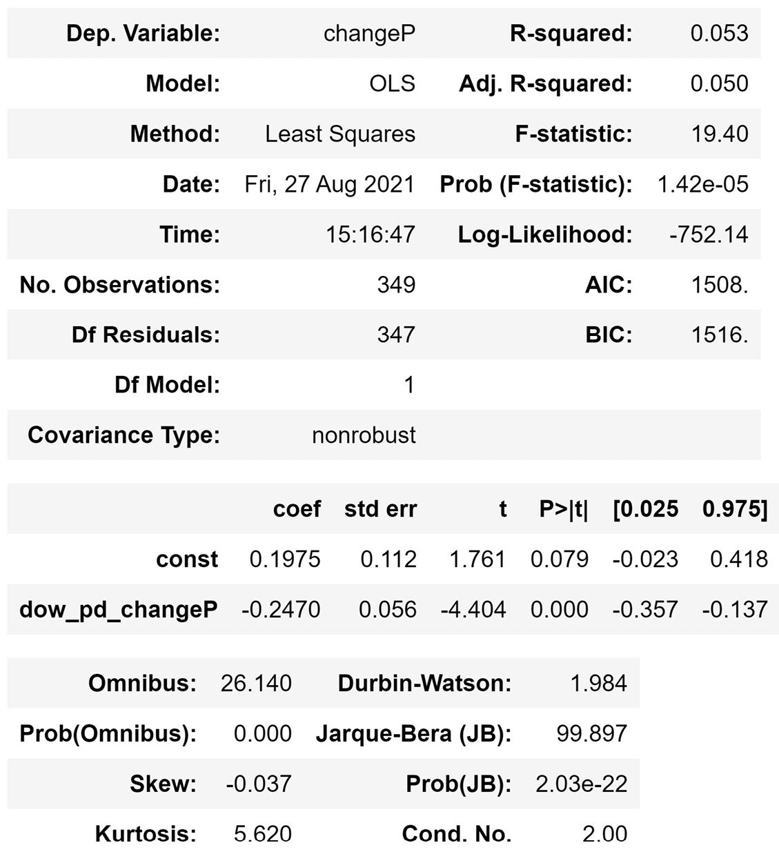
Figure 13.7 – The result of the OLS() function on the reduced linear regression model
Comparing the adjusted R2 (Adj. R-squared), which is a reliable metric for the quality of linear regression, in Figure 13.6 and Figure 13.7 shows that data reduction helped with the success of the model. Even though the model in Figure 13.7 has fewer independent attributes, it is more successful than the model in Figure 13.6.
The shortcoming of linear regression as a dimension reduction method is that the model takes a univariate approach in deciding if an independent attribute helps predict the dependent attribute. In many situations, it might be the case that an independent attribute is not a good predictor of the dependent attribute but its interaction with other independent attributes might be helpful. That is why, when we want to perform dimension reduction before capturing multi-variate pattern recognition, linear regression is not a good method of choice. For those cases, we should use one of the other methods, such as decision tree, random forest, or computational dimension reduction. We will be learning about each of these methods in this section. Next up, we'll look at using a decision tree as a dimension reduction method.
Using a decision tree as a dimension reduction method
Throughout this book, we have learned that the decision tree algorithm can handle both prediction and classification data mining tasks. However, here, we want to see how a decision tree can be used as a method for dimension reduction. The logic is simple: if an attribute was a part of a tuned and trained final decision tree, then the attribute must have helped predict or classify the dependent attribute.
For example, in the tuned and trained decision tree for predicting customer churn, as shown in Figure 13.2, all of the eight attributes were used in the final decision tree. This shows that we would not want to remove any of the independent attributes for multi-variate pattern recognition.
The decision tree algorithm is an effective way to see if an attribute has the potential to predict or classify a dependent attribute in a multi-variate way, but it does have some shortcomings. First, the decision tree makes a binary decision about whether each attribute should be included or not, and we do not have a way to see how valuable each dependent attribute is. Second, it might be the case that an attribute is excluded – not because it does not play a role in any multivariate pattern, which can help predict the dependent attribute – but because the attribute can be beneficial but the structure and/or the logic of the decision tree fails to capture the specific patterns that the attribute plays a role in.
Next, we will learn about the random forest algorithm, which rectifies the first shortcoming of the decision tree. After that, we will learn about brute-force computational dimension reduction, which can deal with the second shortcoming.
Using random forest as a dimension reduction method
We have not been introduced to the random forest algorithm before in this book. This algorithm is similar to the decision tree algorithm and can handle both classification and prediction data mining tasks. However, its unique design makes the random forest a prime candidate to be used as a dimension reduction method.
Random forest, as the name suggests, instead of just relying on one decision tree to perform classification or prediction, uses many decision trees in a randomized way. The decision trees that the random forest uses are random and have fewer levels. These smaller decision trees are called weak predictors or classifiers. The logic behind random forest is that instead of using an opinionated decision tree (one strong predictor) to give us one prediction, we can employ multiple, more flexible, decision trees (weak predictors) and consolidate their predictions into a final class or a value.
As a dimension reduction method, we can just look at the number of times each attribute appeared in the multiple weak decision trees and arrive at a percentage of decision trees that each attribute was employed by. This will be invaluable information regarding our choice to keep or remove attributes.
Let's look at an example.
Example – dimension reduction using random forest
In this example, we would like to use random forest to come to the relative importance of each attribute in the classification of customer churn using the Customer Churn.csv file. We saw the influence that each attribute has on one tuned and trained decision tree in Figure 13.2. However, here, we are more interested in coming to a numerical value that shows the importance of each attribute.
The following code uses RandomForestClassifier() from sklearn.ensemble to train a random forest model that uses 1000 weak decision trees:
from sklearn.ensemble import RandomForestClassifier
y=customer_df['Churn']
Xs = customer_df.drop(columns=['Churn'])
rf = RandomForestClassifier(n_estimators=1000)
rf.fit(Xs, y)
After successfully running the preceding code, which might take a few seconds to run, nothing will happen. But don't worry – the magic has happened; we just need to access what we are looking for. Print rf.feature_importances_ and look at the numerical values that show the importance of the independent attributes. The code shown in the following screenshot creates a pandas Series, sorts the attributes based on their importance, and then creates a bar chart that shows the relative importance of each attribute to classify customer churn:
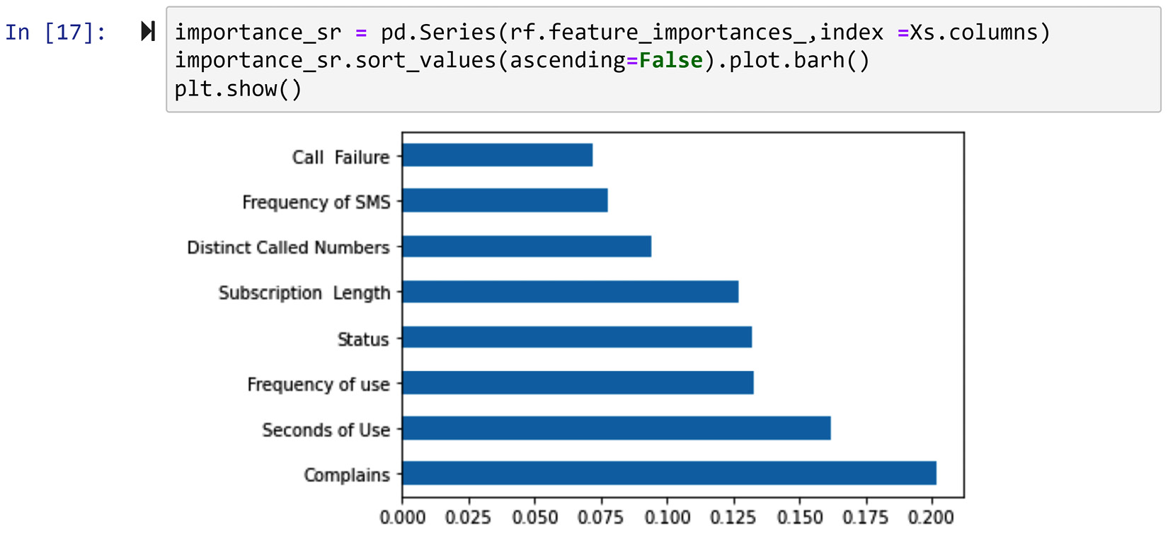
Figure 13.8 – Creating a bar chart using a pandas Series and Matplotlib to show the relative importance of independent attributes to classify customer churn in customer_df
The information shown in the preceding screenshot, other than the valuable implications for dimension reduction, may also be used for direct analysis. For instance, we can see that the complaints attribute has floated to the top of the list. This means that customer complaints have very important implications for customer churn and that the decision-makers of the telecommunication company that this data was collected from may be able to use that for positive change.
While random forests do not suffer from the first shortcoming of decision trees regarding dimension reduction, they do suffer from the second shortcoming. That is, we cannot be certain that if an attribute does not show enough importance through the fandom forest, it will not be valuable for predicting the dependent attribute in other algorithms. The next dimension reduction method that we will learn about, brute-force computational dimension reduction, does not have this shortcoming. However, this method is computationally very expensive. Let's learn more about it.
Brute-force computational dimension reduction
This method uses a brute-force approach where all the different subsets of independent attributes are used in an algorithm to predict or classify the dependent attribute. After this brute-force experimentation, we will know which combination of the independent attributes can best predict the dependent attribute.
The Achilles heel of this method is that it can become computationally very expensive, especially if the algorithm of choice is also computationally expensive. For instance, using computational dimension reduction to find the best subset of independent attributes using an artificial neural network (ANN) will probably have a higher chance of leading to the optimum predictor, but at the same time, it will probably take a significant amount of time to run.
On the other hand, this approach does not suffer from the shortcomings of the other dimension reduction methods we have learned about so far. Brute-force computational dimension reduction can be coupled with any prediction or classification algorithms, thus removing our method-specific results concern we had with the decision tree and random forest.
Now, let's look at an example and see what brute-force computational dimension reduction would look like.
Example – finding the best subset of independent attributes for a classification algorithm
In this example, we would like to find the best subset of independent attributes that would lead to the best performance of K-Nearest Neighbors (KNN) in predicting customer churn in the Customer Churn.csv file.
We learned about KNN in Chapter 7, Classification, and, as you may recall, to successfully implement KNN, we need to have tuned the number of neighbors (K). So, if we want to check which subset will lead to the best KNN performance, we will need to tune KNN once for every combination of the independent attributes. This will make the process even more computationally expensive.
The following code has put all these pieces together so that we can experiment with every combination of independent attributes after tuning KNN for them. This code has many parts and we will go over them later in the chapter.
This code has been presented in the form of a screenshot because it is rather large. If you wish to copy the code instead of typing it, please see the Chapter13 file in this book's GitHub repository:
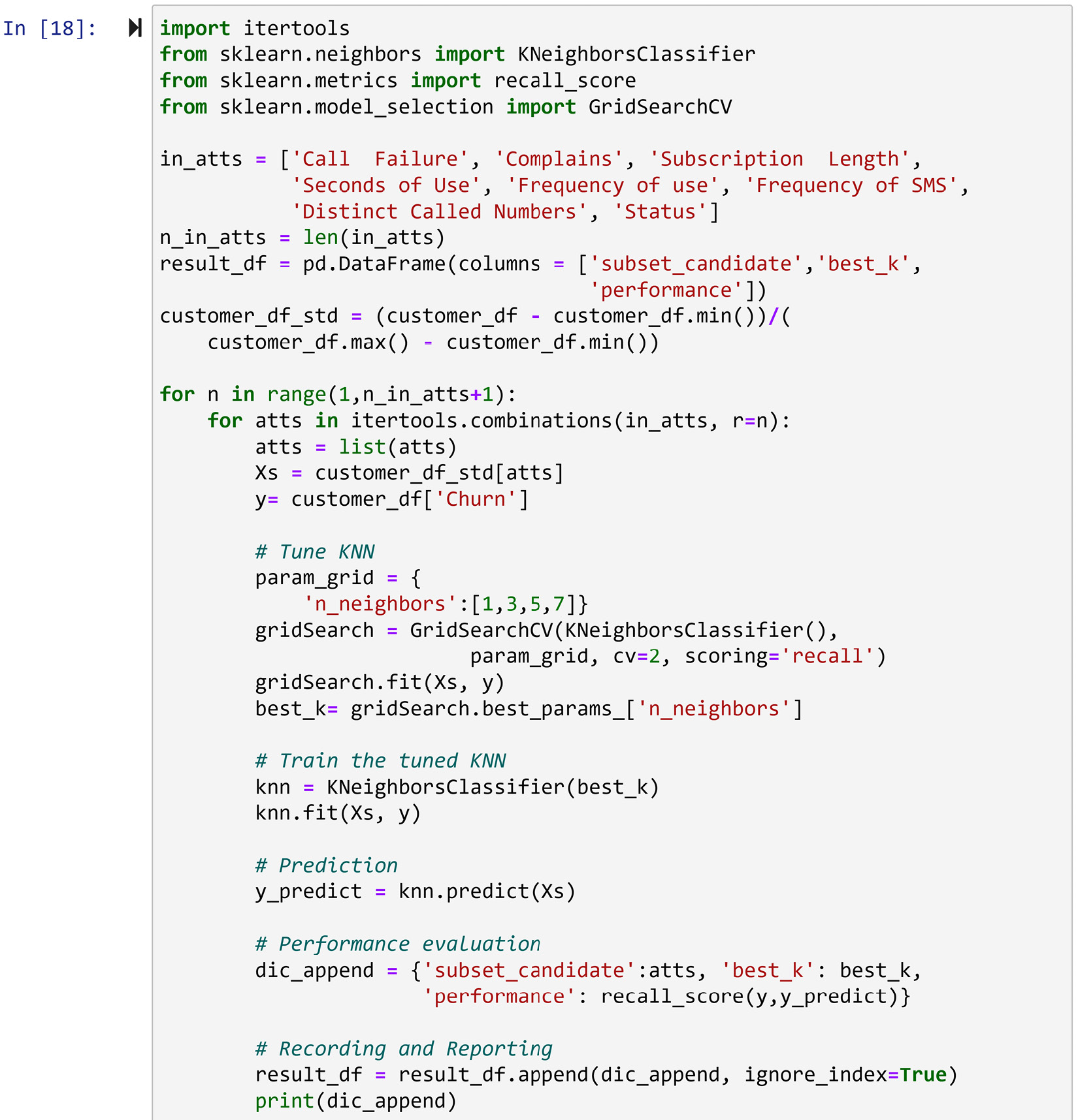
Figure 13.9 – Brute-force dimensionality reduction to optimize KNN's performance when predicting customer churn
Let's go over the different parts of the code in the form of the questions you might have about it. Before reading on, try running and also understanding the code.
As the code will be computationally expensive, it might be smart to let your computer run the code while you try to understand it:
- What is itertools and why do we need it? It is a very useful module when we need a complex web of nested loops to get our task done. To create every possible combination of the independent attributes, we need to have various number of nested loops under the main loop, and that is not possible to do using the regular iteration functionality of Python. If the previous sentence didn't make sense and you are adamant about understanding it, try to write some code that prints all the combinations of the independent attributes; then, you will understand.
By using itertools .combinations(), we were able to create all the combinations in a two-level nested loop.
- What is result_df and why do we need it? This is a pandas DataFrame that this code uses as a placeholder, in which we will record the records of all the brute_force experimentations.
- What is recall and why are we evaluating our method using recall instead of accuracy? Recall is a specific evaluation metric of binary classification tasks, and in this case study, having a better recall is more important than better accuracy. I'd say Google it and learn more about it, but if you are not interested in learning about what recall is at this point in your data analytics career, I think just looking at it as an appropriate evaluation metric would do for now.
- Why are we only experimenting with the four possible values of [1,3,5,7] for K? This is a measure that's used to cut the computational costs because without it, the code would take a very long time to run.
Once you have fully understood the preceding code and your computer has finished running it, you should sort the pandas DataFrame, result_df, by the performance column and see the results of your experimentation. result_df.sort_values('performance',ascending=False) does this, and studying its output will help you realize that the following two combinations will lead to a very successful KNN classification with recall scores of 0.99596:
- Complains, Seconds of Use, Frequency of use, Distinct Called Numbers
- Seconds of Use, Frequency of SMS, Distinct Called Numbers
Comparing the final results of this example with Figure 13.8, which was the final result of the random forest on the same case study, can teach us a lot about the advantages of the brute-force computational dimension reduction method:
- First, we can see that what was important for the random forest is not necessarily important for KNN. For instance, while for the random forest, Distinct Called Numbers was not very important, we can see that KNN can use it to get its best performance.
- Second, while the random forest gave us a good visualization about the importance of the attributes after we received these results, we will still need to make decisions as to what attributes we need to exclude or include. However, brute-force computational dimension reduction will tell us exactly what attributes to include.
While these advantages of brute-force computational dimension reduction sound very impressive, I'd hesitate to write this method up as the best. The computational cost of this method is a real concern.
So far in this chapter, we've learned about two numerosity reduction methods and four dimensionality reduction methods. The dimensionality reduction methods we've learned about so far are specific to prediction or classification. We will learn about two more dimensionality reduction methods that are more general and can be used as one of the preprocessing steps before any task, including classification and prediction. These two methods are principal component analysis (PCA) and functional data analysis (FDA). Let's start with PCA.
PCA
This dimension reduction method is the most famous general and non-parametric dimension reduction method in the literature. There are rather complex mathematical formulas if we raise the hood of the method and take a look at how the method works. However, we are not going to get bogged down in the mathematical complexities. Instead, we are going to learn about PCA by using two examples: one containing a toy dataset and one containing a real example. So, let's dive into the first example and learn about PCA.
Example – toy dataset
In this example, we are going to use the PCA_toy_dataset.xlsx file. The following screenshot, which is in a dashboard-style, shows five items:
- The code to read the file into toy_df
- The Jupyter Notebook representation of toy_df
- The scatterplot of the two dimensions of toy_df
- The calculated variance of both attributes in toy_df and their summation (Total)
- The correlation matrix of toy_df:

Figure 13.10 – A dashboard containing information and visuals for toy_df
Using the preceding screenshot, we can gain a lot of insight into toy_df. What jumps out right off the bat is that Dimension_1 and Dimension_2 are strongly correlated. We can see this both in the scatterplot and the correlation matrix; the correlation coefficient between Dimension_1 and Dimension_2 is 0.859195. We can also see that there is a total of 1026.989474 variations in toy_df; Dimension_1 contributes 415.315789 of the total variation, while Dimension_2 contributes the rest.
The way PCA looks at any data is in terms of variations. For PCA, there is this much (1026.989474) information presented in toy_df. Yes, PCA considers variations across different data attribute information. For PCA, the way that the information is presented across the two attributes is troublesome. PCA doesn't like the fact that some of the information that is presented by Dimension_1 is the same as some of the information presented by Dimension_2, and vice versa. PCA has a non-parametric view of the data. For PCA, the attributes are simply the holders of information in form of numerical variations. Thus, PCA sees it as fitting to transform the data so that the dimensions do not show similar information.
Before discussing what transformations PCA applies to a dataset, let's go ahead and apply them to toy_df and see its results. The following screenshot shows another dashboard-style visual that shows the information about the PCA-transformed toy_df. This screenshot contains five items that are similar to the ones shown in Figure 13.11. This screenshot also contains the code that uses the PCA() function from sklearn.decomposition to transform toy_df:
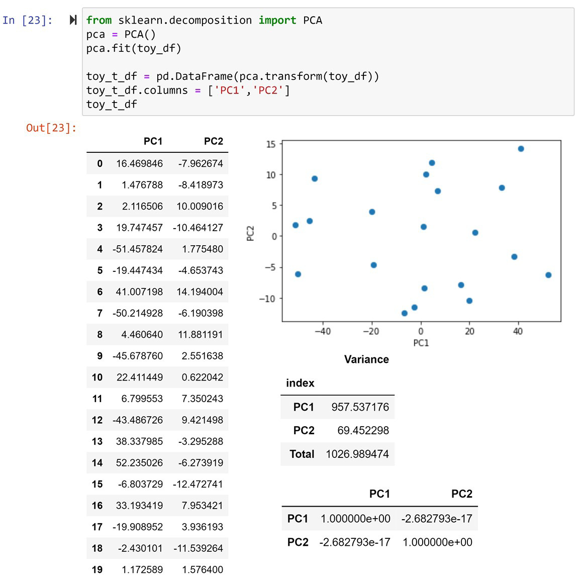
Figure 13.11 – A dashboard containing information and visuals for the PCA transformed toy_df dataset
In the preceding screenshot, we can see the information and visualizations of the PCA-transformed toy_df, which is called toy_t_df. We call the new columns of a PCA-transformed dataset principal components (PCs). Here, you can see that since toy_df has two attributes, toy_t_df has two PCs called PC1 and PC2.
After taking a cursory look at the preceding screenshot and comparing it with Figure 13.11, it might feel like there's no points of similarity between the two DataFrames: the original toy_df dataset and its PCA-transformed version, toy_t_df. However, you'll be surprised to know that there are lots of commonalities between the two. First, look at the total amount of variance in both figures. They are both exactly 1026.989474. So, PCA does not add information to and remove information from the dataset, it just moves the variations from one attribute to the other.
A second similarity will show itself when we rotate the scatterplot of Dimension_1 and Dimension_2 in Figure 13.11. This can be seen in the following diagram, and you can see that the data presented in Figure 13.12 is the same as that shown in Figure 13.11 after some axis transformation:
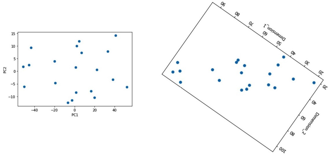
Figure 13.12 – A comparison between the PCA-transformed toy_df dataset and the visually rotated toy_df dataset
Now, let's talk about what PCA does to a dataset. In plain English, PCA transforms the axes of a dataset in such a way that the first PC – in this example, PC1 – carries the maximum possible variation, and the correlation between the PCs – in this example, PC1 and PC2 – will be zero.
Now, let's compare Figure 13.11 and Figure 13.12 again. While Dimension_1 only contributes 415.315789 to the total 1026.989474 variations in Figure 13.11, PC1 contributes 957.53716 to the total 1026.989474 variations in Figure 13.12. So, we can see that the PCA transformation has successfully pushed most of the variations into the first PC, PC1. Moreover, looking at the scatterplot and the correlation matrix in Figure 13.12, we can see that PC1 and PC2 have no relationship with one another and that the correlation coefficient is zero (-2.682793e-17). However, we do remember from Figure 13.11 that the relationship between Dimension_1 and Dimension_2 was rather strong (0.859195). Again, we can see that PCA has been successful in making sure there is no correlation between PC1 and PC2 in this example. When two attributes are poised to have zero correlation with one another, it is said that they are orthogonal to one another.
There is more to learn about PCA, but now, you are ready to learn via a real data analytic application. Let's look at the next example.
Example – non-parametric dimension reduction
Go back to Chapter 8, Clustering Analysis, the Using K-Means to cluster a dataset with more than two dimensions section and review the clustering we performed there. We employed K-Means to cluster the countries in WH Report_preprocessed.csv based on their data from 2019 into three groups. In this example, instead of using only 2019 data, we want to use all of the data in the file. Also, instead of using clustering analysis, we want to use PCA to visualize the inherent patterns in the data.
In Chapter 8, Clustering Analysis, we used the following nine attributes to cluster the countries: Life_Ladder, Log_GDP_per_capita, Social_support, Healthy_life_expectancy_at_birth, Freedom_to_make_life_choices, Generosity, Perceptions_of_corruption, Positive_affect, and Negative_affect. As there are more than three attributes, we were unable to use the visualization methods to visualize a complete representation of the dataset. With the help of PCA, we can push most of the variations in the data into the first few PCs and visualize them instead, which will help us get some insight into the general trends in the dataset.
The following code reads the WH Report_preprocessed.csv file into report_df and then uses the pandas.pivot() function to create country_df:
report_df = pd.read_csv('WH Report_preprocessed.csv')
country_df = report_df.pivot(index='Name', columns='year', values=['Life_Ladder','Log_GDP_per_capita', 'Social_support', 'Healthy_life_expectancy_at_birth', 'Freedom_to_make_life_choices', 'Generosity', 'Perceptions_of_corruption', 'Positive_affect', 'Negative_affect'])
After running the preceding code and studying country_df, you will see that the dataset has been restructured so that the definitions of the data objects are for each country, while all the happiness indices of all the 10 years from 2010 to 2019 are included. Therefore, in total, country_df has 90 attributes now.
After data restructuring, the following code creates Xs and standardizes it. To be specific, Xs = (Xs - Xs.mean())/Xs.std() standardizes the Xs DataFrame:
Xs = country_df
Xs = (Xs - Xs.mean())/Xs.std()
Xs
We already know how to normalize a dataset. Here, we are using another data transformation technique: standardization. What distinguishes these two data transformation methods is why they are used. For clustering, we use normalization as it makes sure the scale of all the attributes is the same, so each attribute will have equal weight in the clustering analysis. However, it is essential to standardize the data before applying PCA. That is because standardization transforms the attributes, so all of the transformed attributes will have an equal standard deviation: one. After successfully running the preceding code, run either Xs.var() or Xs.std() to see that standardizing the data ensures each attribute has the same variance across the data objects.
Why is standardization necessary before applying PCA? If you remember from what we have been learning about PCA, this method looks at each attribute as a carrier of some variation of the total variation. If one attribute happens to have a significantly larger variance, it will just dominate the PCA's attention. Therefore, to ensure each attribute will get fair and equal attention from PCA, we will standardize the dataset.
Now that the dataset is ready, let's apply PCA. The following code uses the PCA() function from sklearn.decomposition to PCA-transform Xs into Xs_t:
from sklearn.decomposition import PCA
pca = PCA()
pca.fit(Xs)
Xs_t = pd.DataFrame(pca.transform(Xs), index = Xs.index)
Xs_t.columns = ['PC{}'.format(i) for i in range(1,91)]
After successfully running the preceding code, print the transformed dataset, Xs_t, and investigate its state.
Attention!
You might be confused about ['PC{}'.format(i) for i in range(1,91)] in the preceding code. The technique that was used in this line of code is called list comprehension. Whenever we want to fill a collection with iterable items, instead of using traditional loops, we can use list comprehensions. For instance, if you were to run this line of code separately, it would print out ['PC1', 'PC2', 'PC3', …, 'PC90'].
The question we should be asking ourselves now is, was PCA successful? We can do better than asking – we can check. By simply running Xs_t.var(), we can see the amount of variations that are explained by each PC. After running this, we can see that most of the variations are explained by the first PCs, but we don't know by exactly how much. Normally, after performing PCA, we perform cumulative variance explanation analysis on the PCs.
The following screenshot shows the code for creating explanation_df, which is a reporting DataFrame that was created to show the variance percentage of each PC, as well as the cumulative variance percentage up until each PC, starting from PC1:
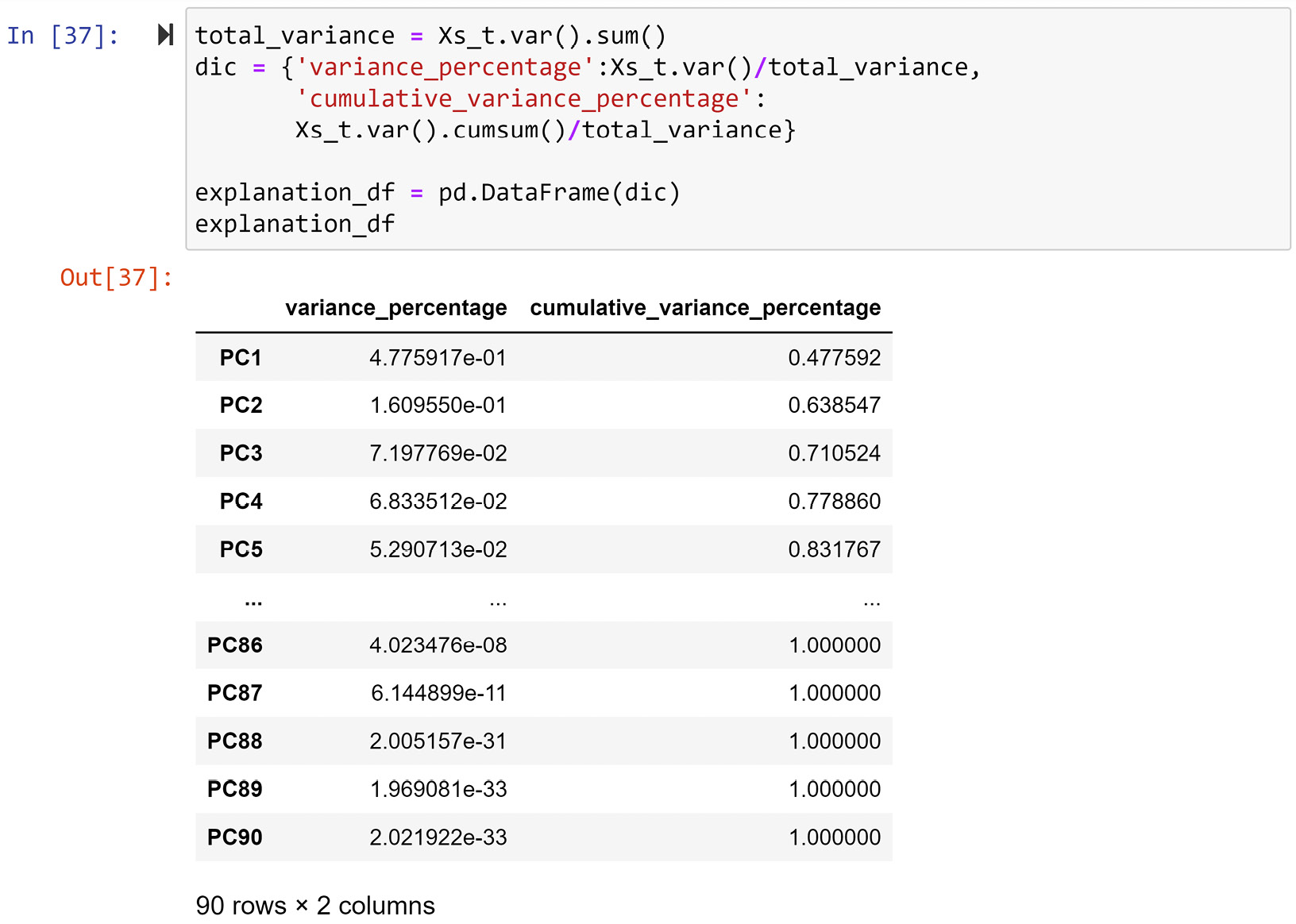
Figure 13.13 – Creating explanation_df from Xs_t
In the preceding screenshot, we can see that the first three PCs account for 71% of the total variation in data. We would roughly need 64 out of 90 attributes to be able to account for around 71% of the variations in a dataset with 90 attributes. However, thanks to PCA, we have transformed the dataset into a state where we can show 71% of the variations in the dataset only using three attributes.
Next, we will use our visualization skills to draw a three-dimensional scatterplot. Running Xs_t.plot.scatter(x='PC1', y='PC2', c='PC3', sharex=False) will ouput the following 3D scatterplot:
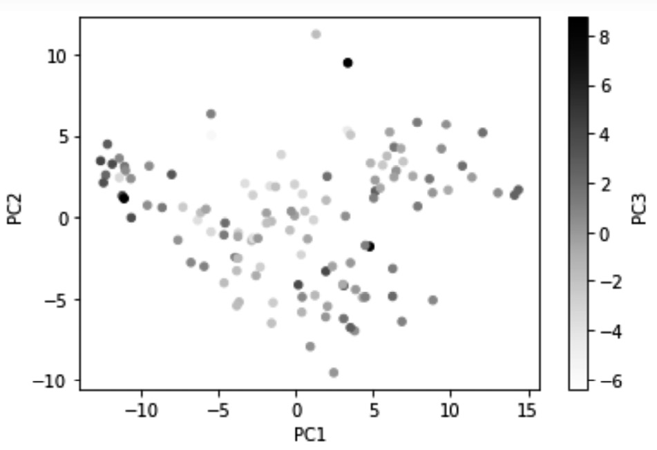
Figure 13.14 – Visualizing 71% of the variations in country_df using PC1, PC2, and PC3
The preceding visualization now has the advantage of having visualized 71% of the information in country_df, which is an excellent achievement. However, the disadvantage of creating visualizations using PCs is that the dimensions in the visualization will not have the intuitive meaning that they would if we were to use the original attributes for visualization. For instance, compare the preceding diagram with Figure 8.3 of Chapter 8, Clustering Analysis. In Figure 8.3, you will see that the x-axis shows Life_Ladder, whereas the y-axis shows Perception_of_corruption, and the color shows Generosity. When we look at the visualization, we have an understanding of what intuitive values change while moving from one dot to the other. However, in the preceding diagram, PC1, PC2 and PC3 are simply capsules of variations; we have no intuitive understanding of what they show.
And that's not where things end. When looking at a regular scatterplot, we would intuitively assume that the x-axis and y-axis have equal weight and importance. However, we should try to beat that second nature when looking at the scatterplots of PCs. The reason for this is that the first PCs have more importance as they carry more variations. We also need to keep in mind that the representation of color only carries about 10.1% of the total variations shown by the visualization; 10.1% was calculated using the formula 7.197769e-02/0.710524; both numbers are from Figure 13.13.
In any case, beating our perception by paying attention to the relevancy and ratios of PCs all at once is a tall order, especially for untrained eyes. The good news is that we can use other visualization techniques to somewhat guide our eyes. The following code uses a few strategies to help us see the relative relationship that the data points have to one another regarding the PCs:
Xs_t.plot.scatter(x='PC1',y='PC2',c='PC3',sharex=False, vmin=-1/0.101, vmax=1/0.101)
x_ticks_vs = [-2.9*4 + 2.9*i for i in range(9)]
for v in x_ticks_vs:
plt.axvline(v,c='gray',linestyle='--',linewidth=0.5)
plt.xticks(x_ticks_vs)
y_ticks_vs = [-8.7,0,8.7]
for v in y_ticks_vs:
plt.axhline(v,c='gray',linestyle='--',linewidth=0.5)
plt.yticks(y_ticks_vs)
plt.show()
Before we look at how the strategies were translated into the preceding code, let's look at the result and use that as a lead-in to learning about those strategies. After running the preceding code, Python will produce the following diagram:
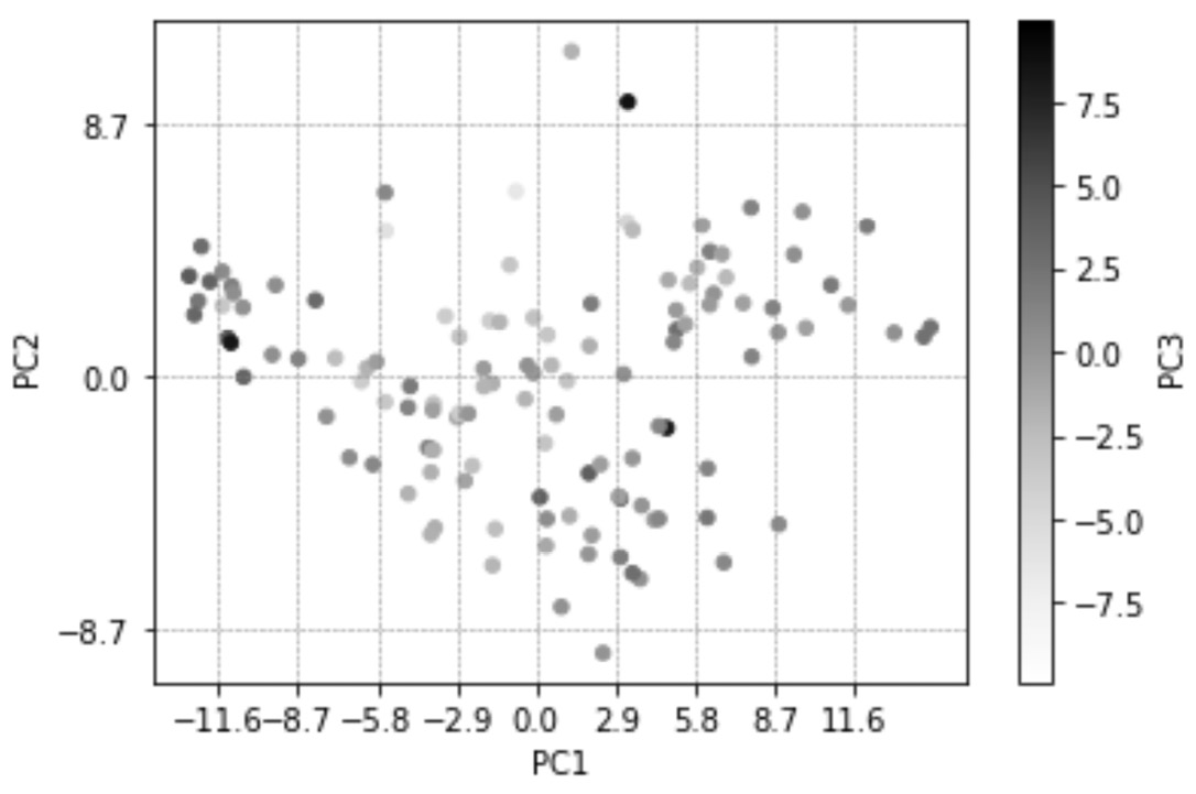
Figure 13.15 – A repeat of Figure 13.13 but with new details to guide our eyes regarding the relevance and ratios of PC1, PC2, and PC3
In the preceding diagram, you can see that two changes have been adopted. Let's go through them one by one and explain them:
- x-ticks of the plot has been updated, and vertical lines have been added accordingly. These changes are adopted using the amount of variations PC1 offers. Likewise, y-ticks of the plot has also been updated, and horizontal lines have been added accordingly.
The numbers 2.9 and 8.7 have been calculated by trial and error and the information taken from Figure 13.13; first, we can calculate 67.21682870670097% and 22.652999757925132% as the percentages that PC1 and PC2 are representing in the diagram, respectively. Then once 1 is divided by each of these values we get 2.9 and 8.7 for PC1 and PC2. Where did being divided by 1 come from? Think about it.
- The color spectrum changes as it represents PC3, which has been widened. We use the range of -1/0.101 to 1/0.101 here. Earlier, we calculated 11.1% as the percentage amount of variations that PC3 carries. This change, as you can observe in the preceding diagram, helps us not give undue importance to the changes of PC3 among the data objects.
Before we move on, let's do one last thing to enrich the visualization.
We want to annotate the dots in the preceding diagram with the names of the countries. Since annotating all of the countries would probably make the visual cluttered and unreadable, we will only add 50 countries; these 50 counties will be selected randomly using the pandas DataFrame.sample() function. We will also make the scatterplot a bit larger. The following code will do this for us. The changes that we've made to the preceding code are in bold so that you can easily find them:
Xs_t.plot.scatter(x='PC1',y='PC2',c='PC3',sharex=False, vmin=-1/0.101, vmax=1/0.101, figsize=(12,9))
x_ticks_vs = [-2.9*4 + 2.9*i for i in range(9)]
for v in x_ticks_vs:
plt.axvline(v,c='gray',linestyle='--',linewidth=0.5)
plt.xticks(x_ticks_vs)
y_ticks_vs = [-8.7,0,8.7]
for v in y_ticks_vs:
plt.axhline(v,c='gray',linestyle='--',linewidth=0.5)
plt.yticks(y_ticks_vs)
for i, row in Xs_t.sample(50).iterrows():
plt.annotate(i, (row.PC1, row.PC2), rotation=50,c='gray',size=8)
plt.show()
The following diagram will be produced after successfully running the preceding code:
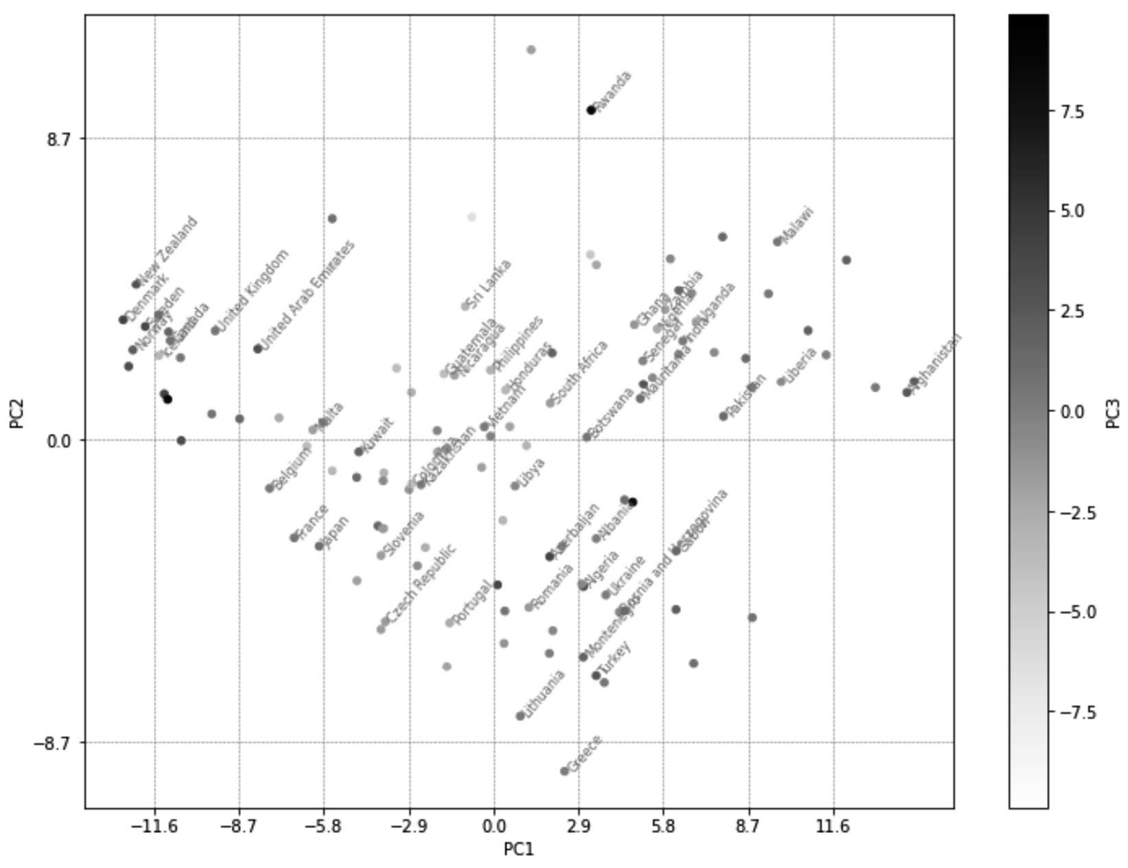
Figure 13.16 – The annotated and enlarged version of Figure 13.15
Now, instead of having to rely on a clustering algorithm to extract and give us the inherent multi-variate patterns in a dataset, we can visualize them. This visualization, to a decision-maker whose eyes have been trained, can be invaluable as 71% of the variations in the dataset are presented in this visualization.
The next dimensionality reduction method we will learn about is functional data analysis (FDA); however, let's discuss the advantages and disadvantages of PCA first. As we saw in this example, PCA may be able to push most of the variations across all the attributes of a dataset into the first PCs. This is great as we can present more information using fewer dimensions.
This can have two distinct positive impacts. First, as we saw in this example, we can visualize more information using fewer visual dimensions. Second, we may use PCA as a way to help with computational costs for algorithmic decision-making. For instance, instead of having to have 90 independent attributes, we may be able to have only three attributes with only a minimal loss of information.
On the other hand, there is a very significant negative impact that comes with using PCA. By pushing the variations around, PCA effectively makes the new dimensions of the transformed data meaningless, which can deprive us of some analytical capabilities.
The next strength/weakness of PCA is also the weakness/strength of the next method we will learn about, which is FDA. PCA is a non-parametric method, which means it can be applied to any dataset and it may be able to transform the data into a new space where fewer dimensions are necessary to present much of the variations. However, FDA is not a method that can be applied to any data. FDA may be applicable or not – it all depends on if we can find a mathematical function that can imitate our data to an acceptable degree. That being said, if we do manage to find that function and apply FDA, then dimension reductionality will not transform the data into a new space where the dimensions are meaningless. However, this is what PCA does.
Is PCA Applicable to Any Dataset?
Actually, no. If the attributes of a dataset form non-linear relationships whose inclusion is important for the analytic goals, PCA should be avoided. However, in most everyday datasets, the assumption that attributes have a linear relationship with one another is safe. On the other hand, if capturing the non-linear relationships between data attributes is essential, you should stay away from PCA.
At this point, I hope you are very excited to learn about FDA. You should be since FDA is a very powerful and exciting method.
Functional data analysis
As the name suggests, functional data analysis (FDA) involves applying mathematical functions to data analytics. FDA can be a standalone analytic tool, or it can be used for dimension reduction or data transformation. Here, we will discuss how it can be used as a dimension reduction method. In the next chapter, we will discuss how FDA can be used for data transformation.
Simply put, as a dimension reduction method, FDA finds a function that can imitate the data well enough so that we can use the parameters of the function instead of the original data.
As always, let's look at an example to understand this better.
Example – parametric dimension reduction
In the preceding example, Example – non-parametric dimension reduction, we used PCA to transform country_df so that most of the variations – 71%, to be exact – were presented in only three dimensions; that is, PC1, PC2, and PC3. Here, we want to approach the same problem but use a parametric approach instead.
Before moving on, get Jupyter Notebook to show country_df and study its structure. Its structure is also shown in the following diagram. You can see that each country has 90 records from nine happiness indices over 10 years:
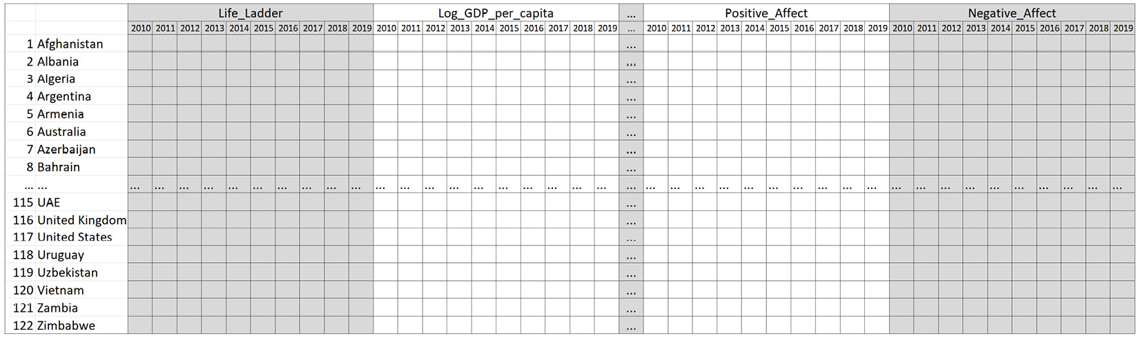
Figure 13.17 – The structure of country_df
To gauge if FDA can help us transform this dataset, let's visualize the 10-year trend of each happiness index per country.
The following code populates 1,098 (122*9) line plots. As you hit run in Jupyter Notebook, line plots will start to appear. You will not have to let your computer populate all the visuals. Once you feel like you have grasped what these plots look like, you can interrupt the kernel. If you don't know how to stop your kernel, go back to Figure 1.2:
happines_index = ['Life_Ladder', 'Log_GDP_per_capita', 'Social_support', 'Healthy_life_expectancy_at_birth', 'Freedom_to_make_life_choices', 'Generosity', 'Perceptions_of_corruption', 'Positive_affect', 'Negative_affect']
for i,row in country_df.iterrows():
for h_i in happines_index:
plt.plot(row[h_i])
plt.title('{} - {}'.format(i,h_i))
plt.show()
After this exercise, you might be convinced that a linear equation might be able to summarize the trends in all of the visualizations. The general linear equation looks like this:

In this equation, t represents time, and in this example, it can take any one of the values in the list [0, 1, 2, 3, 4, 5, 6, 7, 8, 9]. For each of the visualizations we saw after running the preceding code, we strive to estimate the a and b parameters so that the function shown in the preceding formula can represent all the points fairly.
Before making any final decisions, let's test the applicability of this function, both visually and statistically. However, as this is our first time fitting a function to a data, let's perform curve fitting for some sample data and then use loops to apply that to all of our data. The sample data we will be using will be Life_Ladder of Afghanistan – the very first visualization the preceding code created.
We will be using the curve_fit() function from scipy.optimize to estimate the a and b parameters for Life_Ladder of Afghanistan. To apply this function, other than importing it (from scipy.optimize import curve_fit), we need to perform the following steps:
- First, we need to define a Python function for the mathematical function we want to use to fit the data.
The following code creates linearFunction(), as we described previously:
def linearFunction(t,a,b):
y = a+ b*t
return y
We will be using linearFunction() shortly.
- Second, prepare the data for the curve_fit() function by organizing it into x_data and y_data.
The following code shows how this is done for Life_Ladder of Afghanistan:
x_data = range(10)
y_data = country_df.loc['Afghanistan','Life_Ladder']
- Pass the function and the data into the curve_fit() function.
The following code shows how this can be done for the sample data:
from scipy.optimize import curve_fit
p, c = curve_fit(linearFunction, x_data, y_data)
After running the three preceding code blocks, the p variable will have the estimated a and b parameters. Printing p will show you that a is estimated to be 4.37978182, while b is estimated to be -0.19528485.
To evaluate the goodness of this estimation, we can use both visualization and statistics. The following screenshot shows the code to create the analyzing visualization, its result, the code for calculating r2, and its result:
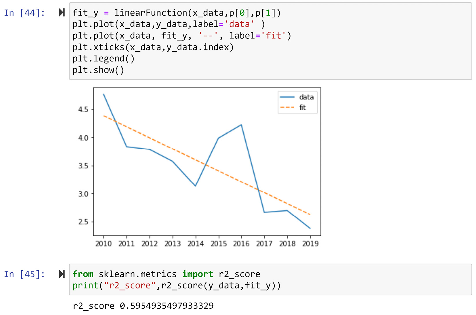
Figure 13.18 – The code and the result of using visualization and statistics to evaluate the curve for fitting goodness-of_fit
Statistically speaking, r2 is the ideal metric for capturing and summarizing the goodness of fit for data one number. The metric can take any value between 0 and 1 and the higher values show a better fit. The value of 0.59 in this example is not a value that would make you say "phew! I've found the perfect fit," but it is also not terrible.
In any case, we want to combine visualization with statistics for the best interpretation and decision-making. Visually speaking, the fitted data nicely shows where the country started in 2010 (a) and the average slope of change the country has had over the years (b). Even though r2 does not show the perfect fit, the visualization shows that the function tells a perfect story of the data with only two parameters. When you're dealing with FDA, being able to capture what is essential to our analysis is more important than having a perfect fit. Sometimes, the perfect fit shows we are capturing the noise over the generalizable trend.
The Meaning behind the Parameters of a Linear Function
Similar to any other famous function, the parameters of the linear function (y=a+b*x) have intuitive meanings. The a parameter is known as an intercept or constant; in this example, the intercept represents where the country started. The b parameter is known as the slope, and it represents the rate and direction of change. In this example, b represents exactly that – the rate and direction of change a country has gone through over the years.
So, every time you perform FDA, one of the must-do activities is understanding the meaning of the parameters of the function that can capture the essential information of the dataset.
Of course, we don't stop here before finalizing the linear function – we must test how well the function can capture the essence of information for the happiness indices of each country.
The following code fits the linear function 1,098 times – one per combination of happiness indices – and the countries (122 countries and 9 happiness indices). For every curve fitting, the line plot shows the actual data and the fitted function is presented. r2 of the fit is also reported. Moreover, all calculated r2 values are recorded in rSqured_df for future analysis:
happines_index = ['Life_Ladder', 'Log_GDP_per_capita', 'Social_support', 'Healthy_life_expectancy_at_birth', 'Freedom_to_make_life_choices', 'Generosity', 'Perceptions_of_corruption', 'Positive_affect', 'Negative_affect']
rSqured_df = pd.DataFrame(index=country_df.index, columns=happines_index)
for i,row in country_df.iterrows():
for h_i in happines_index:
x_data = range(10)
y_data = row[h_i]
p,c= curve_fit(linearFunction, x_data, y_data)
fit_y = linearFunction(x_data,p[0],p[1])
rS = r2_score(y_data,fit_y)
rSqured_df.at[i,h_i] = rS
plt.plot(x_data,y_data,label='data' )
plt.plot(x_data, fit_y, '--', label='fit')
plt.xticks(x_data,y_data.index)
plt.legend()
plt.title('{} - {} - r2={}' .format(i,h_i,str(round(rS,2))))
plt.show()
Spend some time and review the visuals that the preceding code populates. You will see that while the r2 values of some of the visualization and the fit of the linear function are not statistically high, for almost all of the visualizations, the story about the linear function state makes sense.
To investigate this further, let's create a box plot of all of the r2 values per happiness index. The following screenshot uses the seaborn.boxplot() function to do this:
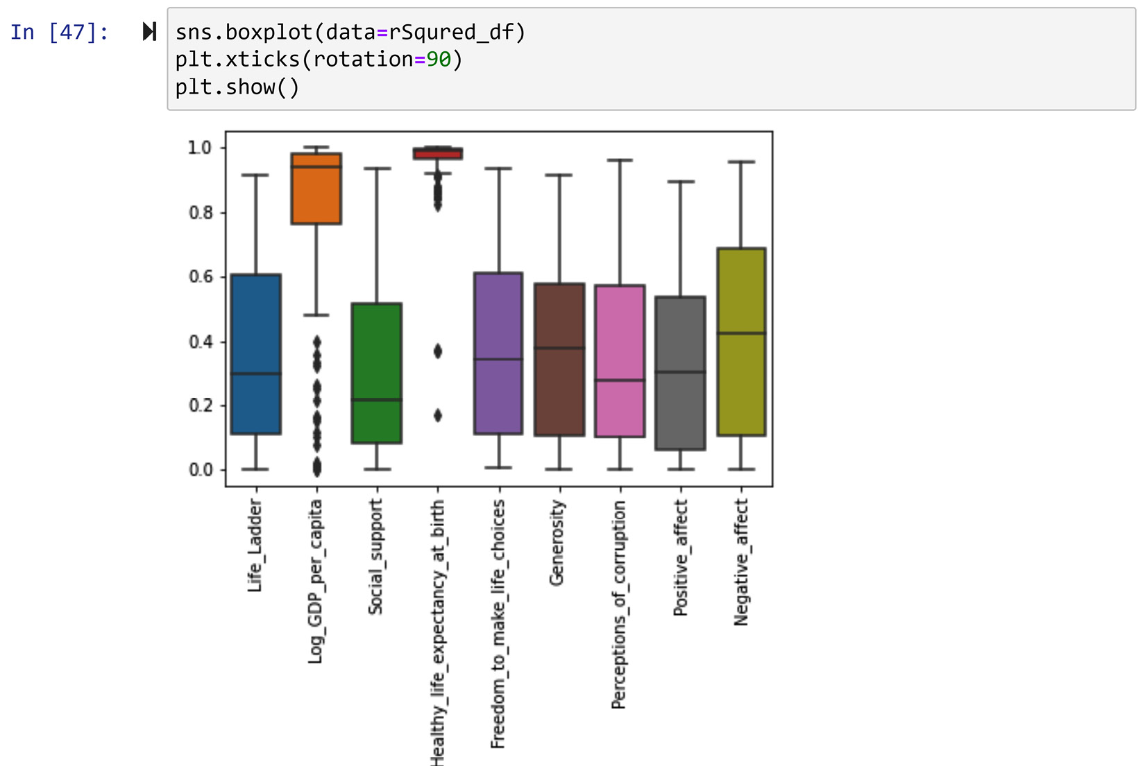
Figure 13.19 – The box plots of r2 per happiness index
After studying the box plot in the preceding screenshot, we can see that the curve fitting for Log_GDP_per_capita and Healthy_life_expectancy_at_birth have had very good fits. This shows that the trends of these two happiness indices have been the most linear.
From the preceding screenshot, we could conclude that the linear function is not the appropriate function to transform the other happiness indices and recommend going to the drawing board to find a more suitable function for them. While that is also a valid direction, continuing with the linear function for all of the happiness indices is also valid. This is because linear functions tend to capture the essence of what is important for this analysis, and having a lower goodness-of-fit does not mean the parameters will not be able to show the trends of the data.
The following code creates a code function to be applied to country_df. The linearFDA() function, when applied to a row, loops through all the hapiness indices, fits the linear function to the 10 values, and returns the estimated parameters, a and b:
happines_index = ['Life_Ladder', 'Log_GDP_per_capita', 'Social_support', 'Healthy_life_expectancy_at_birth', 'Freedom_to_make_life_choices','Generosity', 'Perceptions_of_corruption','Positive_affect', 'Negative_affect']
ml_index = pd.MultiIndex.from_product([happines_index,['a','b']], names=('Hapiness Index', 'Parameter'))
def linearFDA(row):
output_sr = pd.Series(np.nan,index = ml_index)
for h_i in happines_index:
x_data = range(10)
y_data = row[h_i]
p,c= curve_fit(linearFunction, x_data, y_data)
output_sr.loc[(h_i,'a')] =p[0]
output_sr.loc[(h_i,'b')] =p[1]
return(output_sr)
Once the function has been created, you can use the following code to create country_t_df, which is the FDA-transformed version of country_df.
However, there is a caveat before running the code. Once run, the code will provide a warning regarding covariance not being able to estimate. That's nothing to worry about:
country_df_t=country_df.apply(linearFDA,axis=1)
Once the code has been run, get Jupyter Notebook to show you country_df_t and study the transformed dataset. The following diagram shows the extent and structure of change that was applied to country_df to shape country_df_t:
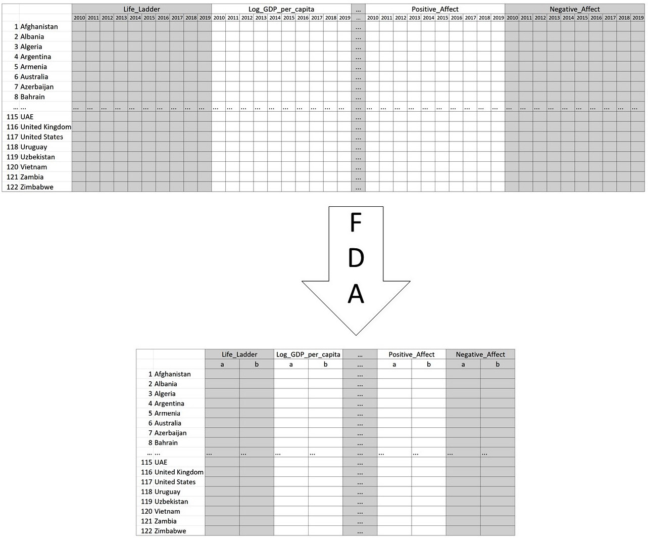
Figure 13.20 – The original structure of country_df and its FDA-transformed one
In the preceding code, we can see that country_df_t now only uses 18 attributes instead of the 90 attributes of country_df. Here, FDA has done more than just data reduction. FDA, along with the linear function, has transformed the data so that its key features – the starting point and the slope of change of the happiness indices – are massaged to the surface.
Before moving on, let's compare the FDA approach and PCA approach that we applied to the same data. There are a few key points here:
- Extension of Reduction: PCA was able to reduce the data into only three attributes, while FDA reduced the data into 18 attributes.
- Loss of Information: Both approaches removed some variations from the data. We know that PCA kept 71% of the variation, but we don't know exactly how many variations were kept by FDA. However, we did have control over what kind of variations we were interested in using with the FDA. PCA does not offer this kind of control.
- Parametricality: While there were fewer new dimensions for PCA, they did not have an intuitive meaning. However, FDA's reduced parameters did have meaning, and those were even more useful for analysis than the original attributes.
Next, we are going to learn about a few possible useful functions that are frequently used when transforming data sources with FDA.
Prominent functions to use for FDA
In this section, we will learn about a few functions that are frequently used for FDA.
Before we look at this list of functions, let's reiterate that the functions can be anything that has the potential to capture the trends in the data. However, the functions we will go over here are famous and frequently used for curve fitting.
When you have data and want to apply it to FDA, you can experiment with one of the four functions - exponential, Fourier, sinusoidal, and Gaussian - to see which one works best for the analytic goals.
Now, let's learn a little bit about each of them. We will start with exponential. Before moving on, please pay close attention to the following caveat.
Caveat!
There is a lot to be said about each of these functions; in a book dedicated to functional data analysis, each of these functions could take up one whole chapter. However, here, we only get a very brief introduction to each of these functions. These instructions will be enough for you to have a good guess if a function will be applicable for a dataset or not. If and when you have a function candidate for a dataset, I highly encourage you to read more about the function to understand its possible variations and the meanings of its parameters. This will be essential if you wish to succeed with functional data analysis.
Now, let's learn a little bit about these functions. We will start with the exponential function.
Exponential function
This function can capture what is characterized as exponential growth or decay. For instance, what we know as exponential growth is a growth that is slow at first but whose rate of growth rapidly increases. The following equation shows the exponential function:

The parameters of these functions are a and b. Here, e is a constant known as Euler's number, which is a constant that is approximately 2.71. To get an accurate value of e, run np.exp(1) in your Jupyter Notebook after having imported NumPy as np.
For example, the following code uses the GoogleStock.csv file, which contains the daily stock prices of Google from the day it went public until September 3, 2021, which is the day this content is being developed. This code uses everything we have learned about in this chapter on how to fit a function to a dataset:
def exponantial(x,a,b):
y = a*np.exp(b*x)
return y
price_df = pd.read_csv('GoogleStock.csv')
price_df.set_index('t',inplace=True)
y_data = price_df.Price
x_data = range(len(y_data))
p,c= curve_fit(exponantial, x_data, y_data,p0=[50,0])
fit_y = exponantial(x_data,p[0],p[1])
plt.plot(x_data,y_data,label='Google Stock Price Data')
plt.plot(x_data, fit_y, '--', label='fit')
plt.xticks(np.linspace(1,len(y_data),15),y_data.iloc[1::300].index,rotation=90)
plt.legend()
plt.show()
Running the preceding code will create the following output:
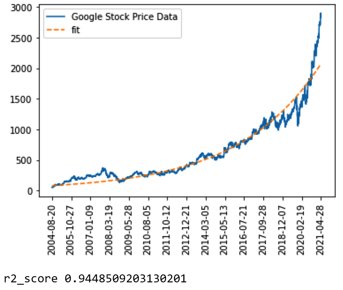
Figure 13.21 – The output of fitting the exponential function to GoogleStock.csv
Before moving on to the next function, allow me to share with you a rather disappointing reality about the curve_fit() function from scipy.optimize. While this is a great and useful function, it is not fully integrated and the most powerful it can be. For more complex functions, for curve_fit() to estimate the best possible parameters, the function needs a leg-up. This small act of help must come from us as a first guess about what we think the parameters should be. For example, in the preceding code, p0=[50,0] is that leg-up. For us to be able to have good educated guesses so that we can help curve_fit(), we need to have a good understanding of what the parameters of the function mean. For instance, in the case of the exponential function, a is known as the intercept and b is known as the base. To get curve_fit() going, we have helped the function by stating that the intercept will be around the number 50. The number 50 is the price of Google stocks for the first few days.
Now, let's move at the Fourier function.
Fourier function
This function is a valid candidate for capturing vibrational signals such as noise and voice data. These vibrational signals are characterized by oscillating, reciprocating, or periodic, and the Fourier function can capture these periodic oscillations and reciprocations. The following equation shows the Fourier function. The parameters of the Fourier function are a0, a1, a2, and w:
![]()
For example, the following code uses the Noise_data.csv file, which contains 200 milliseconds of vibrational signals collected from a car engine for health diagnosis. Similar to the preceding code, it uses everything we have learned about in this chapter on how to fit a function to a dataset:
def fourier(x,a0,a1,b1,w):
y = a0 + a1*np.cos(x*w) + b1*np.sin(x*w)
return y
noise_df = pd.read_csv('Noise_data.csv')
noise_df.set_index('t',inplace=True)
y_data = noise_df.Signal
x_data = range(len(y_data))
p,c= curve_fit(fourier, x_data, y_data,p0=[10,1000,-400,0.3])
fit_y = fourier(x_data,p[0],p[1],p[2],p[3])
plt.figure(figsize=(15,4))
plt.plot(x_data,y_data,label='Noise Data')
plt.plot(x_data, fit_y, '--', label='fit')
plt.legend()
plt.show()
print("r2_score",r2_score(y_data,fit_y))
Running the preceding code will create the following output:
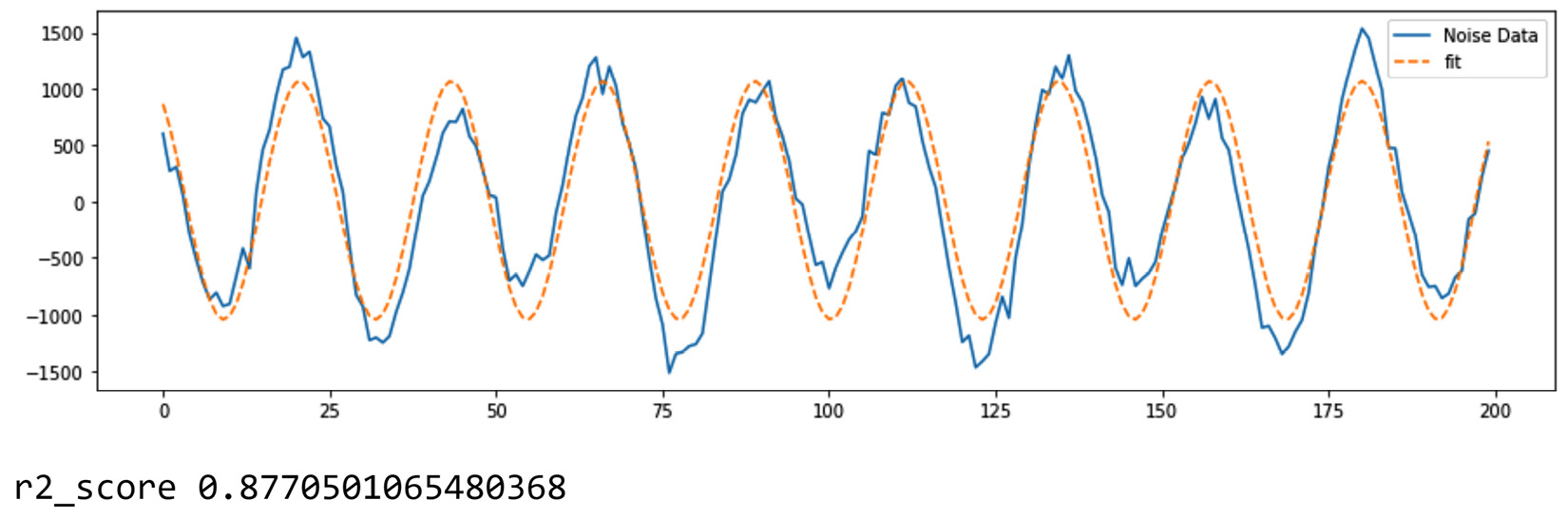
Figure 13.22 – The output of fitting the Fourier function to Noise_data.csv
Before moving on to the next function, Sinusoidal, note that the curve_fit() function needed even a stronger leg-up (p0=[10,1000,-400,0.3]) to be able to fit the data.
Sinusoidal function
This function, which is similar to the Fourier function, can capture oscillations and reciprocations, and similarly, the function could be a candidate for capturing noise and voice data. The following equation shows the sinusoidal function. The parameters of the sinusoidal function are a1, b1, and c1:
![]()
For example, the following code uses the same data as in the previous example, which is contained in the Noise_data.csv file, to see whether the function can simulate the data:
def sinusoidal(x,a1,b1,c1):
y = a1*np.sin(b1*x+c1)
return y
noise_df = pd.read_csv('Noise_data.csv')
noise_df.set_index('t',inplace=True)
y_data = noise_df.Signal
x_data = range(len(y_data))
p,c= curve_fit(sinusoidal, x_data, y_data,p0=[1000,0.25,2.5])
fit_y = sinusoidal(x_data,p[0],p[1],p[2])
plt.figure(figsize=(15,4))
plt.plot(x_data,y_data,label='Noise Data')
plt.plot(x_data, fit_y, '--', label='fit')
plt.legend()
plt.show()
print("r2_score",r2_score(y_data,fit_y))
Running the preceding code will create the following output:
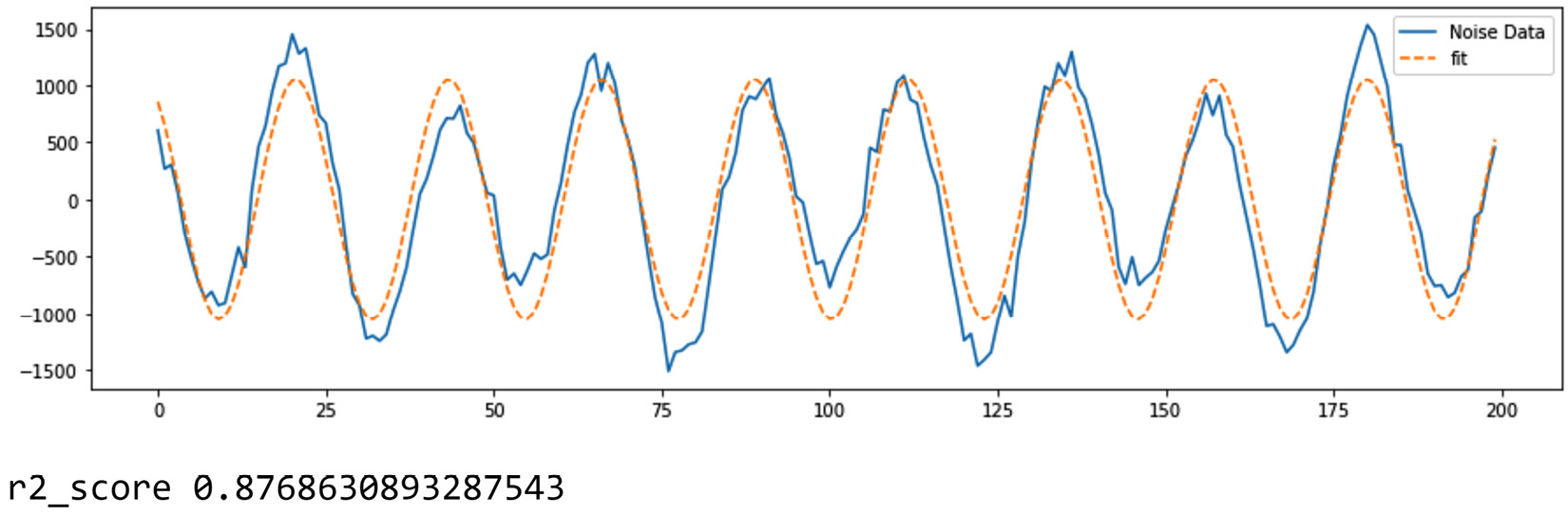
Figure 13.23 – The output of fitting the sinusoidal function to Noise_data.csv
Again, note that the curve_fit() function needed even a more significant leg-up (p0=[1000,0.25,2.5]) to be able to fit the data. These leg-ups can only be given to the curve_fit() function if we have a good understanding of the parameters of the sinusoidal function.
Gaussian function
This function is famous for Gaussian or normal distribution from probability and statistics. The functionality behind the normal distribution that we use to summarize, analyze, and compare many populations with comes from the Gaussian function. The general Gaussian function has three parameters called a1, b1, and c1. The following equation shows its formula:

The density function of a normal distribution is a specific variation of the preceding formula with only two parameters, where b1=μ and c1=δ, and a1 is calculated as ![]() . If you don't know about the normal distribution, just ignore this paragraph and move on. You can just treat this function as another famous function you just became aware of.
. If you don't know about the normal distribution, just ignore this paragraph and move on. You can just treat this function as another famous function you just became aware of.
The Gaussian function is famous for being a bell-shaped figure, and each of the three parameters shows the characteristics of the shape of a bell. Let's look at an example.
We will use the covid19hospitalbycounty.csv file here, which contains the daily COVID hospitalization data of all the counties in California, as collected on September 4, 2021. The following code reads the file into covid_county_day_df and then uses the .groupby() function to aggregate all of the counties' data by summing them, thus creating covid_day_df. The code also plots the trend of daily hospitalizations:
covid_county_day_df = pd.read_csv('covid19hospitalbycounty.csv')
covid_day_df = covid_county_day_df.groupby('todays_date').hospitalized_covid_patients.sum()
covid_day_df.plot()
plt.xticks(rotation=90)
plt.show()
Running the preceding code will create the following output:

Figure 13.24 – California COVID hospitalizations until September 4, 2021
We can see a few bell-shaped figures in the trend of the data. Each of these waves can be summarized and captured using the Guassian function. For example, let's capture the one from 2020-10-15 to 2021-05-03. The following code does that just like all the previous curve fittings do:
def gaussian(x,a1,b1,c1):
y= a1*np.exp(-((x-b1)**2/2*c1**2))
return y
y_data = covid_day_df.loc['2020-10-15':'2021-05-03']
x_data = range(len(y_data))
p,c= curve_fit(gaussian, x_data, y_data)
fit_y = gaussian(x_data,p[0],p[1],p[2])
plt.plot(x_data,y_data,label='Hospitalization Data')
plt.plot(x_data, fit_y, '--', label='fit')
plt.legend()
plt.show()
print("r2_score",r2_score(y_data,fit_y))
Running the preceding code will create the following output:
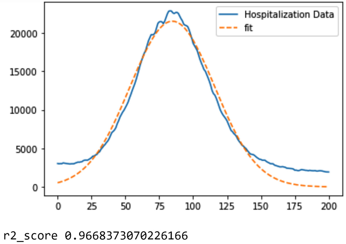
Figure 13.25 – The output of fitting the Gaussian function to a part of covid_day_df
While the preceding diagram shows a great fit, you may be wondering how this can be of any analytics value. This is an excellent question. Let's consider an analytics project where we want to predict the number of COVID deaths in the next month using the historical data. You could create a prediction model that connects the number of COVID deaths on any given day (the dependent attribute) to the total number of hospitalizations 2 weeks before that day (the independent attribute). Such a model can achieve a certain level of success in prediction. However, there are ways to improve that. For instance, we could add more independent attributes, such as the rate of COVID test positivity a month before that day, or the rate of vaccination 2 months before that day. This approach uses more data sources to enrich the prediction model. A second approach, which can use FDA, is to enrich the independent attributes that come from the same source of data. For instance, instead of just extracting one value from the hospitalization data from 3 weeks ago, we might be able to use the parameters of the function we used to fit the data. Doing this is certainly trickier than adding more data sources, but this might just be the improvement a model needs to reach even better predictions. See Chapter 16, Case Study 2 – Predicting COVID 19 Hospitalization, for great data integration/reduction examples of using FDA.
As we get closer to the end of this chapter, let us first go over a quick summary of the FDA, and after that, we will have another quick summary of the whole chapter.
Final notes on FDA
There is a lot to be said and covered in FDA. It has its own world. What we covered here should just be looked at as an introduction and a springboard for a possible deep dive into this world for more learning.
As we finish learning about FDA, we will provide a few notes and considerations:
- Any function, even one that has just been created, can be used as the function for FDA. The advantage of using these famous functions is that they are well known and there are lots of resources for them to support your learning and your data analytic projects.
- Most functions have variations and they can become more complex for more complicated datasets. If a function kind of works for a dataset but not perfectly, maybe one of its variations will. For instance, the sinusoidal function, when used with two terms, can accommodate more complex oscillations. See the following equation:

- Knowing the meaning of the parameters is essential in understanding the transformed data. Also, as we saw, you may have to tap into that knowledge in giving a leg-up to the function curve_fit().
- FDA can be used as a dimension reduction method. However, FDA can be looked at as a data analytics tool. Furthermore, as we will see in the next chapter, FDA can be a data transformation method.
Now, let's summarize this chapter.
Summary
Congratulations on your excellent progress on yet another exciting and important chapter. In this chapter, we learned about the concept of data reduction, its uniqueness, the different types, and saw a few examples of how knowing about the tools and techniques we can use for data reduction can be of significant value in our data analytic projects.
First, we understood the distinction between data redundancy and data reduction and then continued to learn about the overarching categories of data reduction: numerosity data reduction and dimensionality data reduction. For numerosity data reduction, we covered two methods and an example to showcase when and where they could be of value. For dimensionality reduction, we covered two categories: supervised and unsupervised dimension reduction.
Supervised dimension reduction is when we pick and choose the independent attributes for prediction or classification data mining tasks, while unsupervised dimension reduction is when we reduce the number of dimensions with a more general outlook.
The next chapter is going to be the last one in Part 3 of this book: preprocessing. We are going to learn about data transformation and massaging. In this chapter, we sometimes had to talk a little about data transformation as well. Some of the techniques that were covered in this chapter can also be used as data transformation techniques.
The next chapter is going to be another exciting chapter. However, before we learn about data transformation and data massaging, take advantage of the learning opportunities that the following exercises provide.
Exercises
- In your own words, describe the similarities and differences between data reduction and data redundancy from the following angles: the literal meanings of the terms, their objectives, and their procedures.
- If you decide to include or exclude independent attributes based on the correlation coefficient value of each independent attribute with the dependent attribute in a prediction task, what would you call this type of preprocessing? Data redundancy or data reduction?
- In this example, we will be using new_train.csv from https://www.kaggle.com/rashmiranu/banking-dataset-classification. Each row of the data contains customer information, along with campaign efforts regarding each customer, to get them to subscribe for a long-term deposit at the bank. In this example, we would like to tune a decision tree that can show us the trends that lead to successful subscription campaigning. As the only tuning process we know about will be computationally very expensive, we have decided to perform one of the numerosity data reductions we've learned about in this chapter to ease the computation for the tuning process. Which method would fit this data better? Why? Once you have arrived at the data reduction method you want to use, apply the method, tune the decision tree, and draw the final decision tree. Finally, comment on a few interesting patterns you found in the final decision tree.
- In this chapter, we learned about six dimensionality reduction methods. For each of these six methods, specify if the method is supervised or unsupervised, and why.
- We would like to continue working on new_train.csv from Excercise 3. Use a decision tree and a random forest to evaluate the usefulness of the independent attributes in new_train.csv. Report and compare the results using both dimension reduction methods.
- Use brute-force computational dimension reduction to figure out the optimum subset of independent attributes that the KNN algorithm needs for the classification task described in Exercise 3. If the task is computationally too expensive, what is one strategy that we learned about that can curb that? If you did end up using that strategy, could you say the subset you've found is still optimum?
- In this exercise, we will use the data in ToyotaCorolla.csv to create a prediction model using MLP that can predict car prices. Do the following:
a) Deal with all the data cleaning issues, if any.
b) Apply linear regression, a decision tree, and a random forest to evaluate the usefulness of the independent attributes in the dataset. Use all the results of the evaluations to come to the top eight independent attributes that can support MLP prediction best. Which three dimension reduction methods should be given the least priority and why?
c) Use similar code to the code we used in this chapter to tune the decision tree to tune MLP for the prediction task of connecting the top eight independent attributes from the previous step to the dependent attribute. In this tuning experiment, use the following two hyperparameters and the values given in the list:
- hidden_layer_sizes: [5,10,15,20,(5,5),(5,10),(10,10),(5,5,5),(5,10,5)]
- max_iter: [50, 100, 200, 500]
If the computation takes too long, feel free to use the computational cost-cutting strategy you have learned about in this chapter.
d) In this step, we would like to use brute-force computational dimension reduction to find the best subset of independent attributes out of the eight independent attributes. Can we use the tuning parameters we found from the previous step or, when using the brute-force dimension reduction method, does it have to be mixed with parameter tuning? Why/why not? Apply the best approach. Again, feel free to use the computational cost-cutting strategy you learned about in this chapter.
- In this exercise, we would like to use the Cereals.csv dataset. This dataset contains rows of information about different cereal products. We would like to perform clustering analysis on this dataset, first using K-Means and then using PCA. Do the following:
a) Impute a central tendency of the attribute for all the missing values.
b) What central tendency did you choose and why?
c) Why did we impute using the central tendency? Why not use other methods? Answer by commenting on how the data will be used next.
d) Remove the categorical attribute from the data.
e) Should the data be normalized or standardized for clustering? Why?
f) Apply K-Means with K=7 and report the resulting clustering.
g) Perform centroid analysis and name each cluster.
h) Investigate the relationship between the clusters and the two categorical attributes that you removed. Which cluster has both hot and cold kinds of cereal? Which company only creates popular cereals that are not very nutritious?
i) The elementary public schools would like to choose a set of cereals to include in their cafeterias. Every day, a different cereal is offered, but all the cereals should be healthy. Which members from which cluster should be used here? Explain why.
j) Now, we want to complement this analysis using PCA. Before applying PCA, should we standardize or normalize the dataset?
k) Using the first few PCs, come up with an annotated three-dimensional scatterplot that shows most of the variation in the data. How much variation is shown? Make sure that the figure contains the necessary element to explain to the audience the importance of each PC.
l) Looking at the three-dimensional scatterplot, would you say the choice of K=7 for K-Means was good?
m) Can you spot the members of the cluster you found in Step i in the three-dimensional scatterplot you created in Step k? Are they all together?
- In this exercise, we will use Stocks 2020.csv, which contains the daily stock prices of 4,154 companies in 2020. Remember that 2020 is the year that the COVID-19 pandemic happened. During this year, the stock market experienced a sudden crash and also a quick recovery. We want to use the data reduction methods that we know of to see if we can capture this from the data. Do the following:
a) Use the k-means algorithm to cluster the data into 27 groups. Also, use the module time to capture the amount of time it took the algorithm to run.
b) What are the outliers in the data based on the clustering results?
c) Draw line plots for all the outliers and describe the trends you see.
d) Draw line plots for all the members of the clusters where there are less than 10 members and describe the trends.
e) Apply PCA to the data and report the number of variations that the first three PCs account for. Also, draw an annotated scatterplot that includes the three PCs with all the necessary visual guides.
f) Using the visual from the previous step, count and report the outliers. Are they the same outliers that we found using k-means clustering?
g) Cluster the stocks into 27 groups again using the most significant PCs. Also, report the amount of time it took for K-means to complete the task. See how much faster K-means was compared to how fast it was in Step a.
h) Draw a visual that compares the clusterings in Steps a and g. Describe your observations.
i) We would like to extract the following features from the data:
- General_Slope: The slope of the linear regression line fitted to the data of the stock.
- Sellout_Slope: The slope of the linear regression line fitted to the data of the stock from Feb 14 – March 19 (stock sell-out period due to COVID).
- Rebound_Slope: The slope of linear regression line fitted to the data of the stock from March 21 – December 30 (Stock rebound after COVID sell-out).
We will do this in a few steps. First, create a placeholder DataFrame (fda_df) where its index is the stock symbols and its columns are the features mentioned previously.
j) Find General_Slope and fill the placeholder using a linear regression model.
k) Find Sellout_Slope and fill the placeholder using a linear regression model.
l) Find Rebound_Slope and fill the placeholder using a linear regression model.
m) Draw a three-dimensional scatterplot for fda_df. Use x_axis for Sellout_Slope and y-axis for Rebound_Slope.
n) Cluster the stocks into 27 groups again using the three attributes of fda_df. Then, compare the clustering outcomes with the clusterings from Steps a and g and describe your observations.
o) Among the three preprocessing approaches (no preprocessing, PCA-transformed, and FDA-transformed) you experimented with in this exercise, which one was able to help in capturing the patterns we were interested in?
- Figure 13.2 was created using a decision tree after random sampling. Recreate this figure but this time, use random over/undersampling, where the sample has 500 churning customers and 500 non-churning customers. Describe the differences in the final visual.
- Figure 13.7 shows the result of dimension reduction for the task of predicting the next day's amazon Stock prices using linear regression. Perform dimension reduction using a decision tree and compare the results. Don't forget that to do so, you will need to tune DecisionTreeRegressor() from sklearn.tree. You can use the following code for this tuning process:
from sklearn.tree import DecisionTreeRegressor
from sklearn.model_selection import GridSearchCV
y=amzn_df.drop(index=['2021-01-12'])['changeP']
Xs = amzn_df.drop(columns=['changeP'],index=['2021-01-12'])
param_grid = { 'criterion':['mse','friedman_mse','mae'], 'max_depth': [2,5,10,20], 'min_samples_split': [10,20,30,40,50,100], 'min_impurity_decrease': [0,0.001, 0.005, 0.01, 0.05, 0.1]}
gridSearch = GridSearchCV(DecisionTreeRegressor(), param_grid, cv=2, scoring='neg_mean_squared_error', verbose=1)
gridSearch.fit(Xs, y)
print('Best score: ', gridSearch.best_score_)
print('Best parameters: ', gridSearch.best_params_)