Understanding bitmap, PostScript, TrueType, OpenType, and Multiple Master fonts
Using the Character panel
Working with the Paragraph panel
Using area type
Working with type on a path
Adding type with the Type tool
Selecting and editing type
Threading and unthreading text blocks
Wrapping and creating headlines
Outlining type
Advanced type functions
Customizing fonts
Fonts are a big deal to Illustrator users. For the seasoned graphic artist, the thousands of typefaces that are available provide a typesetting heaven on Earth. For a newcomer to Illustrator and typesetting, fonts can be overwhelming. Illustrator ships with about 300 Adobe PostScript Type 1 fonts; other fonts are available for purchase at costs that range from about $2 per face to hundreds of dollars for a family. (A font face is a single variation, while a font family typically includes quite a few variations.)
This chapter covers creating type with various type tools, all the different formatting available, and cool things to do with type on a path and outlined type.
Fonts come in various formats, with each format having advantages and disadvantages over other formats. Fonts fall into the following categories: bitmap fonts, PostScript fonts (Type 1), TrueType fonts, OpenType fonts, and Multiple Master fonts.
Bitmap fonts are the original fonts used for computers. They consist of a series of dots inside a grid pattern and worked well both on-screen and on the dot-matrix printers that were prevalent at the time of their introduction.
Each character in a bitmap font has a certain number of dots that define its shape. Some bitmap fonts include different point sizes, with the smaller point sizes having fewer dots than the larger point sizes. The larger the point size of the bitmap fonts, the more detail is available and the better the letter looks.
Because bitmap fonts were originally designed for a computer screen, the dots in a bitmap font are set at 72 dpi (dots per inch). When you print a bitmap font on a laser printer, which has a resolution of at least 300 dpi, the letters tend to look blocky, even when their sizes are supported by the typeface.
Although PostScript fonts have in the past been the most popular font format in professional publishing circles, they're also the most confusing and frustrating fonts to use because they have two parts: the screen fonts (which are really bitmap fonts) and the printer fonts.
You need the printer fonts, as their name implies, for printing. Printer fonts consist of outlined shapes that get filled with as many dots as the printer can stuff into that particular shape. Because these printer fonts are mathematical outlines and not a certain number of dots, they make characters look good at any point size. In fact, PostScript printer fonts are device-independent, meaning that the quality of the type depends on the dpi of the printer (which is device-dependent). The higher the dpi, the smoother the curves and diagonal lines look. If printer fonts are missing, the printer either uses the corresponding bitmap font or substitutes another font whose printer font is available.
Adobe, just by coincidence, created the PostScript page description language based on outlines instead of dots, developed PostScript fonts, and also created typefaces in PostScript format called Type 1 format and Type 3 format. Since the rise of desktop publishing, the font standard has been PostScript.
The greatest advantage of TrueType fonts is that they have only one component — not separate screen fonts and printer fonts. Actually, many TrueType fonts do include screen fonts because hand-tuned screen fonts at small sizes tend to look better than filled outlines at screen resolution.
The quality of TrueType fonts is comparable to, if not better than, that of PostScript typefaces. Apple includes TrueType fonts with every new computer it sells. Microsoft includes a boatload of fonts with Windows, Office, and all the other applications it sells and licenses.
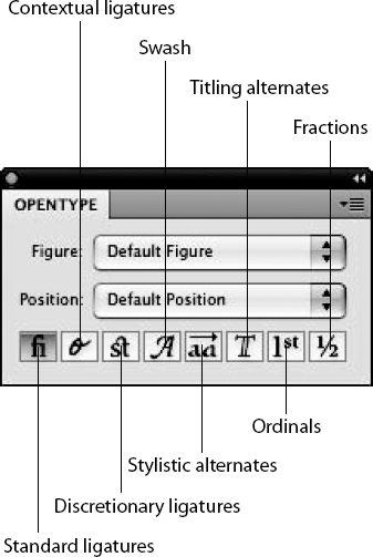
OpenType fonts take TrueType fonts a step further by including PostScript information. They also include a variety of features, such as ligatures (typographic replacement characters for certain letter pairs) and alternate glyphs that PostScript and TrueType don't offer. A glyph is the form of a character, such as a capital letter with a swash, making it a bit more exciting than the regular capital letter. Glyphs are covered in more detail later in this chapter. Ligatures are replacement characters for paired letters, such as ff, fi, and ffl. Illustrator offers an OpenType panel for you to specify alternate characters, such as ligatures. You open the OpenType panel by choosing Window
Multiple Master fonts, again from Adobe, provide a somewhat complex way to vary fonts. Normally, a typeface may come in several weights, such as bold, regular, light, and black. But what if you want a weight that's between bold and black? Usually, you're out of luck.
The theory behind Multiple Master fonts was that a font has two extremes — black and light, for example. Multiple Master technology creates any number of in-betweens that range from one extreme to the other. Multiple Masters don't stop with weights though. They also work to step between regular and oblique, wide and condensed, and serif (fonts that include the little detailed hooks on the end of most strokes) and sans serif (fonts without those hooks).
Although it seemed like a good idea when Adobe introduced the idea of Multiple Master fonts back in 1991, little interest was generated among users, and Adobe no longer develops this technology.
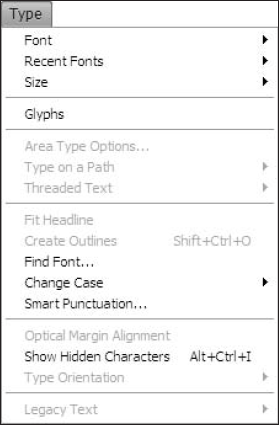
The Type menu, as shown in Figure 9.1, contains all of Illustrator's type controls (with the exception of the type tools).
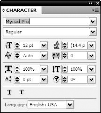
You can change most of the Type options in the Character panel, as shown in Figure 9.2, by choosing Window
Type is set in Illustrator in blocks of continuous, linked text. In most cases, text blocks in Illustrator are threaded — meaning that the text automatically reflows to fit the linked text boxes if they're resized.
Note
When the term paragraph is mentioned, it's usually referring to the characters that are between Returns. If there are no Returns in a story, then that story is said to have one paragraph. Returns end paragraphs and begin new ones. There's always exactly one more paragraph in a story than there are Returns.
The following sections describe each of the Type menu options. The next four sections discuss the first four of these commands. The rest of the options are covered throughout this chapter.
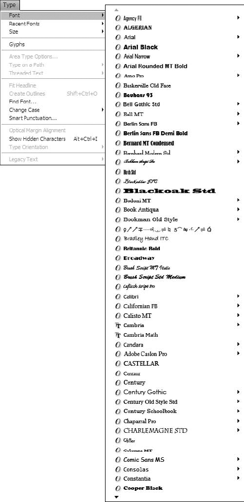
The Font submenu of the Type menu displays the typefaces in their actual form. The Font submenu displays all the fonts that are accessible from your user account (not necessarily all the fonts currently installed on your computer). A check mark appears next to the font that's currently selected; an indicator as to whether it's a TrueType, Type 1, or OpenType font also appears. If no check mark appears next to any of the fonts, more than one font is currently selected. Figure 9.3 shows the Font submenu.
The Recent Fonts submenu of the Type menu displays the most recent fonts you've used in that document. The default setting for Recent Fonts is 5. You can change that number in the Type section of the Preferences dialog box. Access the Type preferences by choosing Edit
Choose Type
A check mark appears in the Size submenu next to the point size that's currently selected. If the point size currently selected doesn't correspond to a point size in the Size submenu, a check mark appears next to the Other menu item. Point size for type is measured from the top of the ascenders (such as the top of a capital letter T) to the bottom of the descenders (such as the bottom of a lowercase g). If no check mark appears next to any of the sizes, more than one size is currently selected (even if the different sizes are all Other sizes).
You can also increase and decrease the point size of type by using the keyboard shortcuts. Pressing Ctrl+Shift+> (
Yet another way to change point size is to use the Scale tool. Using the Scale tool to change point size lets you change to any size; that size is displayed in the Character panel as soon as you're finished scaling. Again, remember that the limit in scaling type is 1296 points; you can't exceed that limit even with the Scale tool unless the type has been converted to outlined paths, at which time you can scale to any size.
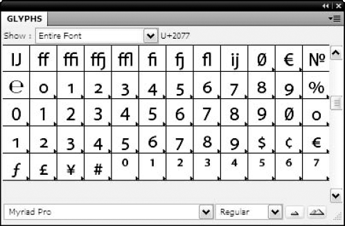
A glyph is the form of a character of text. Some fonts have multiple forms for a letter, and the Glyphs panel is where you can choose those other options. Glyphs are also the ornamental forms, swashes, ligatures, and fractions that are part of OpenType fonts. Choosing Glyphs from the Type menu displays the Glyphs panel, as shown in Figure 9.4. If no type is selected, the panel displays Entire Font in the Show list (popup menu). The other choice in the Show list (popup menu) is for Alternates for Current Selection. Use this panel to view some of the special character fonts, such as Symbol or Zapf Dingbats.
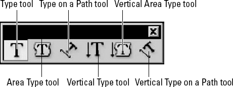
You use the type tools to create and later edit type. The default tool is the standard Type tool, which creates both individual type and area type. Individual type is created when you click with the Type tool, creating a point for the type to begin. Area type is created by dragging a box that the type then fills. The popup tools on the tearaway Type panel, as shown in Figure 9.5, are the Type tool, the Area Type tool, the Type on a Path tool, the Vertical Type tool, the Vertical Area Type tool, and the Vertical Type on a Path tool. Each of the type tools displays a different cursor.
You can select type in Illustrator with the Selection tool, in which case all the type in the text block is modified. You select type with a type tool by dragging across either characters or lines — every character from the initial click until the release of the mouse button is selected. Double-clicking with a type tool highlights the entire word you clicked, including the space (but not the punctuation) after it. Triple-clicking (clicking three times in the same place) highlights an entire paragraph.
You can add new type to an existing story by clicking with a type tool where you want the new type to begin and then typing. If type is highlighted when you begin typing, the highlighted type is replaced with the new type.
The original reason for the inclusion of a vertical type capability in Illustrator was for Japanese type (commonly referred to as Kanji) compatibility. Vertical type can also have a number of specialized uses. The following sections that discuss the different kinds of type blocks (Point, Rectangle, Area, and Path) address both normal (horizontal) type and vertical type capabilities.
With the Type tool, you can do everything you need to do with type. Clicking in any empty part of your document creates individual type, an anchor point to which the type aligns. Type created as individual type doesn't wrap automatically; instead, you must manually press Enter (Return) and start typing the next line. Individual type is usually used for creating smaller portions of type, such as labels and headlines.
Clicking and dragging with the Type tool creates area type — type that's bordered by a box.
As the Type tool passes over a closed path, it changes automatically into the Area Type tool. Clicking a closed path results in type that fills the shape of the area you clicked. Holding Alt (Option) as you pass over a closed path changes the tool into the Type on a Path tool.
If the Type tool crosses over an open path, it becomes the Type on a Path tool. Clicking an open path places type on the path, with the baseline of the type aligning along the curves and angles of the path. Holding Alt (Option) when the Type tool is over an open path changes it into the Area Type tool.
This intelligent switching of type tools by Illustrator keeps you from having to choose different type tools when you want a different kind of type.
You can toggle between the Type tool and the Vertical Type tool by pressing Shift. In fact, pressing Shift with the Area Type and Type on a Path tools automatically toggles those tools to their Vertical Type counterparts. This holds true even if you press Shift along with Alt (Option) (when toggling between Area Type and Type on a Path tools).
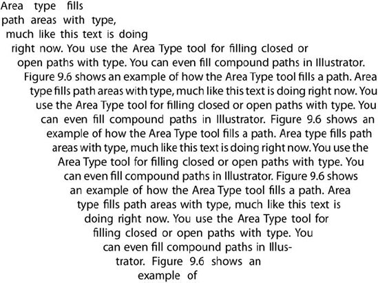
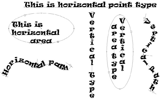
You use the Area Type tool for filling closed or open paths with type. You can even fill compound paths in Illustrator. Figure 9.6 shows an example of how the Area Type tool fills a path.
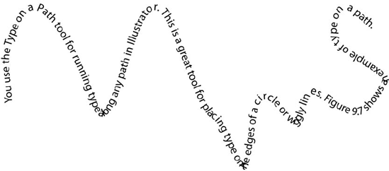
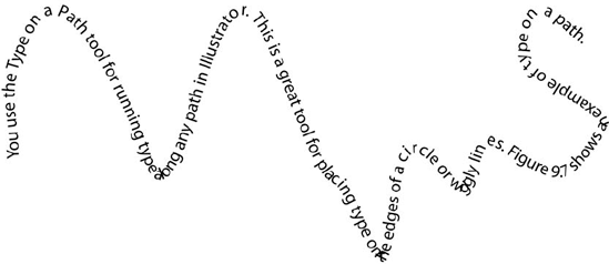
You use the Type on a Path tool for running type along any path in Illustrator. This is a great tool for placing type on the edges of a circle or wiggly lines. Figure 9.7 shows an example of type on a path.
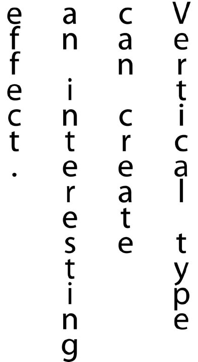
Vertical type will probably remind you of the signs on the front of an old-time movie theater where the letters of the theater's name were stacked vertically rather than horizontally. The effect can be rather stunning when used properly. For the most part, the Vertical Type tool works like the regular Type tool, but instead of placing characters side by side, characters are placed from top to bottom, as shown in Figure 9.8. Note that this is not the same as simply rotating the text 90°. Vertical text really isn't that common, as it was added to Illustrator primarily to allow Kanji (such as Chinese and Japanese characters) writing, which is usually done vertically instead of horizontally.
To create type with a single point defining its location, use the Type tool to click a single location within the document window where there are no paths. A blinking insertion point appears, signifying that type will appear where that point is located. When you type on the keyboard, text appears in the document at that insertion point.
Warning
When creating individual type, remember that only a hard return forces a new line of text to be created. If no returns are used, text eventually runs right off the document. When importing text used as individual type, be sure that the text contains hard returns; otherwise, the text will run into oblivion. Hard returns can be added after importing (via the File
You can create type in a rectangle in two ways. The easiest way is by clicking and dragging the Type tool diagonally, which creates a rectangle as you drag. The blinking insertion point appears in the top row of text, with its horizontal location dependent on the text alignment choice. Choosing flush-right alignment forces the insertion point to appear in the upper-right corner; centered alignment puts the insertion point in the center of the top row; and flush-left alignment, or one of the justification methods, makes the insertion point appear in the upper-left corner. Choose any alignment option in the Paragraph panel or by pressing the appropriate keyboard command (refer to the Appendix for a list of type alignment keyboard commands). Access this panel by choosing Window
If you press Shift while drawing the rectangle, the rectangle is constrained to a perfect square. There's no need to drag from the upper left to the lower right — you can drag from any corner to its opposite, whichever way is most convenient.
To create type in a rectangle of specific proportions, click once in the document window with the Rectangle tool. The Rectangle Size dialog box opens, and you can type the information needed. Choose the Type tool and then click the edge of the rectangle. The type fills the rectangle as you type.
Note
For more on the using the Rectangle tool, see Chapter 5.
Note
If you use a rectangle as a type rectangle, it's always a type rectangle, even if your remove the text.
If you need to create a type container that's a precise size but don't want to draw a rectangle first, open the Info panel by choosing Window
For type to exist in Illustrator, you must first define a type area. You can never have type outside these areas because type is treated very differently from any other object in Illustrator.
You can create different kinds of type areas:
Individual type: Type that exists around a single point clicked with the standard Type tool
Area type: Type that flows within a specific open or closed path
Type on a path: Type whose baseline is attached to a specific open or closed path
Vertical type: Type that flows vertically rather than horizontally. As with normal horizontal type, vertical type can be individual type, area type, or type on a path.
Figure 9.9 shows examples of the variations of type you can create in Illustrator. In the figure, all the paths are selected to provide a clearer picture of how the type areas compare.
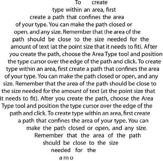
To create type within an area, first create a path that confines the area of your type. You can make the path closed or open and any size. Remember that the area of the path should be close to the size needed for the amount of text (at the point size that it needs to fit). After you create the path, choose the Area Type tool, position the type cursor over the edge of the path, and then click.
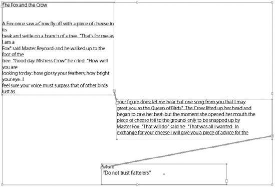
The type in Figure 9.10 flows into the outline of a polygon that has been distorted.
When working with area type, you can choose several options. First, you need to have some area type selected. Then, double-click the Area Type tool or choose Type
You can set these options:
Width/Height: Defines the area of the type
Rows/Columns: Sets the number, size, and gutter of the horizontal rows and vertical columns
Offset: Determines how far the text is offset from the edge of the path area
Text Flow: Sets whether the text flows left to right and top to bottom or top to bottom and left to right
Click the Preview check box to see the settings you set before clicking OK or pressing Enter (Return) or clicking Cancel.

What exactly constitutes a good shape to use for area type? As a rule, gently curved shapes are better than harsh, jagged ones. Type tends to flow better into the larger lumps created by smoothly curving paths.
Try to avoid creating paths with wild or tight curves. Other designs that can cause problems are hourglass shapes or any closed path that has an area where the sides are almost touching. Type flows into a smoothly curved area, but it has trouble flowing into a sharp, spiky shape.
Try to make the top and bottom boundaries of the path have less bumpiness than the sides. This reduces the number of times that type jumps from one area to another.
Tip
For the best results with area type, make the type small relative to the path and justify it by pressing Ctrl+Shift+J (
Placing a stroke on the path surrounding area type can be a great visual effect, but doing so and getting good results can be a bit tricky. If the stroke is thicker than 1 or 2 points, and you don't want the type to run into the edges of the stroke, there are a few things you can do. The best way to set the offset value is to use the Area Type Options dialog box to type the value you want the text to offset away from the path. To do so, follow these steps:
Create a path for your Area type with any drawing tool — for example, the Rectangle tool is a good tool to use. For more on the drawing tools, see Chapters 4 and 5.
Click the shape with the Area Type tool.
Type your text.
With the text selected, double-click the Area Type tool or choose Type

Type the value by which you want to offset the type away from the edge of the path. You type this in the Inset Spacing area under the Offset section of the dialog box.
Click Preview to see the result.
If you like what you see, click OK.
Probably the most overlooked rule when it comes to manipulating area type and the paths that create the type boundaries is the simple fact that Illustrator treats the path and the type equally, unless you choose the path with the Direct Selection (or Group Selection) tool. Area type is selected when you see an underline under all the characters in the area.
When using the transformation tools, be sure that if you don't want to change any of the characteristics of the type that you select just the path. Use the Group Selection tool to click once on the deselected path, and Illustrator selects only the path, not the type. If you transform the area text when you have both selected, the transformation applies to the text as well as the path.
Warning
If you have both the type and the path selected, the transformations affect both the type and the path.
Note
For more on the selection tools, see Chapter 6.
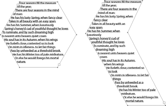
Sometimes, you need to adjust the path that makes up the area of the area type — for example, when you scale a path up or down so that the text flows better. The trick here is to ensure that you select the entire path without selecting any of the characters. To do this, deselect the type and then select the path with the Group Selection tool (the hollow [white] arrow with the + sign).
Now any changes you make affect only the path, allowing you to scale it, rotate it, or change its paint style attributes without directly affecting the text within it. Figure 9.12 shows a transformed path, which allows the text inside to flow differently.
You can also use the Direct Selection tool to move individual points and control handles, and you can also use path editing tools to add, modify, and delete anchor points.
You can do all sorts of nifty things with type that you flow into areas — from unusual column designs to fascinating shapes. Using nonrectangular columns can liven up a publication quite easily. Some magazines use curved columns that are easy to read and lend a futuristic, hip look to the publication. Angled and curved columns are simple to make in Illustrator by creating the shape of the column and flowing area type from one shape to the next.
Traditionally, forcing type into an irregular (nonrectangular) area was quite a task. The typesetter had to set several individual lines of type, each specified by the art director or client to be a certain length so that when all the text was put together, the text formed the shape. This is probably the main reason the world has not seen much of this, except in the portfolios of overly zealous art students.
For example, you can give a report on toxic waste more impact by shaping the text into the form of a hypodermic needle. Or you can make a seasonal ad in the shape of a Christmas tree. Look at some of the Absolut Vodka ads to see what has been done to flow text onto that all-too-familiar bottle.
The unique thing about type on a path is that when the path is not visible, the type becomes the path, as shown in Figure 9.13. This can produce some really fascinating results, especially when combined with various fonts of different weights, styles, colors, and special characters. You can even give the path a fill or stroke by selecting it with the Direct Selection tool and then applying a fill or stroke.
Although using the Type on a Path tool can create some great effects, it has one glitch. You usually run into trouble when the path you're using has either corner anchor points or very sharp curves. Letters often crash (run into one another) when this occurs. Besides the most obvious way to avoid this problem, which is to not use paths with corner anchor points and sharp curves, you can sometimes kern (add or subtract space between specific pairs of characters) the areas where the letters crash until they aren't touching anymore.
When kerning type on a path, be sure to kern from the flush side first. For example, if the type is flush left, start your kerning from the left side and then work to the right. If you start on the wrong end, the letters you kern apart move along the path until they aren't in an area that needs kerning, but other letters appear there instead.
Another method of fixing crashed letters is to tweak the path with the Direct Selection tool. Carefully adjusting both anchor points and control handles can often easily fix crashes and letters that have huge amounts of space between them.
To create type on a path:
First, create a path in your document. You should create a path that doesn't cross over itself.
Click the path with the Type on a Path tool. This creates an insertion point along the path. This works whether the path is a closed path or an open path.
Start typing your text. Type aligns to the insertion point; if the type is set to flush left, the left edge of the type aligns to the location where the Type on a Path tool was first clicked.
Tip
Instead of typing your text in Illustrator, you can copy and paste it from another application using the Edit
Under the Type menu, you can wrap type on a path by changing some of the settings. After you create type on a path, choose from the following effects: Rainbow, Skew, 3D Ribbon, Stair Step, or Gravity. To adjust the settings, choose Type
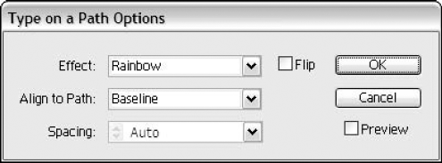
In this dialog box, you can choose the following:
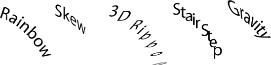
Effect: Choose from Rainbow, Skew, 3D Ribbon, Stair Step, and Gravity, as shown in Figure 9.15. The Rainbow effect places each letter's baseline along a path curved like a rainbow. Skew keeps all the letters' vertical edges strictly vertical. 3D Ribbon keeps all the letters' horizontal edges strictly horizontal. Stair Step does exactly what you expect: It raises (or lowers, depending on the settings) each letter as if the text were climbing (or descending) stairs. Gravity puts the center of each letter on the baseline of the path with increasing rotation.
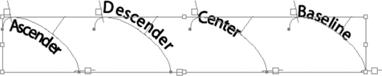
Align to Path: This option alters the path's alignment, with the choices being Ascender, Descender, Center, or Baseline, as shown in Figure 9.16. Choosing Ascender aligns the type higher on the path in line with the top of the highest part of the letter (an h, for example). The Descender option aligns the type lower on the path in line with the hanging part of the letter (a g, for example). Choosing Center aligns the type equally on the path, with half being above the line and half being below the path. The Baseline option aligns the base of the type (not the descender) to the path.
Spacing: This allows you to space the path up or down from its original position.
Flip: This option flips the type to the opposite side.
Preview: This allows you to preview your changes before you click OK to commit to them.
Vertical type is a fascinating capability in Illustrator. If you use Kanji (including Japanese or Chinese) characters, you'll find it invaluable. But even if you don't, you may find some interesting uses for setting type vertically rather than horizontally.
You can make your type appear vertical instead of horizontal in two ways. You can create type using any of the three Vertical Type tools or you can convert horizontal type into vertical type with Type
Most of Illustrator's standard character and paragraph panel changes work with vertical type but not always in ways you expect. For example, type is set on a centerline, not a baseline. The centerline runs vertically through the center of each character. Table 9.1 lists the differences in the way each major function works.
Table 9.1. Vertical Type Functions
Difference | |
|---|---|
Font | Same as standard |
Size | Same as standard |
Leading | Changes the amount of space between the vertical lines of type, measured from centerline to centerline |
Kerning/Tracking | Kerning changes the amount of space between each pair of characters. Tracking changes the amount of space between characters. Because very few Roman characters have both ascenders and descenders, tracking and kerning substantially can really help eliminate the excess white space between characters that makes vertical type so hard to read. |
Vertical Scale | Changes the width of the characters |
Horizontal Scale | Changes the height of the characters |
Baseline Shift | Moves the type left (negative values) and right (positive values) along the centerline |
Flush Left | Words are flush top |
Center | Words are vertically centered |
Flush Right | Words are flush bottom |
Justify Full Lines | Words on full (vertical) lines are justified from top to bottom |
Justify All Lines | This vertically justifies all the lines. |
Left Indent | Top is indented. Positive numbers move the text down, and negative numbers move the text up. |
Right Indent | Bottom is indented, with numbers working like Left Indent |
First Line Indent | The rightmost line is indented. Again, positive numbers move the text down, and negative numbers move the text up. |
Space Before Paragraph | Paragraphs go from right to left, so this control increases the space to the right of the selected paragraph(s). |
Auto Hyphenate | Hyphenates words the same way as horizontal type, but the hyphens appear at the bottom of each line. |
Hang Punctuation | Punctuation hangs above and below the text area |
Tab Ruler | Appears to the right of text areas in vertical form |
Create Outlines |
Before you can make changes to text, you must first select it. You can select text in two ways: You can select type areas with a selection tool, which selects every character in the type area, or you can select characters individually or in groups with any of the type tools.
To select the entire type area or multiple type areas, click the type or the baseline of a line of type within the type area you want to select. Any changes made in the Type menu, Font menu, Character panel, or Paragraph panel affect every character in the selected type areas.
To select individual characters within a type area, you must use a type tool. As you near text that has been typed in the document, the dotted lines surrounding the cursor disappear. The hot spot of the type cursor is the place where the short horizontal bar crosses the vertical bar.
To select an individual character, drag across the character you want to select. As you select a character, its color reverses, so black text appears white. To select more than one character, drag left or right across multiple characters; all characters from the location you originally clicked to the current location of the cursor are highlighted. If you drag up with the cursor over straight text, you select all the characters to the left and all the characters to the right of the cursor's current location. Dragging down does the reverse. The more lines you drag up or down, the more lines you select.
To select one word at a time (and the space that follows it), double-click the word you want to select. The word and the space after it reverse. The reason that Illustrator selects the space following the word has to do with the number of times you copy, cut, and paste words from within sentences. For example, to remove the word Lazy in the phrase "The lazy boy," you double-click the word "lazy" and press Backspace (Delete). The phrase then becomes "The boy," which only has one space where the word Lazy used to be. To select several words, double-click and drag the Type cursor across the words you want to select. Illustrator selects each word you touch with the cursor, from the location you initially double-click to the current location. Dragging to the previous or next line selects additional lines, with at least a word on the first line double-clicked and one word on the dragged-to line.
For the nimble-fingered clickers, you can also click three times to select a paragraph. Triple-clicking anywhere inside the paragraph selects the entire paragraph, including the hard Return at the end of the paragraph (if there is one). Triple-clicking and dragging selects successive paragraphs if you move the cursor up or down while pressing the mouse button during the third click.
To select all the text within a type area with a type tool, click once in the type area and then choose Select
You can also select type through the use of Shift. Click one spot (I'll call it the beginning) and then Shift+click another spot. The characters between the beginning and the Shift+click are selected. Successive Shift+clicks select characters from the beginning to the current location of the most recent Shift+click.
Illustrator has limited text-editing features. By clicking once within a type area, a blinking insertion point appears. If you begin typing, characters appear where the blinking insertion point is. Pressing Delete removes the character to the right of the insertion point.
The arrow keys on your keyboard move the blinking insertion point around in the direction of the arrow. The right arrow moves the insertion point one character to the right, and the left arrow moves the insertion point one character to the left. The up arrow moves the insertion point to the previous line; the down arrow moves the insertion point to the next line.
Pressing Ctrl (
Tip
Pressing Shift while moving the insertion point around with the arrows selects all the characters that the insertion point passes over. This also works for the Ctrl+arrow (
When you select characters with a type tool, typing anything deletes the selected characters and replaces them with what you're currently typing. Pressing Backspace (Delete) when characters are selected deletes all the selected characters. If you paste type by pressing Ctrl+V (
Illustrator offers a variety of type panels. The Character, Paragraph, and OpenType panels are tabbed together. The Tabs panel is on its own. There's also a Glyphs panel. You can create character and paragraph styles and keep them in the Character Styles or Paragraph Styles panel. You can change typeface, style, alignment, kerning, and so much more with the panels.
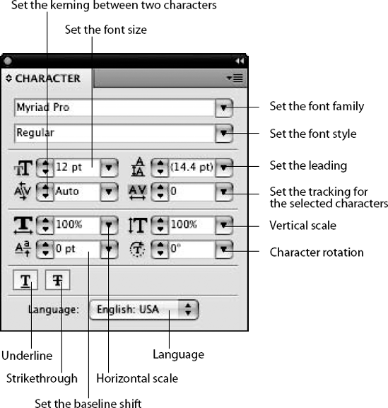
The easiest way to change the attributes of characters is by using the Character panel, as shown in Figure 9.18. Many of the changes in the Character panel are also available as options in the Type menu. As a rule, if you've more than one change to make, it's better to do it in the Character panel than the menu, even if just so that everything you need is in one place.
Character attribute changes affect only the letters that are selected, with the exception of leading (explained later), which should probably really be in the Paragraph panel.
Tip
You can change several character attributes by increments. The increments are set in the General and Type sections of the Preferences dialog box. You can change increments for point size, leading, baseline shift, and tracking/kerning values. Where appropriate, the key commands for each attribute change are listed in the following sections.
You can use Tab to move across the different text fields in the Character panel. In addition to Tab tabbing forward through the text fields, pressing Shift+Tab tabs backward through the text fields.
Note
Choosing Edit
Tip
All the text fields in the Character panel have both a list with common values in them for quick access and up and down arrows to the left of each text field. These arrows increase (up) and decrease (down) the values of each of the currently selected text fields. Pressing Shift while clicking the little arrow buttons makes the change with each press even greater.
Tip
You can use the keyboard to press these buttons. When the text field is highlighted, press the up arrow on your keyboard to press the up arrow button; press the down arrow on your keyboard to press the down arrow button. Press Shift at the same time to jump the value by a greater amount.
The top field on the Character panel is called Set the font family. When you click the Set the font family field triangle, the list of fonts and how they look displays (that is, the fonts are displayed using actual characters from the font family). This also happens when you choose Font from the Type menu.
You can change the font style by clicking the Set the font style field triangle. The options that appear are based on the current font that's selected — typically, styles such as bold and italic appear here.
At 72 points, the letter I is about 50 points tall. In inches, that's just under ¾ inch. To get better results for specially sized capital letters, a good rule is that every 100 points is about a 1-inch capital letter (because the height of a font includes the descenders). This works for most typefaces and only for the first several inches, but it's a good start to getting capital letters that are sized pretty accurately.
Curves in capital letters are yet another wrench thrown into the equation. In many typefaces, the bottom and top of the letter
You measure type from the top of the ascenders (such as the top of a capital T) to the bottom of the descenders (such as the bottom of a lowercase p). So, when people tell you they want a capital I that's 1-inch high, you can't just say, "Oh, there are 72 points in an inch, so I'll create a 72-point I for them."
The text field on the left below the Set the font style text field is the Set the font size text field. You type the desired point size (from 0.1 point to 1296 points in increments of .001 point), and any selected characters increase or decrease to that particular point size. Next to the Set the font size text field, you find a menu triangle, which lists the standard point sizes available. The point size for type is always measured from the top of the ascenders to the bottom of the descenders. You can increase or decrease the point size with the keyboard by typing Ctrl+Shift+> (
Tip
The keyboard commands for increasing and decreasing typographic attributes, such as point size, leading, baseline shift, and tracking, are more than just other ways to change those attributes. Instead, they're invaluable for making changes when the selected type has more than one different value of that attribute within it. For example, if some of the characters have a point size of 10 and some have a point size of 20, using the keyboard command (with an increment set to 2 points) changes the type to 12 and 22 points. This is tedious to do separately, especially if there are multiple sizes or just a few sizes scattered widely about. See Appendix A for a thorough list of keyboard commands for type functions.
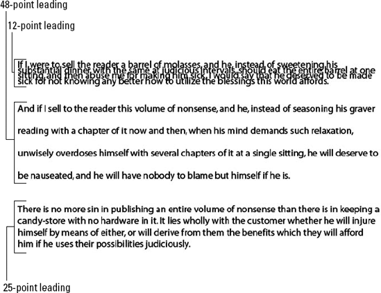
Next to the Set the font size text field, you find the Set the leading text field. Leading is the spacing between lines. In this text field, you type the desired leading value between 0.1 point and 1296 points, in increments of .001 point. To the right of the Set the leading text field is a popup menu triangle, from which you can choose common leading values. In Illustrator, leading is measured from the baseline of the current line up to the baseline of the preceding line, as shown in Figure 9.20. The distance between these two baselines is the amount of leading. The type in this figure is set to 24 points, with various leading amounts between different lines.
If you change the Character panel's leading text field from the number that displays there by default, the Auto entry in the Set the leading list becomes deselected. The Auto option, when clicked, makes the leading exactly 120% of the point size. This is just great when the type is 10 points because the leading is 12 points, a common point size-to-leading relationship. But as point size goes up, leading should become proportionately less, until, at around 72 points, it's less than the point size. Instead, when Auto Leading is clicked (or you can type it into the field), 72-point type has an 86.5-point leading. That's lots of unsightly white space.
You can also set Leading increments in the Type section of the Preferences dialog box.
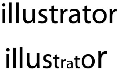
Kerning is the amount of space between any specific pair of letters. You can change kerning values only when there's a blinking insertion point between two characters.
Tracking is the amount of space between all the letters currently selected. If you select the type area with a selection tool, it refers to all the space among all the characters in the entire type area. If you select characters with a type tool, tracking affects only the space among the specific letters selected.
Although they're related and appear to do basically the same thing, tracking and kerning actually work quite independently of each other. They only look like they're affecting each other; altering one never actually changes the amount of the other. The Set the kerning between two characters text field appears directly below the Set the font size text field, while the Set the tracking for the selected characters text field appears below the Set the leading text field. Figure 9.21 shows examples of both leading and kerning.
The Set the kerning text field often reads Auto instead of a value when you select several letters. If Auto appears in that text field, the kerning built into the font is used automatically. Choosing a different value overrides the Auto setting and uses the value you type. If you select several letters, you can choose only 0, but you can type any number if a blinking insertion point appears between the letters. Auto kerning works by reading the kerning values of the typeface that were embedded by the type designer when the typeface was originally created. The typeface designer normally defines the space between letters; different typefaces look like they have different amounts of space between letters. There are usually a couple hundred preset kerning pairs for common Adobe typefaces, although the expert sets have quite a few more. When Auto kerning is in effect, you can see those preset kerning values by clicking between kerned letter pairs (capital T with most vowels is a good one to check) and then reading the value in the Set the kerning text field. If you use Auto kerning, Illustrator displays the value in parentheses when the cursor is positioned between any two characters. Different typefaces have different kerning pairs, and kerning pairs change from typeface to typeface as well as from weight to weight and style to style.
Figure 9.21. The top line is the original, the second line has tracking set close, the third has tracking set apart, the fourth shows an example of kerning set close, and the last shows kerning set farther apart.
For example, a kerning pair of the letters AV in Times New Roman Bold, when Auto kerning is on, is set to (−129). If you type a value of −250, that value overrides the Auto kerning, turning it off and using your new value of −250 (tracking and kerning are both measured in .001 em, a unit of measure that's relative to the current type size). Figure 9.22 shows the difference between a kerning value of −129 and −250.
Note
An em space is the width of a capital M in a particular font at a particular point size.
To use the keyboard to decrease or increase the kerning or tracking by the increments specified in the Preferences dialog box, click between two letters with the Type tool and press Alt+← (Option+←) or Alt+→ (Option+→). To increase or decrease the tracking or kerning by a factor of five times the amount in the Preferences dialog box, press Alt+Ctrl+→ (Option+
The values entered for tracking and kerning must be between −1000 and 10,000. A value of −1000 results in stacked letters that overlap each other. A value of 10,000 makes enough space between letters for 10 em spaces. That's lots of space.
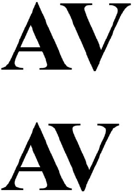
Figure 9.22. The top letters are using Auto kerning (−129). The bottom letters are using −250 kerning.
Note
Different software works with kerning and tracking differently. In programs that do offer numerical tracking, it's usually represented in some form of a fraction of an em space, but the denominator varies from software to software. Fortunately, all Adobe software is consistent here.
Also in the Options section of the Character panel are the Horizontal Scale and the Vertical Scale text fields. These options are just below the kerning and tracking text fields. Horizontal scale controls the width of the type, causing it to become expanded or condensed horizontally. Vertical scale controls the height of the type. You can type values from 1% to 10,000% in these text fields. Like most other text fields in the Character panel, the values entered are absolute values, so whatever the horizontal scale is, changing it back to 100% returns the type to its original proportions.
The lower portion of the Character panel contains the Set the baseline shift text field, which, unlike leading, moves individual characters up and down relative to their baseline (from leading). Positive numbers move the selected characters up, and negative numbers move the characters down by the amount specified. The maximum amount of baseline shift is 1296 points in either direction. Baseline shift is especially useful for type on a path. You can change baseline shift via the keyboard by selecting a letter with the Type tool and pressing Alt+Shift+↑ (Option+Shift+↑) to increase. Pressing Alt+Shift+↓ (Option+Shift+↓) decreases the baseline shift by the increment specified in the Preferences dialog box.
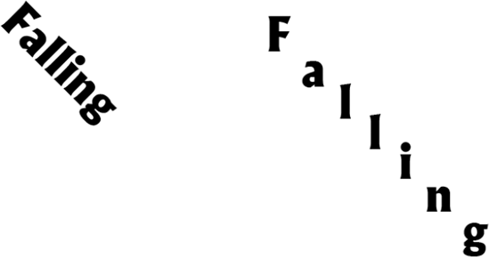
Along with the scale and baseline options, the Character panel also contains the Character Rotation text field. This somewhat odd option tilts individual characters by rotating them relative to the baseline without changing the direction of the baseline. Figure 9.23 shows an example of how this works. In this case, the baseline is a line segment that slants downward at a 45° angle. The characters on the left use normal character rotation, while those on the right are rotated 45° counterclockwise, producing a very interesting visual effect of letters falling down a hill.
To underline or strikethrough text, you simply click the Underline or Strikethrough button at the bottom left of the Character panel.
If you're reading a translation of the Illustrator Bible in a language other than English, I'd like to welcome you by saying hello in your native language: "Hello." Okay, I'm probably not fooling you here; through the magic of translators who speak several languages much more fluently than I speak westernized American English, my current language of choice, this book is translated into other languages without one iota of input from me.
If your language of choice is not English, you'll be interested in the Language option along the bottom of the Character panel. You can change to your language of choice so that functions such as the spelling dictionary and hyphenation dictionary work for words that you'll be typing.
Some of the changes you make to text affect entire paragraphs at once. Paragraph attributes include options such as alignment, indentation, hyphenation, spacing, and line breaking.
You can change paragraph attributes if you first select a type area using a selection tool, in which case the changes affect every paragraph within the entire type area. If you use the Type tool to select one or more characters, changes you make to paragraph attributes affect the entire paragraphs containing the selected characters.
To display the Paragraph panel, as shown in Figure 9.24, choose Window
The bottom part of the Paragraph panel contains information that isn't changed often, so it almost doesn't need to be displayed. If you want to display it, choose Show Options from the Paragraph panel's popup menu.
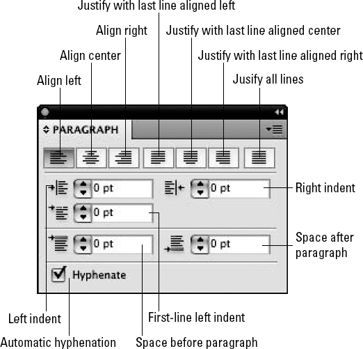
You can align paragraphs in different ways. Each way is represented by an icon in the Paragraph panel that shows a graphical representation of what multiple lines of type look like when that particular alignment is applied. Each alignment type has a specific function:
Align left: Moves all your text so that it lines up with the left side of your page. The most common and the default setting, experienced typesetters often refer to this option as ragged right due to the uneven right side of the text. You can also apply this type of alignment by pressing Ctrl+Shift+L (

Align center: All lines of type in the paragraph are centered relative to each other, to the point clicked, or to the location of the I-bar in type on a path. You can also apply this type of alignment by pressing Ctrl+Shift+C (
Align right: Use this option to create a smooth, even right side and an uneven left side (no, ragged left isn't really a correct term). You can also apply this type of alignment by pressing Ctrl+Shift+R (
Justify with last line aligned left: You apply this to make both the left and right sides appear smooth and even, except for the last line, which is aligned left.
Justify with last line aligned center: Use this option to make both the left and right sides appear smooth and even, except for the last line, which is aligned in the center.
Justify with last line aligned right: With this option, both the left and right sides appear smooth and even, except for the last line, which is aligned right.
Justify all lines: Sometimes called Force Justify, this option is the same as Justify, except that the last line of every paragraph is justified along with the other lines of the paragraph. This can create some really awful looking paragraphs, and it's done mainly for artistic emphasis, not as a proper way to justify type. The Justify all lines option is particularly useful for stretching a single line of type across a certain width. You can also apply this type of alignment by pressing Ctrl+Shift+F (
Note
Justification works only on area type. Illustrator doesn't allow you to choose Justify or Justify all lines for type on a path or individual type.
Paragraphs can be indented within the Paragraph panel by choosing different amounts of indentation for the left edge, the right edge, and first line of each paragraph. The maximum indentation for all three text fields is 1296 points and the minimum is −1296 points.
Using indents is a great way to offset type, such as quotes, that needs to have smaller margins than the rest of the type surrounding the offset type. Changing the indentation values is also useful for creating hanging indents, such as numbered or bulleted text.
To create hanging indents easily, make the Left indent as large as the width of a bullet or a number and a space and then make the First-line value the negative value of that. If the Left indent is 2 picas, the first line is −2 picas. This creates great hanging indents every time.
Illustrator lets you place additional space between paragraphs by typing a number in the Space before paragraph text field or the Space after paragraph text field. You add this measurement to the leading to determine the distance from baseline to baseline before the selected paragraphs. You can also type a negative number to decrease space between paragraphs, if necessary. You can make the values for Space before paragraph between −1296 and 1296 points.
Illustrator allows you to control the spacing of letters, words, auto leading, and glyphs in text by changing the values you find in the Justification dialog box. You access this dialog box by choosing the Justification option in the Paragraph panel's popup menu, as shown in Figure 9.25. You can control these options in the Justification dialog box:
Word Spacing: Word spacing is the space between the words that you create by pressing the spacebar. Set the Minimum, Desired, and Maximum values. The word space can range from 0% to 1000%; 100% is the default, where no additional space is added. The minimum is the least amount of word spacing in percentage that you want to accept.
Type the exact percentage for the Desired setting. The maximum is the most amount of spacing you accept.
Letter Spacing: Letter spacing is the space between letters of words. The Letter spacing can be set from −100% to 500%. A value of 0% means that no space is added. Set the Minimum, Desired, and Maximum values.
Glyph Scaling: A glyph refers to any font character. Glyph scaling lets you change the width of the character as a percentage of the original. Set the Minimum, Desired, and Maximum scaling percentages. The range of glyph scaling is from 50% to 200%; 100% is the default, where no scaling occurs.
Auto Leading: Set the auto leading as a percentage, which ranges from 0% to 500%, with 120% being the default.
Single Word Justification: When there's a single word for the last line justification, choose one of these options from the popup menu: Full Justify, Align Left, Align Center, and Align Right.
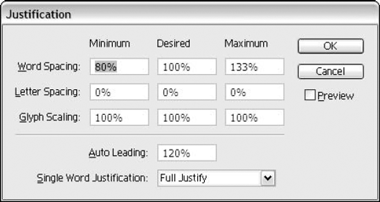
Figure 9.25. The Justification dialog box allows you to control how Illustrator applies paragraph justification.
Spacing affects the space between letters and words regardless of the alignment, although Justified text has even more spacing control than Flush Left, Flush Right, or Centered text.
When you choose Flush Left, Flush Right, or Centered alignment, the only text fields in the dialog box that you can change are the Desired text fields for Letter Spacing and Word Spacing.
The Minimum and Maximum boxes in the Word Spacing, Letter Spacing, and Glyph Scaling areas are mainly used to control where the extra space goes and where it's removed from when stretching out and compressing the lines of text.
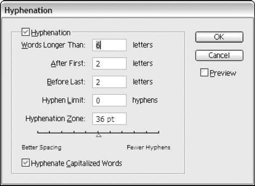
Hyphenation? In a drawing program? Unbelievably, but yes, and it's a neat addition to Illustrator's text-handling capabilities. Hyphenation works in the background, silently hyphenating when necessary.
To use Illustrator's hyphenation, you must click the Automatic hyphenation check box in the lower left of the Paragraph panel.
Hyphenation in Illustrator works from a set of hyphenation rules that you define in the Hyphenation dialog box, as shown in Figure 9.26. View the Hyphenation dialog box by choosing Hyphenation from the Paragraph panel's popup menu. Here, you can specify how many letters must fall before the hyphen can appear and how many letters must fall after the hyphen. You can also limit the number of consecutive hyphens that appear at the end of a line of text to avoid the ladder look of multiple hyphens, where they all line up in a vertical column above each other.
In Illustrator, you can choose from two composition methods: Adobe Every-line Composer or Adobe Single-line Composer. These composer options are found in the Paragraph panel's popup menu. What this means is that in a paragraph, the composer checks and chooses the best breaks, hyphenation, and justification for the specific paragraph.
Every-line Composer checks all the lines in the paragraph and makes its evaluation based on the paragraph as a whole. Single-line Composer looks at each line of type rather than the whole paragraph to determine the best breaks, hyphenation, and justification.
Roman Hanging Punctuation handles the alignment of punctuation marks for a specified paragraph. With the Roman Hanging Punctuation option turned on, apostrophes, quotes, commas, periods, and hyphens are 100% outside the margin or type area. Characters — such as asterisks, tildes, ellipses, en dashes, em dashes, colons, and semicolons — are 50% out of the margin.
If you click the Roman Hanging Punctuation option in the Paragraph panel's popup menu, punctuation at the left edge of a flush left, justified, or justified last line paragraph appears outside the margin or type area. Punctuation on the right edge of a flush right, justified, or justified last line paragraph also appears outside the margin or type area. Strangely enough, Illustrator is one of the few programs that support this very hip feature, which allows tiny pieces of punctuation to exist outside solid blocks of type.
Another choice for punctuation is Optical Margin Alignment. Optical Margin Alignment handles the punctuation marks alignment for all paragraphs inside a type area. With this option turned on, all punctuation hangs outside the margin or type area so the type is aligned. You can find this feature under the Type menu.
Note
Additional options in the Paragraph panel's popup menu are Burasagari, Kinsoku Shori Type, Bunri-Kinshi, and Kurikaeshi Moji Shori. To see these options, you first must turn on Asian Options in the Type preferences. To do this, choose Edit
Choose Window
Note
Different OpenType fonts vary greatly in the features they offer. If you attempt to choose one of the options in the OpenType panel that isn't offered in the font you have selected, Illustrator changes the mouse pointer to a slashed circle to indicate that you can't select that option.
You use the Tabs panel to set tabs the same way you would in your word-processing or page-layout program. To display the Tabs panel, as shown in Figure 9.28, choose Window
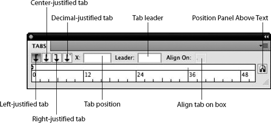
To change the width of the Tabs panel, click and drag on the resize triangle in the lower-right corner of the panel. The Tabs panel can be made wider but not taller. To reset the Tabs panel to the exact size of the type area, drag the resize box back.
Tip
The Position Panel Above Text button moves the Tabs panel to make it flush left with the type and moves it up or down so that it's right above the selected text area.
Illustrator automatically sets tabs at every half-inch. These are called Auto tab stops. After you set a tab, all the Auto tab stops to the left of the tab you have set disappear. The Auto tab stops work like left-justified tabs.
If you click the Snap to Unit check box in the Tabs panel's popup menu, tab stops correspond to the ruler tick marks.
The measurement system shown on the ruler is the same system that the rest of the documents use. You can change the measurement system in the Units & Display Performance section of the Preferences dialog box. You can access this by choosing Edit
To set a tab, choose a tab from the four Tab style buttons on the upper left of the Tabs panel and then click the ruler below to set exactly where you want the new tab. After the tab has been set, you can move it by dragging it along the ruler or remove it by dragging it off the top or bottom edge of the ruler.
You can set four types of tabs:
Left-justified: This option makes type align to the right side of the tab, with the leftmost character aligning with the tab stop.
Center-justified: This option makes type align to the center of the tab, with half the characters aligning on either side of the tab stop.
Right-justified: This option makes type align to the left side of the tab, with the rightmost character aligning with the tab stop.
Decimal-justified: This option makes type align to the left side of the tab, with a decimal or the rightmost character aligning with the tab stop.
To change a tab from one style to another, choose a tab stop and then click the Tab style button you want to use for the tab stop. To deselect all tabs, click in the area to the right of the Tab position box. (If you don't click far enough away from the Tab position box, you end up changing the units.) It's a good idea to deselect tabs after setting them so that when you define a new Tab style for the next tab stop, it doesn't change the tab stop that you just set.
Illustrator has built in some more advanced type functions that go beyond the basic user. In these functions, you find Threading Text, Wrapping Text, Fitting Headlines, Find Font, Check Spelling, and Change Case. You find each of these functions under the Edit and Type menus.
The Threading Text option links text from one area to another, continuing a story from one area to another, as shown in Figure 9.29. Linked blocks act like groups, enabling you to use the Selection tool and then click just one area to select all areas. (You can still select individual blocks with the Direct Selection tool.) Whenever you have more text than can fit into a text area, a tiny red plus sign in a box appears, alerting you that there's more text in the box than you can see.
To use threaded text, select a text area or rectangle and any other shapes, even text rectangles and areas, and then choose Type
You can unthread text in various ways. To release the object from the text thread, choose Type
When you double-click the out port again, the text flows forward into the next object.
The Type menu's Fit Headline option is designed to automatically increase the width of type in order to fit type perfectly from the left side of a type area to the right side of that same type area, as shown in Figure 9.30. In this case, the Fit Headline option was used on the headline over the right-side text, while the left side uses normal text. Another option is to use Justify all lines in the Paragraph panel, but it doesn't do as good of a job as Fit Headline.
Under the Edit menu are more choices for text editing. Illustrator lets you find certain text and then replace it with other text by choosing Edit
Match Case: Selects the characters only if they have the same uppercase and lowercase attributes as the characters you type in the Find text field
Find Whole Word: Tells Illustrator that the characters you type in the Find text field are an entire word and not part of a word
Search Backwards: Tells Illustrator to look before the current insertion point for the next instance of the characters, instead of using the default, which is to look after the current insertion point
Check Hidden Layers: Instructs Illustrator to look in the text in hidden layers
Check Locked Layers: Instructs Illustrator to look in the text in locked layers

Figure 9.30. The Fit Headline option makes headlines fit across the entire text block, as shown on the right.
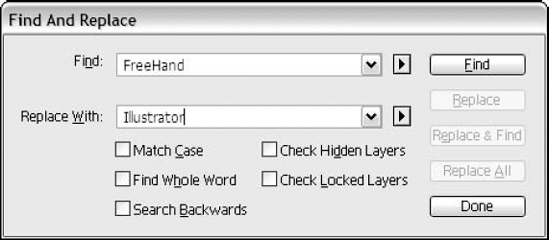
The following steps describe how to use these options to find and replace text:
Choose Edit
Type the word(s), phrase(s), or character(s) that you want to find in the Find text field.
In the Replace With text field, type the word(s) or character(s) that you want to use to replace the text.
Click the appropriate check boxes described in the previous section.
Click Find to find the first occurrence of the word(s) or character(s).
Click Replace to replace the selected text. Click Replace & Find to first replace the text and then locate the next occurrence. If you want to change all occurrences, click Replace All.
Note
You don't need to select areas of type with the selection or type tools in order to search for text — all that's necessary is that the document that you want to search is the open and active document.
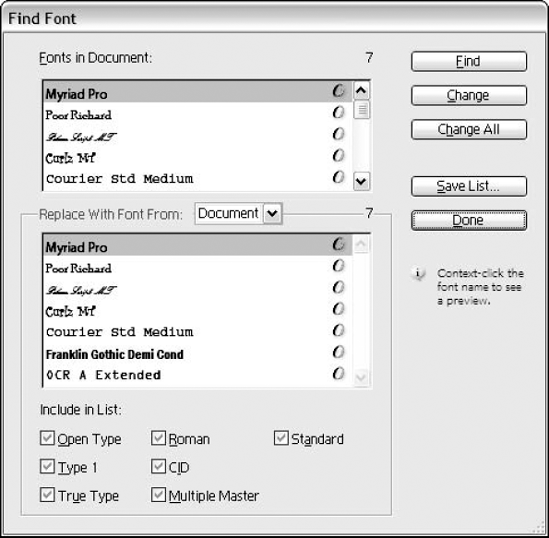
The Find Font option looks for certain fonts in a document and replaces them with fonts you specify. This can be especially handy if you've pasted in text from other applications and you want to make certain that your Illustrator document has a uniform appearance throughout.
To locate the fonts in your document, choose Type
To change all occurrences of a certain font to another font, choose the font you want to change in the top list, titled Fonts in Document. Choose a font in the box in the lower section of the dialog box and then click Change All. To change one particular instance, click Change. To find the next occurrence of that font, click Find Next. The Skip button skips over the currently selected text and finds the next occurrence of that font. Keep in mind that choosing System from the Replace With Font From list can take a while for Illustrator to build and display the font list, especially if you have a ton of fonts on your system.
Clicking Save List allows you to save your font list as a text file. You can deselect any of the options at the bottom of the Find Font dialog box to avoid searching within those types of type areas.
Spell-check checks all text in a document to see whether it's spelled (and capitalized) correctly. To use this feature, choose Edit
Note
Check Spelling uses a standard user dictionary as well as all foreign language and hyphenation dictionaries that are available.
If you have any misspelled words or words that aren't in the available dictionaries, those words are listed at the top of the Check Spelling dialog box in the Misspelled Words list. Choosing a word from this list displays similar words below in the Suggestions list.
Some of the options you can change are to find repeated words or lowercased words at the start of a sentence. Other options are to ignore uppercase words, Roman numerals, and words with numbers.
You use the Add button when you want to add the selected misspelled word to your custom dictionary.
As you're checking your spelling in the Check Spelling dialog box, clicking Change replaces the misspelled word with the highlighted word in the Suggested Corrections list. Clicking Change All replaces all misspelled occurrences of that word throughout the entire document with the correctly spelled word.
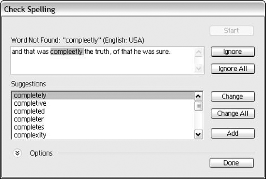
Figure 9.33. Use the Check Spelling dialog box to make certain your documents don't contain embarrassing spelling errors.
Clicking Ignore ignores that occurrence of the misspelled word. Clicking Ignore All skips all occurrences of that word in the document.
Clicking Done closes the Check Spelling dialog box.
The Change Case option converts selected text to one of a variety of case options. To use this feature, select type with a type tool and then choose Type
The four Change Case options affect only letters, not numbers, symbols, or punctuation. The options are as follows:
UPPERCASE: Converts all selected letters into uppercase, regardless of whether any letters were uppercase or lowercase
lowercase: Converts all selected letters into lowercase, regardless of whether any letters were uppercase or lowercase. It also doesn't matter if the letters were originally uppercase because they were typed with Caps Lock engaged or if the uppercase letters were uppercase because of a style format.
Title Case: Capitalizes the first letter of each word (except articles and prepositions that aren't the first word or last word or don't follow punctuation)
Sentence case: Uses periods, exclamation points, and question marks as the end of the sentence to capitalize the first letter of each sentence
Tip
Be sure to check your text for proper capitalization after using any of these options. You're almost certain to find errors in things, such as proper names and acronyms.
The Smart Punctuation option looks for certain characters in a document and replaces them with characters you specify. To use this feature, select type with either a selection tool or a type tool. Then, choose Type
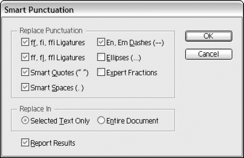
Figure 9.34. Use the Smart Punctuation dialog box to replace ordinary punctuation with typographer's punctuation.
The Smart Punctuation option works after the fact, making changes to text already in the Illustrator document. There are no settings, for example, to convert quotes to curved quotes as you're typing them (once they're curved quotes, they stay that way). The types of punctuation to be changed are determined by a set of check boxes in the Smart Punctuation dialog box. Clicking this check box causes Illustrator to look for these certain instances and, if it finds them, corrects them with the proper punctuation.
The first two options are used for replacing ff, fi (or fl), and ffi (or ffl) with ligatures. Ligatures are characters that represent several characters with one character that's designed to let those characters appear better-looking when placed next to each other. Most fonts have fi and fl ligatures, which look like fi and fl, respectively.
The remaining Smart Punctuation options work as follows:
Smart Quotes replaces straight (or dumb) quotes (" " and ' ') with curly (smart) quotes (" " and ' '), also known as typesetter's quotes or printer's quotes.
Smart Spaces replaces multiple spaces after a period with one space. (In typesetting, there should only be one space following a period.)
En, Em Dashes replaces hyphens (-) with en dashes (-) and double hyphens (--) with em dashes (—).
Ellipses replaces three periods (...) with an ellipsis (...).
Expert Fractions replaces fractions with expert fractions if you have the expert fractions for the font family you're using. Adobe sells Expert Collection fonts that contain these fractions. If you don't have expert fractions, your fractions remain unchanged.
Other options are to replace in Selected Text Only or in Entire Document. Clicking the Report Results check box displays a dialog box once changes have occurred, telling you how many of the punctuation changes were made.
Area Type Options divides rectangular paths (text rectangles) into even sections. You can add rows, columns, or both to a text area using these options.
To add Rows and Columns, select a path and then choose Type
You can select any text path, open or closed, and divide it into rows and columns. The Area Type Options dialog box has the following options:
You can set the Width of the columns and the Height of the rows in the text fields or by using the up and down arrows.
Note
All measurements in the Area Type Options dialog box are displayed in the current measurement system.
In the Rows section, the Number text field sets the number of rows for the original path.
The Span text field is the height of each of the rows.
Click the Fixed check box to prevent the row height from changing if the text block is resized.
The Gutter text field specifies the space between rows.
In the Columns section, the Number text field sets the number of columns for the original path.
The Span text field determines the width of the columns.
Click the Fixed check box to prevent the column width from changing if the text block is resized.
The Gutter text field specifies the space between columns.
Figure 9.35. The Area Type Options dialog box allows you to create additional columns and rows in your text blocks.
Remember that using the Area Type Options feature actually divides the selected rectangle into several pieces.
The Offset options are for Inset Spacing (from the edge of the object area) and First Baseline. Use the settings in this section to move text slightly away from the baseline for improved readability.
The Text Flow options determine the direction of text as it flows from one section to the next. You may choose between text that starts along the top row and flows from left to right and then goes to the next lowest row, flowing from left to right, etc. The second option is to have text start in the left column, flowing from top to bottom, and then to the next column to the right, flowing from top to bottom.
Clicking the Preview check box displays changes as you make them in the Area Type Options dialog box.
Showing hidden characters
When you type, you typically add certain special characters — such as spaces, returns, and tabs. Typically, you don't see these characters. You can choose to view the hidden characters by choosing Show Hidden Characters from the Type menu. This option can be especially useful when you're working with imported text because it allows you to find any extra hidden characters that can interfere with proper text formatting.
You can easily change the orientation of your type by choosing Type Orientation from the Type menu. You then choose either Horizontal or Vertical from the Type Orientation submenu. That way, if you wanted vertical type and did it as horizontal, you can easily change it without retyping it.
Legacy text is any text created in version 10 and earlier. Because Illustrator now uses a new Adobe Text Engine, the older text must be converted to take advantage of this new type engine. The changes are character positioning with tracking, leading, and kerning, shifts in the words (resulting in different hyphenation), and changes in word flow from threaded text. When you open an older file, a dialog box appears asking if you want to update all legacy text. If you decline to do the update when opening the file, you can use the Legacy Text submenu entries to update all or selected legacy text while editing the file.
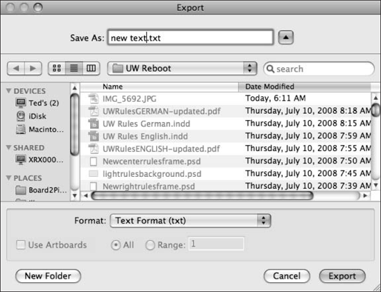
You can export text from your Illustrator documents for use in other applications. To export text, select the text you want to export and then choose File
Word-processing software, page-layout software, or any other software that can read text files can open and use text that you save in Illustrator.
To place text in Illustrator, choose File
After you create, edit, and spell-check your text, you may want to create outlines from the characters so that you can modify the characters to produce some interesting visual effects. To do so, choose Type
Note
For more on the Direct Selection tool, see Chapter 6.
OpenType and TrueType combine the screen and printer fonts into one file — if you can choose any of these font types in Illustrator, you can create outlines from them. Illustrator locates the font file and uses that information to create the outlines.
After you convert type to outlines, you can apply gradients to its fill, and you can apply patterns to its fill, which you can preview on-screen. You can also apply patterns to nonoutline type by clicking a pattern in the Swatch panel for the file or stroke of the character.
Note
Although you can undo Create Outlines, be forewarned that you can't convert back to type in case you make a spelling error or want to change the font or any other type attribute.
You can convert all forms of type, including individual type, type on a path, area type, and type containers to outlines.
Tip
Creating outlines out of type is also very useful when you want to send the file to be outputted and the person doing the output doesn't have the font you're using. Simply use the Create Outlines option before you send the file, and it prints just fine. (This is not advised for 4-point type or smaller, as described later in this chapter.)
The process of creating editable type outlines has many uses, including distorting mild-mannered characters into grotesque letters. More practical uses for editable type outlines include making type-based logos unique, arcing type (where one side is flat and the other is curved), special effects and masking, and avoiding font-compatibility problems.
Initially, when type is converted into outlines, individual characters are turned into compound paths. This ensures that holes in letters, such as in a lowercase a, b, or d, are transparent and not just white-filled paths placed on top of the original objects.
Note
For more on warp effects, see Chapter 11. For more on compound paths, see Chapter 12.
After letters have been turned into outlines, there's nothing to stop you from distorting them into shapes that resemble letters only in the most simplistic sense of the word.
The results of letter distortion usually aren't all that eye-pleasing, but they can be fun. Few things in life are as pleasing as taking a boring letter Q and twisting it into the letter that time forgot. Or fiddling around with your boss's name until the letters look as evil as your boss does. Or adding pointed ears and whiskers to a random array of letters and numbers and printing out several sheets of them with the words "Mutant kittens for sale."
When modifying existing letters, use the Direct Selection tool. Select the points or segments you want to move and then drag them around to your heart's content. This can be great practice for adjusting paths, and you might accidentally stumble onto some really cool designs.
Type outlines provide you with the flexibility to manipulate letters to turn an ordinary, boring, letters-only logo into a distinct symbol embodying the company's image. Outlines are flexible enough that there really are no limits to what can be done with something as simple as a word of type.
Standard type or type that has been converted into outlines can be used as a mask or filled with a placed image or any objects, as shown in Figure 9.38.
For outlined words to work as a single mask, you must first change them into a compound path. Usually, individual letters of converted type are changed into individual compound paths, whether the letter has a hole in it or not. For masks to work properly, you must select the entire word or words you want to use as a mask and then choose Object
After the words are a compound path, place them in front of the objects to be masked, select both the words and the masked objects, and then choose Object
Tip
In some third-party (non-Adobe) and shareware typefaces, making a compound path out of a series of letters can produce results where the holes aren't transparent. This issue is usually one of path direction, which can be corrected by selecting the inner shape (the hole) and changing the direction with the path direction buttons on the Attributes panel (accessed by choosing Window
Note
For more on masks, see Chapters 7 and 12.
If you ever give your files to a service bureau or to clients, you've probably already run into some font-compatibility problems. A font-compatibility problem usually means that the place you gave your file to doesn't have a typeface that you used in your Illustrator document or that it has a different version of the same typeface with different metrics.
This is a problem to which there's no great solution, and the trouble seems to be worsening as more font manufacturers spring up. And then there are shareware typefaces, some of which resemble Adobe originals to an uncanny degree of accuracy. All this leads to a great deal of confusion and frustration for the average Illustrator user.
But there's a way around this problem — at least most of the time. Convert your typefaces into outlines before you send them to other people with other systems — they don't need your typefaces for the letters to print correctly. In fact, converted letters aren't really considered type anymore, just outlines.
Tip
Save your file before converting the text to outlines and then save it as a different file name after converting the text to outlines. This allows you to do text editing later on the original file, if necessary.
Most Type 1 fonts have hinting built into them. Hinting is a method for adjusting type at small point sizes, especially at low resolutions. Although hinting is built into the fonts, when those fonts are converted into paths via the Create Outlines command, the hinting functionality is gone. This is part of the reason that type converted to outlines can look heavier than it does otherwise.
Creating outlines shouldn't cause that much of a problem when the type is to be output to an imagesetter because the high resolution of the imagesetter makes up for the loss of hinting. However, very small type — 4 points or less — could be adversely affected.
Note
Converting typefaces to outlines removes the hinting system that Adobe has implemented. This hinting system makes small letters on low-resolution (less than 600 dpi) devices print more accurately, controlling the placement and visibility of serifs and other small, thin strokes in characters. Type at small point sizes looks quite different on laser printers, although it retains its shape and consistency when it's output to an imagesetter or an output scanner system.
When you're using type in Illustrator, remember these things if you want to get good results:
Ensure that the person you're sending the Illustrator file to has the same fonts you have. It isn't enough just to have the same name of a font; you need the exact font that was created by the same manufacturer.
Try not to mix TrueType fonts with PostScript fonts. This usually ends up confusing everyone involved.
If the person you're sending Illustrator files to doesn't have your typeface, select the type in that font and then choose Type
If you're saving your illustration as an EPS file to be placed into another program and you're not going to open the file, you can choose Include Document Fonts in the EPS Save dialog box. This forces any fonts used in the illustration to be saved with the illustration and allows the illustration to print as a placed image from within another program or to print from Illustrator as a placed EPS. The same goes for PDF files.
Text can be an important part of Illustrator documents. Understanding how Illustrator handles text-related issues is vital to getting the best results. In this chapter, you learned about the following important topics in this area:
Individual type has one point as its anchor, and the type is aligned to that point.
There are four ways to put type on a page: individual type, type containers, area type, and type on a path.
Type containers exist within a rectangle drawn with the Type tool.
Type can be selected all at once by clicking the path (or point) of the type with the Selection tool.
Individual characters, words, and paragraphs can be selected by using any of the type tools.
Area type is type that exists within the confines of any path.
Type on a path is type that runs along the edge of a path.
The Character panel, accessed by pressing Ctrl+T (
Tracking and kerning remove or add space between groups or pairs of letters, respectively.
The Paragraph panel contains all the paragraph-specific information about selected type and can be used to change that information.
Most of the options used to control type can be found in the Type menu.
Type can be set to wrap around selected paths by using the Text Wrapping feature.
Type can be set to jump from text block to text block by threading text blocks together.
The Tabs panel is used to set tabs for text areas.
If you have both the screen font and the printer font of a Type 1 typeface, or if you have an OpenType or TrueType font installed, you can convert the font into outlines via the Create Outlines command.
After type has been changed to outlines, you can use those outlines as a mask or fill those outlines with gradients or patterns.