Creating path blends
Using Blend options
Making a color blend
Creating shape blends
Using stroke blends
Creating compound paths
Figuring out path directions
Creating clipping masks
Three of the more difficult areas of Illustrator to master are path blends, compound paths, and masks. Of course, these are also three of the more powerful functions in Illustrator. A blend is a bunch of paths created from two original paths. Compound paths consist of two or more separate paths that Illustrator treats as a single path. You use a mask to hide portions of an image or mask them out. This chapter shows you how to get to know these three functions so that you can use them in your documents.
In Illustrator, a blend is a series of paths that Illustrator creates based on two other paths. A series of paths transforms from the first path into the second path, changing fill and stroke attributes as it moves. A gradient is a smooth blend of colors between two or more colors. The big difference is that the gradient appears as a box rather than a series of paths, as in a blend. With a gradient, you use a panel to signify where the colors start and stop.
At first glance, blends and gradients seem to do the same things but in different ways — so why have both? The Blend tool, moreover, seems to be much harder to use than the Gradient Vector tool. On the surface, it seems that you can do more with gradients than with blends. Blends take a long time to redraw; gradients take a fraction of the time.
After all, if gradients are so much easier to use and produce so much better results, is it really necessary to have a Blend tool or a Blend function? Students, clients, and the occasional passersby have asked me this question quite often, and they seem to have a good point at first. Upon further study, however, it becomes apparent that blends are quite different from gradients, both in form and function.
You use gradients only as fills for paths. You can make gradients either linear or radial, meaning that color can change from side to side, top to bottom, or from an interior point to the outside. Every gradient can have as many distinct colors in it as you can create. Gradients are simply an easier way to create blends that change only in color, not in shape or size.
Note
For more on gradients, see Chapter 7.
Blends, on the other hand, are a series of transformed paths between two end paths. The paths between the end paths mutate from one end path into the other. All the attributes of the end paths change throughout the transformed paths, including shape, size, and all paint style attributes. The major benefit is that you can blend multiple colors at one time.
Blends can be incredibly flexible when it comes to creating photorealistic changes in color if you plan ahead. Changes to blends aren't really changes at all; instead, they're deletions of the transformed objects and changes in the attributes of the end paths. If you know what you want, blending colors can take on an incredibly realistic look by changing the shapes of the blend's end paths just slightly.
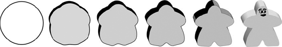
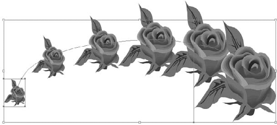
But even more useful than creating realistic changes in color is blending's capability to transform shapes from one shape to another (this is typically called morphing), as shown in Figure 12.1. With a bit of practice (and the information in this chapter), you can transform any illustration into another illustration. There's a limit to the complexity of the illustrations that you can transform, but the limit is due more to the time it takes to create the blends than to limitations inherent in Illustrator.
Because blends work on both stroke and fill attributes of objects, you can create some really exciting effects that aren't possible by using any other technique, electronic or traditional.
Originally, Adobe marketed the Blend tool as a tool whose primary purpose was to transform shapes, not blend colors. Instead, designers used the tool for blending colors to create what were known as vignettes or what traditional artists called gradients.
The Blend tool creates in-between steps in the area between two paths, where the paint style and shape of one path transform themselves into the paint style and shape of the second path.
Version 8 of Illustrator dramatically enhanced the Blending function. The big change is that blends became live, or editable. This huge change allows users to change the color, shape, and location of the blend shapes. The blend instantly reblends to the new changes. Another great change is the capability to blend along a path.
Although any blend takes into account both color and shape, I treat color and shape separately in this chapter because people using the Blend tool are often trying to obtain either a color effect or a shape effect rather than both at once.
You use the Blend tool to create blends, which are a group of paths (commonly referred to as blend steps) that change in shape and color as each intermediate path comes closer to the opposite end path. Follow these steps to create a blend:
Using a shape tool, create a small (1-inch) vertical shape. This example uses a rectangle. For more on creating shapes, see Chapter 5.
With the Selection tool, click on the rectangle, press Alt (Option), and then drag a few inches to the right. This copies the path a few inches to the side. Press Shift as you drag horizontally to constrain the movement of the path.
On the left shape, change the fill and stroke to desired values. This example uses a fill of Black and a stroke of None. For more on changing the fills and strokes for shapes, see Chapters 4 and 5.
For the right rectangle, change the fill and stroke to desired values. This example uses a fill of White and a stroke of None.
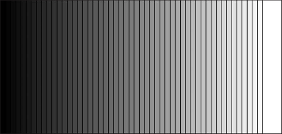
Select the Blend tool by pressing W, click the top-left point of the left path, and then click the top-left point of the right path. This step tells Illustrator to blend between these two paths, and it uses the top-left points as reference. The Blend tool cursor changes from x to + in the lower-right corner. Illustrator creates a spine between the two end paths, which are now transparent. Figure 12.2 shows the resulting blend.
Press Ctrl+Shift+A (

You create color blends by making two end paths, usually identical in shape and size, giving each path different paint style attributes, and generating a series of steps between them with the Blend tool. The more end paths you create, the more colors you can create.
Note
The examples in this chapter are easier to understand when you work in Preview mode. For more on Preview mode, see Chapter 2.
Follow these steps to create a basic linear blend:
Draw a curved path with the Pen tool, filling and stroking it as desired. The example has a fill of None and a stroke of 2-point Black.
Alt+copy (Option+copy) the path to the right, filling and stroking the copied path as desired. The example gives the new path a stroke of 2-point Yellow.
With the Blend tool, click the path on the left and then the path on the right. Alternately, you can select both objects and then choose Object

Deselect all by pressing Ctrl+Shift+A (
Note
The blend shown in Figure 12.3 demonstrates one of the hazards of creating blends — something often referred to as banding. See the sidebar on banding later in this chapter to learn what to do to reduce or eliminate banding.
You have a variety of ways to blend objects. Keep in mind these suggestions when blending objects:
You can edit blends by using the Selection, Rotate, or Scale tools.
You can perform blending with any number of objects, colors, opacities, and gradients.
You can't apply blending with mesh objects.
You can't edit the path (or spine, as it's called) that the blend creates.
The fill of the topmost object is used when blending patterns.
When intermixing process and spot colors, the blend is colored with process colors.
When blending with transparent objects, the topmost object's transparency is used.
You can blend symbols.
You can change the number of steps that Illustrator uses in the Blend Options dialog box.
Blends create a knockout with transparency groups. (If you don't want this, change it in the Transparency panel by deselecting the Knockout Group option.)

Adobe has enhanced the Blending functions of Illustrator by making the Blend tool easier to use and faster and by adding a Blend submenu under the Object menu. The Blend options are Make, Release, Blend Options, Expand, Replace Spine, Reverse Spine, and Reverse Front to Back. With Illustrator's Blend capability, you may not need to release a blend to change it. You can use the Direct Selection tool to select the end paths and edit the paths or change their color, and the blend instantly updates. Live Blending is the capability to change the shape or color of a blend and update it automatically.
The Blend Options dialog box lets you change the Spacing and Orientation aspects. Select the blend that you want to adjust, and either double-click the Blend tool or choose Object
Figure 12.4 shows the Blend Options dialog box. The three Spacing choices are Smooth Color, Specified Steps, and Specified Distance. The Orientation options are Align to Page and Align to Path.
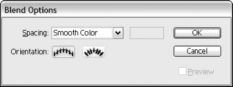
These are the Blend options:
Smooth Color: This option automatically determines the best number of steps needed to make this blend look very smooth.
Specified Steps: This option lets you choose the number of intermediate steps you want in the blend.
Specified Distance: This option allows you to type the distance between steps.
Align to Page: This option runs the blend vertically or horizontally, depending on your page orientation.
Align to Path: This option runs the blend perpendicular to the path.
Illustrator has the capability to blend multiple objects in one step. Long gone are the days of blending, hiding, blending, hiding, etc. Select all the objects that you want to blend and then choose Object

Blend functionality lets you change the colors of a blend without having to redo the whole blend. With the Direct Selection tool, select the path whose color you want to change in the blended shape. Choose a new fill and/or stroke color. The blend updates instantly with the new color.
Another great aspect of Live Blend is the capability to edit the blend at any time and have it automatically update on the fly. As mentioned before, Illustrator creates a path, or spine, when you create a blend. With the Direct Selection tool, you can select an anchor point on the spine and move it. This changes the location of that point, and the blend updates accordingly.
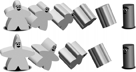
Now you can edit lines by adding, deleting, or moving any part of your blend, and it updates automatically. You can delete and add points or change the shape of a path with the Direct Selection tool. Figure 12.6 shows a figure before and after editing the blend. In this case, the meeple that begins the blend was modified in the lower blend by dragging the point at the top of his head up.
The Replace Spine option allows you to make a blend follow a selected path. Follow these steps to apply this effect:
Create the blend as described earlier in this chapter. For example, create a blend that blends a mostly vertical ellipse into a mostly horizontal ellipse.
Draw a path in the shape that you want the spine of the blend to follow. In this case, draw a large diameter circle to use as the path for the blend.
Select the blend with the spine that you want to change and the path that you want to become the new spine.
Choose Object
This menu option reverses the sequence of the objects that you're blending. If you have a rectangle on the right blended to a circle on the left, choosing Object
The Reverse Front to Back option reverses the order in which your paths were drawn when you created your blend. If you drew a small circle first and a large circle second, choosing Object
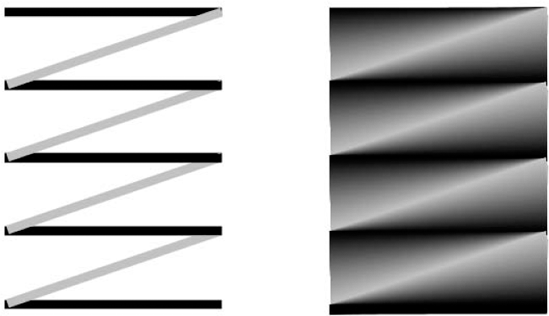
End paths on a blend with two endpoints (linear segments) used to make blends don't have to be just horizontal or vertical. And when you create multiple color blends, you don't have to align the intermediate end paths the same way as you align the end paths. Careful setup of intermediate blends can create many interesting effects, such as circular and wavy appearances, all created with straight paths.
Note
End paths that cross usually produce undesirable effects; if carefully constructed, however, the resulting blends can be quite intriguing. Blending crossed end paths creates the appearance of a three-dimensional blend, where one of the end paths blends up into the other.
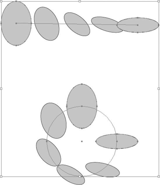
To create nonlinear blends, set up the end paths and either rotate them or change their orientation by using the Direct Selection tool on one of the endpoints. Then, blend from one end path to the intermediate end paths and then to the other end path. Figure 12.10 shows an example of a nonlinear blend.
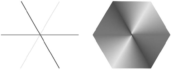
Another good example of a nonlinear blend is to create a color wheel by aligning straight lines in a hexagon shape with differing colors and then blending between them, as shown in Figure 12.11.
You can also use rectangles with fills and no strokes to achieve a linear blend effect. Figure 12.12 shows both lines and rectangles used for end paths.
Although you can use a rectangle as an end path, you should use a single line with two endpoints instead. In fact, lines are better than rectangles for three reasons. First, lines use half as much information as rectangles because lines have two anchor points, while rectangles have four anchor points. Second, it's much easier to change the width of a line (stroke weight) after you create the blend (just select the lines and then type a new weight in the Stroke panel) than it is to change the width of rectangles (you would have to use Transform Each's Scale option). Third, creating a linear blend with lines (strokes) creates a thick mess of paths, but creating a linear blend with rectangles creates a thicker mess, so much so that it's difficult to select specific rectangles.
Tip
You can blend an open path with a closed path and vice versa. You can blend open or closed paths to any path by choosing Object
Whenever you create a blend, Illustrator provides a default value in the Specified Steps text field of the Blend Options dialog box that assumes that you want to print your illustration to an imagesetter or another high-resolution device capable of printing all 256 levels of gray that PostScript allows.

The formula that Illustrator uses is quite simple. It takes the largest change that any one color goes through from end path to end path and multiplies that percentage by 256. The formula looks like this:
256 × largest color change % = the number of steps you want to create
For example, using a linear blend example where the difference in tint values is 100% (100% – 0% = 100%), when you multiply 100% by 256, you get 256. Because the total number of grays must be 256 or fewer, Illustrator creates only 254. When you add this to the two ends, you have 256 tints. But, of course, not everything you create outputs on an imagesetter. Your laser printer, for example, can't print 256 grays unless you set the line screen extremely low. To determine how many grays your laser printer can produce, you must know both the dpi (dots per inch) and the line screen (refer to the printer documentation). In some software packages, you can specify the line screen, but unless the printer is a high-end model, it's usually difficult to specify or change the dpi. Use the following formula to find out how many grays your printer can produce:
(dpi/line screen) × (dpi/line screen) = number of grays
For a 300-dpi printer with a typical line screen of 53, the formula looks like this:
(300/53) × (300/53) = 5.66 × 5.66 = 32
A 400-dpi printer at a line screen of 65 has the following formula:
(400/65) × (400/65) = 6.15 × 6.15 = 38
A 600-dpi printer at 75 lines per inch uses this formula:
(600/75) × (600/75) = 8 × 8 = 64
Sometimes, you may want to reduce the number of blend steps in a blend from the default because either your printer can't display that many grays or the distance from one end path to another is extremely small (see the sidebar on stroke blends later in this chapter).
When reducing the number of blends, start by dividing the default by two and then continue dividing by two until you have a number of steps with which you're comfortable. If you aren't sure how many steps you need, do a quick test of just that blend with different numbers of steps specified and print it out. If you're going to an imagesetter, don't divide by two more than twice; otherwise, banding can occur.
To create a radial blend (one that goes from a larger shape to a smaller shape), follow these steps:
Make a shape about 2 inches in diameter. See Chapter 4 for more on creating shapes. Fill the shape. The example uses a fill of 100% Black.
Make a smaller shape inside the larger shape and then fill it as desired. The example fills the smaller shape with White.
Select both shapes using the Direct Selection tool and then choose Object
To change the number of steps, choose Object
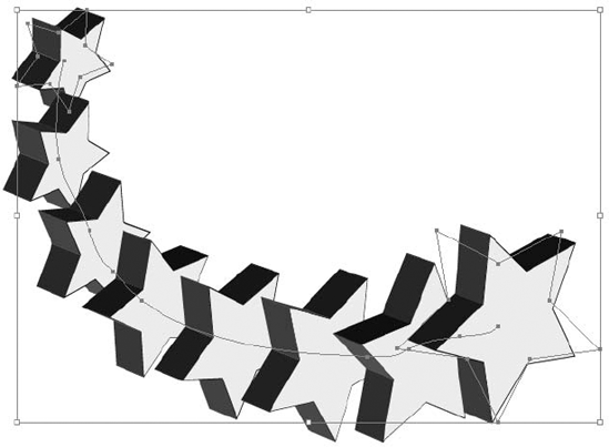
You can create radial blends with almost any object. Figure 12.13 shows a radial blend using a star.
Warning
As with most other blends, when blending from two identically shaped end paths, always click the anchor point in the same position on each object. Figure 12.13 shows the difference between clicking the anchor points in the same position (left) and clicking those that aren't in the same position (right).

Figure 12.13. Here are two examples of radial blends that differ because different anchor points were selected.
One of the great things about creating radial blends manually (not using the gradient feature) is that by changing the location and the size of the inner object, you can make the gradient look vastly different. The larger you make the inner object, the smaller the blended area becomes.
The Gradient tool allows you to change the highlight point on a radial gradient without changing the source, or angle, of the highlight.
Note
For more on gradients and meshes, see Chapter 7.
Using colors in a blend is really no different from using black and white, except for the spectacular results. The only difficulty in using colors in blends is whether the colors look good together.
To create linear blends that have multiple colors, you must create intermediate end paths, one for each additional color within the blend. Follow these steps:
Create two end paths at the edges of where you want the entire blend to begin and end. Don't worry about colors at this time.
Select the two paths and then choose Object
Choose Object
Choose the values you want for the blend. Change the Spacing option to Specified Steps. Choose your orientation and then type a number for the steps. (I typed 3 to create three evenly spaced paths between the two end paths.)
Expand the newly created strokes by choosing Object
Select all the paths using the Selection tool and then choose Object
Although the preceding procedure should have gone smoothly with no problems, follow these guidelines when creating blends to obtain good results each time you print:
For linear blends, use either rectangles with only four anchor points or a basic 2-point path. If you use a shape with any more anchor points or if you use a curved shape with any paths that aren't perfectly straight, you get extra information that isn't needed to create the blend and printing takes much longer than usual.
When creating linear blends, use one rectangle per end path and color the fills of the paths, not the strokes. Coloring the strokes may appear to work, but it usually results in a moiré (wavy) pattern when you print. Ensure that you set the stroke to None, regardless of what you have for the fill.
Don't change the number that appears in the Specified Steps text field in the Blend Options dialog box if you want smooth color. Making the number higher creates additional paths that you can't print; making the number lower can result in banding when you print (see the sidebar on banding earlier in this chapter).
The difference between color blends and shape blends is in their emphasis. Color blends emphasize a color change; shape blends emphasize blending between different shapes.
You have a number of details to remember when creating the end paths that form a shape blend. You must make both paths either open or closed. If open, you can only click endpoints to blend between the two paths. If the shapes also change color, be sure to follow the guidelines in the section related to color blends earlier in this chapter.
For the best results, both paths should have the same number of anchor points selected before blending, and you should have the selected points in a relatively similar location. Illustrator pairs up points on end paths and the segments between them so that when it creates the blend steps, the lines are in about the same position.
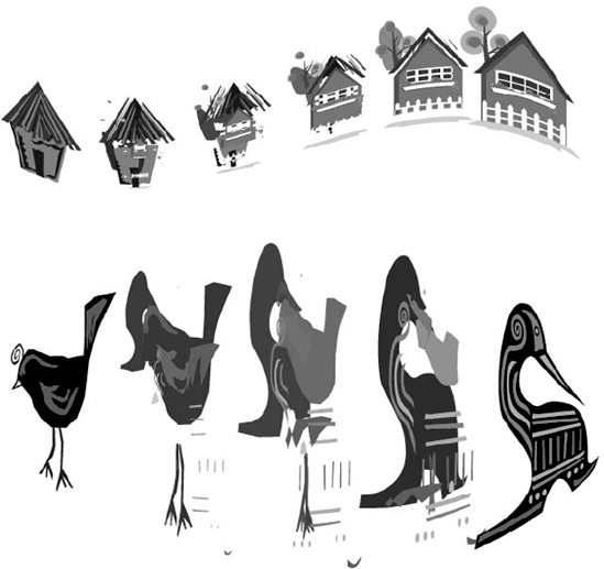
Whenever a shape is complex (that is, it isn't a perfectly symmetrical shape), you may have to perform a number of functions to create realistic and eye-pleasing effects. Figure 12.15 shows a complex-shape blend.
One function that you can perform to improve the blend involves adding or removing anchor points from the end paths. Even if you select the same number of points and those points are in similar areas on each path, Illustrator may not give you an acceptable result. The Add Anchor Point and Delete Anchor Point tools become quite useful here. By adding points in strategic locations, you can often fool Illustrator into creating an accurate blend; otherwise, the blend steps can resemble a total disaster.
Tip
As a general rule, you disturb the composition of the graphic less if you add anchor points rather than remove them. On most paths, removing anchor points changes the shape of the path dramatically.
Another method of getting the paths to blend more accurately involves shortening them by splitting a long, complex path into one or two smaller sections that aren't nearly as complex. You must blend each path, which you can do in one step by choosing Object
To create a realistic effect with shape blends, the paths you use to create the blends need to resemble objects you see in life, which are generally curved rather than straight. Take a look around you and try to find a solid-colored object. Doesn't the color appear to change from one part of the object to another? Shadows and reflections are everywhere. Colors change gradually from light to dark — not in straight lines but in smooth, rounded curves.
You can use blends to simulate reflections and shadows. You usually create reflections with shape blends and create shadows with stroke blends.
This section shows you how to simulate reflections with shape blends. This procedure is a little tricky for any artist because the environment determines a reflection. The artwork you create may be viewed in any number of environments, so the reflections have to compensate for these differences. Fortunately, unless you create a mirror angled directly at the viewer (impossible, even if you know who the viewer is in advance), you can get the person seeing the artwork to perceive reflection without really being aware of it.
The chrome-like type in the word DON'T in Figure 12.16 was created by masking shape blends designed to look like a reflective surface.
Type the word or words you want to use for masking the reflective surface. The typeface and the word itself have an impact on how an observer perceives the finished artwork. The example uses the word DON'T and the typeface Stencil. The example also required a great deal of tracking to make all the letters touch so that the word looks like one piece of material. In addition, the example uses baseline shift to move the apostrophe up several points.
Select the text using the Selection tool.
Choose Type
Select all the letters and then choose Add to Shape Area from the Pathfinder panel. This command eliminates any unsightly seams between the letters. If desired, create a rectangle and then place it behind the letters. This makes the letters of the word stand out.
Using the Pencil tool, draw a horizontal line from left to right across the rectangle.
Alt+drag (Option+drag) several of this pencil-drawn path from the original down to the bottom of the rectangle to create copies. The example required the creation of five more paths.
With the Direct Selection tool, randomly move around individual anchor points and direction points on each path, but try to avoid overlapping paths.
Color the stroke of each path differently, going from dark to light to dark. In my example, I went from dark to light to dark to light and back to dark again.
Blend the stroked paths together.
Open the Transparency panel and then choose Make Opacity Mask from the popup menu to mask the blend with the type outlines. The mask you're creating is an opacity rather than a clipping mask. Your results should look similar to Figure 12.16.

In the preceding steps, you press Alt (Option) to copy the path not only because it makes things easier but also to ensure that the end paths in the blends have the same points in the same locations. This technique is much more effective than adding or deleting points from a path.
Tip
With slight transformations, you can use the same reflection blend for other objects in the same illustration and no one is the wiser. A method that I often use is to reflect the original, scale it to 200%, and then use only a portion of the blend in the next mask.
Figure 12.17 shows how to use shape blends to create the glowing surface of a lit object — in this case, a light bulb. The key to successfully achieving this effect is to draw the shape first and then use a copy of the exact same path for the highlights. The relative locations of anchor points stay the same, and the number of anchor points never changes.
Draw the shape you want to light. Take your time to get it exactly the way you want it because this path is the basis for everything else in this example. The example of the light bulb uses a fill of 30% Magenta and 80% Yellow and a stroke of None.
Copy the object and then scale it down just a little bit, setting the origin on the base of the bulb. Make two more copies of the object, each a little smaller than the previous copy.
Change the color of each copy slightly. In the example, the light bulb's paths from inside to outside are as follows: Color the first (inside) path as 5% Magenta and 10% Yellow; the next path as 10% Magenta and 30% Yellow; and the last path as 15% Magenta and 40% Yellow. The outermost path should still be 30% Magenta and 80% Yellow.
The paths should be in the correct top-to-bottom order, but if they aren't, fix them. To see if they're in the correct order, go to Preview mode. If the smaller paths aren't visible, then send the outer paths to the back by choosing Object
Note
For more on Preview mode, see Chapter 2.
Blend the paths together by selecting similar anchor point locations in each step.
Figure 12.17 shows the result. You can, of course, make additional modifications for an even more realistic appearance should you desire.
The Blend tool can also blend symbols. Use the Symbol Sprayer tool to spray symbols or drag some symbols from the panel. Select the symbols and then blend them together. You can blend similar or different symbols. Figure 12.18 shows a basic blend from a large flower symbol to a small flower symbol, and the spine was edited to an arch shape.
Note
For more on the Symbol Sprayer tool, see Chapter 5.
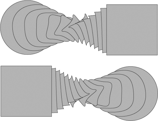
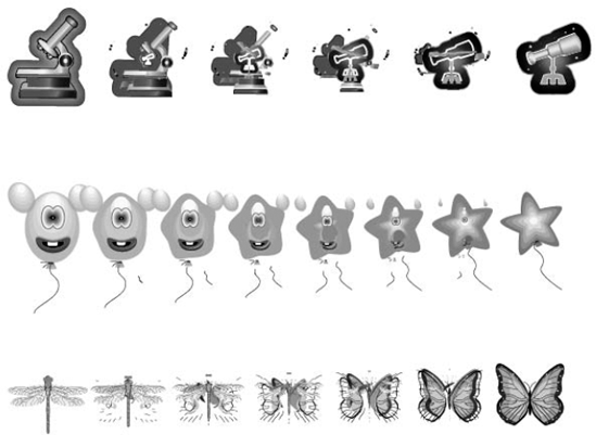
In blending different symbols, the blend may be a bit distorted. Even expanding the symbol won't change the blend outcome. Figure 12.19 shows several sets of blends between different symbols.
Not only can you blend symbols, but you also can take a blend and stuff it in an envelope-like shape with warp effects. Simply select the blend and then choose Effect
Note
For more on warp effects, see Chapter 11.
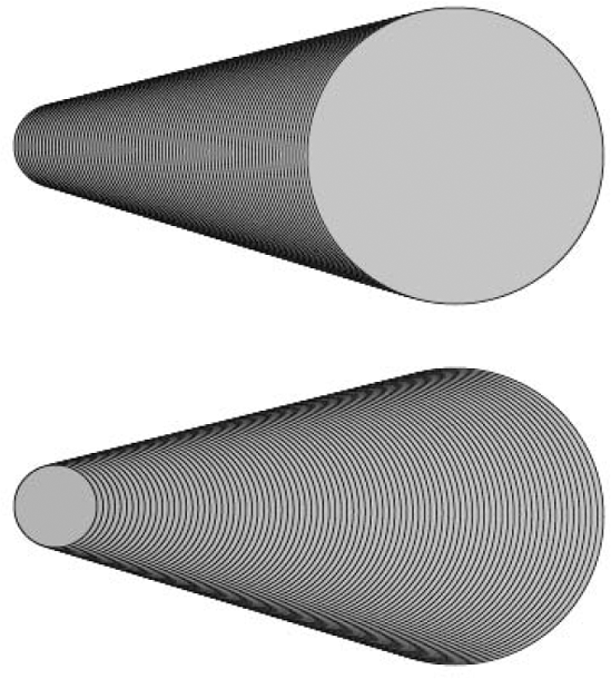
Another great use of blending is to blend 3-D objects. You create a 3-D object, either create another one or duplicate and alter the original, and then press Ctrl+Alt+B (
Note
For more on the Appearance panel, see Chapter 15. For more on using 3-D, see Chapter 16.
Tip
A really cool thing to do with the 3-D stars is to select all objects and the blend and S" then open the Layers panel. Choose Release to Layers (Sequence) from the panel menu. After you do this, choose File
To create a realistic shadow effect, the edges of an object must be a little fuzzy. The amount of fuzziness on the edges of the path is relative to the distance of the object from its shadow and the strength of the light source. These two areas also affect how dark the shadow is.
To make really cool shadows, you can use the drop shadow effect to create soft- or hard-edged shadows, which are usually good for quickly creating text shadows.
A second way to create smooth shadows is to use stroke blends. Stroke blends can allow the shadows to fade smoothly into the background with a Gaussian blur-like effect. Follow these steps to create this effect:
Copy the object/path and then paste it behind the original object by choosing Edit
Fill the shadowed path with the color you want the shadow to be and then make the stroke the same color, with a 0.5-point stroke weight. In this case, if your text is black, you might want to use gray.
Copy the shadow and then choose Edit
Now blend these two paths. Blending is easy using the Object

Glows are very similar to soft-edged shadows, but instead of a dark area fading into the background, a lighter area fades into the background. You can create a glow by using the Glow effect or maintain much more control over the glow by using stroke blending.
Follow these steps to create a stroke-blended glow behind an object:
Draw an object around which you want to create a glow. In this example, the Ellipse tool is used to draw a circle with a red fill.
Change the stroke to 6% Magenta, 60% Yellow, and 100% Black, and make the stroke about 40 points wide. You can make the stroke wider if you want the glow to spread over a larger area.
Select the object and then choose Edit
Choose Edit
Give the copied object a stroke of 6% Magenta and 62% Yellow and a weight of 1 point.
Select both objects by choosing Select
Blend the two edge paths together to create the glow behind the object.
Draw a Black rectangle around the outside edge of the object and then send it to the back by choosing Object
Note
When creating glows, make the initial glow area (around the edge of the object) lighter than the object's edges if there are bright highlights in the object. Make the initial glow darker than the edges if the edges of the object are the brightest part of the object.
You can soften edges of objects in a manner very similar to that of creating shadows. The reason you soften edges is to remove the hard, computer-like edges from objects in your illustration. You can soften edges to an extreme measure so that the object appears out of focus or you can soften just a tiny bit for an almost imperceptible change.
When determining how much of a distance you want to soften, look at the whole illustration, not just that one piece. Usually, the softening area is no more than 1 or 2 points (unless you're blurring the object).
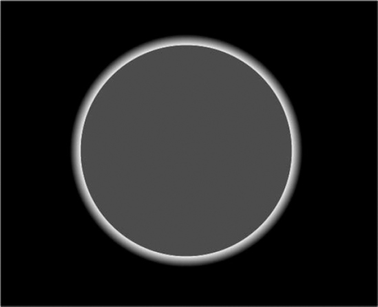
Figure 12.23. A glow added behind this object makes it look like a sun shining in the blackness of space.
To soften edges on an object, follow these general steps:
Draw the object you want to soften.
Choose Edit
Change the stroke to the color of the background and the weight to twice the width you want for the softening edge. An amount of 3 or 4 points produces a good result in most cases.
Choose Edit
Click the object to ensure the front object is selected.
Make the stroke on the object 0.25 points, and use the same color as the fill.
Choose Object
Choose Edit
Click outside the objects to deselect them. Figure 12.24 shows an example of how a softened edge looks when zoomed in to 800%.

To blur an object, just make the bottom layer stroke extremely wide (12 to 20 points or more, depending on the size of the illustration) and then blend as described in the preceding instructions.
To create neon effects with stroke blends, you need to create two distinct parts. Part one is the neon tubing, which by itself is neat, but it doesn't really have a neon effect. The second part is the tubing's reflection off the background, which usually appears as a glowing area. These two separate blends give the illusion of lit neon.
Note
Neon effects work much better when the background is very dark, although some interesting effects can be achieved with light backgrounds.
Basically, creating a neon effect simply requires that you make two copies of the blended object. The copy in front requires a blend where the top object has a smaller stroke weight and a brighter color to emulate the glow of a neon tube. The copy in the rear uses a wider stroke that blends to the darker color of the background. Figure 12.25 shows an example of the neon effect.
Tip
Try crossing paths with neon, or for an even more realistic look, create unlit portions of neon by using darker shading with no reflective glow.
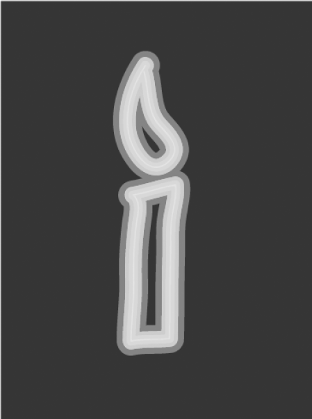
Figure 12.25. A neon candle is a good example of how you can use two blends to create an interesting effect.
Another interesting effect that you can create that's similar to the neon effect is a backlighting effect. You can accomplish backlighting effects by creating a glow for an object and then placing that same object on top of the glow. By making the topmost object filled with black or another dark color, a backlit effect is produced.
Compound paths are one of the least understood areas of Illustrator, but after you understand a few simple guidelines and rules, manipulating and using them correctly is easy.
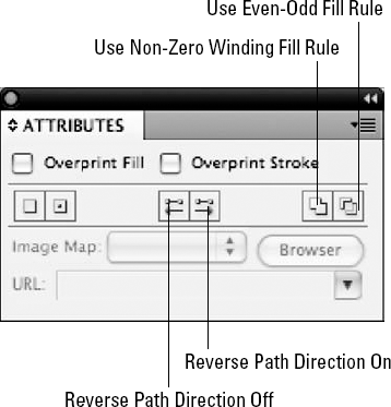
Compound paths are paths made of two or more open or closed paths. Where the paths cross with fills is a transparent hole. You can specify which paths create the holes by changing the direction of the paths by selecting them with the Direct Selection tool and then choosing the reverse path direction option in the Attributes panel. The general rule is that paths traveling in the opposite direction of any adjoining paths form holes.
You can create compound paths of all sorts by using the following steps. Ensure that none of the paths are currently compound paths or grouped paths before creating a new compound path and then follow these steps:
Create all the paths that you need for the compound path, including the outside path and the holes.
Select all the paths and then choose Object
Place the compound path over any other object. I used a placed EPS image for this example. The inner paths act as holes that allow you to see the object underneath. Figure 12.26 shows a before and after example of creating a compound path.
You can select individual paths by clicking them once with the Group Selection tool. As always, you can select points and segments within each path by using the Direct Selection tool. Clicking only once with the Group Selection tool on paths that you want to select is important. Clicking those paths more than once with the Group Selection tool selects all the other paths in the compound path. To click (for moving or copying purposes) the selected individual paths after the Group Selection tool has clicked them once, click them with the Direct Selection tool.
Note
Paths belonging to different groups can't be made into a compound path unless all paths in all the groups are selected.
Here are some things you need to understand about compound paths:
When you create a compound path, it takes on the paint style attributes of the bottommost path of all the paths that were selected and have become part of that compound path.
You can create a compound path that's only one path, although there are few reasons to do so.
If the singular compound path is selected as part of a larger compound path (with either the Direct Selection tool or the Group Selection tool), the path directions may be altered.
If you aren't sure whether an individual path is a compound path, choose the Release option from the Object
Compound paths don't work in a hierarchical process as groups do. If a path is part of a compound path, it's part of that compound path only. If a compound path becomes part of another compound path, the paths in the original compound path are compounded only with the new compound path.

When you want to release a compound path, select the path and then choose Object
If any of the paths appear as holes, they're instead filled with the fill of the rest of the compound path. The results may be a little confusing because these holes then seem to blend right in to the outer shape of the compound paths.
If the compound path that you're releasing contains other compound paths, they're also released because Illustrator doesn't recognize compound paths that are within other compound paths.
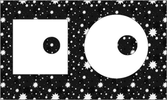
Holes for donuts, Life Savers, and rings are quite simple to create. Just select two circles, one smaller than and totally within a larger circle, and then choose Compound Path
A compound path considers every path within it to lie along the borders of the compound path. Path edges within an object appear to you to be on the inside of an object, but they appear to Illustrator to be just another edge of the path.
With this concept in mind, you can create a compound path that has several holes, such as a slice of Swiss cheese or a snowflake. Just create the outermost paths and the paths that you want to make holes, select all the paths, and then choose Object
Tip
You aren't limited to one set of holes. You can create a compound path with a hole that has an object inside it with a hole. In that hole can be an object with a hole, etc.
Holes, if they really are paths that are supposed to be empty areas of an object, shouldn't overlap. If anything, you can combine multiple holes that are overlapping into one larger hole, possibly by using Unite in the Pathfinder panel (accessed via Window
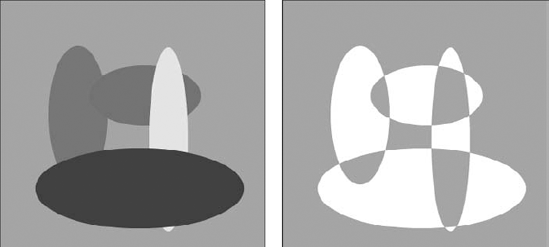
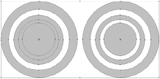
If holes within a compound path do overlap, the result is a solid area with the same fill color as the rest of the object. If multiple holes overlap, the results can be quite unusual, as shown in Figure 12.27. (A section later in this chapter discusses reversing path directions.)
Note
In most cases, you get the desired results with holes only if the outermost path contains all the holes. As a rule, Illustrator uses the topmost objects to poke holes out of the bottommost objects. If you want holes to overlap, ensure that the holes are above the outside border.
Compound paths are very flexible. You can choose two sets of paths, each with an outline and a hole, and make them into one compound path. This technique is especially useful for making masks, but you also can use it to alleviate the repetition of creating several compound paths and selecting one of them at a time.
For example, if you have two shapes, a square and a circle, and want a round hole in each of them, you draw two smaller circles and put them into place. After you position the two shapes in the correct locations, you select them and the round paths inside each of them and then you choose Object
To move separate objects that are part of the same compound path, select each object with the Group Selection tool, which selects an entire path at a time, and then move them. Remember that after they're selected, you should use the Direct Selection tool to move the selected portions of a compound path.
You've been using compound paths as long as you've been using computer PostScript typefaces. All PostScript typefaces are made of characters that are compound paths. Letters that have holes, such as uppercase B, D, and P and lowercase a, b, and d, benefit from being compound paths. When you place them in front of other objects, you can see through the empty areas to objects behind them that are visible in those holes.
Each character in a PostScript typeface is a compound path. When you convert characters to editable outlines in Illustrator, each character is still a compound path. If you release the compound paths, the characters with empty areas appear to fill with the same color as the rest of the character, as shown in Figure 12.29, because the holes are no longer knocked out of the letters.
Note
Many times, type is used as a mask, but all the letters used in the mask need to be one compound path. Simply select all the letters and then choose Object
Any letters that overlap in a word that you make into a compound path can change path directions and thus affect the emptiness of some paths. If letters have to overlap, use the Pathfinder Unite feature on them first, select all the letters, and then choose Object

Each path in Illustrator has a direction. For paths that you draw with the Pen or Pencil tool, the direction of the path is the direction in which you draw the path. When Illustrator creates an ellipse or a rectangle, the direction of the path is clockwise.
If you're curious about which way a path travels, click any spot of the path with the Scissors tool and then choose Effect
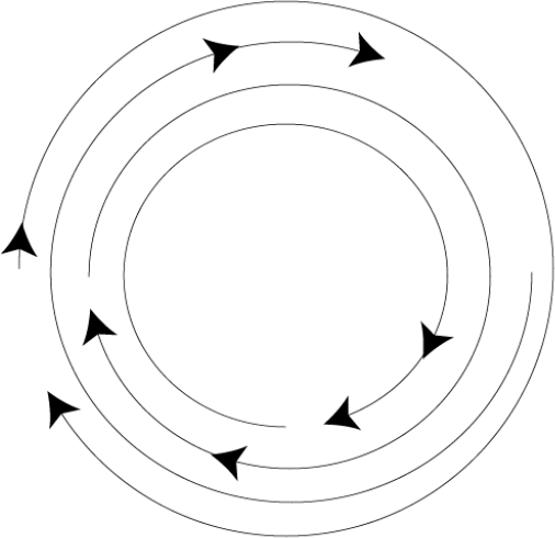
Paths have directions for one purpose (one purpose that you need to know about anyway) and that's to determine what the solid areas of a compound path and the empty areas become. The individual paths in a compound path that create holes from solid paths go in opposite directions.
If two smaller circles are inside a larger circle, they still punch holes in the larger circle because both of them are traveling in the same direction. But what happens when the two inside circles overlap? The area where they overlap is inside the empty area, but both holes go in the same direction. The intersection of the two holes is solid because of the winding path rule (see the next section for an explanation of winding).
Understanding the Winding Numbers Rule is helpful when you're dealing with compound paths. The Winding Numbers Rule counts surrounded areas, starting with 0 (outside the outermost edge) and working inward. Any area with an odd number is filled, and any area with an even number (such as 0, the outside of the path) is empty, or a hole.
You can apply this rule to most compound paths — although taking the time to diagram the paths you've drawn and place little numbers in them to figure out what is going to be filled and what isn't is usually more time-consuming than doing it wrong, undoing it, and doing it right.
To change the direction of a path, select just the path using the Group Selection tool and then choose Window
When you convert a path into a compound path, its direction may change. One element that's consistent when dealing with path directions is that holes must travel in the opposite direction from the outside path. As a result, if the Reverse Path Direction button is on for the holes, it's not on for the outside path. That's the normal scenario when you create compound paths with holes. You can, if you desire, click Reverse Path Direction On for the outside path and Reverse Path Direction Off for the inside path. The resulting image has the same holes as produced by the reversing of the path. Figure 12.32 shows a compound path and its path directions before and after some of the paths were reversed.
At times, using a compound path just doesn't work. You may need to cheat a little. Except in the most extreme circumstances, you can fake compound paths, but you need to make quite an effort.
If the background is part of a gradient, select the hole and the object that's painted with the gradient, apply the gradient, and then use the Gradient tool to make the gradient spread across both objects in exactly the same way. This trick can fool even the experts.
Tip
One way to fake a compound path is by selecting the background, making a copy of it, making the hole a mask of the background area, and then grouping the mask to the copy of the background.
In Illustrator, you use clipping masks to mask out parts of underlying objects that you don't want to see. The path that you draw in Illustrator defines the shape of the mask. Anything outside the mask is hidden from view in Preview mode and doesn't print.
Clipping masks are objects that mask out everything but the paths made up by the mask, as shown in Figure 12.33. Clipping masks can be open, closed, or compound paths. The masking object is the object whose paths make up the mask, and this object must be in front of all the objects that are being masked.
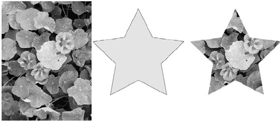
You can make clipping masks from any path, including compound paths and text. You can use masks to view portions of multiple objects, individual objects, and placed images.
To create a mask, the masking object (the path that's in the shape of the mask) has to be in front of the objects that you want it to mask. You select the masking object and the objects that you want to mask. Then, you choose Object
Tip
Masks are much easier to use and understand in Preview mode than in Outline mode. For more on these modes, see Chapter 2.
If you want to mask an object that isn't currently being masked, select the new object and all the objects in the mask, including the masking object. Then, choose Object
Like compound paths, masking doesn't work in hierarchical levels. Each time you add an object to a mask, the old mask that didn't have that object is released, and a new mask is made that contains all the original mask objects as well as the new object. Releasing a mask affects every object in the mask, as discussed later in this chapter.

There are two ways to mask raster images. You accomplish the first method in Photoshop by creating a clipping path and then saving it as an EPS image. For the second method, you use a clipping mask in Illustrator.
Each method has its strengths and weaknesses. The best solution is a combination of both methods. The main advantage to creating a clipping path in Photoshop is that you can adjust the path while viewing the image clearly at 16:1. (Viewing an image at 1600% in Illustrator displays chunky, unrecognizable blocks of color.) In this manner, you can precisely position the path over the correct pixels so that the right pixels are selected for masking. A disadvantage to using a clipping path is that compound paths in Photoshop adhere to one of two different fill rules, which control the way holes appear for differing path directions. Illustrator is much more flexible in this respect because you're able to change the path direction of each individual path with the Reverse Path Direction option in the Attributes panel.
You can mask objects that are masking other objects. Just ensure that you select all the objects in each mask and that, as with other objects, they're behind the path that you want to use for a masking object.
Note
You can apply a stroke or fill to a masking object. A fill and stroke of None replace any paint style attributes that you applied to the object prior to transforming it into a mask. But if you select the object after it's a mask, you can apply a stroke or fill to that mask. If you release the mask, the path that was the masking object continues to have a fill and stroke of None.
To release a mask, first select the masking object (you can also select other objects). Then, choose Object
If you aren't sure which object is the masking object or if you're having trouble selecting the masking object, choose Select
To release all the masks in the document, even those masks that are being masked by other masks, choose Select All (Edit
As a rule, PostScript printers don't care too much for masks. They care even less for masks that mask other masks. And they really don't like masks that are compound paths.
Unfortunately, because of the way that Illustrator works, every part of every object in a mask is sent to the printer, even if you only use a tiny piece of an object. In addition, controlling where the masking object slices objects requires a great deal of computing power and memory. You can have a problem, for example, when you have more stuff to mask than the printer can handle.
More important than any other issue involved with masks and printing is the length and complexity of the masking path.
The more objects in a mask, the more complex it is. More anchor points and direction points coming off those anchor points add more complexity to the document. In other words, your printer enjoys a mask only if the masking object is a rectangle and you're not masking other objects.
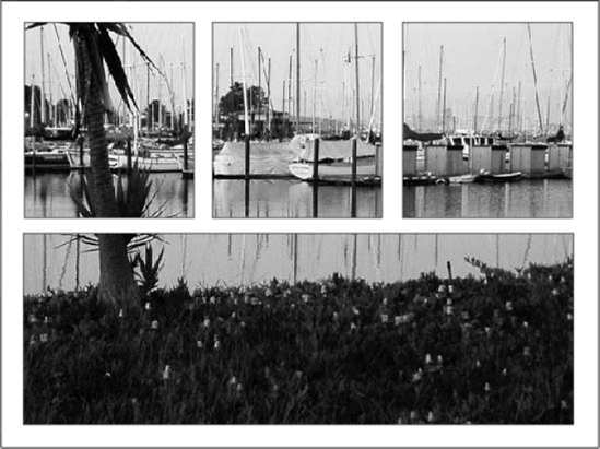
Creating masks from compound paths is especially useful when you're working with text and want several separate letters to mask a placed EPS image or a series of pictures that you created in Illustrator.
The reason that you need to transform separate objects into compound paths is that a masking object can be only one path. The topmost object of the selected objects becomes the masking object, and the others become objects within the mask. Creating a compound path from several paths makes the masking feature treat all the objects as one path and makes a masking object out of the entire compound path.
You can use compound paths for masking when you're working with objects that need to have holes as well as when you're working with text and other separate objects. Figure 12.35 was created by making one compound path from all the parts of the window frame and using that compound path as a mask.
Path blends, compound paths, and masks allow you to create some really fancy effects in your Illustrator documents. In this chapter, you learned the following important information about these topics:
Using blends rather than gradients can produce some pretty cool and realistic results.
With Blend options, you can change the blend to steps, distance, or smooth color.
You can blend from 3-D objects to symbols and use different objects.
Compound paths are one or more paths that Illustrator treats as a single path.
Compound paths give you the ability to put holes in your paths.
Changing the direction of a path via the Attributes panel can change the holes in the compound path.
Each character of type converted to outlines consists of a compound path.
Masks are paths that overlay other Illustrator objects, showing the objects only through the masking path.
When using text outlines as a mask, ensure that all the paths making up the text outlines are joined into a single compound path.