IN THIS CHAPTER
Using the default patterns
Creating your own patterns
Understanding how transparency works with patterns
Modifying existing patterns
Putting patterns and gradients into patterns
Transforming patterns
No Illustrator book would be complete without discussing the how-tos of creating creative strokes, patterns, and textures with the Scribble effect. Sure, you can create these by simply drawing them, but Illustrator makes their creation a breeze. Illustrator allows you to create a pattern as well as save it for future use.
We all have the desire to add some texture to make flat images pop up. The Scribble effect lets you add some sketchy or computery effects to an otherwise boring illustration, giving the drawing a loose, free, quality look.
In Chapter 4, I discuss how to apply strokes to paths, and in Chapter 5, I discuss all the attributes of a stroke and how to apply them to objects. In this chapter, you learn how to use strokes to create something spectacular.
The ability to stroke a path in Illustrator is greatly underrated. Strokes can do more than just outline shapes and vary thickness and patterns. You can enhance illustrations with a combination of strokes, including easily creating a filmstrip or a railroad track with some stroke attribute changes.
The first part of this section explains some of the greatest mysteries and unlocks some of the deepest secrets that surround strokes. If that sounds at all boring, take a look at the figures in this chapter. I created most of them by using strokes, not filled paths.
You create most effects with strokes by overlaying several strokes on top of each other. By using the Appearance panel's popup menu to add a new stroke, you place an exact duplicate of the original path on top of itself.
Changing the weight and color of the top stroke gives the appearance of a path that's a designer, or custom, stroke. You can add strokes on top of or under the original stroke to make the pattern more complex or to add more colors or shapes.
Strokes act and work differently than fills. Remember these basic rules when using strokes:
Even distribution: The most important thing to remember when using strokes is that you should evenly distribute stroke-weight width on both sides of a path. In other words, for a stroke with a 6-point weight, each side of the stroke's path should have 3 points of weight.
Using patterns in strokes: You can place patterns in strokes, and you can see the pattern on the stroke.
No gradients allowed: Due to PostScript limitations, you can't use gradients to color strokes. The workaround for this is to choose Effect

Consistent stroke weight: Stroke weight never varies on the same path.
No stroke weight: A stroke with a color of None has no stroke weight.
Strokes and Pathfinder functions: Strokes are, for the most part, ignored when combining, splitting, or modifying paths with the Pathfinder functions. Strokes are never considered when the Pathfinder functions search for the locations of the paths.
Note
For more on gradients, see Chapter 7. For more on stroke weights as they relate to paths and objects, see Chapters 4 and 5. For more on the Pathfinder functions, see Chapter 6.
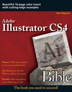
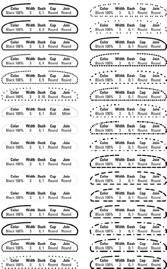
The stroke charts in Figures 10.1 through 10.3 show how some of the basic stroke-dash patterns look with various options chosen, at different weights, and in different combinations. The great advantage of these charts is that you can find a style similar to the one you want and then modify it to suit your situation. The charts should help you determine when to use certain types of stroke patterns because some patterns work better than others with curves and corners. All the paths in the charts were taken from an original shape that included a straight segment, a corner, and a curve.
The first chart, shown in Figure 10.1, consists of thirty-two 3-point stroke paths that have a variety of dash patterns and end and join attributes. The second chart, shown in Figure 10.2, shows eighteen 10-point stroke paths with similar attributes. These charts show stroke effects with only one path. The area in the middle of each path in the charts describes the path.
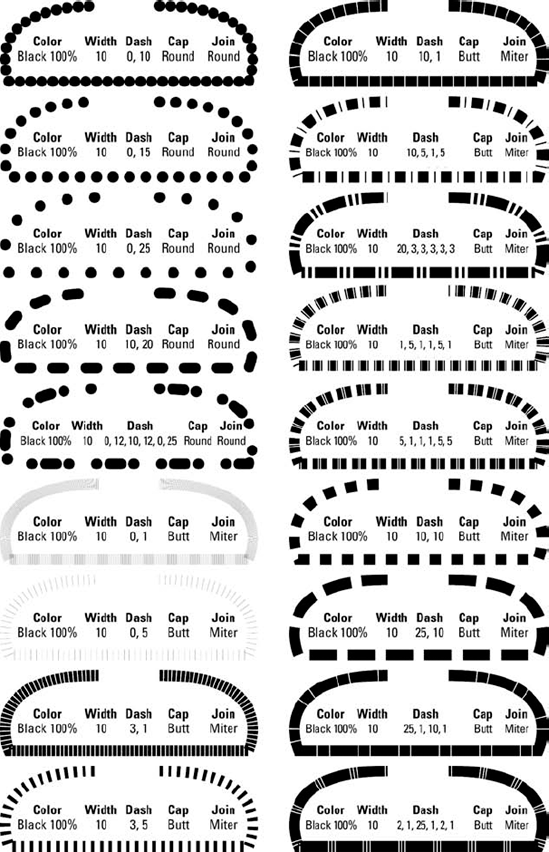
The third chart, shown in Figure 10.3, contains paths that have been copied on top of the original by using the Appearance panel. To copy the path this way, select the path and then choose Add New Stroke from the Appearance panel's popup menu. The paths are listed in the order that they were created. The first path is described at the bottom of the list. The first path is duplicated in the Appearance panel by choosing Add New Stroke from the popup menu and then given the paint style attributes of the item in the list. In the case of blended paths (the fourth one down in the first row of Figure 10.3), you need to copy the original line and then choose Edit
Tip
To create some really great effects, such as a pearl necklace, you need to blend the cVsaUä paths. You can blend paths from one to another. Simply select the paths and then choose Object
Note
For more on blends, see Chapter 12.
When you create a stroke pattern, the original path is frequently selected in the Appearance panel and then copied on top of the original by using the Appearance panel's popup menu (select the path and then choose Add New Stroke) several times.
Do you need to create a railroad track or a racetrack quickly? Creating the curvy parallel lines to make your illustration realistic is easier than you think. The following steps describe how to create a specialty stroke that looks like parallel strokes:
Use the Pen tool to draw a short curved line similar to the line at the top in Figure 10.4. The example uses a fill of None and a stroke-path weight that's 42-point Black (use the Stroke panel to set the size of the stroke).
In the Appearance panel's popup menu, choose Add New Stroke. You access the popup menu by clicking the triangle in the upper-right corner of the Appearance panel. The new stroke appears just above the existing stroke in the Appearance panel.
Change the stroke weight of the new stroke to 30-point White. Make certain that the new stroke is selected in the Appearance panel before making these changes. This overlays the new, narrower white stroke on top of the wider black stroke.
Choose Add New Stroke from the Appearance panel's popup menu.
Change the stroke weight of the new stroke to 18-point Black.
Again, choose Add New Stroke from the Appearance panel's popup menu.
Change the stroke weight of the new stroke to 6-point White. In the final product, shown in Figure 10.4, the 30-point stroke is 12 points more than the 18 points of the black stroke — or 6 points on each side. The 42-point stroke is 12 points more than the white 30-point stroke.
Warning
The order in which the overlapping strokes appear in the Appearance panel is very important. The widest stroke must be at the bottom of the list, the next widest just above that, etc. If you don't have the strokes in the proper order, narrower strokes that are below wider strokes will not be visible (unless you change the opacity of the thicker strokes). If necessary, you can drag the strokes in the Appearance panel to rearrange them into the correct order.
This example is just the tip of the iceberg in creating custom strokes. Not only can you have paths that overlap, but you also can give the stroke on each path different dash patterns, joins, and caps. You can even add fills to certain paths to make the stroke different on both sides of the path. And if all that isn't enough, you can use Outline Path to outline strokes.
Tip
When you create parallel strokes, determine how thick each of the visible strokes should be, multiply that number by the black and white visible strokes that you want for the base stroke, and work up from there. For example, if you want 10-point strokes and there are four white strokes and five black strokes, make the first stroke 90-point Black. Then, make the next strokes 70-point White, 50-point Black, 30-point White, and 10-point Black.
Knowing the secrets doesn't let you in on the really good stuff though. Read on to learn how to apply these techniques to achieve truly amazing effects with strokes.

Figure 10.4. The original 42-point stroke at the top and the final parallel stroke that results from overlaying new, smaller, contrasting strokes over existing ones
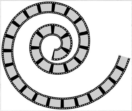
Creating a Filmstrip Stroke
The stroke examples shown earlier in this chapter can help you find a specific style, which you can then modify for your situation. As an example, the second stroke from the top in the right column in Figure 10.3 is a stroke that looks like filmstrip. The following steps describe how to create this filmstrip stroke, which is a basic stroke that produces a stunning effect.
Draw a wavy path with the Pen tool. For more on using the Pen tool, see Chapter 4.
Change the stroke of the path to 18-point Black and the fill to None.
Choose Add New Stroke from the Appearance panel's popup menu. Change the new stroke to 16-point White and then use a dash pattern of Dash 1, Gap 2.
Choose Add New Stroke from the Appearance panel's popup menu again. Change the new stroke to 14-point Black.
Choose Add New Stroke from the Appearance panel's popup menu once more. Change the new stroke to 50% Black, 12 points, with a dash pattern of Dash 20, Gap 10.
The figure that follows shows the final filmstrip, and the Appearance panel displays the list of strokes. You can use this procedure to create any of the strokes in Figure 10.3 or substitute the values that are listed in the chart to create custom strokes.
Creating cinematic celluloid
Several effects that you can create with paths have a traveling theme, mainly because a path starts somewhere and finishes somewhere else. Railroad tracks, roads, highways, trails, and rivers all have a tendency to neatly conform to stroke effects with paths.
One of the trickiest traveling paths to create is a railroad track. The practical point of creating this railroad track is to illustrate how to change a stroke into a gradient. As mentioned at the beginning of this chapter, you can do this only if you convert your stroke into an outline. Then, you can fill it with the gradient of your choosing. To get the real railroad track look, some innovative thinking is necessary, as described in the following steps:
Draw a line with the Pen tool to represent the railroad track. Set the fill to None.
Give the path a desired stroke weight. This example uses a stroke weight of 60 points, as shown in Figure 10.5.
Copy the path by choosing Edit
Choose Edit
Give the inside path a desired stroke weight. The example uses a stroke weight of 40 points, which is the inner section of the train track.
Select both paths by dragging a marquee around them with the Selection tool and then choose Object
Fill the paths with a metallic gradient, as shown in Figure 10.6. For more on applying gradients, see Chapter 7.
Select both paths and then click the Exclude overlapping shape areas button in the Pathfinder panel. This command subtracts the inner section of the track from the two outer sections. Now you have two metal rails, as shown in Figure 10.7.
Choose Edit
Give the new path a stroke weight that you want. This example uses a stroke weight of 80 points. This part becomes the wooden railroad ties that support the rails.
Choose Object
Choose Edit
Give the stroke the same color as the background, give it a weight of 50, and give it a dash pattern of Dash 20, Gap 10. The gaps are the see-through areas, showing the wood-filled path below them. Figure 10.9 shows the final result.

Outline Stroke is often used on this type of stroke design because strokes can't have gradient fills. The reason that the railroad ties were not given a dash pattern before Outline Path was applied is that Outline Path doesn't work with dash patterns.
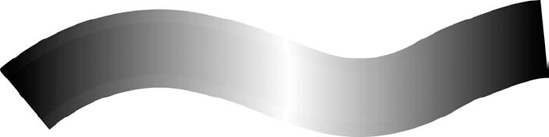
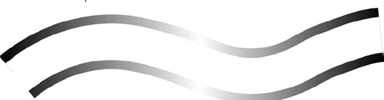
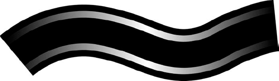
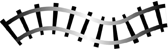
Figure 10.10 shows a stroke design that I discovered a few years back while I was playing with Illustrator. It has the makings of a cute parlor magic trick that you can use to impress your friends. Back when you had to work in Artwork mode — that is, before Illustrator 5.0 — creating designs with strokes was much more difficult. Artists couldn't see what they were drawing on-screen, so they had to envision it in their minds. Editing dashes and weights is almost a pleasure now that you can use the Stroke panel and undo multiple changes.
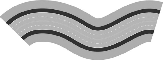
Follow these steps to create a four-lane highway by drawing just one path:
Use the Pen tool to draw a slightly wavy path from the left side of the Artboard to the right.
Change the Path to a fill of None and then create a 400-point stroke in green. This path is the grass next to the highway.
Choose Add New Stroke from the Appearance panel's popup menu. Change the paint style of the stroke to 25% Cyan, 25% Yellow, and 85% Black, with a weight of 240 points. This path creates the shoulders on the highway. Remember to double-click the stroke color picker to display the Color Picker dialog box and to use the Stroke panel to set the stroke width.
Choose Add New Stroke from the Appearance panel's popup menu. Change the paint style to 5% Cyan and 10% Black, with a weight of 165 points. This path creates the white lines at the edges of the shoulders.
Choose Add New Stroke from the Appearance panel's popup menu. Change the paint style to 15% Cyan, 10% Yellow, and 50% Black, with a weight of 160 points. This path is the highway's road surface.
To create the dashed white lines for the lanes, choose Add New Stroke from the Appearance panel's popup menu. Change the paint style to 5% Cyan and 10% Black, with a weight of 85 points, a dash of 20, and a gap of 20.
Choose Add New Stroke from the Appearance panel's popup menu. Change the paint style to 15% Cyan, 10% Yellow, and 50% Black, with a weight of 80 points. Deselect the Dashed line check box. This path is the inner part of the highway's road surface.
To create the two yellow lines, choose Add New Stroke from the Appearance panel's popup menu. Change the paint style to 15% Cyan, 20% Magenta, and 100% Yellow, with a weight of 8 points.
Choose Add New Stroke from the Appearance panel's popup menu. Change the paint style to 15% Cyan, 10% Yellow, and 50% Black, with a weight of 3 points. This path is the piece of highway that divides the yellow lines.
"The Perfect Pattern is one in which you cannot determine the borders of its tiles," according to the Chinese Book of Patterns. If that's true, you can use Illustrator to create perfect patterns.
The Pattern function in Illustrator is twofold. First, you can fill or stroke any path with a pattern. Second, you can edit existing patterns or create new ones from Illustrator objects. The real strength of Illustrator's pattern features is that you can create patterns as well as apply them on-screen in almost any way imaginable.
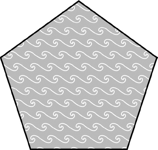
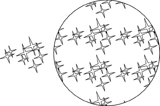
A pattern in Illustrator is a series of objects within a rectangle that's commonly referred to as a pattern tile. When you choose a pattern in the Swatches panel, Illustrator repeats the selected pattern as necessary to fill the object, as shown in Figure 10.11.
Illustrator places the pattern tiles together for you. After you apply a pattern to an object, you can use any of the transformation tools (discussed later in this chapter) to alter it.
Note
Tile patterns can either have a background color or they can be transparent. Transparent patterns can overlay other objects, including objects filled with patterns.
Note
For more on creating objects with fills, see Chapter 5.
A few patterns are available at all times in Illustrator. You can open other libraries from the Swatch Libraries submenu of the Window menu. Under the Swatch Libraries submenu, you have a variety of libraries from which to choose. The last option is Other Library. Through Other Library, you can bring in saved libraries as well as the sample libraries that ship with Illustrator. Figure 10.12 shows one of the sample pattern libraries.
To fill a path with a pattern, select that path, ensure the Fill icon is active, and click the corresponding pattern swatch in the Swatches panel. Illustrator fills the path with the pattern you select.
Although there are a few different default fill patterns, each one can take on a whole new perspective if you use the various transformation functions — move, rotate, scale, reflect, and skew — on them. The default patterns are stored in the Adobe Illustrator Startup file.
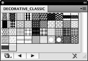
Figure 10.12. The Decorative_Classic pattern library is one of several sample libraries you can use in your Illustrator documents.
Note
For more on the move, rotate, scale, reflect, and skew functions, see Chapter 11.
In addition to using the patterns provided with Illustrator, you can create custom patterns by following these steps:
Create the artwork that you want to appear in the pattern tile. This example uses a bunch of different stars created and arranged in a specific order.
Select the artwork with the Selection tool. For more on the Selection tool, see Chapter 6.
Drag your artwork into the Swatches panel. A swatch with your new pattern appears on the panel.
Select the object first and then choose the new pattern you created in the Swatches panel. This applies the new pattern to your object.
Figure 10.13 also shows the artwork applied as the fill of another shape. Patterns can contain paths, symbols, and text but can't contain masks, gradients, placed images, or other patterns.
Any pattern tile you create can have the color background you specify simply by making a rectangle the size of the tile and placing it behind the objects in the pattern. When you create the pattern on top of the background rectangle, just select the entire background along with the pattern objects to create the pattern.
If you don't create a background rectangle, Illustrator uses the Bounding Box, as shown in Figure 10.14, of the selected objects to determine the size of the pattern tile. The Bounding Box is the smallest rectangle that completely encloses all selected objects and paths.
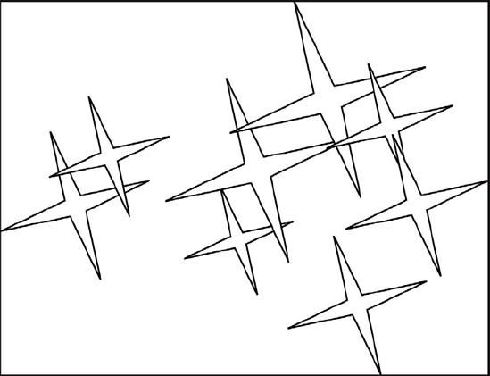
Figure 10.14. The Bounding Box is the smallest rectangle that completely encloses your selected objects and paths.
But what happens if you want the edge of the pattern tile to be somewhere inside the Bounding Box? Illustrator provides a way for you to create a Bounding Box to define pattern tiles that consist of objects that extend beyond the pattern edges. You create a Bounding Box by creating a rectangle with the Rectangle tool, fill it with None, and make it the backmost object in the pattern tile.
Note
For more on drawing rectangles and using fills, see Chapter 5.
To make patterns seamless, you need to remember that objects that lie across the edge of the pattern border are cut into two sections, the outside section of which is invisible. You also need to ensure that lines that stretch from one edge of a pattern border to the other side connect to another line on the opposite edge of the boundary. The second problem is more difficult to deal with than the first one. To make a line match well from one side to the other, you usually have to move one or both of the ends up or down slightly.
For patterns to appear seamless, you can't make the edges of the pattern noticeable. Avoiding this sounds rather easy.
All you have to do is avoid placing any objects that touch the edges of a background rectangle. Well, that technique will do it, but when you use such a pattern, the lack of any objects along the borders of the tile can make the pattern look strange.
You can easily create symmetrical patterns in Illustrator. The key to creating them is to draw the Bounding Box after you create the rest of the objects, drawing outward from the center point of one of the objects.
When you create symmetrical patterns, the main difficulty is judging the space between the objects in the pattern. Objects can seem too close together or too far apart, especially in patterns that have different amounts of horizontal and vertical space between the objects. The solution is to use a square as the pattern tile boundary. This ensures that you have an equal amount of space from the center of one object to the center of the next object, both vertically and horizontally.
Using lines and grids for patterns is ideal because they're so easy to create. The key in both types of patterns is the size of the bounding rectangle. You use a grid to draw accurate floor plans or even for drawing perspective scenes. Line patterns are great for creating fences or any repeating linear paths.
Follow these steps to create a line pattern:
Decide what point size you want for the lines and how far apart you want them.
Draw a rectangle, making the height match the separation you want between the lines. Ensure you draw the rectangle with a fill and stroke of None.
Draw a horizontal line with a fill of None and a stroke of the point size you want from outside the left edge of the rectangle to outside the right edge of the rectangle.
Make a pattern from the two objects. You make a pattern by adding the image to the Swatches panel.
Apply the pattern to the object of your choice. You can apply a pattern by selecting the object and then choosing the pattern from the Swatches panel. The triangle in Figure 10.15 shows the results.
You can also use this technique with vertical lines. Just make the bounding rectangle's width the distance from line to line.
You can use a grid pattern to create graphing paper for a logo. Another good use of grid patterns is for grates or windows because you can use the transformation tools to add perspective. Creating grids is even easier than creating evenly spaced lines:
Create a rectangle that's the size of the grid holes. For example, for a ¼-inch grid, you make the rectangle ¼ inch × ¼ inch. For more on creating rectangles, see Chapter 5.
Apply a stroke to the object. Make the stroke the weight that you want the gridlines to be.
Note
For more on stroke weights and applying strokes, see Chapter 5.
Make that rectangle into a pattern. You make a pattern by adding your object to the Swatches panel. That's it. You now have a pattern grid that's as precise as possible.
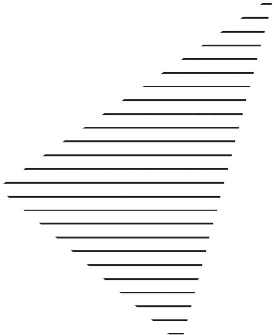
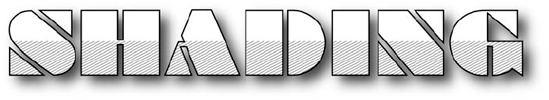
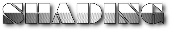
Shading effects, such as hatched lines, are easily created with a diagonal-line and grid pattern. Figure 10.16 shows text shaded using a diagonal-line pattern rotated and scaled to show a shaded effect. You may find creating diagonal-line and grid patterns difficult if you try to make a rectangle; instead, draw a path at an angle and then use the rectangle with the path in it as a pattern. Joining diagonal lines at the edges of the pattern is nearly impossible.
Using this technique is also a great way to avoid making several patterns when you need line patterns that are set at different angles. Just make one horizontal line pattern and rotate the patterns within the paths.
Follow these steps for a better method of creating a shaded effect:
Create a Bounding Box using the Rectangle tool.
Create lines (or grids) in horizontal or vertical alignment that extend beyond the Bounding Box.
Make the lines (or grids) into a pattern. You can do this by dragging the lines (or grids) to the Swatches panel.
Apply the pattern to an object. You do this by selecting the object and then clicking the pattern in the Swatches panel.
Double-click the Rotate tool. The Rotate dialog box opens.
In the Rotate dialog box, type the angle to change the lines, deselect the Objects check box, and click the Patterns check box. The pattern rotates to the desired angle inside the path.
Transparent patterns are great to use over the top of color, or gradients, or even other patterns. Instead of creating a bunch of specific patterns that use other patterns, use the transparent pattern option to layer over the top of other patterns. A great use of this option is to use a gradient and then use a line pattern to add a hatched shading look. To make the background of a pattern transparent, don't use a background rectangle. Only the objects in the pattern will be opaque.
You can use the simple line pattern with a transparent background alone or over another pattern. Figure 10.17 shows the same text from Figure 10.16 but with the transparent pattern over a gradient.
One way to achieve interesting effects is by making a copy of the object behind the original. Follow these steps:
Select the object.
Choose Edit
Choose Edit
Change the fill in the copy of the object to a solid, a gradient, or another pattern.
Use the Opacity slider in the Transparency panel to change the appearance as desired.
After you create patterns and place them within paths, you may find that they're too big or at the wrong angle for the path. Likewise, they may start in an awkward location. You can use the transformation tools and the Move command to resolve these problems.
To transform a pattern inside a path, follow these steps:
Select the path.
Double-click the transformation tool that corresponds to the change that you want to make to the pattern. The transformation tool's dialog box, as shown in Figure 10.18, opens.
In this transformation (Rotate, Scale, etc.) dialog box, deselect the Objects check box. This selects the Patterns check box. The Patterns and Objects check boxes are grayed out if the selected object doesn't contain a pattern.
Any changes that you make in a transformation dialog box when only the Patterns check box is clicked affect only the pattern, not the outside shape.
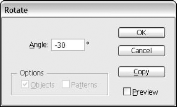
Figure 10.18. The Rotate dialog box (along with the other transformation dialog boxes) lets you transform patterns independently of objects.
Note
For more on transforming objects, see Chapter 11.
To move a pattern within a path, choose Object
Using patterns and strokes creatively makes drawing objects a far easier task. In this chapter, you learned about the following topics:
The most attractive aspect of strokes is that you can use them on top of each another.
The stroke charts provided in this chapter show some of what you can do with strokes.
Use Outline Path to create filled paths from strokes.
Use fills to create half-stroked paths.
Patterns are a type of fill that provides texture to any path.
Illustrator supplies several default patterns. You can transform these patterns in the same ways that you can transform other Illustrator objects.
You can use almost anything you create in Illustrator as a pattern, with the exception of masks, gradients, placed images, and other patterns.
You construct diagonal-line patterns by creating a horizontal-line pattern and rotating it with the Rotate tool when the pattern is filling a path.