
Graphite graphs are very helpful in their default form, even though it simply reflects the data it can access. One of the less obvious features that Graphite offers is data transformation. Graphite has several choices for line and background colors, legend names, and so on. We can calculate moving averages, standard deviations, and logs.
There is a lot of extra functionality available in Graphite, and only exploration will truly unveil much of it. We'll introduce a few basic examples in this recipe.
In this recipe, we will be combining the results of all the previous recipes related to collectd and Graphite. We recommend that you have a functional monitor server configured, as discussed in those recipes.
Follow these instructions to apply several transformations to a simple graph:
- Direct a web browser at the monitor server on port 8080.
- Click on the Graphite and collectd links on the left pane.
- Click on the name of the server to view.
- Continue by clicking on postgresql, Production, and then on derive.
- Select the item corresponding to a busy database or default to TPS-postgres.
- Click on the Graph Options button on the graph composer; then, click on Graph Title.
- Enter
Production TPS Graphas the new graph name. - Click on the Graph Data button on the graph composer.
- Click on the only existing data point.
- Select Apply Function, Calculate, and then Moving Average.
- Enter
60as the number of data points. - Select Apply Function, Special, and then Set Legend Name.
- Enter
TPS - Moving Averageas the new legend name. - Close the Graph Data pane.
To begin creating a graph, we first need data to display. The first few steps simply dictate what elements we should select to drill down to an appropriate level where data points are stored. Once we've selected one, it's time to customize the data.
The graph composer has two buttons that directly interest us: Graph Options and Graph Data. They will look like this:
The Graph Options button groups the items that apply to the entire graph. This is the menu we would use to change the graph's title, its line mode, fonts, colors, and so on. For now, we've kept it simple and changed the graph's name.
The Graph Data button is the more complicated one of the two. It actually launches a submenu, which looks like this:
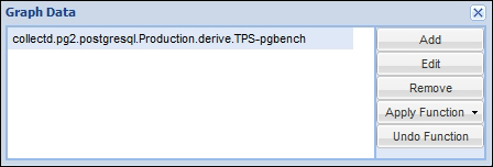
This is where we apply transformations to specific data points or modify the ones that are included in the graph. Of the functions available, we chose to apply a moving average of 60 readings. By default, collectd takes 1 reading every 10 seconds. Thus, 60 readings equates to 10 minutes worth of readings. We now have a 10 minute moving average on our graph instead of the raw data.
However, the full path to the collectd data point is also used as the label in the legend. Even worse, now that we have applied a function to the data, it's included in the label as well. So, our next steps involve changing the label under the Special menu to make it more readable. Once we've changed the legend name, our graph should resemble this:

If we were to save this graph, all of the customizations would be saved as well. This allows others to reuse the graphs that we've prepared, whether for system monitor dashboards or presentations.