Part III
Visual Analytics in Practice
In this part
- Chapter 10: Scorecards and Indicators
- Chapter 11: Timelines
- Chapter 12: Comparison Visuals
- Chapter 13: Slice and Dice: Ad-hoc Analytics
- Chapter 14: Relationship Analysis
- Chapter 15: Embedded Visualizations
- Chapter 16: Other Visualizations
Chapter 10
Scorecards and Indicators
A scorecard can be thought of as the business version of a school report card: it’s a summary of how the business has performed over the last period, shown as numbers for key performance areas (KPAs), which are aggregated from key performance indicators (KPIs). A KPI is loosely similar to the subjects on a school report card, but generally a scorecard’s KPIs have graphical indicators and interactive capabilities (unlike a school report card).
Scorecards have been popularized in recent years through the widespread adoption of Performance Management. Starting in the management consultancy McKinsey & Company in the 1930s, Performance Management as a discipline advocates building a measurable strategy to grow a business and identifying key performance indicators to measure various aspects of the business. Key performance indicators, roll up into key performance areas, and these are put together in a visual way in a scorecard, typically using “robot” indicators of red, yellow, and green to indicate whether targets are being met. On the Microsoft platform, Business Scorecard Manager evolved into PerformancePoint as the tool of choice for displaying these scorecards and other visualizations together in dashboards.
This chapter discusses how these tools can be used both for Performance Management and for business intelligence (BI) in general.
A Quick Understanding: Glance and Go
The main reason for implementing a scorecard system is to enable quick analysis of key metrics—the ability to view a metric (be it a KPI, an operational metric, or indeed any metric in your business) and either move on when values are within predefined bands, or start an investigation when the values are out of band. This definition often sits outside the traditional scorecard and dashboards arena, but is a very important and growing area for these tools.
Some key design features to enable this are vital—the details vary from tool to tool, but the basics are the same:
- A filter area to change the data displayed
- A scorecard area, with drill-down capabilities and indicators, to highlight where investigation is needed
- A further details area—either drill across or drill through
KPIs
KPIs are the heart and soul of scorecards. In its simplest form, a KPI is an actual value, measured against a target, and assigned to a band by the distance from the target. The reality of choosing KPIs for an organization’s strategy is that the process is long, complicated and fraught with difficulties—for instance, measuring customer service representatives by how long they spend on the phone with customers (what appears to be an easy way to drive down costs) can have grave effects.
In this book, it’s assumed that you’ve gotten all of that perfect, and you need to master using the technology.
The other piece of this puzzle is that technologies allow you to do much more than simply assign an actual, a target, and bands to a KPI. For instance, in PerformancePoint you can add both dimension and time filters, and have multiple actuals and targets—for example, actuals of Today, Month-to-Date, Year-to-Date, with targets of This-Day-Last-Year, Last-Month-to-Date, and Last-Year-to-Date. The bands are the range of values that are considered good, acceptable and poor. For instance, 120 percent and above against the previous year would be good, anything above 100 percent of the previous year would be acceptable, and anything lower than the previous year would be poor. In addition, the drilling functionality that comes out of the box adds a lot of depth to the scorecards.
Ease of Development
| Reporting Tool | Predefined Chart Type | Ease of Development |
| Excel | Yes | |
| PerformancePoint | Yes | |
| Power View | Yes | |
| Reporting Services | Yes | |
| Silverlight/HTML5 | N/A |
Drill Down
Drill down is the process of starting analysis at a high level, with aggregated data, and narrowing the focus to show detail data. This is typically done using a list of higher-level dimension items with a drill-down plus sign next to each and inserting the more detailed items between the drilled member and the next member. Lower levels are indented to distinguish them. A minus sign allowing you to drill up is usually included as well. For instance, in a retail environment, the aggregated levels may be states or regions, showing sales figures, and drilling down allows you to view individual stores.
Ease of Development
| Reporting Tool | Predefined Chart Type | Ease of evelopment |
| Excel | Yes | |
| PerformancePoint | Yes | |
| Power View | Yes | |
| Reporting Services | Yes | |
| Silverlight/HTML5 | N/A |
Drill Through
Drill through, although it has a similar function to drill down, is usually implemented as a double-click, or a click on a link, that takes you to a different report or worksheet to get more details about the KPI. Drill through is very often used to go to view the individual transactions that make up the values on a scorecard.
Ease of Development
| Reporting Tool | Predefined Chart Type | Ease of Development |
| Excel | Yes | |
| PerformancePoint | Yes | |
| Power View | No | |
| Reporting Services | Yes | |
| Silverlight/HTML5 | N/A |
Drill Across
Drill across is aimed at obtaining additional information about the dimension member. For example, when viewing the sales figures in a scorecard that has a store drill-down hierarchy, you may want to see the breakdown by product category and include a profit margin.
You accomplish this by linking the scorecard to another item on the same page—a chart or a table of values—and filtering this item by the dimension value that’s been clicked in the scorecard.
Ease of Development
| Reporting Tool | Predefined Chart Type | Ease of Development |
| Excel | No | |
| PerformancePoint | Yes | |
| Power View | Yes | |
| Reporting Services | No | |
| Silverlight/HTML5 | N/A |
Tool Choices, with Examples
Scorecards can be built with all of the Microsoft tools. PerformancePoint is designed around scorecards, but with SQL Server 2008 R2, scorecard functionality was added to Reporting Services. Excel has always been able to build scorecards and indicators, but has had this functionality natively since Excel 2010. In the following sections you learn in detail about the capabilities of each tool.
PerformancePoint
PerformancePoint excels at scorecards, as it is aimed squarely at this segment of BI. A key point, however, is that PerformancePoint works immensely better when combined with Analysis Services or PowerPivot Services—the functionality around analytic charts, hierarchies for drill down in scorecards—which are all based upon having the semantic layer already built.
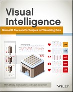
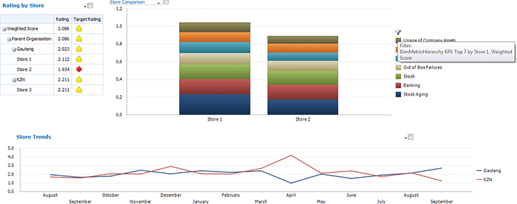
PerformancePoint dashboards can scale from the simplest—a single traffic light visualization (red/yellow/green) used on an operational page, as shown in Figure 10-1—to a completely interactive dashboard that has multiple pages, several filters, a scorecard driving an analytic chart and another scorecard, as shown in Figures 10-2, 10-3, and 10-4.
Figure 10-1: A scorecard showing rollups of store scores
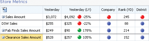
Figure 10-2: The same dashboard but with the righthand scorecard switched for a chart
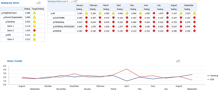
Figure 10-3: Drilling down on an analytic chart
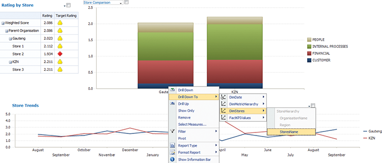
Figure 10-4: Drilling down in an analytic chart
The true power of PerformancePoint is that the connections between these components are completely developer driven—having some filters only affect a selection of components on the page is a great tool to have in your arsenal. Another useful advantage is that the filters remember the selection of each user—allowing them to seamlessly move from page to page and continue analyzing the same selections.
The following is a list of some key design guidelines to work with in PerformancePoint:
- Keep filters along the top of the page.
- Keep a scorecard that controls other components on the left.
- Add additional items on the right side and at the bottom linked to the scorecard.
Figure 10-5 shows an example of these.
Figure 10-5: Key design considerations in PerformancePoint
Excel
Excel in Office 2013 has become a very powerful dashboard tool. Although it has some limitations compared to the power of PerformancePoint in terms of the control over the connections, Excel still has a very simple and intuitive interface.
Excel includes KPIs, with the sole limitation that you must use the built-in icons. PerformancePoint enables you to import your own indicators.
Excel is much more customizable than PerformancePoint when it comes to appearance. You can fairly extensively customize a basic pivot table, as you can see in Figure 10-6. When further customization is required, you can use cube functions, which allow for total control, as you can see in Figure 10-7.
Figure 10-6: A pivot table showing an Income statement, with conditional formatting
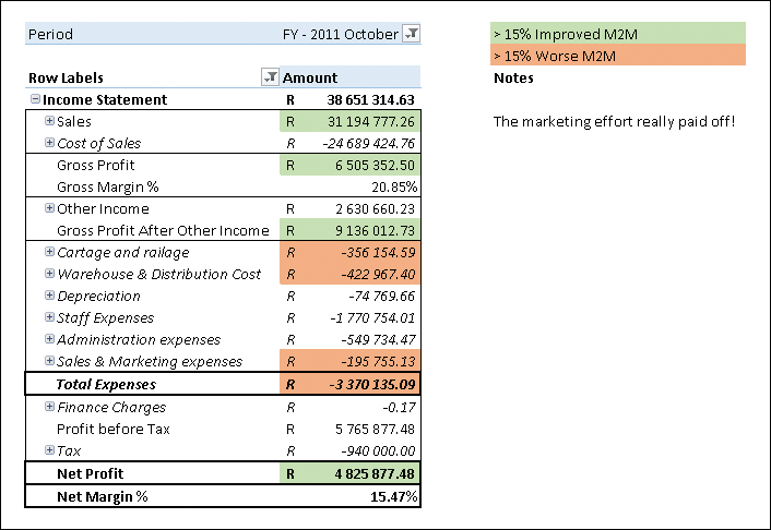
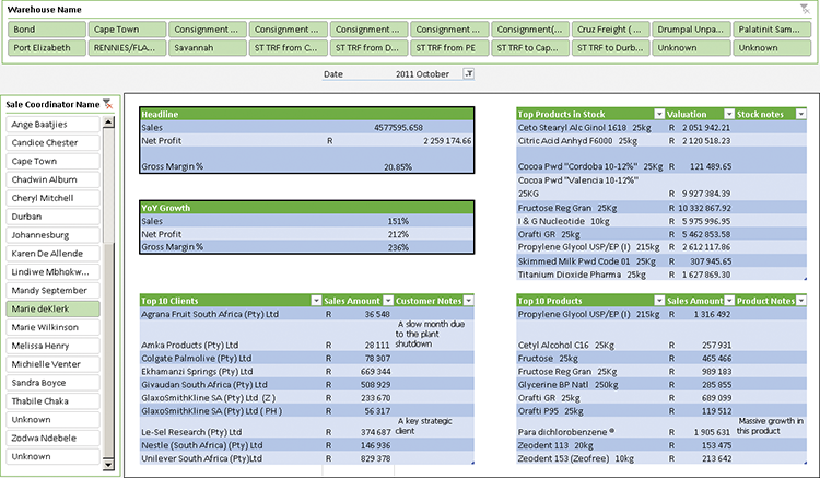
Figure 10-7: An excel sheet customized to include notes fields
The design principles for Excel are a little different, due to the limitation on filters that a standard filter can only be along the top of the screen, and the fact that slicers are inherently larger than the filters. The guidelines are the following:
- Keep filters along the top of the page.
- Keep data on one sheet visible to the user without scrolling when possible.
- Use slicers below the data on the sheet that are linked to all data points.
- Use slicers to the right of the sheet that are only linked to data on that sheet.
Implementation Examples
In this section you learn how to implement a scorecard in Excel (using PowerPivot) and in PerformancePoint. You also learn how to implement indicators in PerformancePoint using your own images in place of the standard ones.
To follow along with the samples, you will need to install the samples, which are available on this book’s web site on Wrox.com. (See Chapter 4 for guidance with installing the database samples.)
Implementing a Scorecard in Excel
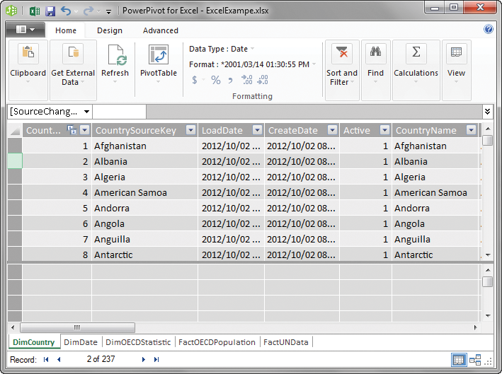
After you have set up a data model for Excel, it is remarkably easy to create something quite good looking in a fairly short amount of time. Luckily, setting up this model is also fairly easy in the latest version of Excel. To do so, open a new Excel workbook, and, on the PowerPivot tab, click the Manage button. (See Chapter 5 for enabling PowerPivot if the tab is not visible). Click the From Database button, choose SQL Server, and enter the location of your SQL Server. Choose the VI_UNData database from the drop-down and click Next. Choose Select from a List of Tables and then select the DimDate, DimCountry, DimOECDStatistic, FactOECDPopulation, and FactUNData tables, and click Finish. Your screen should look like Figure 10-8.
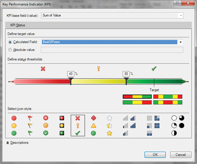
In order to use indicators, you first need to have a target, and you also need to have a calculated measure on both the actual and the target.
Figure 10-8: A PowerPivot data set
For the target, you are going to compare each country against the best of its peers. To do that, you are going to create a Data Analysis Expression (DAX) calculation as a calculated column on FactOECDPopulation. The DAX code to put into the column is:
=CALCULATE(
MAX(FactOECDPopulation[Value])
, FILTER (ALL(FactOECDPopulation), FactOECDPopulation
[DimOECDStatisticID]  = EARLIER(FactOECDPopulation
[DimOECDStatisticID])
)
)
After this, create a SUM rollup on both the new column and on the actual, which you will do by clicking the Sigma (sideways M) symbol on the Ribbon while you have those columns highlighted.
Then click the measure you just created on the actual column, and click Create KPI on the Home tab of the Ribbon. The pop-up box in Figure 10-9 appears. Configure it to use your new measure as a target by selecting your new measure from the drop-down and set the red band to 40%, set yellow from 40% to 80%, and set green above 120%.
Figure 10-9: Setting KPI values in Excel
When you’re done, create a new pivot table. Add the Sum of Value and Status measures to the pivot table, and drag the country column of the DimCountry table from the list of fields to the rows. You need to add a filter and choose a single metric to get a meaningful number. See Figure 10-10 for an example.
Figure 10-10: A pivot table with indicators
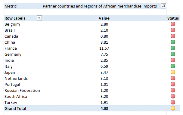
Of course, the ability to accidentally leave off a filter and get meaningless values is quite dangerous. With a slight tweak to your calculated measures, you can fix that up. Change your two measures (Sum of Value and Status) to the following DAX to show a value only when the DimOECDStatistics table has only one value:
Sum of Value:=IF(
HASONEVALUE(DimOECDStatistic[Metric]),
 SUM([Value]),
Blank()
)

BestOfPeers:=IF (HASONEFILTER(DimOECDStatistic[Metric]),
 SUM([MaxOfPeers]),
Blank()
)
PerformancePoint Services (PPS) Scorecard: Traffic Lights
In this section, you are going to create a scorecard using the standard PerformancePoint indicator images for the KPIs. The data source you will be using is from the Organization for Economic Development.
Start by setting up the data connection and mapping the date dimension as described in Chapter 7. You are connecting to the OECD_Data tabular mode cube.
To make the connection, right-click the PerformancePoint content list and choose New > KPI. Select Blank KPI in the screen that follows. You will see a screen like the one shown in Figure 10-11.
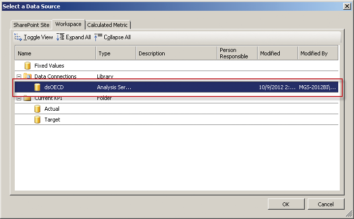
You need to map the KPI metrics to data points because they default to a fixed value. Click 1 (Fixed Values) under Data Mappings on the same line with the title Actual to start editing. In the screen that displays, click Change Source and then double-click the data connection you created. In Figure 10-12, the data connection is called dsOECD.
Figure 10-11: Editing KPIs in Dashboard Designer
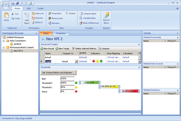
Figure 10-12: The Select a Data Source dialog
Choose MetricValueAvg in the Select a Measure drop-down field, as shown in Figure 10-13, then click OK to close the window. Click the (Default) link underneath Number Format and then choose Number. Click OK.
Figure 10-13: Selecting a data source
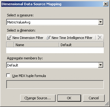
To finish setting up the Actual, click the Default link under Calculation, choose Average of Children, and then click OK.
Now, map the Target metric in exactly the same manner, but use MetricValueMax for the measure and Max of Children for the calculation. Your screen should look like the one shown in Figure 10-14.
Finish by naming your KPI Metric Value and then saving it by right-clicking on the KPI and clicking save.
Figure 10-14: A fully setup indicator

It’s now time to create a scorecard: Right-click the PerformancePoint content list and choose New > Scorecard. Choose a Blank Scorecard from the Standard Scorecards category. Drag the KPI from the Details tab onto the left-hand column labeled Drag KPI Items Here. Click the Update button on the Edit tab of the Ribbon, and the scorecard displays as shown in Figure 10-15.
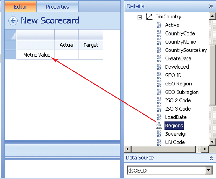
In the example in Figure 10-15, no values show because of the rollup up we chose; as there are no children, and neither average nor max will work. Drag the Regions hierarchy onto the Metric Value KPI so that the tooltip shows Last Child, as shown in Figure 10-16. Release the mouse button.
Right-click the All member select Autoselect Members > Select Children, and then click OK. Click the Update button in the Edit tab to see the result.
The current result showing on the scorecard is meaningless because it is a rollup of all the indicators for all time. You are going to fix this by adding two filters for year and statistic. Begin by renaming the scorecard as Metric Scorecard and then saving it.
Figure 10-15: Adding a metric to a scorecard
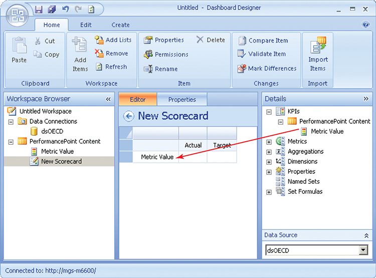
Figure 10-16: Adding a dimension to a scorecard
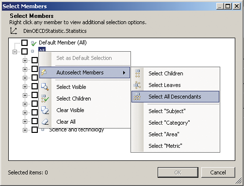
Right-click the PerformancePoint content list and choose New > Filter > Member Selection. Select the dsOECD data connection you created earlier by double-clicking it, and then click Select Dimension on screen that displays. Select the DimOECDStatistic.Statistics dimension hierarchy. Click Select Members right-click All, and then choose Autoselect Members > Select All Descendants, as shown in Figure 10-17.
Figure 10-17: Using auto-select to allow for data changes
Leave the Default member selection blank and click Next. Choose Tree on the next screen. Name the filter Statistic and save it.
Repeat this process for DimDate.Year, using the member selection filter again, but only select the years 2000, 2005, 2008, 2009, 2010, and 2011 (which are the years we have data for). Name the filter Year and save it.
Finish by creating a new dashboard (right-click the PerformancePoint content list and select New > Dashboard). Select 2 Rows and click OK.
Figure 10-18: A basic scorecard with filters

Drag the filters to the top row and then drag the scorecard to the bottom row. Connect them as described in Chapter 7 in the “Filters” section.
Rename your dashboard as OECD Statistics, right-click it, and deploy it to SharePoint. You should have a dashboard similar to the one shown in Figure 10-18. Not all data points have data for all years in this data set, so you may need to work through a few.
MAX( [DimCountry].[Regions].CurrentMember.Parent.Children  ,
[Measures].[MetricValue] )IIF( [Measures].[MetricValue] = NULL, NULL,
MAX( [DimCountry].[Regions].CurrentMember.Parent.Children ,
[Measures].[MetricValue] )
)IIF( [Measures].[MetricValue] = NULL, NULL,
RANK([DimCountry].[Regions].CurrentMember,
ORDER( [DimCountry].[Regions].CurrentMember.Parent.Children ,
[Measures]. [MetricValue] ) )
)Custom Indicators in PerformancePoint
Custom indicators are relatively easy in PerformancePoint. For this example, you are going to use them to create conditional formatting, but you could as easily add your own images.
Working on the workspace created in the previous example, right-click the PerformancePoint content list and choose New > Indicator. Choose Blank Indicator and then click OK. Leave the defaults of Standard and 3 levels, and click Finish.
Figure 10-19: Conditional formatting on an indicator

You change the image by double-clicking the red-lined box, or change the background color by double clicking. For Level 1 (Worst) click background color, choose Red from the standard colors, and then click OK. Set Level 2 as Yellow, and set Level 3 (Best) as Green. Your indicator setup screen should look like Figure 10-19.
Name your indicator ConditionalFormatting and save it. Now, go back to your KPI, click the Target, and click Set Scoring Pattern and Indicator. Leave the defaults as they are and click Next.
Click the Workspace tab and choose the indicator you just created, as shown in Figure 10-20. Click Next and then click Finish.
Figure 10-20: Selecting an indicator
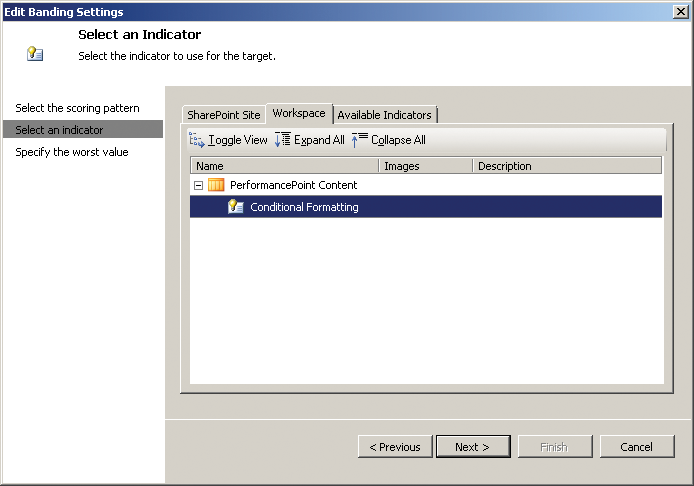
Figure 10-21: Formatting a scorecard
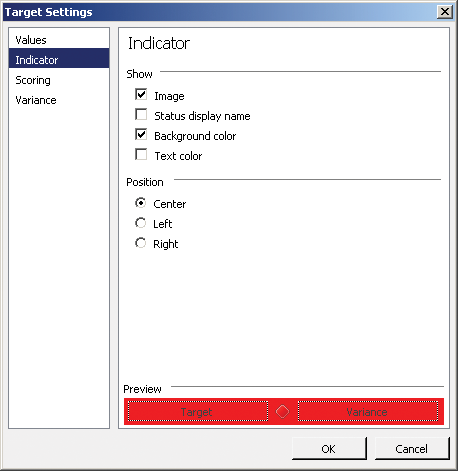
Save your KPI and go to your scorecard. By default the scorecard doesn’t use KPIs’ conditional formatting settings, so right-click any cell below the Target and choose Metric Settings. Click the Indicator tab and select the background color check box, as shown in Figure 10-21.
Click OK to see your scorecard. Notice that most values are red. The empty values are black because you didn’t choose a color.
You are going to hide those values, so right-click again and choose View Settings. Select to the Filter tab select the Filter Empty Rows check box, and then click OK. The rows that are hidden still show on the scorecard in design mode, but they are highlighted in red to show that they will be hidden when the scorecard is deployed on a dashboard. Save your scorecard, go back to your deployed dashboard, and refresh it to see a similar dashboard to the one in Figure 10-22.
Figure 10-22: A scorecard with conditional formatting

Summary
In this chapter you learned the basic principles of using scorecards, and you worked through the practical implementations in both PerformancePoint and Excel. Scorecards are one of the most prevalent forms of business intelligence deployed today, and knowing how to build them is an essential part of your toolbox.