Chapter 16
Other Visualizations
Throughout this book you have learned about visualizations that you can implement using the Microsoft stack, and how to implement them. In this chapter you learn about other visualizations—many of these are not data-driven; instead, they are often drawn by artists or handcrafted by other professionals.
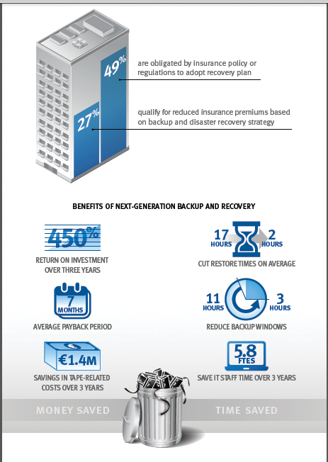
Figure 16-1: An infographic promoting next generation backup and recovery
Traditional Infographics
As discussed at length in Chapter 1, data driven visualizations and infographics are very different in function, and they are often different in form as well. An infographic is typically static—in other words, if the data changes, the infographic doesn’t update. Many infographics are simply images rather than being interactive.
An infographic is often used to tell a single story, with imagery chosen to fit that story. It might have numeric values attached to the images. An example infographic is shown in Figure 16-1.
Periodic Tables
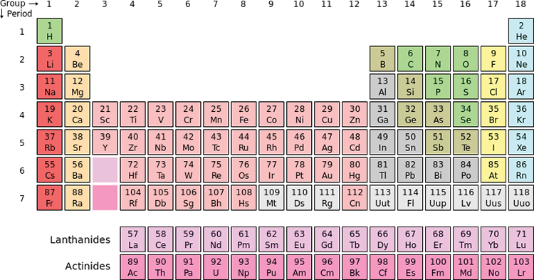
Mendelev’s periodic table of the elements was a revolution in understanding of the elements—not just as a visualization, but also because he used the atomic weight—that is, how many protons were in the atom—as the underpinning, and isotypes are simply versions of the same element. The effect of the way Mendelev laid out the table cannot be overstated. As shown in Figure 16-2, being able to read the group (for example, beryllium and magnesium both in Group 2) across, and the periods (such as hydrogen and helium being the only two members of Period 1) down was of enormous value.
Figure 16-2: The periodic table of elements
Other forms of this periodic table have been used to illustrate other subject areas. The periodic table of fonts in Figure 16-3 is a stellar example. This visualization (including the option to purchase a print) is available here: www.squidspot.com/Periodic_Table_of_Typefaces.html.
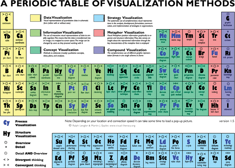
Perhaps the most intriguing of the periodic table of elements visualizations is the one at www.visual-literacy.org/periodic_table/periodic_table.html, which is a periodic table of visualizations. This is shown in Figure 16-4.
Figure 16-3: A periodic table of fonts

Figure 16-4: The periodic table of visualizations
Swim Lanes
Swim lanes, also called cross-functional flow charts in Microsoft Visio, are most often used to show process flows across different areas (see Figure 16-5). This flow shows a typical ETL (Extract, Transform, Load) process loading data from one system into a warehouse, and the data subsequently being used by the business information (BI) system.
Figure 16-5: A swim lane illustrating different ETL processes

Transportation Maps
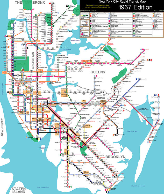
When trains and subways were first put into service, maps of their routes followed the same conventions as traditional maps. Shown to scale, there was often an enormous amount of wasted space on the map, as well as overlapping text when stations were close together. With the launch of the New York subway, which had more stations than ever before, something new was needed, and this was the novel concept of showing each station evenly spaced. That concept, along with color-coding the lines and removing the background graphics, made this map revolutionary in visualizations of travel routes. Figure 16-6 shows the original New York subway map. (You can obtain other New York subways maps through history at http://nycsubway.org/wiki/Historical_Maps.) Figure 16-7 shows a newer version of the subway map.
Figure 16-6: The original NYC subway map
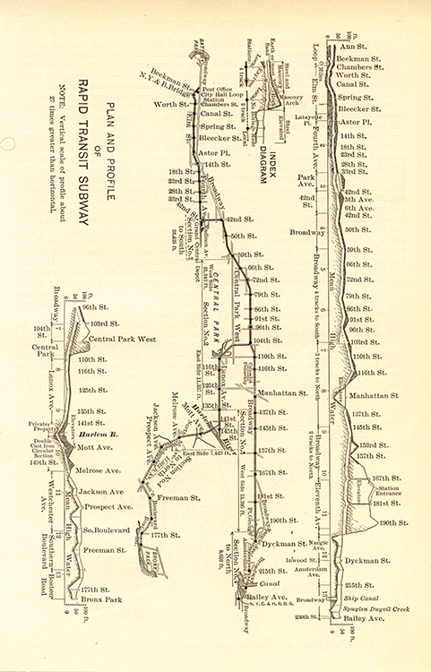
Figure 16-7: A newer NYC subway map
Mind Maps
Mind maps are a little outside the traditional visualization arena, but are very useful for brainstorming and framing your thoughts around a plan. A book’s contents are easily planned in a mind map, and this book’s original Table of Contents is shown as a mind map in Figure 16-8. You’ll note that the book has evolved over time!
Figure 16-8: Mind maps used for planning this book
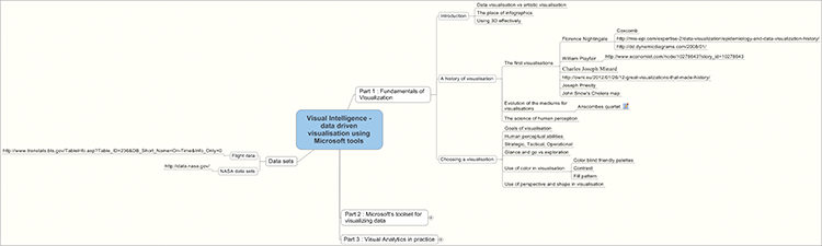
Figure 16-9: A humorous Venn diagram
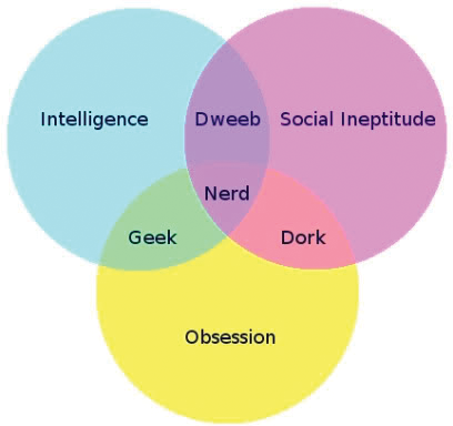
Venn Diagram
A Venn diagram is a very simple visualization used in set theory, which has been widely adopted on the Internet. Two or three circles, each representing a group, are shown overlapping each other, with the overlap being the group (or set) of people or things that belong to all those groupings overlapping those areas. These circles are not shown to scale in the most common form of these diagrams. A widely shared example of a Venn diagram is shown in Figure 16-9. (It’s become quite popular to use Venn diagrams for humor.)
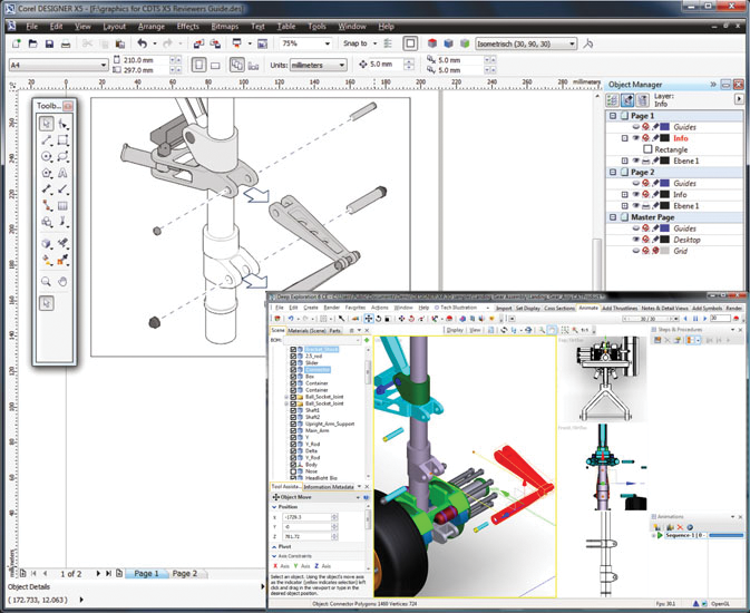
CAD Drawings
Computer aided design (CAD) is a massively growing field, especially with the growth of 3D printing. Originally CAD was commonly used only by engineers and architects on high-end workstations, but it has penetrated the world of design very deeply. A CAD drawing is shown in Figure 16-10.
Figure 16-10: Computer aided design—more complex than the average visualization
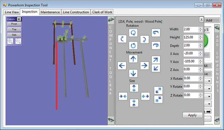
3D Modeling
CAD is a form of 3D modeling, but the world of 3D has expanded vastly beyond just CAD with engineering precision. Games, such as the original Quake and all of its successors, are an obvious example, but 3D design has penetrated far further. Figure 16-11 shows an example of a 3D inspection program designed to run on a tablet computer and used to aid engineers in inspecting power pylons.
Figure 16-11: The Orion inspection system developed by Aphelion Software
Funnels
Funnels represent any process where the number of items decreases as the process progresses. They have widely been applied to the sales process—some leads turn into opportunities, some opportunities turn into negotiations, some negotiations turn into sales. The value in visualizing this as a funnel is showing the effectiveness of this process as well as showing which step has the lowest conversion ratio. If a salesperson has a wide pipeline in every step except turning negotiations into sales, perhaps he could use some assistance in closing or needs to attend a course on sales techniques. Figure 16-12 shows an example of a typical sales funnel. This funnel is built in Microsoft Reporting Services.
Figure 16-12: A sales funnel developed in SSRS

Flow Diagrams
The swim lanes discussed earlier in this chapter are a type of flow diagram. The instance shown in Figure 16-5 was specific to one process, but flow diagrams can be very conceptual. The following figures are two different flow charts: Figure 16-13 is a normal UML (Universal Modelling Language) flowchart, showing a start, end, and a couple of decision points and processes, whereas Figure 16-14 is a SharePoint workflow diagram that shows a workflow process.
Figure 16-13: A UML data flow
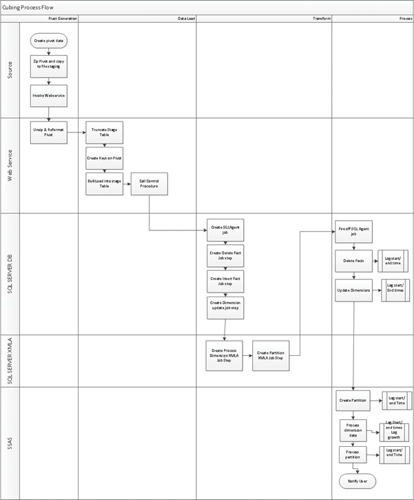
Figure 16-14: A SharePoint workflow in Visio

Geographic Information System Maps
Any data containing a latitude and longitude could technically be considered a Geographic Information System (GIS). The term GIS is typically used for those systems containing spatial data types and/or mapping capabilities.
On the Microsoft platform, SQL Server has had support for spatial data types since SQL 2008, and mapping support came along in Reporting Services for SQL 2008 R2, which included support for Bing Maps. You can see an example in Figure 16-15.
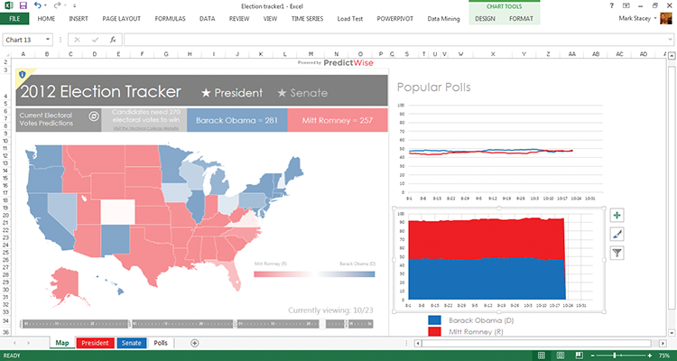
Further evolution in Office 2013 Power View has enabled people to create slicker maps directly in Excel (and SharePoint), as shown in Figure 16-16, which is an election-tracking template provided with Excel 2013.
Figure 16-15: A geospatial heatmap, or chloropleth, in SSRS
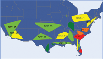
Figure 16-16: An election-tracking map in Excel
The various types of visualizations that can be done on maps (in other words, adding visualizations to maps as opposed to the different types of maps) include the following:
- Chloropleth: The different bounded areas are highlighted by changing the shading or color to represent a value.
- Prism map: Similar to a chloropleth, but in 3D.
- Pin map: Pins are shown on a map to highlight areas of interest.
- Combined chart maps: Instead of pins, some other chart type, such as a bar chart or pie chart, is shown to represent a value at that point.
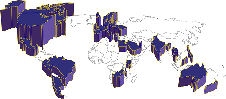
Chloropleth and prism maps are often used for representing values such as population density or voters, but they are also good for representing sales or profitability in a state. The reporting services map shown in Figure 16-16 is a chloropleth, and Figure 16-17 shows a prism map. You can also see one at www.pwinfographics.net.
Figure 16-17: A prism map
Pin maps are good for navigation and orientation. Although they are used to represent data by having a variable number of pins, this is an inefficient use of space, and pin maps are often unreadable when the volumes become too high.
Showing charts on a map is another usage that is inefficient—especially as the prevalence is toward pie charts. The charts obscure the map itself, they are often too small to read easily, and they are often poorly distributed and obscure one another.
Heatmaps
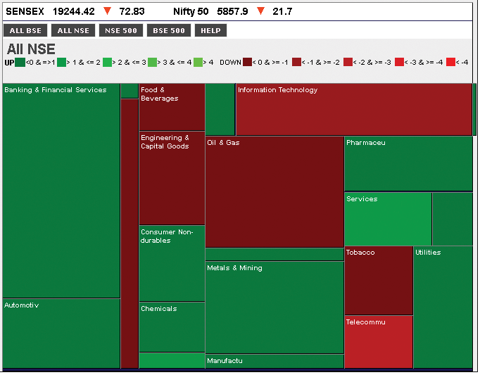
The chloropleth map shown in the previous section is in fact a specialized type of heatmap in which the size and shape of the individual items are based upon GIS shapes such as countries or states. A heatmap uses the color of the item to convey one dimension, and the size to convey another. This has often been used in stock-market analyses, where size is used to show either market capitalization, or the size of the investor’s holding, and color has been used to show the performance of the share. Figure 16-18 is an example of a chloropleth.
Figure 16-18: A heatmap of stock prices
Summary
In this chapter you learned about some other common types of visualizations. Many of these, such as infographics and periodic tables especially, are likely to be handcrafted, and so won’t be data driven—but they can still be useful in the decision-making process.