Chapter 4
Building Data Sets to Support Visualization
This chapter focuses on the building of data sets and storing them in formats conducive to data access and creating great visualizations. We will cover a number of common and more unique data sets and discuss specifically the uses, types of data, creators and consumers, and benefits or drawbacks to each data source.
What Data Sets Are
Data sets are groups of information that may be stored in a number of formats in today’s digital age. These formats can include lists of customers, products, sales records, or even logs from a server or computer system. These sets are then combined in a number of different ways to produce information that businesses can use to drive decisions.
Why We Need Them
We need these data sets to help us answer questions such as these:
- What are our customers buying?
- What products are the most profitable?
- What kinds of trends do we see in our sales over time?
- How do these trends affect the buying behavior or volume of sales?
These and other questions are important to any organization that is looking to get more insight into how it does business. Your business is often faced with these kinds of questions (and their more complex versions), and having data sets available to work with will enable folks (soon to be you) to gain the know-how to use them to provide answers.
How Data Sets Are Created
Data sets get created in a number of ways: automatically by some systems, by teams of people, and by organizations for publishing. In this chapter you learn to use a couple of the most common methods, including the following:
- Cutcopy and paste
- Import or export from a computer system
- Manually entering data that comes from offline sources
Any one of these methods might be easier for your particular situation, as you learn later in the chapter where each of these methods is discussed, but they are all focused on bringing different pieces of data (customer names, products purchased, registrations, and/or other important data points) together to paint a picture of activities and conditions that you want to analyze.
Why Data Sets Are Important
The data sets mentioned in the previous section are important since you need good source data to ultimately create great visualizations, and they are the reasons this book was written. These data sets, and the systems or processes that create them, become the basis for all the analysis you will do. Their capability to provide clean and accurate information, a consistent approach to organization of the data, and completeness of the included fields is directly proportional to the quality and quantity of analysis that those sets of data will support.
Common Data Set Elements
Data sets share a number of elements or qualities that help you work with them and navigate their contents to reach the information you’re looking for. This section dives deeper into those to help you understand what to pay attention to.
Data Quality
You should spot check or, if possible, do a more in-depth analysis of the data you’ve accumulated to make sure it is accurate and free of miscellaneous characters and punctuation that might cause you a problem when writing expressions or formulas in your visualization platform. Being able to count on clean data is a great advantage for the visualization techniques you are learning in this book. This means if you are pulling this data from different sources or locations that may have been manually updated or altered, you need to pay special attention or go through a cleansing process where the data is reviewed for accuracy.
Metadata
Hand in hand with clean data go descriptive column headers. If you do not have these in place, you will have to adjust them later in the data consumption cycle, which might impact the performance and methods you can take to visualize your data. See a good before and after example of descriptive column headers in Figure 4-1.
Metadata is important because many visualization tools will pull this information in to allow you to reference your data by its descriptive properties so you can navigate the data sets more easily.
Figure 4-1: Before and after descriptive column names

Formatting
Data formatting is also important. If you have currency values, make sure they reflect the correct currency. If you have international data, make sure any nuances for handling other languages are in place, such as support for international font types, and so on. Problems with language-specific characters or alphabets is often not an issue if the data is coming from a modern computer system, but can be the case if it is manually entered. Other concerns for international data include special accents or punctuation formatting. Spreadsheets can shine here because data enhancement can be easily done by a business user or administrative professional and does not require IT interaction to change the data. See a good example of proper data formatting in Figure 4-2.
Data Volume
The volume of data you’re working with needs to be in the manageable range for the tools you’re using. There are technologies better suited for greater volumes of data such as SQL tables; tabular models; and, of course, Hadoop for very large volumes. Excel will handle up to 100,000 to 200,000 rows and then will begin to experience some performance problems with scaling that many rows. There is also a hard limit at 1 million rows. Make sure you are aware of the types of problems you might run into. These types of sources will be covered more in depth in this and future chapters, but it’s important to make sure you know that you can start with a smaller set of data and then begin working with larger sets once you’re comfortable with the types of analysis that you’re performing.
Figure 4-2: Proper data formatting

Automated Data
If you have calculated values in your data, you need to make sure those are identified. Spreadsheets and other data analysis tools can create powerful calculations, but they may have some limitations as you begin to use them for sourcing. For example, in some cases, drill-through functionality is limited based on the type of calculation and where it is in your data source. If it is coming from an OLAP cube, there will be limited functionality if it is being calculated in the OLAP layer and not in the spreadsheet. In addition, data that is autogenerated may have lots of repeated information that you don’t need, and importing it would only make your analysis tasks more cumbersome.
Types of Data Sets and Sources
There are many different types of data, from lists of people and products to financial documents and more. This section reviews some of the important sources you will see most often in projects like those in this book.
Data in the Internet Age
It’s no secret that in today’s enterprises many organizations are finding data in all sorts of new places. Departments are doing more of their own IT and analysis, and the concept of self-service reporting is no longer a myth; it is rapidly becoming the norm. Folks are using data from wherever they can access it to give them a leg up on doing better analysis and finding more insight from data they already have. This section covers some common data sources you will run into in an enterprise and when you may want to leverage them for storing your data as you collect it.
Spreadsheets
Spreadsheets, which are one of the most common data sources, are popular because they are so easily created and very accessible. Spreadsheets can store many different types of data, but typically store financial information and extracts from other systems, and function as a collection point for data consolidated from many other sources. A recent Gartner report said that more than 90% of all the reports in the world wind up in Excel to be manipulated. With that being the case, it is easy to see why Excel and spreadsheets became such a critical source for our data.
When to Store Data in a Spreadsheet
Spreadsheets are typically created by analysts and then consumed by analysts, sales professionals, and executives. Professionals in many departments are consumers of this data, and in many cases it is reviewed in a meeting either on a shared screen over the Internet or on a projection in a conference room. Spreadsheets are consumed in many ways, but the most important thing to remember about the simple spreadsheet is that it’s not really simple at all. Spreadsheets can have complicated formulas and macros built into them.
These complications can cause challenges when using spreadsheets as a source and should be mitigated as part of your data processing or loading, depending on how the visualizations are being sourced. Some of these concerns can be mitigated by converting your spreadsheets to use PowerPivot or a tabular model (more on this later). These options give you more powerful capability to embed calculations that will perform better on larger volumes of data. Spreadsheets are an incredible, powerful source and will likely be used extensively in any visualization exercise, but remember that data may not need to be sourced directly from spreadsheets and to use the most appropriate source for the type of visualization desired.
Spreadsheets can provide an easy-to-use and easy to source (i.e., many tools connect to it directly) platform for data visualizations if your data size is relatively small and you have a need to easily combine data from multiple sources. If you can leverage the power of Excel’s functions and features to help ensure that your data is high quality and formatted appropriately for consumption, this might be a great option for you. Next, let’s talk about using data stored in a database for our source.
SQL Tables
SQL tables are another common source, although they are typically accessed and leveraged differently. When the term SQL table is used, many times we are specifically speaking about a table that is in a relational database. This can be a data warehouse or data mart, CRM system, ERP solution, or simply a table in a Microsoft Access database that a user has created to do an individual analysis. This is a pretty common solution for many organizations that do not have a cohesive strategy for data management and reporting. Many users are taking the “I’ll-find-it-myself” strategy and managing the extraction of data from a number of different places in the organization.
The types of data stored in tables are usually more organized physically than in spreadsheets or other locations, but this can be deceiving. Just because the data is organized well physically, stored in tables with relationships, and labeled in detail, doesn’t mean that the application or user process that is populating them has the right amount of governance or access rights built in. That governance is critically important because when you are building data sources for visualization, data quality is so important. A key part of creating data visualizations is knowing the data well enough to help others understand and interpret it more effectively. Storing data in tables is normally a byproduct of that data coming from another source where it was worked with previously, then put in a table, and is now persisted that way. If you’re going to keep the data, add to it, and continue to improve it, a table is often a better long-term location than a spreadsheet that could be easily deleted from the file system.
OLAP and Tabular Models
OLAP and tabular models are terms for systems that store data in a special format called multidimensional, or in the case of tabular, as a column store with a multidimensional interface. This means the data is designed and stored in a way that allows the end user to connect data across different business segments more easily. These models are usually set up by developers or power users and deployed to a server in your environment. This provides a trove of data for end users to navigate through and begin to explore and build visualizations. These are very common data sources and are made up of data from tables and other sources to consolidate the information in one place that other tools can connect to and analyze.
PowerPivot is an instance of a tabular model embedded inside Excel and can be published from PowerPivot to Analysis Services.
Reports and Data Feeds
Reports and data feeds are also good sources of data. May tools these days can connect directly to reports and data “feeds,” or online streams of data. These tools can pull this data in as if it were a spreadsheet or table and enable users to work with it in more creative ways. These sources are advantageous because many times the security and integrity of the data was already addressed upstream in the process. The risk is that using reports as data sources for other reports can lead to a long chain of reports pulling data from reports and lead to a scenario where the data has gotten polluted—that is, the figures coming through are wrong.
Hadoop and Other Nonrelational Sources
You may have heard the term Big Data around your organization or in the industry; it often means someone is referring to unstructured or loosely organized data that comes in large volumes. These sources come with their own tools to analyze the data and powerful results can be generated. Caution should be taken, however, because this data has not been cleansed or organized, is often quite raw, and should be used for exploratory purposes only before moving it to a more stable and organized framework for specific or in-depth analysis. This analysis can be done in Hadoop, but is not typically for beginners who are more familiar with visual tools.
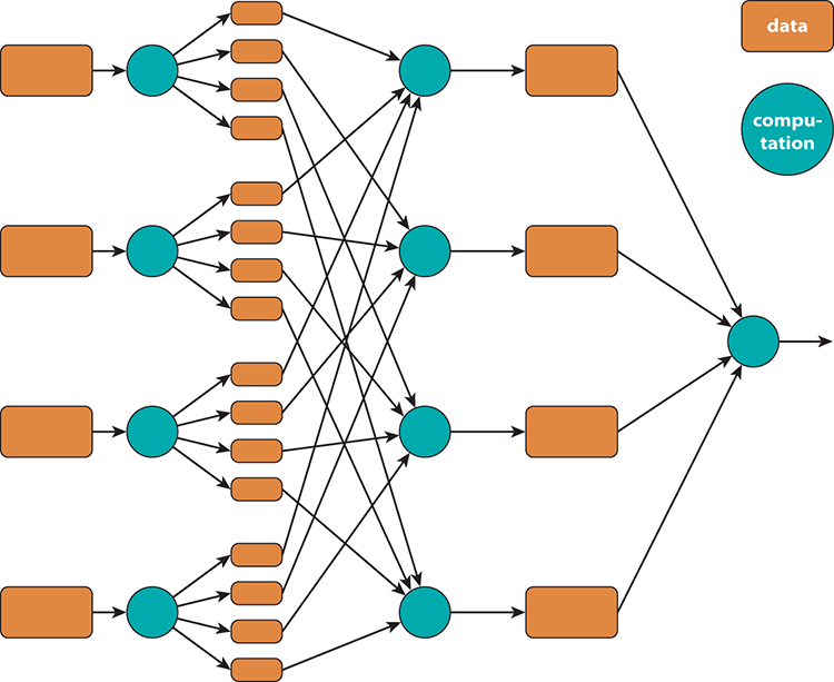
Map-reduce, the algorithm underlying technologies such as Hadoop, is at its heart a mechanism to split a processing problem into parts (the map part of the name), distribute the data among nodes, do the processing (the reduce part of the name), and then recombine the data. A diagram of this process sourced from http://code.google.com/p/mapreduce-framework/wiki/MapReduce is shown in Figure 4-3.
Figure 4-3: Map-reduce
Creating Data Sets for Visualization
When you create data sets specifically for visualization there are tasks and priorities you need to pay close attention to that make the process much smoother. Now is the time to learn them! Let’s get started.
Copy and Paste
Many data sets are composed of data from other locations around the organization. Although this is part of the power of the spreadsheet, it is also dangerous. This data has now become portable and static in its current form, but being able to combine a text file containing customer and marketing mailing list data with geographic information can significantly enhance our ability to create great visual effects with our data while keeping its preparation time and effort manageable.
Exporting Data from Systems
Users, developers, and administrators can export data from systems. The user can also get data from an automated feed or e-mail delivery. Although exporting data is a good way to get data in some cases because the format will be predictable, it may not be the most intuitive or flexible method. Review your options to see whether this is the best fit for a first data set. An example of this is a SAP user with the appropriate rights exporting data to a format such as CSV, which can be opened in Excel or imported into a database for analysis.
Import Techniques and Tools
Through Excel’s built-in functionality, much of this data is imported from enterprise or departmental systems and then combined to create a unique, business-oriented view of a product, service, or internal data focus point. This importing is done easily by most end users and provides a quick and easy way to get data in while maintaining connections to those sources so data can be reimported at some point, if necessary. Tools such as Microsoft Access or SQL tables may be used as sources, so Excel can do some additional data preparation not easily performed in the source.
Getting Started
In this chapter you create a representative data set like those you use throughout the book. So make sure you have all the sample files downloaded for the book to follow along as we move forward.
Your First Data Set
When creating your first data set, it is important to get advice from others in your organizations about an easy data set to begin working with. Alternatively, you can start with some of the samples included in this book or with other free data from sites such as Data.gov, infochimps.com, and others where free data is available for download. Working with data that is familiar is often a good exercise because it helps reduce confusion for folks new to these techniques.
Check with your developers, analysts, and administrators for data that you’re allowed to access, or pair up with someone working on a data project and offer some “free” help to get some exposure to the processes used in your organization for this type of work. This exposure can be invaluable when learning how to better visualize data because you’ll have additional perspective on what folks like and dislike when it comes to reviewing their information.
Your First Data Set
In this chapter you work with a simple and freely available database from Microsoft called AdventureWorks. You can download this database at http://msftdbprodsamples.codeplex.com/. The file you want is the SQL Server 2012 DW database. When it downloads you will need to attach the files to a SQL Server instance. If you have trouble with this please see your database administrator. This will work with all editions of SQL Server 2012.
Other chapters use data sets provided by the authors with the book, and obtained from the Organisation for Economic Co-operation, so be sure to review the sections in each chapter that cover installing and configuring those data sets along with the instructions provided in Chapter 3 for installing all the data sets at one time. Installing them all at once will provide the best overall experience as you move through the chapters’ walkthroughs. The data sets were carefully crafted to support the walkthroughs and demos, and some chapters have data sets to make them more approachable while others have very specific sources of data to be able to showcase specific features in a product or approach.
Getting Data
The first step is getting some data, so open Excel and connect to your database, as explained in the following steps.
Figure 4-4: Connecting to your data source
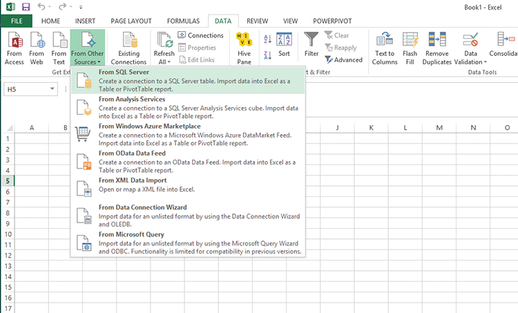
Figure 4-5: Selecting tables to import
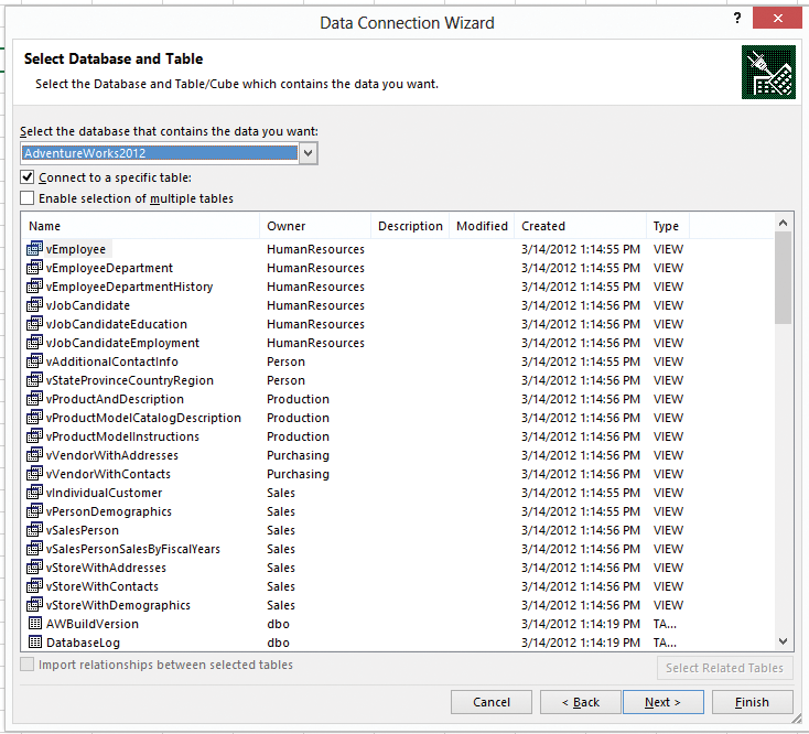
Figure 4-6: Create a new table in Excel

Cleaning Your Data
You can clean this data up by removing some columns you do not need. Then you are ready to begin analyzing the data using many of Excel’s tools (more on this in future chapters).
Next you make some formatting changes to allow for better visualization.
Moving Your Data into a Good Format for Visualization
Now that you have your data in a good clean layout, you can format it as a pivot table, which is a basic type of visualization but is very powerful within Excel. After you’ve formatted your data as a pivot table (as shown in Figure 4-7), you can begin to do some nice drag-and-drop analysis on the data, as shown in Figure 4-8.
Figure 4-7: Create a pivot table
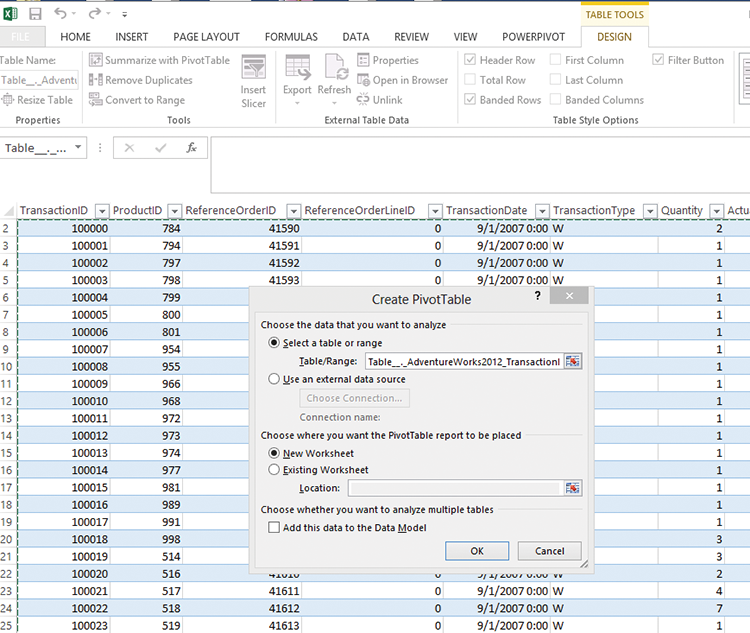
First things first: Highlight your entire table, go to the design tab, and select Summarize with pivot table (see Figure 4-7). This will convert your regular table into something you can use for the drag-and-drop (or slice and dice) type of analysis mentioned earlier.
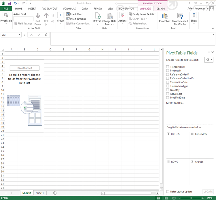
Next, drag the column names you’d like to filter or sort to the field box in the PivotTable Fields list. You must click somewhere in the table for this to work. You will begin to see results like those shown in Figure 4-8.
Figure 4-8: Sorted and organized pivot table
Verifying Your Data by Prototyping
The best way to tell if your data process is working is to do some basic visualizing or “playing around” to see whether the data is lining up as expected. In this instance, we’ll build a simple report, as shown in Figure 4-9.
Figure 4-9: Simple pivot table report
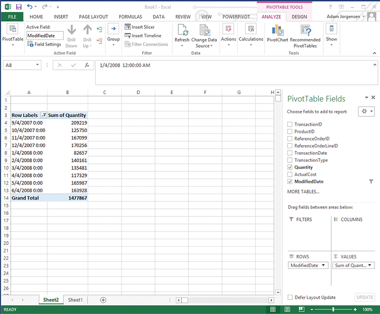
Since the previous section got you comfortable with dragging and dropping, let’s drag Modified Date into the Rows box and Quantity into the Values box in the PivotTable Fields list. This will create a simple report you can use to test your process.
This is the simplest possible Excel pivot—in Part 3 of this book you learn how to format your pivot tables.
Summary
Many visualization techniques and technologies can make the most of different sources of data. In many cases, the sources described in this chapter are used together to align information for easier consumption and understanding by the users. This chapter provided an introduction to your first data set. Going forward, the next chapters will all be focused on how to imagine and build next–generation data visualizations on the next generation of tools. So buckle up and turn the page.