Part I
Introduction to Data Visualization
In this part
- Chapter 1: Fundamentals of Visualization
- Chapter 2: Choosing a Visualization
Chapter 1
Fundamentals of Visualization
When we talk about visualizing data, it is important to understand that any representation of data other than simple text is visualization. The very first visualization was a tabular representation of numbers, and tables are still a very powerful visualization—indeed the most common. Tables, however, are not the most appropriate visualization for every type of data—visualizations such as bar, column, and line charts; scorecards and key performance indicators; network maps; and custom graphics drawn by an illustrator are all visualization techniques that, when used appropriately, convey the meaning of data better than a simple table.
This book explores the different visualization types and, more importantly, how to choose a visualization based on the data you have.
These explanations apply to any business intelligence application, but we perform implementation examples using the Microsoft stack—starting with Excel, the world’s most widely used Business Intelligence (BI) tool and then covering the entire toolset. We also explore the new world of custom visualization techniques using HTML5.
This book is divided into three parts: this first part introduces you to the subject of visualization; the second part introduces you to the tools you will use; and in the third part, you dive deeply into the individual visualizations, learning when to use them, which tool to use, and how to build them using the appropriate tools.
In this first chapter, you learn how to differentiate between data visualization and artistic visualization. Each has its place, but it is important when presenting data to focus on data presentation and not just make the visualization presentation pretty. Typically, three-dimensional (3D) rendering is an example of choosing form over function, but it can be done right, with form properly serving function, and you will learn how.
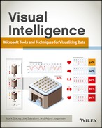
Figure 1-1: The very earliest bar chart from William Playfair
Data Visualization versus Artistic Visualization
The goal of data visualization is to present data to either provide a more intuitive understanding of the data or show it in a way to view a large amount of data in a smaller area. Artistic visualization is designed to present a piece of data in a way that appeals to people and hence engenders interest in the data being presented.
There is obviously an overlap between these goals, but it is important when developing data visualizations to remember that the goal is to present data more meaningfully, not just to make it prettier.
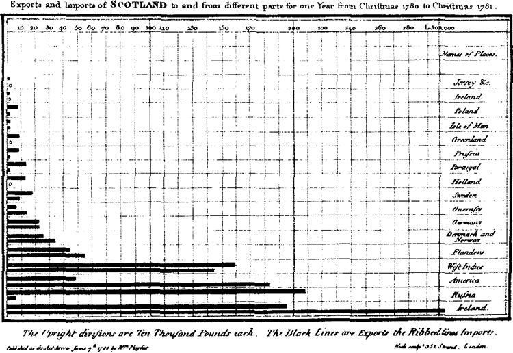
Figure 1-2 shows an artistic visualization—it is exceptionally pretty, but it contains a minimal amount of data.
Figure 1-2: An infographic where the pictures don’t add value
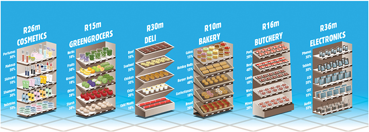
Figure 1-3 follows the same theme, but has been enhanced to be data rich. It shows how graphics can be used to enhance data presentation:
Figure 1-3: The same infographic crafted as a data driven graphic
Of course, as pretty as these graphics might be, they are very space-consuming. Figure 1-4 is a traditional BI chart showing the same data.
Figure 1-4: A stacked bar chart
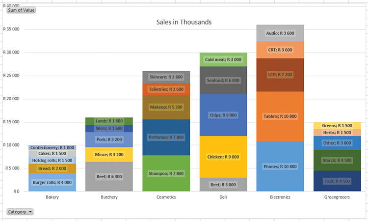
Although not as flashy, this chart shows it’s utility quite quickly: the different categories can be compared to each other at a glance, while still allowing for comparisons of the components of the categories. In addition, comparing cakes and pork in this graph, it is apparent that pork is a much bigger sale amount, although they are the same percentage of their category. Labels for the actual amounts have been added in lieu of percentages; either could be used, but comparing values is more meaningful for cross-category comparisons here.
Now that you have looked at these graphics, you should keep the following questions in your mind each time you develop a visualization:
- Does this visualization contain more data than an equivalently sized table?
- Is the data presented in this visualization easier to comprehend than an equivalent table?
- Do the artistic elements add meaning?
- Have I added any gratuitous elements that don’t add meaning or distract from the meaning, such as 3D effects, animated transitions, or gratuitous images?
At the point of answering these questions, consider then whether you are producing an infographic or a data visualization.
The Place of Infographics
The distinction between an infographic and a visualization is a narrow one, but can be put simply as follows:
- An infographic is a graphic used to convey a message that is known before the creation of the infographic.
- A data visualization is a graphical aid used to discover a message buried in data.
It is clear from these definitions that a data visualization can be published as an infographic. But data visualizations are often interactive and dynamic, so if the message changes (for instance, the sales figures that are being reported on show a decrease from June to July), the data visualization updates automatically and shows the new figures. Whereas an infographic designed specifically around showing how well the sales team performed in June still shows the same figures because an infographic is typically simply a flat graphic.
The reason for flat and non-interactive infographics typically being the case is rather simple: infographics are often handcrafted one-offs, and the level of effort involved in creating a data visualization that performs image transforms similar to those done in a tool such as Photoshop can be challenging. However, this work is valuable because it means that an infographic does not become stale and out of date; it stays up to date as the data changes. (You read more about how to do this using HTML5 in Chapter 9 and throughout Part 3 of this book.)
To reiterate the questions mentioned previously: When you create a data visualization, you enable the discovery of answers through the data presented, and as such the data presentation should be as rich as possible.
Using 3D Effectively
The use of three dimensions in visualization is a controversial topic. 3D effects are used in many ways: to add flash by creating an illusion of depth; as an additional dimension to represent another data point; and for representation of true 3D objects, such as machinery or topography. In this chapter, you learn how 3D can distort the meaning of your visualization. This applies to other types of visualization as well, so take care in any visualization that you do not create an equivalent distortion!
This section delves into the pitfalls of the various approaches used in charts and graphs, and goes through one of the approaches to solve the problem of parallax.
The Illusion of Depth
Figure 1-5 shows a typical Excel chart—and as you see, the default chart formatting leaves much to be desired. (You learn how to address many of Excel’s formatting issues in later chapters.) The main issue with the 3D representation here is the distortion of the values: Compare June 2011 to October 2011, and work out whether they’re the same. You need to look between September 2011 and November 2011, and May 2011 and July 2011. We deal with this particular flaw in the chart in later chapters.
Figure 1-5: A default Excel chart showing a misuse of 3D, distortion of figures by stacking values, and poor axis label choice

Reading the values off this chart can be done by following the lines and thinking about them: they look fairly similar. But the top of the October column is slightly below on the image, so you could be forgiven for thinking October is about the same or a little more. It turns out that October is 2.64% less than June: 553849 versus 539566. You see this by carefully following the lines drawn above it, but it is not as intuitive as showing the columns starting from the same baseline.
An additional issue is that the height of the columns is also distorted. January 2010, with a value of 101586, has a height of 22 px; whereas December 2012, with a value of 618987, has a height of 132 px. The ratio of the values is 6.077, and the ratio of the heights is a ratio of exactly 6—a distortion of almost 8%!
It is clear that adding perspective in this manner must be approached with caution, if done at all.
Additional Dimensions
A better use of 3D is to show an additional dimension, as shown in the Excel graph displayed in Figure 1-6.
Figure 1-6: A better use of the third dimension
In this chart, the third dimension is being used to break up the numbers by the country dimension. Although it is better because the third dimension is no longer simply stacked and indeed carries data, this representation still carries all the flaws of the previous chart.
The solution in both of these cases is truly that three dimensions are not required to adequately represent the data points. A stacked bar chart in 2D is a better representation and is more efficient in terms of space. The third dimension would be great if it could be used in addition to stacking and add a dimension otherwise not present, but unfortunately, basic tools such as Excel do not allow for this functionality. In Excel, the one solution is to choose “Right angle axes” in the Rotation menu to get the chart shown in Figure 1-7.
Figure 1-7: Flattening out the chart
A Description of the Problem and a Proposed Solution
The reason why these distortions occur is that although an object is created in three-dimensional space, a further transform is applied to represent it on the two-dimensional screen on which we view it. This transform projects the edges of the 3D dimensional object against your screen, applying a shrinking factor to the height (as in the first example) and width to give a sense of perspective. The solution in these examples is to provide a faux 3D transform—keeping the relationships of the heights to one another identical and distorting the shape to present a 3D view.
Figure 1-8 is an example of such a graphic on a country map. Note that the countries are extended vertically rather than in three-dimensional space.
The way the extension of the countries is achieved is through a transform—essentially each country is the base of a column graph, and as such the height of the country can be read as the height of a column.
Figure 1-8: A prism map illustrating a false 3D projection

If you are using a tool with predefined three-dimensional transforms, I urge you to hesitate and think through the utility of using them before you apply them. They often add no value and also easily distort the values presented.
Summary
In this chapter you learned to distinguish by their intended purposes between a data-driven graphic (a true visualization) and an infographic: visualizations enable you to discover facts in your data, whereas infographics are designed to communicate a message.
You also learned about one of the ways visualizations can misrepresent data, with the hope that you will apply this thinking to the visualizations you learn throughout this book. In Chapter 2 you learn the principles of choosing a specific visualization to match the type of data you are working with, to prepare you for the details that come the chapters that make up Part 3 of this book.