
Chapter 14
Relationship Analysis
Relationship analysis is a visualization form you are probably more familiar with than you know. The earliest exposure you would have had to a visualization of this type would have been a family tree. Understanding how relationships work, and being able to tell at a glance which of a set of objects is dependent on another, is an old but growing area. Especially given the advent of social media, networks are taken to represent influence; for instance, a marketer may be more inclined to market to people with many followers on twitter than to those with only a few followers. Being able to analyze this is thus is a key differentiator. This chapter skips the pieces of heavy lifting that often sit underneath these analyses. The tools that would be used for this analysis include graph databases.
Visualizing Relationships: Nodes, Trees, and Leaves
The two different types of relationship analysis we are going to cover in this chapter are network graphs, which show items at the same level and how they interrelate, and hierarchical or tree structures, which show the relationships from the top down. Trees and hierarchies have technical differences in detail, but for the purposes of visualization, you can treat them the same. You will be familiar with the Analysis Services hierarchies already from Chapter 13, so those types of visualization will be excluded.
Figure 14-1: Farbenpyramide

Both types of visualizations have various flavors. This chapter covers four of them, with very different uses.
The network map is used purely to show relationships without any value attached to the network. This is useful especially in the social media analysis context, where the connection between items in the network, known as nodes, is the sole arbiter of value. Other older uses for the network graphs include the representation of computer networks, telecommunication networks, and transport networks. In some of the versions of the network graph, direction is included.
A color wheel, which is a wheel divided into sections with the relationships shown as lines connecting the sections, has an added dimension in that it can show the size of a relationship. This is useful when showing, for example, trade balances.
Tree structures are used to represent top-down hierarchies. Organization charts and family trees are the most well-known examples of tree structures.
The strategy map visualization, made famous by Robert S. Kaplan and David P. Norton in their article, “The Balanced Scorecard—Measures That Drive Performance,” is a very specific version of a tree chart. The implementation of this tool in Performance Point also lends itself to other uses.
Network Maps
A network map shows the connections between objects visually—these connections could be physical (as in the case of computer networks or railway tracks), or they could be more abstract (as in the case of social media networks).
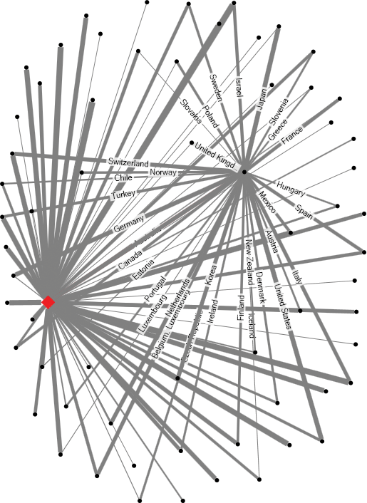
The easiest place to see a network map is at http://inmaps.linkedin.com/. This tool analyzes your LinkedIn network and gives you a network graph of your connections. An example of my network is shown in Figure 14-2.
If your network is fairly large, the limitations of network maps at scale are quickly apparent. As a node is added, performance degrades as a function of the number of connections of that node rather than as a function of the number of nodes. The readability of the graph quickly degrades as well. In the zoomed-out view, the categories blur into one another; when the view is zoomed in, only in the outskirts of the network graph are the relationships immediately apparent.
Creating data for a network map is relatively straightforward: It is simply a list of pairs, each pair being the two nodes, and with an edge that is the connection between the nodes. In order to render network graphs, it is worth considering rendering order. You might assume that drawing all the nodes first and then connecting them up will work—and indeed it will—but you are likely to end up with a severely non-optimal layout. Luckily, most tools available to you handle this fairly well.
Ease of Development
| Reporting Tool | Predefined Chart Type | Ease of Development |
| Excel | No | |
| PerformancePoint | No | |
| Power View | No | |
| Reporting Services | No | |
| Silverlight/HTML5 | N/A |
Color Wheel
Primarily, a color wheel is a wheel divided up into sections as categories; secondarily, it shows links between the sections. It’s a similar concept to the network map, but it’s a condensed version. When you build a color wheel, you will almost certainly have to build it interactively to show only one relationship at a time, otherwise the lines overlap and look chaotic. A great example of an interactive version of a color wheel is shown in Figure 14-3.
Figure 14-2: The author’s LinkedIn network
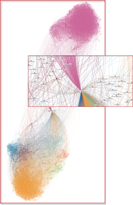
Figure 14-3: A color wheel showing trade balances from http://www.bbc.co.uk/news/business-15748696 (Source: bbc.co.uk © BBC)

Ease of Development
| Reporting Tool | Predefined Chart Type | Ease of Development |
| Excel | No | |
| PerformancePoint | No | |
| Power View | No | |
| Reporting Services | No | |
| Silverlight/HTML5 | N/A |
Another consideration related to color wheels is not having too many categories. Representing the entire world in this manner would likely be confusing and chaotic for end users.
Tree Structures: Organization Charts and Other Hierarchies
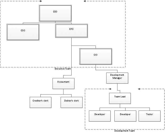
Tree structures are used everywhere in our world. The most ubiquitous example in the corporate world is the organization chart. Figure 14-4 shows a prototypical organization chart that was built in Visio.
Figure 14-4: Organization chart built in Visio
A standard drill-down tree structure is another example. This type is extensively covered in the earlier chapters and is excluded from the following Ease of Development table.
Ease of Development
| Reporting Tool | Predefined Chart Type | Ease of development |
| Excel | No | |
| PerformancePoint | Yes | |
| Power View | No | |
| Reporting Services | No | |
| Silverlight/HTML5 | N/A |
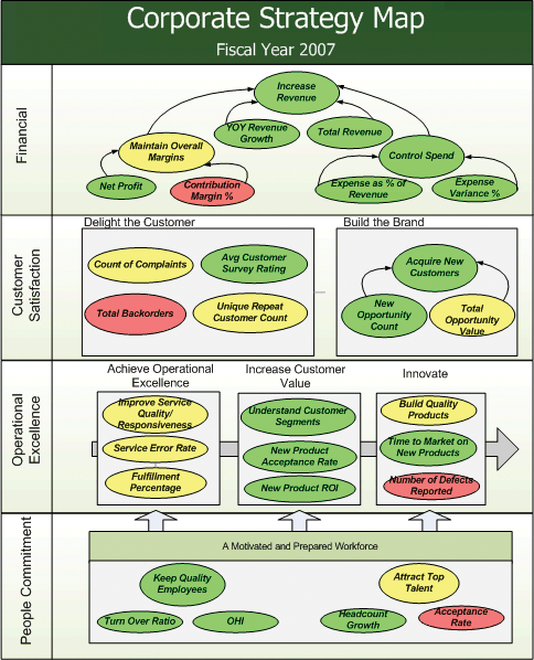
Strategy Maps
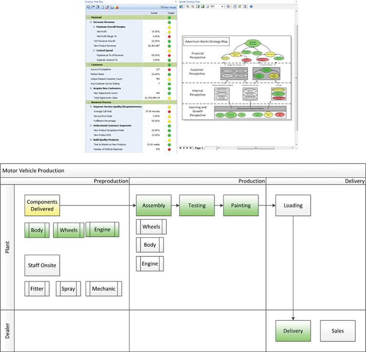
Strategy maps are, in many ways, a refinement of the tree structure. The hierarchy of an organization’s strategy is shown visually; the key addition is that each block of the strategy map is dynamically linked to data. Figure 14-5 shows a prototypical strategy map next to a scorecard that it is mapping.
Figure 14-5: A standard strategy map based on the balanced scorecard is shown on top, and at the bottom the same tools are used to show a process map
Ease of Development
| Reporting Tool | Predefined Chart Type | Ease of Development |
| Excel | No | |
| PerformancePoint | Yes | |
| Power View | No | |
| Reporting Services | No | |
| Silverlight/HTML5 | N/A |
Tool Choices
Relationship analysis is an area in which the Microsoft stack is especially poor. PerformancePoint has some native capabilities in the form of Decomposition Trees and strategy maps, and there is an add-in for Excel, but outside of that, any relationship analysis must be coded. The techniques necessary to do that are covered later in this chapter.
PPS Decomposition Tree
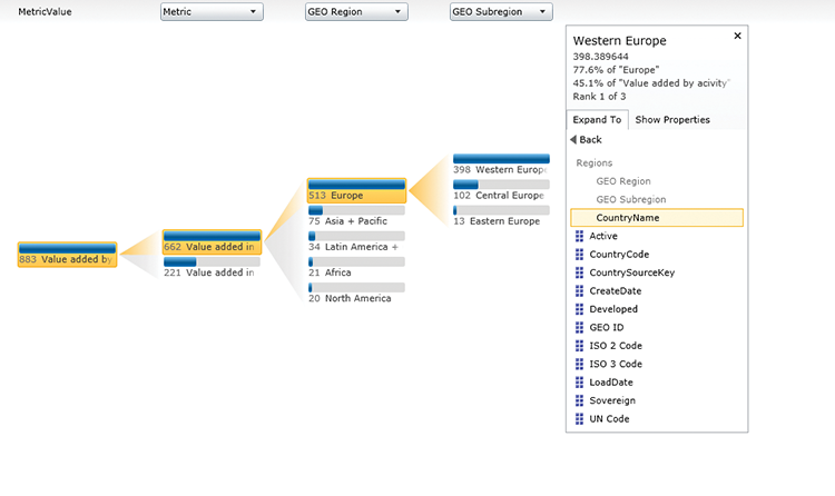
PerformancePoint is great for showing how a particular metric is broken down—not just by predefined hierarchies, as in the drill-down capabilities, but also with the Decomposition Tree, which allows for a continual drill down by alternative hierarchies in a tree format.
You want to know the best part? The Decomposition Tree is available at any time to you. All you have to do is right-click and choose Decomposition Tree, as shown in Figure 14-6.
Figure 14-6: Opening the Decomposition Tree

The Decomposition Tree displays (like the one shown in Figure 14-7), allowing your end users to drill down on the various dimensions and see the makeup of the values they are examining.
Figure 14-7: A PerformancePoint Decomposition Tree
Excel and NodeXL
Excel itself does not have any support for network diagrams, but a downloadable add-in called NodeXL is available. You can download this tool from http://nodexl.codeplex.com/.
The NodeXL add-in is an Excel template into which you paste your data. In the simplest format, you can paste a list of edges and change the widths based on some value. In Figure 14-8, the edges are trade values between South Africa and other countries, and the width of the lines is the log of the distance from the trade value to the minimum trade value.
Figure 14-8: The NodeXL template with data entered

Figure 14-9: Dragging a node around in NodeXL
As you add more root nodes (that is, nodes that are connected to multiple nodes), the layout becomes more important. In Figure 14-9, Australia’s trade exports have been added. NodeXL makes working with a large number of connections fairly easy, as you can click on a node to highlight what it is connected to. NodeXL also enables you to drag the node around to improve the layout.
PerformancePoint Services (PPS) Strategy Maps
PerformancePoint has a great toolset for custom strategy maps because it can link any data in PerformancePoint to custom shapes in Visio. The most common example of this is to implement a Kaplan and Norton balanced scorecard, as shown in Figure 14-10.
Figure 14-10: A balanced scorecard in PerformancePoint
More extensive use of this technology is great for visualizing flows such as manufacturing processes. Because PerformancePoint strategy maps are based on a user-customizable Visio diagram, almost any process can be visualized.
HTML5 Structure Maps
The biggest challenge with the NodeXL tool is that it is embedded only within Excel. You can build a network map equivalent on the web using the same libraries that we’ve been using and you were introduced to in Chapter 9, but there are also some great online tools. You can see examples at https://www.google.com/fusiontables/Home/.
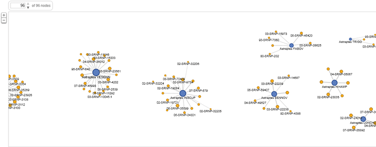
The output of the network graph built in Fusion Tables is shown in Figure 14-11.
Figure 14-11: Networks built in Fusion Tables
Implementation Examples
The implementation examples use the OECD_Data model. You can obtain the datasets from the Wiley website; see Chapter 3 for information about installing them in the “Installing the Sample Databases” section.
Building an Organization Chart in PerformancePoint
To create custom visualizations in PerformancePoint, you use the Strategy map feature, which requires you to first build a scorecard and then create a Visio document to which you link the key performance indicators (KPIs) in the scorecard. You can read about creating scorecards in Chapter 10.
In this example, you create custom rollups of OECD (Organization for Economic Development) statistic metrics and associate them with organizations. The organizations in this example are going to be our own creation, and this shows the power of this approach in PerformancePoint. The data points you will be using will be GDP per hour and Purchasing Price Parity in the Production category, and Mean score in reading performance in the Education category.
In the PerformancePoint Content section of the Business Intelligence Center in SharePoint, create a new PerformancePoint KPI in the Items section of the ListTools tab in the Ribbon. This action launches the Dashboard Designer. Choose Blank KPI in the Select a KPI Template dialog and click OK. Name the KPI GDP per hour.
The next step is to create a new data source in Data Connections pointing to Analysis Services. Name the data source dsOECD. Fill in the SSAS server and instance name, and then select the OECD_Data database and Model cube.
On the Time tab of the new data connection, set up the time dimension. Select DimDate.Date under Time Dimension. Choose 2012-01-01 as the reference member. The Hierarchy level is Day and the Reference Date is 2012-01-01. In the bottom section, map the Date member level to the Day time aggregation.
On the KPI, click the 1 (Fixed Value) link in the Actual row/Data Mappings column. Click Change Source, change to the dsOECD data source, and then click OK.
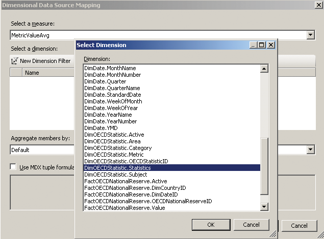
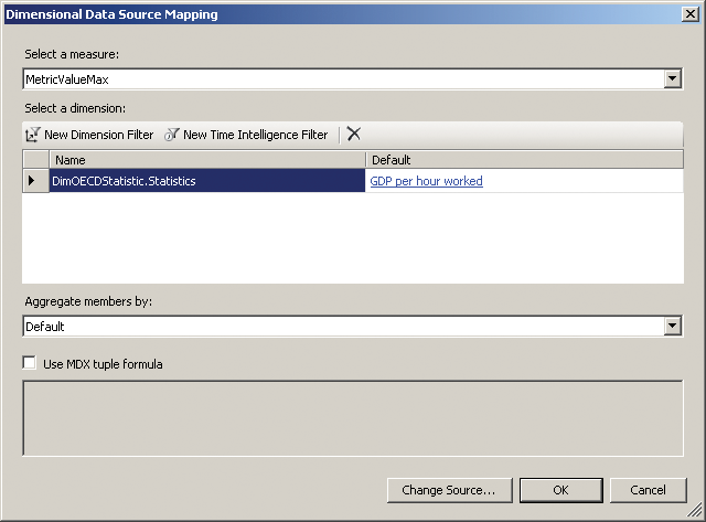
For the Actual, you are going to use the MetricValueAvg measure. Add a new Dimension Filter, and choose DimOECDStatistics.Statistics, as shown in Figure 14-12.
Figure 14-12: Choosing a dimension to filter by
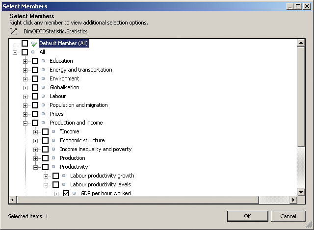
Click the default measure and change the selection to GDP per hour, as shown in Figure 14-13. Be sure to uncheck Default Member (All).
Figure 14-13: Selecting the correct metric
Repeat this process for the target, and replace MetricValueAvg with MetricValueMax as the target, as shown in Figure 14-14.
Figure 14-14: Replace MetricValueAvg with MetricValueMax as the target
Click OK and adjust the target values to 80% for Threshold 2.
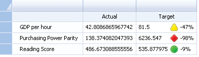
Repeat this process for Purchasing Power Parity, which you find under prices, and Mean score in reading performance, located in education, giving you three total KPIs. Each one of these filters will filter the values of the measure to return only the recorded value for that metric.
Create a new blank scorecard by right-clicking PerformancePoint Content and then selecting New > Scorecard. Add the three KPIs to the scorecard, as shown in Figure 14-15.
Figure 14-15: A PerformancePoint scorecard
You now have a base scorecard, which you can map to shapes.
To do this mapping, you need a Visio diagram. Launch Visio and create a new drawing. Choose the flowchart category, and create a cross-functional flowchart. Drag in three Process items. Name all the items meaningfully, as in Figure 14-16.
Figure 14-16: A cross-functional flowchart in Visio

Save the Visio document and go back to PerformancePoint’s Dashboard Designer. Create a new report and choose Strategy Map. Choose the scorecard you just created, and then click Edit Strategy Map in the Ribbon’s Edit tab. You see a screen you use to import the Visio document (see Figure 14-17).
Figure 14-17: Visio Import screen

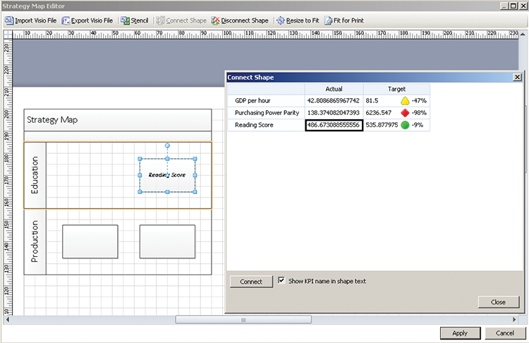
Import the Visio file you created earlier and click the top shape. Click the Connect Shape button and then double-click the Reading Score KPI. The shape updates with the name. Make sure to click the Target to ensure that it updates the color as well. You should see the updates shown in Figure 14-18.
Figure 14-18: Connecting shapes in Visio
Close the Connect Shape dialog and click the Apply button. Your strategy map is ready to be embedded in PerformancePoint dashboards.
Building a Network Map in HTML5
For this network map, you use an online tool called Fusion Tables. Visit https://www.google.com/fusiontables/Home/ and click See My Tables. You have to have a Google account to use this tool, so create one now if you don’t have one.
Click Create > More > Fusion Tables (experimental), and then upload the TradePartners.xlsx workbook you were provided with. Click Next. The column names are in Row 1; click Next again and then click Finish. You have imported your data. Click Labs > Network graph.
As the final step, click the drop-down next to Weight and choose the Weight option. A network graph similar to the one in Figure 14-19 is generated.
Figure 14-19: A network graph
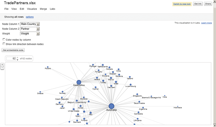
This network graph is built on an HTML5 canvas, and you can easily embed it in your web pages. Although it doesn’t have the interactivity of NodeXL, it does give you a very easy way of generating a web-friendly network graph.
Color Wheel in HTML5
For the color wheel, you are going to use a visualization called Sunburst from the JavaScript InfoVis Toolkit. You can download the toolkit from http://philogb.github.com/jit/. This basic example uses the Sunburst trivially. The code samples include an example of dynamically changing the color and width of the lines joining the nodes.
The following code samples assume that a JSON structure already has been setup, in a format like so:
"id": "node1",
        "name": "node 1",
        "data": {
          "$angularWidth": 13.00,
          "$color": "#33a",
          "$height": 70
        },
        "adjacencies": [
            {
              "nodeTo": "node3",
              "data": {
                "$color": "#ddaacc",
                "$lineWidth": 4
              }
            }
           ]

         }
The first piece of the JSON structure specifies the node properties: the Name and the definition of the node itself—its color, height, and angular width (the portion of the circle it occupies). Then, in the adjacencies node, the properties of each joining line are defined. In the preceding example, Node 1 is connected to Node 3 with a line width of 4 and an HTML code for color.
Each of these properties is then used to represent an item of data. For example, each node is a country, the angular width is the gross domestic product (GDP) of that country, and the width of the line is the size of the exports to that country. Figure 14-20 shows how it looks.
Figure 14-20: The color wheel

The implementation using the InfoVis library is relatively easy. The class is called Sunburst, and a complete sample is provided separately, and is available from the Wiley website. The code that is specific to the color wheel (called Sunburst by InfoVis) is shown.
  var json = dpGetData();

  //end
  //init Sunburst
  var sb = new $jit.Sunburst({
    //id container for the visualization
    injectInto: 'infovis',
    //Change node and edge styles such as
    //color, width, lineWidth and edge types
    Node: {},
    Edge: {},
    //Draw canvas text. Can also be
    //'HTML' or 'SVG' to draw DOM labels
    Label: {},
    //Add animations when hovering and clicking nodes
    NodeStyles: {},
    Events: {},
    levelDistance: 190,
    // Only used when Label type is 'HTML' or 'SVG'
    // Add text to the labels.
    // This method is only triggered on label creation
    onCreateLabel: function(domElement, node){},
    // Only used when Label type is 'HTML' or 'SVG'
    // Change node styles when labels are placed
    // or moved.
    onPlaceLabel: function(domElement, node){}
  });
  // load JSON data.
  sb.loadJSON(json);
  // compute positions and plot.
  sb.refresh();
First, a JSON object is obtained and then the new object is instantiated. The outlines given here are the styling for the nodes, the edges, the labels, and any events. (The events are how the lines are hidden when a node is clicked.) onCreateLabel and onPlaceLabel are internal workings and can mostly be left alone. The library does the rest of the work.
The end result is a graphic that, when it’s been clicked, looks like the one in Figure 14-21.
Note that the log of the trade amounts was used to size the lines.
Figure 14-21: An InfoVis color wheel

Summary
Relationship analysis is an area in which the Microsoft toolset falls far short. Luckily, this is fairly easy to remedy with free add-ins and web software. Each of the tools covered in this chapter has a different use case, so it is useful to be familiar with all of them.