Chapter 5
Excel and PowerPivot
This chapter is about the two most frequently used tools in a power users’ arsenal for working with and visualizing data. It will review Excel and PowerPivot and discuss important use cases for leveraging them in your quest to for visualizing your data. They are the best tools to gather data and then begin visualizing and analyzing data quickly. This is the foundation for many of the types of visualizations you’ll be doing in the rest of the book, so it’s important to be familiar with them.
What are Excel and PowerPivot?
Excel and PowerPivot are easy-to-use, very intuitive programs that work together to create a powerful set of tools and capabilities for the end user. Excel came first in the 1990s, with PowerPivot following as part of SQL Server 2008 R2’s release cycle to deliver powerful data volume enhancements through a column store engine.
Calling Excel a spreadsheet application seems so 1990s because it has grown so much, but its foundation is still the top data analysis tool in the world. More on this in the “What Does Excel Do for Me?” section later in this chapter. PowerPivot is a free add-in for Excel that provides capabilities far beyond what traditional Excel could even deliver, including more Analysis Services–style functionality (online analytical processing (OLAP)) tools directly in Excel and accessible by the end user.
PowerPivot versus BISM versus Analysis Services
When you work with PowerPivot, you will notice that there are several names for this technology as new editions of the software it is part of with are released. In addition to PowerPivot, you will hear names such as the following:
- BI Semantic Model (BISM): new in SQL Server 2012
- BISM tabular: new server version of PowerPivot
Each of these is accurate in its own way. So let’s explore them before we move forward.
PowerPivot
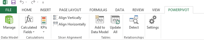
PowerPivot is the correct name for the client-side tools. This functionality is installed from a free add-in that you can find at http://www.powerpivot.com. Choose your add-in version (32- or 64-bit) and install. The installation is very simple with no options, and the functionality is then added to Excel. You will know you succeeded when you see the POWERPIVOT tab and its options shown in Figure 5-1.
Figure 5-1: The POWERPIVOT tab in the Ribbon

BI Semantic Model (BISM)
BI Semantic Model (BISM) is the name Microsoft gave to its OLAP suite in the new SQL Server 2012 release. The tools, features, and applications were all enhanced to align them with modeling the way a business needs to see data, adding flexibility and functionality to support it. PowerPivot is a part of this new feature set, but it is not all of it. BISM tabular is another feature, and so are other enhancements such as Power View, which you learn more about in Chapter 6. Figure 5-2 shows the BISM architecture.
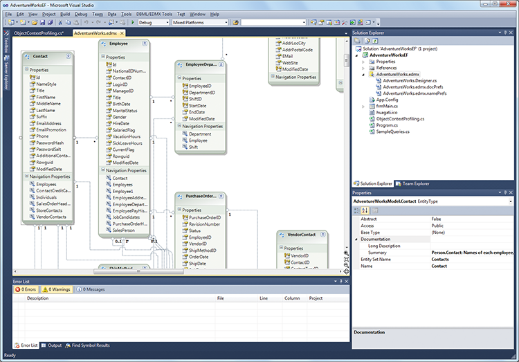
BISM Tabular
BISM tabular is the new server version of Analysis Services that supports models created in PowerPivot. Now that PowerPivot has been available for a while, we can upload these models to a production Analysis Services Server and share them across the company, taking advantage of the extra memory on a server to process and collaborate on larger, more intensive models. Figure 5-3 shows some of what this new interface looks like.
Figure 5-2: BISM architecture view
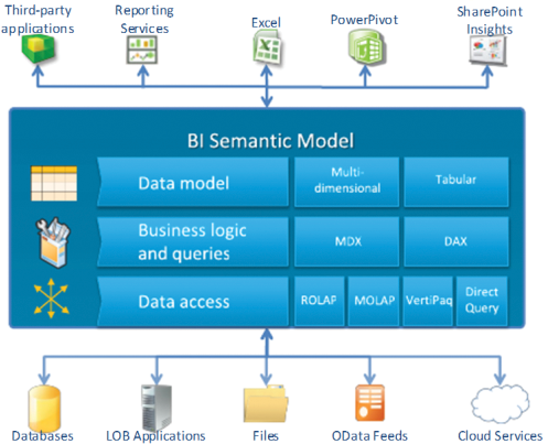
Figure 5-3: SQL Server Data Tools
Use Cases
Excel is often used by a variety of professionals to collect, sift through, and analyze data in an organized and predictable fashion. The users’ activities include pivoting data to be able to see how numbers or information look when different filters, parameters, and criteria are applied. The functionality and design of Excel makes this process very straightforward and painless.
PowerPivot is often used by the same folks who want to work with a much larger amount of data and need to persist the model. In other words, they want to keep their creations around and continually enhance then with features like partitioned data, automated data refresh, hierarchies for easier browsing, and course, much more data than Excel can handle natively. Analysis of tens of millions of rows of data is possible in PowerPivot, while Excel struggles above 60K rows in a native Excel table. This is because of the new column store features in PowerPivot that deliver significantly increased compression and performance when iterating over the data.
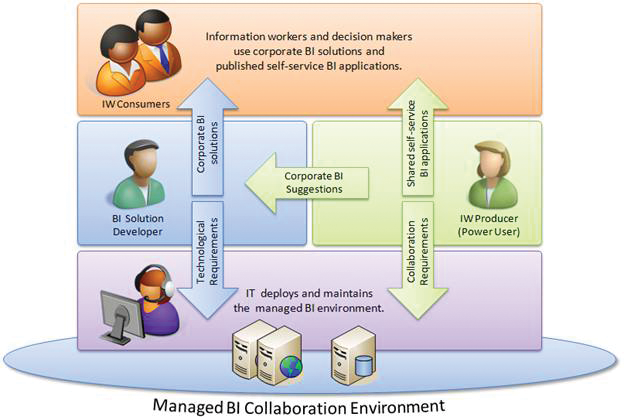
These persisted models are then shared and made available for collaboration by publishing them to SharePoint either through Excel Services or BISM tabular integrated with SharePoint to enable browsing and collaboration across the organizations. A typical workflow looks like this:
Create Workbook > Enhance in PowerPivot > Publish to SharePoint > Collaborate
This workflow is illustrated in Figure 5-4.
Figure 5-4: A self-service BI model
How Do These Models Fit into Your Organization?
Think through your organization and the types of people and roles who are always working with data, asking for more data, and needing more memory on their machines or access to data sources. Some examples include:
- Accounting and finance teams
- Marketing analysts
- Retail, manufacturing, and logistics analysts
- Executives
- Reporting analysts
Many of these people will already be familiar with these tools but will love the additional assistance professionals can give them with all the new things you’re learning in this text.
Column Stores
Figure 5-5: Row store versus column store
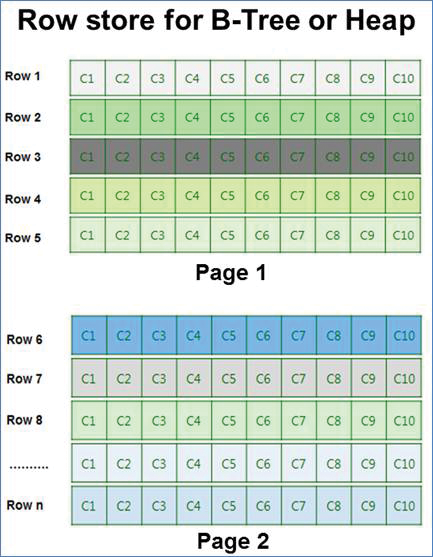
The term column store has been mentioned several times in this chapter already with only a basic explanation. This section highlights the importance and building blocks of this powerful technology. The technology is not new, although it’s very new to client tools such as PowerPivot.
SQL Server’s traditional index structure is based on a B-Tree model. B-Tree models are great for finding data that match a particular condition in a query. They are also pretty fast when you need to scan all the data in a table. There are a couple of main reasons we need the column store, however.
Compression is critical to getting increased performance out of the same data on the same disks. Most of the time, data is stored in rows as shown in Figure 5-5.
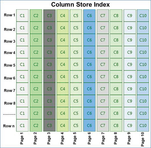
With a column store, the data is reorganized into a column-wise fashion similar to Figure 5-6.
Figure 5-6: Column store index
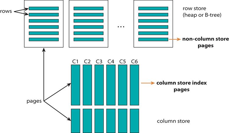
When you put that together it looks something like Figure 5-7.
Figure 5-7: Selecting from a column-store index
If this seems complicated, that’s okay. You don’t need to know all the internal details, but if you’d like to know more, use your favorite search engine to search for “Columnstore Indexes” and go to the page for “Columnstore Indexes: A New Feature in SQL Server known as Project ‘Apollo’“ on blogs.technet.com.
Multidimensional versus In Memory Models
PowerPivot represents a new shift in enhancing the capabilities around in-memory models. This differs from the traditional multidimensional model in that now we don’t need to build out a traditional OLAP cube to be able to do much of the OLAP-type analysis. Not that we might not want to build it out, but sometimes that is more work than we have time for. Typically, you would want to use a multidimensional model when size or complexity overruns the PowerPivot or BISM tabular toolset.
For size, this would be data that would be too much for a server memory footprint or perhaps require complicated MDX scripting. PowerPivot can do much of this scripting as well, however, so don’t discount the power of its DAX language.
Creating Your First PowerPivot Model
Let’s move forward by creating our first PowerPivot model. This model will be based on a sample data set in the Chapter05.zip from this book’s download files. First, you want to have the PowerPivot add-in installed; or if you are already running Office 2013, you just need to enable it.
To enable the add-in in Excel 2013, go to File > Options > Add-ins > Com Add-ins > GO. After the add-in is enabled, you should see a dialog like the one shown in Figure 5-8.
Figure 5-8: Add-ins in Excel
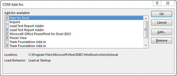
Make sure the “Microsoft Office PowerPivot for Excel 2013” check box is selected. Now you’ll see the PowerPivot tab in the top of the Ribbon and you can get to work!
Step 1: Understand Your Data
The VI_UNData.bak database contains tables based on United Nations data collected for a number of countries around the globe. It contains a number of statistics and facts by country that we’ll be using throughout the book. For this first example, we’ll take a couple of tables and build a simple model.
Open a new workbook in Excel, go to the PowerPivot tab, and click the Manage icon, as shown to the left in Figure 5-9.
Figure 5-9: The PowerPivot Ribbon in Excel 2010
Step 2: Create Your First Model
Now that we have the right add-in configured, let’s create our model. There are a number of ways to do this, but the primary way is to import data from one or many data sources. For this example, we are going to use the United Nations data sample from the book’s downloadable files.
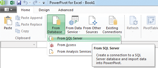
Make sure you have the database restored to an accessible server and then select your PowerPivot tab and click the Manage icon. Then click “Get External Data” and choose SQL Server database. In this case, the database is the database backup file you downloaded for this chapter that you should have restored and made accessible somewhere in your environment. The next several sections will highlight the steps to load data into your model.
Step 2a: Select Your Data Source and Data to Load into Your Model
The UN data sample is a SQL database, but remember that the “power” in PowerPivot comes from the ability to use virtually any source of data and then combine it with data from other sources. See the following figures for the process to get your data.
First, you connect to your data source. Click the manage icon in the Ribbon to open the PowerPivot window. This window is where you do most of your work with PowerPivot. Next, locate the section in the Home tab for getting data. Click the From Database button, then select From SQL Server, as shown in Figure 5-10.
Figure 5-10: Creating a SQL data source
Enter the server and connection credentials for the data source you’re connecting too, then choose the VI_UNData database as shown in Figure 5-11.
Figure 5-11: Table import wizard

Figure 5-12 shows the check boxes next to each table. You can also give the tables friendlier names, which you use in this model. This is important to make the model more readable and usable down the road. You could filter your data here as well, but you don’t need to do that in this case. Click finish to complete the import.
Figure 5-12: Using relationship detection
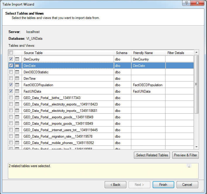
Figure 5-13: Import screen

Figure 5-13 shows the import running successfully! Great work!
Step 2b: Build and Check Relationships
If there are existing physical keys or relationships in the underlying data, they will be imported into PowerPivot if you clicked “Import Related Tables.” However, the goal is to combine data and begin visualizing it, so you can create additional relationships in your model based on how the data lines up. You just drag and drop the column names onto each other and the relationship is created! Simple! See the before and after in the figures that follow.
To build your relationships, switch to the diagram view in your PowerPivot window using the icon at the lower right, as shown in Figure 5-14.
Figure 5-14: The diagram view

Find the columns in your tables that relate to each other and drag them from one table and drop them on the column name that matches in the related table. For this example, FACTOECDPopulation.CountryID was dropped on DimCountry.CountryID. Continue this for the remainder of your tables. Often you’ll drag the column from the fact table and drop it on your dimension table.
Step 2c: Clean-Up Work
The last thing to do before verifying your model is clean it up. Inevitably, you will bring in columns you thought you needed but wind up not using, or columns whose names don’t really match or mean anything semantically valuable to you or your end users. See how in the following figures.
Highlight the columns that you’re not using (you can pick columns with little or no data or that don’t seem to be as useful). Right-click in the header of the column and select Delete. The columns with empty rows near the top right in this Figure 5-15 are the columns we chose to delete.
Figure 5-15: Cleaning up columns
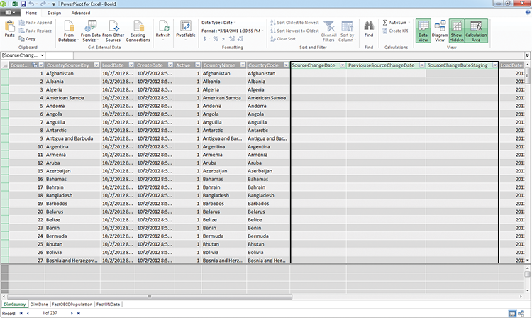
Figure 5-16 shows the second clean-up step where you rename your columns to something more usable. You can right click on the column header and select Rename. This will then edit the model right there and persist the change. You can see this renaming in Figure 5-16.
Figure 5-16: Renaming columns
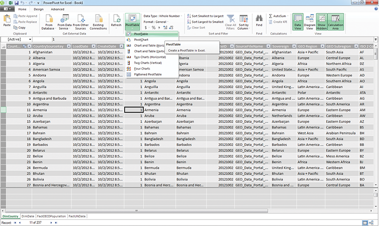
Step 3: Does Your Model Work?
To test your model, let’s explore it in Excel. Click the PivotTable button on the Home tab in the Ribbon, as shown in Figure 5-17.
Now that we know we can use our model, let’s take a look at some things that Excel can do for us. The next section will build some tables and visualization on top of this foundation.
Figure 5-17: Creating a pivot table
What Does Excel Do for Me?
If you’re still asking this question, you haven’t been paying attention! Kidding, but only a little. Excel is very powerful. Even without PowerPivot, Excel gives us some great functionality for analyzing our data. In fact, without Excel’s pivoting, charting, and analysis tools, PowerPivot would not be as functional either because we often explore our models right in Excel.
Pivot Charts and Tables
Using pivot charts and tables is an incredibly powerful and easy way to begin simple visualizations that provide some great self-service capabilities for end users. They allow for dynamic work on charts and tables by using drag-and-drop functionality and easy-to-learn formulas and techniques for more advanced users.
Intro to Pivots in Excel
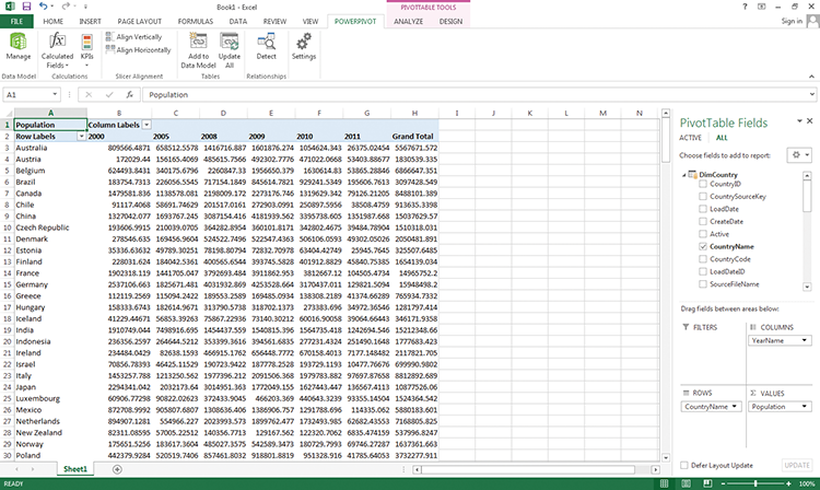
Let’s explore our model and see some examples of pivots. Pivots enable us to change the axis alignment of our data to show, or “pivot,” it differently. This is a big key to a lot of Excel’s power. See examples of us building and using pivots in Excel. We do this by changing where we drag the columns in the grid on the right. See the difference in where the columns are placed in the grid and how that affects the pivot report’s axes.
In your model in PowerPivot, click the Explore in Excel icon to get an empty Excel pivot table. Then you drag some of the values into the boxes in the Field Well on the bottom right to begin to see the report take shape. Notice that we’ve put the year as the column, the country in the rows, and population as a simple value. Figure 5-18 shows how this looks.
Figure 5-18: The layout of a pivot table
Filters versus Slicers
We can add extra functionality by going to the Ribbon, as shown in Figure 5-19, and inserting a slicer (a visual filter), or we can use the built-in Excel filters (see Figure 5-20). Inserting a filter is as easy as dragging the column you want to filter by into the filter area in the Field well (where you just dragged the other columns).
Figure 5-19: Inserting a slicer from the Ribbon
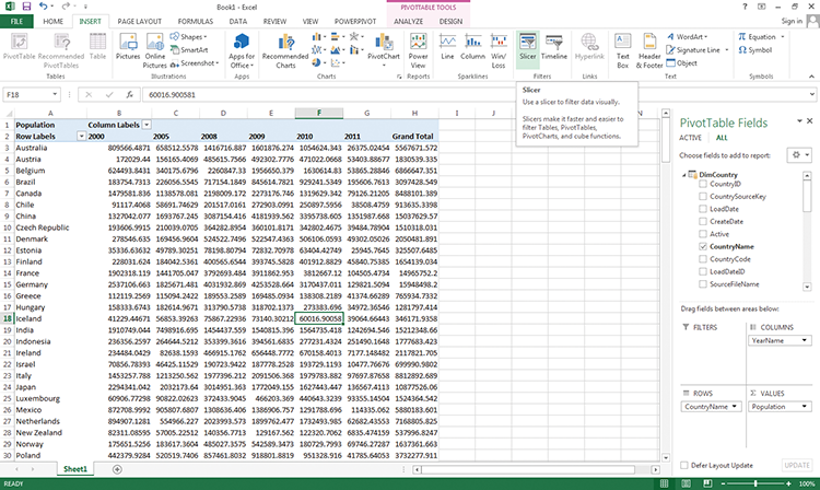
Inserting a slicer is one extra step. You need to click on your pivot table somewhere and select Insert > Slicer. Then you can choose the fields you’d like to slice by. These function as live filters on the canvas as opposed to in a drop-down list, so they are better for common filters that users would combine. They are also sometimes more visually preferable to regular filters. The slicers we chose are shown in Figure 5-20.
See how easy that was? Now we can format and sort our report using some of the cool functionality in Excel.
Figure 5-20: Slicers on a worksheet

Formatting and Sorting Pivots
All the formatting is right at your fingertips. We have so many options to play with here to dial in how we want this to work. Let’s see the following few figures, in which we can choose options and see the results of our formatting capabilities in Excel.
The best way to experiment with formatting is to right click on columns in your pivot table and select Format Cells. This will allow you to choose all kinds of formatting options including currency, date formatting and other customer formats like phone numbers, internal codes, etc. These options will be covered throughout Part III of this book in the Excel implementation examples in each chapter.
You also have the option to do custom filtering on a pivot. Figure 5-21 shows an option to filter by value.
Figure 5-21: A value filter

Summary
This chapter covered some great ways to begin assembling data for analysis. We covered the different ways we can use Excel and PowerPivot to build simple models and tables to begin using them as baselines for visualizing our data on top of them. You can now build a model, improve it and clean it up, and begin visualizing it in Excel. In Chapter 6 you learn about bigger and better models and visualizations using Power View.