Chapter 6
Power View
This chapter focuses on building a solution in Power View so you can continue your data visualization efforts. It covers what Power View is, what the requirements are to create Power View reports, how to create a report, data modeling tips, and also how to deploy and share the reports.
What Is Power View?
Power View is a new reporting feature that was added in Reporting Services 2012. Power View was created to provide web-based self-service reporting capabilities to end users. It is designed for rapid data exploration and mash-ups of data from a tabular BI Semantic Model (BISM). The tabular data model can either be created using PowerPivot or Tabular Analysis Services. Users can very quickly create highly visual and interactive reports with Power View and the experience is greatly simplified. Report developers no longer have to deal with setting properties on objects included in the design, worry about relationships in the data, how a particular visualization will look, or how to connect items together for filtering.
With Power View the property settings are not present like they are with the other Reporting Services development tools such as Report Builder and Report Designer. The modeler of the data has already taken care of the relationships in the data. Power View provides you a WYSIWYG (What-You-See-Is-What-You-Get) experience, so there’s no flipping back and forth between design and preview anymore to see what your report will look like. Items within Power View reports are also connected to each other based on how the data is related, so clicking on an item in a chart legend can automatically filter related data in a table.
Power View is also a new feature in Excel 2013, so now this new functionality is available either as an add-in that you can easily enable in Excel 2013 or through Reporting Services in SharePoint integration mode. Figures 6-1, 6-2, and 6-3 show some of the types of visualizations you can do with Power View.
Figure 6-1: Sales Dashboard Power View report

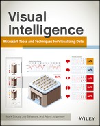
Figure 6-2: Promotion Evaluation Power View report
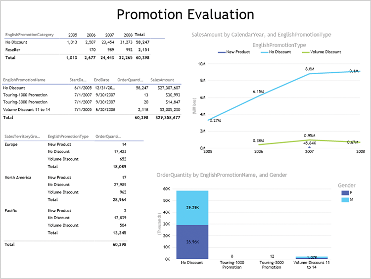
Figure 6-3: Geo-Analysis Power View report
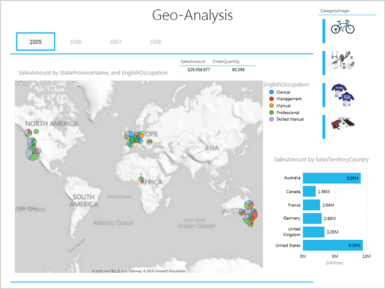
Table 6-1 outlines the different visualizations that are available in Power View.
Table 6-1: Power View Visualization Options
| Visualization | Additional Information |
| Table | Regular table or matrix style, which can include row and column groups. Tables can also include totals for the values, which can be turned on or off. |
| Bar chart | Bar charts also include options for clustered, stacked, and 100% stacked. Data labels can be included as well. |
| Column chart | Similar to the bar charts, they include options for clustered, stacked, and 100% stacked. Data labels can be included as well. |
| Line chart | Line charts can support multiple values or can be broken out by a particular dimension attribute. Data labels can be included as well. |
| Pie chart | Pie charts can be broken out by a particular dimension attribute. Data labels cannot be included. |
| Small multiples | Also known as trellis charts; can turn a single chart into smaller repeating charts based on groupings and can be organized either horizontally or vertically. This option is available in the Field Well when a chart is selected. |
| Scatter chart | Also known as a bubble chart. Provides ability to analyze three metrics simultaneously and also provides a play button feature to enable viewing how data changes over time. You can view the history of a particular bubble by clicking it to see the trail over time (assuming time was set up in the chart). |
| Map | The map uses the Bing map service to provide geo-coding to plot the data elements using geographical data elements such as text or latitude and longitude. |
| Card | The card provides an index style layout for dimension members, which can include images as well as text and data values. |
BISM: The First Requirement for Power View
As mentioned previously, a BISM tabular model is the foundation for the Power View reports in Reporting Services. If you are using Excel 2013, which now has native support for data models, you will be able to create a Power View report from any data formatted as a table in addition to using tabular data models. The native data model capabilities in Excel 2013 are limited, and an advanced BISM tabular model will provide you much more functionality. Also, it is a good idea to build a BISM tabular model with Analysis Services to centralize your data and enhancements (such as calculated values or images, etc.). That is functionality you can’t get if you just import data into Excel and then create a Power View report.
Creating a Power View Report
In this section you create a Power View report from scratch. This process involves connecting to a deployed BISM tabular model and using that data and functionality to drive the Power View experience.
Creating a Data Source
Be sure to install the data samples for this chapter before beginning this section. For more information, see the “Installing the Power View Samples” section later in this chapter. The data sample files will be used to perform the exercises in this chapter.
First, you need to create the data source. You can do this in one of several ways. You can connect to your data model through Excel 2013 and import the data into an Excel worksheet. Although this process will limit the amount of data and functionality you can leverage, it is great for simple tasks. You can use PowerPivot to import the data and then create tables in Excel to analyze or you can connect to a PowerPivot data model that is published in SharePoint. Right now, your data model is published to an Analysis Services server somewhere, and that is the type of solution we’re focusing on. For now, let’s jump into Excel.
Creating a New Power View Report in Excel
To create your new report, open Excel 2013 and select the Data tab. Then select From Other Sources in the top-left third of the Ribbon. See Figure 6-4.
Figure 6-4: Getting external data from other sources

Figure 6-5: Choosing to view data in a Power View report
Next, select From Analysis Services, enter your connection information, and click Next. Now select the Chapter 6 - BISM Model from the database dropdown and click Finish.
From the Import Data dialog box choose Power View Report, as shown in Figure 6-5, and click OK. If you do not see the Power View Report option, that means that the add-in has not been enabled yet, so click Cancel and follow the steps in the “Enabling the Power View Add-in” sidebar—then you will be able to complete these steps.
After the Import Data dialog box closes you should see a screen like that shown in Figure 6-6.
Figure 6-6: Clean Power View report canvas
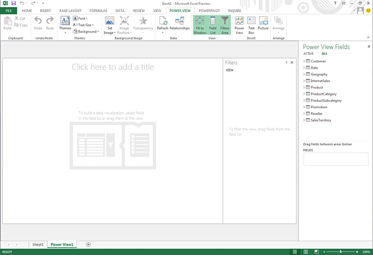
When you see the Power View interface for the first time, you’ll notice how uncluttered it looks. Let’s review the sections of this interface and see where to go for certain types of actions.
- Canvas: The center section dominated by the watermark is called the canvas, which is where your different visualizations will show up. You can build tables, slicers, charts, and other elements to create an interactive experience.
- Field List: The upper right of the screen should look familiar if you’ve used Excel’s pivot table functionality in the past. It is where the tables from the data model show up for you to work with.
- Field Well: The Field Well, found in the bottom right, is where you drag and drop fields to enable them in different elements on the canvas. We can change some settings here as well to help them show up the way we want.
- Filters Area: The Filters Area restricts the amount of data displayed in your canvas elements. We could, for example, restrict to showing just a particular year or a city/state combination for more detailed viewing of our data. If it gets in the way, you can toggle it using the “<“ icon at the top of the Filters Area or remove it completely with the Filters Area option in the Ribbon.
- View area: The View Area is available when using the SharePoint Power View option and allows for tracking different states and/or views of the data in the same report file to provide capabilities to analyze data at different points in time and/or in different ways.
- Ribbon: This is the familiar interface introduced with Office 2007 in which many of your other common tasks such as saving, design, and data connectivity are grouped together.
Now we can begin creating our first report, but before we do let’s review the steps at a high level and then we’ll complete an exercise:
Creating Your First Simple Power View Report
Now you dive deeper and build a financial-style report step by step. Because financials are not always eye-grabbing, you can add some visualizations to it to spice it up.
Figure 6-7: Your first table in a Power View report
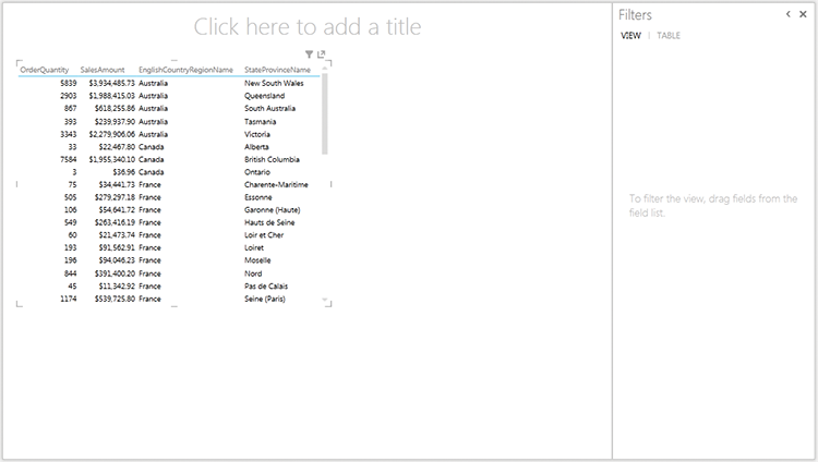
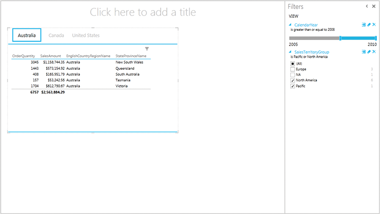
Figure 6-8: A Power View report with filters and tiles
Enhancing Your Power View Reports
Now that you’ve created your first simple report, let’s add some pizazz to your reports by adding images.
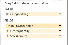
Figure 6-9: The Field Well showing Tile By CategoryImage
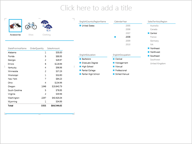
- Geography > EnglishCountryRegionName
- Date > CalendarYear
- SalesTerritory > SalesTerritoryRegion
- Customer > EnglishEducation
- Customer > EnglishOccupation
Figure 6-10: Power View report with images and slicers
Enhancing Data Models for Power View
Before you make your data model available to end users to create reports against, there are a few enhancements that should be done to improve the usability and adoption of the model. These enhancements include cleaning up the data model as well as setting some additional settings within the model that Power View can then leverage when you’re creating reports. Now let’s take a look at what is involved with these enhancements.
Cleaning Up Your Data Model
There are a number of things you can do to clean up your data model and make it more valuable for your efforts or for your end users’ needs. Let’s explore some of them here:
- Remove unnecessary columns. Many times we import a lot more columns than we need into our data models. Now is the time to go about cleaning them out. Just remove them; or if you feel they must be there, you can right-click the column header and select Hide From Client Tools.
- Make sure column names are clear and understandable. Go through your data model and make sure the names are clear and legible. Now is the time to make this easily understandable for your end users. These names can be edited by either changing the properties of a column in the properties pane of SQL Server Data Tools, or by right-clicking the column header and selecting Rename.
- Review formatting of data and ensure the data is clean. You should always spend some time reviewing the data in your model to make sure it fits the profile you believe to be correct. Sometimes you won’t know and that’s okay, but check for simple things such as ensuring that the Description column does not contain Prices and other things like that.
- Add any images you might need for building cards or more-advanced visualizations. Review the previous section on Enhancing Your Power View Report to see how to add images and other impressive interactivity to your model so you can consume them in Power View.
Adding Metadata for Power View
After the data model has been cleaned up, there are some additional items that can be looked at to further enhance it when used with Power View. These items include the default field set, table behavior settings, and categorizing the data in your columns within your tables accordingly. This section discusses these and provides an example from a Tabular Analysis Services project. In a PowerPivot data model, these items are found in the Reporting Properties section of the Advanced tab in the PowerPivot window.
Default Field Set
First there is the default field set. This setting on a table in your data model provides you the ability to select one or more columns from your table (including measures) and allows you to order them as you see fit. Now when a user clicks on the table in the Power View Fields, all of the columns that were defined in the default field set will be added to the canvas. This provides a quick way to add multiple columns that are typically used for a particular table in a report. Figure 6-11 shows an example of what the Default Field Set dialog boxes looks like.
Figure 6-11: Default Field Set dialog box
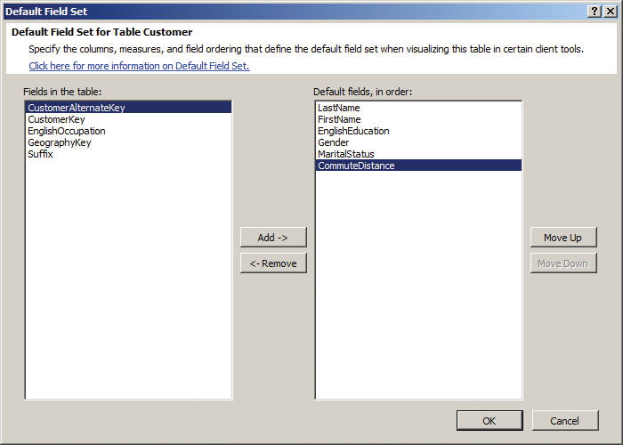
Table Behavior
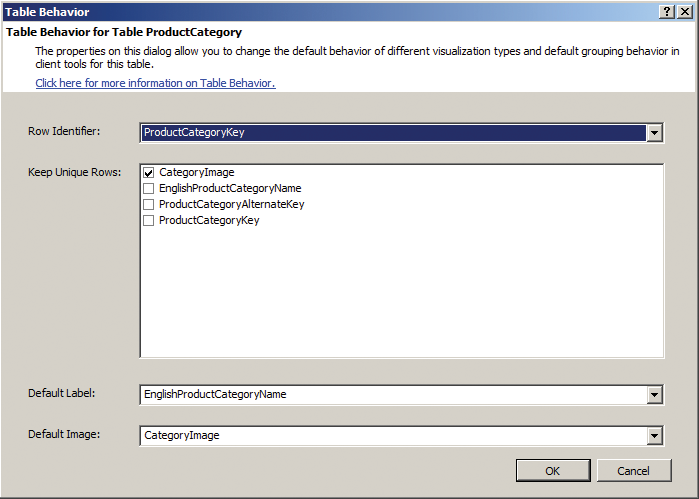
The table behavior properties can be used to set the following properties for a particular table: Row Identifier, Keep Unique Rows, Default Label, and Default Image. The Row Identifier allows you to designate the column in the table that is the unique identifier (primary key) for that table. The Keep Unique Rows setting allows you to establish which column(s) in the table will be used to determine unique rows when reporting. So, for instance, in the Chapter 6 – BISM Model, if the Row Identifier is set to CustomerKey, the Keep Unique Rows could be set to CustomerAlternateKey or possibly FirstName and LastName. That way if a customer is in the table multiple times you can report on them as a single customer instead of multiple customers and avoid sending them multiple offerings.
The Default Label and Default Image do exactly what you would think—they allow you to define the label and image for each unique row in the table. So for the ProductCategory table you would select EnglishProductCategoryName for the Default Label and CategoryImage for the Default Image. The Default Image can reference either binary data-type columns or text columns that are designated as URL references to image files. See Figure 6-12 for an example of the table behavior dialog box.
Figure 6-12: Table Behavior dialog box
Data Category
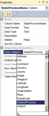
Data category is a property setting that is available on a column within your data model. Some of the values for this property are address, city, continent, image, imageURL, place, etc. Once this property is set on the column, Power View can interpret that information and use it so that it knows that the text is a URL reference to an image or that the text represents a country name. This can then be used to display images and map the data depending on the type of visualization used in the report. Figure 6-13 shows an example of this property setting in a Tabular Analysis Services project for the StateProvinceName column in the Geography table.
Figure 6-13: Data Category column property
Sharing Power View Reports
Now that you have learned how to create these highly interactive Power View reports, the next step is to share them with others. There are a few options for this—one is that you can publish them to a SharePoint portal and another option is to use the export to PowerPoint capability. Let’s look at these two options a little further.
Publish in SharePoint
It is especially useful to be able to share not only your Power View creations, but also your PowerPivot data models. This section explores doing that and shows some of the value it provides.
Deploying Your Data Model to SharePoint
When you want to share your data model with co-workers or a team, you can save it to a SharePoint library, enabling them to create new Power View reports right from the SharePoint interface. Here are the steps that you can use to deploy the PowerPivot Excel file to SharePoint.
Figure 6-14: Saving an Excel file to SharePoint
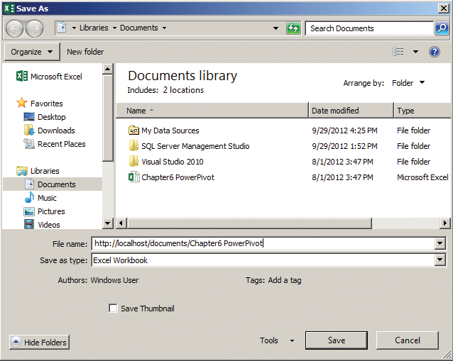
Alternatively, you can share your own reports and people can view them if given the right access. These Power View reports could have potentially been included in the Excel file with the PowerPivot data model already, they could be in a separate Excel file like the one we created in the exercises in this chapter against the Tabular Analysis Services model, or they could be created and saved directly in SharePoint. If they are included in the Excel file, you can follow the steps just listed to save them to SharePoint.
Now that the file is in SharePoint, users have the ability to connect to that file from their desktops in a new Excel file and create reports from it. In addition, users could also create connection files in SharePoint that could in turn be used to develop Power View reports from directly in SharePoint, or even use them as sources for PerformancePoint dashboards.
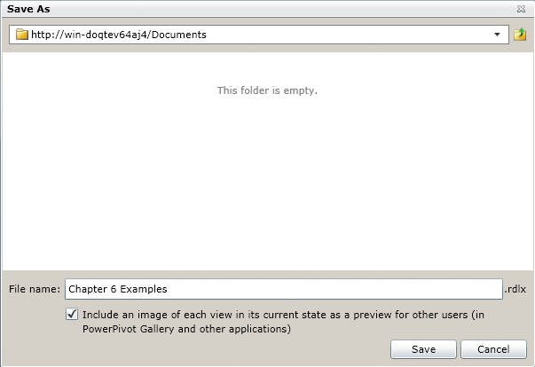
Saving Your Power View Reports in SharePoint
If you are creating the Power View reports directly in SharePoint instead of Excel, you can quickly save and share the reports directly in a document library. Once the files are in the document library or possibly a PowerPivot Gallery, then you can provide access to these reports for others to reference and explore. The following are the steps that you can use to save a Power View report directly in SharePoint.
Figure 6-15: Save a Power View report in SharePoint
Exporting to PowerPoint
Figure 6-16: Power View Export to PowerPoint option
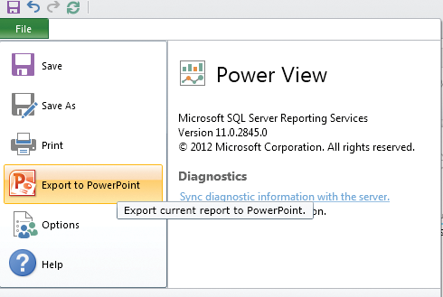
Power View reports created in SharePoint (not the ones created by using Excel) have another great feature: they can be exported to PowerPoint. This makes these reports more mobile, and full interactivity is possible as long as the person has connectivity to the data source. To export your Power View reports to PowerPoint, simply press the button shown in Figure 6-16 while you are viewing the report in SharePoint.
In addition to being able to make these reports more mobile and being able to incorporate them into a presentation, this also provides a nice way to be able to print all of the reports at the same time. If you tried to print them from SharePoint you would only be able to print one view within a report file at a time, so if you have multiple pages, using the Export to PowerPoint option works nicely. In addition to that, you are also able to save them to a PDF format once they are exported.
Installing the Power View Samples
The samples are simple to install. You need an instance of SQL Server 2012 SP1, SQL Server Data Tools, a tabular instance of Analysis Services running in your environment, and a SharePoint installation with PowerPivot and Reporting Services integration. Follow these steps:
You’re now ready to connect to it with Excel 2013 and start building reports!
Summary
In this chapter, you created models to explore your data and then created some simple visualizations using Microsoft Power View. Power View, like many of the tools in this book, is bigger than we can cover completely in one chapter. We hope this introduction has inspired you to test it out more thoroughly in your environment!