Chapter 12
Comparison Visuals
Using a visualization to compare two or more objects either at a point in time or over a period is one of the oldest forms of visualization. In Chapter 11, a treatment of comparisons over time has been done, so this chapter focuses on point-in-time comparisons.
Comparing items of data and deciding which is better is one of the most common actions people take. This may take the form of ranking: for instance determining which of your stores are in the top 10% and which stores are in the bottom 10% by sales (or gross profit) allows you to determine the appropriate remedial action for the poorly performing stores, and apply what’s been learned by the best 10% to your other stores.
Another comparison is comparing actuals against targets: For instance, while a store may be in the top 10% by sales, it could well have not achieved a target set for the period.
In this chapter you learn about several methods for comparing values visually: heatmaps (also called chloropleths), traditional bar charts, and pie charts, as well as bullet graphs, radar graphs, and matrices.
Overview of Point-in-Time Comparisons
The effect used to show point-in-time comparisons can take one or a combination of the following forms:
- Change in color (heatmaps, chloropleth, indicators)
- Change in width (bar charts)
- Change in height (column charts, prism charts)
- Change in position (scatter plots)
- Change in area (bubble charts, tree maps)
- Change in angular width (pie charts, donut charts)
- Change in length (radar charts)
Combinations of these formats to add data—for instance, color to show a change, and size of a bubble to show the absolute value—are very common.
Figure 12-1: A comparison visual with several problems
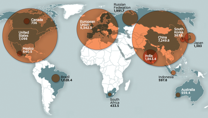
Figure 12-2: XKCD showing the problem with heatmaps
Explaining Perspective and Perceiving Comparisons
How you perceive the difference between two objects is dependent on a variety of factors—the difficulty with using area as a comparison method is covered in Chapter 2, and the challenges of using 3D is covered in Chapter 1. Other factors include their relative positioning and ordering—putting two slices of a pie chart with similar but not identical values opposite each other can be hard to read. As you learned in Chapter 2, background images can also distort comparisons.
Pie Charts Versus Bar Charts
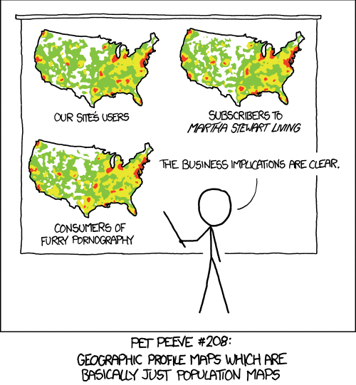
Figure 12-3: An Excel pie chart with similar-sized slices
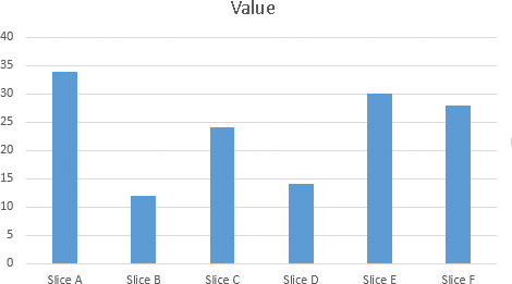
People commonly use pie charts as a comparison visual. However, you need to carefully think before using a pie chart. Figure 12-3 shows a pie chart. Look carefully. Is Slice B or Slice D bigger?
It’s fairly difficult to determine which slice is larger. While, as shown later, ordering the pie chart by value will assist in this comparison, there are better methods. Compare Figure 12-3 to Figure 12-4, a column chart of the same values.
In Figure 12-4, it’s much easier to determine which column is larger, and it’s also easier to tell the absolute values.
Figure 12-4: An Excel column chart with the same values
Another option is a stacked column. With a stacked column, as with a pie chart, it aids perception greatly to order the numbers by value. You can see by this by comparing the pie chart in Figure 12-5 with the stacked chart in Figure 12-6.
Figure 12-5: A pie chart ordered by value

Figure 12-6: A stacked chart
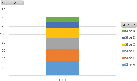
It’s easier to see the total value in the stacked chart, but that comes at the expense of the ease of comparing the individual items (although that’s still possible). Also, comparing individual items to the total value is now easier. Which of these charts you choose depends on the message you are trying to convey.
Ease of Development
| Reporting Tool | Predefined Chart Type | Ease of development |
| Excel | Yes | |
| PerformancePoint | Yes | |
| Power View | Yes | |
| Reporting Services | Yes | |
| Silverlight/HTML5 | N/A |
Bullet Charts
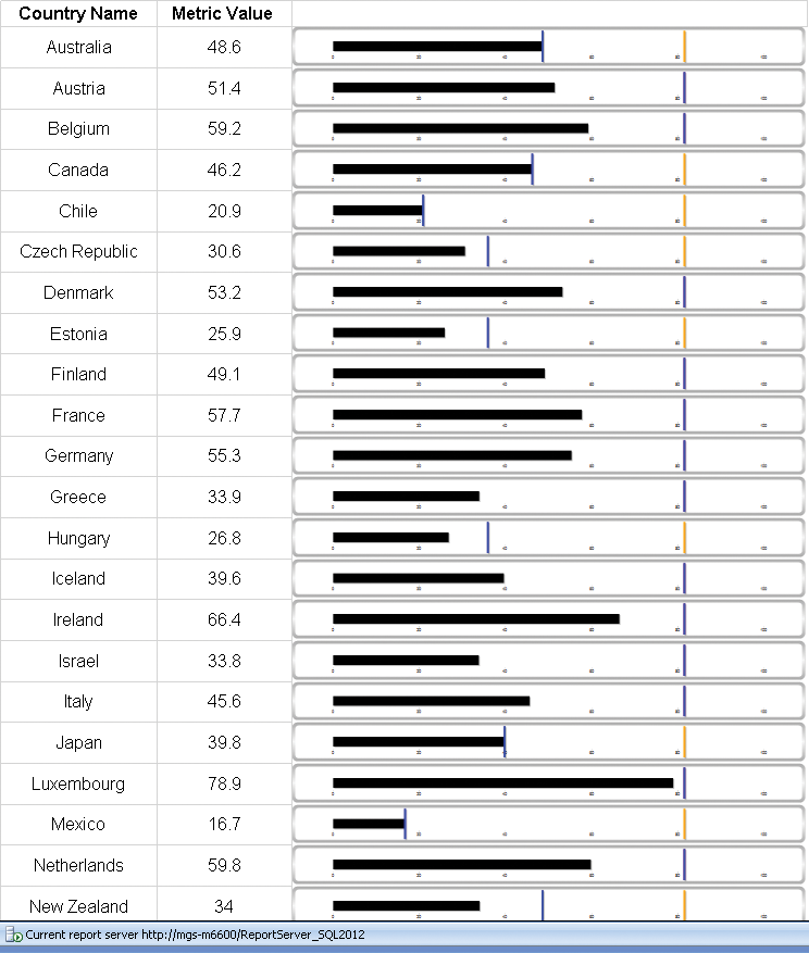
Bullet charts have been popularized by Stephen Few, and are an excellent way of having multiple comparison points. Chapter 16 deals with them more extensively, but this chapter includes an implementation in Reporting Services (SSRS).
Figure 12-7 shows a basic example of a bullet chart.
Figure 12-7: A bullet graph in SSRS

Ease of Development
| Reporting Tool | Predefined Chart Type | Ease of development |
| Excel | No | |
| PerformancePoint | No | |
| Power View | No | |
| Reporting Services | No | |
| Silverlight/HTML5 | N/A |
Radar Charts
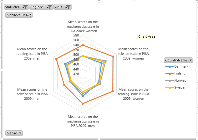
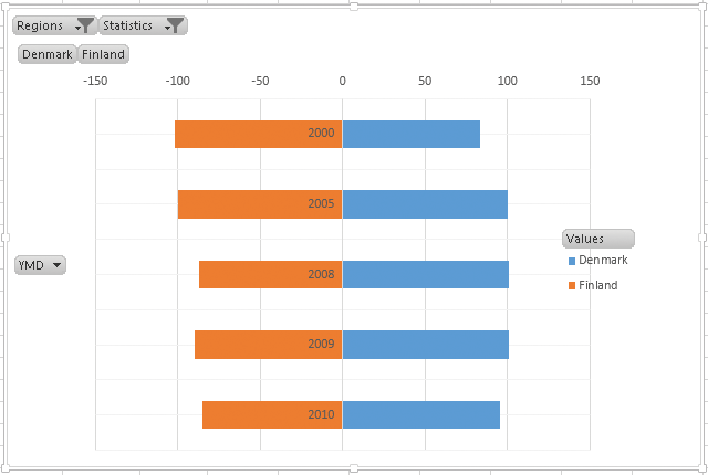
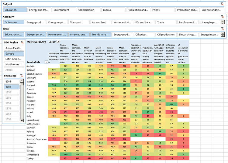
A radar chart is a way of comparing data along multiple axes. In a radar chart, each point is represented as a distance from the center. The order and choice of data points is quite important in this type of graph, as adjacent nodes should be related in some manner, and the slope of the graph has meaning. In the chart of education ratings for the Scandinavian countries shown in Figure 12-8, the ratings for men and women have been chosen to be opposite each other, allowing for each comparison, and science was picked to be between math and reading, as science ability can be considered highly influenced by ability in math and reading.
The high slope for women up to science versus the flat one for men is an interesting contrast.
Figure 12-8: A radar graph of Scandinavian education scores
Ease of Development
| Reporting Tool | Predefined Chart Type | Ease of development |
| Excel | Yes | |
| PerformancePoint | No | |
| Power View | No | |
| Reporting Services | Yes | |
| Silverlight/HTML5 | N/A |
Matrices
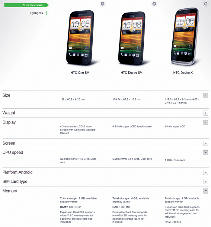
A matrix of different comparisons is a very common visualization. A common use for them is on online shopping portals, such as the one from HTC in Figure 12-9.
Figure 12-9: HTC comparing models of phones
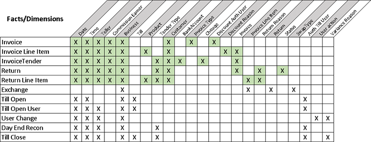
Another form of matrix comparison is the bus matrix used in the Data Warehouse design, shown in Figure 12-10. By listing the dimensions along the top and the fact tables down the side, you can make an estimation of the difficulty of development of each area based upon the order in which they’re done.
Figure 12-10: A bus matrix
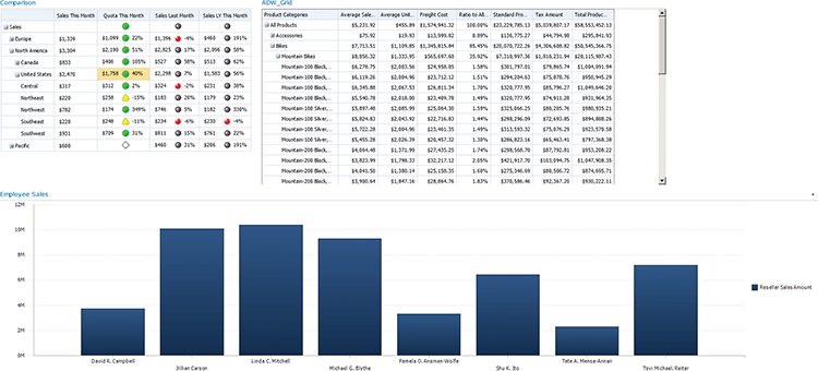
PerformancePoint has an analytic grid, Excel has a pivot table, and SQL Server Reporting Services (SSRS) has a matrix for creating these comparison tables.
PerformancePoint’s analytic grid is shown in Figure 12-11.
Figure 12-11: A PerformancePoint analytic grid
Ease of Development
| Reporting Tool | Predefined Chart Type | Ease of development |
| Excel | Yes | |
| PerformancePoint | Yes | |
| PowerView | Yes | |
| Reporting Services | Yes | |
| Silverlight/HTML5 | N/A |
Custom Comparisons
A custom comparison can take several forms. You can format the various charts in Excel and Reporting Services to a level that the chart is essentially a custom type.
For instance, Figure 12-12 is an example of a Christmas tree comparison.
Figure 12-12: A bar chart as a Christmas tree comparison
Bullet graphs such as the one shown in Figure 12-13 are a custom comparison in Excel. This graph was developed by superimposing two bar graphs with a transparent background and a colored shape with a gradient.
Figure 12-13: A bullet graph in Excel
Other custom visualizations include filled-up shelves shown in Figure 1-3 in Chapter 1, or the animated building in Figure 2-21 in Chapter 2. The animated buildings are essentially just prettified columns in a column graph.
Another custom visualization is the prism map also shown in Chapter 1.
Tool Choices, with Examples
The Microsoft toolset is relatively good with comparison visualizations, and works well across the toolset. The only large gap is an automatically generated heatmap. While Excel can be used to generate a heatmap of sorts, it is far from use friendly. The InfoVis toolkit is discussed later in this chapter to show you what these heatmaps look like.
PerformancePoint Services
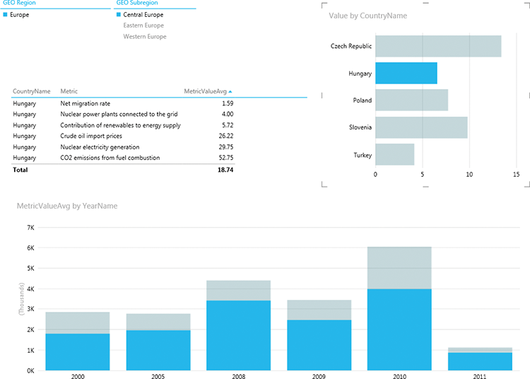
PerformancePoint is very good with the basic comparison visualizations. It has column charts, scorecards (the indicators covered in Chapter 13 are a form of comparison visual), and an analytic grid. It is, however, limited in that further customization is not possible. The interactivity of being able to slice your various comparisons by a scorecard—as shown in Figure 12-14—makes up for this in large part by making the experience of filtering the comparisons very easy.
Figure 12-14: A PerformancePoint dashboard
SSRS
Reporting Services allows for great and finely detailed control over the individual elements in the charts being displayed. It enables you to easily create embedded charts (such as bullet charts) in table matrices. An example of embedding a bar chart in a matrix is shown in Figure 12-15.
This repeating (or tiling) of a chart is one of Reporting Services’ greater strengths for comparing values.
Excel
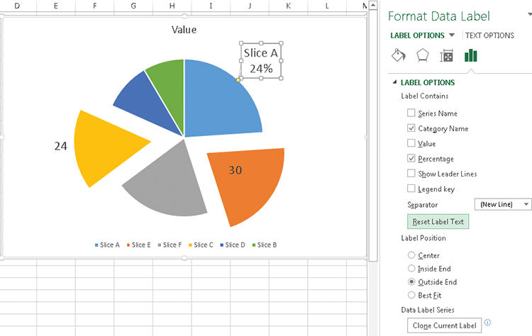
Excel’s greatest strength is in the level of control you have over a visualization’s exact look. For instance, the pie charts shown in Figures 12-4 and 12-6 can have the individual slices pulled out to highlight items you are interested in, as shown in Figure 12-16, as well as a great deal of customization of how the labels are shown.
Figure 12-15: Comparisons in Reporting Services
Figure 12-16: An exploded Excel pie chart
Another strength of using Excel is conditional formatting, which is used to create heatmaps, as well as the data bars. You can read more about heatmaps in Chapter 16, but an example of one is shown in Figure 12-17.
Figure 12-17: A heatmap in Excel
Power View
Power View is a good tool for interactive comparison visualizations. The automatic linking of column and bar charts on the same page is very useful. Just as with PerformancePoint, though, the level of control over the visualization is very limited. Figure 12-18 shows an example of a dashboard with a slicer, a table of data, and column and bar charts interacting with each other. Active regions are shown in blue, and inactive in a grey-blue.
Figure 12-18: A Power View dashboard
HTML5
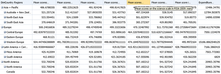
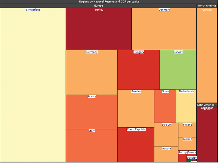
Working in HTML5 gives you the ability to build your own visualizations. The prism map referenced earlier is one example, but all the other examples previously listed are possible—with an additional amount of work, of course. Figure 12-19 shows a heatmap chart built using the InfoVis toolkit. InfoVis is an open source HTML5 library available at http://philogb.github.com/jit/. The chart in the figure is based on countries for which we have both National Reserves and GDP per capita in 2009.
Figure 12-19: A heatmap built in InfoVis
Implementation Examples
The implementation examples in this section use the OECD_Data model, so be sure you have downloaded those from this book’s web page on Wiley.com.
PerformancePoint: Column Graphs
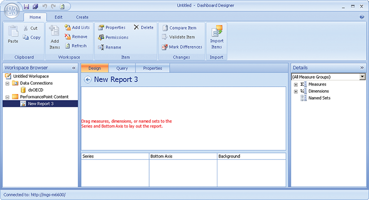
PerformancePoint is the easiest tool to set up. To create the column chart for this example, create a data source, as explained in Chapter 7, right-click your PerformancePoint content list, and then create a new report. Choose Analytic Chart from the window that appears and finish off by choosing your data source. At this point you should see the Dashboard Designer window like the one in Figure 12-20.
Figure 12-20: Dashboard designer
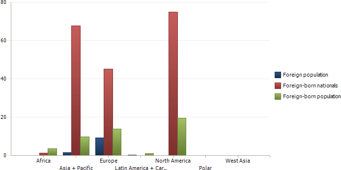
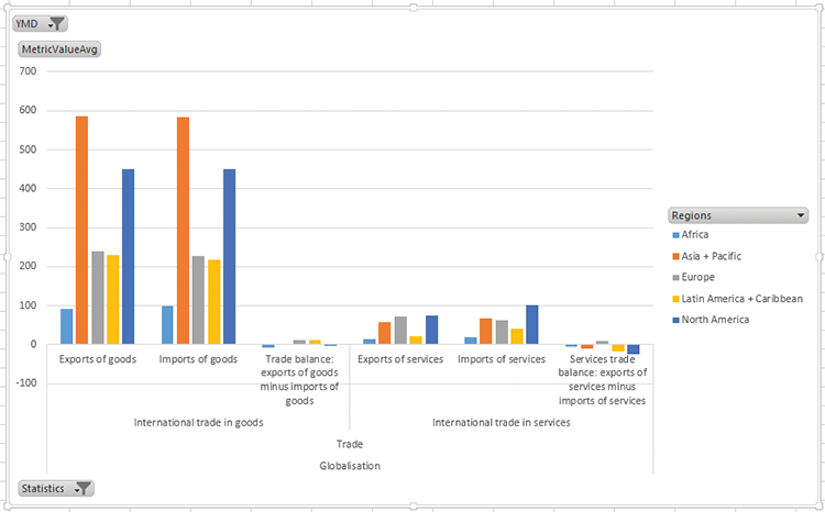
Drag MetricValueAvg to the Background, DimDate > YMD to the background, DimCountryRegions > Regions to the Bottom Axis, and DimOECDStatistics > Statistics to the Series. You will find these by drilling down on Measures and Dimensions on the right-hand pane. Click the drop-down arrow next to DimDate and select 2009. Click the drop-down arrow next to Statistics and choose Foreign Population > Foreign-born Nationals > Foreign-born population. Finally, click the All member on the bottom axis to show the data at the region level. You should see a chart similar to Figure 12-21.
Figure 12-21: A PerformacePoint analytic chart
Excel: Multiple Axes and Scale Breaks
The implementation examples in this section use the OECDPopulation PowerPivot model available from this book’s web page, and called OECDPopulationStats.xlsx.
Sometimes it is difficult to show comparison for data—for instance, comparing the GDP per capita to the National Reserve value, as they are substantially different values, or comparing two countries that are very different. For instance, the chart shown in Figure 12-22 has these two measures for Switzerland and for Estonia, and Estonia’s Reserve value is barely visible:
Figure 12-22: An Excel chart with difficult-to-read figures

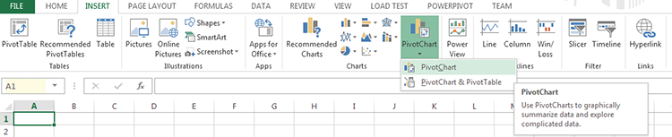
Open OECDPopulationStats.xlsx. Switch to sheet 1, then start by clicking the Pivot Chart button on the Insert Ribbon, as shown in Figure 12-23.
Figure 12-23: Excel Ribbon interface to add a pivot chart
Choose Existing Worksheet and Use an External Data Source. Click Choose Connection, as shown in Figure 12-24.
Figure 12-24: Choosing a connection for a pivot chart

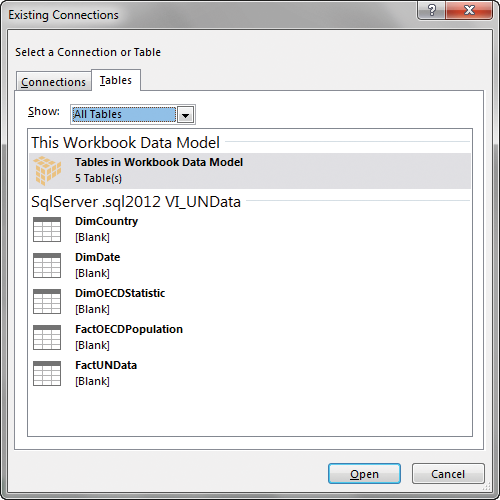
The choice of a connection is a bit different between Excel 2013 and earlier versions. In the earlier versions, you select PowerPivot as the data source, but in Excel 2013 you must choose Tables, and then select Tables in Workbook Data Model, as shown in Figure 12-25.
Figure 12-25: Choosing your workbook model
At this point, you see an empty pivot chart on the left and the PivotChart Fields pane is on the right, but you need to add the appropriate fields to the chart. Drag MetricValueAvg and LatestReserveValue to the Values field in the right-hand pane.
Next, drag the DimOECDStatistics > Statistics Hierarchy onto the Filter pane. Click the arrow next to the word Statistics on the chart, and drill down to Production and Income > Production > Size of GDP > GDP per Capita, and then click OK.
Drag DimDate > YMD onto Filters, click on the arrow next to the word YMD, select 2011, then press OK.
Drag DimCountry > Regions to the Axis field on the right-hand pane. Click the arrow next to the word Regions on the chart, then click Select multiple items. Untick the All check box, and then tick Europe > Central Europe > Estonia and Europe > Western Europe > Switzerland.
Right-click on the word Europe that appears on the bottom of the chart, then click Expand/Collapse, and then Expand to CountryName. This will finish the chart shown at the beginning of this section.
For the first problem, you can put the one series onto a second axis by right-clicking the series and then selecting Format Data Series. On the screen that displays, set the axis to Secondary. Notice that some of your data has disappeared. To fix this, change the Gap Width to 400% and then go to the other series and change the Gap Width to 100%. The widths of the two series changes so that they can always be seen.
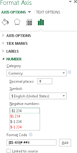
Next, right-click the right axis, choose Format Axis, and then change to the Axis Options tab in the Format Axis pane. Change the Number format to Currency, check that the correct currency (US$) is chosen, and set the Decimal places to 0. Your setup screen should look like Figure 12-26.
Figure 12-26: Formatting a number in Excel
Now, do the same for the axis on the left. In this case, there is one additional setting you want to set—check the box next to Logarithmic Scale. (See Figure 12-27.)
Figure 12-27: Formatting the secondary axis in Excel
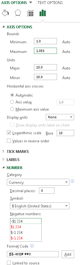
The Logarithmic Scale option sets your axis to show in multiples of 10, which nicely compresses the data values. It requires some skill on the part of the reader to know that the values on the two axes scale differently, so be careful when using this technique.
The chart is as shown in Figure 12-28, but you still have to apply formatting to make it readable.
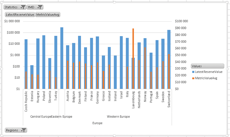
Having two axes enables you to show different scales, but it does mean that your reader needs to pay attention to the scales when reading the visualization. Figure 12-29 shows how the relationships change when using data for all of Europe. The left axis stays the same, but the values on the right axis do not.
Figure 12-28: Two axes superimposed
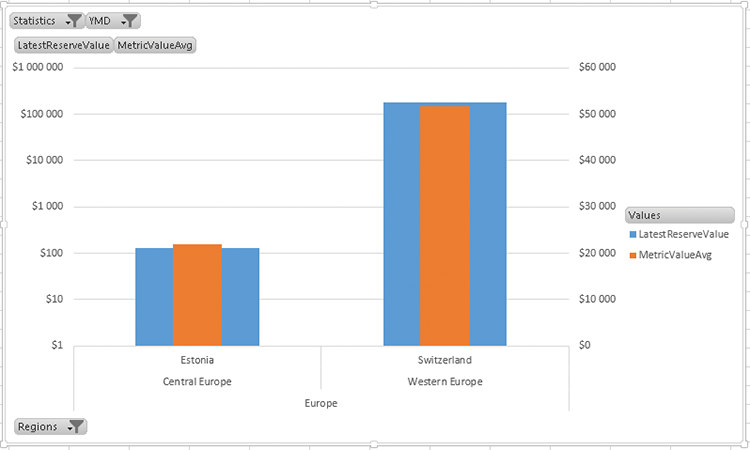
Figure 12-29: A change in only one axis
This is of course not a scale break, which you may be familiar with from Reporting Services (which has it as a built-in option).
There are some (relatively tricky) ways of getting scale breaks to work in Excel: The one you are going to work through now is reliant on being able to create custom measures. This is a feature specific to Excel 2013—in Excel 2007 and 2010 you need to download a tool called OLAPPivotTableExtensions from http://olappivottableextend.codeplex.com/. You will be continuing to use the same pivot table you used in the previous example.
Figure 12-30: Adding an MDX Calculated Measure
Start by removing your current measures from the pivot table. Alternatively, if you are creating a new chart, make sure to add the YMD hierarchy to the filters section, filter for 2011, add the Regions hierarchy to the Axis category, and filter for Switzerland and Estonia.
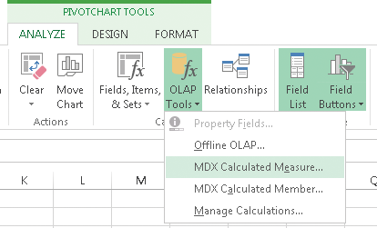
Next, choose the appropriate scale break values. Given how low the value for Estonia is, you can set the upper scale break to 2000. You will do this by going to OLAP Tools on the Ribbon’s Analyze tab and choosing MDX Calculated Measure, as shown Figure 12-30.
As shown in Figure 12-31, call your new measure LowerReserve and put it in the FactOECDNationalReserve measure group. Use the following code—all it does is set any value higher than 2000 to 2000.
CASE WHEN  [Measures].[LatestReserveValue] > 2000 THEN  2000 ELSE
[Measures].[LatestReserveValue] END
Add this measure to your pivot table by dragging the field name from the right-hand pane onto your pivot table. Now right-click the axis on the right side and choose format Axis. Set the number format to currency, and set the maximum to 4000. Because you are splitting the axis in two, this setting is always double the maximum value for the lower reserve.
Figure 12-31: Calculated measure text
Next, create a new measure called UpperReserve in exactly the same manner as LowerReserve. This value instead has a lower limit. Setting this lower limit is crucial—any chart item with a value between the upper end of the Lower value (2000) and the lower end of the Upper value disappears off the chart. In this case, with just two values, you can be fairly arbitrary, and 150000 works. Use the following code:
CASE WHEN  [Measures].[LatestReserveValue] > 150000 THEN
[Measures].[LatestReserveValue] ELSE NULL END
The difference here is that the value at the bottom end is getting removed from the chart. Add Upper Reserve to the chart and switch it to the secondary axis.
The trick is to set the minimum and maximum bounds of the axis so that it appears above the other chart items. In this case, set the maximum to 200000 and the minimum to -228571 (-200000 plus an offset value of 1 seventh—you often need to tweak this offset).
Your chart should currently look like Figure 12-32.
Figure 12-32: The chart with double scales
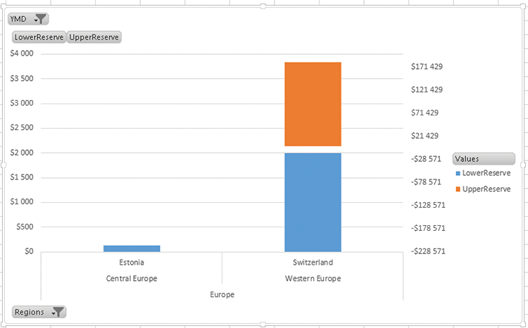
Figure 12-33: Removing labels from a chart

It isn’t immediately apparent that what we are doing is a type of scale break technique. To make that more evident, first hide both axis titles and add data labels. You can do this by right-clicking each axis, choosing Format Axis, and then setting the Label Position to None, as shown in Figure 12-33.
Add data labels by right-clicking an axis and choosing Add Data Label. After you’ve added the labels, right-click and choose Format Data Label, set the number format, and also set the position to Inside End, as in Figure 12-34.
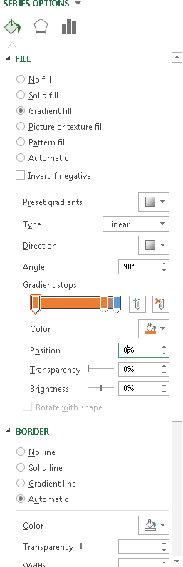
After that, change the font in the Home Ribbon where you’d normally do it. The final step is to set a gradient to show that the two series are related. Using one stop at 15% away and keeping to the very distinct colors illustrates that the two sections can’t be compared. Figure 12-35 shows the gradient setup.
Figure 12-34: Changing label position
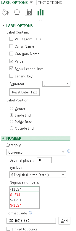
Figure 12-35: Setting gradient stops
Obviously, you need to do this twice—once for each series—and your final chart should like the one shown in Figure 12-36.
To get back to the Axis options (for instance, if you change the selection of countries and need to adjust the axis maximum and minimum), you have to go through the chart format area because you have hidden the axis. (See Figure 12-37.)
Figure 12-36: A chart with scale breaks
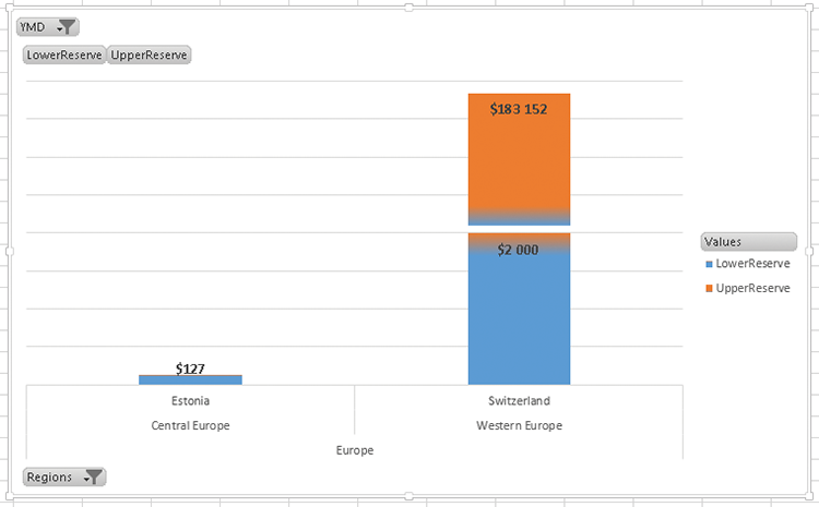
Figure 12-37: Changing axis options
Adding all the countries of Europe creates a rather messy chart. You can tidy it up by clicking the individual $2000 labels and deleting them. There is still data missing, and to bring that missing data onto the chart, you need to change the lower value for the upper reserve. This approach requires some manual effort to get these values set to 100% correctly.
Excel: Radar Charts
Excel radar charts are very easy to set up. From a new sheet, click Insert > Pivot chart. Select the external data connection option, and choose the connection to OECD_Data. If you need assistance, refer to Chapter 5.
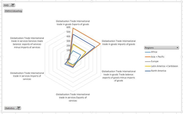
On your new pivot chart, add MetricValueAvg to the values and drag DimDate > YMD to the filters. Add DimCountry > Regions to the Series, and DimOECDStatistic > Statistics to the Axis.
On the pivot chart, click the drop-down arrow next to YMD and select 2011. Then click the drop-down arrow next to Statistics and uncheck the Select All box.
Navigate to Globalisation > Trade > and select International Trade in Services and International Trade in Goods and click OK.
Right-click Globalisation on the chart, choose Expand/Collapse, and then choose Expand to Metric.
Your chart should look like Figure 12-38.
Figure 12-38: The basic chart before converting to a radar chart
To convert this to a radar chart, right-click the chart, choose Change Chart Type, and then pick Radar chart from the list of charts, and click OK. Your chart changes, as shown in Figure 12-39.
This chart is one that works better as a column chart. Give careful thought before using radar charts.
Figure 12-39: A radar chart
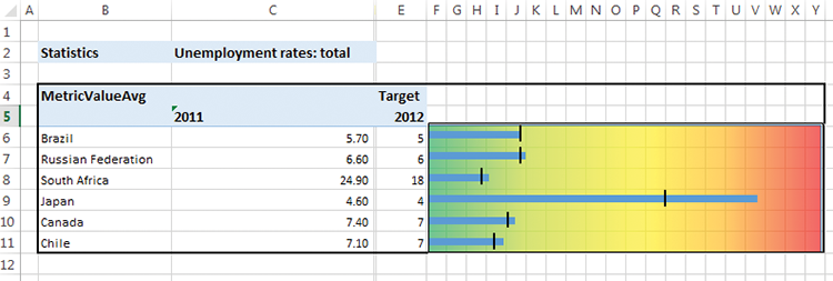
SSRS: A Bullet Chart
Reporting Services has a chart very closely related to the bullet chart—the gauge chart—which you use to create the bullet chart.
Start by creating a data source connecting to the OECD tabular model, and then create a new data set, and call it dsOECD. Pull the MetricValueAvg measure onto the design surface, drag DimOECDStatistics > Statistics onto the parameters, and select the Production and Income > Productivity > Size of GDP > GDP per hour worked metric. Check the parameter box.
Now drag DimDate > YMD onto the design surface, and choose 2011. Drag DimCountry > Regions > CountryName onto the design surface.
Your design surface should look like the one shown in Figure 12-40.
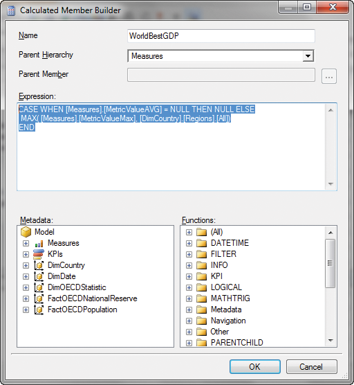
The next step is to set a target, so you need to create a calculated measure. In this case, you are going to create two measures: one target being the best GDP per hour worked across the planet, and another one for the best GDP for the Sub Region. To create a calculated measure, right-click in the box in the lower-left corner, and choose New Calculated Member. Your code will be the following:
CASE WHEN [Measures].[MetricValueAVG] = NULL THEN NULL ELSE
MAX( [Measures].[MetricValueMax], [DimCountry].[Regions].[All])
END
And the screen should look like Figure 12-41.
Figure 12-40: A dataset query window for Analysis Services
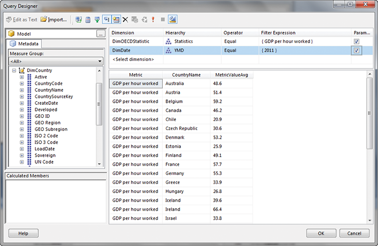
Figure 12-41: Adding a calculated member
Create another new calculated member, and use the following formula:
CASE WHEN [Measures].[MetricValueAvg] = NULL THEN NULL ELSE
MAX(
{([DimCountry].[Regions].CurrentMember.Parent).Children}
 ,[Measures].[MetricValueMax]
 )
END
Your screen should look like the one in Figure 12-42.
Figure 12-42: Calculated column

You now have two target values to use for the bullet graph. Click OK twice and then remove the footer and the title on the report.
In the Insert tab, click Matrix > Matrix Wizard. Choose the dsOECD dataset you just created. Add Country Name to the Row group, and MetricValueAvg to the values, and click Next. Uncheck Show Subtotals and Grand Totals on the next screen and click Next. Finally, choose the generic style and click Finish.
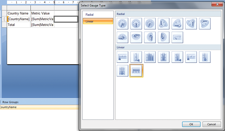
On the table that appears, right-click the Metric value column, and choose Insert Columns > Right. Click the new cell that appears, parallel to the Country Name, and from the Ribbon choose Insert > Gauge. Click the cell again to make the gauge choice screen in Figure 12-43 appear, choose the linear bar, and then click OK.
Figure 12-43: Inserting a gauge chart
Enlarge the row and column to make working easier, as shown in Figure 12-44.
Figure 12-44: Formatting the gauge chart
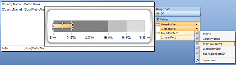
Figure 12-45: Adding a pointer to a gauge chart
Right-click the gauge and choose Gauge Properties. Select Back Fill and set it to solid and white. Click the gauge, click the arrow next to Unspecified below LinearPoint1, and set it to MetricValueAvg.
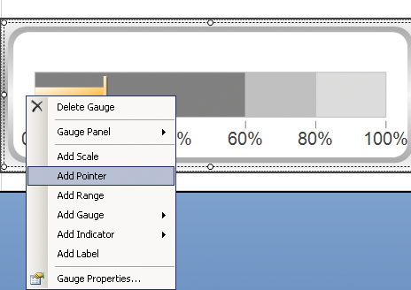
Repeat the process for LinearPoint2, and set it to WorldBestGDP. To add another point, select the first pointer on the graph, and then right-click just next to it on the white space, as shown in Figure 12-45.
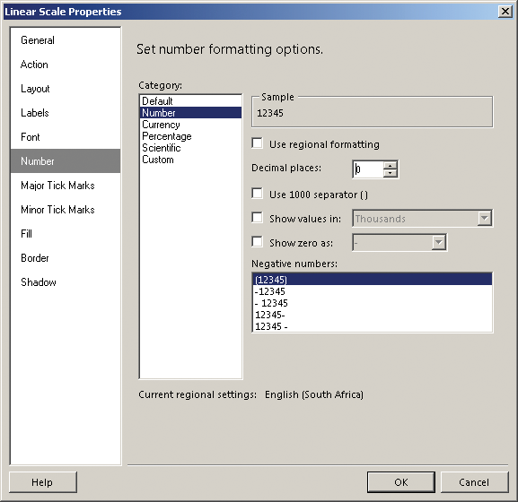
Set the third pointer to SubRegionBestGDP. Your GDP values are not percentages, so right-click the scale, IOW the numbers along the bottom of the gauge, and choose Scale Properties. Select the Number tab, as shown in Figure 12-46, and choose Number in the Category list.
Figure 12-46: Formatting the numbers for the chart
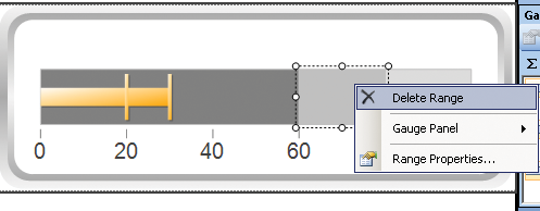
A few final steps are all you have left to do. The background ranges are not relevant in this case—they are useful when percentages are being used. Delete each of the ranges (see Figure 12-47).
Figure 12-47: Deleting the background for the range
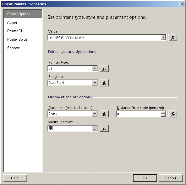
Now you have just some formatting to finish. For the LinearPointer1, click the arrow and choose Pointer Options. Change the width percentage to 25%, as shown in Figure 12-48.
Figure 12-48: Setting the size of the pointer
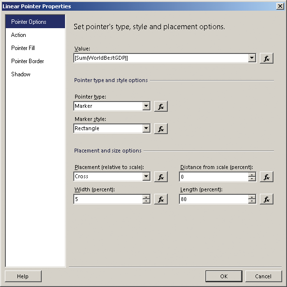
Next, select the Pointer Fill tab and change the fill to solid black. Click OK, and get to the same settings for LinearPointer2. Change the width to 5% and the length to 80%, as shown in Figure 12-49.
Change to the Pointer Fill tab, and change the color to solid orange.
Repeat the process a third time for LinearPointer3; set the width to 5% and the length to 80%. Switch to the Pointer Fill tab, and set the color to solid blue.
Figure 12-49: Formatting the pointer
To finish off, shrink the row that the bullet graph is embedded in, and run the report. Your report should look similar to the one in Figure 12-50.
Figure 12-50: A bullet chart
HTML5
For your HTML5 visualization, you are going to implement the treemap visualization shown earlier in this chapter under the HTML5 examples. Although you would typically use the C# web service from Chapter 9 to return the JSON required, in this section you find out how to use SQL Server stored procedures to create the JSON. You copy it manually, but it could just as easily be used to supply server-side code to create the JSON.
You will need the files available from this book’s page on Wiley.com called Chapter12_Treemap.js. All the editing can happen in any text editor, such as Notepad++.
You will need the following:
- Base.css
- Excanvas.js
- Jit.js
- Treemap.css
- Treemap.html
- Treemap.js
Treemap.html simply references the appropriate JavaScript files.
Treemap.js contains the active code. The first section is the function init(), which is fired when the page is open. The code var json={} is the data piece—you will paste the code you get from SQL over the {}.
The next call is to initialize the treemap object:
var tm = new $jit.TM.Squarified({
    //where to inject the visualization
    injectInto: 'infovis',
    //parent box title heights
    titleHeight: 15,
    //enable animations
    animate: animate,
    //box offsets
    offset: 1,
    //Attach left and right click events
    Events: {
      enable: true,
      onClick: function(node) {
        if(node) tm.enter(node);
      },
      onRightClick: function() {
        tm.out();
      }
    },
    duration: 1000,
    //Enable tips
    Tips: {
      enable: true,
      //add positioning offsets
      offsetX: 20,
      offsetY: 20,
      //implement the onShow method to
      //add content to the tooltip when a node
      //is hovered
      onShow: function(tip, node, isLeaf, domElement) {
        var html = "<div class="tip-title">" + node.name
          + "</div><div class="tip-text">";
        var data = node.data;
        if(data.playcount) {
          html += "play count: " + data.playcount;
        }
        if(data.image) {
          html += "<img src=""+ data.image +"" class="album" />";
        }
        tip.innerHTML =  html;
      }
    },
    //Add the name of the node in the correponding label
    //This method is called once, on label creation.
    onCreateLabel: function(domElement, node){
        domElement.innerHTML = node.name;
        var style = domElement.style;
        style.display = '';
        style.border = '1px solid transparent';
        domElement.onmouseover = function() {
          style.border = '1px solid #9FD4FF';
        };
        domElement.onmouseout = function() {
          style.border = '1px solid transparent';
        };
    }
  });
The parameters are the name of the div to insert the visualization into, the height, the title, whether or not to animate transitions, and how to enable left- and right-clicks. All of these settings are available from the InfoVis examples at http://philogb.github.com/jit/static/v20/Jit/Examples/Treemap/example1.html.
It’s a two-step process to generate the JSON you will paste in. The first step is a function that creates the individual child nodes, as follows:
ALTER FUNCTION dbo.fn_JSONCountryTree (@RegionName varchar(255))

RETURNS varchar(max)
AS
BEGIN
DECLARE @return varchar(max) = ''

DECLARE @tbl Table(CountryName varchar(255), JSON varchar(max),
FullJSON varchar(max))

INSERT INTO @tbl (CountryName, JSON)
select

countryname,


CASE WHEN ROW_NUMBER() over (order by countryname) = 1 THEN '' ELSE ',
' END +
'{
           "children": [],
           "data": {
             "GDP Per Capita": "' + CAST( CAST( round(fonr.value /
131.487000,0) as int) as varchar(10)) +   '",
             "$color": "' +  CASE CAST( ROUND( (FOP.Value -
17311.929220) / 7248.925672000,0) + 1 as int)
WHEN 1 THEN '#A50026'
WHEN 2 THEN '#D73027'
WHEN 3 THEN '#F46D43'
WHEN 4 THEN '#FDAE61'
WHEN 5 THEN '#FEE08B'
WHEN 6 THEN '#FFFFBF'
WHEN 7 THEN '#A6D96A'
WHEN 8 THEN '#66BD63'
WHEN 9 THEN '#66BD63'
WHEN 10 THEN '#1A9850'
WHEN 11 THEN '#006837'
END +'",
             "image": "",
             "$area": ' + CAST( CAST( round(fonr.value / 131.487000,0)
 as int) as varchar(10)) +   '
           },
           "id": "' + dc.CountryName  +  '",
           "name": "' + dc.CountryName  +  '"
         }'

               FROM DBO.FactOECDNationalReserve FONR
               INNER JOIN
               dbo.DimCountry DC
               on FONR.DimCountryID = dc.CountryID
               INNER JOIN dbo.FactOECDPopulation FOP
               on DC.CountryID = FOP.DimCountryID
               and fop.DimDateID = 20110101
               and FOP.DimOECDStatisticID = 197
               and FOP.value is not null
               where fonr.DimDateID = 20110901

               and [geo region] = @RegionName

              --and CountryName = 'Austria'
               order by CountryName asc


UPDATE @tbl
SET @return = @return+json,  FullJSON = @return


RETURN @return
END
go
In this code, the function takes a template JSON in the following format:
"{
           "children": [],
           "data": {
             "GDP Per Capita": "56",
             "$color": "#FDAE61",
             "image": "",
             "$area": 56
           }"
and uses values for the GDP per Capita and National Reserve to set the color and area. A case statement for 11 ranges of color is set up to set the color. There is also a chunk of code that appends each of the individual countries JSON to the @return variable. The RowNumber() call adds a comma to each entry except the first.
The following is the stored procedure that uses this function:
ALTER PROC TreeMapByRegion
as

DECLARE @return varchar(max) = ''


DECLARE @tbl Table(RegionName varchar(255), JSON varchar(max),
FUllJson  varchar(max))


INSERT INTO @tbl(RegionName, JSON)

select [GEO Region] ,
CASE WHEN ROW_NUMBER () over (order by  [GEO Region]) = 1 THEN ''
ELSE ',' END +
' {
       "children": [' +
dbo.fn_JSONCountryTree( [gEO rEGION]) + ' ],
       "data": {
         "GDP Per Capita": '  + cast( SUM(ROUND(FONR.Value /
131.487000,0)) as varchar(100)) +    ',
         "$area": '  + cast( SUM(ROUND(FONR.Value /  131.487000,0)) as
varchar(100)) +    '
       },
       "id": "'+[GEO Region]+'",
       "name": "'+[GEO Region]+'"
     }'


 FROM DBO.FactOECDNationalReserve FONR
               INNER JOIN
               dbo.DimCountry DC
               on FONR.DimCountryID = dc.CountryID
               INNER JOIN dbo.FactOECDPopulation FOP
               on DC.CountryID = FOP.DimCountryID
               and fop.DimDateID = 20110101
               and FOP.DimOECDStatisticID = 197
               and FOP.value is not null

                             where fonr.DimDateID = 20110901

GROUP BY [GEO Region]

UPDATE @tbl
SET @return = @return + JSON,
FUllJson = @return

SET @return = '{
    "children": [' + @return + ' ],
   "data": {},
   "id": "root",
   "name": "Regions by National Reserve and GDP per capita"
   }'

select @return


GO
This code calls the previous function for each region, and inserts the result into a table variable using a JSON template. It then uses the same variable appending logic to put all the regions together into a single string, and adds the outside wrappers of the JSON format for the treemaps.
To finish off the work, simply paste the results of this query into Treemap.js where the var json = {} is. Double check to be sure the semicolon is after the last brace!
Summary
In this chapter you learned about comparisons using visualizations. For the most part, all the Microsoft tools are good at this, and you have seen how to use them effectively. You have also learned more on using the treemap visualization introduced in Chapter 9.