Chapter 2
Designing a Visualization
Designing visualization is not a simple case of picking one from the list that a tool supports. The right visualization conveys the right message, whereas the wrong visualization might confuse the message you are trying to send, or even convey the wrong message. An example of this is a 3D pie chart in which the 3D distortion shows one slice of a pie as the largest even though it isn’t the biggest piece. Another example is a line chart that shows discrete values, such as murder rates, across countries but the interpolation between the countries makes no sense. Each visualization is covered in later chapters; this chapter shares the background of why you should choose different visualizations.
Goals of Visualization
The goal of a visualization is to make it possible to answer questions—even questions you didn’t know you should be asking until you saw the pattern of the data in the visualization.
Example questions include:
- How are my sales figures trending over time?
- What is my most profitable product line?
- Who is the best sales person in the company?
- How does seasonality affect my stock levels?
Temporal analysis is the place where the advantages of visualization first become easily apparent. Someone reading two lines on a graph can predict where the lines will cross or diverge by glancing at the graph. (Read more in Chapter 11.)
Visualizations answer questions by highlighting patterns and outliers. For example, changing the color of an element that is significantly different from its neighbors, tracking the relationship of two lines over time, comparing two columns that are side by side are ways to graphically illustrate a pattern that may not be immediately apparent.
In Figure 2-1, an early chart of the “radar” or “polar” type, comparisons of causes of mortality are compared in the Crimean war. The red areas are used for war wounds, blue areas are for preventable diseases, with black for all other causes. It is immediately apparent that disease significantly outweighs any other cause of death on average. Indeed, barring September, war wounds are still outweighed as a cause of death by all other types.
The chart in Figure 2-1 easily illustrates, at a glance, a weighty amount of information. The chart visually describes how the deaths from war wounds grew and how quickly they grew, but it also shows how the increase in disease-related death outweighed the war deaths. Both causes of mortality grew earlier and carried on growing after the war wound deaths started decreasing.
Figure 2-1: One of Florence Nightingale’s early charts

However, as with many of the chart types developed prior to this, there are failings. Although the pattern of growth and decline is easy to see, the absolute values of the deaths are not easily discernible. Being able to quickly get to an absolute value that can be compared to other charts and data sources is a key goal of data visualization.
To summarize, the possible goals of visualization are
- To present more data than otherwise possible
- To illustrate patterns that are not immediately apparent
- To answer questions posed by a viewer
- To compare values
- To show changes over time
- To easily extract the underlying data points used
- To draw a viewer toward a visualization
- To create a quick mechanism to view a value
Human Perceptual Abilities
Human visual perception is not as clear-cut as you might think. The perceptual difference in the size of a full moon just above the horizon versus the full moon directly overhead is the most commonly known instance of how an optical illusion can trick you. The moon is in fact the exact same size in terms of angular diameter, or what fraction of your visual field it takes up. Knowing and taking into account perceptual differences are key to creating visualizations that communicate the intended message.
You have already discovered how the use of 3D imagery in visualizations can be misleading—partly due to the technologies used to represent it and partly due to our perceptual abilities—but there are additional pitfalls you need to be aware of.
The most important pitfall is context—the shapes around a visualization may distort the message of the visualization. An extreme example is shown in Figure 2-2.
The two lines in Figure 2-2 are, in fact, the same length. Of course, you are unlikely to end up with such an extreme example in your visualization, but the use of a gradient background or a watermark could lead to more subtle, but just as misleading, misinterpretation. Using grid lines, as in Figure 2-3, aids the viewers’ comprehension.
Figure 2-2: Which line is longer? The one on the bottom, or the one on the top?
Figure 2-3: Using grid lines to aid perception
Another key to human perception is choosing an unambiguous dimension upon which you show values. On the left in Figure 2-4, it is immediately apparent that we are measuring the difference in height. In the middle pair and on the right, it is immediately apparent that we are using angle. But which of these changes in the angles is equivalent to the left-hand change in the height?
Figure 2-4: Changes in angles versus changes in height

Technically, either of them could be deemed equivalent. The right side is angled at 14.4 degrees from vertical, or 4 percent of 360 degrees, and the middle is angled 3.6 degrees, or 4 percent of 90 degrees. As it turns out, most people, whether due to training in school or a natural proclivity, tend to perceive the middle figure—represented as a percentage of the difference between vertical and horizontal—as closer in difference to the change in height.
Figure 2-5: Doubling and halving widths and heights to keep the areas the same
A change in area in a column, as shown in these figures, is harder to read. The area in each of the three columns in Figure 2-5 are equivalent, and can be perceived as such after a little mental ninjitsu. At first glance, though, your eye rebels at seeing them as the same.
This difficulty comes in trying to equate change in two different dimensions with each other. A rectangular shape is by far the easiest to do this with. Attempt to determine the relationships between the circular shapes in Figure 2-6 using area and not radius.
Figure 2-6: Evaluating the area of circles

The answer may be surprising: the radii are 20, 28, 34, and 40. The areas, based on * (radius squared) are 1256.63, 2463, 3631.38, and 5026.55.
Not an even stepping, but that is hard to pick up.
This problem is compounded with pie charts. Attempting to dissect a circle and determine the constituent percentages is even more difficult. You might be saying, “But we can use the angles to tell the difference!” Alas, although the human eye is skilled at judging the angle from vertical or horizontal, judging intermediate angles is something at which humans are not so skilled, as you can see from the examples in the figures. Read more on this issue in Chapter 12 about comparison visuals.
Strategic, Tactical, and Operational Views
Strategic, tactical, and operational views have been around since the early days of military action. They reflect a real need for different levels of an organization to have a different type of view of the data flowing within that organization.
In any intelligence application—from the military uses in which the techniques evolved to the business intelligence (BI) applications you are more likely to be familiar with—the reason for having a view of data is to make a decision and/or take an action. The key difference among strategic, tactical, and operational views is the level of detail required in the view and the magnitude or importance of the decision being made.
In the retail world, an example strategic decision is the decision to open a new store. A decision like this is typically collaborative, with many people contributing to making the decision. A market research firm may be engaged to discover and compare the demographics of the possible areas in which the store could open; the Finance Department evaluates the cost of doing business in those areas and does profitability projections; and product managers supply their knowledge of what products would work well in each store. All of these data are collated and discussed. It takes some time, and—most likely—many meetings to make a decision to open a new store, but an organization does not usually have to make very many strategic decisions.
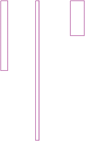
The other aspect of strategic views of data is monitoring. While the new store project is being evaluated, the CEO and other executives need to know, at a glance, that the business is still performing optimally, or at least adequately. The executives need to know which of the existing regions, and which stores within those regions, are doing poorly so that an intervention can occur immediately. The strategic view is at an aggregated level, and it offers the ability to drill into more details. See Figure 2-7 for an example.
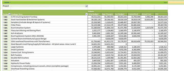
An operational view, such as what’s shown in Figure 2-8 on the other hand, is at a detailed level. For example, in the same retail organization, a credit controller at a store may be considering a request from a customer to get a credit extension for a specific purchase, and will run a report showing the customer’s payment history and credit rating. The presentation style of this type of detailed data is typically very different from the high level view used in the strategic level. In direct contrast to strategic decisions, operational decisions are made frequently. Individually, they have very little effect on the organization, but in aggregate they spell the difference between success and bankruptcy.
Figure 2-7: An example of a strategic view with drill down
Figure 2-8: An example of an operational report
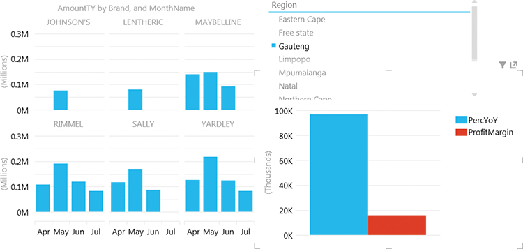
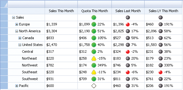
Tactical decisions are the middleground between strategic and operational decisions. For the most part, in the preceding example scenarios, the decisions being taken into account and the data being monitored are known ahead of time; tactical decisions are often about data exploration more than just pure monitoring or evaluating a detail view. For instance, a product manager may need to decide which products need to be held in extra stock over the festive season. The product manager examines the product’s sales data and its seasonality, and might also examine data from fashion labels that highlights which products will have strong marketing campaigns. The key here is more interactivity and flexibility than in the other views. Decisions and actions arising from tactical business intelligence (BI) typically sit between strategic and operational in terms of both their business impact and the quantity of them. An example of a tactical report is shown in Figure 2-9. This report provides an interactive view of sales and profit, broken down by month and by brand, and with a slicer for region. The view allows for additional analysis by changing each chart element according to the other chart elements that are clicked on—for instance, when clicking a particular brand, each column for the months will be split up by that brand. This is covered in more depth in Chapter 6.
The Microsoft business intelligence toolset loosely follows this model: PerformancePoint dashboards match to the strategic level; Excel, PowerPivot, and now Power View match to the data exploration of the tactical level; and Reporting Services is often used for operational-level reports. This correlation is not very strong and is explored further in Chapter 3.
Figure 2-9: An example of a tactical report being used for data exploration. Clicking on one chart or slicer will filter the other charts.
Glance and Go versus Data Exploration
We’ve explored the use of monitoring (which can also be called glance and go), specifically for strategic views, and exploration specifically for tactical BI, but of course there is a large overlap. Strategic views can include exploration, and tactical views can include monitoring.
It’s time to explore the different use cases. “Glance-and-go” BI, which is often called monitoring and is epitomized by colorful indicator icons, has for many years been the poster child of BI applications. Figure 2-10 shows an example with colorful indicators that are presented on a scorecard with drill-down and drill-across capabilities.
Figure 2-10: An interactive scorecard, with indicators. Clicking on an indicator will filter the chart on the right.
For a long time the use of vehicle-type gauges and dials, such as those shown in Figure 2-11, were immensely popular for a long time, but they’re luckily fading into oblivion now. This format that resembled a vehicular dashboard seemed like an ideal way of showing business information in a manner that people were familiar with. However, a key failing of these types of dashboards were that they showed little information. A gauge is designed to show a continually changing figure, and it is ideal for continual monitoring; information such as speed, engine revolutions, and oil temperature are measured up to thousands of times per minute, and keeping an eye on a gauge is a good mechanism for viewing this velocity of data. However, business rarely changes this frequently; Indeed, much financial data is only relevant as of the last month end, and the gauge is a poor representation of this data.
Figure 2-11: An early example of a “gauge” in a dashboard. Note how only one number is communicated.

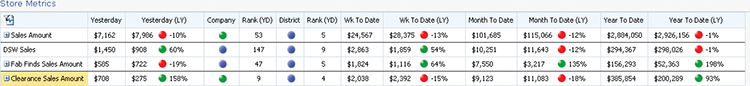
Glance-and-go visualizations thus need to be at once “information dense” (or, to use another term, data rich) such that enough data are presented to enable a viewer to know whether more investigation is required, but sparse enough that the data do not overwhelm. A guided maximum of seven data points is suggested, with the extension that multiple axes of seven points can be used. For instance, you might have seven indicators each for Month-To-Date, Year-To-Date, and Year-over-Year. This would be viable in a scorecard, but depends on the visualization. Figure 2-12 shows a good example of a monitoring scorecard, including drill-down information.
Figure 2-12: A scorecard with key performance indicators (KPIs) and time-based measures
Glance-and-go visualizations are often accompanied by interactive elements. Drilling down on the KPIs to see what figures make up the number that is not meeting target and drilling across to a second element, such as a line chart, to give detail about how the KPI has trended over time are two of the most common. In addition, capabilities such as interactive slice and dice are often incorporated to aid discovery of the data behind the KPI. For instance, a retail organization analyzing poor sales in a region may want to drill down to a store that’s performing particularly poorly, check the store’s performance trend over the last year, and bring in a list of any marketing campaigns run in that store for that period.
Be careful not to confuse this data discovery portion of glance and go with data exploration!
The key difference between the data discovery based on glance-and-go visualizations is the intent. In glance and go, you know what question to ask—for instance, “Have sales targets been reached?”—and typically which follow-up questions need to be asked, such as the following:
- Which stores missed their sales targets?
- Which product categories are performing poorly?
- What marketing campaigns were run in that period?
In data exploration, the questions are unknown, and the visualization is explored until a pattern is discovered. The patterns to be discovered may be correlations such as similar products being bought together or seasonality of purchasing patterns.
Using Color in Visualizations
Preparatory to discussing the use of color in visualization, it’s important to understand the way color is perceived in the human brain. Despite the popular education of red/green/yellow as primary colors, the three primary colors in the human eye, and not coincidentally, in the computer monitor are red/green/blue, or RGB. Several things are important about the RGB encoding scheme for colors on computers:
- RGB does not adequately cover the spectrum of visible light. To test this, simply compare a photo of a sunset to the real sunset, and the differences between the two will be very apparent.
- Human perception of color is skewed. Red, green, and blue are the most readily perceived colors because they match to the cones in the eye, but not in direct proportion. Reds and greens are much stronger than blue, and the cones are more centered in the eye, whereas blue is more in the surrounding areas of the eye. This has led to the use of red and green in most indicators, mostly notably traffic lights.
- The differences between rods and cones in the eye are beyond the scope of this book, but a nice explanation is available at www.cis.rit.edu/people/faculty/montag/vandplite/pages/chap_9/ch9p1.html.
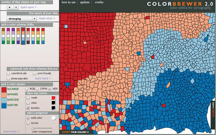
Figure 2-13: Colorbrewer
What should you use color for? Color can be used to highlight and separate different series, to show a value along an axis, or as a quick visual cue to show crossing a threshold.
Looking at Figure 2-14, you can see that differentiating between the series is relatively easy based on the use of colors.
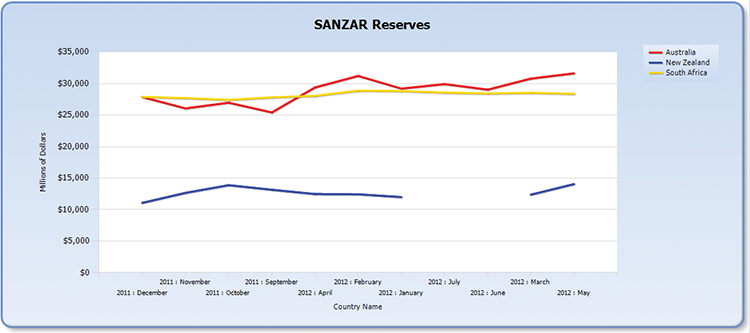
Figure 2-14: Chart contrasting the 3 SANZAR countries’ reserves over time
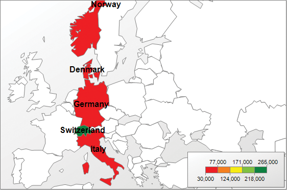
Showing a value along an axis can take many forms, with shapes in forms such as heat maps, bubble charts, and geo-spatial maps. In all these cases, the color is used to indicate a value along a range, with the most common ranges being green > yellow > red, or blue > orange > red. Figures 2-15, 2-16, and 2-17 show these different charts.
It is important when choosing these color ranges to make sure that the number of colors chosen and the values being displayed are congruent. Choosing a four-color range when there are five different possible values easily leads to confusion when two disparate values are displayed using the same color.
In the same way, choosing the intervals between the colors is important. Having one value widely divergent while using an even interval, as in Figure 2-18, bunches up colors toward one end of the spectrum and possibly hides variances in the values. Figure 2-18 shows the five European countries with the highest national reserves, and Switzerland is much higher than the rest, which can’t be distinguished by color.
Figure 2-15: Heat map example
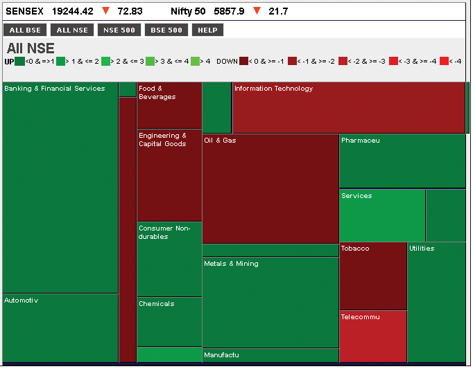
Figure 2-16: Bubble chart example—color is based on profit margin, banded into ten percentiles
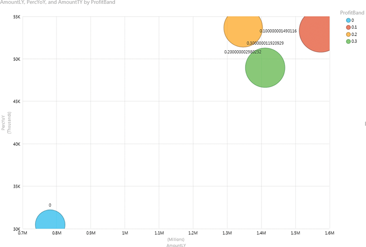
Figure 2-17: Geo-spatial example
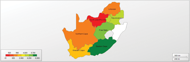
Figure 2-18: Divergent values
The solution in these cases is to choose intervals carefully and, knowing your data, apply a wider range to the first color. Figure 2-19 shows this approach with the same data. The variances are much clearer, and color has been used to rank the countries.
You can think of indicators as a subset of the display of colors along an axis, with predetermined shapes in a predetermined grid rather than colors on a map. The convention of red is bad; yellow is a warning; and green is good. Just red and green is very typical and should only be diverged from with much thought. One example of a divergence may be to show red for values less than last year, and black for values greater, which is a system that more closely matches accounting conventions. Figure 2-20 shows an example of a scorecard using red/yellow/green for figures against targets and red and black for values against the previous year.
Figure 2-19: A better spread
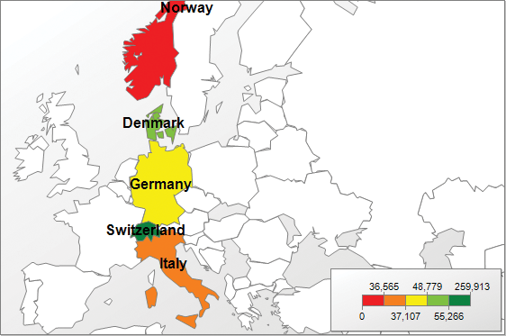
Figure 2-20: A scorecard using colored shapes to indicate performance
Use of Perspective and Shape
Perspective and shape may appear different, but in the two-dimensional world of visualization, shape is the only way to show perspective, and thus we treat them as the same.
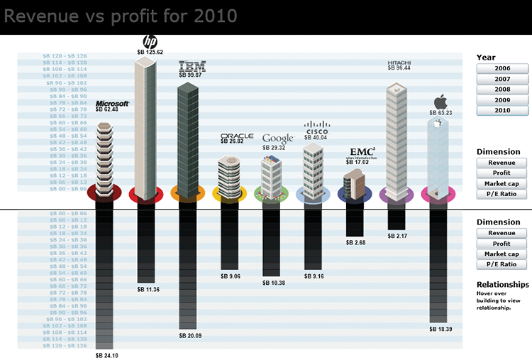
There are many ways to use shape in visualizations. The one you will be most familiar with is to use the shape of an object as it appears in the physical world as a representation. Examples of this are the use of shapes of countries as used in maps, representing real objects in infographics as well as the 3D representation of objects, or using an object as a metaphor for a size. Figure 2-21 shows an example of using the height of buildings to represent a measure. An interactive version of this is available at www.pwinfographics.net.
Figure 2-21: A column chart implemented using buildings instead of columns
Other ways of using shapes in visualizations are similar to the ways you can use color: as ways to differentiate between series; as ways to illustrate a point along an axis; or as a quick way to differentiate crossing a threshold. Figures 2-22, 2-23, and 2-24 show an example of each of these.
Although this seems similar to the use of color, it’s important to note that the number of discrete values, often called the set of domain values, which is available to us when using shapes is much less than when using colors. For instance, the human eye struggles to differentiate between a septagon (seven sides) and a nonagon (nine sides), whereas nine different shades of green are easy to differentiate. The number of different shapes that allow for ranges—such as equilateral polygons, stars, and crosses—is also much smaller than the number of colors.
Figure 2-22: A scatterplot using different shapes for each set of values. The use of both color and shape is useful.
Figure 2-23: A bubble chart using the size of the bubbles to show the magnitude of the visualized values
Figure 2-24: Ticks and exclamation points used to show crossing a threshold
Sizes, on the other hand, are much easier to comprehend, but you must take care in how the sizes are represented. The use of area versus diameter to represent sizes could be challenging to read. Look at Figure 2-25 for two values that are 25 percent apart, using diameter and area. Which looks most like a 25 percent increase?
It is a good idea to indicate what differentiator you have used when it is ambiguous. If you have bars increasing in one dimension only—for example, the lengths are changing—it is not necessary to state what differentiating characteristic you are using, but when a circle’s size is increasing, visually indicating which dimension is being used is helpful to a user.
Summary
In this chapter you learned about the elements to consider when choosing and designing your visualization, balancing illustrating data by using color and shape. This knowledge will be used as the basis of the chapters in Part 3 of this book, guiding you to choosing a specific visualization.