Part II
Microsoft's Toolset for Visualizing Data
In this part
- Chapter 3: The Microsoft Toolset
- Chapter 4: Building Data Sets to Support Visualization
- Chapter 5: Excel and PowerPivot
- Chapter 6: Power View
- Chapter 7: PerformancePoint
- Chapter 8: Reporting Services
- Chapter 9: Custom Code
Chapter 3
The Microsoft Toolset
Microsoft was a late entry to the visualization market. Although it had a strong and early entry to the online analytical processing (OLAP) market, for the most part it relied on third-party vendors to do the front-end work and focused in the early days on the database work, allowing vendors such as Panorama and Proclarity to take the lead. More recently, as Microsoft wanted to take more control of the market, it started to develop and buy more of the front-end toolset. Microsoft’s purchase of Proclarity and later Report Builder marked a strong entry into the front-end market, but it was paralleled by a strong independent entry in the form of both strengthening the Excel visualization tools and developing a tool called Business Scorecard Manager (BSM), which evolved into PerformancePoint and was eventually subsumed into SharePoint as PerformancePoint services. Reporting Services, originally aimed squarely at the technical user from a developers' point of view, has evolved into a self-service tool aimed at the business user. In this chapter, you find out about the history of the Microsoft toolset and discover how each tool fits in the tool bag.
A Brief History
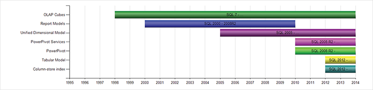
The history of Microsoft’s business intelligence (BI) toolset is in two parts: the history of the analytic tools is first and begins with Microsoft’s purchase of the OLAP engine from Panorama, which happened in 1996. In the initial days, Microsoft focused on building SQL Server, and allowing third-party vendors such as Panorama and Proclarity to build the front-end tools. The chart in Figure 3-1 shows the release versions for each analytic database. It’s important to note that even the analytic databases embedded in SharePoint and in Office are in fact developed by the SQL team and, more importantly, require a separate installation. Read more about the evolution of these products in the “Database Tools” section.
Figure 3-1: A timeline of the Microsoft backend tools
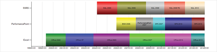
Development of the front-end toolset started much later, and it has a much more diverse path. Figure 3-2 shows the introduction timelines and evolution of each tool currently available from Microsoft.
Figure 3-2: A timeline of the Microsoft front-end toolsets currently in use.
Excel introduced pivot charts in Office 2000. Pivot charts are hardly true BI, yet they are quite likely the single most prevalent subset of BI. With the ability to connect to cubes in Analysis Services, this combination of tools was truly the first Microsoft BI stack.
The next entrant to the BI field was Reporting Services. Released as an add-on to SQL 2000 in 2004, Reporting Services was aimed squarely at the developer demographic; it required that you have Visual Studio and a fair degree of technical expertise. Reporting Services served as replacement for the venerable Crystal Reports.
Both Excel and Reporting Services have kept their names but, as discussed in the following paragraphs, the dashboard toolkit has had a much more checkered history. One caveat: Reporting Services now includes Power View, a break from the earlier naming.
Business Scorecard Manager (BSM) was the first iteration of this tool. It provided the ability to connect to multiple types of data sources, and incorporated Key Performance Indicator tools (read Chapter 10 for more details), as well as some graphing capabilities. Much like PerformancePoint today, much of the power of BSM 2005 was only provided when connecting to Analysis Services as a backend.
PerformancePoint 2007 was Microsoft’s foray in the world of Enterprise planning. With three different products (each with its own installation) sold as a single product at a fairly hefty price point (by Microsoft standards—it was well priced compared to the competition), Microsoft struggled to sell massive volumes of this product. The three products were PerformancePoint Monitoring (the predecessor to PerformancePoint services that is discussed heavily throughout this book), PerformancePoint Planning, and Proclarity.
The planning product was deemed too complex for most organizations because it required multiple skills across various Microsoft technologies, and the product was deemed too expensive to obtain solely to have PerformancePoint. Consequently, Microsoft started bundling PerformancePoint with the SharePoint 2007 Enterprise license from April 2009. This move, although derided by those who had implemented the planning product, was a good one for the monitoring toolset.
The SharePoint 2010 release incorporated PerformancePoint Services as a baked-in service application, making administration and installation much easier.
SharePoint 2013 adds theming and makes administering security simpler.
The tool history in Table 3-1 gives some highlights the released feature set. With Excel especially, this is a small subset of the changes.
Table 3-1: Tool history
| Tool | Version | Features Added |
| PerformancePoint | BSM | Initial release |
| PerformancePoint | 2007 | Dashboard Designer with Office RibbonClick-once client installDrag-and-drop designMultiply connected filtersAnalytic charts and gridsScorecard aggregation formulae |
| PerformancePoint | 2010 | Pie chartsMultimetric (multiple column) KPIsDecomposition treeContent integration into SharePointConnect to SharePoint filtersDynamic hierarchies with drill down/upDynamic selectionsTime intelligenceCalculation engineValue filteringReusable filters |
| PerformancePoint | 2013 | SharePoint theming Kerberos not required for role-based security |
| Excel | 2000 | Pivot charts |
| Excel | XP | Task panes |
| Excel | 2003 | Lists Auto filter SharePoint integrationNew statistical functions |
| Excel | 2007 | Ribbon UI1 million-row workbooksXML formatLists upgraded to tablesConditional formatting limits raised from threeUnlimited color pallet |
| Excel | 2010 | SlicersPowerPivot available as an add-inSparklines64-bit Excel (essential for big PowerPivot workbooks)Faster conditional formatting |
| Excel | 2013 | PowerPivot built inPower View built inRecommended chartsFlashFill |
| SSRS | 2000 | Initial release |
| SSRS | 2005 | DatePickerMulti-value parametersReport sorting of dataXML Data provider64 bit Report Builder 1 and Report Models (Note: RB1 and RB2 are actually different products, not versions of one product) |
| SSRS | 2008 | Report Builder 2 for self-service reportingPerformance improvementsTablixGaugeText formatting |
| SSRS | 2008 R2 | Shared data setsReport partsIntegrated GIS capabilitiesAzure, PDW, and SharePoint List data sourcesSparklinesIndicatorsAtom rendering extensionAggregation expression enhancements |
| SSRS | 2012 | AlertsPower View |
Database Tools
Many people working in the SQL Server world don’t understand the need for analytic databases. Especially in organizations with either small databases or really good SQL developers, some of the benefits are not immediately apparent.
The first benefit of analytic databases is related to performance, and this benefit is typically the one that blinds some SQL developers to the other benefits. SQL databases are really good at row-by-row work, but not as good at doing aggregations. Summary tables have often been used to solve the issue of aggregation, and OLAP was one approach to this.
OLAP (and hence Microsoft’s OLAP product, Analysis Services) provides performance benefits by aggregating data according to user defined hierarchies. For instance, the designer of the cube defines a date hierarchy as rolling up from Day to Month to Year (YMD), and the OLAP engine creates aggregations at each level—for example, summarizing sales for the day, for the month, and for the year. Other hierarchies across multiple dimensions such as the organization or location dimensions are also created and aggregated. This can lead to a problem called database explosion (where the size of the database increases exponentially), and thus needs a fair degree of skill to optimize.
Partitioning is another performance enhancement technique in Analysis Services. This works by splitting the data into partitions (for instance by region or by month), and then queries are optimized, either by reducing the size of the data to be queried when it exists within a single partition, or by allowing parallelization when the data is split across multiple partitions.
An alternative method for accelerating queries is to use a column store database. Whereas SQL is a row store and stores data in rows, pages, and extents, column stores instead store each column independently. This has benefits in terms of not having to scan over all the attributes of a row when scanning for large aggregations. It’s a big benefit when a lot of attributes are present, as in a typical data warehouse scenario.
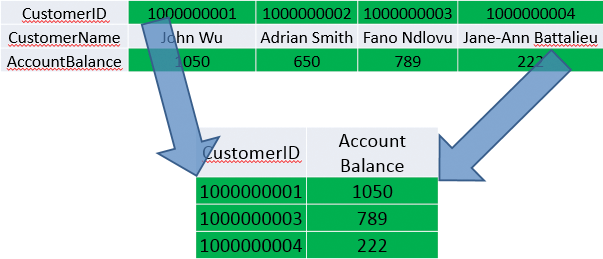
Figures 3-3 and 3-4 show the differences between a column store and a row store.
Figure 3-3: How a row store selects data
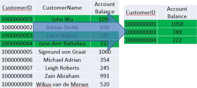
Figure 3-4: How a column store selects data
An additional benefit of column store databases is the compression that’s achievable. As similar data is stored contiguously, both dictionary compression and run length encoding are successful techniques. Read more on this at Daniel Abadi’s excellent paper, which you can find at http://db.csail.mit.edu/projects/cstore/abadi-sigmod08.pdf.
Another key benefit of column store databases (as proven in the Abadi’s paper, as well as in much other research) is that denormalization is not as necessary for performance reasons in a column store. This is the reason the latest version of Analysis Services has a “tabular” mode (or at least that it is called that).
The final reason for the Microsoft column store being so fast is that it is stored in memory.
With the advent of much better performance on SQL Server, including the introduction of a column store index that has all the benefits of the engine spoken that was previously described, the other benefits of using an analytic database become much more important.
The second benefit of analytic databases is the creation of what Microsoft once called a Unified Dimension Model, and now calls a Business Intelligence Semantic Layer. This layer abstracts the naming conventions of the underlying database and allows for meaningful, business-friendly naming, as well as abstracting the structures, aggregations, and calculations. The main benefit of this is that a single maintenance point is created. If the calculation of Net profit changes, it can be maintained in a single place and not have every single report require changes.
The third benefit of analytic databases rolls on from the second: Report writers and self-service users do not need to know the underlying structures or how to write SQL queries against them, nor do they need to know the calculations used. Instead, if they are working in a tool such as Excel, they can simply drag the Net profit measure onto a pivot table and then drag the location hierarchy onto the rows and have a basic report with drill-down capabilities.
In today’s world, with the hardware capabilities available, the second and third benefits are often greater than the first—at least in the enterprise space that has a BI team.
In the organizations that don’t have BI teams, an organization’s ability to build its own “analytic databases” or cubes is important. This is where the tool PowerPivot comes in.
PowerPivot was first introduced as a downloadable add-in for Excel 2010 and an installable add-in for SharePoint (run from the SQL 2008 R2 install) called PowerPivot Services. The engine running underneath both of these is the Microsoft column store implementation then called VertiPaq—the same column-store you have just read about.
In the SQL 2012 release, these options were expanded to include an Analysis Services instance that doesn’t require SharePoint. The engine was renamed xVelocity (a naming choice this particular author doesn’t like—Vertipaq was a better name in my opinion). One of the biggest advantages of this shared engine across the tools is that a model can be designed in PowerPivot, shared across a team by saving to a SharePoint library, and then imported and optimized by importing into Visual Studio.
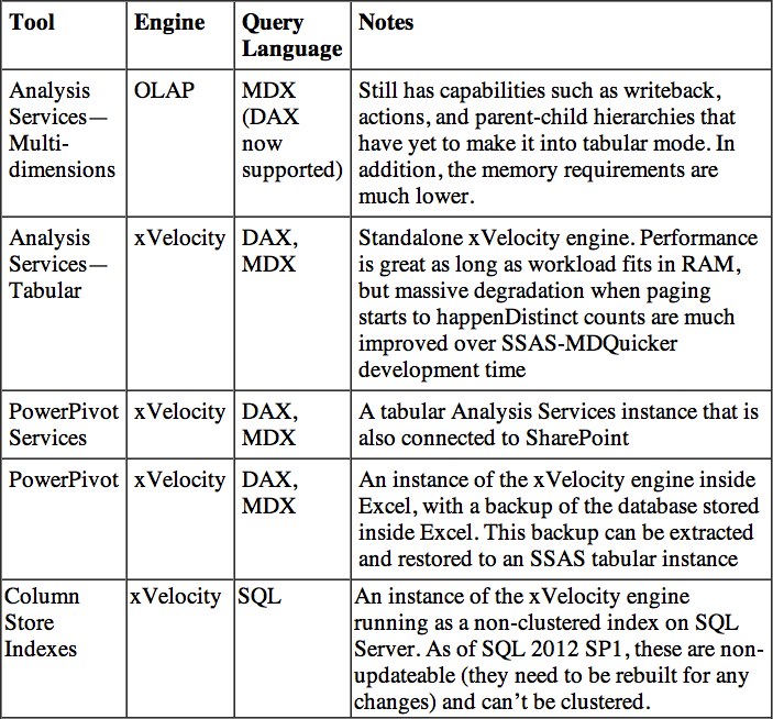
Table 3-2 summarizes the toolsets available for databases with SQL 2012.
Table 3-2: Toolset for databases as of SQL 2012
The Place of Each Front-End Tool
Chapter 2 introduced the concept of strategic, tactical, and operational views, with a statement that the tools loosely match to the following concepts:
- PerformancePoint is the strategic tool, allowing for monitoring of business metrics and some analysis when the values are out of band.
- Excel is the tactical tool for data exploration. It is split into two pieces, with PowerPivot being the data integration tool, and Power View being the visualization tool.
- Reporting Services fits in as the operational tool, showing detailed data.
In reality, this view is off-kilter, with quite a lot of overlap.
Historically, these tools were developed by different teams within Microsoft, which is why there’s some overlap. Table 3-3 shows the differences in the tools.
Table 3-3: Front-end tools
| Tool | Pros | Cons |
| PerformancePoint | Scorecards: High-level overview, drill downAnalytics : Interactive | Not totally customizable |
| SSRS | High fidelityAdvanced visualizationsDrill down/drill through—can be dynamic, requires more work | Interactivity requires work and even then is limited |
| Excel/Excel Services | Fully customizsable High fidelity | Loses fidelity in Excel ServicesNot as interactive with other SharePoint components |
| Power View | Very interactive—data explorationAnimations | Not a great deal of control over visualizationsRequires a model for visualizationsGimmicky GUI |
It is very important to keep in mind that each tool has its place. It is not the case that an organization will only choose a single tool and implement everything on it. This is commonly the case with either Excel or Reporting Services as they have been aimed at different users. Instead, it is vital to choose the appropriate tool for each task.
PerformancePoint is really strong at the monitoring and guided analysis tasks. The designer of the report knows what needs to be monitored—for instance, sales per store—and also knows that when an out-of-band value occurs, the person looking at the value is likely to analyze the cause through a finite set of choices. For instance, the person is likely to take the sales figure and break it up by date, salesperson, or product to determine exactly where the problem is coming from.
Reporting Services is used for reports and visualizations that are likely to remain mostly static—for example, a monthly management report, an engineer’s report, or a spatial visualization. The data that feeds these reports are dynamic, but the interactivity is limited.
Excel (and this author includes PowerPivot and Power View in this description) is an interactive experience for users who might not know up front how they will combine and analyze the data and instead want to discover meaning in data.
These roles map to the retail example in Chapter 2.
When to use PerformancePoint:
- An analysis services cube (multidimensional or tabular) is available.
- Glance-and-go dashboards are required.
- Users are likely to need to change the view displayed.
- Integrating Reporting Services or Excel within a report is required.
When not to use PerformancePoint:
- Control over aspects such as color is required.
- Dashboards need to be printed.
When to use Reporting Services:
- Specific visualizations, such as ranges and maps, are required.
- High visual fidelity is required.
- Reports need to be printed.
When not to use Reporting Services:
- Dynamic measures are required.
- Slice and dice capabilities.
- Anonymous access is required.
When to use Excel:
- Interactivity is required.
- No cube is available (build one through PowerPivot).
- A higher level of control over individual chart elements is required (for example, drag-and-drop positioning of chart labels).
- Possibly the fastest development using pivot tables and charts.
When not to use Excel:
- Guided interactivity is necessary—it’s better in PerformancePoint.
When to use Power View:
- Animation is required.
- Cross-filtering between charts.
When not to use Power View:
- When any control over chart formatting is required—it is even more limited than PerformancePoint.
Installing the Sample Databases
The two samples are in SQL server database format and in Analysis Services tabular mode. You need SQL 2012 for both.
To restore the SQL database, open Management Studio, right-click Databases, and choose Restore. Select the Device radio button, and click the ellipsis to see the screen in Figure 3-5.
Click Add, browse to the VI_UNData.bak backup file, and click OK. Type VI_UNData in the Database Name field and restore the database.
For restoring the Analysis Services database, ensure that you have Analysis Services running in tabular mode (you may well need to run the SQL install again if you chose all the defaults because multi-dimensional is installed by default), and connect to it in Management Studio.
Figure 3-5: Restoring a SQL database

You need to copy the backup to a folder that Analysis Services can access. You can check what these are by right-clicking the instance and then clicking Properties. The information tab has a line item called BackupDir as in Figure 3-6. Copy OECD_Data.ABF to this folder.
Figure 3-6: Analysis Services backup directory location
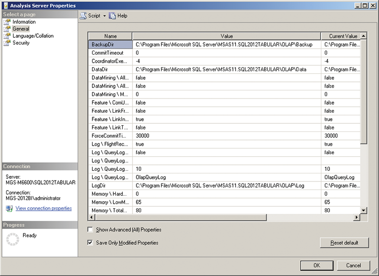
Figure 3-7: Changing an Analysis Services Connection
Right-click Databases and choose Restore. Browse to OECD_Data.abf in the backup folder, and then type in the name of the Database (OECD_Data), and restore it.
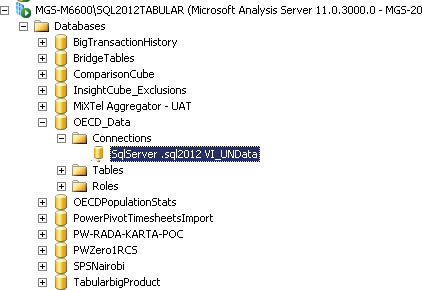
Your final step is to connect this cube to the SQL database you restored previously. Right-click Databases and choose Refresh to show the database you just restored. Open OECD_Data.abf, expand the connections, and then double-click the connection as shown in Figure 3-7.
In the Connection Properties dialog box, click the Connection String property and then click the ellipsis next to it to see the connection string builder shown in Figure 3-8.
Set the connection to your SQL database and test the connection. If you get an error, you may need to edit the security settings on your SQL Database. Start by going Start > All Programs > Microsoft SQL Server 2012 > Configuration tools > SQL Server Configuration Manager. Click SQL Server Services and check what account Analysis Services is running under, as shown in Figure 3-9.
Figure 3-8: Analysis Services connection string builder
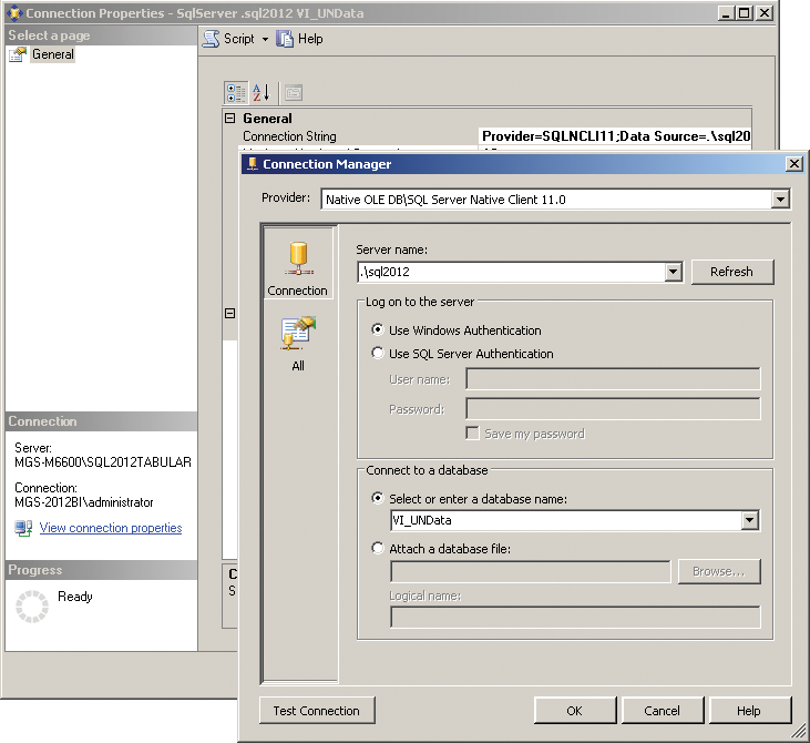
Figure 3-9: Analysis Services Service account
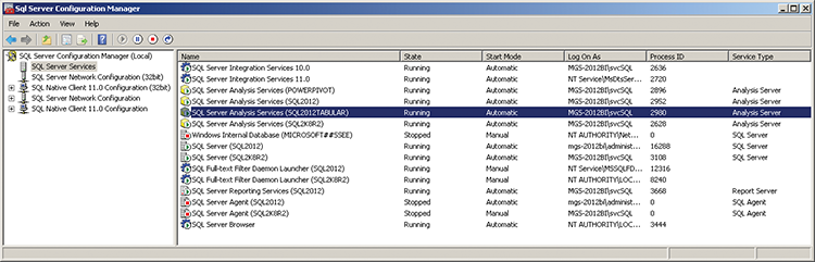
Figure 3-10: SQL Server logins
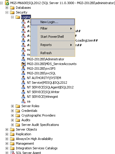
Now, go to your SQL database and expand Security and then Logins, as in Figure 3-10. If the login exists, double-click it; otherwise, right-click and choose New Login.
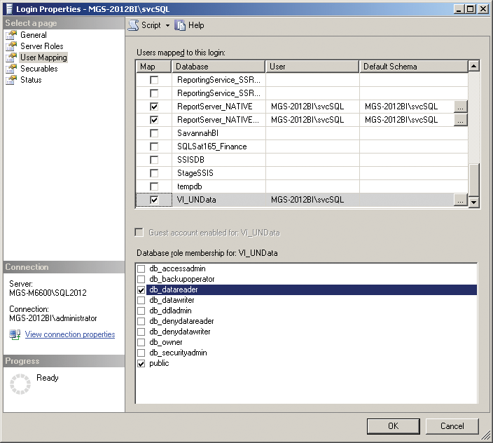
If you created a new login, first search for the login you identified in the configuration screen, and choose it.
Next, go to the User Mapping tab and, as shown in Figure 3-11, select the VI_UNdata database. Ensure that the database is checked, and that the db_datareader role is selected.
Figure 3-11: SQL Server username mapping
This process allows Analysis Services to access the database, so go back and change the connection appropriately.
Summary
This chapter discussed the background of the Microsoft tools that you work with throughout this book. The remainder of the chapters in this part of the book take you through the tools themselves in detail, laying the foundation for creating visualizations as well as guiding you in choosing a tool to create your visualizations.