Chapter 15
Embedded Visualizations
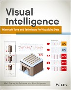
An embedded visualization, as the name suggests, is a visualization that is contained within some other content—typically, this table of data will be that most widely used of visualizations. Indeed, this book has made extensive use of this approach in the tables contained within every chapter, with indicators showing the ease of implementation. It is also possible to do these visualizations within a flow of text or perhaps within an application—but they are much less common. An example of an indicator embedded within an application is shown in Figure 15-1.
Figure 15-1: Visualizations embedded in an application
In this case, the indicators are being used as buttons that can be clicked on to set a status.
Common uses for embedded visualizations include highlighting problems such as highly divergent numbers that are likely to be a data-capture error, and ranking of various numbers such as all the stores within a region. Covered much more extensively in Chapter 10, indicators showing achievement against a target are another form of embedded visualization. Another great use is the ability to show multiple small charts, thereby allowing for a great deal of data to be displayed on a single page.
In this chapter, we will focus on the traditional tabular embedded visualizations—formatting of the table itself, embedding charts within cells in a table, and conditional formatting of cells according to value. You will also read about indicators and a specific type of embedded chart called a bullet graph.
Tabular Data: Adding Visual Acuity
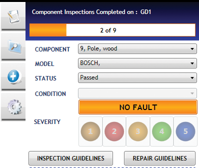
Figure 15-2: An unformatted table

The primary reason to add any sort of visualization to a table to is draw attention to particular rows, columns, or cells in the table; or alternatively to show their relationship to other rows, columns, or cells. There are various ways of doing this—in the old paper chart world, using a highlighter was the only way, and this translates to the conditional formatting discussed in this chapter. Several other ways of highlighting the relevant data points are those not always traditionally thought of as visualization techniques—changing the font of a cell, making it bigger, and using italics or bold is one method; and adding borders is another. These small changes can make a huge difference in the reading of a chart.
For this example, I will use a very common scenario—you need to present a table of costs: to a potential client, your boss for budget approval, or possibly even at home while you decide on a holiday. In the following example, I use a fictitious consulting cost for a project, and the unformatted table is in Figure 15-2.
Figure 15-3: A formatted table of costs
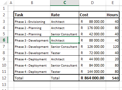
A few very basic formatting techniques applied make a huge difference in legibility: starting by sorting the data in the order that it will be read—in this case, most likely the task rather than the rate. Adding some white space on top and to the left, and adding a border around the entire cell with data will create the visual impression of a discrete table rather than a set of data. Changing the fonts to accentuate the important cells is important—in this case, the headers along the top and the total value are the most important, followed by costs and hours, and then the descriptions last. Little formatting items such as setting the currency are vital—without it, would you have known that these figures were South African rands and not U.S. dollars?
Adding borders to separate the costs as well as the phases will finish off the visual touches, as seen in Figure 15-3.
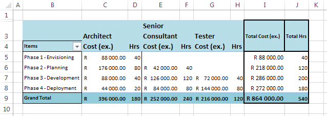
This is a much more legible chart, with only a couple of touches, but what will make it more readable yet is to include subtotals—in order to do that, we are going to pivot the table, and then finish touching it up. (You work with pivot tables in the “Embedding Visualizations in a Pivot Table” section later in this chapter.) The final result is shown in Figure 15-4.
Figure 15-4: A pivot table
Finishing off any table in this manner is essential before even diving into the rest of the visualization techniques—it is a subtle and yet powerful way of highlighting the data points you wish your audience to notice.
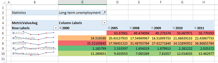
Embedded Charts: Sparklines and Bars
Embedding charts in a table is an excellent way to have a repeating set of data that can be easily compared—for instance, the growth of product sales over time or the trades of stocks over time.
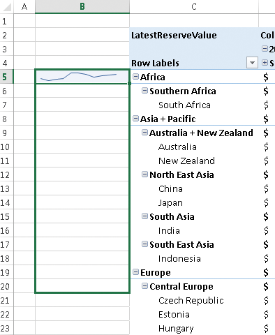
In Figure 15-5, a sparkline has been used to show the national reserves of the BRICSA countries (Brazil, Russia, India, China, and South Africa) for the first 6 months of 2012.
Figure 15-5: Sparklines embedded in a pivot table
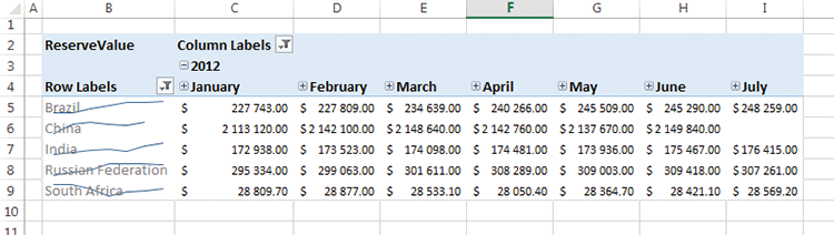
A couple of things are worth mentioning: The sparklines in this format are good for comparing patterns, and not absolute values—South Africa is just over 1% of China, and would not even show up on a chart at the same scale. An additional point is that (as is common with sparklines) the data has been shown superimposed on the text. Although this is an excellent space saver, care needs to be taken that the sparkline is still visible. In this case, using a lighter shade of gray for the text was sufficient.
Just as with line charts and column charts, columns can be used in sparklines.
Data bars are another visualization to be embedded inside a table, but in this case they are used to show a single value in the cell rather than summarizing the values of a series. Their usage on the same data set is shown in Figure 15-6.
Figure 15-6: Databars embedded in a pivot table
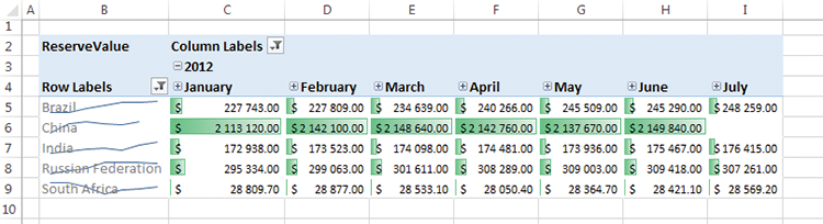
Sparklines and their variations are good for summarizing values over a series, and are often better for showing patterns rather than absolute values due to their extremely compressed nature, whereas data bars are good for showing absolute values.
Ease of Development
| Reporting Tool | Predefined Chart Type | Ease of development |
| Excel | Yes | |
| PerformancePoint | No | |
| Power View | No | |
| Reporting Services | Yes | |
| Silverlight/HTML5 | N/A |
Conditional Formatting
Conditional formatting is very similar to the data bars in an application—it is used to show the relationship of the value in a particular cell to the value in other cells by including a visualization in that cell. The value is denoted by the color in the cell. An oft-applied example in the accountancy world is red for losses and black for gains, leading to the phrases “in the black” and “in the red.” Another use is to quickly show relative values by shading them along a color line—often green to red or blue to red—differing shades denote different values, in a similar way to a heat map.
In Figure 15-7, you can see the unemployment rates, with higher numbers shown in red:
Figure 15-7: Conditonal formatting on a pivot table
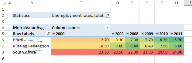
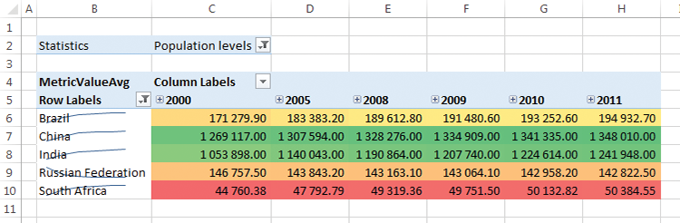
Care in the choice of colors needs to be exercised, however. In the example in Figure 15-7, red for high unemployment and green for low unemployment are apt; in other examples, the assumption of red for bad, as people are wont to do, can be misleading. In Figure 15-8, red has been used for low population, yet China and India are definitely countries with worse population problems. Reversing the scale doesn’t help because South Africa has a higher density population than Russia.
Figure 15-8: Color can be misleading
Ease of Development
| Reporting Tool | Predefined Chart Type | Ease of development |
| Excel | Yes | |
| PerformancePoint | Yes | |
| Power View | No | |
| Reporting Services | Yes | |
| Silverlight/HTML5 | N/A |
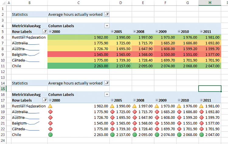
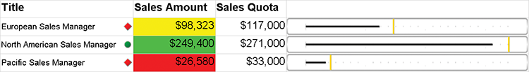
Indicators
Indicators have been treated fairly extensively in Chapter 10, but they are in many ways simply a subset of the conditional formatting. Although the color is contained within a shape (which may have meaning), the color banding is essentially the same concept as coding the entire cell in a color. The advantage of an indicator is that it is a discrete item, and as such won’t distract or overlay the numeric value.
Commonly, indicators are limited to fewer numbers than conditional formatting, so a problem with them both is rather more apparent: The numbers that are being shown have been banded into ranges, and as such you lose precision when displaying in this manner. As an example, let us consider the data set showing average hours worked per year—in the conditional formatting cells for 2011, it is very easy to rank the countries by color alone, but in the indicator set it is much harder. This problem doesn’t disappear with the conditional formatting—look at cells H11 and C6 in Figure 15-9.
This banding of data into these buckets is in fact the greatest strength of indicators. Red icons mean they need immediate action, green icons can be ignored with safety, and yellow icons need to be investigated. Choosing the boundaries for these values is thus of utmost importance!
Figure 15-9: Using indicators
Ease of Development
| Reporting Tool | Predefined Chart Type | Ease of development |
| Excel | Yes | |
| PerformancePoint | Yes | |
| Power View | Yes | |
| Reporting Services | Yes | |
| Silverlight/HTML5 | N/A |
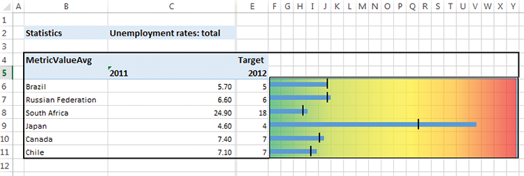
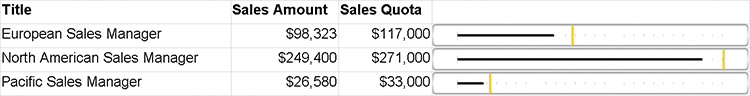
Bullet Graphs
A bullet graph is really two or three embedded bar charts in a single cell, superimposed upon one another. They are very useful when you need to show a series of data points against targets or averages. For example, you may need to compare the total sales of each store within a region to each other, as well as to a target that is set for each store, and quite possibly the store average as well.
The bullet graph in Figure 15-10 shows 2011 unemployment rates (the blue bar for each country) against a country-specific target (the black line—note that I made up the target), as well as against the overall target bands (the colored band at the back). Using a graph spread across the 20 columns in Excel is not necessary, but does give a nice visual cue to exactly how far the bullet graph is along the bands.
Figure 15-10: Using a bullet graph
Ease of Development
| Reporting Tool | Predefined Chart Type | Ease of development |
| Excel | No | |
| PerformancePoint | No | |
| Power View | No | |
| Reporting Services | No | |
| Silverlight/HTML5 | N/A |
Tool Choices with Examples
Excel, PerformancePoint, and Reporting Services all allow for embedded formatting of some description, while Power View does not. Excel is the leader in this section, with Reporting Services second, and PerformancePoint a long way behind.
Excel
Excel is the most widespread tabular display tool, and as such it has a very powerful set of visualizations; it is definitely the easiest tool to add embedded visualizations into. Covering data bars, sparklines, and conditional formatting, Excel may seem like the first choice in all cases—however there are some shortcomings.
Excel is great with conditional formatting—as shown in Figure 15-11, it is easy to add conditional formatting year by year to get a different scale when there are major data differences.
Figure 15-11: Sparklines combined with conditional formatting in a pivot table
However, when using a sparkline on the same graph, it won’t dynamically get new data as they come in. Compare Figure 15-11 to Figure 15-12: the sparklines have shown up only for the data points we’d selected.
This same issue occurs with the bullet graph you saw earlier: It was made by superimposing two bar charts on top of one another, and it does not have the capability of dynamically resizing. Conditional formatting and indicators both have the capability of being dynamic, so they are great choices. As shown in Figure 15-13, Excel provides additional settings for applying conditional formatting.
Figure 15-12: Expanding a pivot table does not expand the sparklines automatically
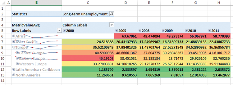
Figure 15-13: Conditional formatting settings
SQL Server Reporting Services (SSRS)
Reporting Services is a good choice for embedded visualizations—it is more work than Excel to generate, however; by embedding the visualization in a matrix, it will automatically repeat.
It also has a chart type that can easily be used to create bullet charts—the gauge chart.
Figure 15-14 shows a gauge chart that has been customized to be a bullet graph.
Figure 15-14: A bullet graph in SSRS
Conditional formatting is also very easy with SSRS, as Figure 15-15 shows.
Figure 15-15: Adding conditional formatting to an SSRS table
Of course, being cautious with colors is imperative if you don’t want your chart to end up being a cartoon canvas—use www.colorbrewer.org for a good selection of colors. As shown in the chart in Figure 15-15, using indicators is a more subtle and less garish way to show the data points.
Figure 15-16: Conditional formatting in PerformancePoint

PerformancePoint
Although PerformancePoint is not a great embedded visualization tool, it is the most capable of the indicator tools with its scorecard component. And with a bit of work, conditional formatting can also be applied.
An example scorecard with both indicators and conditional formatting is shown in Figure 15-16.
Implementation Examples
The implementation examples all use the OECD_Data model. See Chapters 4 and 5 for creating this data model.
Embedding Visualizations on a Pivot Table
Pivot tables are the most likely place for you to need visualizations; in this section you will create a new pivot table, add sparklines, and use conditional formatting. Data bars can be added in the same manner as conditional formatting.
Start by creating a connection to the OECD_Data tabular model. Do this in Excel by going to the Data tab, clicking Connections, and then clicking Add. (You need to click Browse for more and then New Source if a connection does not exist already.) Your connection type will be Microsoft SQL Server Analysis Services, and you will need to enter the name of the server to connect to. If it is on your local machine, using a dot (“.”) to mean “local” will suffice. Finish by choosing the correct model and clicking OK.
Then on the Insert tab, choose PivotTable. Your screen should look similar to the one shown in Figure 15-17.
Figure 15-17: Designing a pivot table
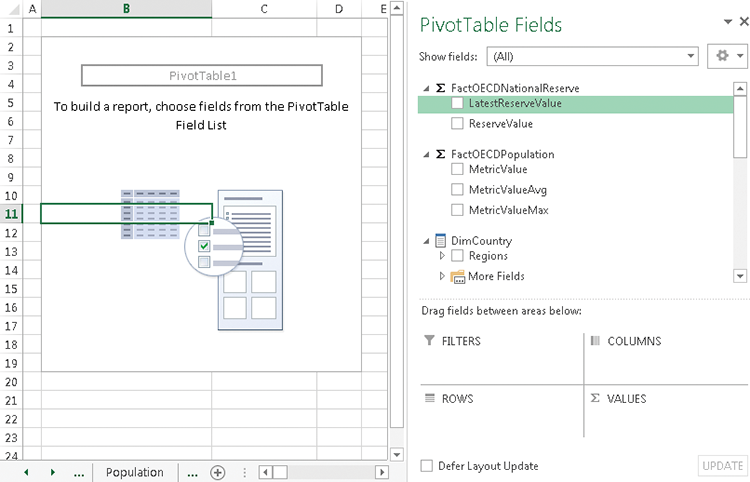
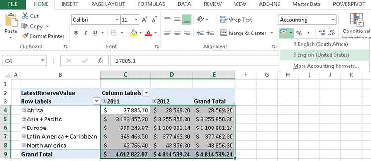
Drag FactOECDNationalReserve > LatestReserveValue to the Values box, DimCountry > Regions to the Rows box, and DimDates > YMD to the Columns box. Right-click in column A and choose Insert; then right-click in row 1 and choose Insert to give the table a border. Do some basic formatting, and set the value fields to use the currency format, as shown in Figure 15-18.
Finish the basic formatting by right-clicking Grand Total. If your pivot table is in A1, this will be D2—if you have left an empty row and an empty column surrounding your pivot table, this will be E3. All later cell references assumed that this cell is in E3 and choose Remove Grand Total. The LatestReserveValue is using a LastNonEmpty pattern, so it always shows the latest value, and Grand Total for the rows is simply repeating the 2012 value.
Figure 15-18: Formatting currencies in Excel
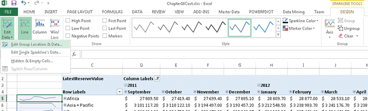
For sparklines, specifically, the data range is not dynamic, so expand both 2011 and 2012 before inserting them. Right-click 2011 Total and remove it by unticking Subtotal YearName. Insert another column by right-clicking in column A and choosing Insert—you will put the sparkline here. In B5, select Insert and then Line, as shown in Figure 15-19.
Figure 15-19: Adding sparklines to a pivot table
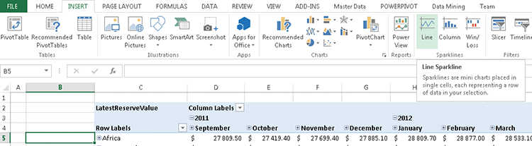
Figure 15-20: Sparkline data range window
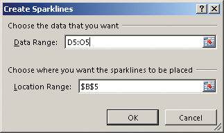
Choose the data range: D5 to O5, as shown in Figure 15-20.
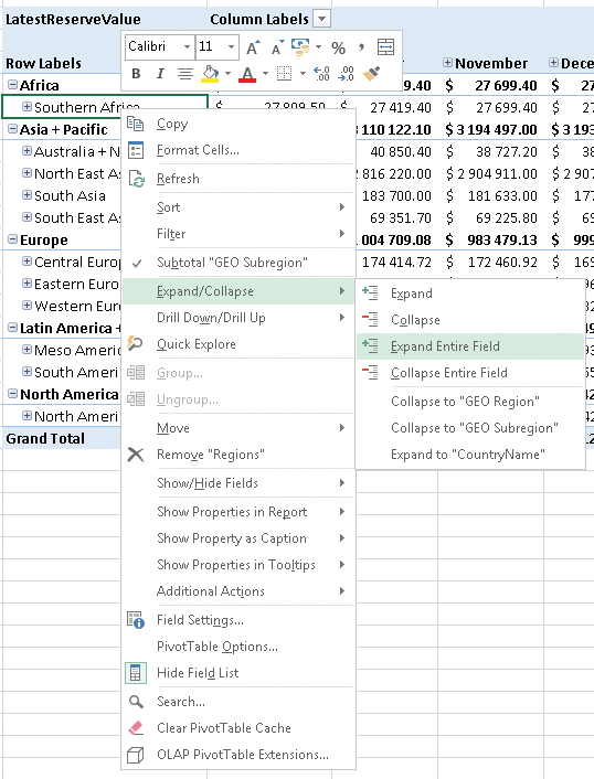
To finish, you need to expand the sparkline to all the rows. In order to know how many rows to expand to, right-click Africa, choose Expand/Collapse, and then Expand Entire Field; then do the same with Southern Africa, as shown in Figure 15-21.
Figure 15-21: Drilling down on a pivot table
Finish by clicking the bottom-right corner of the cell with your sparkline in it and dragging it to the bottom of all your data, as shown in Figure 15-22.
Figure 15-22: Extending a sparkline
Once you have done this, collapse the fields again to get a view similar to that shown in Figure 15-23.
Figure 15-23: Sparklines in a collapsed pivot table

Immediately apparent is the influence of the missing data in August 2012: Not all countries have submitted and it distorts the sparklines. Fix this by removing August completely in the Excel filters. Do so by clicking on the arrow next to the words “Column labels” and then ticking the multiselect tickbox. Find August 2012 in the tree, and deselect it. This distorts the sparkline, so when you click the sparkline, a new context menu appears in the Ribbon, and you can edit the data, as shown in Figure 15-24.
Figure 15-24: Changing sparkline data fields
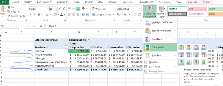
Another way of showing data is conditional formatting—the temptation is to simply highlight the whole data set and add conditional formatting, but doing this has a problem: the grand total will always be on one end of the spectrum, and the smallest point of the data set the other. Comparing the smallest country’s reserve to that of all the OECD nations is not particularly helpful unless it’s expressed as a percentage.
Instead, you will apply conditional formatting to each level independently. Start by clicking cell D5, choose conditional formatting in the Home Ribbon, and choose the Green-White scale, as shown in Figure 15-25.
Figure 15-25: Applying conditional formatting to a single cell
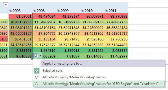
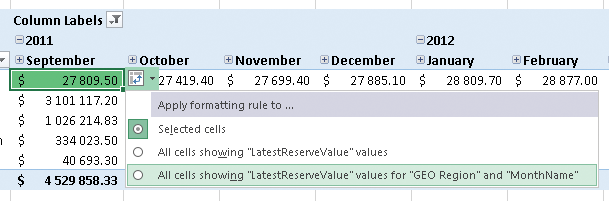
A small icon will appear next to the cell you just formatted. Click it and set it to appear for all cells with the year and region, as shown in Figure 15-26.
Figure 15-26: Expanding a conditional formatting selection
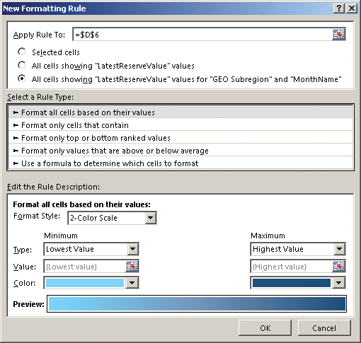
Next, you will do the same for the level below that: the subregion. In this case, to differentiate between the levels, you will use a color scale from light to dark blue. So instead of choosing the same color scale, choose more rules. Set the rule up, as shown in Figure 15-27, making sure to set it to apply to all cells with the values Sub Region and Month, and choose two appropriately spaced blue values.
Figure 15-27: Conditional formatting rules window
Repeat this process at the country level, using yellow and red (you could choose any color you want, as long as it doesn’t overlap with the existing color sets). The result is a table looking similar to the one shown in Figure 15-28.
Figure 15-28: Multiple conditional formatting rules applied to a pivot table
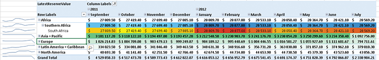
It is important to note that the conditional formatting is relative to the data currently visible: drilling down on Europe. (Take note of the change in the coloring for South Africa, as seen in Figure 15-29.)
Figure 15-29: Changing conditional formatting by drilling down

Summary
Embedding visualizations in applications and in tables is one of the most powerful ways to use them. The tools available from Microsoft to do this are quite powerful, and in this chapter you learned the techniques to apply them.