Chapter 13
Slice and Dice: Ad Hoc Analytics
The term slice and dice has been a synonym for business intelligence (BI) and probably predates that term. With the advent of online analytical processing (OLAP) tools, business users became able to manipulate large data sets, and apply summaries such as SUM and COUNT across custom groupings in real-time—this capability is what is known as slice and dice. A better term is really ad hoc analytics because slice and dice was originally used purely for tabular data, and later advances mean that more graphical visualizations can also be interrogated in the same manner. In this chapter, you will learn about the different types of ad hoc analysis and explore the value of each of the tools.
Explanation of Terms
The field of ad hoc analytics is vast and murky, with different vendors perpetuating their own terminology. Microsoft, as always, does the same, and it is important to understand the different way the tools are defined.
First, ad hoc analytics needs to be differentiated from the way the term analytics is used in general. The term is often used as a synonym for predictive analytics, statistical analysis, or machine learning. These fields (to some extent one and the same) are all based around the concept that an analysis is being done mathematically and probabilistically—far outside the scope of this chapter.
Instead, ad hoc analytics is the analysis by a person of a data set, by dynamically applying filters, grouping, and aggregations until a result is discovered. This process, as mentioned, is also called slice and dice, and (outside the Microsoft space) is called data mining as well. Data mining in that context is analyzing data to derive value. However, Microsoft has a tool as part of its Analysis Services called Data Mining Extensions and a language DMX, which are in fact a statistical toolset. This distinction is important as it can lead to some confusion!
Some other important terms that are often confused are covered next.
Self-Service BI
Self-service BI is another one of those hot industry topics with confusion attached.
In the first definition, self-service BI simply refers to the ad hoc analytic capability described in the preceding section. Data has been prepared, possibly in a data warehouse, loaded into a BI tool, perhaps OLAP or not, and then the business users are allowed to interact with the data in this controlled manner.
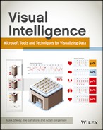
At the other end of the spectrum is the self-service user who is gathering his own data and then building his own reports. Typically, as seen in Figure 13-1, this is easy enough when a single source of data (such as an ERP system) is available, but this becomes much more difficult after multiple sources of data are required to be combined, such as a CRM and an ERP system, with the possibility of duplication and data mismatches.
Figure 13-1: Self-service BI lifecycles
As with everything in life, the best approach is often a middle-ground: allowing a Business Intelligence Competency Center (BICC) to do the large part of combining data and then opening the door to business departments to use the centralized data sources, but also to expand and integrate their own sources.
The Place of PowerPivot
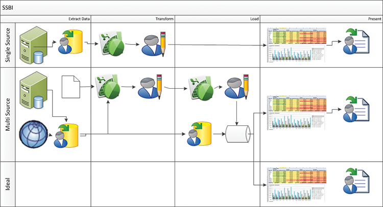
A common misconception is that PowerPivot is a visualization tool. Aside from the ever-present table visualization, PowerPivot is not a visualization tool in the slightest—no graphs or charts are part of the toolset. Instead, PowerPivot is a data modeling and data integration tool aimed at a business user. Incorporating Microsoft’s xVelocity engine, an in-memory column-store analytic database at its heart, and a new functional language called DAX (for Data Analysis Expressions). Where PowerPivot sits is as a bridge between users and IT. Business users can create their own analyses, combining data from the corporate data warehouse as well as their own formulae and possibly external data sources. They can start sharing these analyses with their team by publishing to a collaboration portal built in SharePoint and using PowerPivot services to do the calculations. The final step in an enterprise BI scenario is when the business has decided that this analytic workbook is business-critical—which decision is often driven by usage metrics on the workbook in questions—and IT is asked to take it over. At this point, the workbook is imported into Analysis Services using Visual Studio, optimized using such techniques as partitioning, role-based security suiting the data within the workbook, and then deployed to a production server and monitored on an ongoing basis. Figure 13-2 shows a typical example of such an environment.
Figure 13-2: BI environments using Microsoft tools
PowerPivot thus sits as the glue holding many of the visualization tools together.
Definitions
There are several terms in general use as verbs when doing ad hoc analytics—each of these will be covered in the section ahead—these terms are used throughout the book, and indeed the industry, so this will be a useful section. The terms are:
- Pivot
- Drill down (Drill up is the reverse)
- Drill through
- Drill across (not to be confused with cross drill)
- Slice
Pivoting
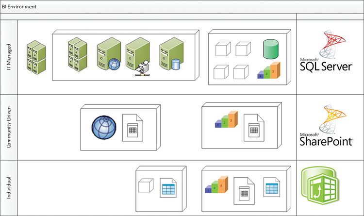
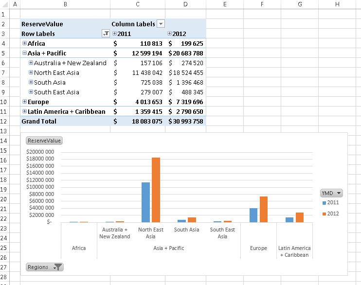
Excel popularized the pivot table, an indispensable tool for any analysis. Pivoting refers to the ability to drag any field into rows or the columns, and then view the data aggregated across those fields. Figure 13-3 shows a typical Excel pivot table and pivot chart beside each other.
Figure 13-3: A pivot chart in Excel
Ease of Development
| Reporting Tool | Predefined Chart Type | Ease of Development |
| Excel | Yes | |
| PerformancePoint | Yes | |
| Power View | Yes | |
| Reporting Services | No | |
| Silverlight/HTML5 | N/A |
Drill-down
A drill down requires a hierarchy, a predefined relationship between data values. The hierarchy that will always appear in any BI analysis (with many different versions) is the date hierarchy. In the most common date hierarchy, the calendar date will be defined as Year-Month-Day, with the drill down corresponding to that. Drill downs are most commonly shown with a “+” to allow drilling down. The inverse of a drill down is a drill up, which will collapse the expanded drill down, and this is most commonly shown with a “-”. PerformancePoint analytic charts are an exception—drill down is achieved by clicking the dimension member name, and drill up requires a right-click. Figure 13-4 shows a drill down in Excel.
Figure 13-4: Drilling down on a pivot table and linked pivot chart
The display of the undrilled values next to the drilled values is by contrast to PerformancePoint, which replaces the values with the drilled-down ones (as you will see later in this chapter).
Ease of Development
| Reporting Tool | Predefined Chart Type | Ease of Development |
| Excel | Yes | |
| PerformancePoint | Yes | |
| Power View | Yes | |
| Reporting Services | Yes | |
| Silverlight/HTML5 | N/A |
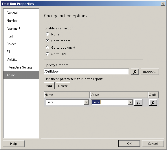
Drill through
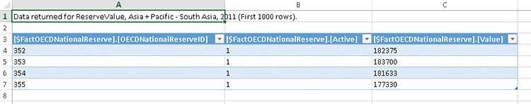
Drill through, although often confused with drill down, is distinct in that it often opens up a completely new visualization. This is a great technique for when you need to display information in a completely different format—for instance, you are looking at a management summary and you need to view the transaction detail. Excel provides a default drill-through action, which shows the detail from the underlying table—this is provided by double-clicking the data point you need to analyze further. A new sheet will be created with all the lines that contribute to the number you clicked, as you can see in Figure 13-5.
Figure 13-5: A table of data displayed by Excel after a drill through
Reporting Services gives you much finer-grained control of drill through, allowing you to specify other reports or even URLs and JavaScript commands.
Ease of Development
| Reporting Tool | Predefined Chart Type | Ease of development |
| Excel | Yes | |
| PerformancePoint | No | |
| Power View | No | |
| Reporting Services | Yes | |
| Silverlight/HTML5 | N/A |
Drill across
A drill across is done by clicking one component on your screen and having another component update according to your selection. This is distinguished from the traditional filters and the slicers we will discuss next because the drill-across item contains data—for instance, clicking a line in a scorecard that has a red indicator and having the chart alongside update automatically is a drill-across. An example of a drill-across is shown in Figure 13-6.
Figure 13-6: Drilling across from a PerformancePoint scorecard to an analytic chart

Ease of Development
| Reporting Tool | Predefined Chart Type | Ease of development |
| Excel | No | |
| PerformancePoint | Yes | |
| Power View | Yes | |
| Reporting Services | No | |
| Silverlight/HTML5 | N/A |
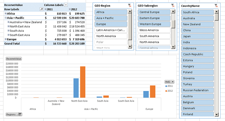
Slicing and Slicers
A slicer is very similar in concept to a drill across, except that the slicer doesn’t contain any information. It is a new way of showing a multiselect filter. One innovation is that slicers change color depending on whether data is contained within the data set. Figure 13-7 shows a slicer in Excel: It is easily apparent that although North America and Latin America are not selected, they do contain data that could be used if they were selected; Polar and West Asia do not contain data.
Figure 13-7: Slicers operating in conjunction with a pivot table and chart
Ease of Development
| Reporting Tool | Predefined Chart Type | Ease of development |
| Excel | Yes | |
| PerformancePoint | No | |
| Power View | Yes | |
| Reporting Services | No | |
| Silverlight/HTML5 | N/A |
Tool Choices with Examples
Ad hoc analysis is an area where the Microsoft tools diverge quite sharply. Reporting Services is not designed for this at all, and PerformancePoint shines on guided analysis. Excel, including PowerPivot and Power View, is truly the best tool for unguided analysis and data discovery.
PerformancePoint: Analytic Charts
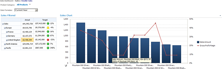
PerformancePoint is great for guided analysis when known conditions are exceeded or not met, for instance when a particular store does not meet a sales target, or an item is overstocked and some further analysis is required. The ability to drill down to the particular store and then do an analysis on how many salespeople are allocated to that store or break down the stores sales by product is one of the key strengths of PerformancePoint. Figure 13-8 shows an analytic chart that drills across to the UK sales figures and drills down to the months for 2007.
Right-clicking October 2007 brings up a context menu that enables us to do a Decomposition Tree and determine what figures make up that low sales figure in October. As you can see in Figure 13-9, a large amount of additional information can be gleaned from the Decomposition Tree.
Figure 13-8: Opening a Decomposition Tree from an analytic chart
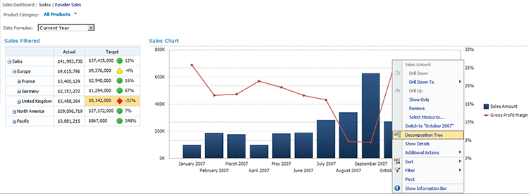
Figure 13-9: A PerformancePoint Decomposition Tree

The analytic chart can also be rearranged significantly to view alternate rollups. In Figure 13-10, I have drilled to November 2007 and filtered for the bottom 10 mountain bikes by Sales Amount. Immediately apparent is that although we have a spread of low-selling bikes, the Mountain-400 W Silver is a very profitable bike, so when talking to the store about doing a promotion, that is most likely the bike to focus on first.
Figure 13-10: Additional analysis within PerformancePoint
One key factor to always remember with PerformancePoint analytic charts is that they are dependent on having well-designed hierarchies to create a rich visualization environment.
PerformancePoint: Drill Across
PerformancePoint has an exceptional strength in that it allows for drill across to non-PerformancePoint components that are on the same dashboard.
A great example is combining GIS visualizations from SQL Server Reporting Services (SSRS) and filtering them by the PerformancePoint scorecard on the same page, as shown in Figure 13-11.
Figure 13-11: Combining PerformancePoint and Reporting Services
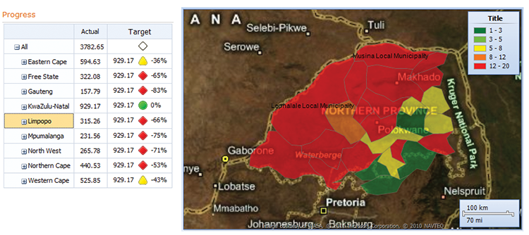
This cross-filtering works only from a PerformancePoint scorecard, not the analytic chart. It can, however, be used to filter an analytic chart by a scorecard.
Excel Pivot Tables
Excel pivot charts are by far the most widely known of the slice and dice tools, and they have a flexibility that none of the other Microsoft tools do. Excel pivots can be created against any data contained within Excel, but they do work much better when they have a solid data model to work from.
The pivot tables can be built up manually, but it is a lot more work because each level has to be added individually, and the subtotals removed. An example of such a pivot is shown in Figure 13-12.
There are other benefits to putting the data into a model first: centrally controlling the structure is the first benefit, the additional calculation power of DAX becomes available, and the data volumes that can be handled increase exponentially. The improved interface is shown in Figure 13-13.
Finally, when Excel pivots are deployed to Excel Services in SharePoint, they can be connected to PerformancePoint scorecards—the scorecard row values connect up to the slicers and change their values.
Figure 13-12: Editing a pivot table
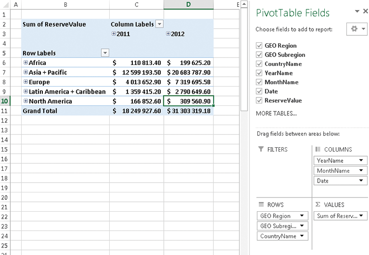
Figure 13-13: The PivotTable Fields task pane, where fields are added to the table
SSRS Drill Down and Drill Through
Reporting Services has the capability of doing both drill down and drill through. Each one of these has to be built in manually—the drill down is not particularly complex, but the drill through does require some work. Figure 13-14 shows the drill down enabled.
Figure 13-14: A Reporting Services matrix with drill down enabled
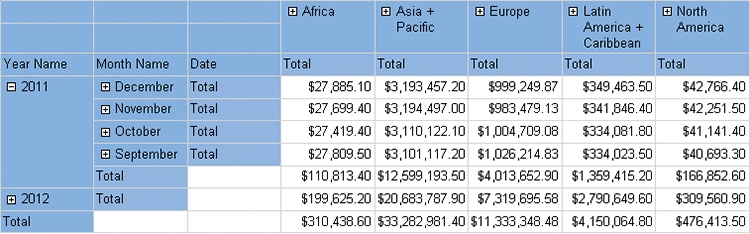
Figure 13-15 shows the setup screen for creating an action. Individual fields within the report table get passed to the report that is linked to, which gives a great deal of control over how the action works to the report designer.
Figure 13-15: Configuring drill through in Reporting Services
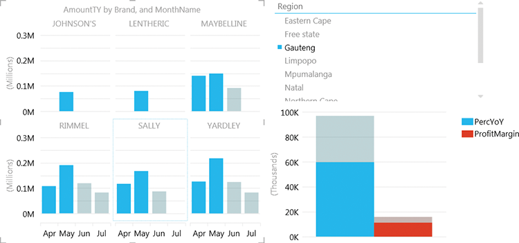
Power View
Power View is a data exploration tool, embedded within both Excel 2013 and SharePoint (installed from SQL).
Obviously, as a data exploration tool, it is squarely aimed at slice and dice analytics. It does require a data model to create these interactive dashboards.
Power View has a few key benefits over the other tools:
- Automatically connected slicers
- Integrated graphics (for instance, pictures of products)
- Tiled views
- Animations
- Integrated maps
Although they are great features and very welcome, Power View’s great disadvantage is that it is impossible to integrate with the other tools. It is purely a standalone tool.
Figure 13-16 shows slicing by region and drill across by selecting specific months, as well as a tiled view of products.
Figure 13-16: A Power View report sliced by specific months
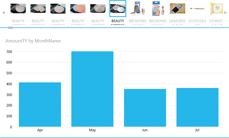
In Figure 13-17, tiles with product images are used to slice the sales amounts in the column graph below:
Figure 13-17: A tiled view in Power View
Implementation Examples
The implementation examples all use the OECD_Data model, so be sure you have downloaded them from this book’s web page on Wrox.com.
SSRS: Dynamic Measures
Although Reporting Services isn’t as dynamic as the other tools by default, it is an exceptionally powerful toolset, and some measure of ad hoc analytics can be enabled by using expressions.
For the purposes of this exercise, we will build the report by pulling in all the data we require and then use expressions to choose which items to use. You can also create dynamic queries, which will often perform much better.
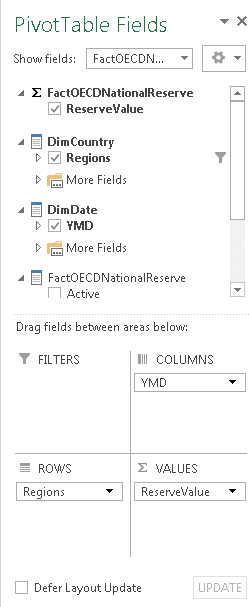
Start by creating a new report in Report Builder and connecting to the OECD_Data tabular model. Create a new data set named dsOECD and pull the following fields onto the design surface:
- Measures > Reserve Value
- Measure > MetricValueAvg
- Measure > MetricValueMax
- Measure > MetricValue
- DimCountry > Regions
- DimDate > YMD
- DimOECDStatistic > Statistics
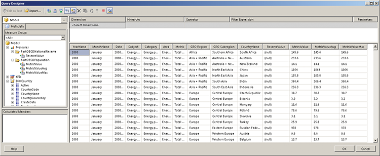
Your query designer should look similar to Figure 13-18.
Figure 13-18: The Report Builder query design screen for Analysis Services
Next, create three new parameters: Measure, X-Axis, and Y-Axis. Use XAxis and YAxis for the actual name, and use X-Axis and Y-Axis for the prompt. For the Measure parameter, add the Available Values shown in Table 13-1. The Value fields are going to match the cube fields exactly so that this report can be used with PerformancePoint later. Set the default to ReserveValue.
Table 13-1: Measure Values
| Label | Value |
| Reserve Value | ReserveValue |
| Metric Value Avg | MetricValueAvg |
| Metric Value Max | MetricValueMax |
| Metric Value | MetricValue |
For the X-Axis and Y-Axis parameters, use the values Table 13-2. Set the X-Axis default to Year and the Y-Axis default to GeoRegion.
Table 13-2: Measure Values
| Label | Value |
| Year | Year |
| Month | Month |
| Date | Date |
| Subject | Subject |
| Category | Category |
| Area | Area |
| Metric | Metric |
| Region | GeoRegion |
| Subregion | GeoSubregion |
| Country | CountryName |
This sets up the basics for the report. Next, you create the dynamic fields that will use the parameters. Right-click dsOECD and click Add Calculated Field. Call the new field Measure and then put the following expression into the expression box (as you can see in Figure 13-19).
Figure 13-19: The calculated measure expression

=switch(
      Parameters!Measure.Value = "ReserveValue",
            Fields!ReserveValue.Value
      ,Parameters!Measure.Value = "MetricValueAvg",
            Fields!MetricValueAvg.Value
      ,Parameters!Measure.Value = "MetricValueMax",
            Fields!MetricValueMax.Value
      ,Parameters!Measure.Value = "ReserveValue",
            Fields!MetricValue.Value
)
This piece of code sets the value of the Measure field to the value of the field chosen by the user. Next, we will do the same for the X-Axis and Y-Axis fields. Create two new calculated fields called XAxis and YAxis. The code for the X-Axis is shown in the following snippet:
=switch(
      Parameters!XAxis.Value = "Year", Fields!YearName.Value
      ,Parameters!XAxis.Value = "Month", Fields!MonthName.Value
      ,Parameters!XAxis.Value = "Date", Fields!Date.Value
      ,Parameters!XAxis.Value = "Subject", Fields!Subject.Value
      ,Parameters!XAxis.Value = "Category", Fields!Category.Value
      ,Parameters!XAxis.Value = "Area", Fields!Area.Value
      ,Parameters!XAxis.Value = "Metric", Fields!Metric.Value
      ,Parameters!XAxis.Value = "GeoRegion", Fields!GEO_Region.Value
      ,Parameters!XAxis.Value = "GeoSubregion",
            Fields!GEO_Subregion.Value
      ,Parameters!XAxis.Value = "CountryName",
            Fields!CountryName.Value
)
The code for the YAxis is very similar, as you can see:
=switch(
      Parameters!YAxis.Value = "Year", Fields!YearName.Value
      ,Parameters!YAxis.Value = "Month", Fields!MonthName.Value
      ,Parameters!YAxis.Value = "Date", Fields!Date.Value
      ,Parameters!YAxis.Value = "Subject", Fields!Subject.Value
      ,Parameters!YAxis.Value = "Category", Fields!Category.Value
      ,Parameters!YAxis.Value = "Area", Fields!Area.Value
      ,Parameters!YAxis.Value = "Metric", Fields!Metric.Value Value
      ,Parameters!YAxis.Value = "GeoRegion",Fields!GEO_Region.Value
      ,Parameters!YAxis.Value = "GeoSubregion",
            Fields!GEO_Subregion.Value
      ,Parameters!YAxis.Value = "CountryName",
            Fields!CountryName.Value
)
Now finish by adding a new column chart, using the fields as shown in Figure 13-20.
Figure 13-20: Laying out the chart

Choose the generic template, click Finish, and run the report to see a report such as the one shown in Figure 13-21.
Figure 13-21: A chart in Reporting Services
There are some very obvious limitations with this report—years are rolled up months as opposed to the last value for the year, the formatting is not correct—but the obvious first issue is that the report is exceptionally slow and it will always return all the data. To rectify these problems, go back to the data set; add the Regions, YMD, and Statistics hierarchies to the filter; and click the Parameterize button, as shown in Figure 13-22.
Figure 13-22: The Query designer
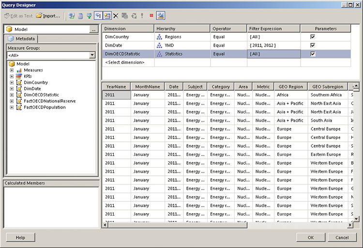
This process enables you to parameterize the query and will serve as a basis for connecting PerformancePoint to Reporting Services.
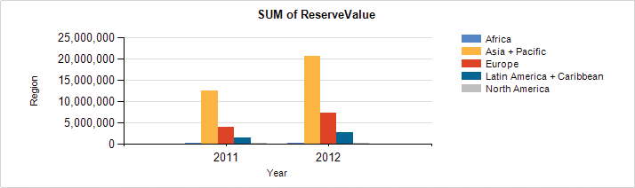
To finish this exercise, you will make the chart title dynamic and label the axes correctly.
Start by right-clicking the Axis Title running along the left of the chart, and clicking Axis Title Properties. Click the Fx button next to the chart title; then replace the wording with Parameters!YAxis.Label, as shown in Figure 13-23. The default, if you choose from the parameters at the bottom, will be Value, but generally speaking, Labels will be more user-friendly.
Figure 13-23: Changing the Y axis label

Repeat this for the XAxis and for the Chart title, using ="SUM of " + Parameters!Measure.Value
Format the axis to have thousands separators as well, and the chart will appear as in Figure 13-24 when run.
Figure 13-24: A better formatted SSRS chart
Integrating PPS and SSRS on a Single Page
One of the strongest uses for PerformancePoint is combining PerformancePoint content with Reporting Services or Excel Services content and having them interact. In this exercise, you will create a Date Filter, a scorecard showing values for average hours actually worked by region, and then embed the report created in the previous section. You will also set up the scorecard such that the region changes the region in the report. The date filter will allow your user to select a date on a calendar, and will display all the months of that year on the report.
Start by opening up Dashboard Designer. If you have not used Dashboard Designer before, you will open it up from the front page of a Business Intelligence Center in SharePoint, choosing the Create Dashboard tab and clicking Start using PerformancePoint services to bring up the Run Dashboard Designer button. Set up the data connection and map the date dimension as described in Chapter 7. Name the data connection dsOECD.
Right-click the List name (PerformancePoint content). Choose New > Filter and then Time Intelligence Connection formula. Click OK.
Click Add Data Source; then choose the dsOECD data source. Click Next and select the Time Intelligence Calendar. Click Finish and name the filter Months of Year.
Next, select PerformancePoint Content > New > KPI, and call the KPI Average Hours Worked Per Year. Change the number formats for both actual and target from Default to Number, and remove the decimal spaces.
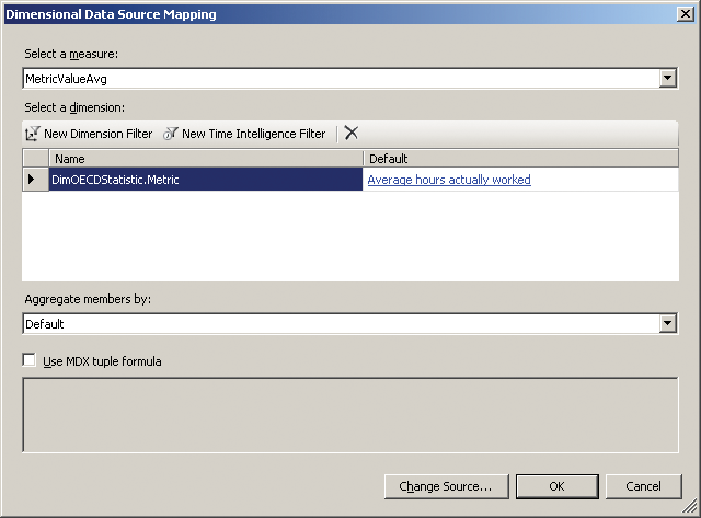
For the actual, click 1 (Fixed Values) under Data mappings; then change the source to dsOECD and click OK. Choose MetricValueAvg under Select A Measure; then click New Dimension Filter and choose DimOECDStatistic.metric. Click OK, and choose Average Hours Actually Worked by clicking Default Member (All) and selecting it from the list. Make sure to deselect the default. Your setup should look like Figure 13-25.
Figure 13-25: Setting up a measure in PerformancePoint Dashboard Designer
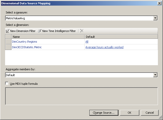
Repeat this process for the target, but also add a dimension filter for DimCountry.Regions and choose All instead of Default Member (All). Your setup should look like Figure 13-26.
Figure 13-26: Adding filters
This process will create a target that is the average of all the countries.
Figure 13-27: A scorecard in PerformancePoint

Next, create a new scorecard by choosing “Blank scorecard” from the templates. Add the KPI to the new scorecard by dragging it onto the design surface, and add the DimCountries > Regions hierarchy by dragging it onto the KPI name on the scorecard. Call your scorecard Average Hours, and it should appear as it does in Figure 13-27.
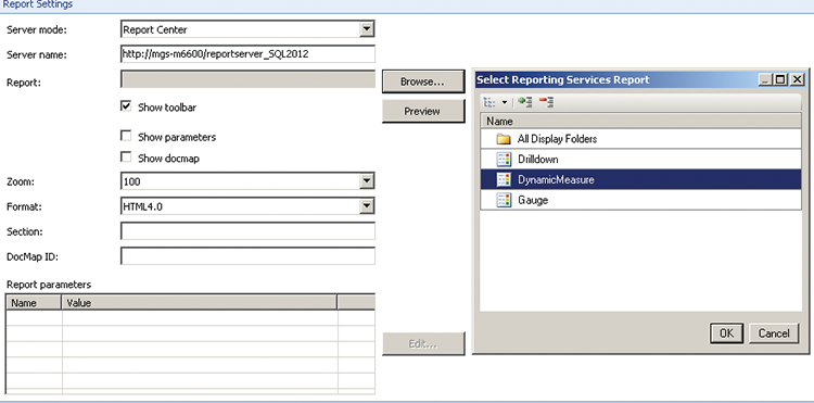
The final step before creating the dashboard is to link to the Reporting Services report. Right-click the PerformancePoint content list, choose New > Report, and then choose Reporting Services.
A setup screen will appear—if you are using Native mode Reporting Services, put in the server name. If you are running a named instance, you will need to go to the Reporting Services Configuration Manager to obtain the name. Once you have set it up, click the Browse button to choose the report, as shown in Figure 13-28.
Figure 13-28: Integrating Reporting Services into PerformancePoint
Choose the report you created in the previous section; then click OK.
PerformancePoint allows you to override the defaults used for the report, as you can see in Figure 13-29.
Figure 13-29: Setting SSRS parameters in PerformancePoint
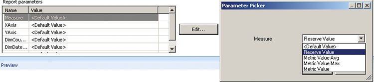
Choose Reserve Value for the measure, Month for XAxis, and Country for YAxis; and leave the rest. Give your report a name and save it.
Now create the dashboard. Right-click the PerformancePoint content list and choose New > Dashboard. Use the Header, 2 Columns template. Drag the Months of Year filter to the top section, the Average Hours scorecard to the left section, and the report you just created to the right section. Note that these will be in the Details window on the right!
Click Average Hours and choose Create Connection from the Ribbon. If you don’t see the Create connection button, change to the Edit tab in the Ribbon at top. Set Get Values From to Header - (1) Months of Year; then change to the Values tab and set the source to Member Unique Name. Click the Connection Formula button and type Year. This will set the filter to the year of the date selected in the calendar. Finish by clicking OK on both screens.
Repeat the process for the report. Click DynamicMeasures and choose Create Connection from the Ribbon. Set Get Values From to Header - (1) Months of Year; then change to the Values tab and set the source to Member Unique Name. Change the Connect To to DimDateYMD.
Click the Connection Formula button and type Year. Finish by clicking OK on both screens.
The final step is to link the scorecard to the report. Click DynamicMeasures and choose Create Connection from the Ribbon. If you can’t see Create Connection in the Ribbon, change the tab in the Ribbon to Set Get Values from to Left Column - (1) Average Hours. Switch to the Values tab and set the source to Member Row: Member Unique Name. Change the Connect To to DimCountryRegions.
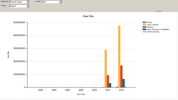
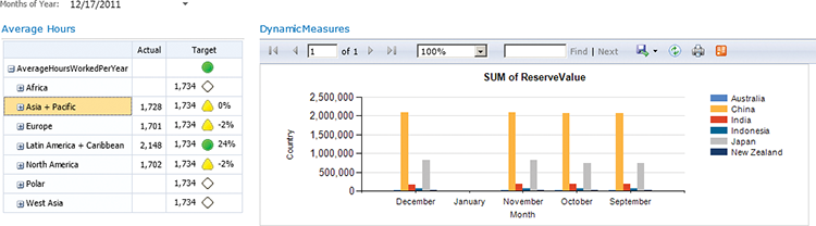
When a row is clicked on in the scorecard, this step will send the underlying unique name from the cube to the report, and hence filter the report. Give your dashboard a name. Right-click and deploy to SharePoint. Choose a date in 2011, as that is the last year for which there is average hourly data available.
Clicking Asia/Pacific in the scorecard will show you a chart similar to the one in Figure 13-30.
Figure 13-30: An integrated dashboard
Power View: Exploring Data
In order to use Power View, you will need to start by creating a data model.
Open a new Excel workbook and on the PowerPivot tab, click the Manage button. (See Chapter 5 for enabling PowerPivot if the tab is not visible.) Click the From Database button, choose SQL Server, and enter the location of your SQL Server. Choose the VI_UNData database from the drop-down and click Next. Choose Select From A List Of Tables; select the DimDate, DimCountry, DimOECDStatistic, FactOECDPopulation, and FactUNData tables; and click Finish. Rename the Value column to ValueSource. In FactOECDPopulation, choose the Value field, click the arrow next to Autosum, and choose Average. Right-click ValueSource and select Hide it from client tools, and then rename the Average of Value calculated measure to Value. You rename this by editing in the formula bar everything before the “:=“.
This satisfies the bare minimum of building the model—in a full implementation, you would spend some time tidying it up.
Figure 13-31: A tiled Power View report
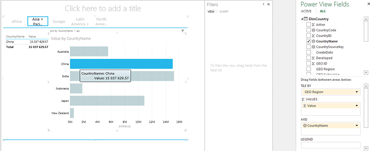
Once you have your model set up, creating a Power View report is simple: Go the Insert tab in the Excel Ribbon and click Power View. Start by dragging the Value field from FaceOECDPopulation to the Fields box, Geo Regions from DimCountry to Tiles, and then CountryName to Fields. You will need to resize the chart and should see something similar to Figure 13-31.
Drag Value from FactOECDPopulation to the whitespace next to the table, which creates a new table, and change it to a bar chart. By dragging CountryName to the Axis field, the bar chart will now become interactive, as seen in Figure 13-32.
Figure 13-32: Filtering a Power View report
This chart is still meaningless as it is simply a sum of all the different statistics. Start by clicking the CHART button on the Filters section, and filtering this chart to show just the GDP per capita. You will need to drag Metric to the Filter section and select the metric, as shown in Figure 13-33.
Figure 13-33: Choosing a metric
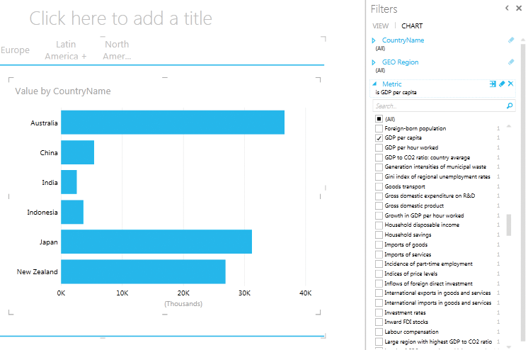
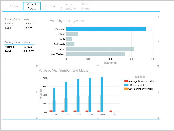
Click on the table on the left (The table and not the chart you edited above), and add a filter to show GDP per hour worked; then add another table below it by dragging value onto the white space. Add a country name and a filter to show average hours actually worked. These tables will all then be sliced by the chart. Each table and chart will be filtered by a different metric value.
Finish by dragging value to the whitespace beneath the chart. You may need to clear some space, which you can do by selecting the corner of the title text box, deleting it, and then resizing the main box. Drag Metric onto this new table; filter by the three metrics GDP per hour worked, GDP per capita, and Average hours actually worked; and then change it to a column chart. Move Metric to Legend, and drag YearNumber to the Axis of the chart. This will give you an interactive dashboard similar to the one in Figure 13-34. Clicking either of the charts will update the other chart with that selection, as well as the tables.
Figure 13-34: An interactive Power View report
Summary
In this chapter you learned how to build interactive visualizations to support ad hoc analytics, using all the Microsoft tools. These visualizations are commonly more used by power users, but applying predetermined analysis paths helps guide less experienced users.