
12. Auto Layout in a New View
Chapter 11, “Building a New View,” was about creating scenes in Passer Rating. To preserve that focus, I finessed the issue of Auto Layout with a quick workaround. For the purpose of an exercise, you don’t need to do more solely for a screen the size and shape of a 4.7-inch iPhone; Passer Rating is not a professional-grade product.
You’ll need to know more sooner or later, and this chapter is a closer look at Auto Layout. You can put it off, or even skip it. I won’t know.
Note
If you attempted Auto Layout in Xcode 4, you found it was a nightmare, and I wouldn’t blame you if you were a bit phobic on the subject. It got better in Xcode 5, and much better in Xcode 6. However, the new workflow is available only if you select at least Xcode 5.0 in the Opens in popup in the File inspector. If you choose Xcode 4.6 compatibility—maybe you or a coworker have to open the file in Xcode 4 for legacy—you’re back to the horrible old workflow.
Why Auto Layout?
For decades, NeXTStep, Cocoa, and Cocoa Touch used autoresizing to adapt the layout of views to changes in geometry—the resizing of a window or the rotation of a device. Autoresizing was very simple: Notionally, each view had “springs,” which would permit it to be resized on one or both axes, and “struts,” which governed whether an edge of the view would maintain its distance from the corresponding edge of its container. As the superview resized, the subviews would adjust according to the spring-and-strut rules.
Limitations of Autoresizing
This worked. Mostly. But there were some things it couldn’t do, things that would have been common had they been easy. Application code would have to intervene for special cases, and some requirements had to be met by trial and error.
Layout can’t be a matter of the window pushing or pulling on its contents, which push or pull on theirs, and so on down the line. Suppose you have a label that absolutely must be readable in full, and it’s three layers down in the containment hierarchy. Its container must not become so small that the full label can’t be shown; so the container above must not become small enough for that to happen; and so on to the container above that, up to the root view of the window. The only place to enforce that must-not-shrink requirement is in the size limits for the window itself: Experiment, see how small the window can get without pressuring the label, write that dimension down, and set it in the parameters for the window.
Now translate the label from English to German: Pour your translations into a duplicate XIB file, see how the widths work out, and repeat the experiments to determine how to constrain the window.
You have ten international markets. And there’s another label that must be readable at all times, and its content is determined in code. This entails some arithmetic.
We have computers to do arithmetic. In the real world, constraints on size and layout propagate up and down—and even across—the containment hierarchy. There have to be compromises and priorities: “I want this label to be centered and wide enough to show its contents (I don’t need it wider), but it has to be at least 8 points away from the controls on either side, and to preserve that distance, respond first by moving it off-center, and if you must, by narrowing the label. Stop the window (three layers up) from resizing if it means making the label any narrower than 120 points. As for the next ten views. . .”
Auto Layout
Auto Layout can express all of this. And while Auto Layout has a reputation for complexity, it’s a lot simpler than writing code to implement that description.
Internally (meaning: don’t think too hard about this), any two views can be related to each other by constraints. A constraint applies to a specific property in each view (such as location of edge, center, or baseline; height, width) and specifies gaps and alignments by an offset, a multiplier, and a priority. Views may have “inherent” sizes, and some views (usually ones containing text) can resist being drawn wider or narrower than their contents. Auto Layout takes all of these constraints and reconciles them to produce an overall layout that satisfies as many as possible, sacrificing lower-priority ones to meet higher priorities.
The Thing to Remember
“Satisfying all constraints” imposes a duty on you: For each view, on each axis, the chain of constraints should fully specify the view’s location and size (sufficiency). And, the constraints must not contradict (consistency). If those conditions are not met, Auto Layout will raise exceptions, and Interface Builder will post warnings.
The Player Billboard, Revisited
In Chapter 11, “Building a New View,” I had you put together the billboard view at the top of the PRGameListController view with little thought of declarative layout. You switched a couple of constraints to get a bug out of the way, and asked Interface Builder to do the rest.
Why You Should Do More
It’s good enough for a start, but there are flaws. Unless you were very careful about alignments, the generated constraints were a little off of your intention, and when you turned the billboard to landscape, your narrow elements wasted most of the available space (Figure 12.1).

Figure 12.1 The automatically generated constraint system you can get from Interface Builder is workable, but it doesn’t make the best use of the area available in landscape orientation.
Note
What I show in Figure 12.1 shows how my constraint network played out. Your own may look different, but probably no better.
Start by examining the constraint system you have now. There are a few ways to explore: If you select a view in the canvas editor, it will display lines to show the constraints that apply to it; the Size (fifth) inspector will include a list of those constraints, and double-clicking an item will select that constraint. The constraint objects themselves stand alone in Constraints categories you’ll find throughout the document outline. (You may have to dig; it helps if you enter the name or type of the view you’re looking for.) Selecting one will highlight it in the editor. Selecting one in the editor canvas itself requires some dexterity, but Interface Builder helps by highlighting the bar when you’re pointing to it, and providing a slightly wider hit area than is visible.
Once a constraint is selected, you can delete it or use the Attributes (fourth) inspector to edit it.
Note
The Editor →Canvas menu contains a number of options for what information Interface Builder will show, particularly as relates to constraints. What interests us now are Show Bounds/Layout Rectangles, which frame views according to either the .frame property of the UIViews, or, what may be different, the bounds that Auto Layout uses to measure spacing and alignment. Also, there are options that expose constraint relationships—some essential, and some useful as debugging aids.
One thing to notice: When you ask Interface Builder to add missing constraints, it can only guess at your intentions, but the guesses aren’t too bad. One thing is particularly good: Most of the constraints cascade. Usually, the most important thing about the layout of a view is not its absolute location, but how it lines up with another.
Consider a partial calendar view that consists of a row of day-of-week labels, and below it a few rows of buttons representing the days. You don’t care about the x-and-y location of a day-of-month button; you only want it to be centered on its day-of-week label, and below the label by a multiple of the height of a row.
A good Auto Layout network gives absolute locations to as few views as possible. The strategy for the calendar view would be to provide an absolute location for one day-of-week label—the first, last, or middle day—and let relative (centering, spacing) constraints do the rest. If you move that one label, the rest of the layout takes care of itself.
Factoring Layout into Subviews
In Chapter 11, “Building a New View,” I had you lay out each and every label in the billboard. For the stats column on the left, that meant a subnetwork of size, spacing, and alignment specifications that was very fragile and very confusing. For five pairs of labels, identical but for the text they contain, that makes no sense. In this section, we’re going to factor that complexity out by defining a custom view that wraps both the name and the value of the integer statistics. On the way, I’ll show you how to create custom views that you can configure directly in Interface Builder.
What should such a UIView subclass—call it StatView—look like? Nothing exciting: Just a rectangle with two text areas, one for the name, one for the value. See Figure 12.2.

Figure 12.2 A wireframe for a simple view that displays a label and an integer. StatView will have inspectable properties for the label, the value, and the color and size of its text.
The process of laying out the name and total will be up to a new UIView subclass, StatView, to be defined in its own source file StatView.swift. Don’t create the file yet. A StatView may be simple, but some things have to be tweaked before they look right. How does it lay out its contents? (It’s going to be a single view object, so it can’t use Auto Layout.) What fonts look good? How does it determine its “fitting” size (minimal needed to fully present its content)? Events like layout generate a cascade of callbacks into a view—how do you sort out which callback should trigger a StatView’s internal layout?
The Playground
One of the blessings of Swift is that it is complete enough that it can be executed interactively (or nearly so) in a Run-Edit-Print Loop (REPL): You enter your code, the REPL interprets it, and you see the results. There is a command-line REPL (type swift, or xcrun swift in Mavericks), but Xcode 6 includes a visual edit-and-display environment, the playground, that makes it easy to develop even moderately complex software, even if it produces graphical output—such as the contents of a view.
That’s the skeleton. Where do we put it?
Select File →New →File. . . ( N). In the template chooser that drops down, select iOS → Source → Playground, then go through the usual steps to save the new file and associate it with your project. You shouldn’t place it in any target.
Warning
iOS and OS X playgrounds are different environments, depending on different frameworks. If your playground doesn’t behave as you expect, look to the top of the file and see whether the first import is for Cocoa or UIKit.
The only executable line in the new playground will be an assignment to a String variable (Swift knows it’s a String because its initial value is one): var str = "Hello, playground". There is a gray column on the right side of the editor pane, containing one line, next to the assignment statement: "Hello, playground".
Let’s start with a simple example: Extracting a square root by Newton’s Method. Replace the contents of the playground with this:
import UIKit
func newton_sqrt(square: Double,
epsilon: Double = 0.001)
-> Double
{
func close_enough(one: Double,
two: Double)
-> Bool {
println("close_enough((one), " +
"(two), (epsilon))")
let diff = abs(one - two),
denom = max(abs(one), abs(two))
if denom == 0 { return true }
return (diff / denom) <= epsilon
}
var lag = square
var guess = square / 2.0
while !close_enough(guess, lag) {
lag = guess
guess -= (guess * guess - square) / (2.0 * guess)
}
return guess
}
// newton_sqrt(200, epsilon: 0.0001)
Xcode colors and error-checks playground code just as it would in any other editor. So far, nothing impressive: It just sits there.
Now un-comment the call to newton_sqrt. The gray column comes alive as the function executes: The inital assignments to guess and lag are tagged with 100.0 and 200.0, respectively; loop contents get counts: (8 times).
Note
A converging algorithm like this depends on getting the terminal condition right; you’re likelier than not to get it wrong on the first try and find yourself in an infinite loop. If that happens, press period to stop the loop. You will have a few seconds to edit the code to hard-code a break into the loop.
What about that println() call in the embedded close_enough function? You don’t want to know that it printed something eight times, you want to see what was printed.
Open the Assistant editor (the paired-ring item in the toolbar). If the root of its jump bar isn’t set to Timeline, switch it over. The timeline includes a white box, Console Output, showing the output.
That’s not all. The heart of newton_sqrt is the last computation in the loop:
guess -= (guess * guess - square) / (2.0 * guess)
If you hover the mouse pointer over the gray margin of the playground, you’ll see two symbols appear, a QuickLook eye and a bubble. In a simple case like this, the QuickLook popover won’t tell you anything you didn’t see in the margin, but for more complex data types, QuickLook will show you array contents, struct members, and so on.
Click the bubble on that line. This is new: Another box appears in the timeline, this time containing a line chart showing the value computed on that line at each iteration. That’s going to be useful. See Figure 12.3.

Figure 12.3 Playgrounds allow you to write entire classes, monitor their execution, and refine them in real time. The Timeline assistant displays compiler errors, console output, and expression results over time. Swift syntax gives Unicode characters first-class treatment, so some variables can have “real” mathematical names.
StatView
Now we’re ready to clear out this playground and attack StatView. There are obvious properties we’d like to see—they’re the API it shows its clients:
 A
A String for the name of the statistic
An Int for the value
A font color
That gets us a start on the class:
import UIKit
import QuartzCore
internal let defaultFontSize:Double = 17.0
internal let verticalMargins:CGFloat = 2.0
internal let sideMargins:CGFloat = 2.0
internal let interMargin:CGFloat = 4.0
@IBDesignable
public
class StatView: UIView {
/// Set the label string to be displayed
/// at the left side of the view
@IBInspectable public
var name: String = "" {
didSet {
nameLayer.string = name
setNeedsLayout()
}
}
/// Set the integer value to be displayed
/// at the right side of the view
@IBInspectable public
var value: Int = 0 {
didSet {
statLayer.string = "(value)"
setNeedsLayout()
}
}
/// Set the size of the font to be used
@IBInspectable public
var fontSize: Double = defaultFontSize {
didSet {
textFont = UIFont.systemFontOfSize(
CGFloat(fontSize))
setUpLayers()
setNeedsLayout()
}
}
@IBInspectable public
var fontColor: UIColor = UIColor.blackColor() {
didSet {
nameLayer.foregroundColor = fontColor.CGColor
statLayer.foregroundColor = fontColor.CGColor
}
}
// More to come
}
@IBDesignable and @IBInspectable—what are those?
Up through Xcode 3, and in Project Builder before it, it was possible to create linkable frameworks that included the resources and code that could draw and operate a view (NSView). The IB plugins could provide their own attribute-inspector forms to set the unique properties of the included views.
Plugins disappeared in Xcode 4, an all but total rewrite. Experience had shown that injecting arbitrary code into privileged software is a very bad idea. Developers had to fall back on inserting blank UIView placeholders into their layouts, changing the classes in the Identity inspector, and waiting for the simulator to show them what the outcome was.
As of Xcode 6, Interface Builder accepts designable views for Live Rendering. IB uses the code and resources of custom views in the layout scenes, and offers controls to set their properties. You designate a view as designable by declaring it @IBDesignable public. You expose properties for editing in IB by declaring them @IBInspectable public.
StatView lays itself out as two Core Animation text layer objects (CATextLayer). Text layers have their limitations, but for this application, they offer the right mix of features and convenience. The contents and font size are all marked @IBInspectable.
The layout and measurement of the contents has to be flexible in response to changes in the view’s frame; those come from outside as the view is placed in its superview and managed by Auto Layout. Here are the highlights—the sample code tells the whole story:
@IBDesignable
public
class StatView: UIView {
// ...
public required override init(frame: CGRect) {
fontColor = UIColor.blackColor()
super.init(frame: frame)
setUpLayers()
setNeedsLayout()
}
public required init(coder aDecoder: NSCoder) {
// ...
}
private let nameLayer = CATextLayer()
private let statLayer = CATextLayer()
private var textFont =
UIFont.systemFontOfSize(CGFloat(defaultFontSize))
private var idealSize = CGSize(width: 100, height: 22)
private
func setUpLayers()
{
let layerFont = UIFont.systemFontOfSize(CGFloat(fontSize))
for subLayer in [nameLayer, statLayer] {
subLayer.fontSize = CGFloat(fontSize)
subLayer.font = layerFont
subLayer.foregroundColor = fontColor.CGColor
subLayer.backgroundColor = UIColor.clearColor().CGColor
subLayer.contentsScale = UIScreen.mainScreen().scale
}
nameLayer.truncationMode = "end"
layer.backgroundColor = UIColor.clearColor().CGColor
layer.addSublayer(nameLayer)
layer.addSublayer(statLayer)
}
override
public func layoutSubviews()
{
// Minimum bounding boxes of the element
let stringAttrs = [NSFontAttributeName: textFont]
let statString = "(value)"
var statSize:CGSize = statString.sizeWithAttributes(stringAttrs)
statSize.width += 3.0
let nameSize: CGSize = name.sizeWithAttributes(stringAttrs)
// Minimum bounding box of the content
idealSize = // ...
// Frame for the statistic in the current bounds
let statFrame = // ...
// Frame for the name in the current bounds
var nameFrame = // ...
// Set the respective frames
nameLayer.frame = CGRectIntegral(nameFrame)
statLayer.frame = CGRectIntegral(statFrame)
}
public
override func intrinsicContentSize() -> CGSize {
return idealSize
}
}
We saw how Playground lets you monitor the execution of simple numeric code while you worked; how about graphical output?
Add this after the class definition:
var statBounds = CGRect(x: 0, y: 0, width: 200, height: 20)
let theView = StatView(frame: statBounds)
theView.name = "Interceptions"
theView.value = 123
Already there’s something to notice: You don’t have a view hierarchy to hold it, but you can create a StatView and set its properties. The margin indicates some activity, including some internal structure names out of the lldb debugger, but nothing helpful—but notice that the “value” of the assignments is the StatView itself.
Click the inspection bubble on that last line, the assignment to value. What you see in the timeline is this:

. . . a rendering of the StatView.
Drop the font size and adjust the bounds to fit:

Keep the frame, but increase the font size so the content will no longer fit the width:

Looks ready for the real world. Use File →New →File. . . ( N), create an empty Swift file named StatView.swift (you don’t need a class template), remove the import Foundation line, and paste in the StatView definition. Make sure it’s part of the Passer Rating target.
Installing StatView
Now for the experiment. Return to Main.storyboard, and remove all the integer-stat name and value labels. (You’ve done a version-control commit, so this isn’t scary.) On my storyboard, that takes the number of constraints in the billboard from 56 to 13.
Find UIView in the Library pane of the Utilities area, and drag it into the billboard where the Attempts name and number had been. Adjust it to a reasonable size and change its class (Identity inspector, third tab) to StatView. While you’re in that inspector, set its Document: Label to Attempts. Interface Builder knows how to identify UILabels by their content, but not StatViews.
Watch the status view in the middle of the toolbar: Xcode compiles inspectable views just for the purpose of rendering them in Interface builder. When that finishes, there’s no apparent change in the view—the class as written has no default values. But the Attributes inspector has a new “Stat View” section, with Name, Value, and Font Size fields. The numeric fields even have steppers to nudge the values up and down. See Figure 12.4. Set these to Attempts, 11230 (just as a placeholder), and 14. Adjust the location and size accordingly.

Figure 12.4 Designating StatView as @IBDesignable and its content and font size as @IBInspectable allows StatViews to appear as they would at run time, and brings the inspectable properties through to the Attributes inspector.
Note
The first time Interface Builder sees a live-editable view (including after a cleaning of the derived-products cache that contains code for IB’s use), it will render the view’s frame with no contents. Further, if, as with StatView, the layout relies on the preferred size of the view, IB will complain that the constraint set is ambiguous—there are no constraints defining the size of those views. The size constraints will appear only when the view classes have been compiled for display. Wait a minute or so, and you should see the error flags disappear.
Because a designable view is code that runs in Interface Builder as well as in your app, you can debug it in IB, too: Select the view and then Editor →Debug Selected Views.
Now we can go to town. We could repeat the drag/drop/new class/resize process, but the Attempts StatView is right for most of it, so duplicate it four times, either by Edit →Duplicate (D), or simply by option-dragging from the original into a new position.
Note
Don’t confuse the editing Duplicate with the File →Duplicate. . . ( S) command, which is for saving a copy of the active file under a new name.
Change the names of the new StatViews to Completions, Yards, Touchdowns, and Interceptions; you might need to adjust the widths to match that of the widest view. Hand-align the leading and trailing edges.
Do not set any constraints.
Planning Constraints
In Chapter 11, “Building a New View,” I had you trust Interface Builder’s guesses on the intended layout, with just a few tweaks to relieve the biggest errors. We won’t do that here. To do Auto Layout right requires a detailed, thoughtful plan.
One thing to consider is that a classic iPhone screen is only 320 points on its smaller axis. The billboard we drew is 168 points tall on my storyboard (yours may vary, it doesn’t matter). In portrait, accounting for the status and navigation bars, on a 4-inch screen, about half of the screen is available to the game table—enough to be useful.
Not so in landscape orientation (Figure 12.1). The billboard, plus navigation bar, plus status bar approach three-quarters of the available height. At the minimal row height of 44 points, there is room for two rows, and taller custom rows are out of the question. The billboard should have a separate, shorter layout for landscape.
Before iOS 8 and Xcode 6, this was bad news. If you wanted layouts that were not just tweaked, but qualitatively different, you had to keep separate constraint networks in code, and respond to orientation changes by swapping them. Layouts for large-screen devices such as iPad have the same problems, though iOS alleviates the problem by accommodating parallel resources for the two screen sizes. That’s not practical any more.
iOS 8 responds with size classes. The details are sophisticated, but so far as Interface Builder is concerned, all you need to know is that each axis is either compact (narrow, like an iPhone in portrait orientation, or short, like an iPhone in landscape), or regular (like iPads in either axis). Interface Builder allows you to identify any constraint as being for compact or regular environments, or to say it is for any environment, compact or regular.
Three classes on two axes make nine environments; some constraints are inactive in some environments; and some are active in more than one (but not all) environments. No graphical presentation can express it fully and well. If you try to do it by eyeball and on the fly, you will be lost.
Back off and consider the goals.
The main thing is to make the billboard shorter. There’s much more room on the horizontal axis, so if we can move some of the information into a third column, that’s a win. Figure 12.5 shows the goal, which can be summarized as follows:
The five-row stack of StatViews can be broken into two stacks of three and two.
The passer rating can be shifted up close to the top of the billboard, because the passer’s name is unlikely to span the width of a “regular” screen.
Accordingly, the trailing edge of the passer’s name can be pulled back to an offset from the rating label, not the trailing edge of the billboard.
There will usually be no need to allow vertical space for the team name to span two lines.

Figure 12.5 The original layout of the billboard view (top) used two columns to put as much information as possible into the restricted width of a classic iPhone screen. Having a wider screen (bottom) adds room for a middle column to hold elements that had been at the bottom of the first.
On my layout, the billboard that had been 168 points tall in portrait becomes 107 points in landscape; enough for one-and-a-half extra table rows of standard height. Worth doing.
That’s the goal. Now the strategy. The first thing to remember is that every view should have some kind of complete constraint set for every combination of size classes, even if the set isn’t ideal for all of them. Doing this silences Interface Builder’s warnings (there could be dozens) of faulty constraint sets, and ensures that if you miss something, or Apple introduces yet more screen sizes, Auto Layout won’t punish you with grossly inappropriate layouts.
The plan for regular-height screens in Figure 12.5 is the most conservative; it’s a good fallback for any combination of width and height you hadn’t provided for explicitly. So the any-width, any-height (wAny/hAny) layout should hold what our plan shows as any-width, regular-height (wAny/hRegular).
Any Layout (including hRegular)
Here, then, is the fallback layout:
 The passer-name label is anchored to the top and left of the billboard.
The passer name spans the full width of the view.
The name and the Attempts, Completions, and Yards StatViews are left-aligned with each other.
The Touchdowns and Interceptions StatViews are left-aligned with each other.
The Touchdowns StatView is aligned with Yards.
All StatViews, and the passer-name label, have the same fixed vertical space between them.
All StatViews are the same width, at least wide enough for the widest content, plus a little padding. Experimenting shows this should be about 140 points minimum.
The rating label is anchored to the trailing edge of the billboard, and wide enough to fit its content.
The top of the rating label is aligned with the top of the Attempts StatView, and therefore clears the bottom of the name label.
The trailing edges of the rating, team, and date-range labels are aligned.
The bottom of the billboard is a fixed distance below the Interceptions StatView; the StatView column is the taller of the two, and should determine the height of the billboard.
The team name label’s leading edge observes a distance of at least 4 points from the trailing edge of the Yards StatView.
The team name label is tall enough to accommodate two lines.
Compact Height (such as classic iPhone landscape)
The three-column-wide layout is a different story:
The top of the rating label lines up with the top of the passer-name label.
The name label ought to be the width of its content, but it’s more important that it keep a fixed distance from the leading edge of the rating.
The top of the Touchdowns StatView is aligned with the top of Attempts.
The team name label’s height is reduced to accommodate one line. It’s important that it be wide enough to show all its content.
The center of the Touchdowns StatView is lined up with the center of the billboard. This, and changing its top to line up with Attempts, moves it and Interceptions to the middle column.
However, centering is less important than giving full width to the team name. If the name is wide, the middle column should be pushed off-center.
That’s a lot, but once you’ve learned how to think about layout, it’s not really hard, just painstaking. You’re a programmer. You know the difference.
Two Line Counts, Two Labels
Forcing a two-line label to lay itself out in a single line is close to impossible. The label will force its single-line width, or truncate, or wrap, and there’s no good way to guarantee it will do something that is both consistent and desirable.
The solution is to have two team-name labels, one for a single line, and one for two. Select the existing team-name label, and press Delete to get rid of it.
Note
You did a version-control commit before doing this, right?
We’re interested in two cases:
Short (“compact height”) screens should have a one-line label, regardless of width.
Any other screen height can afford a two-line label; in fact, needs one, because the billboard will likely be narrow enough to require a line break.
You’ve noticed that the bottom of the Interface Builder canvas has a bar labeled wAny hAny. This indicates that the layout you do will apply to any size or orientation of the device screen. The choice of labels is for specific sizes. Click on the bar; you’ll see a size-class picker (Figure 12.6) that responds to mouse movements by highlighting rectangles. The left column and top row represents “compact” screens on those axes; the right and bottom “regular,” and the middle column and row, “any,” or don’t-care dimensions. The default class, wAny/hAny, is right in the middle.
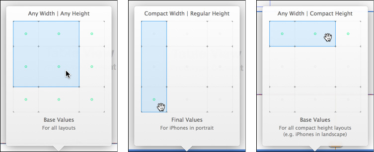
Figure 12.6 (left) By default, the Interface Builder canvas is set up for creating generic (wAny/hAny) layouts. (middle) Classic iPhones need wCompact/hRegular. (right) Interface Builder recommends that landscape orientation for classic iPhones be set up with wAny/hAny. Dots appear among the nine cells to show which configurations will be affected by the selected classes.
Select wAny hCompact. The size-class bar changes from white to blue to indicate that everything you do will apply only to that combination of size classes.
Note
Don’t kid yourself with these abstract size classes. For 2015, at least, you’re designing for 320-point iPhones. Click the GameListController icon (the first one) above the game-list scene, and in the Attributes inspector, select a non-Plus iPhone from the Size popup, and the Orientation corresponding to your target size class.
Drag a UILabel from the object library into the proper place for a team name, and format it as before. Set it to have one line; fill in the Label Text with something unreasonably long like one-liner with place and team name. Constrain it to a single-line height (like 20 points). See the “for both” paragraph below, for common constraints.
Look at the bottom of the label’s Attributes inspector. There will be two checkboxes: The first will be simply Installed. If the view were to be displayed in all circumstances, this would be checked, but we don’t want that; make sure it’s cleared. Below it is a box labeled wAny hC - Installed. That is checked: The view will be in the billboard on any compact-height layout.
Note
If your ideas about layout are more intricate, click the + button next to the plain Installed button, and select any combination of size classes to add a new Installed switch.
Switch the canvas’s view classes to wAny/hAny. The one-line team label will disappear (it’s not installed for any but compact height). Drag in the two-line UILabel; format it the same as the other, but make it narrower, two lines tall, and set Label Lines to 2. Give it the text two-liner with place and team name; not only will it challenge the layout, it will make the label easier to find in the document outline. Constrain this label to a two-line height (36 points). If you look at the bottom of its Attributes inspector, you’ll find that it is Installed for wAny hAny, making it the default.
For both, set the trailing (right) edge to that of the rating label (158.3); that fixes their horizontal position, because the rating has a defined margin into the billboard. Set the top edge to a distance of 8 points from the rating label, which will fix its vertical position. Set the bottom edge to a distance of 8 points from the date-range level; given that the date label has a fixed margin from the bottom of the billboard when the height is compact, this completely defines the height of a short billboard.
GameListController will have to set both labels when it sets up the billboard. Control-drag from one of them into GameListController.swift, and create an outlet collection; I named it teamLabels. The outlet will be declared as an @IBOutlet for [UILabel]!, and a connection bubble will appear next to the declaration. Drag from the bubble to the other label, thus adding that label to the collection. Now, when the storyboard loads, teamLabels will be an array containing references to both labels. Change
currentTeamLabel.text = passer.currentTeam
to
for label in teamLabels {
label.text = passer.currentTeam
}
I just got you through the hard part—you had to place two labels, and their constraint sets, and at least one of them is invisible at any time. The rest is tedium. Do a version-control commit now.
Constraints for Real
As for the constraints on the permanent views, the plan forces us to start from scratch. I repeat: If you start from a complete set of constraints and try to adapt them to other size classes by cut-and-try, you will get yourself into serious trouble.
Focus Interface Builder on the game-list scene, open the document outline at the left side of the canvas, and expand every view within the billboard view. The views that have constraints will have blue subcategories that contain them. Select everything in those blue folders (except for the constraints on the team-name labels) and press Delete to remove them.
Delete only the constraints under the billboard view itself, not the ones at the top level of the scene. They hold the billboard and table views in place, and there’s no need to risk losing track of them if we accidentally update the view frames.
Try not to hit anything in the Resolve Auto Layout Issues menu, whether in the Editor menu or the  widget in the canvas. If you trigger a layout before you’re ready for it, views will fly beyond the bounds of their containers, and one or both dimensions will go to zero.
Default (Any/Any)
Start with the default—wAny hAny. Run through the “Any Layout” checklist above. You can do most of these with the  popover (or the Editor →Pin submenu, depending on which makes more sense to you). Here are some more hints:
Don’t set any absolute constraints—point insets, sizes or spacing—you don’t have to. If you want a column of StatViews down the left edge of the billboard, set the leading edge of the passer-name label to a fixed distance (8 points) from the billboard’s leading edge; then align all the StatViews to that. Change the indent of the name label, and all the StatView go with it.
Pay close attention to the division between the hAny and hCompact layouts. The first three StatViews (Attempts, Completions, Yards) line up with each other; and the last two (Touchdowns, Interceptions) line up. How the two groups align with each other depends on whether the height class is Compact.
You can set the StatViews to have equal widths by command-clicking on each and selecting Editor →Pin →Widths Equally. Do the same for Heights Equally.
You can rely on the rating label to be wide enough, because text containers “know” the minimum width they need to display their content. By default, Interface Builder sets this constraint (Content Compression Resistance) to have a priority of 750—important, but if the layout doesn’t work with the natural width, this will be sacrificed to fulfill constraints with higher priority.
Any Height (not Compact)
If you’re careful, and you’re certain that you’ve competed the full constraint set for a view in the currently selected size class, you can have Interface Builder trigger those constraints; this would be useful when you pin the name label to the right edge of the billboard and want to see whether it lays out as expected. Select that view (only) and then Editor →Resolve Auto Layout Issues →(Selected Views) Update Frames ( , or the equivalent in the popover). If it doesn’t work out, you can always undo.
The critical thing to remember is that in this two-column layout, all five StatViews line up, but you don’t do that directly. You’ve set the defaults that the Attempts/ Completions/Yards group aligns at the leading edges, and the Touchdowns/ Interceptions group aligns at their leading edges. To get the effect of the whole column lining up, just align the leading edges of Touchdowns and Attempts; the default alignments will take care of the rest.
Landscape (wAny/hCompact)
Switch to wAny/hCompact, and follow the checklist. The main difference is that Touchdowns and Interceptions move to the center column. Break the leading-edge alignment between Touchdowns and Attempts, and add top-edge alignment to those two StatViews. That, and center-aligning Touchdowns in the billboard, completely specify the layout of the center column.
Chasing Issues
All along, you’ve been selecting individual views and triggering Selected Views: Update Frames ( ) in either Editor →Resolve Auto Layout Issues or the popup. When you’re sure of your placements for the entire view, select the view-controller placeholder icon (rightmost in the scene’s upper bar) and choose All Views in Game-ListController: Update Frames. Undo and repair as needed.
When things are mostly under control, take note of the red or yellow badge next to the controller’s name in the document outline. Click it; a list of Auto Layout issues appear. The red badges show cardinal sins: The constraints on the horizontal or vertical placement of a view are either insufficient or contradictory. Click one of these; the problem view will be highlighted.
In the case of insufficient constraints, you will be given a moderately informative tooltip describing the problem. In the case of conflicting constraints, a popover will appear showing them, and you can check off the ones you can sacrifice.
The yellow badges note views that are merely misplaced. If you highlight such a view, you’ll see a dotted outline where Interface Builder thinks the view should go if its constraints were fired. Clicking the badge on a warning affords a popover giving you the choice of moving the view to conform to the constraints; changing the constraints to conform to the view; or allowing Interface Builder to replace the view’s constraint set with its best guess of what the intended placement should be. You’ll have the option of applying your chosen solution to all the views in the container.
A Tweak
It almost works (Figure 12.7, top). On an iPhone 5 in landscape orientation, the unreasonably long one-line team name runs into the middle column, and is forced to truncate itself. This is a shame, because this may be the only place to see the full name of the team, and while it’s nice to have the middle column centered, there is empty space to its left.

Figure 12.7 (top) By default, the centering of the middle column trumps the “desire” of the team-name label to display its full contents. (bottom) Changing the priority of the centering constraint to below the full-contents constraint allows the team-name label to push the middle column off-center if necessary.
What’s happening is that new constraints come in with the highest priority—1,000. Auto Layout must enforce those constraints. As for the label (and some other views, mostly text containers), it “knows” what width it has to be to display its contents in full. This is the Content Compression Resistance Priority (Horizontal) constraint. By default, this has a priority of 750. The centering of the Touchdowns and Interceptions StatViews trumps the preferred width of the team name label, which then has to truncate its contents.
Find the centering constraint—it’s in the Size inspector for the Touchdowns StatView, where you can click Edit; or you can find it in the document outline by typing Touch in the search field, and double-click it. Either way, you’ll be able to edit the priority of the constraint. All you need is for centering to be lower than 750; 749 will do.
Now when you run Passer Rating, the long contents of the team-name label push the Touchdowns column off center if necessary. See Figure 12.7, bottom.
Summary
That was a lot of work. You can understand why many developers avoided Auto Layout as long as they could, especially if they walked away from Xcode 4’s. . . unsatisfactory support for it. There are now four iPhone formats in two orientations each. “As long as possible” has come to an end. Apple had been hinting, then warning, of this for more than two years before the introduction of the iPhone 6.
Auto Layout can be very complex, but with a few habits, it can be brought down to mostly only tedious:
Remember the One Rule: Every view, for both axes, must have constraints that specify the locations of its edges, completely and without inconsistency. Look at everything through that lens.
Plan! Make a sketch. Study it. Decide what you want to accomplish, and the minimal set of constraints you need to do it. If you can clearly state what you want, you’re not far from a specification.
Make as few absolute constraints—spacing, size, alignment offsets—as you can. If you have a grid, identify the one element you can anchor to an absolute position and size, and make all the other members of the group aligned, or equal-sized, or centered. That way, changing just the anchored views will bring the rest of the layout along for free.
Interface Builder’s “suggested” constraints aren’t that bad for a start—they even observe the anchor-and-align rule when possible. If your requirements are simple, you may be able to get by with just a tweak from the suggested set; if nothing else, the suggestions may be useful to keep your views from flying away or collapsing as you bring in your planned constraints.
Most important, do not add constraints off the top of your head. Without a plan, you will inevitably violate the One Rule, and from there you’ll thrash to the point where a working layout system will be impossible.