
11. Building a New View
The passer list works well enough now. It’s not fancy, but it very nearly matches the wireframe in Figure 8.2. One thing it is lacking is a transition from a list of passers to a passer summary and a list of games. For this, you will create a new view controller and make the acquaintance of Interface Builder.
The Next View Controller
The thing to remember is that unless you are doing some custom drawing or event handling, there’s little reason to create a new subclass of UIView. The standard views are so generic, versatile, and easy to combine that making a new one is rare. What isn’t rare is the need to set the content of views and respond to the events they capture. You know already that this is the business of the controller layer of the MVC design pattern, for which you’ll need a subclass UIViewController.
If You Want to Add a View Controller
This time around, it wasn’t necessary to add a view controller. The master-detail project template provided a detail view, and all you had to do was a little renaming and repurposing. What would you have to do to create a new view controller?
It’s not hard. First, you need .swift source files for a subclass of UIViewController. Select File →New →File. . . ( N), and pick the iOS → Cocoa Touch template. You’d name the class, select
 UIViewController as the superclass, find that Xcode had appended ViewController to the class name you’d just typed, and change your class name back. Select Swift for the Language. This being a view controller, there will be a checkbox, Also create XIB file, that I’ll discuss shortly.
Note
Xcode’s revision of the name you chose for your class is annoying, but the principle is sound: Pick a name that describes the role. It seems obvious, but the temptation to call a controller for editing passers either PasserEditor or PasserEditorView is strong.
Click Next, and use the get-folder sheet as you have before, to pick a place for the files on-disk, select a project group to display them, and assign them to one or more targets.
In principle, you’re done. Your controller could build its entire view tree in code by implementing the .loadView() method.
In practice, you’d rarely do that. You would instead embody the controller’s view in a layout created in an Interface Builder document—usually a storyboard so you can integrate it into the flow of your application design. If you need a stand-alone design—for instance, if you intend to use the same layout repeatedly in different contexts—you’d isolate the view in its own XIB file.
That’s the purpose of the checkbox, Also create XIB file that became active when you elected UIViewController as the superclass. If you check it, Xcode will create a XIB linked to the new class.
If you want to add your controller to the storyboard flow, you’d add it and its view to the canvas as a scene. Create the scene by looking for View Controller in the Object library in the Utility area, and dragging it into the canvas, where it will bloom to the size of a screen. Click the bar above the scene to select the controller, and use the Custom Class field in the Identity inspector (third tab) to identify your new class as the controller.
Storyboards, Scenes, and Segues
Superficially, Interface Builder looks like a tool for drawing UI layouts. And that is part of what it does: More accurately, Interface Builder is a visual editor for the relationships between objects in your application. What-goes-where is just one kind of relationship.
Note
From the 1990s through Xcode 3, Interface Builder was a separate application. There are other editors in Xcode that are also radically different from the main code editor, but because of its long history of being a stand-alone application, people still speak of IB as a thing apart.
You’ve seen UI-layout editors before, on many other platforms: Most of them emit executable code that constructs the view hierarchy described in the editor; or they work on files that the build process turns into executable code; or at least they construct data streams that script the creation of UI objects. IB is similar in that the files it works on are compiled and installed at build time for use in the target application.
That’s where the similarity ends. Remember this: There is no code. There is no script. Interface Builder products are not executable; instead they are archives of Cocoa objects. The archives include links between objects and methods both within themselves and externally. Many newcomers who are used to other systems want code so they can “see how it’s really done.” The IB products are how it’s really done. Except in trivial cases, it’s hard to produce code that mimics NIB loading correctly; and in some cases (particularly on OS X) it isn’t possible.
That is at least where you should start your thinking. On iOS, it’s often useful to instantiate, arrange, and link views dynamically—it’s how many project templates start out—but code should not be the first technique you try. Interface Builder can be intimidating because it feels magical. As with most of Cocoa, it does things you may be used to controlling yourself. Relax. In the long run, if you learn to use Interface Builder effectively, you’ll spend much less of your life fighting the operating system.
A storyboard goes beyond even that: It provides a canvas that holds scenes, each representing a controller that runs (roughly) a whole screen at a time; linked by segues running from individual controls to the next scene to be presented. When tapping a button in the running app triggers a segue, the tap goes directly to UIKit, which creates the next scene and its controller, gives the outgoing controller a chance to touch up the new one’s configuration, and moves the scene onto the screen. Again: The storyboard product makes a lot happen that you may be accustomed to controlling yourself. If you can adjust your thinking to take advantage of the flow, you’ll find you can do almost anything, and much more easily.
Arranging Your Tools
Interface Builder has peculiar needs for its editing space. A completed storyboard is very large. You can zoom in or out using the Editor →Canvas →Zoom submenu, or by pinch gestures with a trackpad, but even if you are working on a single scene in your app, every pixel in the canvas view is precious. A Mac screen that is otherwise respectable for development probably won’t show all of an iPad layout at once.
Note
At the maximum, zoomed-in scale, the canvas displays the layout to match the screen point-for-point. This is the only scale at which Interface Builder allows you to lay out views. However, you can add scenes and link outlets, actions, and segues in zoomed-out views.
At the left edge, IB has a document outline view that you’ll rarely want to close, and on the right, you need the Utility area open to create and adjust the views you insert. If you use an Assistant editor (and sometimes you must), things get tighter still. What you don’t need are the Navigator area, because you’ll spend most of your time on one IB document, or the Debug area.
This is a job for tabs. You probably already have your workspace window set up as you prefer for editing source files. Start from there. Select File →New →Tab ( T). This is where you’ll do all your IB work, so double-click on the tab’s name and change it to Interface Builder.
Now configure the tab: Use the Project navigator to select Main.storyboard. With the View control in the toolbar (three rectangles with portions highlighted), close the Navigator and Debug areas and open the Utility area. The bottom part of the Utility area is called the Library; select the Object library tab (the third one, with the cube) to show the repertoire of objects you can put into the canvas or a scene.
With the Project navigator gone, how will you get to other files? That’s not a problem in this project: Passer Rating has one storyboard, and that’s all it will ever need. But sooner or later you’ll have a project with more than one file that needs attention from Interface Builder. How do you switch among them without shoving the Navigator area back into the window?
You’ve probably already noticed the bar that spans the top of the Editor area. This is the jump bar. It presents a number of controls for navigating your project directly. What interests you at the moment is the path control, spanning most of the bar. It takes the form of a series of arrow-shaped segments. Each segment is a link in the chain that starts with the project and goes down through the project’s groups, to the file on which the editor is focused. (In the case of structured documents, it will go on through the hierarchy of functions or IB objects.) If the current file has a selection, one last link identifies the selection by name. See Figure 11.1.
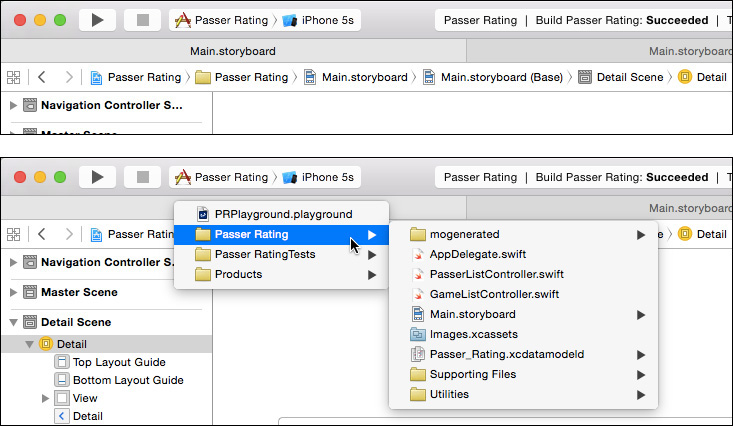
Figure 11.1 (top) The jump bar runs across the Editor area between the tabs and the editor itself. The main part of it is a path control tracing from the project through your groups to the current file and its selection. (bottom) Each level of the path control is a hierarchical popup menu that lets you set the path.
Clicking a segment displays a popup menu offering a choice of the projects, groups, files, and selections available at that level in the hierarchy. The popup is itself hierarchical, so you can trace a new path for the editor. If one level of the jump bar has too many items to search by eye, you can narrow it incrementally by typing a search string—the search key isn’t consecutive, so alcon will turn up the PasserListController and GameListController Swift files.
This suggests a strategy if you have many XIBs and storyboards, and want to work on them in a dedicated Interface Builder tab. Open the Project navigator again. In the search field at the bottom, type .xib to narrow the list down to the project’s XIBs.
Command-click each so they are all selected. Then select File →New →Group from Selection. All of your XIBs are now in a common group, which means that they are all at the same level in your jump bar. You can move your storyboard files to the same group. The file segment of the path control will switch you among the design files directly. You can close the Project navigator for good. Your workspace should look like Figure 11.2.

Figure 11.2 Interface Builder is easier to use if you give it its own tab, configured for the purpose.
Building a View
The Master-Detail Application template provides a detail controller class (the one we’ve renamed to GameListController) and realizes it in Main.storyboard as the third scene in the canvas (Figure 11.3). The first scene, marked with the single arrow that shows it is the initial scene in the storyboard, is for a UINavigationController. It is joined by a root view controller segue to its initial content, the PasserListController that presents the roster of passers. In turn, a push segue links it to the next step, the game list.
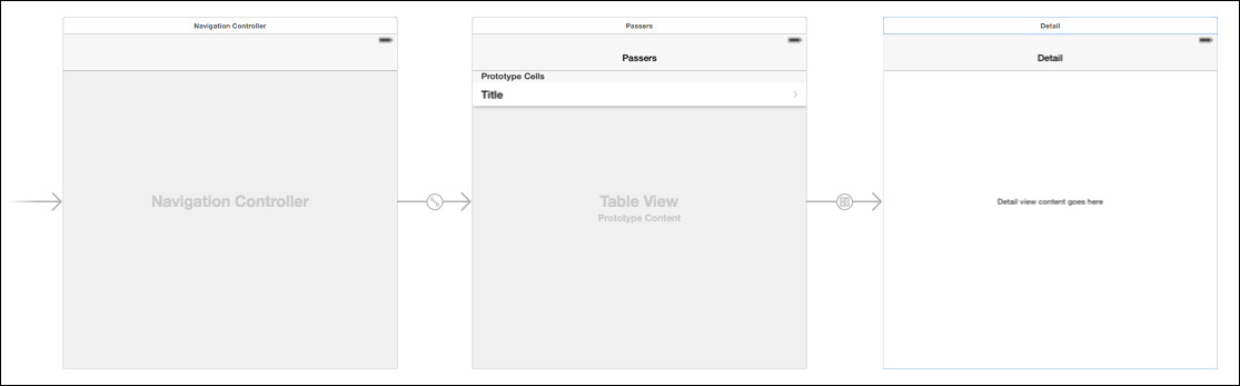
Figure 11.3 The master-detail project template fills Main.storyboard with three scenes: a navigation controller that contains a master scene (Passer List Controller), which cascades to a detail scene (Game List Controller).
The navigation controller is a wrapper on the other two; it manages a stack of views that slide into and out of the screen as the user navigates a hierarchy, such as from a passer in a list to the passer’s detailed record. It also maintains a navigation bar at the top of the screen to display the current view’s title and a back button so the user can step back through the hierarchy (from passer to passer list). The first scene linked to it is the root view, the first view the navigation controller will display.
The succeeding views in the controller stack all display navigation bars, but those controllers don’t actually manage those bars: The bars are there so you can allow for the space as you work the layout out.
The last view in the chain, the “detail” view that we’ve renamed GameListController, comes from the template as a plain view, empty but for a single label; the template simply filled the label with the time-of-day held by the dummy Event entity. That’s not what we want, but before we get rid of it, there’s something to notice.
Note
All UIViewControllers have a title property that UINavigationController uses to fill in the title in the navigation bar. The Master-Detail template has filled these with “Master” and “Detail,” which is beginning to get tedious. Select each scene with the canvas zoomed in to 100 percent. The active scene will show three icons in the bar at the top; the first represents the view-controller object. Click it, and then select the Attributes inspector (fourth tab at the top of the Utility area). Set View Controller—Title to Passers and Games, respectively. Then, select the navigation bars in each scene, and set the titles there, too.
Outlets and Assistants, in Passing
Click the middle item in the Editor group in the toolbar—it looks like two linked rings, to suggest the display of two related things. This adds an Assistant editor to the Editor area. This probably ruins the window layout you worked so hard to construct, so make adjustments until you have something like Figure 11.4.
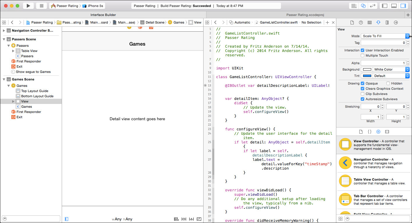
Figure 11.4 Adding the Assistant editor by clicking the middle button in the Editor group (the one that looks like linked rings) requires some adjustments to the project layout.
At base, the Assistant editor is just another editor, allowing you to see more than one file as you work on them. And that is one way you can use it. What makes the Assistant editor special is that it can automate its choice of content, adapting itself to what you do in the main editor. The jump bar in the assistant determines the relationship it will pursue. Use the first segment as a menu to set the assistant to Automatic, and click on the various objects in the IB canvas. You’ll see that the assistant shows the source code that backs each object.
Click the white bar above the Game Controller scene. As fits the pattern, the Assistant editor fills with GameListController.swift. If more than one file met the need, the control at the right end of the jump bar would show how many matched, and would present arrowheads on either side to switch between them.
The template has added this line to the class declaration:
@IBOutlet var detailDescriptionLabel: UILabel!
So: One of the properties of the controller is a reference to the label in the middle of the view. There’s something more—notice the @IBOutlet attribute. It is merely a signal to Interface Builder that this property of the view controller is eligible to receive a pointer to something in the scene.
Note
The UILabel type carries an exclamation point, which you saw earlier in the “Editing the View Controller” section of Chapter 10, “An iOS Application: Controller.” It guarantees that although the value will start as nil, Swift can assume it will be non-nil before your first use of it.
For your first look at what this means, hover the mouse cursor over the dot you see in the gutter next to the line (Figure 11.5). That dot shows that a link has been made between an IB object and that outlet. Interface Builder demonstrates the link by highlighting the label in the canvas when the mouse hovers over the linkage dot.

Figure 11.5 @IBOutlet properties are meant to be filled with pointers to objects that will be realized when a scene is loaded. Hovering the mouse cursor over the linkage bubble next to an outlet property highlights the corresponding object in the controller’s scene.
That’s all there is to see this time around; there will be much more later. For now, we don’t need that label. Select it in the game-controller scene, and press Delete. After taking note that the connection bubble next to the property var is now empty, select the line and delete that, too. Now that the outlet property is no longer defined, Xcode will flag an error on the reference to it in configureView(); delete those lines, too.
Warning
If you go the other way around, and forget to delete the label, you’re heading for a crash: When the scene loads, the storyboard still calls for linking the label. UIKit will look for the outlet property in the controller, and will throw an exception when it doesn’t find it. The error message will be only vaguely helpful, and you’re on your own finding the dangling reference. Make sure you clean up both ends.
The Billboard View
Now you can add content of your own. The design calls for two elements: a billboard containing overall statistics for the passer, and a table with the details of each game. Start with the billboard.
The billboard will contain labels of various sizes and styles. First, add the container itself. Click in the search field at the bottom of the Object library (third tab, bottom part of the Utility area), and type UIView. You’ll see an entry labeled “View.” Drag it out of the library and into the scene in the editor. As you drag it, it transforms into a rectangle that sizes itself to the available space in the scene. Let it go.
You don’t want the billboard to take up the whole space. Click on it to display resizing “handles” at the sides and corners. Given how large the new view is, this may not help you much—it’s white-on-white, and there’s no way to identify which corner or side you’re dealing with. Select Editor →Canvas →Show Bounds Rectangles to show the edges of the view. Better.
Drag the bottom edge up until the view takes up about the top quarter of the available space (168 points). This may be a bit tricky—IB clips the handles to the edge of the superview. It may be easier to grab the top handle, size it down, then drag the resized view up until it abuts the navigation bar.
The billboard view is supposed to be light gray, to match the navigation bar. In the Attributes inspector, there’s a Background control, which has two parts: The left part is a color well, which you can click to get a color palette to edit the color. The right part is a drop-down menu containing standard colors. Click the color well to bring up the color-picker palette; click the magnifying-glass button and then the navigation bar that’s already in the scene. The inspector should look like Figure 11.6.
Figure 11.6 The Attributes inspector for the passer billboard view should look like this when you’re done.
Pretty nice, eh? Use the first segment of the Assistant editor’s jump bar to display a Preview of the layout. (Select the GameListController scene if it isn’t already selected.) You’ll see something like Figure 11.7, with the scene rendered as it will be on screen.
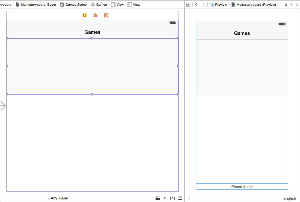
Figure 11.7 Selecting the Preview view in the Assistant editor’s jump bar displays a straightforward rendering of the selected scene. Controls at the lower left change the presentation of the view for different screen sizes, orientations, and idioms.
The Preview view includes a + button in the lower-left corner to add device layouts to the display, such as the various sizes of iPhones and iPads. Each preview has a white bar at the bottom naming the format (“iPhone 4-inch,” for instance), and providing a button that will rotate the view. You can choose any of them more than once: The second time you add a layout, it will appear in the other orientation from the existing one, allowing you to monitor changes in your layouts in both orientations at once.
There are a couple of fixups to do. First, we’ll arrange to make the billboard visible to GameListController, and then make the briefest possible acquaintance of Auto Layout.
Linking Views to a View Controller
View controllers exist to link your data to your views. GameListController needs direct access to its main view (through the view property, which is linked automatically in Storyboard scenes) and to its subviews (which you must identify and link yourself). The instance variables containing those pointers are marked with the @IBOutlet attribute. @IBOutlet has no effect on the generated code. It is merely a signal to Interface Builder that the property is eligible for linking to an object in a storyboard or NIB.
Select the game list scene in the storyboard canvas; make sure it is visible while the Assistant editor is open. From the first item in the assistant’s jump bar, select Automatic →GameListController.swift. Experiment: Click another scene or view, and see that the assistant tracks the selection and displays the corresponding controller’s source code. Get back to the GameListController scene.
Hold the Control key down and drag from the billboard view into the controller’s class block. It doesn’t matter where, so long as it isn’t in content blocks like enums or funcs. A horizontal insertion bar appears in the code, labeled to show that if you release the mouse button there, you’ll be creating an outlet or an action method (which I’ll get to later). See Figure 11.8.
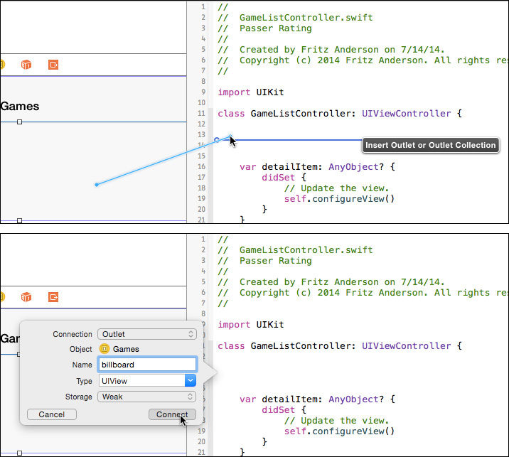
Figure 11.8 (top) Control-dragging from a view in a storyboard scene into the code for the scene’s controller shows an insertion bar for an outlet or an action. (bottom) Releasing the mouse button brings up a popover for you to specify the kind of link, its type, and its name. Clicking Connect inserts an @IBOutlet for the view.
When you release the mouse button, Interface Builder presents a popover dialog for you to specify the kind of link you want to create, and what you want to name it. Call it billboard and click Create.
Your class now includes a new line of code:
@IBOutlet weak var billboard: UIView!
This shows an outlet for a UIView named billboard. weak means that the controller doesn’t “own” the view, and, if every other owner (such as the view tree) relinquishes it, billboard will become nil. You’ve seen the ! before—the var is “implicitly unwrapped,” which is your promise that by the time your code starts using it, billboard will refer to an actual object, so Swift will free you from having to decorate every reference with a !.
One more thing: If you have the document outline expanded (click the button at the lower-left corner of the canvas, if not), and you expand the outline under “Games Scene,” you’ll find a UIView containing a UIView. This means that the root view that comes with the scene contains another view, which we know is the billboard. As this scene becomes more complex, the generic names won’t be useful.
With the billboard view still selected, go to the Identity inspector (third tab in the Inspector panel) and type Billboard in the Label field in the Document section. Tab out of the field, and find that the billboard now appears in the outline under that name.
Auto Layout for the Nonce
Next, Auto Layout. Auto Layout is a technique for ensuring that your views are always placed and sized as you intend them, no matter the size or orientation of the screen—this view spaced 8 points below that, centers aligned, and so on. Expressing “intention” is a hard thing to do right, and Apple was at pains to do it right. Unfortunately, that requires you to take pains, too.
For the moment, we will do the very least we have to do to make the billboard display correctly on the screen (or at all; Auto Layout’s best guess at what we want crushes the billboard to zero height in landscape orientation). This chapter is quick-and-dirty. I’ll go into depth in Chapter 12, “Auto Layout in a New View.”
You express your intentions as a system of constraints, which Cocoa reconciles to lay out your views. It is versatile and effective. The core principles are not hard to understand: Every view’s size and placement on both axes should be completely specified by a chain of constraints that must not contain contradictions. Simple.
Simple to understand, but not to get right. I wasn’t satisfied with the constraints system for the billboard view we’re about to build until I had produced nearly 40 of them. (This was with Xcode 5; Xcode 6 represents a lot of progress.) Some conflicts are inevitable, and you have to give Auto Layout a way out by assigning priorities among them, and in a long chain of dependencies, there’s a lot of trial and error. Doing the billboard view right would consume most of this chapter.
This chapter will be all about building the billboard view. There are five things you must do to get over the immediate problem of the billboard disappearing:
1. Click the white bar above the GameListController scene, and select Editor →Resolve Auto Layout Issues →Add Missing Constraints in Game List Controller. This will put best-guess constraints on the billboard view’s position relative to its nearest neighbors.
2. If you still have the Preview assistant open to show a 4-inch screen in portrait mode, you see that the billboard is compressed vertically, from the intended height of 168 points to 106. If you rotate the preview, the height of the billboard goes to nothing.
3. Select the billboard view, and look at the Size inspector (fifth tab): At the bottom of the panel is a list of the constraints IB added to the view. Horizontally, the “leading” and “trailing” spaces (I’ll get to that terminology soon) are fixed to the container, and those don’t seem to be a problem; you want the sides glued to the sides of the screen.
The top and bottom edges are placed relative to the respective layout guides, notional lines in the screen view that represent the extent to which upper and lower bars (navigation, tab, status, toolbar) compress the usable vertical space. As I placed and sized the billboard, the top edge is at the upper guide, and 368 from the lower. The upper guide, allowing for the status and navigation bars, is 134 points from the top of the screen. So when the device is turned to landscape, the billboard’s available height is 320 – (0 + 64) (bars) – 368 (bottom margin) = –112 points. The “missing constraints” did not serve us well.
On reflection, we care about the billboard’s being just below the upper bars (we have a constraint for that), we don’t care about its keeping a consistent distance from the bottom (but IB gave us a constraint for that); for now, we do care about its having a consistent height (but we don’t have a constraint for that).
4. Select the billboard view itself. An i-beam line extends from its bottom edge to the bottom of the view, representing the bottom-edge constraint. Click to select it. (It’s hard to catch, but IB gives you a hint by highlighting it when the mouse cursor is over it.) Press Delete to get rid of it.
5. At the lower-right corner of the editor, you see a palette of button groups. The one with four segments governs Auto Layout. With the billboard view still selected, click the Pin button ( ). A popover view appears in which you check the box marked Height. Click Add 1 Constraint at the bottom of the popover.
That’s it; the billboard behaves as intended on all screen sizes and orientations, in the preview and the simulator. There will be one more step once you’ve populated the billboard.
Lots of Labels
The billboard view consists of 14 instances of the UIKit class UILabel. Some of them are labels in the colloquial sense—static text that identifies something else on the screen. Others are “labels” because even though the application will change their content, the user can’t. They’ll be placed in three groups:
 The name label, across the top
The left-side group, consisting of labels and values for cumulative statistics like total attempts
The right-side group, with summary information like the overall passer rating, the passer’s most recent team, and the span of his career
Note
The cries of horror you will be hearing will be those of professional graphic designers. Ignore them. They’re used to it.
The Name Label
This is only one label, extending across the top of the view.
Type label into the Library search field to turn up the label (UILabel) view. Drag it into the top of the billboard view. The Attributes inspector will have a Text field; fill it with FirstName LastName as a placeholder, and discover that most of what you typed was truncated (with an ellipsis) because the label was too narrow. UILabels adjust their text size (down to a limit you can set) to fit the content to the bounds of the label; if that’s not enough, they truncate. Stretch the label across the top of the detail view so no shrinkage is necessary.
The passer’s name is pretty important, so let’s give it some emphasis. The Font element in the inspector shows the text to be “System 17.0.” Click the boxed-T button to open the Font popover (Figure 11.9). Make it System Bold and 18 points.

Figure 11.9 (left) Clicking the T button in the Font field in the Attributes inspector displays a popover to specify the font, style, and size for the text in a view. (middle) The Font popup menu offers you the “System” fonts, plus the dynamic-typography categories. (right) Selecting Custom from the Font popup enables the Family popup, which offers every font family available in iOS 8.
The Right-Side Group
Now a label for the passer rating, on the right side, just under the name. This is really, really important, and I have no taste, so make it big, bold, and red. Fill it with 158.3 and set the font to System Bold, 52 points (you’ll need to stretch the bounds). For Alignment, choose right-aligned (the third segment), so numbers less than 100 will line up. Click the color well at the left end of the Text Color control in the inspector; that gets you the Colors palette. Use the fifth tab in the palette, and select the “Maraschino” crayon. The passer rating is now really, really red. Experiment with Shadow and Shadow Offset, if you like.
A label for a team name, System Bold, 14 points, right justified, should go under the big rating label. Set its text to Tacoma Touchdown-Scorers, the longest team name in the data set, so you can be sure it will fit. In the Attributes inspector, there’s a stepper for Lines; if you set it to 2, the team name can wrap to two lines. Resize the label so the whole name is visible.
And this is the last one, I promise: A label to show the start and end dates of the passer’s career: Below the team name, System, 12, right justified. Fill with the widest plausible content, 10/29/2015–10/29/2015.
Note
If your curiosity led you to the Preview assistant, you probably found the results of the layout so far discouraging—the right column is partly or wholly beyond the right end of the billboard. We’ll fix it soon.
The Left-Side Group
The statistics come next. Start with one label, Attempts, System, 14-point, regular, sized to fit, and positioned under the left end of the name label. You need four more captions, and you can save some effort by duplicating the one you just set up: Edit →Duplicate ( D), or hold down the Option key and drag. Line those up under the original, then edit each so that they read Attempts, Completions, Yards, Touchdowns, and Interceptions.
Note
You can set the text style of multiple items by selecting them all and setting the style in the Attributes inspector.
Next, the labels for the statistics themselves. Insert five UILabels next to the stat-name labels. Throughout the process, Interface Builder will snap your views to blue guide lines that show standard spacing and alignment with their neighbors. In the case of views with text content, you’ll also be given a dotted line when the view’s baseline is aligned with its neighbors. When in doubt, align baselines.
I suggest filling the value labels with 00,000 as a guide to the minimum necessary width. The identical content won’t help in listings, so select each, and in the Identity inspector, set its Xcode label to correspond to the statistic it is to display. The statistic-name labels will show up in listings with their content, so distinguish the numeric labels with a #: #Attempts, #Completions, and so on.
Make their text style the same as the stat-name labels, only right-justified.
Just for fun, make sure the Game List Controller scene is selected, and select the Editor →Resolve Auto Layout Issues →Update Frames command, which you can also find in the third button ( ) of the Auto Layout group in the canvas.
No. All the labels were moved out of sight. If you select them in the document outline, you’ll see that they’ve all been moved to a Y position of –64, which would be the top edge of the scene, relative to the top of the billboard. With nothing to guide it, Auto Layout resolves the (absent) constraint network by putting everything in the same place. You have to add some constraints so it won’t wreck your display. Undo (Edit →Undo, Z, did I need to tell you?) the layout.
Again making sure the game list scene is selected, select Editor →Resolve Auto Layout Issues →Add Missing Constraints. Once again, Interface Builder will take its best guesses at what you intend for the layout and create constraints accordingly.
If you click around among the labels, you’ll see blue i-beams and alignment strokes representing the constraints. The network of constraints is complete and consistent, so the Update Frames command is disabled.
It looks good enough for now. See Figure 11.10.
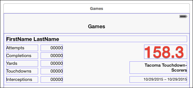
Figure 11.10 The billboard view as it comes from the hard work of filling in the constituent labels. The lines around the labels are their layout rectangles, which are the criteria Auto Layout uses to calculate layout.
Cleaning Up
But it isn’t. Because Auto Layout is the result of a mathematical solution to a complex network of constraints that may be contradictory or insufficient, you can’t always predict how it will go wrong when it does. What follows is the story of what I saw when I ran this layout through the Preview assistant and the iPhone 5 simulator. You will see something different—I saw different things between the preview and the simulator—but we should come out the same by the end.
The Columns Collide
Figure 11.11 shows the first problem, apparent even in the Preview assistant.

Figure 11.11 The Preview assistant’s guess at the billboard layout has the views in the left half overrunning the ones on the right.
The statistics in the left column run into the rating, team name, and dates on the right. By default, Interface Builder has you edit scenes in a generic form factor that might adapt itself to any size or shape of screen, and the generic width didn’t tip us off that a 320-point screen wouldn’t allow the room our layout needed.
If you look again at the layout, you’ll see that the bounds of the number labels are much wider than necessary—above 70 points. In my layout—I almost guarantee yours will be different—Interface Builder set a fixed width for the #Attempts label, and aligned the leading and trailing edges of the other four to it; the effect being to make all five the same width. If we resize the #Attempts label, the other four will follow.
Select #Attempts, and expose the Size inspector. Find the numerical width constraint in the list, and click the Edit button for it. A popover will appear showing that the constraint is set to be equal to 72 (or the like). Change the number to 48 (that’s what worked for me) and tab out of the field. All the integer-stats labels will narrow (the other four are tied to #Attempts, remember), and the Preview assistant shows that the columns no longer overlap. It doesn’t look perfect, but it’s good enough; we’re going to replace all of it in the next chapter.
The Billboard Collapses
The simulator tells a different story. The billboard view is there, but it occupies only a 20-point-wide swath in the middle of the view. The right column goes left from the right edge, the left column from the left edge, so the two seem to be exchanged on the screen.
Obviously, something was wrong with the constraints on the edges of the billboard. I looked closely at the Size inspector for the billboard and found that the leading and trailing edges were fixed to the leading and trailing edges of the top layout guide. And, it appears, the breadth of the guide line might be 20 points, or 320 points beginning 160 points to the left of the view. . .
That’s just wrong. If I’d done the layout myself, I would have fixed the edges to the edges of the root view, the one that contains the billboard. Double-click those leading and trailing constraints and press Delete to get rid of them.
Then, with the billboard selected, click the Pin () button to bring up a popover for adding constraints to a view (Figure 11.12). Uncheck Prefer Margin Relative, make sure the left- and right-neighbor boxes show 0, and make the struts between them and the center solid (and therefore effective) by clicking them.

Figure 11.12 The Pin () button displays a popover window for adding constraints to a view. In this case, you want to set the leading and trailing edges to be zero points from the nearest neighbor (the sides of the main view). Clicking the struts next to the fields so they become solid indicates you want to add those constraints. Note that the Prefer Margin Relative button is unchecked.
The Update Frames popup should be set to Items of New Constraints so the billboard will move to its newly constrained position (which shouldn’t be different in this case). The alternative is All Frames in Container, but I’m never bold enough to expose myself to a total rearrangement after adding only a couple of constraints.
Then click Add 2 Constraints to install them. Two things to remember:
You have to click the Add . . . Constraints button to install the new constraints. Clicking away, or bringing another window forward, will make the popover disappear, but it won’t add the constraints.
The constraints will be added. The popover does not edit existing constraints. Whatever you create with the Pin button will be added to the constraint set, even if another such constraint is already there.
The Table View
It’s almost an afterthought—we don’t yet have a table view to hold the individual game performances, taking the form of a UITableView. Typing table in the Library search field should show you a “Table View.” Drag it into the lower part of the main view. (Take care not to use the “Table View Controller” instead.) You’ll have to expand it to fit the available space. This isn’t too hard at the sides and bottom, because Interface Builder “snaps” the edges to the bounds of the main view, but it won’t give you any help with the top edge.
This is something that Auto Layout actually makes easier. Place the table view in the lower part of the scene, and size it so it is clear of all neighbors. Click the button in the Auto Layout group at the bottom right of the canvas to expose the Pin popover. Set all four spacing fields to 0, making sure the drop-down menu for the upper spacing makes it relative to the billboard view.
Note
IB prefers side margins to be inset by a standard amount (16 pixels), and by default calculates edges relative to that inset. Uncheck Prefer margin relative to ensure that the sides stick to the sides of the root view itself.
Set the Update Frames menu in the popover to Items of New Constraints, and click the acceptance button at the bottom, which now has the label Add 4 Constraints. The table view will snap to exactly the position and size you want, with the added benefit that it will resize in sync with the rest of the scene.
Outlets
We just added 14 labels to the billboard view, and nine of them display names, dates, and statistics taken from the Passer Rating data store. You know how to do this: Control-drag into the class declaration in GameListController.swift to create @IBOutlets linking the labels to the controller.
Every NIB, and every Storyboard scene, has an owner. This is an object that is external to the scene (or NIB); the loading mechanism then fills the @IBOutlet properties with pointers to objects in the scene. Storyboards and XIBs have different treatments for owners:
Interface Builder’s editor for XIBs includes an “object” in the document outline named “File’s Owner.” This object does not literally exist in the XIB; Interface Builder shows it in a section of the document outline for placeholders. It stands in for the owner object that will load the XIB (actually its NIB product) at run time.
In a storyboard, each scene belongs to a UIViewController subclass. The controller’s placeholder appears in the document outline, and in the top bar when the scene is selected, as a yellow circle with a “view” in the middle.
When you create a subclass of UIViewController, UITableViewController, NSWindowController, or NSViewController, Xcode enables a checkbox marked Also create XIB file (OS X projects will add “for user interface”). If you check it, Xcode will create a XIB in addition to the new class’s .swift file. Xcode knows what the owner class will be, so it sets the class of File’s Owner accordingly.
If you create a XIB alone, Xcode would not know what the class of File’s Owner should be, and you would have to set it yourself: You’d select the File’s Owner icon in the document outline and open the Identity inspector (third tab in the Inspector view in the Utility area). The first field will be a combo box to enter the name of the owner’s class. The box will autocomplete as you type.
It’s the same with view controllers in a storyboard: After you drag a view controller into the canvas to create a scene, the owner is identified as a plain UIViewController. You must edit the class name in the Identity inspector to point the scene at the right controller.
Note
There are other kinds of controller in the object library, some of which you’d subclass (UITableViewController always), some not. Use those, not the plain view controller, and set the controller class as needed.
Back to the specifics of GameListController. We have to hook the controller’s @IBOutlets to objects in its scene. You could type in var declarations for all the labels you’ll be using. Try it: Display the Assistant editor and select Automatic from its jump bar to show GameListController.swift.
Somewhere inside the declaration of class GameListController, declare the outlet for the “dates” label:
class GameListController: UIViewController {
@IBOutlet weak var datesLabel: UILabel!
Go back to the document outline sidebar at the left edge of the canvas (click the button in the lower-left corner if it isn’t visible), and right-click on “Games,” the Englished name of the scene’s owner. A small black heads-up display (HUD) window appears, containing a table of outlets, among them datesLabel. There’s a bubble at the right end of that row in the table. Drag from it to the label you set up with a range of dates, and release; the adjoining column in the HUD fills with a reference to the label (Figure 11.13).
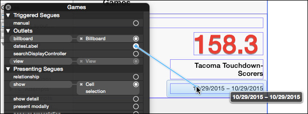
Figure 11.13 Right-clicking the “GameListController” entry in the document outline opens a heads-up display window that includes the controller’s outlets. Drag from an outlet’s linkage bubble to a view in the controller’s scene, and the outlet’s @property will be filled with a pointer to that view.
Now, when the scene is loaded, the owning GameListController’s datesLabel property will contain a pointer to that label.
Note
The first icon in the white bar above the scene represents the same controller object; the right-click method works there, too. Also, the bubble next to the outlet declaration in GameListController.swift contains a black dot—you can drag from there to an element in the storyboard and make the link that way.
This is a great way to link views to outlets—if the outlet properties are already defined, as they might be if you were reusing an existing File’s Owner object and dropping it into a scene.
In this case, it would be tedious, because the outlet vars haven’t been declared. The control-drag-into-source is the better option.
Hooking Up the Outlets
Before you go on a spree of making outlet connections, taking a little care will pay off: There is a + button next to the right end of the assistant’s jump bar. Click it. The Assistant area is now divided into two editors. Use the lower editor’s jump bar, starting at the Manual category, to navigate to Passer.swift. You want the names of the new outlets to match up with the names of the Passer properties they display, and the new editor will give you a reference for the property names.
Now control-drag from the variable labels to make new properties in GameListController. Use this convention in naming the outlets: Take the name of a Passer property, and add Label to it. The team name label goes into the controller interface as currentTeamLabel, attempts as attemptsLabel, and so on.
Note
Interface Builder can also link controls to action methods, declared with the IBAction tag in the class @interface. When you trigger a control that you’ve linked to an IBAction, the action method is executed. See the “Wiring a Menu” section of Chapter 19, “Starting an OS X Application,” for an example.
GameListController needs to know about the table view, as well. Control-drag a link from the table into GameListController, and name the new outlet tableView.
Checking Connections
Do one last pass to verify that everything is connected to what it’s supposed to connect to: With the storyboard in the main editor, and the @IBOutlet declarations for GameListController showing in an Assistant editor, run your mouse down the connection dots, and make sure every view gets highlighted in turn.
If an outlet isn’t connected, or is connected to the wrong view, drag from the connection bubble to the correct view. An @IBOutlet can refer to at most one view—it’s just a single pointer. A view can be connected to many outlets because it has no reference back to the outlets. Checking the outlets, one by one, and reconnecting them as needed will be enough to get you out of any tangles.
There is an exception to the one-view-per-outlet rule: You can have an outlet collection. So far as the Swift code goes, a collection is little different from a single-object connection; the only new thing is that the type of the outlet is an array of the views in the collection:
@IBOutlet var numericLabels: [UILabel]!
The billboard contains five labels that display integers. We may want to clear all of them out simultaneously. The naïve approach would be to keep an array var, and fill it with all the outlet variables:
var numericLabels:[UILabel]!
...
numericLabels = [attemptsLabel, completionsLabel,
yardsLabel, touchdownsLabel,
interceptionsLabel]
But that’s accident prone: Some day, you will add, drop, or rename labels in that list, and it’s not always clear when in the life cycle of the view controller you should initialize the array that is after the label outlets are initialized, but before any possible use of numericLabels.
This is why there are outlet collections. Start by control-dragging from one of the integer labels (such as the one marked “Attempts”) into GameListController.swift, as before. But this time, when the outlet popover appears, choose Outlet Collection for the Connection type, not Outlet. Name the collection (numericLabels is fine), and accept UILabel as the Type.
The collection starts with one member, the one you created the collection from. Drag from the bubble in the gutter next to the collection outlet var to each of the other integer-valued labels. Each will be added to the collection.
Note
If you add a label by mistake, control-click on it to bring up a heads-up display, find the link to numericLabels, and click the small x next to it.
The function to empty all the labels becomes very simple:
func emptyIntegerLabels() {
for label in numericLabels {
label.text = ""
}
}
Note
Outlet collections do not guarantee the order of the views in their arrays. If the order is important, select each of the views in Interface Builder and set the Tag value of each to a distinct number (it’s well down in the Attributes inspector, in the “View” category); then check the tag property of the view to confirm its identity.
Connecting GameListController
Interface Builder is great, but you still have to write code to get data from the model into the view. You’ll make some changes to GameListController.
The template provides a setter for detailItem, setDetailItem:, that calls through to a configureView method. That’s where you’ll move the statistics in Passer to the labels in the view.
The template Xcode gave you had to be generic, but you know what kind of object the detail item will be. Rewrite the declaration of the property:
var detailItem: Passer? {
didSet {
// Update the view.
self.configureView()
}
}
The configureView Method
Here’s configureView. It’s a little long, but there’s a point I want to make:
let integerProperties = [
"attempts", "completions", "yards",
"touchdowns", "interceptions"
]
func configureView() {
if detailItem == nil { return }
let passer = detailItem!
for name in integerProperties {
let stat = passer.valueForKey(name) as! Int
let label = self.valueForKey("(name)Label") as! UILabel
label.text = "(stat)"
}
// ratingFormatter is defined in Utilities.swift
// It formats a number into a decimal string
// with a mandatory single digit after the
// decimal point.
let ratingString =
ratingFormatter.stringFromNumber(
passer.passerRating)
passerRatingLabel.text = ratingString
currentTeamLabel.text = passer.currentTeam
// shortDateFormatter is defined in Utilities.swift
// It formats a date into a short string according
// to the user's locale. In US English, this would
// be mm/dd/yyyy.
let startDate = shortDateFormatter.stringFromDate(
passer.firstPlayed)
let endDate = shortDateFormatter.stringFromDate(
passer.lastPlayed)
datesLabel.text = "(startDate) { (endDate)"
fullNameLabel.text = passer.fullName
title = passer.fullName
}
How configureView Works
Here’s where the care in naming the label outlets pays off:
1. Loop through the integer property names in integerProperties.
2. Get the corresponding integer from the passer by key-value coding (an Objective-C technique that gives access to object properties through string paths—the same feature is available in Swift for all objects that descend from Objective-C classes, or are tagged with the @objc attribute). In this case the name of the attribute is the key string.
3. Append “Label” to the property name, and use that as the KVC key to get the corresponding UILabel outlet from the controller itself.
4. Format the integer value as a string and put it in the label’s text property.
Consolidating the names of the Passer properties in an array, and making the names of the outlet vars a simple variant on the property names, relieves the need to repeat the same assignment pattern for each property-label pair. Changes in the number or names of the properties can be handled simply by editing the property-name array.
Code Completion and Snippets
You probably fumbled a bit as you filled in all this code. Cocoa Touch is a huge API, and nobody remembers every symbol and method name. NSString has more than 130 methods in its Objective-C interface. If you don’t have a crib, you might be pausing to look up spellings all the time. Here is where you turn on another feature I had you turn off in the “Quieting Xcode Down” section of Chapter 2, “Kicking the Tires.”
Open the Preferences window (Xcode →Preferences. . ., comma), and turn to the Editing tab of the Text Editing panel. Check Suggest completions while typing.
Now try the line let startDate = shortDateFormatter.stringFromDate(passer.firstPlayed) again, typing sho. Xcode pops up a window offering to complete the symbol and shows the proposed completion in gray in the editor (Figure 11.14). There are about a dozen symbols beginning with sho, so you can scroll the popup through all of them. Pressing the Up- or Down-Arrow key lets you choose.

Figure 11.14 With autocompletion on, typing a partial symbol will yield a list of possible completions, including a brief description of each. Select one and press Return to accept a completion.
Automatic completion is surprisingly good. It’s context sensitive, and I’ve found that when I’ve recently used one symbol from an enum list,or even if I’m typing in a context in which that enum type is expected, the next suggestions prefer other members of the same enum.
Continue typing to refine the completion list. When the selected completion shares a prefix with other suggestions, pressing the Tab key will advance the cursor through the common prefix, narrowing the completion list. If you’re satisfied with the current suggestion, press Return and continue editing.
Completion is sometimes perverse, offering suggestions that have nothing to do with what you want. This is particularly painful when you want to type a symbol (e.g., completion) that shares letters, but not case, with another (e.g., COMPLETION). You can type to the end of your desired spelling, but Xcode will insist on the other one. If this happens to you (or if you simply want to suppress the popup), press Escape, and the completions will go away.
Note
Don’t like automatic completion at all? If Escape key shows code completions is checked, you can summon the code-completion window whenever you want it. Even with escape-completion turned off, you can still invoke completion with ^Space.
Code Snippets
Code completion doesn’t stop at spelling. Xcode supports code snippets (see the second tab, marked with braces, in the Library section of the Utility area), which are blocks of code you can insert and edit for your purposes.
Passer Rating calls for saving the app’s managed-object context whenever a Passer or Game object changes. An example is at the end of PasserListController.insertNewObject(sender:). The pattern
// Save the context.
var error: NSError? = nil
if !managedObjectContext.save(&error) {
abort()
}
is a stereotype that comes up in the app repeatedly. If the code were easier to enter, it might even be possible to do something better than that foolish abort() call.
Comment-out the existing code for reference, and paste a copy of it in the same place; you could use the code as a snippet unchanged, but let’s include some placeholders so it can be customized:
var error: NSError? = nil
if !managedObjectContext.save(&error) {
NSLog("In %@: could not save %@",
"<#method name#>",
"<#how failed#>")
// MOCSaveException is defined in Utilites.swift
NSException.raise(MOCSaveException,
format: "Context: %@",
arguments: getVaList(["<#how failed#>"]))
}
The placeholders are bracketed in <# #> pairs, with some text to cue the coder on the sort of thing that should replace them. You might want to shift the placeholder code to the left margin (Editor →Structure →Shift Left,  ), so the leading whitespace won’t appear when the snippet is expanded.
Select the snippet text, and drop it into the Snippet library pane (bottom of the Utility area, second tab). The border of the area will highlight, and you can release the mouse button. See Figure 11.15.
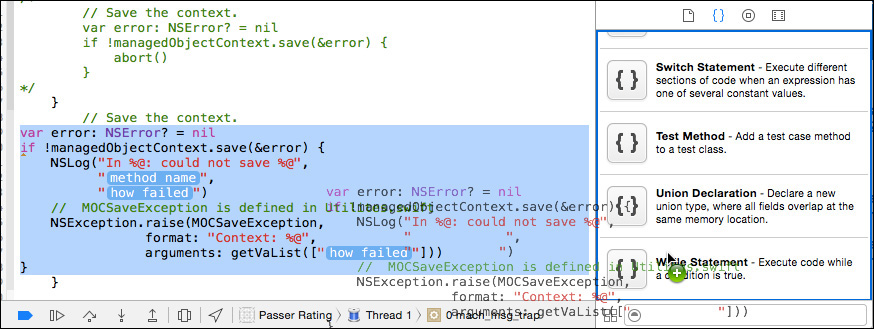
Figure 11.15 After building up a code snippet, select it and drag it into the Clipping library in the second tab at the bottom of the Utility area.
The new snippet will appear at the bottom of the list, with a generic name like “User Snippet.” Double-click it to expand a popover displaying the snippet’s content. Click Edit, and the popover allows you to label it, select the scope (language, context) in which it should be available, and—most important for the moment—the completion shortcut. Enter savemoc for the shortcut, and see Figure 11.16 for the rest. Click Done.
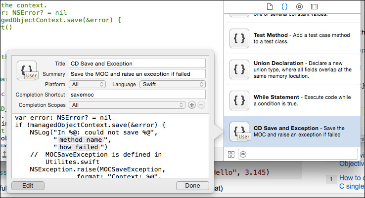
Figure 11.16 Find the snippet you dragged in (as “User Snippet”), double-click it, click Edit, and fill in the labels, context, and completion shortcut.
Go back to the main editor and delete your work on the snippet. Type sav; the resulting completion popup will show you the name of your snippet, and the description you supplied. Press Return to insert the snippet text, with the placeholders highlighted. The Tab key will step you through them, and when you’re finished, this is what you’ll have:
var error: NSError? = nil
if !managedObjectContext.save(&error) {
NSLog("In %@: could not save %@",
"PasserListController.insertNewObject",
"the new Passer")
// MOCSaveException is defined in Utilites.swift
NSException.raise(MOCSaveException,
format: "Context: %@",
arguments: getVaList(["Trying to save a new passer"]))
}
With a template to work from, you can produce better-performing and more consistent code without tedium.
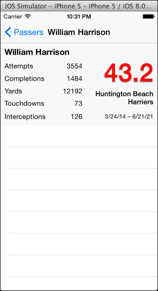
Testing the Billboard View
Everything should be in place now. Run Passer Rating. Xcode builds the app and installs it in the iOS Simulator, which launches it. (The app takes a long time to load that CSV file—long enough that you might worry that iOS would kill it for being nonresponsive, but there are things you can do about that. See Chapter 16, “Measurement and Analysis.”)
Select a passer from the initial view. Something like the view in Figure 11.17 should appear. All of the labels are filled in. It works. The game table is still empty, but you’ve made progress in making the data available to the user.
Summary
This was a long chapter, but you got a lot done. The passer table at the root of the application came almost fully implemented from the project template; all you had to do was change some formats and data-table names. This time, you took a view from practically nothing to a display of the unique data Passer Rating manages.
You provisioned the screen with a table and a container view for the summary billboard. After that, it was all labels, but you learned how to lay them out and how to use the Attributes editor to fit them to their purposes. And, I showed you how to finesse the problem of Auto Layout, at least for a while.
Data displays need data, and controller objects move data from the model to the views. Using Interface Builder with an Assistant editor, you gave GameListController direct access to the data labels and filled them in from the Passer object.
And, at least through the billboard display, it works. The rest, the table of games, will come in Chapter 13, “Adding Table Cells,” later on. But first I will (and you should) take a closer look at laying out that billboard view.