
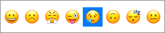
Next you are going to add a circle beneath the currently selected image (Figure 18.5). This will give users context as to what is currently selected.
Open ImageSelector.swift and add a property for the highlight view.
Listing 18.11 Adding the highlight view (ImageSelector.swift)
private let highlightView: UIView = {
    let view = UIView()
    view.backgroundColor = view.tintColor
    view.translatesAutoresizingMaskIntoConstraints = false
    return view
}()
You worked with the global tint color in Chapter 16. This tint color is passed down the view hierarchy from the root level window. You can access it via the tintColor property on UIView instances, and you do so here to set the background color for the highlight view.
Now add that view to the view hierarchy and configure its constraints.
Listing 18.12 Adding the highlight view to the view hierarchy (ImageSelector.swift)
private func configureViewHierarchy() {
    addSubview(selectorStackView)
    insertSubview(highlightView, belowSubview: selectorStackView)

    NSLayoutConstraint.activate([
        selectorStackView.leadingAnchor.constraint(equalTo: leadingAnchor),
        selectorStackView.trailingAnchor.constraint(equalTo: trailingAnchor),
        selectorStackView.topAnchor.constraint(equalTo: topAnchor),
        selectorStackView.bottomAnchor.constraint(equalTo: bottomAnchor),
        highlightView.heightAnchor.constraint(equalTo: highlightView.widthAnchor),
        highlightView.heightAnchor.constraint(equalTo: heightAnchor, multiplier: 0.9),
        highlightView.centerYAnchor
            .constraint(equalTo: selectorStackView.centerYAnchor),
    ])
}
The only constraint left to add is the highlight view’s horizontal constraint. As the selectedIndex is updated, the highlightView will be behind the corresponding button within the stack view.
Add a property for this horizontal constraint.
Listing 18.13 Adding the horizontal constraint (ImageSelector.swift)
private var highlightViewXConstraint: NSLayoutConstraint! {
    didSet {
        oldValue?.isActive = false
        highlightViewXConstraint.isActive = true
    }
}
Whenever this constraint is set, the previous constraint will be deactivated and the new constraint will be activated.
Now, add a property observer to the selectedIndex that sets the highlightViewXConstraint.
Listing 18.14 Updating the horizontal constraint (ImageSelector.swift)
var selectedIndex = 0 {
    didSet {
        if selectedIndex < 0 {
            selectedIndex = 0
        }
        if selectedIndex >= imageButtons.count {
            selectedIndex = imageButtons.count - 1
        }

        let imageButton = imageButtons[selectedIndex]
        highlightViewXConstraint =
            highlightView.centerXAnchor.constraint(equalTo: imageButton.centerXAnchor)
    }
}
First, you check that the selectedIndex is within the bounds of the number of buttons. If not, it gets set to either the lower or upper bound. Note that setting a property within its own property observer will not cause the property observer to get called again. Finally, you reference the corresponding button to constrain the highlight view to that button.
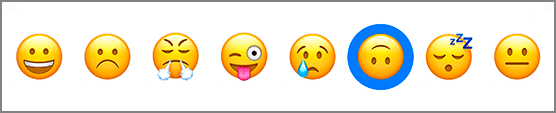
Build and run the application. Tap different images and you will notice that the highlight view jumps behind the corresponding button (Figure 18.6).
Currently the highlight view is a blue square – functional, but not attractive. To make it a circle, set its corner radius to be half of its width.
Listing 18.15 Setting the corner radius (ImageSelector.swift)
override func layoutSubviews() {
    super.layoutSubviews()

    highlightView.layer.cornerRadius = highlightView.bounds.width / 2.0
}
The corner radius is set in layoutSubviews(). This method is called after a view has changed size. The method updates the size and position of subviews based on the constraints that have been set. It is important to update the corner radius in this method because the corner radius is dependent on the size of the highlight view, and the highlight view’s size is a ratio of the total height of the ImageSelector.
Build and run the application again and confirm that the square is now a circle. The ImageSelector control is now operational – and pretty good looking, though you will add some polish to it in the next chapter. By creating a custom control, you have accomplished a couple of things. Primarily, you have created a reusable control that is not directly coupled with a specific set of images. This control can now be used in other applications and other contexts very easily. Additionally, you have removed many of the responsibilities that the MoodSelectionViewController previously had.
In the next chapter, you will finish your work on Mandala by adding a little more color and some animations.