
Before you can fix the labels to be flexible in their layout, you need to learn a little of the theory behind the Auto Layout system.
Absolute coordinates make your layout fragile because they assume that you know the size of the screen ahead of time. Using Auto Layout, you can describe the layout of your views in a relative way that enables their frames to be determined at runtime so that the frames’ definitions can take into account the screen size of the device that the application is running on.
The Auto Layout system is based on the alignment rectangle. This rectangle is defined by several layout attributes (Figure 3.16).
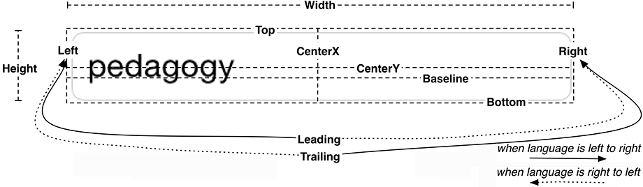
- Width, Height
-
These values determine the alignment rectangle’s size.
-
Top, Bottom,
Left, Right -
These values determine the spacing between the given edge of the alignment rectangle and the alignment rectangle of another view.
-
CenterX,
CenterY -
These values determine the center point of the alignment rectangle.
-
FirstBaseline,
LastBaseline -
These values are the same as the bottom attribute for most, but not all, views. For example, UITextField defines its baselines as the bottom of the text it displays rather than the bottom of the alignment rectangle. This keeps “descenders” (the parts of letters like “g” and “p” that descend below the baseline) from being obscured by a view right below the text field. For multiline text labels and text views, the first and last baseline refer to the first and last line of text. In all other situations, the first and last baseline are the same.
-
Leading,
Trailing -
These values are language-specific attributes. If the device is set to a language that reads left to right (such as English), then the leading attribute is the same as the left attribute and the trailing attribute is the same as the right attribute. If the language reads right to left (such as Arabic), then the leading attribute is on the right and the trailing attribute is on the left. Interface Builder automatically prefers leading and trailing over left and right, and, in general, you should as well.
By default, every view has an alignment rectangle, and every view hierarchy uses Auto Layout.
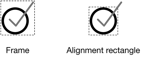
The alignment rectangle is very similar to the frame. In fact, these two rectangles are often the same. Whereas the frame encompasses the entire view, the alignment rectangle only encompasses the content that you wish to use for alignment purposes. Figure 3.17 shows an example where the frame and the alignment rectangle are different.
You define a view’s alignment rectangle by providing a set of constraints. Taken together, these constraints enable the system to determine the layout attributes, and thus the alignment rectangle, for each view in the view hierarchy.
A constraint defines a specific relationship in a view hierarchy that can be used to determine a layout attribute for one or more views. For example, you might add a constraint like, “The vertical space between these two views should always be 8 points,” or, “These views should always have the same width.” A constraint can also be used to give a view a fixed size, like, “This view’s height should always be 44 points.”
You do not need a constraint for every layout attribute. Some values may come directly from a constraint; others will be computed by the values of related layout attributes. For example, if a view’s constraints set its left edge and its width, then the right edge is already determined (left edge + width = right edge, always). As a general rule of thumb, you need at least two constraints per dimension (horizontal and vertical).
If, after all the constraints have been considered, there is still an ambiguous or missing value for a layout attribute, then there will be errors and warnings from Auto Layout and your interface will not look as you expect on all devices. Debugging these problems is important, and you will get some practice later in this chapter.
How do you come up with constraints? Let’s see how, using the labels that you have laid out on the canvas.
First, describe what you want the view to look like independent of screen size. For example, you might say that you want the top label to be:
-
8 points from the top of the screen
-
centered horizontally in its superview
-
as wide and as tall as its text
To turn this description into constraints in Interface Builder, it will help to understand how to find a view’s nearest neighbor. The nearest neighbor is the closest sibling view in the specified direction (Figure 3.18).
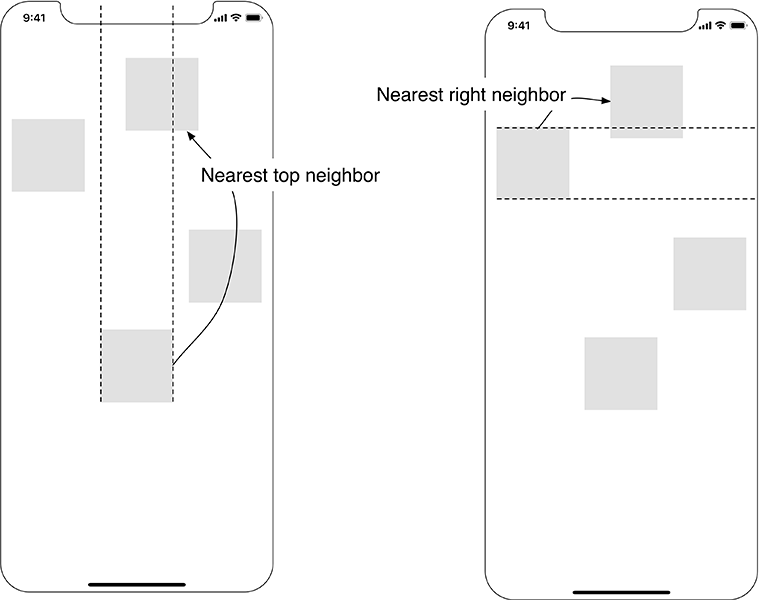
If a view does not have any siblings in the specified direction, then the nearest neighbor is its superview, also known as its container.
Now you can spell out the constraints for the label:
-
The label’s top edge should be 8 points away from its nearest neighbor.
-
The label’s center should be the same as its superview’s center.
-
The label’s width should be equal to the width of its text rendered at its font size.
-
The label’s height should be equal to the height of its text rendered at its font size.
If you consider the first and fourth constraints, you can see that there is no need to explicitly constrain the label’s bottom edge. It will be determined from the constraints on the label’s top edge and the label’s height. Similarly, the second and third constraints together determine the label’s right and left edges.
Now that you have a plan for the top label, you can add these constraints. Constraints can be added using Interface Builder or in code. Apple recommends that you add constraints using Interface Builder whenever possible, and that is what you will do here. However, if your views are created and configured programmatically, then you can add constraints in code. In Chapter 5, you will practice that approach.
Let’s get started constraining that top label.
Select the top label on the canvas. In the bottom-right corner of the canvas, find the Auto Layout constraint menus (Figure 3.19).
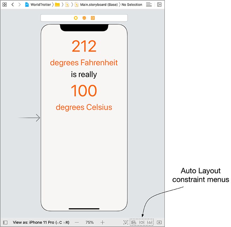
Click the  icon to reveal the Add New Constraints menu. This menu allows you to set the size and position of the label.
At the top of the Add New Constraints menu are four values that describe the label’s current spacing from its nearest neighbor on the canvas. For this label, you are only interested in the top value.
To turn this value into a constraint, click the top red strut separating the value from the square in the middle. The strut will become a solid red line. Also, replace whatever value you have in the top text field with 8.
In the middle of the menu, find the label’s Width and Height. The values next to Width and Height indicate the current canvas values. To constrain the label’s width and height to the current canvas values, check the Width and Height checkboxes. The button at the bottom of the menu reads Add 3 Constraints. Click this button. The constraints will be added and the label will be automatically repositioned to match them.
You might have noticed that your top label is not actually 8 points below the top of the screen, but instead 8 points below the sensor housing. By default, constraints made to a superview are made to its safe area. The safe area is an alignment rectangle that represents the visible portion of your interface.
At this point, you have not specified enough constraints to fully determine the alignment rectangle. The red left and right edges around the label indicate that its alignment rectangle is incompletely defined – specifically that there is some problem along the horizontal axis. (The top and bottom edges would be red if there were a vertical constraint problem.) Interface Builder will help you determine what the problem is.
Open the document outline and notice the red arrow in the top-right corner (Figure 3.20). A red or yellow arrow here indicates a potential issue with your interface.
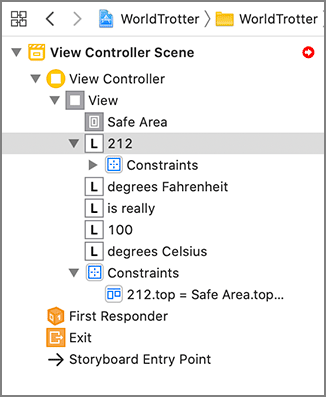
Click this icon to reveal the Auto Layout issues outline (Figure 3.21). Most of the issues listed here are classified as Localization Issues. These are associated with the labels that do not yet have constraints and therefore might have layout issues similar to what you experienced before.
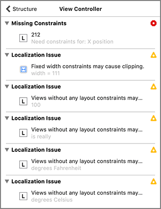
The issue you are concerned with relates to the 212 label. For that label, there is a Missing Constraints issue described as Need constraints for: X position.
You have added two vertical constraints (a top edge constraint and a height constraint), but you have only added one horizontal constraint (a width constraint). Having only one constraint makes the horizontal position of the label ambiguous. You will fix this issue by adding a center alignment constraint between the label and its superview.
With the top label still selected, click the  icon to reveal the Align menu. If you have multiple views selected, this menu will allow you to align attributes among the views. Because you have only selected one label, the only options you are given are to align the view within its container.
In the Align menu, check Horizontally in Container and then click Add 1 Constraint to add the centering constraint and reposition the label if needed. After adding this constraint, there will be enough constraints to fully determine the alignment rectangle.
The label’s constraints are all blue now that the alignment rectangle for the label is fully specified.
Build and run the application on the iPhone 11 Pro simulator and the iPhone 11 Pro Max simulator. The top label will remain centered in both simulators.
There is still one issue associated with the top label: Fixed width constraints may cause clipping. Let’s discuss and address this warning.
Although the top label’s position is flexible, its size is not. This is because you have added explicit width and height constraints to the label. If the text or font were to change, the frame would not hug to the content, which could then be cut off (“clipped”) or left swimming in extra space. We will discuss two causes of this, localization and Dynamic Type, in Chapter 7 and Chapter 10, respectively.
This is where the intrinsic content size of a view comes into play. You can think of the intrinsic content size as the natural size for a view based on its contents. For labels, this size is the size of the text rendered at the given font. For images, this is the size of the image itself.
We said earlier that you generally need at least two constraints per dimension (horizontal and vertical). A view’s intrinsic content size acts as implicit width and height constraints. If you do not specify constraints that explicitly determine the width, the view will be its intrinsic width. The same goes for the height.
With this knowledge, let the top label have a flexible size by removing the explicit width and height constraints.
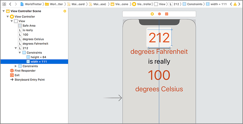
In Main.storyboard, select the width constraint on the label. You can do this by clicking on the constraint on the canvas. Alternatively, in the document outline, you can click the disclosure triangle next to the 212 label, then disclose the list of constraints for the label (Figure 3.22).
Once you have selected the width constraint, press the Delete key. Do the same for the height constraint.
Notice that the remaining constraints for the label are still blue. Because the width and height are being inferred from the label’s intrinsic content size, there are still enough constraints to determine the label’s alignment rectangle. (Wondering where the constraints that position the label relative to its superview are? They are in the constraints for the top-level View.)
As you have seen, blue constraints indicate that the alignment rectangle for a view is fully specified. Orange constraints often indicate a misplaced view. This means that the frame for the view in Interface Builder is different than the frame that Auto Layout has computed.
A misplaced view is very easy to fix. That is good, because it is also a very common issue that you will encounter when working with Auto Layout.
Give your top label a misplaced view so that you can see how to resolve this issue. Resize the top label on the canvas using the resize controls and look for the yellow warning in the top-right corner of the canvas. Click on this warning icon to reveal the problem: Frame for "212" will be different at run time (Figure 3.23).
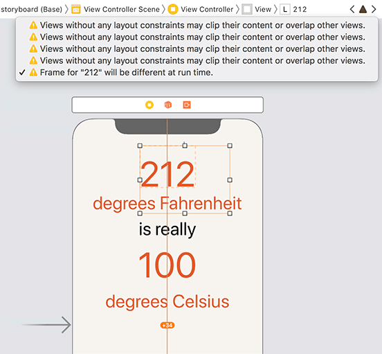
As the warning says, the frame at runtime will not be the same as the frame specified on the canvas. If you look closely, you will see an orange dotted line that indicates what the runtime frame will be.
Build and run the application. Notice that the label is still centered despite the new frame that you gave it in Interface Builder. This might seem great – you get the result that you want, after all. But the disconnect between what you have specified in Interface Builder and the constraints computed by Auto Layout will cause problems down the line as you continue to build your views. Let’s fix the misplaced view.
Back in the storyboard, select the top label on the canvas. Click the  icon (the left-most icon in the lower-right corner of the canvas) to update the frame of the label to match the frame that the constraints will compute.
You will get very used to updating the frames of views as you work with Auto Layout. One word of caution: If you try to update the frames for a view that does not have enough constraints, you will almost certainly get unexpected results. If that happens, undo the change and inspect the constraints to see what is missing.
At this point, the top label is in good shape. It has enough constraints to determine its alignment rectangle, and the view is laying out the way you want.
Becoming proficient with Auto Layout takes a lot of experience, so in the next section you are going to remove the constraints from the top label and then add constraints to all the labels.
Let’s flesh out the constraints for the rest of the views. Before you do that, you will remove the existing constraints from the top label.
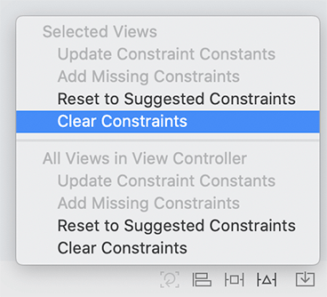
Select the top label on the canvas. Open the Resolve Auto Layout Issues menu (the icon second from right) and select Clear Constraints from the Selected Views section (Figure 3.24).
You are going to add the constraints to all the views in three steps. First you will center the top label horizontally within the superview. Then you will add constraints that pin the top of each label to its nearest neighbor. Finally you will align the centers of all the labels.
Select the top label. Open the Align menu and choose Horizontally in Container with a constant of 0. Click Add 1 Constraint.
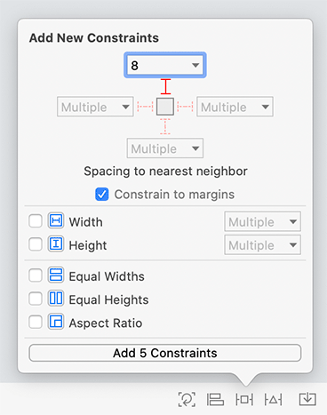
Now select all five labels. Open the Add New Constraints menu. Select the top strut and make sure it has a constant of 8.
Your menu should match Figure 3.25. Once it does, click Add 5 Constraints.
Finally, with all five labels still selected, open the Align menu and select Horizontal Centers (Figure 3.26). Go ahead and Add 4 Constraints.

At this point, the labels are no longer horizontally or vertically ambiguous. If you had any doubts, the fact that their constraints have all turned blue verifies this.
Build and run the application on the iPhone 11 Pro simulator. The views will be centered within the interface. Now build and run the application on the iPhone 11 Pro Max simulator. Unlike earlier in the chapter, all the labels remain centered on the larger interface.
Auto Layout is a crucial technology for every iOS developer. It helps you create flexible layouts that work across a range of devices and interface sizes. It also takes a lot of practice to master. You will get a lot of experience using Auto Layout as you work through this book.