18. Working with Type
In This Chapter
To state the obvious: Photoshop is not a word processor. (It’s called Photoshop, not Wordshop). So don’t make the mistake of trying to create documents with lots of text or complex layouts. Trust us, that’s what Adobe InDesign is for. That said, Photoshop offers three methods for adding type: point text for single lines, paragraph text for multiline text, and type on a path for creating special effects. Plus, because Photoshop allows you to work in resolution-independent vector outlines for editable type, you can always output type at the full document resolution. So, there’s no reason not to make ads, web graphics, posters, postcards, and maybe even a simple flyer in Photoshop. And you can apply unique creative effects to text that you can’t do (or do easily) in other programs.
Adding Point and Paragraph Text
Most of the time you’ll be using point or paragraph text in your projects. Point text is best for short single lines of display type. Use paragraph text when you want long passages of type where lines automatically wrap.
Point text is left, center, or right aligned from the point where you click on the canvas and continues in a straight line (FIGURE 18.1). It will not wrap to another line unless you manually add a paragraph or other break character, so it can continue past the edge of the canvas.

FIGURE 18.1 Center-aligned point text. Notice the alignment point just after the letter h.
To add point text:
With a Type tool, click the canvas.
Type or paste in the desired text. When you add type, Photoshop automatically adds a new type layer to the Layers panel.
Press Enter/Return to add line breaks as desired.
To accept the new text, click the Commit button on the Options bar. (Or, click Cancel if you’ve changed your mind.)
Paragraph text is contained within a bounding box that you set and modify with the Type tool (FIGURE 18.2). It wraps automatically to fit the box and will rewrap if you reshape the box.

FIGURE 18.2 Paragraph text. Notice the bounding box with control handles surrounding the text.
Tip
If you want to set a precise bounding box for paragraph text, Alt/Option-click, and enter the desired Width and Height in the Paragraph Text Size dialog (FIGURE 18.3).

FIGURE 18.3 You can create a container for paragraph text with specific Height and Width values.
Tip
When you add a type layer, Photoshop will insert placeholder Lorem Ipsum text that you can type over or leave as is and replace later. If you don’t want automatic placeholder text, go to Type Preferences and turn off Fill New Layers With Placeholder Text. At any time, you can fill the bounding box for paragraph type with placeholder text by choosing Type > Paste Lorem Ipsum.
To add paragraph text:
With a type tool, click and drag on the canvas to set a bounding box for the text.
Type or paste in the text. Photoshop automatically creates a new text layer in the Layers panel.
To accept the new text, click the Commit button on the Options bar. (Or, click Cancel if you’ve changed your mind.)
If you try to paste in more paragraph text than will fit in the box you created for it, part of the text becomes overset. It’s still in the file, but it will not be visible.
To find and fix overset text:
Click the type with a Selection tool or a Type tool. If there’s overset text, a plus sign appears in the corner handle of the bounding box (FIGURE 18.4).

FIGURE 18.4 You can tell there’s overset text in this paragraph by the plus sign in the bottom-right control handle.
Move, scale, or edit the text, or resize the box by dragging the control handles or changing the Width and Height values in the Properties panel.
If you change your mind after adding text, and want to convert from paragraph text to point text (or vice versa), the process is simple. However, if you are converting from paragraph text, you will need to fix any overset text first, as it will be deleted in the conversion (FIGURE 18.5).

FIGURE 18.5 Photoshop cannot convert overset paragraph text to point text, so it warns you to fix the problem (or accept the consequence) before converting.
To convert paragraph text to point text, or vice versa:
Click the T icon of the type layer on the Layers panel.
Choose Type > Convert To Point Text or Type > Convert To Paragraph Text.
Choosing a Font Family and Style
As someone once said, “fonts are the clothes words wear.” Use these methods when it’s time to dress up your text.
To change the font family and font style:
Select the type.
On the Options bar or Character panel, click the Font menu arrow to display a list of available font families and styles.
To preview how your text will look with a different font, move your pointer over the font in the list (FIGURE 18.6).

FIGURE 18.6 Move your pointer over a font in the menu list to see a preview of it applied to your text.
To apply the currently highlighted font, press Enter/Return or click the font name.
Tip
You can use the Up and Down Arrow keys to step through the font previews. To jump to the next font family, press Shift+Up Arrow or Shift+Down Arrow.
Tip
To change the size of the samples displayed on the Font menus, choose Type > Font Preview Size.
Tip
By default, Photoshop lists the 10 most recently used fonts at the top of the Font menus. You can change this number in Type Preferences to any value from 100 to 0 (to display no recent fonts). The change takes effect when you quit and relaunch Photoshop.
To search for specific fonts by name or style:
Select the type.
On the Options bar or Character panel, click in the Font Family field.
Start typing a font name or style, such as semibold or condensed. Photoshop will filter the font list to match what you type. You can also type partial names, such as clar to display every version of Clarendon active on your computer (FIGURE 18.7).

FIGURE 18.7 When you have an idea of which font you want to apply, start typing the font name or style in the Font menu, and Photoshop will filter the list to show only matching items.
To preview a font in your document, move your pointer over the font in the list.
Press Enter/Return or click the font name to apply it to the text.
Tip
To display only fonts from a specific class of fonts (Serif, Sans Serif, Script, etc.) use the Filter menu at the top of the fonts menu. Choose All Classes to reset the menu to display all available fonts (FIGURE 18.8).
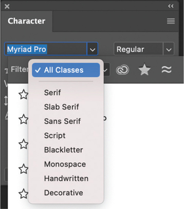
FIGURE 18.8 Filtering the Font menu to show only a specific class of fonts can help you find the one you’re looking for faster.
Tip
You can also filter the Fonts menu to show only Adobe Fonts, fonts you have favorited, or Adobe Fonts that are visually similar to the current font (FIGURE 18.9).
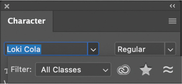
FIGURE 18.9 Use the three filtering buttons in the Font menu to browse fonts with specific characteristics.
Tip
To change the formatting of all the text on a type layer, you don’t have to select it first. Just click the layer in the Layers panel and use the controls in the Options bar or Character and Paragraph panels.
 Video 18.1
Overview of Basic Type Options
Kerning and Tracking
Kerning and tracking are typographic terms for changing the space between text characters. Kerning is used to change the spacing between a pair of text characters. Tracking is used to change the spacing across a range of characters, typically an entire paragraph.
To apply kerning:
With a Type tool, click between two characters on a type layer.
Do one of the following:
 On the Character panel, drag the Kerning icon (
 ) left to decrease or right to increase the kerning. (FIGURE 18.10) (Or enter a positive or negative value in the kerning field.)
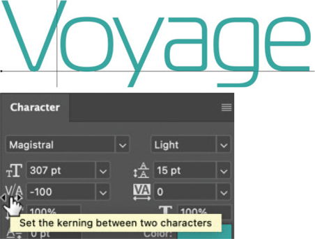
FIGURE 18.10 Drag the Kerning icon to quickly change the kerning between two characters.
- Choose Metrics from the Kerning menu to apply the kerning value built into the current font (FIGURE 18.11).
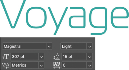
FIGURE 18.11 The Metrics kerning method uses the default spacing set by the font designer.
- Choose Optical to let Photoshop determine the kerning based on the character shapes, which usually produces a tighter result (FIGURE 18.12).
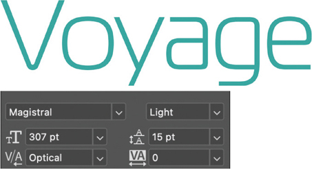
FIGURE 18.12 Optical kerning can offer a quick way to tighten up a bit of type, with Photoshop choosing the optimal spacing between characters.
To apply tracking:
Select the text with the Type tool or click the layer on the Layers panel to adjust tracking of all text on that layer.
On the Character panel, drag the Tracking icon (
 ) left to decrease or right to increase the tracking. (FIGURE 18.13) (Or, enter a specific value in the associated field.)
FIGURE 18.13 When you just want to eyeball the spacing in a bit of text, drag the Tracking icon.
To remove custom tracking, reset the tracking value of selected characters to 0.
Tip
To make finer manual adjustments, hold the Alt/Option key while you drag the Kerning or Tracking icon.
Adjusting Leading, Vertical Spacing, and Baseline Shift
Leading and baseline shift are the two features you can use to move horizontal type up and down. If you’re working with vertical type, then tracking is the feature that will allow you to adjust the vertical spacing between characters.
Leading is the spacing between lines of type in a paragraph. The character with the highest leading value in a line of text determines the spacing of the entire line (FIGURE 18.14).
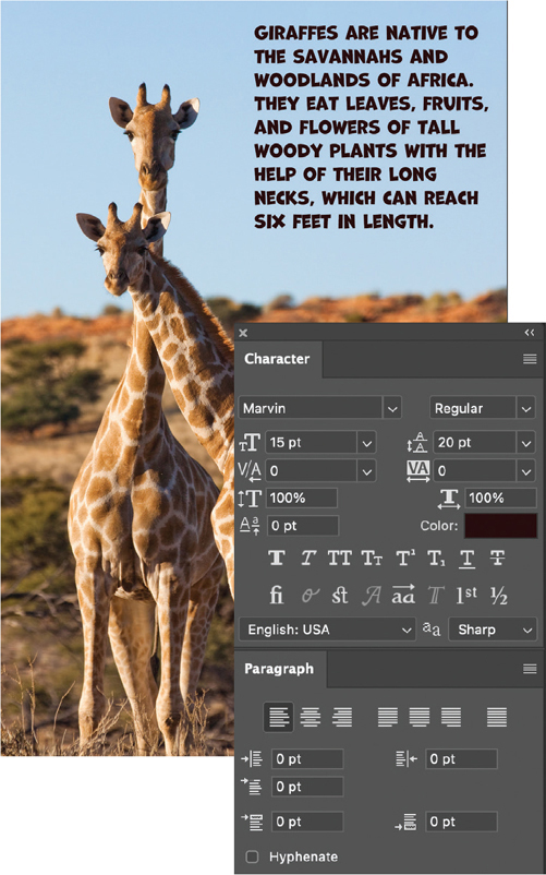
FIGURE 18.14 The paragraphs of text are set with 70-point leading, which is slightly less than the default Auto leading value for 60-point type. The extra space between paragraphs was added in the Paragraph panel.
The Auto leading value is calculated as a percentage of the current font size. By default, it is set to 120%. So Auto leading applied to 20-point type will be 24 points. To change it from the default, open the Justification dialog from the Paragraph panel menu and enter a new Auto Leading value (FIGURE 18.15).

FIGURE 18.15 You can set the Auto Leading value in the Justification dialog box.
To adjust leading in horizontal paragraph type:
On the Layers panel, click a type layer.
On the Character panel, enter or choose a Leading value.
Tip
If all the text on the layer has the same leading, you can change the leading by dragging the Leading icon right (increase) or left (decrease). Hold down Alt/Option as you drag to make finer adjustments.
Leading apples only to horizontal type. For vertical type, you change the vertical space between letters using tracking (FIGURE 18.16).
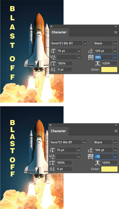
FIGURE 18.16 By adjusting the Tracking value, you can set vertical type loose or tight.
To adjust the spacing between characters in vertical type:
On the Layers panel, click a type layer containing vertical type.
On the Character panel, change the Tracking value.
To convert vertical type to horizontal type, or vice versa:
Double-click a type layer thumbnail.
On the Tool Options bar, click the Toggle Text Orientation icon (
 ).
).
You can use Baseline Shift to adjust the vertical position of type, typically raising or lowering characters relative to the others on the line (FIGURE 18.17).
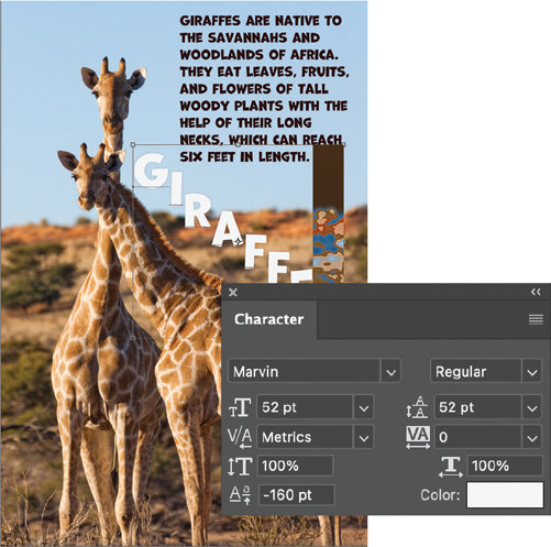
FIGURE 18.17 Negative baseline shift applied to letters in the title Giraffes allows the word to follow the line of the animal’s neck.
To apply Baseline Shift:
Select the words or characters you want to shift.
On the Character panel, drag the Baseline Shift icon (
 ) right (raise characters) or left (lower characters), or enter a value. Positive values move characters upward from the baseline; negative values move them down.
Tip
Hold down Alt/Option as you drag to make finer adjustments.
Inserting Special Characters
You can achieve a more polished look with type by applying ligatures, fractions, and other alternate characters, provided you are using a font that contains those glyphs. Typically, OpenType “Pro” fonts offer the most special character options (FIGURE 18.18).
FIGURE 18.18 To see which special characters are available in the current font, keep your eye on the bottom row of buttons in the Character panel. Adobe Garamond Pro offers standard ligatures, discretionary ligatures, stylistic alternates, titling alternates, ordinals, and fractions.
For example, you can replace a typed fraction like 1/2 with the typographically correct ½ glyph. You can also replace letter pairs such as ff, ffl, and st with ligatures that combine those letters into a single glyph (FIGURE 18.19). Or, if you are working with display type, you can insert swash and titling characters to add flair.
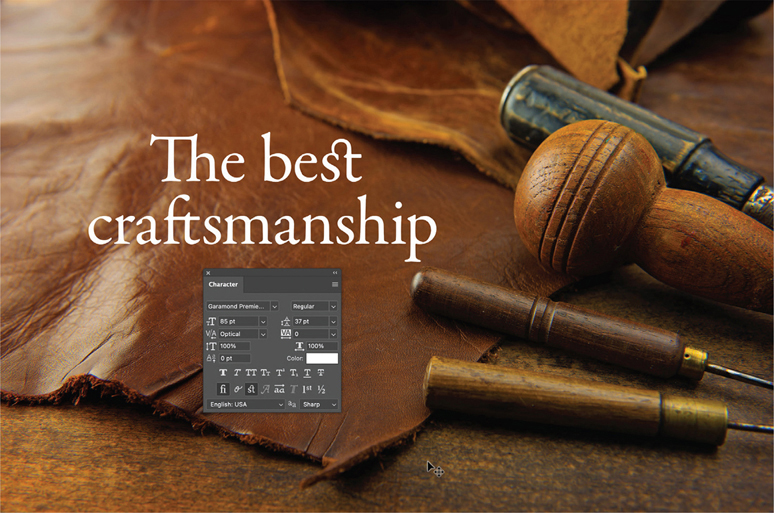
FIGURE 18.19 The craftsmanship in the image is echoed in the type through the use of standard ligatures (Th and ft) and a discretionary ligature (st).
To insert or specify alternate glyphs for OpenType characters:
With a Type tool, click in text to create an insertion point.
Open the Glyphs panel (Type > Panels > Glyphs), and scroll to find the glyph you want to insert.
(Optional) Use the Font Category menu to display a subset of the font, like Punctuation, Fractions, Dashes & Quotes, Symbols, and so on (FIGURE 18.20).

FIGURE 18.20 The Font Category menu on the Glyphs panel gives you quick access to every subset of glyphs within a font.
Double-click a glyph to insert it (FIGURE 18.21).

FIGURE 18.21 You can use the Glyphs panel to browse and insert special characters into text.
Tip
The Glyphs panel keeps track of the 25 most recent glyphs you inserted. Double-click one of the recent glyphs to insert it again.
Tip
To view and insert glyphs from a different font family and style, choose from the menus on the Glyphs panel.
Formatting Paragraphs
You’ve formatted your text at the character level, applying fonts, colors, and so on. Now, it’s time to take your design to the next level and apply formatting to paragraphs of text, setting the alignment, justification, indents, and spacing options. You can do all these things with the controls on the Paragraph panel.
To access paragraph settings:
With a Type tool, click in a paragraph or select a series of paragraphs. Or, if you want to apply settings to all the type in a layer, click the layer on the Layers panel.
If necessary, click the Toggle Character and Paragraph Panels button on the Options bar (
 ). (Note that paragraph settings are also displayed in the Properties panel when you are working on a type layer.)
Alignment
You can use the three groups of controls at the top of the Paragraph panel to set the alignment of paragraph text: left, right, centered, or justified.
To choose an alignment:
Select the text you want to modify.
On the Paragraph panel, click Left Align Text, Center Text, or Right Align Text from the first group of icons (
 ) to align type to the center or an edge of the bounding box (paragraph text) or initial insertion point (point text).
Click a button in the second group (
 ) to justify text. These options make all lines but the last one span the full width of the bounding box surrounding paragraph text.
Click the last button, Justify All (
 ), if you’d prefer to force all lines of paragraph text to span the full width of the bounding box.
Justification
You can use Justification settings to tighten or loosen the default spacing between words or letters in paragraphs of justified text. Justification settings can also apply glyph scaling to make characters wider or narrower. Taken together, these settings can have a strong impact on the overall flow and appearance of paragraph text. For example, use them when you need to fit more text in a particular area without changing the font or font size (FIGURE 18.22).
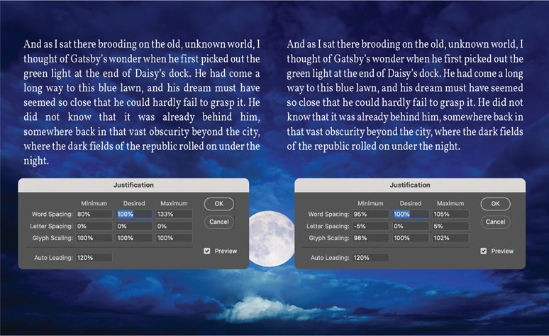
FIGURE 18.22 These two paragraphs have the same text and character formatting. The left paragraph uses default Justification settings. The one on the right has custom Justification settings that give the text a more consistent spacing throughout the paragraph, while using one less line. This is achieved by allowing small variations in letter spacing within words and glyph scaling, while allowing less variation in the spacing between words.
To change the spacing between words and letters in justified text:
Select the text you want to modify.
Choose Justification from the Paragraph panel menu.
In the Justification dialog, select the Preview option so you can see the effect of changing settings.
Use the controls in the Justification dialog to set Maximum, Desired, and Minimum values for Word Spacing, Letter Spacing, and Glyph Scaling.
Line wrap
Photoshop offers two paragraph composer options to control the way lines wrap in paragraph text. The Single-Line Composer handles each line separately. The Every-Line Composer takes every line in the paragraph into account to give a more balanced appearance to the “rag” end of the paragraph. When you edit text with the Every-Line Composer selected, all lines in the paragraph can rewrap.
To change the way lines wrap in paragraph text:
Select the text you want to modify.
From the Paragraph panel menu, choose either Single-Line Composer or Every-Line Composer.
To control hyphenation:
Select the text you want to modify.
Check or uncheck Hyphenate at the bottom of the Paragraph panel.
(Optional) To customize hyphenation settings, choose Hyphenation from the Paragraph panel menu and use the controls in the Hyphenation dialog (FIGURE 18.23).

FIGURE 18.23 By allowing hyphenation you can often fit more text in a given space and achieve more consistent spacing.
Indents and margins
The Paragraph panel offers convenient controls for setting margins and indents on paragraphs of text.
To set indents:
Select the text you want to modify.
Use the controls on the Paragraph panel for Indent Left Margin, Indent First Line, or Indent Right Margin (FIGURE 18.24). Note that you can also use negative values to push text outside its bounding box.
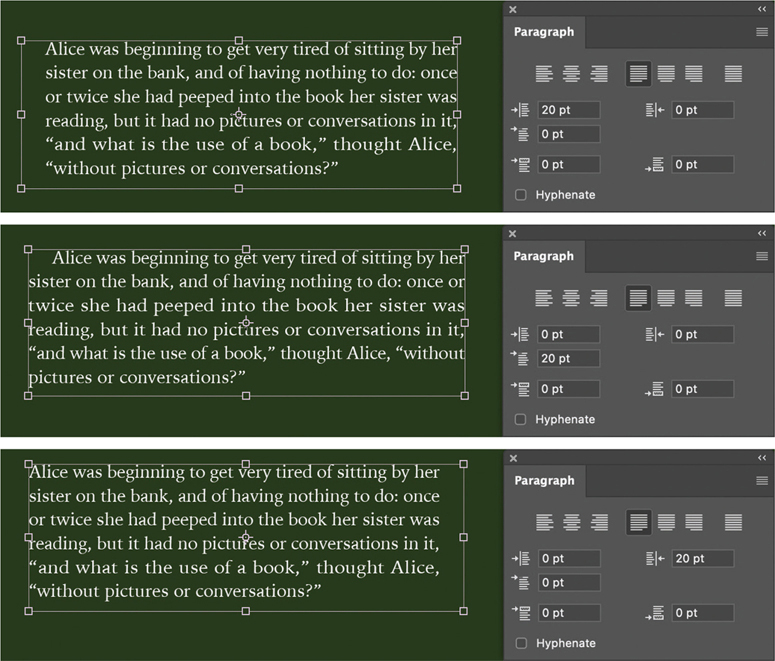
FIGURE 18.24 You can set various margins and indents for paragraph text.
To add space before or after a paragraph:
Select the text you want to modify.
Use the controls on the Paragraph panel for Add Space Before Paragraph or Add Space After Paragraph.
Working with Type on a Path
You can make type flow along the edge of an open or closed path created by a Pen or Shape tool. You can also use a closed path as a container for type.
To enter type along an existing path:
With a Type tool, position the pointer over the path so it changes its appearance (
 ) and click.
Enter the type.
To adjust the vertical alignment of type on a path, use the Baseline Shift controls in the Character panel. Negative Baseline Shift values move the type down. Positive Baseline Shift values raise type above the path (FIGURE 18.25).
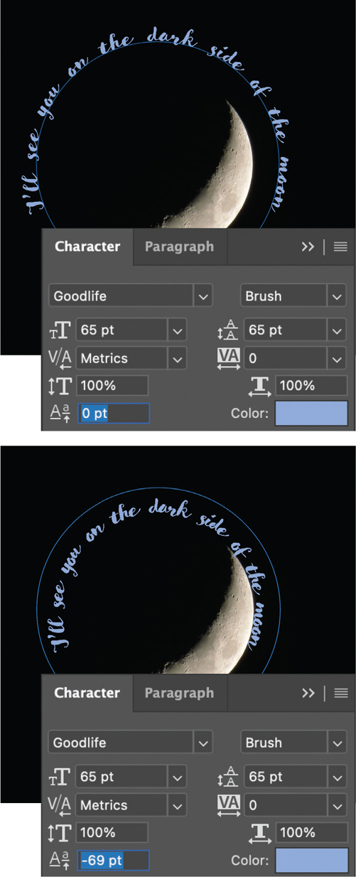
FIGURE 18.25 When you first add type on a path, the baseline is exactly on the path. To move it up or down, use Baseline Shift.
Tip
Horizontal type is oriented perpendicular to the path. Vertical type is oriented parallel to the path. To change the orientation of type, select it and choose Type > Orientation > Horizontal Or Vertical.
To enter type inside a closed path:
With the Type tool, position the pointer inside the path so it changes its appearance (
 ) and click.
Enter the type. The path acts as a container, so lines automatically break wherever the type reaches the path boundaries (FIGURE 18.26).
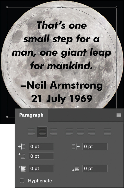
FIGURE 18.26 Center-aligned type set inside a circular path
You can change the position of type along a path and its orientation to the path by flipping it. When moving your type along a path, pay attention to the end of the type to make sure it all remains visible. If you move type so far that it will no longer fit on the path, you will create overset text. This text is still in the file, but it will not be visible until you fix the problem by moving, scaling, or editing the text. You can tell if there is overset text by clicking the path with a Selection tool or a Type tool. If there’s overset text, a plus sign inside a small circle appears at the end of the visible text (![]() ).
).
To move type along a path:
With either the Direct Selection tool or Path Selection tool, position your pointer over the type on a path. The pointer changes to an I-beam with an arrow (
 ).
).Click and drag the type along the path. Keep your pointer on the same side of the path; do not drag across it, or the type will flip (FIGURE 18.27).
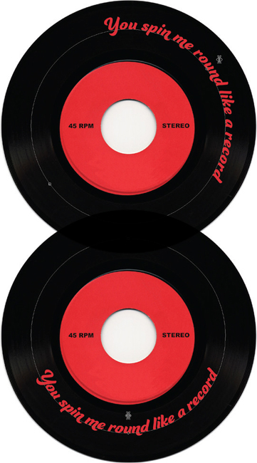
FIGURE 18.27 By dragging with either Selection tool, you can move type along a path. If you drag across the path, the type will flip to the other side.
Tip
You can reposition type on a path using the Alignment controls on the Options bar or the Paragraph panel, making it left aligned, centered, or right aligned.
To move type by changing the shape of a path:
On the Layers panel, click a layer containing type on a path.
With a Type tool or Selection tool, click the path on the Paths panel to make it active.
To change the path’s shape, do one of the following:
- Choose Edit > Free Transform Path and then reshape the path by dragging with the control handles or change the width, height, angle, or skew in the Options bar.
- With the Direct Selection tool, click and drag anchor points to move them.
The type moves to conform to the new shape of the path.(FIGURE 18.28).
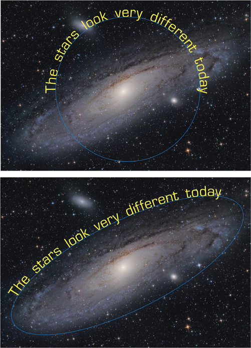
FIGURE 18.28 Type moves to conform to the new shape of a transformed path.
Tip
If you need more anchor points to achieve the shape you envision, use the Pen tool to add, remove, or convert anchor points to reshape the path.
To flip type to the other side of the path:
With either the Direct Selection tool or Path Selection tool, position your pointer over the type on a path. The pointer changes to an I-beam with an arrow.
Click and drag across the path.
Tip
If you want to move type across a path without changing the direction of the type, use the Baseline Shift controls in the Character panel. Negative values move type down, positive values move type up.
Warping Type
You can create special effects by applying warp styles to type. Any warp style you apply becomes an attribute of the type layer, so you can make changes to it at any time.
To warp type:
Select a type layer.
With a Type tool, click the Warp button on the Options bar (
 ).
).Choose a warp style and orientation (Horizontal or Vertical).
(Optional) Specify values for such warping options as Bend, Horizontal Distortion, and Vertical Distortion (FIGURE 18.29).
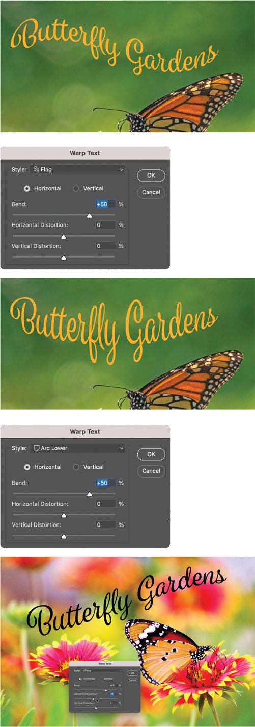
FIGURE 18.29 Use the Warp feature to reshape type with a variety of nondestructive effects.
Click OK.
To change or remove a warp effect:
Select a type layer.
With a Type tool, click the Warp button on the Options bar.
Apply different settings in the Warp Options dialog, as desired. Or, to remove a warp effect, choose None from the Style menu.
Click OK to apply the changes or remove the effect.
Painting on a Type Layer
If you want to apply certain creative effects to type, like painting directly on type with the Brush tool or distorting the letters with the Smudge tool, you must convert it to pixels first via the Rasterize Type command (FIGURE 18.30).
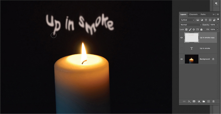
FIGURE 18.30 Before you can create smoky letters like these with the Smudge tool, you have to rasterize the type layer.
Note that most other features that cannot be directly applied to live type, like filters, or the Transform > Distort or Perspective commands, can be applied to Smart Objects. So, it is not necessary to rasterize type to use these features. Instead, convert the type layers to Smart Objects. Then, if you need to modify the text, you can simply edit the Smart Object (see Chapter 14).
Also, in some cases, you may be able to create the effects you want by painting on a separate layer, while keeping your live type intact.
If you need to rasterize a type layer, it’s a good idea to keep a backup of the original text in case you need to make changes to it. To preserve a copy of the editable type layer, click on it in the Layers panel and press Ctrl/Command+J.
To rasterize a type layer into pixels:
Right-click the type layer name and choose Rasterize Type. The layer thumbnail changes from a T to the type shapes surrounded by transparent pixels.
Replacing Missing Fonts
The problem of missing fonts occurs when you open a document that uses fonts not installed on your computer.
On the Layers panel, a type layer with missing fonts appears with a yellow warning icon (![]() ).
).
Photoshop will automatically activate missing Adobe Fonts when you open a document that uses them, provided you are online and logged in to your Creative Cloud account. While missing Adobe Fonts are syncing to your computer, you will see a blue download icon on the Layers panel. When the fonts are synced, the icon will disappear, and you can work with the type as normal.
If you activate missing fonts from a source other than Adobe while a document is open, you may see a gray warning icon on a type layer thumbnail (![]() ). Double-click it to update the layer before proceeding. Or, if there are multiple layers with gray warning icons, choose Type > Update All Text Layers.
). Double-click it to update the layer before proceeding. Or, if there are multiple layers with gray warning icons, choose Type > Update All Text Layers.
If you are unable to activate missing fonts automatically, you can replace the missing font manually, or use the Manage Missing Fonts feature to resolve the situation.
To manually resolve missing font issues:
On the Layers panel, double-click the thumbnail of the type layer with missing fonts.
In the dialog that appears, do one of the following:
- Click Replace and choose a different font in the Options bar.
- Click Manage, and use the options in the Manage Missing Fonts dialog to either replace the missing font with the default font or with a font already used in the document (FIGURE 18.31).
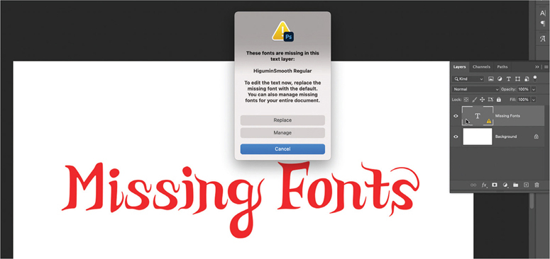
FIGURE 18.31 Double-click the type layer thumbnail to replace a missing font.
Tip
You can quickly replace all missing fonts at once by selecting Replace All Missing Fonts With The Default Font
Matching Fonts
If you have an image containing type that is not live, you can use the Match Font feature to find visually similar fonts in the Adobe Fonts collection.
To find and activate matching fonts:
Select Type > Match Font.
Adjust the rectangular marquee so it encompasses up to three lines of type. The more different characters in the sample, the more accurate the search results will be.
Photoshop displays a list of fonts that are similar to the text in your selection.
To activate an Adobe Font from the list, click the cloud icon (FIGURE 18.32).
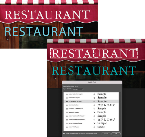
FIGURE 18.32 The Match Font feature is a fast way to identify typefaces in raster images, and then download the exact font or one that’s similar.
When the Match Font feature works, it can be a great time saver. The problem is, it frequently doesn’t work, which can be frustrating. If you’re not satisfied with the initial search results, try readjusting the marquee to force Photoshop to search again. You may also get better results with other font matching services like What the Font.
Creating a Text Sandwich
Here’s another timeless text technique that almost every Photoshop user should have in their bag of tricks. You’ve seen it countless times on magazine covers where a model’s head (or some object) overlaps the magazine title.
To make a text sandwich:
Identify which portion of the image you want to overlap the text and make a selection of it.
Copy that selection to a new layer (Ctrl/Command+J) and drag that layer above the type layer (FIGURE 18.33).
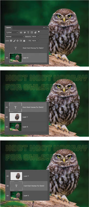
FIGURE 18.33 By copying a selection of the image to a separate layer above the type layer, you can create the text sandwich effect.
Filling Type with an Image
One common job that Photoshop users are asked to perform is filling type with an image. When it’s done well, the shapes of the type outlines combine with the content of the image to convey a message that’s greater than the sum of its parts. There are various ways of accomplishing this, but the most flexible and efficient is to use a clipping mask.
To fill type with an image:
Start with a file containing the image you want to put in type. If the image layer is the Background layer, click its lock icon on the Layers panel to convert it from a background layer into a regular layer.
Create a type layer with the text you want and format it as desired. Large, bold, sans serif type usually works best.
On the Layers panel, drag the image layer so that it is immediately above the type layer.
Create a clipping mask by Alt/Option-clicking on the divider between the image layer and the type layer on the Layers panel. The image appears inside the text (FIGURE 18.34).
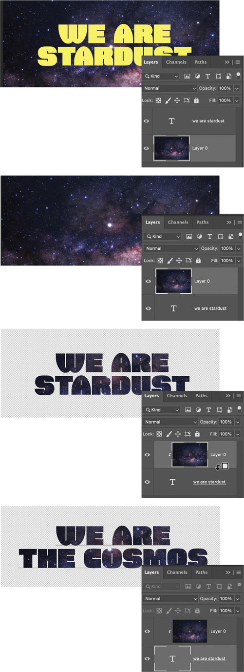
FIGURE 18.34 A clipping mask is the simple key to putting an image in text. Best part: The text remains editable.
Tip
To adjust the position of the image within the text, select the Move tool, click the image layer, and drag the image.
Tip
To move the text outlines in relation to the image, select the type layer and use the Move tool to move the text. Note that you may need to turn off Auto-Select in the Options bar to avoid selecting the image layer when you click and drag on the canvas.