

1a
1a. Printmaking is a rich medium for architects to discover the effective use of light and dark. The artist and printmaker Anne Desmet brings a deep understanding of the subject into her architectural works. Here, for instance, is Domus Aurea II 1991, a linocut printed in blue/black ink on off-white Japanese Kozu-shi paper. It was developed from tiny pencil and gray wash sketchbook drawings made from memory of the now-underground Golden House of Nero in Rome. It was not intended to be an accurate representation of the interior but more an evocation of some of the light effects, flashes of fresco detail, and a sense of the cavernous space, silent abandonment, and inky darkness.

1b
1b. A second image by Anne Desmet, Poolside Reflection, is inspired by the interior of Manchester’s Victoria Baths. It is a wood engraving and Chine-collé, printed in black ink. In the cutting of the block, the artist enhanced and exaggerated various light effects observed in the reflected mirror seen in the building and in the photographs. The mirror in question was dented and discolored, creating a distorted reflection that the artist has exaggerated in her engraving to suggest the effects of reflections in pool water, in former times when the baths were in use. The Chine-collé areas of the print (the buff-colored paper sections) were added to give a sense of the mirror being a different color and texture to the wall on which it hangs. The pattern of light and shadow underscores the tonal effect of the Chine-collé to create a sense of the spatial and material conditions of the derelict baths. The abstraction of the mirror-like surface of the drawing engages the imagination and opens up associations that move between light and structure to glazed surfaces and rippling shadows to create an impression of an aqueous world that remains long after the baths have closed.

2
2. A number of contemporary rendering techniques are best understood as a process of layering. The simplest of these is pencil and colored pencils. The potential of these techniques is brilliantly demonstrated in the drawings of Eric Parry, one of which, Elevational studies for Old Wardour House in Wiltshire, is illustrated above. This sequence of elevations, drawn at a metric scale of 1:50 in pencil, is delicately balanced between precise, ruled line work, freehand lines, and hatching and layered colored pencil. Together, the simple techniques convey both material and modeling of the building’s surface. The drawing is delicate in its execution, but also underpinned with precision, and represents a real sense of the architect’s understanding of material, making, and landscape.
3
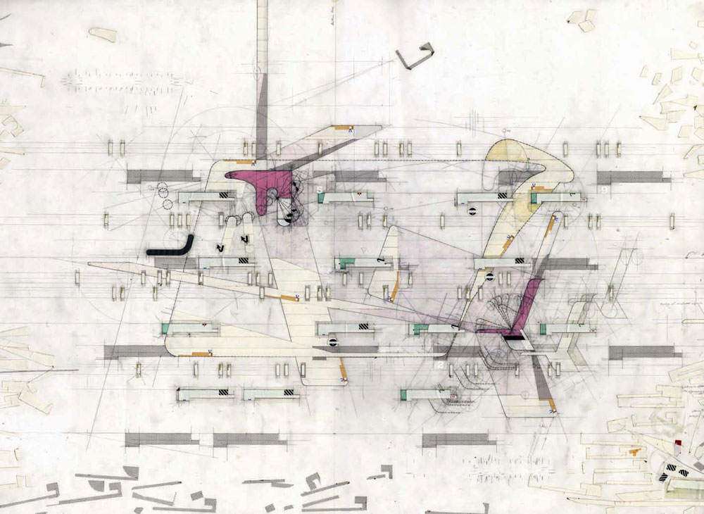
3. Perry Kulper develops pencil drawings with a similar refinement to Parry, using line weights of different kinds, and a depth that comes from working on both sides of the Mylar. In this drawing, his line technique is extended to become a more tonal field. The rendering has a flat, graphic quality that contrasts with a more ambiguous reading of overlapping spaces that move across the page. Around the middle of the image the density of the tone increases to establish a space comprised of primary and secondary layers. These are distinguished using different tones. In the background is a light crimson-madder that reads almost like a shadow. In the foreground are more specifically defined shapes, rendered in Naples yellow, and between the two floats a rhythm of gray zones, like elements of structure, made from transfer adhesive tone and occasionally highlighted in white. Finally two crimson-pink elements grow out of the lower shadows and appear to generate an array of other lines and movements. Kulper uses a combination of tonal render and differential line weights to initiate a wonderfully alive spatial dynamic across the page. Relative values of color and light open and close shapes and movements, like collages of fragments of plan and section, to form a composite relief.

4
4. Watercolor, though often associated with smaller observational or illustrative renders, is among the most expressive of techniques and applicable to drawings of all scales. In a watercolor the translucent layers allow the luminosity of the page itself to emerge; light travels through the layers of colored glazes, is reflected off the page and animates the image. The vibrancy of a watercolor comes from this play of incidental and reflected light within the microscopic depths of its surface. Like ink, watercolor is a challenging technique and depends on a precise control of surface and brush-held water. Here, a rapid sketch by the architects Moore Ruble Yudell represents a plan arrangement. Like most watercolors, the drawing is first mapped out in soft pencil and then liberally colored, using water in such a way as to encourage the colors to run into each other. Deliberately leaving the paper surface wet in this way gives the impression of both pencil and color coming together to represent this conceptual arrangement.

5
5. This aerial perspective of the Center for Music, Art, and Design, University of Manitoba, Canada, by Patkau Architects is characterized by tonal restraint. The sense of depth in this drawing is in part created by the perspective structure, in part by the selective use of color and detail in the foreground and then the gradual shift to an out-of-focus image in the background. The understated rendering gives the drawing impact; line and monochromatic drawings can be as powerful as a full-color photographic render. What is important is that rendering is perceived as a creative and integral component of the process of reflective design thinking, not a simple mechanical application of a software product or technique. Here the level of rendering is particularly well judged, bringing out simple form, façade detail, and the broad relationship of the building to the landscape and the overall topography of the city.

6
6. Lindakirkja, Kópavogur, Iceland, Studio Granda architects. This external render of the church illustrates the architects’ intention that in the long, dark winter the perception of the building is inverted, as light from within dissolves the mass of the walls.

7
7. Delugan Meissl’s perspective is interesting in this sense. The drawing is constructed out of a line drawing of an interior. The building has a specific relationship to the hillside and surrounding landscape and this is effectively read in the drawing as it focuses on a montage section of the landscape, collaged in Photoshop as a layer through the glazed wall.

8
8. Lindakirkja, Studio Granda architects. Internal render showing how the mass of the external shell is evaporated by the light filtering through the vertical slots that make up its walls. Both internal and external renders of this building are effective in their balance between realistic and abstract images.