
This section gives an overview of the range of drawing tools available to the architect, with an emphasis on the representational techniques that may inspire students and professionals alike. The approach taken here is to assume that the computer is only one tool among many others. It explores traditional techniques as well as in-principle guides to CAD software in order to recover the breadth of expression still available to the architect. This is bound not to be exhaustive: it is intended only to cover some key practical tools that can be augmented with reference to other material, printed or online.
In dealing with digital media, the emphasis is to outline principles and approaches to working with certain types of processes and software types. The guides described here are meant to complement, rather than replace, online tuition and manuals. The most fruitful way to learn technique, however, is through practical exploration, and this section is intended to inspire a creative discovery of architectural drawing through the practice of drawing itself.
The text is prefaced with comments on drawing surface that affect all drawing techniques. This is followed by an exploration of line in drawings, the most elemental but individual of a drawing’s components. When a drawing is developed a little further, the lines may begin to describe form in terms of light and shadow—and eventually render. The second section, render, looks at both manual and digital rendering techniques. Finally, a section on mixed media explores the creative use of combining the two, focusing on techniques that use a variety of materials or processes to create an image.
The characteristics of the drawing surface, its texture, surface durability, and color, are all important elements in the visual qualities of a drawing. This may be true for both manual and digital drawings, depending on output devices. On the whole, manual drawings can take more advantage of different kinds of surface: luminosity of the surface is, for instance, particularly important with techniques such as watercolor, where thin, translucent, colored glazes allow light to reflect off the paper or gesso surface.
Typically, architects will work on, and certainly print out their work on, paper. Papers are differentiated first according to the texture and density of their surface. The smoother of these have a surface created by the application of pressured, heated steel surfaces "hot-pressed" (HP). "Not" papers (meaning not "hot pressed," but rather cold pressed—or "CP") tend to have a coarser (medium or rough) texture.
Both HP and CP papers are also distinguished by weight. As a general rule CP (Not) surfaces are sympathetic to washes and larger-scale drawings whereas HP surfaces are good for line drawings. Coating either kind of paper with acrylic gesso can make the paper more suitable for other media. Standard "tracing" paper is best avoided in favor of the translucent layout papers now available. Mylar is more robust and picks up less dirt. It takes pencil or colored pencil particularly well, and interesting layers can be built into the film by drawing on both sides.
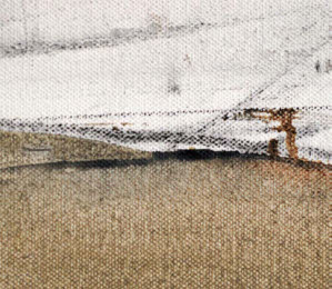
Landscape Study, detail, using charcoal, pigment, and white spirit on canvas.