
STEP BY STEP WATERCOLOR INTERIOR SKETCH
The key to a successful watercolor is retaining the luminosity of the paper. Working from the light of the surface, watercolor involves a process of adding translucent washes, working from light to shadow, to create layered colors and depths. In this way the light is always retained in the image. More than anything else, watercolor requires the ability to control the water content in the brush and on the page at every stage.
The following colors are useful for architectural drawings:
• Oxide of Chromium, Cobalt Green, Winsor Green (Yellow Shade), New Gamboge (Gomme Gutte), Yellow Ocher, Naples Yellow, Gold Ocher
• Light Red (Rouge Anglais), Burnt Sienna, Raw Umber (natural), Sepia, Caput Mortuum Violet, Van Dyke Brown,
• Permanent Alizarin Crimson, Cadmium Scarlet, Madder Lake Deep
• Prussian Blue, Delft Blue, Ivory Black, Payne’s Gray
Although not strictly necessary, white (or a white gouache for its opacity) is often used to add highlights when finishing a drawing and where the paper has been obscured.
Watercolor has traditionally been the rendering medium for final illustrative drawings. However, it also lends itself to exploratory design, and here are three exploratory sketches using watercolor.
This sequence of three images illustrates the process of making a quick sketch interior study.

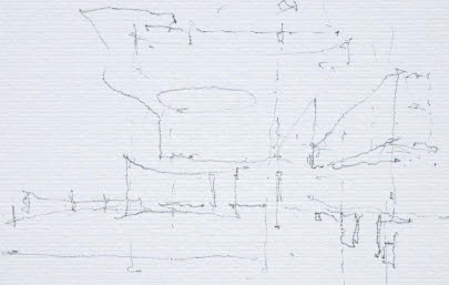
1
First a pencil study roughly maps out what is known about the interior in terms of scale and primary openings.
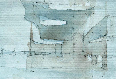
2
The image is painted over liberally with a light glaze of Raw Umber and Sepia.

3
Detail and reflections are added in Photoshop.
TIP LAYERING COLOR
Work colors in layers, from lights to darks or vice versa, depending on the technique you are using and the transparency of the medium.