Setting the Stage
You might spend a lot of time preparing for a presentation, but when you arrive to deliver, all your difficulties may just be starting. It seems the only things that go according to plan are the problems.
Many things can happen to make the audience uncomfortable, distracted, and even disinterested. Many of these things can be dealt with in advance. Of course, experience is the best teacher. Hundreds of presentations have taught me that well-thought-out logistics of an event (planning and coordinating) make a world of difference for everyone involved, especially me.
The bottom line is that you are ultimately responsible for your presentation and the conditions of the event for the audience. If the group expects coffee and there is no coffee, it is your fault. It's certainly not the audience's fault. They did their job; they showed up. The rest of the event is in your hands. Even if you delegate tasks to others, the ultimate responsibility is still yours.
If you plan ahead, you can set the stage for a great event by paying attention to the logistics covered in the following sections.
Using Risers
If you've already dressed the part, then it makes sense that everyone be able to see as much of your outfit as possible. If you use the Hollywood principle of “more face, more body, and more screen” when planning the room layout, you'll realize a good starting point is to consider risers or stage platforms. I'll use the terms interchangeably, even though a riser is typically lower than a platform.
Remember that ballrooms are designed for dinner and for dancing, not for discussion. The plan to make such a space “presentable” must be well thought out. Line-of-sight is critical: If the audience can't see you or your support information, they can't grasp the entire message.
When you stand on the same level as the chairs, most people see only the top third of your body. In larger settings, always look for the opportunity to use platforms to raise yourself one or two feet from the floor. Platforms give those sitting in the back a chance to see more of you. It is more difficult to communicate when less of your body is visible. When you are on the same level as the audience, I suggest that you at least keep your wrists higher than your elbows when gesturing, so that everyone has a better chance to see those gestures.
If given the chance to place yourself at a higher level than the floor, take it. The audience will get to see more of you and your physical expression of the message. Stage platforms or risers can give you that little lift you need to be seen.
Risers can range from as little as 6 inches high to large platforms that adjust from 18 to 24 inches. You can even use a fixed stage, if available, which is usually 36 inches from the floor. In some corporate auditoriums, the seating is fixed as well, and the rows are sometimes built up on an incline, similar to a playhouse or movie theater.
You won't be able to make changes to fixed structures or stationary seating, but in most hotel situations you can request platforms. Platforms are usually six feet by eight feet and can be rolled into the space and locked together for stability. In some cases, the platforms are four feet by eight feet. In addition, most platforms have extension supports that can change the height from 18 inches to 24 inches.
For audiences of about 50 to 100 people, 18 inches should be the minimum. For more than 100 people, use the 24-inch height setting for maximum visibility. Of course, if the best you can get are 12-inch risers, take them. Any opportunity for the audience to see you better is worth it.
Most platforms are covered with material such as carpeting to dull the hollow sound from your footsteps when you move. If the staging is not carpeted, you'll have to place less of your weight on your heels as you move or simply take smaller steps to minimize any distractions.
Tip from
Check for the creaks. If possible, walk around the entire stage before the presentation and take note of any creaks or squeaking sounds you hear. If you know that part of the staging makes noise when you walk over it, you should avoid that area as much as possible. The last thing you want is a loud squeak just as you say a key phrase. Many creaks in staging happen where the platforms meet. Some heavy-duty tape can usually eliminate the problem.
Of course, when you are up on risers, avoid leaning forward when you are in the front of the triangle. For people in the front row of the audience, this can appear intimidating. It's best to keep your weight shifted back or stand straight. Depending on platform height and proximity to the first row, the angle of your face gets distorted when you get too close to the edge of the stage.
Working with Lighting and Sound
If you can choose only one thing during a presentation, it should be good lighting, followed closely by good sound. The whole notion of a visual presenter revolves around being seen and heard. When an audience watches your presentation, they are getting a lot from your physical delivery, and a tremendous amount of emphasis is given to your facial expressions, including your voice. Bad lighting masks your expressions, and poor acoustics makes the message difficult to hear.
Lighting
Good lighting is the key to a good presentation. The audience should see as much of the presenter's face as possible. The goal is to create an unequal distribution of light, with most of the light on the presenter, some light over the audience for note-taking, and no light on the screen (other than from the projected image, of course).
You need only two stage lights to cross-light the presenter effectively. Add a dimmer pack, and you can adjust the light level so that the presenter can still see the audience while speaking.
I recommend using two Leiko lights on trees. A Leiko light is a stage light of 500 to 750 watts (or more) and has four adjustable shutters for directing (cropping) the light into a specific area without spilling onto another area, specifically the screen.
The light is hung from a big metal pole that sits in a round heavy base, with a smaller metal pole across the top that holds one to four lights. When you use stage lights, it's best when the ceiling height is 15 feet or higher and free from obstructions such as low-hanging chandeliers. The lower the ceiling, the lower the lights hang from the tree. Low-hanging lights usually spill into the first few rows of the audience, and you end up with shadows of people in your triangle. You don't want silhouettes all over your body as you move around, which happens when the angle of the light is too low. Higher ceilings allow the light to cast down on you and not spill onto the audience. Use the shutters to crop the light from the bottom if the angles are too low.
Tip from
In the case of low ceilings, position the light trees closer to the riser on opposite sides of the room and direct the light just a little higher (using a little bounce light from the ceiling). Be sure to keep all light from spilling onto the screen. Depending on the angle, this will be more difficult for the light positioned on the side of the room where the presenter stands. In addition, you may need to arrange a few seats differently so no one's view is blocked by light poles.
A dimmer pack can be a small switch with a round knob, or it can be a complete lighting board with moving levers to reduce the intensity of the lights.
If you are not used to lighting and you stand on a stage with even one light at full intensity, you'll be seeing orange spots for about a week! If you are working with stage lights, make sure you can handle the bright light without excessive blinking or squinting. That's why a dimmer pack is important. Typically, you'll drop the level to about 60% or lower, depending on how much of the audience you need to see. The brighter the lights, the less chance of your seeing a hand raised for questions.
Tip from
One way to test how bright the lights should be is to bring them up until you see a glare off your cheeks in the lower peripheral of your eyes. The point at which your skin reflects the light into the bottoms of your eyes is the maximum brightness setting.
Two lights are needed to provide cross-lighting. Just a single light from one side creates shadows on your face on the opposite side. Cross-lighting allows light to reach you from each direction and eliminates any shadows, regardless of whether you stand in the rest or power position.
You might think it costs a lot of money to have lighting set up this way, but we're talking about only $250 for everything. Obviously, that's an average price and may be higher, but it's worth checking into when planning the event.
In smaller venues such as a conference room, incandescent lighting works best. These are recessed lights that usually have a dimmer control. Avoid fluorescent lights whenever possible because they are the least flattering and least controlled, and they cast an equal amount of light around the room. When the light is equal, the audience could be distracted by wall hangings, furniture pieces, and worst of all, a clock. By creating an unequal distribution of light, you keep the audience's eyes focused on you and minimize other distractions in the room.
Sound
Sound is especially important for groups of 50 or more. A wireless lavaliere microphone (one that clips to the tie or blouse) is always preferred to allow you the most mobility. The microphone, or mic as it is commonly called (pronounced “mike”), should always be clipped in the center—not on the lapel—because most lavaliere microphones pick up sound from only one direction to eliminate background noise. If the microphone is on your lapel, you'll be less audible when you turn your head away.
There are a couple ways to select a microphone. The environment makes a difference. A directional mic is best when you don't want anything but the voice from one direction to be heard. Typically, this is what you will use for presenting. The microphones found on lecterns tend to be omnidirectional, which means they pick up nearby sounds, including your voice, in all directions. That's why you may hear pages turning or thumping when your hand hits the lectern as you speak into the mic.
Tip from
If you are picking up sound from vibration while at a lectern, try taping another microphone to the existing microphone on the lectern. Shut the lectern mic off and use the other microphone instead. Any vibration caused by your hands bumping the sides of the lectern will be muffled or completely eliminated.
Mics also fall into one of two basic types: dynamic and condenser. A dynamic mic is durable and usually of the handheld or lectern type. It is very versatile and handles almost any type sound. It doesn't require batteries because it is directly connected to some audio power source.
A condenser mic is smaller and more sophisticated, and is usually found on a wireless lavaliere. This type is best for picking up the richer tones in the voice but are more breakable, especially where the cable meets the mic. It needs a power supply, usually batteries.
Tip from
If you plan to use a wireless mic for a full-day event, change the battery at lunchtime to ensure quality sound for the rest of the day.
The key to any microphone setup is to make sure the mic is far enough away from your mouth so there is no distortion. For the lavaliere microphone, keep it clipped one hand's width below your neck. Put your thumb at the base of your neck and lay your hand flat so that it rests on the top of your chest. Right past your hand, below your bottom knuckle, is where to clip the mic.
Finally, because the transmitter clips to your belt, place it on your left side, more toward your back, away from your hip bone. It will have less of a tendency to fall off. If you place it on your right side, a gesture you make with your left hand toward the screen is higher and usually tilts your body down to your right. This can lift the transmitter off your right side and possibly make it fall off.
A belt helps, but for some women's form-fitting suits, clipping the transmitter on the side might create a slight bulge through the jacket. You can just as easily clip the transmitter behind you, near your backbone. If your suit jacket is less restrictive, you can even place the transmitter in the inside or outside left pocket, depending on where it is least distracting. If you know you are going to be wearing a mic and transmitter, wear an outfit that will accommodate this equipment with the least problem.
Choosing a Display Screen
You have two considerations regarding the display screen, and both involve visibility issues. One is the physical characteristics of the screen, and the other is the placement of the display.
Screen Types
The most versatile displays are those that allow the best viewing from all angles. For projection screens, I recommend a flat, non-glare, matte-white screen. The image will be just as bright from the sides as from the center. Conversely, glass-beaded screens tend to be very bright when viewed from the center but gradually become dimmer when viewed from wider angles.
Rear-screen projection will be less bright than front-screen, but it is viewable from the same angles. This is good for situations in which people may be crossing in front of the screen, as in an awards ceremony. As the presenter, you should never cross in front of the screen, whether the image is projected from behind or the front.
In addition, the screen should be keystone-correcting. An image “keystones” when the projector is positioned lower than the screen. The greater the angle, the more the visual appears like the letter “V,” wider at the top and narrower at the bottom. Usually, a tripod screen has an extension bar at the top. When the bar is extended, the screen is able to hook onto the bar at any of several tabs or notches, depending on how far forward you want the screen to lean. The more you tilt the screen toward the projector, the more the image becomes square (less like a V).
Some presentations use a monitor or TV. A monitor takes computer input directly, and a TV needs to change the computer signal using a device known as a scan converter. Usually, the more you pay for these converters, the closer the image looks to the original.
Tip from
Typically, converters increase the size of the computer's image, and the edges of your visual will be cut off. If you plan to present on a TV using a converter, check your images in PowerPoint's Slide Show view. Then, place your thumb up to the first knuckle on each side of any visual where you think information is close to the edge. The headings and the right side are the most likely problem areas. Anything under your thumb may be missing when the image is sent through the scan converter. If you pretend you have this border or safety zone when creating the visual, you can be sure it will be seen through nearly any scan converter.
A monitor or TV has a light source from within, and therefore the lighting in the room can be quite bright, and the image will still be visible. But the size of these displays is usually limited to about a 35-inch diagonal or less, which limits the number of people able to view the presentation. In addition, monitors are usually set in a wall or mounted in some other fixed position, which makes connecting another piece of equipment pretty difficult. Go for the projection screen whenever possible.
Screen Placement
Look at where the bottom of your visual is in relation to the floor. The bottom of your visual should be higher than your shoulder as you stand on the floor; that way, people seated behind other people will probably be able to see the entire visual. To be sure, try to get the bottom of the visual at least six feet from the floor.
Check this out at the next presentation you attend. If you sit behind someone, you probably can see only the top two-thirds of the image, unless your view is clear. Usually, only the people in the front row have a full view of the screen. In a conference room, the views are usually fairly good for most people, but larger events are the ones with the most problems.
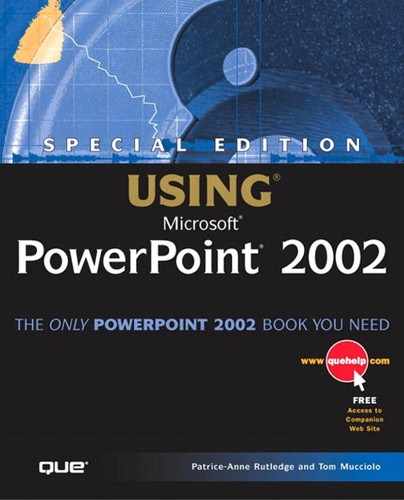
If only the top two-thirds of your image is viewable and you have any data-driven charts showing progress over time, chances are the comparison points are at the bottom. If the content is financial data and the audience can't see the changing dates along the bottom of the visual, how can they understand the chart? For example, Figures 26.1 and 26.2 compare the way a visual can appear, depending on your seat. Figure 26.1 shows a vertical bar chart viewed when sitting in the front row. It is completely visible.
Figure 26.1. A simple bar chart showing activity for selected months in the year. If you sit in the front row, you can see the entire image.
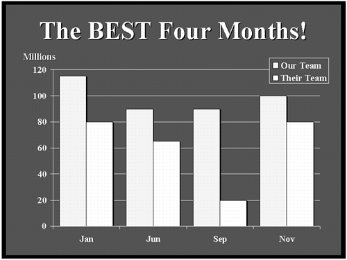
Figure 26.2. The same bar chart seen from a few rows back. When the bottom of the image is not high enough, you have to look around people to see the screen.
Figure 26.2 is the same visual, but note the way it appears from about row six. From this view, you can't see the lower third of the image, and the heading makes little sense because you don't know which are the best four months. Comparisons are more difficult when people have to make an effort to see the entire image. The harder your audience works to see the full screen, the less effective you will be.
What happens when you can't raise the screen so that the bottom is at shoulder height because the ceiling is too low? As I mentioned before, look for a ceiling 15 feet or higher. In hotels, a ballroom is typical of such height. For example, if you can get a room with a ceiling height of 16 feet, you can use a 9-foot screen and place the bottom of the screen 6 feet from the floor, leaving a foot to spare.
If your ceiling height is too low, then you can try shrinking the overall size of your image so that the bottom of it is higher. If you can get the bottom to a height where anyone can see the entire image from any seat, then the only other thing you have to check is text readability from the back row. Don't shrink the image so that it is totally unreadable from a distance. I'd rather lose some of the visual at the bottom in order for the rest of it to be readable.
Deciding on Seating Arrangements
You can use several different styles of seating, but they generally fall into one of two categories—theater or classroom. The difference is tables.
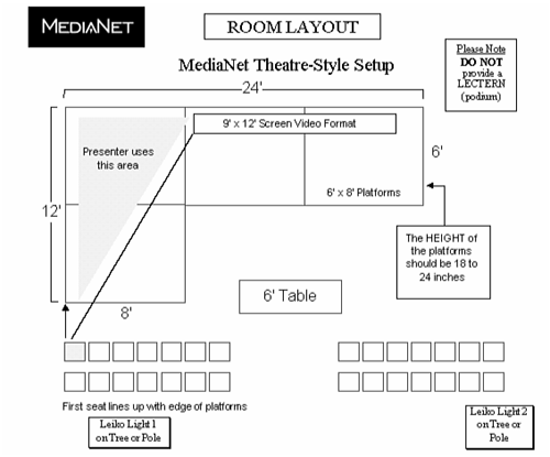
No matter how you arrange the chairs, theater style does not include tables. This style is typical for large groups, and when the seating is not fixed, flexibility improves. You will probably use theater-style seating for groups of 50 or more and for events of short duration (no more than a half-day). Figure 26.3 is MediaNet's suggested room layout for theater-style seating. This diagram, along with more complete setup advice, appears on MediaNet's Web site at http://www.medianet-ny.com/layout.htm. You can print out these layout considerations and use them to help set up your own event.
Figure 26.3. A suggested room layout with theater-style seating.
If the event is more than a half-day, you should provide tables for a classroom-style approach. Although this reduces the number of people the space can hold by about 60%, the comfort of your audience will be greatly enhanced.
Classroom-style seating can have all the tables facing straight to the front, as the theater setup would be. Classroom style can also have variations. Angling the tables toward the center of the room, called chevron seating, can help increase the interaction among audience members because people can see more of one another with the tables on an angle. Interaction is increased even more when you use a U-shape arrangement because almost everyone can see everyone else in the room. The U shape is like a big conference table without the table.
Tip from
Don't make a perfect U shape. Leave off the front-end table on the side you present from, the left side, so that you have more room for your triangle.
The smaller the group, the more likely your setting will be in a conference room or in a training room with 10-foot or lower ceilings, limited lighting options, and less area for you to move. When you are faced with a lot of limitations, arrange the seats with more people facing one another. This shifts the focus more toward discussion and enables you to play the role of both lecturer and facilitator.
Seating and Distance
The size of the text displayed should relate to the distance people are seated from the viewing screen. You learned about this earlier with the 8 to 1 rule. To recap, eight times the height of the visual (not the screen) is the maximum viewing distance to read 24-point text. If your visual is 6 feet high, people seated 48 feet away should be able to read text that is as small as 24 points in size.
Just for your reference, when you type a letter to someone, the text is usually 12-point size. The cell of a spreadsheet is about 10-point size. The pull-down menu bar on your computer screen (you know, File, Edit, View, and so forth) is about 8-point size. If you do the math, you can see that presenting software or demonstrating a Web site to an audience is going to be a lot harder than running a PowerPoint presentation. With the software program or Web page, you likely will be displaying 12-point type at best. If the point size is 12 rather than 24, the 8 to 1 rule becomes the 4 to 1 rule. This means everyone has to sit twice as close. Using a 6-foot-high image, people will have to sit no more than 24 feet from the visual (instead of 48 feet) in order to be able to read your screen. Unfortunately, when the room is set up, the hotel staff doesn't think about point size. Now you'll have to ask people in row 14 to move up to row 7.
Calculating the DistanceIf you want a simple formula for calculating how far away a person can sit and still be able to read your information, use the letters T, V, and D. T is the type size, V is the height of the visual, and D is the maximum distance to sit. The formula is (T/3)V=D. (The type size T divided by 3, then multiplied by the visual height V equals the maximum seating distance D to read that type size.) Find your smallest type on any visual you intend to display. Divide the point size by three. Multiply that by the height of your image. The result is how far away people can sit and still read your visual. Try this example. The smallest type size in your presentation is 18 points, and your visual is 4 feet high. How many feet away can a person sit and still be able to read your image easily? |
Why do type size and distance make a difference? Think about the number of people attending your presentation. When you know the maximum viewing distance, you can figure out if the room you plan to present in is big enough. In fact, the arrangement of the seats will make a difference as to how many people you can accommodate.
For example, using theater-style seating (no tables, just chairs), how can you figure out the number of people that can fit in the room? First, the typical space between rows—that is, from the back of one chair to the back of the chair in the next row—should be about three feet. This leaves enough room for people to pass by. But keep in mind that to display your image, the projection equipment will take up room in the front. The first row of chairs is usually set up a distance away from the screen, usually about 25% of the maximum seating distance from the visual. That means the audience can occupy only the space in the remaining 75% of the maximum distance.
Let's say you have a 6-foot-high image containing 24-point type, which allows a 48-foot maximum seating distance. That means the first 12 feet (one-fourth of 48) is cleared so that the projector can be set up to cast that six-foot-high image. You end up with only 36 feet of available depth for the audience. Because you need about three feet of space between rows, you now have room for about 12 rows of chairs.
Based on approximately 16 people across each row separated by a middle aisle, you have room for as many as 120 people, give or take a few.
Tip from
Set up one middle aisle and limit the width of any row on either side of the aisle to no more than 10 chairs. That way, no one needs to pass in front of more than five people to exit any row into the middle or side aisle.
Another way to set up the rows is to double the height of the visual. For example, if you have a 6-foot-high image, seat no more than 12 people per row. With a middle aisle, you'll have six chairs on each side.
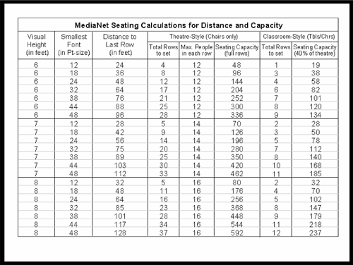
Figure 26.4 is a section taken from the table “MediaNet Seating Calculations for Distance and Capacity.” This chart is helpful in determining what changes you may have to make to the font sizes or the visual height in order to accommodate your audience. The rounded-off calculations allow for empty seats and extra rows here and there, but the general results are useful when planning your event. The entire table can be seen by visiting MediaNet's Web site at www.medianet-ny.com/seating.htm.
Figure 26.4. A section of MediaNet's seating table, showing calculations for visual heights of 6 to 10 feet and selected font sizes.
When seating people classroom-style, the presence of tables reduces the available seating space. Typically, fewer than half the number of people seated theater style can be seated classroom style because you have about five to six feet of space between the rows of chairs to allow for the table.
For example, suppose you have an 8-foot-high image. If you use 6-foot-long tables and place two rows of tables on each side of a middle aisle, you'll probably end up with six people on each side or just 12 across (as opposed to 16 across in theater-style seating). Not only do you have fewer rows, but you have fewer people per row. When using classroom seating, estimate the capacity to be no more than 40% of theater-style seating to be safe.
Visibility from a distance and the seating arrangements are important considerations when you design your support visuals. If you can't get the room set up the way you want, you may have to change the appearance of some of your visuals. Of course, the more control you have over the room conditions, the fewer changes you'll need to make to your content.
Most presenters ignore the importance of the room. They take what they get when they get there and then wonder why the event failed. As a presenter, it is your job to provide a room layout diagram to a meeting planner, a hotel A/V group, or even a major presentation service in order to get what you want.