Setting field properties is an important part of creating forms that are fillable and work properly. So far, though, we've only had a glimpse of the numerous field properties available to you for preparing fields to accept data from form recipients.
As you'll discover in this chapter, you have numerous choices available for setting appearances, options, formatting, and actions properties. As you turn through the pages in this chapter, you'll find descriptions you'll want to use as references and make some frequent returns to review items we discuss relative to properties. You'll find what you need to know to set up fields properly for optimizing your results.
Read through this chapter, and keep it bookmarked for future reference when you need a short description for assigning different form fields properties.
The process of manually adding form fields to a form is the same for all fields. Click a Form tool in the Form Editing mode, click or click+drag open a rectangle on a form, and release the mouse button, and a mini Properties window opens. Some choices vary a little, depending on the field type created in the mini Properties window, but all fields drawn on a form have limited choices that you can make for field properties in the mini Properties window. For a much larger set of choices for properties settings, you need to open the Properties window.
If you use auto field detection and Acrobat has populated a form with fields, you can open a field's Properties window using the Select Object tool and double-clicking a field object.
Yet another way to open the Properties window is to select a field with the Select Object tool in either Form Editing Mode or Viewer mode and open a context menu. From the menu commands, choose Properties at the top of the context menu.
One last method for opening Properties is to select a field in Form Editing Mode and choose Forms
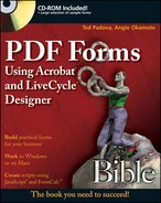
When you first open the Properties window in a new Acrobat session, the General tab shown in Figure 9.1 is selected, showing the settings identified as General properties. The General tab also opens for all field types when you open a field's Properties window.
If you work with text fields and open the Properties window and click on another tab, such as Appearance, all subsequent text fields in the current Acrobat session open the Appearance tab when you open the Text Field Properties window.
If you open a radio button's properties and click the Options tab, all subsequent radio buttons opened in the current Acrobat session open to the Options tab. Click another field, such as a digital signature field, and open the properties, and the default General tab opens. Change the view to the Signed tab and all subsequent digital signature fields open to the Signed tab.
In essence, Acrobat changes the default to the last tab for each field individually that you viewed in the current session only. If you quit Acrobat, opening any field's properties defaults to the General tab. If you change from the Appearance tab to the Calculate tab in a session for a text field, all subsequent views of the Text Field Properties window default to the Calculate view. The new defaults you establish remain in effect until you change a view in the Properties window.
There are eight different field types in Acrobat 8 and 9. Acrobat 7 and earlier had only seven different field types. The barcode field was added as a plug-in during the Acrobat 7 life cycle so Acrobat 7 users could make use of all eight different field types. In Acrobat 8 and 9, the barcode tool exists among the Form tools.
Each field type has various options in the different tabs respective to the field type's Properties window. The most tabs belong to the combo box and text fields. Only two tabs are common for all fields. The General tab and the Actions tab, where you can assign actions such as JavaScripts to the fields, are common to all fields. Other tabs hold various options specific to a given field type.
For a quick glance and resource to visit regularly, look over Table 9.1, which displays all tabs contained for all the field types. In the next section, we talk about each tab and all the options available for defining field properties.
Table 9.1 shows the different fields listed in the first column. Across the top of the table are all the individual tabs you find in the Properties windows. The tab titles give you a general idea of what to expect for options choices in the individual tabs, but a clear understanding for all the toggles and controls in each tab is required for all Acrobat forms authors.
The General properties tab (refer to Figure 9.1) is the default tab where general properties are assigned. These properties are common to all field types. The properties include:
Name: By default, Acrobat adds a name in the Name field. As a matter of practice, you should type a descriptive name in the Name text box. Don't use spaces in names, and try to use parent/child names for fields in common groups, as discussed in Chapter 7.
Tooltip: Type a name, and when the cursor is placed over the field in Preview mode or Viewer mode, the text appears as a tooltip below the Hand tool cursor.
Form Field: From the pull-down menu, you have four choices:
Visible: The default is Visible, which simply means your field is visible to form recipients.
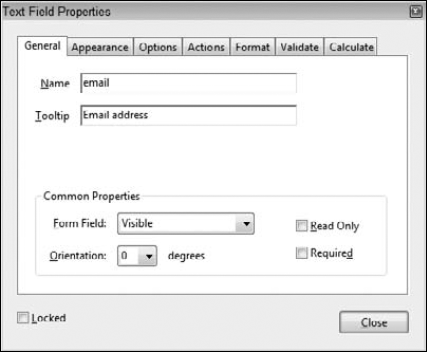
Hidden: When the field is hidden, the field object and the data contained in the field are hidden to the form recipient. You might use a hidden field to hold a calculation that's not necessary for the form recipient to use when filling in the form. You also might use a hidden field to be displayed on a particular action. For example, suppose you have a form that asks a user to make a choice in a check box for a shipping address. If the mailing address and the shipping address are the same, the form recipient clicks No, indicating there is no difference between mailing and shipping address. The hidden shipping fields remain invisible. If the form recipient clicks Yes, indicating that mailing and shipping addresses are different, the shipping addresses are made visible. In Figure 9.2, you can see an example for this kind of use for hiding fields.
Visible but doesn't print: You might have some buttons on a form used for actions such as printing a form, resetting a form, submitting a form, and so on. When you mark the fields for Visible but doesn't print, the buttons won't print, thereby reducing the clutter on the printed form.
Hidden but printable: You might have a watermark, symbol, or other type of graphic as a button face that you want printed on the output but perhaps the graphic is too distracting when visible. If you encounter a situation like this, choose Hidden but printable.
Orientation: A field and a field's contents can be rotated in 90-degree rotations. By default, fields are at a 0 (zero)-degree rotation. Select from 90, 180, and 270 to rotate fields in fixed rotations. You might use an orientation other than the default 0 (zero) setting when adding buttons fields with icon images or text labels. Perhaps you might want the button to read vertically on a form to save some space at the bottom on a tight form for a digital signature.
Read Only: When a field is marked as Read Only, the field is not editable. The form recipient is locked out of the field. A Read Only field might be something you use to show fixed price costs in a table where you don't want users changing a fixed purchase price on an order form. Another example is a value that is pre-populated from a database or with fields that show results of calculated data.
Required: If a field needs to be filled in before the data are submitted, select the Required box. Note that Required is also an option you can choose in Form Editing Mode when you drop a field on a form.
Locked: Locking a field prevents the field from being moved. You can still type data in the field or make a choice from options for other fields. This item might be used to fix fields in position as you edit a form. The Locked check box is visible in all tabs.
Close: The Close button is visible in all tabs. If you make a change in any properties tab and click the Close button, the property changes take effect. Also, if you click the features button (the X in the top-right corner for Windows, the top-left circle for Macintosh) to close the window, any changes made in the Properties also take effect. There is no way to cancel out of a field's Properties window to revert to the settings that were in place when you opened the Properties.
All the options you have in the General properties are available for all field types.
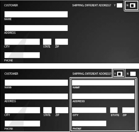
The Appearance tab relates to form field appearances. The rectangles you draw can be assigned border colors and content fills. The text added to a field box or default text you use for a field can be assigned different fonts, font sizes, and font colors. These options exist in the Appearance properties for all field types except barcode fields, because barcode fields don't have an Appearance tab. In regard to radio buttons and check box fields, you have all options available except changing the font. These fields use a special font for symbols used as check marks. Figure 9.3 shows the Appearance properties for a selected text field.
Figure 9.3. Click the Appearance tab for any field properties, and make choices for the appearance of fields and text.
The Appearance options include the following:
Border Color: The keyline created for a field is made visible with a rectangular border assigned by clicking the Border Color swatch and choosing a color.
Fill Color: The field box can be assigned a fill color. If you want the field box displayed in a color, enable this option, click the color swatch next to it, and choose a color the same way you do for the borders. When the check box is disabled, the field contents appear transparent.
Line Thickness: Select the pull-down menu, and choose from Thin, Medium, or Thick. The pull-down menu is grayed out unless you first select a Border Color.
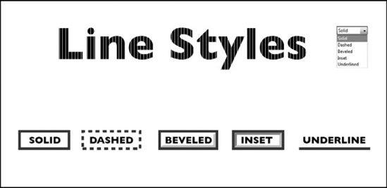
Line Style: You can choose from five style types from the pull-down menu shown in Figure 9.4. The Solid option shows the border as a keyline at the width specified in the Width setting. Dashed shows a dashed line; Beveled appears as a box with a beveled edge; Inset makes the field look recessed; and Underline eliminates the keyline and shows an underline for the text across the width of the field box.
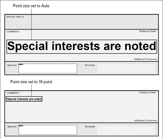
Font Size: Depending on the size of the form fields you create, you may need to choose a different point size for the text. The default is Auto, which automatically adjusts point sizes according to the height of the field box. You want to exercise some care in examining your forms after using auto field detection and creating fields manually—especially large text boxes designed for comments.
Acrobat sets the fields to an Auto Font Size by default. In some cases, the font size may look awkward on a form if the captions appear with text much smaller than the field text. You can make adjustments for the point size ranging from 2 to 300 points. If you want to use a custom point size for all fields on a form as you create them, add one field, set the Properties, and choose Use Current Properties as New Defaults. For more on setting type in the Appearance tab, see the nearby sidebar "Setting Font Attributes."
Text Color: If you identify a color for text by selecting the swatch adjacent to Text Color, the field contents supplied by the end user change to the selected color.
Font: From the pull-down menu, select a font for the field data. All the fonts installed in your system are accessible from the pull-down menu. When designing forms for screen displays, try to use sans serif fonts for better screen views.
Setting Font Attributes
When you want to determine a point size for the type in a field, click either the Preview button or the Close Form Editing button in Form Editing Mode. Type some text in a field, and then open the Text Field Properties. As you make selections in the Appearance tab for Font Size, the text is sized dynamically on the form field.
If you choose Auto for the font size and then move to the Options tab and check Multi-line for large text fields, the point size for the type is fixed to 12 points. If you remove the check mark for Multi-line in the Options tab, Auto font sizes expand to the height of the text field.
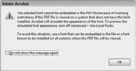
When you choose a font from the Font pull-down menu, any font that cannot be embedded in your form is prohibited from use. Acrobat opens a warning dialog box and informs you that there are licensing restrictions. Fonts that can be embedded can be seen on other computers where the operating system has no access to the original font. If you want to check your forms for embedded fonts, open the Document Properties window (Ctrl/
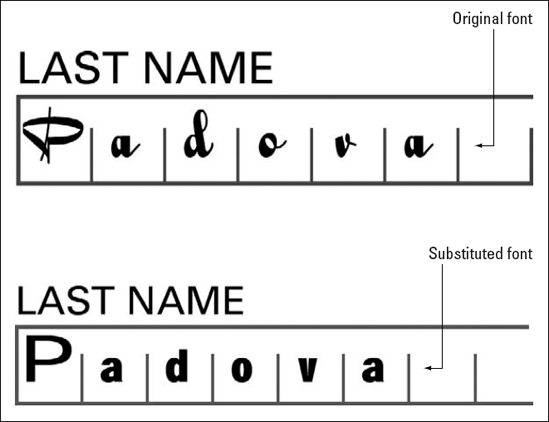
Some fonts without licensing restrictions cannot be embedded in your forms. When a font is used that cannot be embedded, Acrobat uses font substitution to find a close match. Depending on the font used, the match may not look at all like the original font.
The Appearance settings are identical for all field types except digital signature fields, radio button fields, check box fields, and barcode fields. The radio button and check box fields use fixed fonts for displaying characters in the field box. You choose what characters to use in the Options tab. When creating radio button and check box fields, you don't have a choice for Font in the Appearance properties. By default, the Adobe Pi font is used. Remember, barcode fields do not have an Appearance tab in the Properties window.
The Options tab provides selections for specific attributes according to the type of fields you add to a page. Options are available for all fields except the digital signatures field. Options tab attributes for the other seven field types include settings for text, radio buttons, combo boxes, list boxes, buttons, and barcodes.
When you use the Text Field tool to create a field and click the Options tab, the Properties window appears, as shown in Figure 9.5.
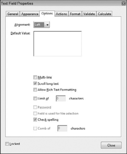
Each of the following attribute settings is optional when creating text fields:
Alignment: The Alignment pull-down menu has two functions. First, any text entered in the Default field is aligned according to the option you specify from the pull-down menu choices. Alignment choices include Left, Center, and Right. Second, regardless of whether text is used in the Default field, when the end user fills out the form, the cursor is positioned at the alignment selected from the pull-down menu choices. Therefore, if you select Center from the Alignment options, the text entered when filling out the form is centered within the field box.
Default Value: You can leave the Default Value field blank, or you can enter text that appears in the field when a form recipient views the form. The Default item has nothing to do with the name of the field. This option is used to provide helpful information when the user fills out the form data. If no text is entered in the Default field, the field appears empty. If you enter text in the Default field, the text you enter appears inside the field box and can be deleted, edited, or replaced.
One use you may have for default text is to add a country name in a field designed for specifying a country of residence. If most of the form recipients come from Botswana, you type Botswana in the Default Value text box. The form opens with the text appearing in the field as a default. When a form recipient from Zambia fills in the form, the user needs to delete the text from the field and add the new Zambia text to the field.
Multi-line: If your text field contains more than one line of text, select the Multi-line option. When you press the Enter key after entering a line of text, the cursor jumps to the second line where additional text is added to the same field. Multi-line text fields might be used, for example, as an address field to accommodate a second address line or a comment box where several lines of text would be used to add a message.
Scrolling long text: If Multi-line is selected and text entries exceed the height of the field, you may want to add scroll bars to the field. Enable the check box to permit users to scroll lines of text. If this check box is disabled, from recipients won't be able to scroll, but as text is added, automatic scrolling accommodates the amount of text typed in the field. To see text without scroll bars, use the down arrow key. As you move the cursor down the text field, the text automatically scrolls up.
Allow Rich Text Formatting: When you check this box, users can style text with bold, italic, and bold italic font styles. Enable the check box if you want users to be able to emphasize a field's contents.
Limit of [ ] characters: The box for this option provides for user character limits for a given field. If you want the user to use a two-letter abbreviation for a U.S. state (CA, TX, MA, and so on), for example, check the box and type 2 in the field box. If the user attempts to go beyond the limit, a system warning beep alerts the user that no more text can be added to the field. You might use this option for limiting the number of characters in a postal code or limit names to a given number of characters.
Password: When this option is enabled, all the text entered in the field appears as a series of asterisks when the user fills in the form. The field is not secure in the sense that you must provide a password to complete the form; it merely protects the data entry from being seen by an onlooker.
Field is used for file selection: This option permits you to specify a file path as part of the field's value. The file is submitted along with the form data.
Check spelling: Spell-checking is available for comments and form fields. When the check box is selected, the field is included in a spell-check. Disabling this check box for many fields can be helpful so the spell-checker doesn't get caught up with stopping at proper names, unique identifiers, and abbreviations that may be used in some fields.
Comb of [ ] characters: When you create a text field box and check this box, Acrobat automatically creates a text field box so characters are spaced equidistant from each other to the value you supply in the Characters text box. Comb fields are most often designed with separator lines or individual boxes in the form design. When you add comb fields to a form, one character fits in each separator box or between two separator lines.
Be certain to deselect all other check boxes. If any other check box in the list is selected, the Comb of [ ] check box is inactive. You can set the alignment of the characters by making a choice from the alignment pull-down menu, but all other check boxes need to be disabled to access the Comb of [ ] check box.
Note
Comb fields are limited to single characters. If you need to create comb fields where two characters are contained in each subdivision, you need to create separate field boxes for each pair of characters.
Check boxes and radio buttons have similar Options choices. When you select either field type and click the Options tab, the settings common to both field types include:
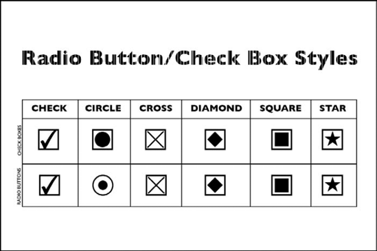
Radio Button/Check Box Style: If a radio button is selected, the title is Button Style, as shown in Figure 9.6. If the field is a check box, the title is listed as Check Box Style. From the pull-down menu, you select the style you want to use for the check mark inside the radio button or check box field.
Button/Export Value: When a radio button is used, the next value you need to set is Button Value in the Options tab. When check boxes are used, the second setting in the Options tab is listed as Export Value. Both these items are essentially the same.
When creating either a check box or radio button to create mutually exclusive fields, use the same field name for all fields in a common group. To distinguish the fields from each other, add a Button Value/Export Value that differs in each field box. You can use export values such as Yes and No or other text, or number values such as 1, 2, 3, 4, and so on.
The creation of radio buttons and check boxes on Acrobat forms has been confusing to many users, and users often inappropriately create workarounds for check boxes and radio buttons to toggle them on and off. To help eliminate confusion, notice that the Options properties in Figure 9.6 include a help message informing you to name fields the same name but use different export values.
To further help PDF forms authors, radio buttons offer options in the mini Properties window for naming fields with a common group name (Radio Group Name) while adding different button values. You don't have to open the Properties window when adding radio buttons on a form to create mutually exclusive fields. If you want mutually exclusive check box fields, you need to make edits in the Options tab.
Button/Check box is checked by default: If you want a default value to be applied for either field type (for example, Yes), enter the export value and select this box to make the value the default. One distinction appears in the Options window between radio buttons and check boxes. The second check box with the circle shown in Figure 9.7 in the radio button properties is unique to radio buttons.
Buttons with the same name and value are selected in unison (applies to radio buttons only): For data export purposes, you'll want to add a different export value for each radio button and check box when designing mutually exclusive fields. If you don't need to export data to a database with unique export values for each radio button, you can add radio buttons to a page with the same export values, and by default, when a user clicks one radio button, all other radio buttons are unchecked. If you want all radio buttons to be checked when clicking one button in a group having the same name and export value, check this check box.
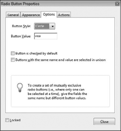
The Button/Check Box Style selection from the pull-down menu in both field types provides almost identical appearances. The single difference is that radio buttons appear with a circle when using the Circle Button Style, while check boxes appear with a rectangle, as shown in Figure 9.7.
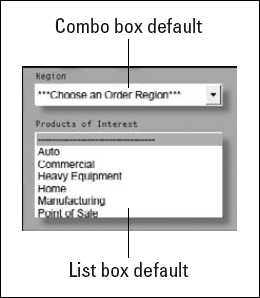
Combo boxes enable you to create form fields with a list of selections appearing in a pull-down menu. The form recipient makes a selection from the menu items. If all items are not visible, the menu contains scroll bars made visible after selecting the down-pointing arrow to open the menu. A list box is designed as a scrollable window with an elevator bar and arrows as you see in authoring application documents, as shown in Figure 9.8.
The two field types differ in several ways. First, combo boxes require less space for the form field. The combo box menu drops down from a narrow field height where the menu options are shown. List boxes require more height to make them functional to the point where at least two or three options are in view before the user attempts to scroll the window. Second, you can select only one menu option from a combo box. List boxes enable users to select multiple items. Finally, combo boxes can be designed for users to add text for a custom choice by editing any of the menu items. List boxes provide no option for users to type text in the field box, and the menu items are not editable.
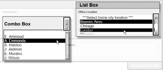
Figure 9.8. View the combo box items by clicking the down arrow. After you open the menu, the scroll bars become visible. List boxes enable users to select multiple items in the scrollable window.
The data exported with the file include the selected item from the combo boxes and all selected items for list boxes. The item choices and menu designs for the field types are created in the Options tab for the respective field type. Choices for list boxes shown in Figure 9.9, with the exception of the Multiple Selection, are identical for combo boxes.
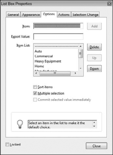
Item: Enter the name of an entry you want to appear in the scrollable list in this field.
Export Value: When the data are exported, the name you enter in this field box is the exported value. If the field is left blank, the exported value is the name used in the item description typed in the Item field. If you want different export values than the name descriptions, type a value in this field box. As an example, suppose you created a consumer satisfaction survey form. In that form, the user can choose from list items such as Very Satisfied, Satisfied, and Unsatisfied, and you've specified the export values for these items to be 1, 2, and 3, respectively. When the data are analyzed, the frequency of the three items would be tabulated and defined in a legend as 1=Very Satisfied, 2=Satisfied, and 3=Unsatisfied.
Add: After you type an Item name and Export Value, click the Add button to place the item in the Item List. After adding an item, you return to the Item field and type a new item in the text box, type a new export value in the Export Value text box, and click Add again to add the item to the list.
Item List: As you add items, the items appear in a scrollable list window. To edit a name in the list window, delete the item, type a new name in the Item text box, and then click the Add button to add the newly edited item back in the list.
Delete: If an item has been added to the list and you want to delete it, first select the item in the list and click the Delete button to remove it from the list.
Up/Down: Items are placed in the list according to the order in which they are entered. The order displayed in the list is shown in the combo box or list box when you return to the document page. If you want to reorganize items, select an item in the list and click the Up or Down button to move one level up or down, respectively. To enable the Up and Down buttons, the Sort Items option must be disabled. Note that only one item in the list can be moved up or down. Acrobat does not provide a means for selecting multiple items in the list and reordering them in unison.
Sort items: When checked, the list is alphabetically sorted in ascending order. As new items are added to the list, the new fields are dynamically sorted while the option is enabled.
Multiple selection (list box only): When a form recipient completes your form, multiple items can be selected. The form recipient uses Shift+click (Windows) for contiguous selections and Ctrl/
Commit selected value immediately: The choice made in the field box is saved immediately. If the check box is disabled, the choice is saved after the user exits the field by tabbing out or clicking the mouse cursor on another field or outside the field.
With the exception of the multiple selection item, the preceding options also are available for combo boxes, as shown in Figure 9.10. In addition to the List Box options, combo boxes offer two more items:
Allow user to enter custom text: The items listed in the Options tab are fixed in the combo box on the Acrobat form by default. If this check box is enabled, the user can create a custom value. Acrobat locks out some items from being edited.
Check spelling: Spell-checking is performed when a user types a custom value. As text is typed, the spelling is checked. Found spelling errors are underlined in red text as the user types data into the field.

Figure 9.10. The Options tab for combo boxes also includes choices for Allow user to enter custom text and for Check spelling.
Setting Combo Box and List Box Defaults
When you create combo boxes and list boxes, the item selected in the Item list is the default choice that appears on your form. If you select one of the options in the list and exit the respective field properties, the selected item becomes the default. A form recipient may pass by this field, and the default choice will be exported when you export the data or it will appear as a choice a form recipient made when viewing the PDF document.
For a better solution, add an item to a list by typing a series of spaces created with the spacebar, a series of asterisks (*) or other character, or a description such as ***Please Choose Your Favorite Ice Cream Flavor***. You can sort your list alphabetically and then uncheck the Sort items check box. Your list still remains sorted. Next, click the item you want to use as a default and click the Up button in the Options tab to move the item to the top of the list. Select this item before closing the Properties window, and your selected item becomes the new default.
Buttons differ from all other fields when it comes to appearance. You can create and use custom icons for button displays from PDF documents or file types compatible with Convert to PDF from File. Rather than entering data or toggling a data field, buttons typically execute an action. You might use a button to clear a form, export data, import data from a data file, or use buttons as navigation links. When you add a button to a page, the Options tab attributes change to those shown in Figure 9.11.
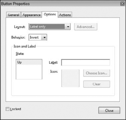
Figure 9.11. The Options tab for the Button field properties includes options for button face displays and several different mouse behaviors.
When you create a button, you make choices from the Options tab for the highlight view of the button, the behavior of the mouse cursor, and the text and icon views. The Options attributes for buttons are as follows:
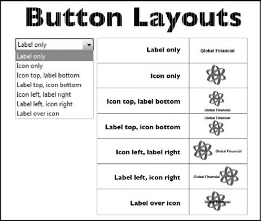
Layout: Several views are available for displaying a button with or without a label, which you add in the Label field described later in this list. The choices from the pull-down menu for Layout provide choices for displaying a button icon with text appearing at the top, bottom, left, or right side of the icon, or over the icon. Figure 9.12 shows the different Layout options you can set in the Options tab of the Button Field Properties window.
Behavior: The Behavior options affect the appearance of the button when the button is clicked. The None option specifies no highlight when the button is clicked. Invert momentarily inverts the colors of the button when clicked. Outline displays a keyline border around the button, and Push makes the button appear to move in on Mouse Down and out on Mouse Up.
Icon and Label State: Three choices are available in the list when you select Push in the Behavior pull-down menu. Up displays the highlight action when the mouse button is released. Down displays the highlight action when the mouse button is pressed. Rollover changes the icon when a second icon has been added to the rollover option. When the user moves the mouse cursor over the button without clicking, the image changes to the second icon you choose—this behavior was designed to replicate the same effects used in HTML buttons on Web pages.
Label: If you've selected a layout that includes a label, type text in the Label text box for the label you want to use. Labels are shown when one of the options for the layout includes a label view with or without the icon. You might frequently use labels such as Reset Form, Submit Form, Print Form, and so on when your design doesn't provide the text for setting buttons for these actions.
Choose Icon: When you use an icon for a button face, click Choose Icon to open the Select Icon window. In the Select Icon window, use a Browse button to open a navigation window where you locate a file for the button face. The file can be a PDF document or a file compatible with converting to PDF from within Acrobat. The size of the file can be as small as the actual icon size or as large as a letter-size page or larger. Acrobat automatically scales the image to fit within the form field rectangle drawn with the Button tool. When you select an icon, it is displayed as a thumbnail in the Select Icon dialog box.
Clear: You can eliminate a button face by clicking the Clear button. Clear eliminates the icon without affecting any text you added in the Label field box.
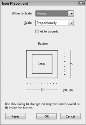
Advanced: Notice the Advanced button at the top of the Options tab. Clicking the Advanced button opens the Icon Placement dialog box where you select attributes related to scaling an icon as shown in Figure 9.13. You can choose from icon scaling for Always, Never, Icon is Too Big, Icon is Too Small to fit in the form field. The Scale option offers choices between Proportional and Non-proportional scaling. Click Fit to bounds to ensure the icon fits to the bounds of the field rectangle. Sliders provide a visual scaling reference for positioning the icon within a field rectangle.
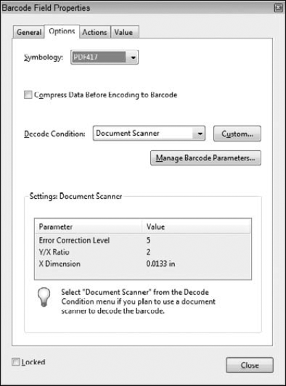
Barcode fields have unique options designed to work with barcode scanners. You have options from pull-down menus and pop-up dialog boxes opened from buttons, as shown in Figure 9.14. In order to make choices for the items in the Options tab in the Barcode Field Properties window, you need to know what parameters are used by your barcode scanner, fax server, or document scanner. Setting the options requires reviewing the documentation supplied by the hardware you use to scan barcodes.
The Actions tab enables you to set an action for any one of the eight field types; the attribute choices are identical for all fields. Sixteen action items are available from the Select Action pull-down menu in any field's Properties window. The same action items also can be added to bookmarks, links, and page actions. Click the Actions tab, and the pane changes, as shown in Figure 9.15.
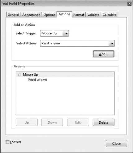
Figure 9.15. Click the Actions tab in any field Properties window, and the actions you have available are identical to all fields.
When you open the Actions tab in any field Properties window, you have these choices:
Select Trigger: From the Select Trigger pull-down menu, you make choices for different mouse behaviors that are assigned to invoke the action. From the menu options, you have choices for:
Mouse Up: When the user releases the mouse button, the action is invoked.
Mouse Down: When the user presses the mouse button, the action is invoked.
Mouse Enter: When the user moves the mouse cursor over the field, the action is invoked.
Mouse Exit: When the user moves the mouse cursor away from the field, the action is invoked.
On Focus: This specifies moving into the field boundaries through mouse movement or by tabbing to the field. As the cursor enters the field, the action is invoked.
On Blur: This specifies moving away from the field boundaries through mouse movement or by tabbing out of the field. As the cursor exits the field, the action is invoked.
The most common trigger used by forms authors is the Mouse Up trigger. This behavior is consistent with users' experiences in working with computer applications and browsing the Web. You might use behaviors like On Focus and On Blur to open a field with a help message for a form recipient to move the mouse cursor over text indicating that a help message exists.
Select Action: From the pull-down menu, you choose from one of the 16 action items in the menu. Although not likely to be part of every field type for every action, all Actions are available for all fields.
Add: You first select a Mouse Trigger, then select an action from the Select Action pull-down menu, and finally click the Add button. Clicking the Add button does two things. For the action item you select, a dialog box opens where you define attributes for the action. For example, if you select Open a file, after clicking Add a Select File to Open, a dialog box opens where you can browse your computer and select the file you want to open. Choose Reset a form from the menu, and the Reset a Form dialog box opens where you can choose what fields on your form to reset. Each action item has a corresponding dialog box where you set up the action parameters.
The second thing the Add button does is add the action item in the Actions list. After you click OK in a dialog box, the action is added to the list.
Actions: The Actions window displays all actions you assign to a field. You can nest actions to perform multiple tasks. For example, you might Show a field on a Mouse Enter trigger and hide the field on a Mouse Exit trigger. When the cursor enters a field, another field is made visible. When you move the mouse away from a field, the field that was made visible is now hidden from view. To perform these actions you would add two actions to the same field.
Up/Down: Two buttons enable you to sort the order of multiple actions. You must select an action in the Actions list and then click either the Up or Down button to move the selected action up or down in the list. All actions are performed in the ascending order you see appearing in the Actions list.
Edit: If you want to change the attributes of an action, select the action in the Actions list and click the Edit button. You would use this button frequently when writing JavaScripts while debugging a script. If you have a Run a JavaScript action in the Actions list, clicking the Edit button opens the JavaScript Editor where you make changes to the code.
Delete: Select an action in the Actions list, and click this button to delete the action.
Not all actions are items that a PDF forms author might use in constructing forms. Those action items that are more often used appear listed here first.
The Go to a page view action might be used with forms when you want other documents associated with a form. For example, you might have a product catalog and a form as separate PDF documents. The documents could be independent of each other or assembled together in a PDF Portfolio. Assuming you have a cover page followed by a contents page, you might want a button on a form to link to the contents page. To do so, you would need to use the Go to a page view action.
Note
For more information on working with PDF Portfolios, see Chapter 13.
This action executes a menu item just like you would open a top-level menu and select a command. Not all menu items are available, but you do have choices for zooming views, closing a file, toggling Full Screen view, navigating pages, printing forms, and more. One common use for this action might be choosing the File
You can set up this action on a Page Action so that when a form recipient opens a PDF document, data are imported on the form, or you could use a button, link, or bookmark to execute the same action. This action might be helpful if you have something like a purchase order that needs to be filled in. All the identifying information such as company, employee name, company address, phone, e-mail, and so on could be a data file that gets imported on the form each time you open the document or click a button. The same data could be added to other forms such as a vacation request, an employee evaluation, or a travel reimbursement form, for example.
Note
For more information on working with data, see Chapter 15.
Standard office forms that are simple and designed in a traditional manner won't make much use of this action. However, if you create more dynamic forms where multimedia is used for instructions on forms completion, displaying maps, charts, or other information, or some other animated event, you might use this action to play, stop, pause, or resume a media clip or Adobe Flash animation.
This action is similar to the Go to a page view action discussed earlier. If you want to open a file accompanying a form on the first page in the document, use the Open a file action.
You might have instructions that are updated routinely on a Web site. You can add a URL link for a form recipient to visit a Web page for obtaining the most up-to-date information on completing a form. This action might be used with very complex forms that need to be filled in such as income tax forms, real estate forms, healthcare forms, and so on.
Although you may not use this action frequently, if you decide to add some audio to a form for the purposes of helping a form recipient walk through the completion process, you can use this action to play the audio.
This is the action you're likely to use the most as a PDF forms author. JavaScript adds great opportunity for making PDF documents interactive and dynamic. When you select Run a JavaScript and click the Add button, the JavaScript Editor dialog box opens. You type JavaScript code in the dialog box, or copy and paste code from a text editor to the JavaScript Editor. Click OK to commit the JavaScript.
Note
For more information on writing JavaScripts, see Chapters 16 through 19.
You can create forms as layered documents in programs such as Adobe InDesign. You might use layers for multiple language versions of your forms, to display some graphic such as a seating chart in an auditorium for an event, or playing a Flash video on a separate layer. When the form recipient needs to change layer views, this action assigned to a button changes the layer state.
Note
For more information on using layers on forms, see Chapter 13.
The Show/hide a field action is particularly useful when you want to display help messages or show fields that are filled out based on user responses. In the latter case, you might design a form that shows all the fields required to complete a form. If a form recipient responds to a question in one way or another, you might show additional fields that were hidden when the form opened in an Acrobat viewer to amplify a response.
Not all forms require a Reset a form action. Some simple office forms may not be good candidates for resetting a form, but complex forms might make use of this action routinely. You can add a single button to clear a form of form data or set up several buttons that you design to clear data in sections. If you create forms having several pages, try to avoid clearing the entire form with a single reset button. Items such as identifying information are less likely to be cleared by a form recipient than other parts of the form. Setting up reset buttons on a complex form requires you to think through the task of when it's best to add buttons for what parts of a form that need be cleared of data.
Unless you're working primarily on in-house forms stored on a company network server, the Submit a form action is perhaps the one action you'll use more than the other actions. You use this action to e-mail a form back to you, host the form on Acrobat.com or on your own Web server. When the form is completed by a form recipient the form is sent back to you via an e-mail attachment or directly to a server.
Remaining actions you find in the Select Action pull-down menu include Go to a 3D View, Play media (Acrobat 5 compatible), Play media (Acrobat 6 and Later Compatible), and Read an article. These action types are not likely to show up in many of your forms. If you want to use media and you prepare files for legacy viewers, you might use the play actions for playing Acrobat 5 and Acrobat 6 media.
As a general rule, several action items are used frequently to moderately for PDF forms authors, while several items are infrequently to rarely used by forms designers. Table 9.2 shows a quick glance at the use of actions in terms of how often the various actions are used by most PDF forms authors today.
Table 9.2. Action Items Frequency of Use by Form Designers
Acton Item | Frequent | Moderate | Infrequent | Rare |
|---|---|---|---|---|
Execute a menu item | X | |||
X | ||||
X | ||||
Multimedia Operation (Acrobat 9 and later)[a] | X | |||
X | ||||
X | ||||
Play a sound | X | |||
Run a JavaScript | X | |||
Set layer visibility | X | |||
Show/hide a field | X | |||
Reset a form | X | |||
Submit a form | X | |||
[a] Adobe made many advances in Acrobat 9 for integrating Adobe Flash in PDFs. We expect to see forms authors increasingly more interested in including Flash video and Flash widgets in PDF forms. | ||||
The General, Appearance, and Actions tabs are available for almost all field types. Option attributes are available for all field types except digital signatures. The Format, Validate, and Calculate tab options are available only for combo box and text field types. To access the Format tab, select either of these field types. The Format options are the same for both field types.
When you click the Format tab, you'll find a pull-down menu for selecting a format category. To define a format, open the Select format category and choose from the menu choices the format you want to assign to the text field or combo box field. As each item is selected, various options pertaining to the selected category appear directly below the pull-down menu. When you select Number from the menu choices, the Number Options appear, as shown in Figure 9.16.
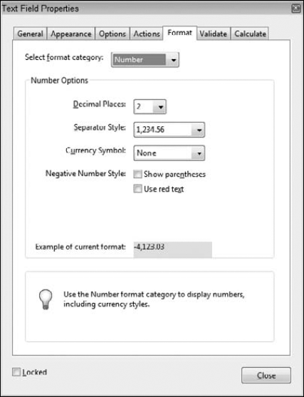
Figure 9.16. When you choose either combo box or text field as the field type, you can select data format options from the Format tab.
The Select format category menu options include:
None: No options are available when None is selected. Select this item if no formatting is needed for the field. An example of where None applies is a text field where you want text data such as name, address, and so on.
Number: When you select Number, the Number Options choices appear below the Select format category pull-down menu. The options for displaying numeric fields include defining the number of decimal places, indicating how the digits are separated (for example, by commas or by decimal points), and specifying any currency symbols. The Negative Number Style check boxes enable you to display negative numbers with parentheses and/or red text. When you design forms that use calculation formulas, you must format your number fields with a number format.
Percentage: The number of decimal places you want to display for percentages is available when you select Percentage from the pull-down menu. The options are listed for number of decimal places and the separator style.
Date: The date choices offer different selections for month, day, year, and time formats in various combinations.
Time: If you want to eliminate the date and identify only time, the Time category enables you to do so, offering choices to express time in standard and 24-hour units and a custom setting where custom formats are user-prescribed in a field box.
Special: The Special category offers formatting selections for U.S. social security numbers, Zip codes, extended Zip codes, phone numbers, and an arbitrary mask. When you select Arbitrary Mask, a field box is added where you define the mask. The acceptable values for setting up an arbitrary mask include:
A: Add A to the arbitrary mask field box, and only the alphabetical characters A–Z and a–z are acceptable for user input.
X: When you add X to the arbitrary mask field box, most printable characters from an alphanumeric character set are acceptable. ANSI values between 32–166 and 128–255 are permitted. (To learn more about what ANSI character values 32–166 and 128–255 are translated to, search the Internet for ANSI character tables. You can capture Web pages and use the tables as reference guides.)
O: The letter O accepts all alphanumeric characters (A–Z, a–z, and 0–9).
9: If you want the user to be limited to filling in numbers only, enter 9 in the Arbitrary Mask field box.
Example: As an example for an Arbitrary mask, a mask defined as A-BFM-9999 means that the form recipient can type any alphabetic character for the first character (A) and four numbers (9999). The result would be something like Z-BFM-1234. The characters BFM are part of the mask definition, and the form recipient cannot change these characters. To fill in a form designed with this mask, the form recipient would type Z1234. Typing more than one alpha character or more or less numeric characters would be rejected by Acrobat.
When a form recipient fills in an arbitrary mask field, the form recipient needs some clue as to how to type in the data. You might add such a clue on the form itself if you use an arbitrary mask. Usually these kinds of fields are added in an Official Use Only area on your form, where employees in a company might use an arbitrary mask for a client or account number. Under these circumstances, the employees are likely to know what characters needed to be typed in the arbitrary mask field(s).
Custom: Custom formatting is available using a JavaScript. To edit the JavaScript code, click the Edit button and create a custom format script. The JavaScript Editor dialog box opens where you type the code. As an example of using a custom JavaScript, assume that you want to add leading zeros to field numbers. You might create a JavaScript with the following code:
event.value = "000" + event.value;
The preceding code adds three leading zeros to all values supplied by the form recipient. If you want to add different characters as a suffix or prefix, enter the values you want within the quotation marks. To add a suffix, use this:
event.value = event.value + "000";
The Validate tab helps ensure that proper information is added on the form. If a value must be within a certain minimum and maximum range, select the radio button for validating the data within the accepted values, as shown in Figure 9.17. The field boxes are used to enter the minimum and maximum values. If the user attempts to enter a value outside the specified range, a warning dialog box opens, informing the user that the values entered on the form are unacceptable.
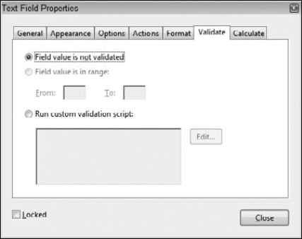
Figure 9.17. Validate is used with combo box and text field types to ensure acceptable responses from user-supplied values.
Selecting the Run custom validation script radio button and clicking the Edit button enables you to add a JavaScript. Scripts that you may want to include in this window are those for validating comparative data fields. A password, for example, may need to be validated. If the response does not meet the condition, the user is denied access to supplying information in the field.
The Calculate tab (supported in text fields and combo box fields) in the Properties window enables you to add calculation formulas. You can choose from preset calculation formulas or add a custom JavaScript for calculating fields, as shown in Figure 9.18.
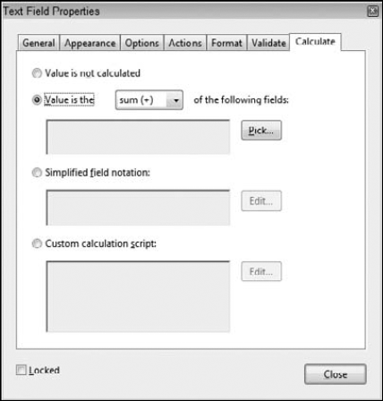
Figure 9.18. The Calculate tab offers built-in formula options for calculating fields for summing data, multiplying data, and finding the average, minimum, and maximum values for selected fields. In addition, you can add custom calculations by writing Simplified Field Notation scripts and JavaScripts.
The preset calculation formulas are limited to addition, multiplication, averaging, calculating the minimum in a range of fields, and calculating the maximum in a range of fields. For all other calculations, you need to select the Simplified Field Notation or Custom calculation script radio button and click the Edit button. In the JavaScript Editor, you write JavaScripts to perform other calculations not available from the preset formulas. Writing scripts in the JavaScript Editor requires you to know JavaScript as it is supported in Acrobat. Simplified Field Notation is written in the JavaScript editor and follows syntax similar to writing formulas in spreadsheets.
Note
Understanding JavaScript or Simplified Field Notation is essential. Even the simplest math functions, such as subtraction and division, are not available as preset formulas and require scripting to perform these calculations.
Note
For more information on calculating data, see Chapter 15. For more information on using Simplified Field Notation, see Chapter 15. For more information on JavaScript, see Chapters 16 through 19.
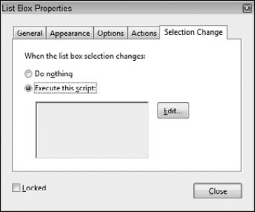
The Selection Change tab, shown in Figure 9.19, is available for list box fields only. If a list box item is selected and then a new item from the list is selected, JavaScript code can be programmed to execute an action when the change is made. As with the other dialog boxes, clicking the Edit button opens the JavaScript Editor, where you write the JavaScript code.
A variety of uses exist for the Selection Change option. You might want to create a form for consumer responses for a given product—something such as an automobile. Depending on information preceding the list box selection, some options may not be available. For example, a user specifies "four-door automobile" as one of the form choices, and then from a list, the user selects "convertible." If the manufacturer does not offer a convertible for four-door automobiles, then through use of a JavaScript in the Selection Change tab, the user is informed that this selection cannot be made based on previous information supplied in the form. The warning message could include information on alternative selections that the user could make.
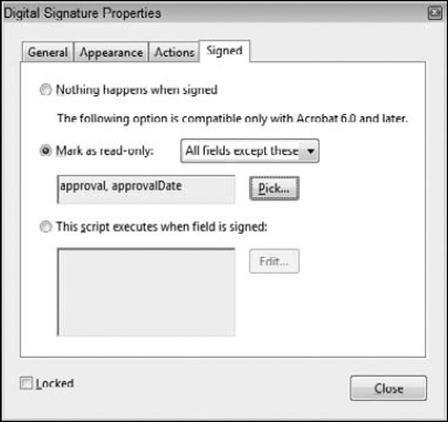
The Digital Signature tool enables you to create a field used for electronically signing a document with a digital signature. The Signed tab, shown in Figure 9.20, offers these options for digital signature behaviors:
Nothing happens when signed: As the item description suggests, the field is signed but no action takes place upon signing.
Mark as read-only: When signed, the selected fields are changed to read-only fields, locking them against further edits. You can mark all fields by selecting the radio button and choosing All fields from the pull-down menu. Choose All fields except these to isolate a few fields not marked for read-only, or select Just these fields to mark a few fields for read-only.
This script executes when the field is signed: Select the radio button, and click the Edit button to open the JavaScript Editor. Write a script in the JavaScript Editor that executes when the field is signed. An example of a JavaScript you might use with a digital signature is date-stamping a document when it is signed. You can write a JavaScript that adds a date in a text field marked as Read Only. When the form recipient signs the document, a text field is populated with the current date from the user's system clock, using a JavaScript. Because a user's system clock is not the most secure form of creating a date-stamp, you have to use a form server or a Web-based clock if you want the utmost security on sensitive forms.
Note
For more information on using servers, see Chapter 34.
The unique property settings in the barcode field are located in the Value tab. Options in this tab are available only with barcode fields, as shown in Figure 9.21. You have options for Encoding from a pull-down menu offering a choice between XML and Tab Delimited data.
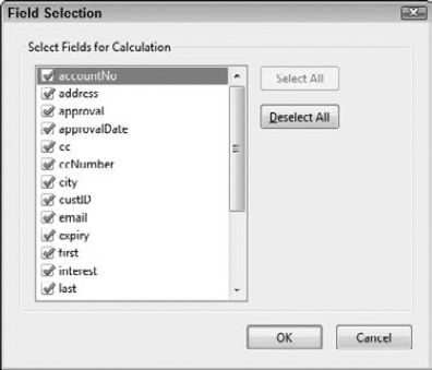
Click the Pick button, and the Field Selection dialog box opens, as shown in Figure 9.22. You use this dialog box to determine what field data are added to the barcode. Uncheck those items you don't want added, such as buttons that invoke actions, temporary calculation fields, and so on. The Include field names text box offers an option to include field names along with the data in the barcode.

An additional box appears for adding a Custom calculation script. Click the radio button, and click Edit to open the JavaScript Editor.
Note that when you design forms with barcodes, you must pre-populate a form with data. After all the field data have been added to the form, you create a barcode. If there's too much data for the barcode to form, you'll see a message in the barcode field indicating that too much data exists on your form, as shown in Figure 9.23.
You have one of two choices to make the barcode functional. You can resize the barcode and make it larger until you see a barcode in the field, or you must remove data fields in the Field Selection dialog box shown in Figure 9.22 by unchecking fields. When the barcode can be successfully drawn on the form, you'll see a barcode appear whether you have the Hand tool or the Select Object tool selected.
Many of the appearance attributes you apply in the Field Properties Appearance tab also can be applied by making selections in the Properties bar shown in Figure 9.24. The Properties bar is visible only in Viewer mode. You don't have access to the Properties bar while in Form Editing Mode.
The Properties bar offers you the following choices:
Fill Color: Click Fill Color, and the same color palette that opens in the Appearance tab appears for choosing a color fill for the selected field object.
Line Color: This choice is the same as using Border Color in the Appearance tab for a field's Properties. Click the Line Color item, and a color palette pops up for making a color choice for the field border.
Text Color: Again, a pop-up color palette opens where you can make a color choice for the text added to a field object. You might use a blue color for text added with the Label Only option for a Button Layout Style. If nothing but text appears for a button face, form recipients are more inclined to recognize blue text as a button or link.
No Line: Click this button on the Properties bar, and the choice is the same as making the No Color Choice in the Appearance tab.
Line Style: Again, the options are the same as you find in the Appearance tab for line styles of Solid, Dashed, Beveled, Inset, and Underlined.
Line Thickness: This item also matches choices in the Appearance tab for choosing Thin, Medium, or Thick lines.
Font: Choose a font from the pull-down menu.
Size: Open the pull-down menu, and choose a preset font size or type a value ranging between 2 and 300.
More: Click More, and the Properties dialog box opens.
In Chapters 5 through 7, we talked about modifying properties for single fields. You know that you have several options to return to the Properties window such as using the Select Object tool and double-clicking a field object.
You can make some changes to multiple fields by changing properties when several fields are selected and you open the Properties dialog box. If you have fields of different types and you select all fields and from a context menu you choose Properties, only the General, Appearance, and Actions tab open, as shown in Figure 9.25. In the General tab, the options available are the Locked check box, Read Only, and Required. You can select all fields, no matter what types of fields are selected, and adjust settings for these three areas.
Figure 9.25. When multiple fields are selected and you open the Properties window, the General, Appearance, and Actions tabs are accessible.
In the Appearance tab, when you select all fields on a form of varying types, you can make changes for most of the options. The one thing you cannot do is change the font if you select other fields along with radio buttons and check boxes. Because these fields are limited to using the Adobe Pi font, you cannot make font changes to these fields. If you select all fields on a form while excluding radio buttons and check boxes, you can make all settings changes in the Appearance tab.
The Actions tab is active when you select multiple fields of different types. You can globally assign actions to all fields on a form using the Actions tab.
When you have multiple fields within a common type, you have some additional choices for making some global settings choices. In addition to the options you have when selecting all fields on a form, you can make changes to common field types as follows:
Text fields: Options choices are available when multiple text fields are selected. Any and all of the options choices you have for text fields can be applied to multiple fields.
Radio buttons/check boxes: If you select both radio buttons and check boxes, the Properties options are the same as when selecting all fields on a form. If you select a group of check box fields or a group of radio button fields, the Options tab opens. In the Options tab, you can globally change the Button/Check Box Style for all selected radio buttons or check boxes. The Button Value/Export Value items are not available when selecting multiple fields.
Combo boxes/list boxes: Although the Options tab opens, you don't have any more choices to make other than when selecting all fields of varying types. No changes can be made to Options if selecting both field types or a group of common field types.
Button fields: You can change Options for multiple button fields. When selecting several buttons, the Options tab is visible where button faces, labels, and button behaviors can be globally changed for all selected buttons.
Signature fields: Your only choice for Properties changes with multiple signature fields is to select all field types of varying fields.
Barcode fields: Because barcode fields don't have an Appearance tab, opening the Properties window for multiple barcode fields shows only the General and Actions tabs. You can make changes to these settings the same as when selecting all fields of varying types.
All the preceding content in this chapter should be thought of as a reference guide to assigning properties to fields. You can glance over the content and refer to this chapter and the preceding section when you have specific issues related to a given field type and the properties adjustments you can make to them.
Assuming you have a general idea of the kinds of properties available for each field type, we're going to deviate from reference mode to learning mode and try to provide some real-world examples for making properties selections for a variety of fields.
In Chapters 5 through 7, we talked about naming fields when creating them manually. In Chapter 8, we talked about naming fields using hierarchical names in tables. We traveled through a few text field properties in earlier chapters, but we haven't yet applied any property settings for real-world conditions.
Just about every form you create in Acrobat requires addressing properties settings for some fields. If you use auto field detection, you still need to add some buttons to the file for distributing your forms, change field names in tables, format some text fields for a more polished form completion experience, or set up radio buttons and check boxes properly. In short, working in the Properties window will be a common editing task you'll perform on most forms edited in Acrobat.
In Figure 9.26, you see a form where auto field detection couldn't successfully detect form fields. The only fields detected on the two-page form were the table fields. We could use the fields Acrobat created for this form, but our work for formatting fields and setting up a calculation formula would be much greater than manually populating the table.
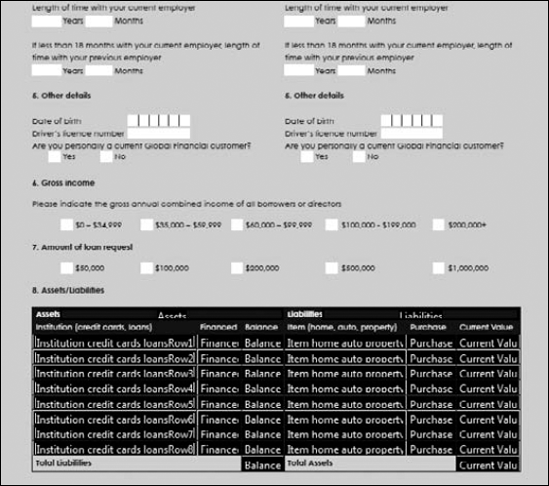
Figure 9.26. This form wasn't successfully populated with field objects when using auto field detection. The only fields on the form that were detected by Acrobat were the fields in the table.
Because field objects appear on the form, we can use the first row of fields Acrobat created, delete the fields below the first row, and format the first row's fields. After formatting the fields, we can easily populate the table using Place Multiple Fields and prepare the calculation formulas for the last two fields.
To prepare the table properly, use the following steps.
Note
To follow the steps here, use the generalApplication.pdf file found in the Chapter09 folder on the book's CD-ROM.
STEPS: Formatting Fields in a Table
Open a form in Form Editing Mode. Open the generalApplication.pdf file found in the Chapter09 folder on the book's CD-ROM, and choose Forms
Delete all fields below the first row. Drag the Select Object tool through the fields below the first row, and press the Delete (or Del) key. Two additional fields were added in the header on this form. Delete the Assets and Liabilities fields in the header.
Change the names of the fields in the row. You can rename fields using a number of different methods. Perhaps the easiest way to rename fields quickly is to rename them in the Fields panel. Double-click the first field in the Fields panel, and the field name is highlighted. Type a new name, and press Enter/Return. When you press Enter/Return, the field name is changed and you move to the next field in the Fields panel. Double-click the field name, type a new name, and then press Return. Follow the same steps to rename all fields. In our example, we renamed fields institution, financed, balance, item, purchasePrice, and currentValue, as shown in Figure 9.27.
Tip
When you click a field name in the Fields panel, the respective field on the form is highlighted. Take a quick glance at your form, and you can be certain the field you are renaming is the correct field to accept the new name.
Format the number fields. Four columns contain number fields (financed, balanced, purchasePrice, and currentValue). We need to format these fields as numbers before populating the table. Double-click the Select Object tool on the financed field to open the Text Field Properties dialog box. Click the Format tab, and choose Number from the Select format category pull-down menu to format the field as a number. From the Decimal Places pull-down menu, choose 0 for zero decimal places, as shown in Figure 9.28. Click OK, and repeat these steps for the remaining three fields (balance, purchasePrice, and currentValue).
Populate the table. After all the fields are formatted properly, it's time to populate the table. Drag through the fields, and open a context menu. From the menu options, choose Place Multiple Fields. Eight rows need to be populated. Type 8 in the Copy selected fields down text box, and click OK. If you leave the remaining items at the default values, the fields are added nicely to the cells in the table without having to use any align and distribute commands.
Save the form. Choose File
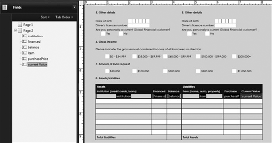
Figure 9.27. Rename fields in the Fields panel by double-clicking a name, typing a new name, and pressing Enter/Return.
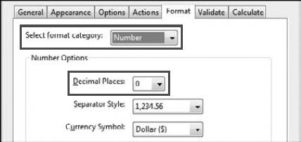
Figure 9.28. Choose Number from the Select format category and 0 (zero) from the Decimal Places pull-down menu.
Notice that after formatting fields, the duplicated fields created with the Place Multiple Fields command created new fields with the same Format properties. As a matter of rule, you'll always want to format fields before duplicating them. This workflow saves you a huge amount of time when you need to duplicate many fields on a form.
Note
You might ask "Why didn't we use the fields Acrobat created and format the number fields globally by selecting all fields requiring a number format and changing the Format properties?" In the section "Editing Multiple Fields Properties" earlier in this chapter, we stated that Format properties options are not available when selecting two or more text fields. The only way to change the format for text fields is to individually change the properties or follow the steps to edit the number format and create multiple copies of fields.
A more important reason for renaming fields and letting Acrobat create the hierarchical names for fields when populating a table is when you want to add a calculation formula. In Figure 9.29, we need four fields at the bottom of the table to calculate the totals for the respective four columns of data.
We explain much more in Chapter 14 about using calculation formulas; for a first look, follow these steps to add fields for calculations to a table.
Note
If you saved the file from the steps on formatting fields in a table earlier in this chapter, use the saved file. If you didn't save the file, use the generalApplication.pdf file found in the Chapter09 folder on the book's CD-ROM. You'll need to return to the "Formatting Fields in a Table" steps to follow the steps for adding calculation formulas.
STEPS: Adding Calculations Formulas
Duplicate the last fields in the four columns you want to calculate. The easiest way to duplicate the fields is to press Ctrl/
Rename the fields. You can use the Fields panel for changing the field names, but the panel is getting cluttered with lots of fields. An easier way to change the field names is to select a field with the Select Object tool and open a context menu. From the menu options, choose Rename Field. The mini Properties window opens, as shown in Figure 9.29. Type a new name for the field, and press Enter. You can quickly rename the four duplicated fields using this method. In our example, we named the four fields financedTotal, balanceTotal, purchasePriceTotal, and currentValueTotal.
Add a calculation formula. Double-click a field, and click the Calculate tab in the Text Field Properties window. Click the radio button beside Value is the. By default, sum (+) is selected. Leave the setting at the default to sum a column of data, as shown in Figure 9.31.
Pick fields to add to the formula. Click the Pick button, and the Field Selection dialog box opens. Scroll the dialog box, and check the parent name for the fields in the column you want to sum. In our example, we checked the financed field in the list, as shown in Figure 9.30.
Note that because Acrobat created fields in the table with hierarchical names, the field names in our first column where we need a calculation are named financed.0, financed.1, financed.2, and so on. When we want to calculate the sum for this column, we choose financed in the Field Selection dialog box. All fields using the same parent name are added to the formula.
Click OK in the Field Selection dialog box. When you click OK, you return to the Calculate tab in the Text Field Properties dialog box. Below the formula used for the calculation, you'll see the field(s) used as part of the formula, as shown in Figure 9.31.
Follow these steps to add the same formula using different parent names respective to the columns you want to calculate.
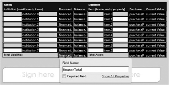
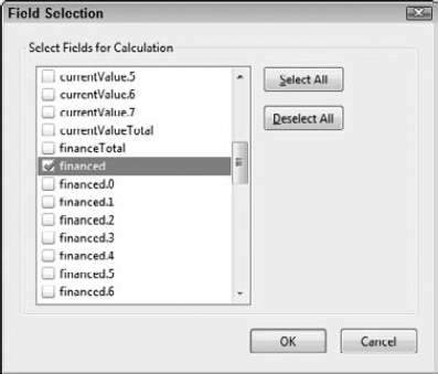
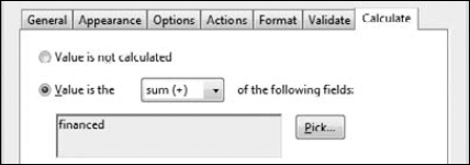
Figure 9.31. When you return to the Calculate tab in the Text Field Properties window, the fields used in the formula are shown below the formula selection.
Hopefully, the steps used to perform a calculation help you understand the importance for naming fields in hierarchical order when calculations need to be made. If Acrobat didn't create a name hierarchy in the table, we would need to individually choose each field for the calculation. If your field names are dissimilar, you'd have to scroll through the Field Selection dialog box and try to locate all fields in a column or row while running the risk of missing critical fields that need to be part of the formula.
You find comb fields on many government and education forms. A comb field is typically designed with separator lines to mark areas on a form design where individual characters need to fall in place. We've seen lots of forms created with what should be comb fields created in the most bizarre manners. You can find forms on the Web where forms authors have created individual fields for each character requiring the form recipient to tab to each field individually. You also can find forms where the form designs have the separator lines but the fields are not formatted properly. When the form recipient types data, the data appear over the lines, not equally spaced in the comb fields.
Fortunately, Acrobat provides a solution for easily creating comb fields. To see how easy setting up comb fields is, follow these steps.
Note
Use the generalApplication.pdf file found in the Chapter09 folder on the book's CD-ROM to follow these steps.
STEPS: Formatting Comb Fields
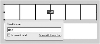
Open a form that contains at least one comb field. On page 2 in the generalApplication.pdf file found in the Chapter09 folder on the book's CD-ROM are two fields designed for comb fields. Zoom in to the Date of Birth area in the "5. Other details category" on the form.
Open the form in Form Editing Mode. Choose Forms
Add a text field. Click the Text Field tool, and click+drag to shape the field precisely in the area on the design where the field needs to be added.
Type a name for the field. As shown in Figure 9.32, we used dob for the field name.
Open the Text Field Properties window. Click Properties after typing a field name in the mini Properties window to open the Text Field Properties.
Set the comb field attributes. Click the Options tab, and remove all check marks below the Default Value text box. Check the Comb of [ ] check box, and type 6 for the number of characters, as shown in Figure 9.33. Note that the Comb of [ ] check box is not active until you remove all the check marks in the Options tab. Adding 6 to the characters text box means we'll use a total of six characters for the comb field.
Add text to the field. Click Preview, and type a birth date using only six characters. The comb field appears, as shown in Figure 9.34, when text is added to the field.
![Remove all check marks, and type 6 in the Comb of [ ] characters text box.](http://imgdetail.ebookreading.net/design/5/9780470400173/9780470400173__pdf-forms-using__9780470400173__figs__0933.png)
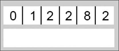
Figure 9.34. When comb fields are set up properly, the data appear evenly spaced within the hash marks.
Note
Use the file applicationDetail.pdf in the Chapter09 folder on the book's CD-ROM for these steps.
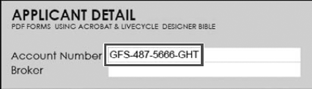
STEPS: Formatting an Arbitrary Mask
Open a file where you want an arbitrary mask field on your form. We used the applicationDetails.pdf document in the Chapter09 folder on the book's CD-ROM. At the top of this form is an account number. We'll use this area to create a field with an arbitrary mask.
Open the form in Form Editing Mode. When you choose Forms
Create a text field. Click the Text Field tool, and draw a rectangle around the design for the Account Number field. When you release the mouse button, you can type a field name and open the Text Field Properties window.
Name the field. Type a name for the field, and click Properties to open the Text Field Properties window.
Open the Format tab, and choose Special from the Select format category pull-down menu.
Format an arbitrary mask. In the Format tab, click Arbitrary Mask in the Special Options list, as shown in Figure 9.35. Type the mask in the text box below the Special Options list. In our example, we use GFS-487-9999-AAA. The form recipient would need to type four numeric characters (9 is the wildcard where the form recipient can type any numeric character in the field) and three alpha characters (A is the wildcard for using alpha characters). The first part of the mask is fixed (GFS-487) and cannot be edited by the form recipient. Click Close in the Format Properties tab, and you return to the Document pane.
Test the field. Click Preview in Form Editing Mode, and type four number characters and three alpha characters to fill in the field. Our example appears as shown in Figure 9.36 after we typed 5666GHT.
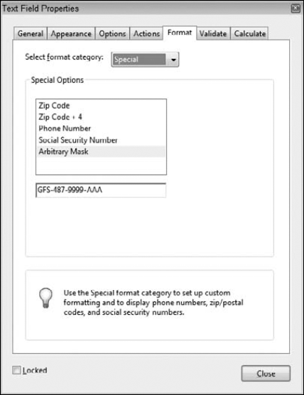
Figure 9.35. Choose Special from the Select format category pull-down menu, click Arbitrary Mask, and type a mask in the text box.
You have a number of other options for setting properties for text fields, We touched on a few in this chapter. When you get to later chapters dealing with calculations and JavaScripts, you'll find many more formatting options in a Text Fields Properties' Format, Validate, and Calculate tabs.
Many of the options for formatting dates, times, social security numbers, phone numbers, percentages, and zip codes should be easy to handle after stepping through some exercises in this chapter.
We covered quite a bit on radio buttons and check boxes in this chapter in the section "Understanding Field Properties Options." If you read through that section, you should have a good idea of how mutually exclusive fields are created.
To help clarify creating mutually exclusive check box fields and solidify your understanding for how they are created, follow these steps.
Note
To follow these steps, use the applicationDetail.pdf file in the Chapter09 folder on the book's CD-ROM.
STEPS: Creating Mutually Exclusive Check Box Fields
Open the file applicationDetail.pdf from the Chapter09 folder on the book's CD-ROM. This file illustrates a good example for using mutually exclusive check box fields. If you look at the Title row of fields, you find choices for Mr, Mrs, Miss, Ms, and Other.
We could use radio buttons, but we would have to go through some extra steps to clear the radio button fields if a form recipient decided to use Other after clicking another radio button. Remember: After you click a radio button, you cannot remove the check mark unless you clear the form.
Suppose a form recipient clicked Ms and then decided that a better choice is to type Dr in the Other field. We would have to prevent a potential error by adding a JavaScript or field action to the Other field to clear all radio buttons in the group if a form recipient types data in the Other field.
By using check boxes, we can leave it up to the form recipient to unmark a check box if the user decides to make a choice for the Other field after clicking a check box. Unlike radio buttons, check boxes can be toggled on and off by the form recipient.
Add a check box field to the form. Open the form in Form Editing Mode, and click the Check Box tool. Click and drag the cursor to shape the rectangle for the first field in a row of check boxes. Type a name for the check box field. As shown in Figure 9.37, we typed title for our field name.
Open the Check Box Properties window. Click Properties, and the Check Box Properties window opens.
Edit the appearances. By default, check box fields are created with a black border and a white fill. Our design takes care of the appearances for the fields, so we need to remove the border and fill. Click the Appearance tab, and choose No Color for the Border Color and Fill Color.
Set the Export value for the first check box field in the group. Click the Options tab, and type an Export Value. In our example, we typed Mr for the first field.
Duplicate the field. While the Check Box Properties window is open and the Options tab is in view, drag the Properties window aside so you can clearly see the area where the field objects need to be created, as shown in Figure 9.38. Move the cursor to the first field you created, press Ctrl/Option+Shift, and drag the field to duplicate it. Position the field in the area for the next check box.
When you duplicate the field, the same attributes for the field are also duplicated. The same field name is used for the duplicate, the same field appearances, and the same export value. The only item we need to change is the export value. All other properties need to remain the same.
Change the Export Value in the duplicated field. In the Options tab, type a new export value. In our example, we used Mrs for the second field.
Repeat Steps 6 and 7 for the remaining fields. In our example, we used Miss for the third field export value, as shown in Figure 9.38.
Click Close in the Check Box Properties window. The check boxes are mutually exclusive fields. When checking one box, all other check boxes are cleared of data. Clicking a marked box removes the check mark.
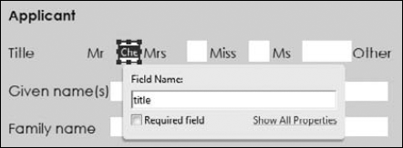
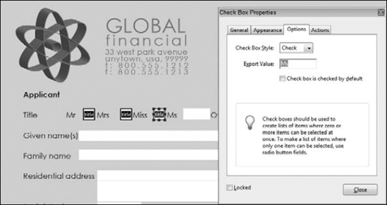
Button fields can be used for a number of different actions you want form recipients to perform when completing your forms. The possibilities for button uses are limitless. One of the many uses you may find interesting for buttons is adding help information for a form recipient to easily work through your form.
With analog forms, we need to add instructions to help form recipients complete complicated areas of a form. Adding instructions to a form takes up space and reduces the amount of area on a form for the most important elements that are the fields.
With electronic forms, you can use buttons to show and hide information, tips, and help guides without taking up valuable space on a form.
Button faces are graphic icons and images that appear within a button field. You can add button faces from any native file format that's supported by using the File
Typically, you'll find creating PDF files to be the best option for creating button faces. After a file is converted to PDF, you can see if the document will work well for a button face. If you use a native file directly in Acrobat and need to go back to the authoring application to make some edits, you have to interrupt your form editing to make the changes and then come back later to populate the form.
Most often, you'll have two issues to deal with when working with button faces. First, you need to create a button and choose a button face. Second, you need to set an action for something that will happen when the form recipient clicks the button. The second item isn't essential if you want to add an icon or graphic to a form, but typically you add graphics when you lay out your form.
To understand how button faces are added to button fields, follow these steps.
Note
Button faces we'll add in this chapter are the guidelinesButton.pdf and the guidelinesMessage.pdf files in the Chapter09 folder on the book's CD-ROM. Additionally, we'll use the generalApplication.pdf document from the same folder.
STEPS: Adding Button Faces to Button Fields
Open a file where you want to add a button field. In our example, we used the generalApplication.pdf document from the Chapter09 folder on the book's CD-ROM.
Create a button field. You can work in either Viewer mode or Form Editing Mode when adding buttons to PDF documents. If you work in Viewer mode, click the Button tool in the Advanced Editing toolbar. If you work in Form Editing Mode, click the Button tool in the Form Edit toolbar. When the cursor is loaded with a Button field, click+drag a button field above the Applicant text in the top-left side of the form, as shown in Figure 9.39. Type a name for the field, and click Properties. In our example, we used help as the field name.
Set the appearances. By default, the button has a gray fill color. Open the Appearance tab, and choose No Color for the fill.
Set the Options attributes. Click the Options tab, and choose Icon only, as shown in Figure 9.39. Click the Advanced button to open the Icon Placement dialog box, and check Fit to Bounds. Click OK in the Icon Placement dialog box to return to the Button Properties window.
Choose a button face. Click the Choose Icon button to open the Select Icon dialog box. Click the Browse button in the Select Icon dialog box, and browse your computer to locate a button to use as the button face. In our example, we used the guidelinesButton.pdf file from the Chapter09 folder on the book's CD-ROM.
Select the file and click Select in the Open dialog box, and you return to the Select Icon dialog box. The button icon you chose appears in the dialog box, as shown in Figure 9.40.
Click OK. You return to the Button Properties dialog box. Normally, you would click the Actions tab to define an action for the button. But in our example, we'll use this button to show/hide another button that has not yet been added to our form. We'll postpone the actions options until after we add another button field.
Set the button visibility. Before leaving the Button Properties, click the General tab. From the Form Field pull-down menu, choose Visible but doesn't print. This button is used for a form recipient to acquire some help information to fill in the form. The button has no significance when the form is printed.
Define new defaults for the button fields. Click Close in the Button Properties dialog box. Click the Select Object tool on the button, and open a context menu. From the menu commands, choose Use Current Properties as New Defaults. When you create additional buttons, you won't need to change the Appearance for the buttons.
Create another button. Follow Steps 2 through 7 to add another button. In our example, we used the file guidelinesMessage.pdf for the second button face. We named this button helpMessage. The second button is a sizeable field, as shown in Figure 9.41.
Add a third button. On the message button face is an area designated for a Close button. We need to add another button here, but because the graphic shows the form recipient what will happen when the action is executed, we don't need a button face. Click the Button tool, and try to draw the field rectangle carefully to the same size as the item denoted as Close on the second button image.
Name the button. We named our third button helpClose. Notice that we named the three buttons help, helpMessage, and helpClose. When it comes time to find these buttons in a list of fields, we can easily scroll a dialog box to locate the three buttons listed together.
Close the Button Properties and save the file. Because we don't need any edits for the third button, click Close in the Button Properties window. Choose File
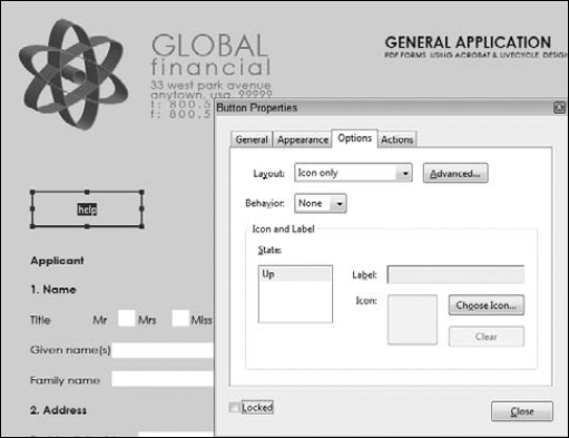
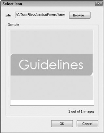

If you followed the steps in the steps section "Adding Button Faces to Button Fields," you should have three buttons on the generalApplication.pdf document. After all the buttons are created, you can now apply actions to show/hide the button fields.
To add actions to the buttons, do the following.
STEPS: Adding Actions to Buttons
Set the attributes for the help message to Read Only. The only two buttons that require an action are the help button and the close button. These buttons are used to show/hide the message button. Because the message button won't have an action assigned to it, you can lock it as a read-only field. Double-click the large message button, and click the General tab. In the General Properties, check Read Only.
When you mark a field as read only, the mouse cursor won't appear with the index finger on hand pointing upward. This cursor shape denotes a button that is assigned an action. Because the cursor doesn't display a clue that the button is used for an action, it results in less confusion for the form recipient.
Select an action for the Close button. Double-click the helpClose button to open the Button Properties. Click the Actions tab, and leave the Mouse trigger set at the default Mouse Up trigger. Open the Select Action pull-down menu, and choose Show/hide a field. Click the Add button to open the Show/Hide Field dialog box.
Choose Show/Hide Options. When the Close button is clicked by the form recipient, we want both the helpMessage button and the helpClose button to disappear. In the Show/Hide Field dialog box, select helpMessage and be certain the Hide radio button is selected, as shown in Figure 9.42. Click OK, and you return to the Button Properties Actions tab.
Define a second action. The Select Action menu choice is still active with the Show/hide a field action type. Click the Add button again. When the Show/Hide Field dialog box opens, click helpClose in the list and be certain the Hide radio button is selected. Click OK, and you finish setting the actions for this button. When you return to the Actions tab, both actions appear listed in the Actions list, as shown in Figure 9.43.
Open the Actions tab for a second field. Double-click the help button to open the Button Properties. Click Actions to open the Actions tab.
Choose Show/hide a field from the Select Action pull-down menu. Click the Add button to open the Show/Hide Field dialog box. Scroll to the helpMessage item, and select it. Click the Show button, and click OK.
Add a second action to the help button field. Click Add again, scroll to the helpClose item, and select it. Click the Show radio button, and click OK.
Test the buttons. At this point, all the actions you need should be properly assigned to the buttons. Click the Close button to close the helpMessage and the helpClose buttons. Click the help button, and the other two buttons should appear.
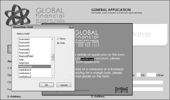
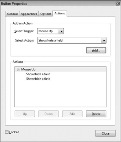
You can assign many more actions to fields in the Properties windows. We introduced a few in this chapter to get you started on the methods for assigning actions to fields. The most robust of the action types are JavaScripts that provide forms authors almost limitless opportunities for creating more dynamic interactive PDF forms. In the chapters remaining where we cover Acrobat Forms, we introduce more field properties and more actions.
Each of the eight form field types have associated Properties windows where a field's attributes are defined.
Many fields have some common properties, and many fields have properties settings exclusive to a given field type.
Properties adjustments can be made in Form Editing Mode or Viewer mode.
The Properties bar is available only in Viewer mode, where appearance properties can be assigned in the toolbar.
Each field's Properties window has multiple panes selected by clicking the tabs in the window.
All field types have a General tab where filenames and tooltips are edited, choices for making fields read only, and choices for displaying and hiding fields.
All fields have an Actions tab where all the actions options can be assigned to any field.
Check box fields can be set up to be mutually exclusive fields using choices for export values in the Options tab in the Check Box Properties window.
Text and combo fields have identical properties options. These two fields offer the most choices you have when making properties changes.
Text fields can accept alpha and numeric data. Calculations are made in the Text Field Properties Calculate tab.
Buttons can be used to display icons, images, and help files. All fields including buttons can be made visible or hidden.
Comb fields are used to separate characters in a single field equidistant from each other. A comb field typically uses separator lines or boxes to mark the character divisions.
Arbitrary masks are used to create alphanumeric codes for items such as account numbers, client numbers, file numbers, and so on. You can define a mask for accepting user input for alpha and numeric values as well as format fixed values.
Numbers should be properly formatted as number values when fields are used to perform calculations.
Calculations are made much easier when using hierarchical names.