
Chapter 28. Color
Strictly speaking, the rays are not colored.
Optics, Isaac Newton
28.1. Introduction
Most people are able to sense color—it’s the sensation that arises when our eyes are presented with different spectral mixes of light. Light with a wavelength of near 400 nanometers makes most people experience the sensation “blue,” while light with a wavelength near 700 nm causes the sensation “red.” We describe color as a sensation because that’s what it is. It’s tempting to say that the light arriving at our eyes is colored, and we’re just detecting that property, but this misses many essential characteristics of the perceptual process; perhaps the most significant one is this: Two very different mixes of light of different frequencies can generate the same perception of color (i.e., we may say “Those two lights are the same color green”). Thus, our notion of color, which we use to distinguish among lights of different wavelengths, is insufficient to distinguish among mixtures of lights at different wavelengths. It’s therefore worth distinguishing between the physical phenomenon (“This light consists of a certain mixture of wavelengths”) and the perceptual one (“This light looks lime green to me”). Furthermore, our observation of the same spectral mix may cause different perceptions at different times or different intensities.
As you read this chapter, you should keep the following high-level facts in mind.
• Color is a perceptual phenomenon; spectral distributions are physical phenomena.
• Everything you learned about red, green, and blue in elementary school was a simplification.
• The eye is approximately logarithmic: Each time you double the light energy (without altering the spectral distribution) arriving at your eye, the brightness that you perceive will increase by the same amount (i.e., the brightness difference between one unit of energy and four units of energy is the same as the brightness difference between 16 units and 64 units).
Most of what a majority of people “know” about color is false, or at the very least, it is true only under very restrictive conditions of which they are unaware. Try to read this chapter with an open mind, forgetting what you’ve learned about color in the past.
28.1.1. Implications of Color
Before we discuss the physical and perceptual phenomena involved in color, let’s consider some implications of color: Because objects have different colors, and because you can tell the difference, you can use color in a user interface to encode certain things. For instance, you might choose to make all the icons in a text editor having to do with high-lighting be based on a yellow background, reflecting the idea that many highlighter markers are yellow. Similarly, you might choose to make all the high-priority items (or all the items with significant consequences, like “Close this document without saving changes”) be drawn in red, to attract the user’s attention.
But a significant number of people are colorblind (or, more accurately, color-perception deficient)—they perceive different wavelength mixes in a different way from the rest of us, and two lights that appear red and green to most people appear to be the same color to a red-green colorblind person. About 8% to 10% of men are red-green colorblind; there’s also yellow-blue colorblindness (quite rare), and even total colorblindness, but this is very rare. Colorblindness is very rare (less than 1%) in women.
From a computer graphics point of view, the critical consequence of colorblindness comes in interface design: If you rely solely on color-coding to indicate things, about 5% of your users will miss the idea you’re trying to indicate.
The effects of individual colors are important, but even more significant is the challenge of selecting groups of colors that “work well together.” Such selections are in the domain of art and design rather than science. As you design a color palette for a user interface, consider the following.
• Someone else may have already developed a good set of colors; try starting from interfaces that you like and working with their colors.
• Use a paint program to see how each of your colors looks when placed atop or near each of your other colors, or in groups of three.
• Consider how your colors will look on various devices; certain colors that look good on an LCD screen may look bad when printed. If this matters in your application, you’ll want to design with this in mind from the start.
28.2. Spectral Distribution of Light
We begin our discussion of color with the physical aspects. As we described in Chapter 26, light is a form of electromagnetic radiation; visible light has wavelengths between 400 and 700 nanometers. An ordinary fluorescent lamp (see Figure 28.1) produces light at many wavelengths; the combination of these makes us perceive “white.” By contrast, a laser pointer uses a light-emitting diode (LED) to create light of a single wavelength, usually around 650 nm, which we perceive as “red.”
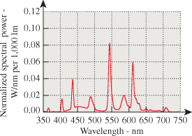
Figure 28.1: The spectral power distribution of a fluorescent lamp. The power emitted at each wavelength varies fairly smoothly across the spectrum, with a few high peaks. Figure provided courtesy of Osram Sylvania, Inc.
The spectral power distribution or SPD is a function describing the power in a light beam at each wavelength. It can take on virtually any shape (as long as it’s everywhere non-negative). Filters are available that allow only certain wavelengths, or wavelength regions, to pass through the filters; clever combinations of these allow one to create almost any possible spectral power distribution. We can add two such functions to get a third, or multiply such a function by a ![]() positive constant to get a new one. Thus, the set of all spectral power distribution functions forms a convex cone in the vector space of all functions on the interval [400 nm, 700 nm]. The possibility of creating almost any function means that this cone is infinite-dimensional; in particular, the spectral power distributions
positive constant to get a new one. Thus, the set of all spectral power distribution functions forms a convex cone in the vector space of all functions on the interval [400 nm, 700 nm]. The possibility of creating almost any function means that this cone is infinite-dimensional; in particular, the spectral power distributions
where s ranges over integers between 400 and 699, are all linearly independent, so the space is at least 299-dimensional. By making the “spikes” in the function narrower and the spacing closer, it’s easy to see that the number of linearly independent functions is arbitrarily large.
By contrast, as we’ll see in later sections, the set of color percepts, or color sensations, is three-dimensional; to the degree that the mapping from spectral power distributions to percepts is linear, it must be many-to-one. Indeed, for any given percept, there must be an infinite-dimensional family of SPDs that give rise to that percept.
Certain SPDs are both important and easy to understand: These are the monospectral distributions, in which nearly all the power is at or very near to a single wavelength (see Figure 28.2).
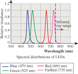
Figure 28.2: The spectral power distributions of several LEDs. The light is concentrated at or near a single wavelength for each kind of LED; an ideal monospectral source would have all energy at a single wavelength.
![]() One reason that these are interesting is that all other SPDs can be written as (infinite) linear combinations of them, so they play the role of a basis for the set of SPDs.
One reason that these are interesting is that all other SPDs can be written as (infinite) linear combinations of them, so they play the role of a basis for the set of SPDs.
A pure monospectral light cannot (in our model of light) carry any energy, because the energy is described in part by an integral over wavelength. So when we speak of “monospectral” lights, you should think of a light whose spectrum is entirely in the interval from 650 nm to 650.01 nm, for example.
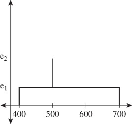
Describing an SPD requires either tabulating its (infinitely many) values, or somehow presenting summary information. In practice, real SPDs are tabulated at finitely many values using a spectroradiometer, but even these tabulated values may need to be summarized. In colorimetry, the terms dominant wavelength, excitation purity, and luminance are used to present such summaries; these vary in utility depending on the shape of the SPD. For the highly contrived SPD of Figure 28.3, the dominant wavelength is 500 nm. The excitation purity is defined in terms of the relative amounts of the dominant wavelength and the broad-spectrum light: If e1 is zero and e2 is large, then the excitation purity is 100%; if e1 = e2, the excitation purity is zero. So excitation purity measures the degree to which the light is monospectral. (For more complex spectra, the precise definition of the “dominant wavelength” is subtler; it’s not always the one with the highest value, which might be ill-defined if multiple peaks had the same height. These subtleties need not concern us.)
One last note about spectral power distributions: Ordinary incandescent lights (especially those with a clear glass bulb) have spectral power distributions that are quite similar to the blackbody radiation described in Chapter 26, because they produce light by heating a piece of metal (tungsten, typically) to a very high temperature—such as 2500°C—by pushing electric current through it; the resultant emission begins to approximate the blackbody curve, even though the tungsten itself is not matte black. (The sun, by contrast, has a surface temperature of around 6000°C.) One important characteristic of this radiation is that the SPD is quite smooth, rather than being very “spiky.” This makes simple summary descriptors like “dominant wavelength” and “excitation purity” work quite well for such smooth SPDs.
28.3. The Phenomenon of Color Perception and the Physiology of the Eye
People with unimpaired vision perceive light; they describe their sensations of it in various terms like “brightness” and “hue” and with a great many individual words (“saffron,” “teal,” “indigo,” “aqua,” ...) that capture individual sensations of color.
Our perception of color is also influenced by a gestalt view of the world: We use different words to describe the color of things that emit light and to describe those that reflect light. People will describe an object as “brown,” but they will almost never speak of a “brown light.”
This same gestalt view allows us to understand the “colors of objects.” One might say that a yellow book, in a completely dark closet, is black, but people are more inclined to say that it’s yellow but not lit right now. Certainly in a dimly lit room, the light leaving the yellow book’s surface is different from that leaving the surface in a well-lit room, and yet we describe the book as “yellow” in both cases. Our ability to detect something about color in a way that’s partly independent of illumination is termed color constancy.
Of course, one can imagine an experiment in which one looks through a peephole and sees something behind it. The something might be a glowing yellow bulb, or it might be a yellow piece of paper reflecting the light from an incandescent bulb. When the object is seen from a distance, and without other objects nearby for comparison, one cannot tell the difference between the two. So the distinction between “emitters” and “reflectors” is not one that’s captured by the physics of the light entering the eye, but by the overall context in which the light is seen.
By the way, to experiment with color, it turns out that “color matching” is different from “color naming”: Saying the name of a color is more complex than matching a color with another during an experiment.
It’s commonplace to say that “intensity” is independent of “hue”: One can have a bright blue light or a dim blue light, and the same goes for red and yellow and orange and green. In the same way, the degree of “saturation” of a color—Is it really red, or is it pinkish, or a grayish-red?—appears independent of both intensity and hue. But it’s difficult to think of a fourth property of color that’s independent of these three. This suggests that perhaps color is defined by three independent characteristics, which we’ll later see is true. Just which three characteristics is a matter of choice (just as choosing the coordinate axes to use on a plane is a matter of choice; any pair of perpendicular lines can work!). So some people choose to describe colors in terms of hue, saturation, and “value,” while others prefer to describe mixes of red, green, and blue. We’ll say much more about these in Section 28.13.
Careful physiological experiments have revealed much of the structure of the eye; Deering [Dee05] presents a good summary of the results of this work in the context of understanding what the retina can detect, which provides a guide to what is worth rendering in the first place. The key thing, from the point of view of understanding color, is the presence of two kinds of receptors: rods and cones. Rods are sensitive to visible light of all wavelengths, while the three types of cones are sensitive to different wavelengths of light: The first has its peak response at 580 nm, the second at 545 nm, and the third at 440 nm (see Figure 28.4). Detailed observations of the response curves for the receptors (including rods) are described by Bowmaker and Dartnall [BD80]. These are often described as “red,” “green,” and “blue” receptors, even though the red and green peaks occur at wavelengths commonly described as yellow, with the red peak being an orangy yellow and the green peak being a greener yellow. (To be more precise, a monospectral light of 580 nm wavelength causes, in most viewers, the percept “orangy yellow.”) A better set of names is “long wavelength,” “medium wavelength,” and “short wavelength” receptors, and the names L, M, and S are often used for these. We’ll generally use “red,” “green,” and “blue,” however, to avoid the need to convert from wavelength to color.
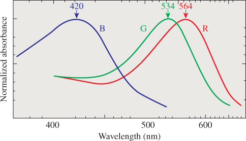
Figure 28.4: The approximate spectral response functions of the three types of cones in the human retina; the labels R, G, and B are misleading, because the peaks of the R and G curves both correspond to monospectral lights that most people describe as in the “yellow” range.
One can read this graph by saying, for instance, that a certain amount e of light at 560 nm will cause a response in a red receptor, but that one would need twice as much light at wavelength 530 nm to generate the same response in that red receptor. (Of course, these lights provoke very different responses in the green and blue receptors, too.) Furthermore, the effects of different lights on the red receptor are additive: Sending in both e light at 560 nm and 2e light at 530 nm will generate the same red-receptor response as sending 2e at 560 nm. If we use f(λ) to indicate the red receptor’s response at wavelength λ and use I(λ) to indicate the incoming light’s intensity at wavelength λ, then the total response from the receptor will be
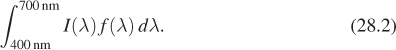
In short, the total response is a linear function of the incoming light I, with the linear operation being “integrate against the response curve.”
With this in mind, we can consider a system diagram (see Figure 28.5) tracing how a physical phenomenon (the spectral power distribution of light) becomes a perceptual phenomenon (the experience of color). Notice that this diagram is slightly simplified, in that it treats the incoming light without considering how the pattern of light is organized (i.e., what the person is actually seeing). This omission makes it impossible for this model to account for phenomena like spatial comparison of colors or color constancy, but the simplification—we can imagine that all the light arriving comes from a single, large, glowing surface surrounding the viewer—makes it easy to discuss the basic phenomena of color.
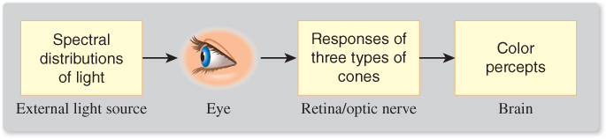
Figure 28.5: Light, described by its spectral power distribution, enters the eye; the three types of cones each respond and their individual responses are conducted by the optic nerves to the brain, resulting in a perception of color. These correspond to three distinct areas of study: physics, physiology, and perceptual psychology.
28.4. The Perception of Color
Given the three types of cones, it’s not surprising that color perception appears to be three-dimensional. We begin with the examination of the aspect that’s least related to color, which is brightness—the impression we have of how bright a light is, independent of its hue. By the way, the brightness we are referring to is not a quantity that has physical units; it’s a generic and informal term used to characterize the human sensation of the amount of light arriving at the eye from somewhere (a lamp, a reflecting surface, etc.).
28.4.1. The Perception of Brightness
To determine relative brightness of light at different wavelengths, imagine an experiment in which you are shown two lights: a 555 nm reference monospectral light source, and a second monospectral light source whose wavelength λ will be varied over the range 400 nm to 700 nm. We fix a particular wavelength λ, and you are given a knob with which you can control a multiplier for the reference light source; you adjust it until it has the same brightness as the one at wavelength λ. We record the setting g(λ) and reset λ to a new value and repeat. When we are done, we have a tabulation of how effective light at frequency λ is at seeming bright, compared to light at the reference wavelength 555 nm. For each value of λ, the number g(λ) tells how much less effective light at wavelength λ is in provoking a response than light at wavelength 555 nm. Scaling so that the largest value of g(λ) is 100%, we can plot the resultant function λ ![]() e(λ) (see Figure 28.6); the resultant graph shows the luminous efficiency function for the human eye. (“Efficiency” here refers to how efficient energy at a particular wavelength is in provoking the sensation of brightness.)
e(λ) (see Figure 28.6); the resultant graph shows the luminous efficiency function for the human eye. (“Efficiency” here refers to how efficient energy at a particular wavelength is in provoking the sensation of brightness.)
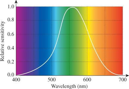
Figure 28.6: The luminous efficiency at each wavelength tells how much less bright light of that wavelength appears than light at the standard wavelength of 555 nm.
The luminous efficiency graph actually varies from person to person, and varies based on the person’s age as well; in view of this, a standard luminous efficiency curve was derived by averaging many observations.
This standardized tabulation can be used to define the luminance of a light source: We multiply the intensity at each of the tabulated wavelengths by the luminous efficiency value for that wavelength, and compute the sum, thus approximating the value
where I(λ) is the spectral intensity at wavelength λ. The resultant value has units of candelas, which is the SI unit for the measurement of luminous intensity. One candela is the luminous intensity, in a given direction, of a source that emits monochromatic radiation at a frequency of 540 × 1012 Hz (i.e., 555 nm wavelength),1 and whose radiant intensity in that direction is 1/683 watt per steradian. The international standards committee chose the peculiar numbers in this definition to make it closely match earlier measures that were based on the light from a single standard candle, or the light from a certain near-blackbody source (a square centimeter of melting platinum). Naturally, light at other wavelengths, of equal radiant intensity, produces fewer candelas of visible light than does light at 555 nm.
1. The definition is given in terms of frequency rather than wavelength because the speed of light varies in different media; in graphics, where we work primarily with light in air, this consideration is irrelevant.
To give a sense of common illumination in terms of candelas, my LCD screen emits about 250 candelas per square meter (one candela per square meter is called a nit; it’s the photometric term corresponding to radiance in radiometry), while the light from the screen at a movie theatre is about 40 candelas per square meter.
A studio broadcast monitor has a reference brightness of 100 candelas per square meter.
It’s tempting to say that since the human eye’s sensitivity to light is captured by the candela, we could (if we wanted to do just grayscale graphics) represent all light in terms of the candela. As mentioned in Chapter 1 and Chapter 26, this would be a grave error. In doing so, we’d need to assign a reflectivity to each surface; assuming diffuse surfaces, this would be a single number indicating what fraction of incoming light becomes outgoing light. Suppose we have a surface whose reflectivity is 50%. Then incoming light of a particular luminous intensity would become outgoing light of half that intensity. The problem is that real surfaces, with real light, may reflect different wavelengths differently. A surface might, for instance, reflect the lower half of the spectrum perfectly, but absorb all light in the upper half. If it’s illuminated by two sources, one that’s in the lower half and one that’s in the upper half, with equal luminous intensity, the reflected light in the first case will have the same luminous intensity, while in the second case it will have none at all. In other words, there are cases where this “summary number” captures information about human perception, but masks information about the underlying physics that brought the light to the eye. One could argue, therefore, that luminous intensity of light should only be examined for light that arrives at some person’s eye.
Counter to this position is the fact that much of the light we encounter every day (like that from incandescent lamps) is a mixture of many wavelengths, and most surfaces reflect some light of every wavelength, so in practice we can use a summary number like luminous intensity, and a summary reflectivity, and the reflected light’s luminous intensity will turn out to be the incoming intensity multiplied by the reflectivity. This summary-number approach only causes problems in cases where the spectral distribution of energy (or of reflectivity) is peculiar. But with the advent of LED-based interior lighting, such peculiar distributions are becoming increasingly commonplace; many of today’s “white LED flashlights” are actually based on multiple LEDs of different frequencies, and have highly peaked spectral distributions, for instance. This discussion is another example of the Noncommutativity principle.
We’ve said that because photometric quantities represent weighted averages, and the weighted-averaging process does not commute with various other operations (like multiplication), these photometric quantities will be of little use to us except when applied to the light arriving at the human eye. To clarify the statement about weighted averages, consider the following example. We take two lists of numbers,
and consider the weighted sum of each under the weights
The results are 2.6 and .233, respectively.
Now consider the term-by-term product of L and R; it is
and its weighted sum, using w, is 0.33. Notice that 0.33 is not 2.6 × .233 = .6058; in other words, computing the weighted sums and then multiplying is different from multiplying and then computing a weighted sum. Now imagine that L represents the light energy at five chosen frequencies, and R represents the reflectivity of a surface at those five frequencies. Then the term-by-term product represents the frequency distribution of the reflected light. But if we computed the weighted sum of each thing (i.e., the thing corresponding to the photometric measurements), then the product of the aggregate incoming light and the aggregate reflectivity is not the aggregate outgoing light. (There’s an argument to be made that we should not multiply the reflectances by the weights, but we should weight them evenly; even with this approach, commutativity fails.)
You may encounter other photometric terms; each of them can be thought of as a radiometric quantity, recorded per wavelength and then integrated against the luminous efficiency curve. Table 28.1 shows this correspondence.
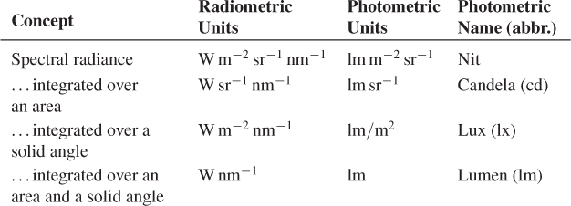
Note that radiance is also an integrated form of spectral radiance, but it’s simply an integral over wavelength, without the weighting factor provided by the luminous efficiency curve. Because of this, you cannot compute photometric quantities from nonspectral radiometric quantities. If someone asks, “I’ve got a source that’s 18 W m–2 sr–1, how many nits is that?” there is no correct answer!
28.4.1.1. Scotopic and Photopic Vision
The rods (the other kind of receptor in the eye) are also sensitive to light, but in a different way than the cones. The cones are the dominant receptors in high-light situations (e.g., daytime), while the rods dominate in low-light situations (e.g., outdoors at night). The first of these is called photopic vision, and the second scotopic vision. The scotopic response curve is different from the photopic response curve (see Figure 28.7), having a peak at a lower wavelength and dropping to zero by about 650 nm. This means that the rods cannot detect the sort of light we perceive as “red.” Because both kinds of receptors perform some adaptation to average light levels, this makes red a good color for instruments that will be used in low-light situations: The red light from the instruments does not affect the average-light-level adjustment for the rods, which are the primary receptors in use for seeing things in the dark.
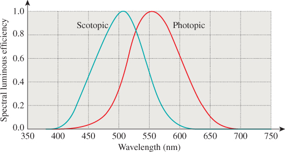
Figure 28.7: The luminous efficiency in photopic vision has a peak at 555 nm; the peak for scotopic vision is closer to 520 nm.
28.4.1.2. Brightness
Our discussion so far has addressed the issue of how light of different wavelengths is perceived. There’s a separate issue: how light of different intensities (but constant spectral distribution) is perceived. In other words, if we have a diffuser—a piece of frosted glass, for example—and it can be lit from behind by 100 identical lamps, and we turn on one, or ten, or all 100 so that the diffuser appears to be a variable light source, how will our eyes and brains characterize the change in brightness? Given the wide range of intensities that we encounter in daily life, it’s hardly surprising that the response can be modeled as logarithmic: The change from one lamp to ten is perceived as being the same “brightness increase” as the change from ten lamps to 100. (Here we are using brightness in a purely perceptual sense, not as something physical to be measured, but as a description of a sensation.) That is to say, this model says that the perceptual strength associated to seeing a light of luminous intensity I is
In support of the idea of a logarithmic model of our sensitivity to luminance, we can display two lights of the same luminous intensity and then adjust one until it becomes just noticeably different from the other. By doing this over and over at different starting sensitivities, we find that the just noticeable difference (or JND) is about 1% (i.e., 1.01I is noticeably different from I) for a wide range of intensities. In very dark and very bright environments, the number increases substantially, but for a range that includes the intensity ranges of virtually all of today’s displays, it is about 1%. So if we adjusted the intensity repeatedly by 1%, we might expect to say that the brightness had increased by several “steps,” and that k steps of increase would be achieved by multiplying by (1.01)k. (This reasoning makes the assumption that each JND seems to the viewer to be of the same “size,” however.) This implies that the response is proportional to the logarithm of the intensity.
An alternative model (Stevens’ law) says that the response should be modeled by a power law:
where b is a number slightly less than 1. The shapes of the graphs of log and y = xb are somewhat similar—both concave down, both slowly growing—so it’s no surprise that both can be used to fit the data decently. Each model has its detractors, but from our point of view, the important feature is that either one can be used to generate a good fit to the data, particularly when the range of brightnesses being considered is relatively small. In fact, as we’ll discuss later, the eye adapts to the prevailing light in an environment, and intensities that differ from this by modest amounts can be compared to one another. But our sensation of lights that are very bright or very dim compared to the average is quite different (“too dark to see” or “too bright to look at”).
The Commission Internationale de l’Éclairage (CIE), a group responsible for defining terms related to lighting and color, chose to use a modified version of Stevens’ law to characterize perceptual responses to light, and it’s this model that we’ll use in further discussing the perception of brightness. To be explicit, the CIE defines lightness as
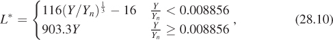
where Y (called luminance) denotes a CIE-defined quantity that’s proportional (for any fixed spectrum) to the energy of the light, and Yn denotes the Y value for a particular light that you choose to be the “reference white.”
You can see that L* is defined by a 1/3 power law that’s been shifted downward a little (the –16 does this), and which has had a short linear segment added to deal with very low light values. In practice, this linear segment applies only to intensities that are a factor of more than 100 smaller than that of the reference white; in a typical computer graphics image, these are effectively black, so the linear segment is mostly irrelevant.
In practice, this logarithmic or power-law nature of things is somewhat confounded by “adaptation” of the rods and cones. The luminance we encounter in ordinary experience ranges over a factor of 109 between a moonless overcast night and a snowy region on a sunny day. Both rods and cones react to arriving light with chemical changes, which in turn generate an electrical change that is communicated to the brain. Plotting the output of the various sensors against the log of the luminance, we get a graph like the one shown in Figure 28.8; the rods react to varying luminance by changing their output ...up to a point. After that point, any further increase in luminance doesn’t affect the rods’ output, and they are said to be saturated. The cones, on the other hand, begin to change their output substantially at about that point, so differences in brightness are detected by the photopic system. The placement of the cones’ curve on the axes, though, is not fixed: Upon exposure to light of a certain level, like D on the chart, the cones, which were near the limit of their output, will gradually adapt and shift their response curve so that it’s centered at D, thus responding to light changes at or near D. This ability to adapt is limited—at some point, all light begins to seem “very bright.” The function of the “reference white” in the CIE definition is to characterize the interval of intensities over which we want to characterize lightness.
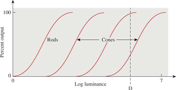
Figure 28.8: The percent output of rods and cones. The rods’ output flattens out at modest luminance levels, and no change in output occurs even in very bright scenes; the cones’ response also flattens out, but the absolute position of the curve may vary along the log luminance axis substantially as the cones adapt to the light present.
28.5. Color Description
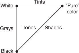
Among lights of constant brightness, there is considerable variation in spectral power distribution: Those with greater power in the long wavelengths tend to have one appearance; those with greater power in the short wavelengths have another. We associate these appearances with the notions of “red” and “blue.” Indeed, there’s a whole vocabulary associated with describing color. Because it’s natural to think of color as an intrinsic property of surfaces or lights, and only after a recognition of the mechanism of color perception is it clear that color is in fact a perceptual phenomenon, most discussions of color talk about the colors of objects, especially paints. We’ll begin by introducing the terms used, and then consider their meanings in light of our system view. Such terms as “hue,” “lightness,” “brightness,” “tints,” “shades,” “tones,” and “grays” are all used to describe our perception of things. Lightness is used to describe surfaces, while brightness usually describes light sources. Hue is used to characterize the quality that we describe with words like “red,” “blue,” “purple,” “aqua,” and so on, that is, the quality that makes something appear to not be a blend of black and white. Blends of black and white are called grays; blends of white and pure colors are called tints, while blends of black and pure colors are called shades. Colors that are blends of black, white, and some pure color are called tones (see Figure 28.9). (Properly speaking, we should say “The percepts arising from various combinations of stimuli that produce the percepts ‘black’ and ‘white’ are called ‘grays’,” but such language rapidly becomes fairly cumbersome.)
What constitutes a “pure color,” though? Among all lights of a given luminance (monospectral or otherwise), we can form combinations by blending 50% of one light with 50% of another, or blending with a 70:30 ratio, etc. Doing so takes lights whose colors we’ve experienced and produces new ones, whose colors may be new to us or may be ones we’ve experienced before. As we experiment with more and more spectral power distributions, we find that certain distributions have colors that are “at the edge,” in the sense that they never appear as the color of any combination of other spectra. Such colors can be called “pure.” Indeed, experiment shows that such a designation of pure spectra leads to labeling precisely to the monospectral sources as “pure.” Our understanding of the cones can tell us why.
The sensitivities of the three cones to various wavelengths of light mean that a monospectral light arriving at the eye generates a signal to the brain consisting of the outputs of the three kinds of sensors, which can be read off the response chart. In Figure 28.11 you can see how light of 440 nm generates lots of blue-cone (i.e., short-wavelength) response, less green (i.e., medium-wavelength), and even less red (i.e., long-wavelength). Similarly, at 570 nm, both red and green cones produce large responses, while the blue cones generate almost none. One can make a three-dimensional coordinate system labeled with S, M, and L, and plot the curve defined by such responses (see Figure 28.10).
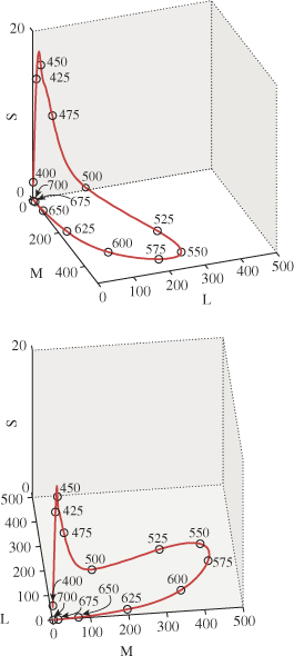
Figure 28.10: The response curve for monospectral visible light. Note that the short-wavelength-response axis has a different scale. We show the curve from two different views.
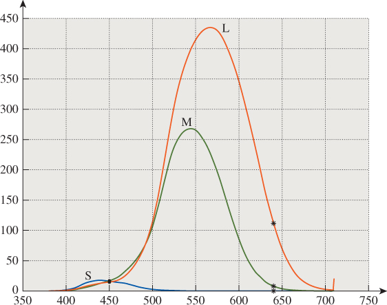
Figure 28.11: The response of the three cone types to a monospectral light can be read from the plot of their sensitivities. Light at 450 nm, for instance, generates about equal short- and medium-wavelength responses (shown in blue and green and labeled “S” and “M”), but a slightly smaller long-wavelength response (shown in red and labeled “L”). Light at 640 nm generates a large red response, a small green response, and almost no blue response.
Light that is a mix of these monospectral lights will (approximately, and within certain bounds) provoke a response that is a linear combination (with positive coefficients) of the responses to the monospectral lights, that is, the set of all responses will form a generalized cone in this space of possible cone responses (see Figure 28.12). The responses to monospectral lights are the points on the boundary of this cone, as predicted, in the sense that each of them cannot be produced as a combination of other responses. There’s one exception: The start and end of the monospectral response curve are points representing pure red and pure violet. Combinations of these form a line; the collection of rays from the origin through this line is a planar region constituting a part of the cone’s boundary. Points on this part of the boundary are representable as combinations of other response points; they are the “purples,” and are not “pure” colors. (Note that the geometry of this response cone—the mostly convex shape of its cross section, in particular—is a consequence of the shapes of the response curves for the three types of cones in the eye. In the exercises in this chapter, you’ll study what the shape of this curve might be if the sensors’ response curves were different, and where the monospectral curve would lie in those cases.)
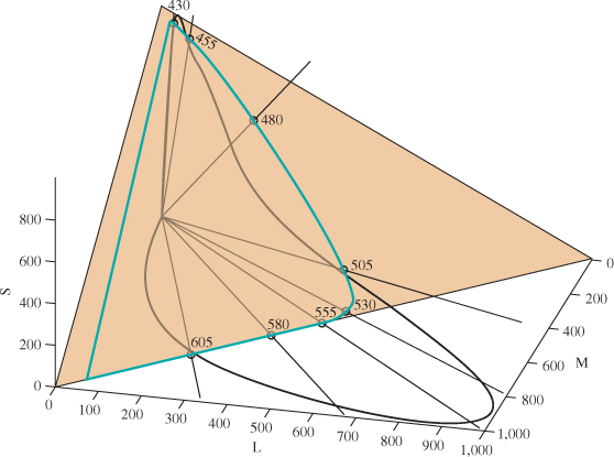
Figure 28.12: The set of all possible responses from combinations of monospectral lights (i.e., all possible spectral power distributions) forms a generalized cone in the space of response triples. The cone’s intersection with the S + M + L = 1000 plane (tan) is the area bounded by the aqua curve.
28.6. Conventional Color Wisdom
Knowing how spectral information is converted to perceive color (at least in the absence of gestalt influences) allows us to understand something about the conventional wisdom surrounding color. We’ll discuss a few common claims here.
28.6.1. Primary Colors
We often hear that “red, yellow, and blue are primary paint colors” (usually without a definition of “primary”), which we take to mean that they are colors that cannot be made from others, while all other colors can be made from them. Anyone who has tried to make saturated green from red, yellow, and blue paint knows this is false. But you can create a wide range of colors (or, to be pedantic, of paints which, when illuminated by sunlight or similar spectra, produce a wide range of color percepts) from red, green, and blue—far wider than you can produce from pink, yellow, and orange, for instance. Similar claims hold for red, green, and blue primary light colors.
If we consider the aqua curve in Figure 28.12, but we adjust each monospectral light using the luminous efficiency curve so that they all have the same perceptual brightness, we get a curve in the plane of constant brightness that looks something like Figure 28.13 and on which we can identify points corresponding to the percepts “red,” “green,” and “blue.” The responses associated to other spectral power distributions of the same brightness fill in this horseshoe shape, resulting in other percepts of “less saturated” colors, including white near the center.
Figure 28.13: The set of responses associated to monospectral lights of equal brightnesses. These form a curve in a plane of constant brightness. Three points, corresponding to percepts of “red,” “green,” and “blue,” are marked on the curve.
The triangle generated by the colors red, green, and blue occupies much of this horseshoe shape, partially justifying calling them “primary,” although this corresponds to the addition of lights (i.e., we can say that red, green, and blue are primary light colors).
For paints, there’s something else going on: Red paint absorbs most light with short wavelengths and reflects most light with longer wavelengths; when illuminated with white light, it appears red. Similar statements apply to green and blue paint. When we mix red and green paint, the red paint absorbs much of the green light, and the green paint absorbs much of the red light, and what’s reflected is a spectral mix of red and green, but not much of either—we see brown.
This, by the way, is the formal explanation of the claim that “lights mix additively, while paints mix subtractively.”
But the statement that red, green, and blue are primary is only part true. Indeed, choosing any three points on the curve above covers some portion of all possible perceptual responses and misses others. To really do the job, you’d need infinitely many “primaries” consisting of all the monospectral lights.
28.6.2. Purple Isn’t a Real Color
People are sometimes told that “purple isn’t a real color,” because it doesn’t appear in the rainbow. (Purple, as we mentioned, is how we describe the color sensation produced by a mix of red and blue-to-violet light, i.e., near the straight edge of the horseshoe shape.) It’s true that it’s not a color sensation corresponding to a monospectral source, but it certainly is a color sensation.
28.6.3. Objects Have Colors; You Can Tell by Looking at Them in White Light
The claim that objects have colors that are revealed by exposing them to white light can perhaps be better stated by saying that objects illuminated by sunlight reflect light with a spectral distribution that provokes a color response in our brains. But there are many kinds of “white light,” and every actor knows that the white lights on stage and the white light of the sun are very different, and require different cosmetics. Furthermore, for objects with highly peaked reflectance spectra, the existence of peaks or valleys in the illuminant spectrum can have drastic effects on the reflected light. It’s perhaps better to say the following: “Objects have reflectance spectra, and the human brain is surprisingly good at predicting, for natural objects with not-too-peaked reflectance spectra, which are common, how an object seen under unusual illumination (shade, ‘colored’ light) will look under illumination by sunlight. This fairly consistent prediction could be called the ‘color’ of the object.”
28.6.4. Blue and Green Make Cyan
Various claims about how colors mix are commonplace. In the case of paint color mixes, they’re often misleading. For instance, painting with a blue watercolor, letting it dry, and then painting a red stripe over the blue leads to one thing; doing this in the opposite order leads to another. Mixing the colors before painting leads to a third. So any claims about mixing of colors must include the mixing process to be testable. In the case of colors atop others (see Figure 28.14), one can think of light as being reflected from the top color, from the bottom color after passing through the top, or from the underlying surface after passing through both. If we assume that each time light passes through a color-layer, some fraction of the energy at certain wavelengths is absorbed, this last kind of light passes twice through each paint layer, while the first kind never passes through any paint layer. The Kubelka-Munk coloring model [Kub54] carries out this analysis in detail.
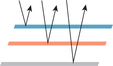
Figure 28.14: One color painted atop another. Light can be reflected from the top, from the bottom after passing through the top, or from the substrate on which the bottom is painted. Assuming some attenuation for each time the light passes through a paint layer, we get a model of the reflected light.
This mixing problem is further compounded by the difference in the way lights mix and pigments mix; the distinction here is purely physical. If I shine a red and a green light onto a uniformly reflective piece of white paper, the reflected light will appear yellow. By contrast, if I have a red paint or dye and apply it to a white piece of paper, it absorbs colors outside the long-wavelength part of the spectrum so that only light we perceive as “red” gets reflected. If I mix this with a green paint or dye that absorbs all light except that in the green-percept part of the spectrum, the two together will absorb almost all light. If the paints or dyes were ideal, the result would be black paint; in practice, as noted earlier, we often get a muddy brown, indicating that very little light is reflected. These two phenomena are given the misleading names additive color and subtractive color, respectively; in fact, it’s spectra that are being added or filtered, and the color perception mechanism remains unchanged, as we said in Section 28.6.1.
28.6.5. Color Is RGB
As computer displays have become commonplace and dialog boxes for choosing colors with RGB sliders have proliferated, one sometimes hears that color is just a mix of red, green, and blue. As we’ve seen already, there are many colors that cannot be made either by mixing red, green, and blue dyes/inks/paints or by mixing red, green, and blue lights. It is true that such mixes can generate a great many colors, but not all.
28.7. Color Perception Strengths and Weaknesses
The physiological description of sensor responses to light is still a step away from the perception of color; that happens in the brain. When those perceptions do occur, we confidently say that we saw something red, or blue, or yellow. But numerous optical illusions show that we may be overconfident. We can summarize a few key things. We’re good at
• Detecting differences between adjacent colors
• Maintaining our sense of the “color of an object” in the presence of changing illumination (see Figure 28.15)

Figure 28.15: The squares labeled A and B have identical gray values, but we perceive them as very different shades of gray; indeed, we’re inclined to call one a “white square” and the other a “black square.” One may regard this as a failure of the visual system to “recognize the same color,” but it’s more appropriate to regard it as the success of the visual system in detecting color constancy in the presence of varying illumination: We perceive all the black squares to be black even though the actual gray values in the image vary substantially. (Courtesy of Edward H. Adelson.)
We’re not very good at telling whether two widely separated colors are the same, or remembering a color from one day to the next. Then again, given the changing lighting circumstances we constantly encounter, this is probably an advantage rather than a limitation.
28.8. Standard Description of Colors
With the goal of having a common language for describing color, there’s been a great deal of work in providing standards. The Pantone™ color-matching system is a naming system in which a wide variety of color chips are given standard numbers so that a printer can say, for instance, “I need Pantone 170C here.” The numbers refer to calibrated mixes of certain standardized inks.
There’s also the widely used Munsell color-order system [Fi76], in which a wide range of colors are organized in a three-dimensional system of hue, value (i.e., lightness), and chroma (i.e., saturation or “color purity”), and in which adjacent colors have equal perceived “distance” in color space (as judged by a wide collection of observers).
28.8.1. The CIE Description of Color
We have observed that monospectral lights provoke a wide range of sensor responses, plotted on the horseshoe-shaped curve. We’ve also seen that choosing three monospectral lights in the red, green, and blue areas of the spectrum (we’ll call these primaries for the remainder of this section) allows us to produce, by combining them, many familiar color sensations, but not by any means all. As we said earlier, when we consider a color like orange, we find that no combination of our red, green, and blue primary lights gets us light that we perceive as orange. We can, through subterfuge, still express the orange light as a sum of the red, green, and blue primaries, however. What we really want is to say that “orange looks like about a half-and-half mix of red and green, and then move away from blue.” In equations, we’d write something like
Of course, we can’t take away blue light that isn’t there, but we can add blue light to the orange. If we find that
in the sense that the color mixes on the left and right produce the same sensor responses, then we’ll express that numerically with Equation 28.11. In this way, we can find what mixes of our primaries are needed to match any monospectral light L, and plot the result as a function of the wavelength of L; the result has the shape shown in Figure 28.16. These three “color matching functions,” ![]() ,
, ![]() , and
, and ![]() , tell us how much of our red, green, and blue primaries need to be mixed to generate each monospectral light. For example, to make light that looked like 500 nm monospectral light, we’d have to combine about equal parts of blue and green, and subtract quite a lot of red (i.e., we’d use
, tell us how much of our red, green, and blue primaries need to be mixed to generate each monospectral light. For example, to make light that looked like 500 nm monospectral light, we’d have to combine about equal parts of blue and green, and subtract quite a lot of red (i.e., we’d use ![]() (500),
(500), ![]() (500), and
(500), and ![]() (500) as the mixing coefficients). To make something resembling 650 nm light, we’d use lots of red, a little green, and no blue.
(500) as the mixing coefficients). To make something resembling 650 nm light, we’d use lots of red, a little green, and no blue.
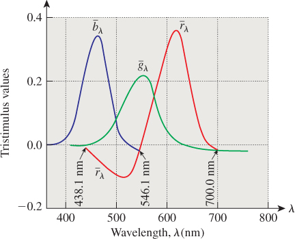
Figure 28.16: The color-matching functions, which indicate, for each wavelength, how much of a standard red, green, and blue light must be mixed to produce the same sensor responses as a monospectral light of wavelength λ. At least one mixing coefficient is negative for many monospectral lights, indicating the impossibility of making those colors as mixes of red, green, and blue.
What about a 50-50 mix of 500 nm and 650 nm light? We’d use a 50-50 mix of the two color matches above. Because such a mix has all coefficients positive, it’s actually possible to make it with our red, green, and blue standard monospectral lights. In general, if we have a light with a spectral power distribution P, we can find the “mixing coefficients” by applying the idea above to each wavelength, that is, we compute
and use these as the amounts of our red, green, and blue primaries. (Of course, if any of the three computed coefficients is negative, we cannot reproduce the color with our sources.)
Unfortunately, the set of all convex combinations of our three primaries doesn’t include all possible colors; geometrically, the triangle whose vertices correspond to our primaries is a proper subset of the horseshoe-shaped set of sensor responses.
In 1931, the CIE defined three standard primaries, which it called X, Y, and Z, with the property that the triangle with these three as vertices actually includes all possible sensor responses. To do so, the CIE had to create primaries that had negative regions in their spectra, that is, they did not correspond to physically realizable light sources. Nonetheless, these primaries have certain advantages.
• The Y primary was defined so that its color-matching function was exactly the luminous efficiency curve; this means that for any spectral light source, T, written as a combination
the number cy will be the perceived intensity of the light. This was significant in developing black-and-white televisions: The signal had to transmit in some form the Y-component of the lights that the camera was seeing.2 Later, when color signals began to be broadcast, the cx and cz data were sent in a different band; color televisions could decode these, and black-and-white televisions could ignore them.
2. The value cy itself is not what’s transmitted; more on this later.
• The color-matching functions for X, Y, and Z are everywhere non-negative (see Figure 28.17), so all colors are expressed as non-negative linear combinations of the primaries.
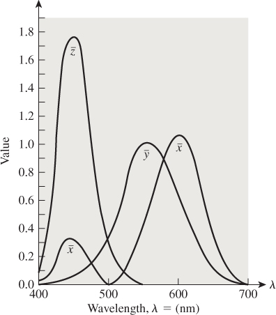
• Because the red, green, and blue primaries can be identified as points in XYZ-space (i.e., as a linear combination of X, Y, and Z), any combination of them can be so expressed as well; thus, there’s a direct conversion from XYZ to RGB coefficients (and vice versa).
In analogy with the color-matching functions for red, green, and blue, a light whose spectral power distribution is P can be expressed as
where
(More precisely: The light with power distribution XX + YY + ZZ and the light with power distribution P will evoke the same color response.)
In practice, such integrations are computed numerically, using the values of the matching functions tabulated at 1 nm intervals that are found in texts such as [WS82, BS81]. The constant k is 680 lm W–1. But we also sometimes compute the “colors” for the reflectance spectrum of some reflecting object. In this case, one must choose a standard light source as a reference for “white” and illuminate the surface. The values are usually scaled so that a completely reflective surface has a Y-value of 100; thus,
where W is the spectral power distribution of the standard white light we’re using.
Suppose that the light C produces the same sensor responses as
In that case, we write
The CIE defines numbers that are independent of the overall brightness by dividing through by X + Y + Z; doubling the incoming light doubles each of X, Y, and Z, but also doubles their sum, so the quotients
remain unchanged. Note that the sum x + y + z is always 1, so if we know x and y, we can compute z. Thus, the collection of intensity-independent colors can be plotted on just the xy-plane; the result is the CIE chromaticity diagram shown in Figure 28.18. Notice that X and Y were chosen so that the diagram is tangent to the x- and y-axes.
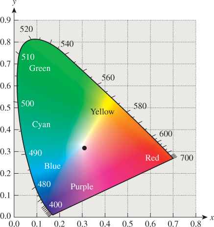
Figure 28.18: The CIE chromaticity diagram. The boundary consists of chromaticities corresponding to monospectral lights of the given wavelengths, shown in nanometers. The dot in the center is a standard “white” light called “illuminant C.”
Near the center of the “horseshoe” is illuminant C, which is a standard reference “white,” based on daylight. Unfortunately, it doesn’t correspond to x = y = z = 1/3, although it is close. (Other reference whites are described in Section 28.11.)
Note that if we know x and y, we can compute z = 1 – (x + y), but this does not allow us to recover X, Y, and Z; for that we need at least one more piece of information (all xyz-triples lie on a planar subspace of XYZ-space). Typically we recover XYZ from x, y, and Y (the luminance value). The formulas are
28.8.2. Applications of the Chromaticity Diagram
The chromaticity diagram has several applications.
First, we can use the diagram to define complementary colors: Colors are complementary if they can be combined to form illuminant C (e.g., D and F in Figure 28.19). If one requires a half-and-half mix in the definition, then some colors, like B, have no complement.
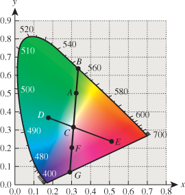
Second, the diagram lets us make precise our notion of excitation purity: A color like the one indicated by point A in Figure 28.18 can be represented by combining illuminant C with the pure-spectral color B. The closer A is to B, the more spectrally pure it is. So we can define the excitation purity to be the ratio of the length AC to the length BC. We extend this definition to C by saying that its excitation purity is zero. For some colors, like F, the ray from C through F meets the boundary of the horseshoe at a nonspectral point; such colors are called nonspectral; but the ratio CF to CG still makes sense, and we can define excitation purity this way. The dominant wavelength, however, is more problematic; the standard is to say that the dominant wavelength is a “complementary” one at B, which would be denoted 555 nm c, where the “c” indicates complementarity.
A third use of the chromaticity diagram is the indication of gamuts: Any light-producing device (like an LCD monitor) can produce a range of colors that can be indicated on the chromaticity diagram. Colors outside this gamut cannot be produced by the device. (Similarly, printing devices have gamuts, once one defines a standard illuminant under which the printed page will be viewed.) A device that can produce two colors can also produce (by adjusting the amounts of each) chromaticity values that are convex combinations of the two. In Figure 28.20, lights whose chromaticity values are I and J can be combined to form chromaticity values on the line segment between them; adding a third color K gives a gamut consisting of a whole triangle. Clearly there’s no triangle with vertices in the horseshoe that contains the entire horseshoe; thus, no three-color display, no matter how perfectly calibrated, can produce all color percepts.
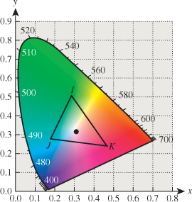
Figure 28.20: Mixing of colors in the chromaticity diagram. Colors on the line IJ can be created by mixing the colors I and J; all colors in the triangle IJK can be created by mixing the colors I, J, and K.
Note that printer gamuts are typically far smaller than those of displays; in high-end printers, this can be partially remedied by the use of spot color—additional inks placed in the printer to expand the gamut so as to include a particular color. But in general, getting faithful print versions of images from a display is impossible. The problem of gamut matching (i.e., finding reasonable mappings from the gamut of one device to that of another) remains a serious challenge.
28.9. Perceptual Color Spaces
The CIE color system is remarkably useful; it’s so standard that colorimeters measure X, Y, and Z values of light, for instance. In the CIE system, each color has XYZ-coordinates; it’s tempting to measure the “distance” between two colors C1 = X1X + Y1Y + Z1Z and C2 = X2X + Y2Y + Z2Z by computing the Euclidean distance between the triples (X1, Y1, Z1) and (X2, Y2, Z2). Unfortunately, this does not correspond to the perceived color distance: If C1 and C2 have the same Euclidean distance as C3 and C4, the perceived distance between them may be very different.
Fortunately, one can transform the XYZ-coordinates, nonlinearly, to get new coordinates in which the Euclidean distance does correspond to perceptual distance. The 1960 CIE Luv color coordinates were developed to meet this need, but they were superseded by the 1976 CIE L*u*v*uniform color space. Letting Xw, Yw, and Zw denote the XYZ-coordinates of the color to be used as white, the L*u*v*coordinates of a color with XYZ-coordinates (X, Y,Z) are defined by the formula for L* given in Equation 28.10, and
The CIE has also defined L*a*b* color coordinates (sometimes called “Lab” color) by
where Xw, Yw, and Zw denote the XYZ-coordinates of the white point. Both L*u*v* and L*a*b* can be used to measure “distance” in color space, and both see frequent use in computer graphics, although L*a*b* seems to be more widely used in the description of displayed colors.
28.9.1. Variations and Miscellany
The CIE diagram we’ve shown is based on the 1931 tabulation of colors, in which samples subtended a 2° field of view on the retina. There’s also a 1964 tabulation for a 10° field of view, emphasizing larger areas of constant color. For much of computer graphics, the narrower field of view is more relevant.
The mapping from the space of all spectra (which is infinite-dimensional) to the space of response triples (which is three-dimensional) is more or less linear (at least for not-too-bright lights, where saturation comes into play, and not-too-dim lights, where photopic/scotopic differences enter); this means that it’s necessarily many-to-one. Different spectra that generate the same response values are called metamers; metameric lights are interesting because, upon reflection by a surface, they can become nonmetamers (see Figure 28.21). In practice, most reflectance functions are nonspiky enough that metameric effects like this are not significant, although with LED lamps, which tend to have spikier spectra, the problem may be more serious.
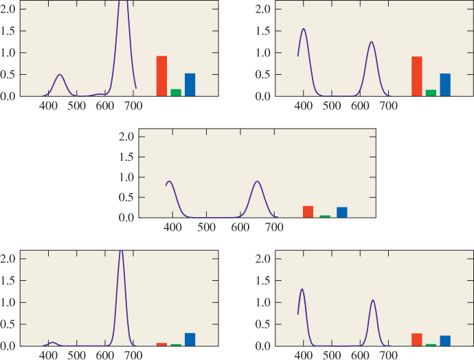
Figure 28.21: Two metameric light spectra (top) are each multiplied (wavelength by wavelength) by the reflectance spectrum (middle). The resultant spectra are no longer metameric. (Next to the spectrum for each light are its corresponding RGB response values.)
The colors in the x + y + z = 1 plane of the CIE XYZ space are not all possible colors. As the sum x + y + z varies, other colors appear (such as maroon). Furthermore, colors like brown, which are generally used to describe reflective color rather than emissive color, tend not to appear at all.
The colors purple and violet are often considered to be synonymous, but violet is the name for a pure spectral color (at about 380 nm, just on the edge of perceptibility), while as we said, purple is the name for points on or near the straight bottom edge of the CIE horseshoe.
28.10. Intermezzo
Let’s pause and note the important points so far. First, color is a three-dimensional perceptual phenomenon evoked by the arrival of different spectral power distributions at the eye. Any color percept can be generated by a combination of the CIE primaries X, Y, and Z; if a color C is generated by XX + YY + ZZ, we can think of X, Y, and Z as “coordinates” for that color in the space of all possible colors.
There are other coordinate systems on the space of colors, such as the CIE L*u*v* and L*a*b*, in which L*captures the notion of intensity, while the other coordinates encode chromaticity. In these systems, distances between color triples correspond to perceptual distances much more closely than do distances between (X, Y, Z)-coordinate triples. But the coordinates in these systems are not linear functions of the X, Y, Z-coordinates (which are in turn linear functions of radio-metric quantities), so they are not suitable for computations with a physical basis.
In both of the “perceptual” coordinate systems, there’s a free parameter, namely, the color chosen as “white.” Without the knowledge of the white point, you cannot convert an L*u*v* coordinate triple into an XYZ triple, for instance.
We now move on from the description of color to the question of how to represent color in an image file, a television signal, etc. Considering that there’s only a half-century of experience in this regard, a surprisingly large number of representation methods have arisen.
28.11. White
As we mentioned earlier, many spectral power distributions appear white, so picking a particular white point can be a challenge. And an SPD that looks white at one intensity may look yellow at another intensity, because of the adaptation of the eye. Furthermore, the surroundings may have a substantial impact on the appearance of a color; if we watch a slide show in a dark room, showing a scene illuminated by incandescent lamps, we rapidly accommodate so that the white point of the slides appears white. But if that same slide show is shown in a well-lit room with white walls, the “white” within the slides may appear yellow, for instance.
The CIE has defined several standard “whites”; the simplest (from the point of view of computation) is illuminant E, which has a constant SPD across the range of visible light. Illuminant C, now deprecated but still widely used, attempts to approximate the white of sunlight. More common in modern usage are the D series of illuminants, which are tabulated by the CIE in 5 nm increments. Many of the most useful are, at a gross level, quite similar to blackbody distributions, and the names indicate this: D65 is similar to 6500 K black body radiation, D50 is similar to 5000 K radiation, etc. The photography industry uses the D55 standard; either this or D65 is a good choice for much of computer graphics.
28.12. Encoding of Intensity, Exponents, and Gamma Correction
As mentioned above, the CIE standard for defining L* uses a ![]() -power law; the idea is that L* is a reasonable measure of perceived brightness of light (at least within a modest range of luminances around the luminance of some reference white). Suppose that you wanted to store or transmit information about light without using too many bits. If you were engaged in physical measurements, you’d just want to choose some numeric representation of intensity. But if you were planning to use the information about light in some way that involved a human looking at it (e.g., if you were a television engineer trying to decide what information to encode in the first black-and-white television signal!), you might argue that if a human can distinguish, say, 100 levels of intensity, then we should use 100 different numbers to represent these. It would be silly to use 200 different numbers, because we’d have different numbers representing different, but indistinguishable, intensities. If we were representing values in binary, we’d be wasting a bit by going from 100 values to 200 values. Similarly, if we encoded only 50 different intensity levels, we’d get nonsmooth intensity gradients in our display.
-power law; the idea is that L* is a reasonable measure of perceived brightness of light (at least within a modest range of luminances around the luminance of some reference white). Suppose that you wanted to store or transmit information about light without using too many bits. If you were engaged in physical measurements, you’d just want to choose some numeric representation of intensity. But if you were planning to use the information about light in some way that involved a human looking at it (e.g., if you were a television engineer trying to decide what information to encode in the first black-and-white television signal!), you might argue that if a human can distinguish, say, 100 levels of intensity, then we should use 100 different numbers to represent these. It would be silly to use 200 different numbers, because we’d have different numbers representing different, but indistinguishable, intensities. If we were representing values in binary, we’d be wasting a bit by going from 100 values to 200 values. Similarly, if we encoded only 50 different intensity levels, we’d get nonsmooth intensity gradients in our display.
If you simply take all possible intensity values and divide them equally (i.e., you quantize the intensity signal), you’d find that to capture perceptual differences that were significant at the low-intensity levels you’d need to use very small buckets. But those same buckets would be redundant at high-intensity levels. In fact, you would be far better off encoding the number L*, because each quantized range of L* values would correspond to the same amount of perceptual variation. By choosing the bucket size correctly, you could most efficiently encode the brightness.
To recover the intensity at the receiving end of the channel, you would invert the formula for L* (roughly, you’d take the third power of L*, and multiply by the constant Yn) and arrange for your television screen to emit the corresponding intensity.
As it happens, the cathode ray tubes (CRTs) that were used in early televisions have an interesting characteristic: The intensity emitted is proportional to the ![]() power of an applied voltage. Since
power of an applied voltage. Since ![]() is fairly close to three, this meant that you could take the L* value and use it as a voltage to determine the color of each pixel, approximately.
is fairly close to three, this meant that you could take the L* value and use it as a voltage to determine the color of each pixel, approximately.
To be clear: The visual system’s response to intensity is nonlinear and looks approximately like I1/3; the CRT’s output intensity in response to applied voltage is also nonlinear and looks like I = kV5/2. Combining these two results in a nearly linear overall effect (a ![]() power law).
power law).
In fact, video engineers defined a “signal representative of luminance” (which has later, in some video literature, been incorrectly called “luminance”); this signal approximately encodes the 0.42 power of luminance. Why use 0.42 instead of 0.33? One answer is that if you used 0.4 instead, then the ![]() power law of the CRT would cancel it exactly: This allows you to simplify the electronics in a consumer television, and at the cost of only a minor inefficiency in the encoding of the signal. The use of 0.42 instead of 0.4 has been explained by the observation that the viewing circumstances for television (much less bright than outdoors) are not the same as the circumstances under which the signal was captured (often bright lights or outdoors in daylight); the slight adjustment is meant to help compensate for this.
power law of the CRT would cancel it exactly: This allows you to simplify the electronics in a consumer television, and at the cost of only a minor inefficiency in the encoding of the signal. The use of 0.42 instead of 0.4 has been explained by the observation that the viewing circumstances for television (much less bright than outdoors) are not the same as the circumstances under which the signal was captured (often bright lights or outdoors in daylight); the slight adjustment is meant to help compensate for this.
You can experience the distinction between high-light and low-light perception of intensity by considering a garden at midday on a slightly overcast day (so that the lighting is reasonably diffuse), and the same garden just after sunset on that day. Only the light levels change. Because our perception of “lightness” is supposed to be approximately logarithmic, the difference in lightness between the leaves of a plant and its flower should be the same at midday and at twilight. In practice, they are not, appearing to be lower-contrast at twilight, and we must do some adjusting to compensate.
To experience this effect directly, we can use the area surrounding some gray values as a proxy for the ambient illumination. Figure 28.22 show three gray squares surrounded by white and black borders. The gray squares in each column are identical, but the contrasts in the left column appear less than the contrasts in the right column.

Figure 28.22: Surrounding context can vary our perception of tones. (Figure concept from Poynton [Poyb].)
The signal representative of luminance (the 0.42 power of luminance) seems as if it should be a part of a video signal; in fact, a video signal starts out as three values, r, g, and b representing the amounts of red, green, and blue light in a way that’s linear in the intensity (if you double the intensity, then each of r, g, and b will double). The luma is then a weighted sum of r0.42, g0.42, and b0.42. The difference between these values and the values determined by computing luminance directly and raising that to the 0.42 power is generally insignificant (another application of the Noncommutativity principle) and luma is used as the Y′ component of the Y′IQ color model described below. The prime on Y′ indicates that this coordinate does not vary linearly as a function of the light intensity. Ordinary video cameras compute R, G, and B values that, for a given aperture and white balance, are proportional to incoming intensities in the appropriate wavelength ranges, and raise these to the 0.45 power; the values they produce should therefore be called R′, G′, and B′, following the naming convention. To recover the original R, G, and B values, these must be raised to the 2.2 power. And to transform to other color spaces, we typically must first recover R, G, and B, and then perform the conversion, since most color transformations are described in terms of things like R, G, and B that vary linearly with energy.
The exponent 2.2 that is used to convert video R′G′B′ values back to RGB is often called gamma, and the process of raising values to some power around 2.2 is known as gamma correction. The number 2.2 is by no means universal; other gamma values have been used in various image formats over the years, and many image display programs allow the user to “adjust gamma” to modify the exponent used in the display process.
28.13. Describing Color
In computer graphics, we often need to describe color mathematically. Because the physical interaction of light and surfaces occurs in ways determined by their spectra rather than their colors, we don’t use the L*u*v*description of light when we want to model this physical interaction. And because the values we compute while rendering are typically spectral radiance values (possibly for some fairly broadband spectra, i.e., the radiance for the bottom, middle, and top thirds of the visible spectrum), which then must be converted to values that govern three display brightnesses, it’s best to separate the physical models used in rendering from our description of colors that appear on our displays or printers.
So we’ll now present several color models used to describe the colors that our devices can produce. Typically these color models are bounded, in the sense that they can only describe colors up to a certain intensity (or generally only a subset of the colors up to some intensity value). This matches the physical characteristics of many devices: An LCD monitor cannot produce more than a certain brightness; the light reflected from a printed page cannot exceed the light arriving at the page, etc.
The choice of a color model may be motivated by simplicity (as in the RGB model), ease of use (the HSV and HLS models), or particular engineering concerns (like the Y′IQ model used for the broadcast of color television signals or the CMY model for printing). And with the widespread interchange of imagery among different devices, there are color models whose design is based on lossless exchange of imagery, in which not only are color coefficients included in one’s data, but so are descriptions of the model used to represent the data. The International Color Consortium notion of profiles is one of these [Con12], used to describe a device’s color space, and thus support reproduction of similar colors across different devices and media; a far simpler (but less rich) approach is sRGB, a single standardized RGB color space discussed below.
In this section, we’ll discuss several color models, their goals, and methods for interconversion.
We’ll mostly follow the convention that says that quantities that vary linearly with the intensity of the light that they represent are denoted by unprimed letters, while those that vary nonlinearly are denoted with primes. Since primes get used for other reasons, and because of historical precedent, we won’t be absolutely rigid in this.
You should understand, however, that conversion among models may not, in general, make sense, because of the context in which the model is described. CMY (a system used to describe ink amounts in printing) is based on the ideas of inks being applied to a certain white paper and illuminated by a certain light; the reflected light cannot be brighter than that illuminant. Converting a color used in an ultrabright display to CMY therefore cannot be done: No CMY value represents that bright a color. There is a fine art in mapping the gamut of one device to that of another; appropriate mappings may depend on intended uses. The message to take away from this is that when you produce images in computer graphics, you should attempt to store them losslessly, with important information (What white point is being used? What primaries?) recorded in the image file so that they can later be converted to other formats. In general, conversion from format A to format B and back again may end up corrupting an image.
28.13.1. The RGB Color Model
Most displays, whether LCDs, CRTs, or DLPs, describe each pixel in terms of three numbers called r, g, and b, which in turn correspond to the degree to which three lights contribute to the appearance of that pixel. In an LCD, the three lights are in fact three filters, each filtering a backlight and allowing differing amounts of red, green, and blue light through; the three filters are vertically aligned as stripes to form a square “pixel.” In the case of a CRT, the three are phosphors that glow when struck by an electron beam; they’re typically arranged in a pattern in which each pixel consists of three colored dots in a closely spaced triangle. The precise spectra of the red, green, and blue lights being blended are not necessarily specified in RGB image data, so the numbers r, g, and b have only a vague display-specific meaning. Still, the general shape of the set of displayable colors within the CIE XYZ-space can be seen in Figure 28.23.
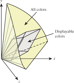
Figure 28.23: The color gamut for a typical display within the CIE XYZ color space. Note that white can be displayed very brightly, while red, green, and blue have much less intensity. Note, too, that many colors are not within the display gamut at all, particularly bright and dim ones.
The good news is that with the development of video standards and HDTV standards, a particular set of three colors has come to be fairly standard; these are used in the sRGB standard, described below. But for older graphics images, it’s a mistake to assume that the RGB values have any particular meaning; it may be best to experiment with adjusting the meaning (in the sense of XYZ-coordinates) of R, G, and B until the image looks best, and then transform the result into sRGB for future use.
The RGB color cube is usually drawn not as it embeds in the CIE XYZ space, but instead with red, green, and blue as the coordinate axes, as in Figure 28.24.
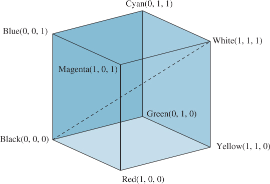
In this form, grays lie along the main diagonal; moving away from this diagonal gives increasingly saturated colors. Viewed this way, we are taking a part of the space of colors and transforming it so that it looks like a rectilinear cube (which is a skewed parallelepiped in XYZ-coordinates). For this reason, people sometimes refer to an RGB color space, rather than RGB coordinates on colors.
To return to the general (prestandards) case: The color gamut associated with the RGB color cube depends on the primary colors producible by the display (the LCD’s color stripes or the CRT’s phosphors). So an RGB triple like (0.5, 0.7, 0.1) may represent rather different greenish-yellows on different devices.
Fortunately, we have a universal description—CIE XYZ values—to which we can convert. Unfortunately, the conversion requires knowing something about the primary colors of our device. These can be measured with a colorimeter by making all pixels red, observing the color in XYZ space, that is, (Xr, Yr, Zr); then making all pixels green, observing the XYZ color (Xg, Yg, Zg), and then doing the same for blue to get (Xb, Yb, Zb). If we then display
the resultant XYZ color coefficient triple will be
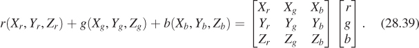
In other words, the result will be the coefficients of X, Y, and Z in the CIE XYZ description of the color. If we have two displays with corresponding matrices M1 and M2, we can convert the colors of each display to XYZ space with the respective matrices. Starting with the color
on display 1, we get to the XYZ color
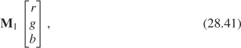
which in turn corresponds to the color triple
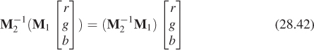
for display 2, so the matrix M-12 M1 will take RGB color descriptions for display 1 to those for display 2.
It will often happen that some RGB color triple for display 1, after multiplication by the transition matrix, will produce a color triple for display 2 some of whose entries are greater than one, or less than zero. This indicates that there’s a color in display 1’s gamut that is outside the gamut of display 2. What can we do in such a case? There are several solutions, ranging from the simple to the complex. We can simply ignore the transition matrix, replacing it with the identity; this fails to match colors, but avoids the gamut-overshoot issue entirely (indeed, this is mostly what’s done in practice with images transferred over the Internet). We can clamp the resultant color values between 0 and 1; this produces unpleasant artifacts in the darkest and brightest areas of the image, but it’s simple. Or we can take a more sophisticated approach like the ones described by Hall [Hal12], or those described in the ICC profile model’s rendering intents [Con12], which include a strategy that maps the white point of the source image to the white point of the medium on which it is to be displayed, and then warps other colors accordingly, a strategy that attempts to map the most saturated colors to the most saturated colors, and then warps others to be consistent with this, and a strategy that attempts to capture the perceptual relations among colors in an image as faithfully as possible. (Of course, this depends on our knowing the white point for the medium.)
The sRGB standard proposed certain “standard” colors for R, G, and B, based on the observation that many displays were closely matched to these standards; their relationships to CIE XYZ coordinates are given by a linear mapping:
Of course, for two displays that both have RGB primaries described by this relation, the transition matrix will be the identity.
28.14. CMY and CMYK Color
Cyan-Magenta-Yellow (CMY) color descriptions are used for printers, where the inks are materials that reflect some portion of incoming light, absorbing other portions. Cyan ink absorbs red light, but reflects blue and green (i.e., its reflectance of long-wavelength visible light is low, but of short- and medium-wavelength light is high); magenta absorbs green, and yellow absorbs blue. Once again, the exact details of which wavelengths are absorbed must be based on measurement.
Colors are described as a mix of cyan, magenta, and yellow. When two inks are mixed, the light that’s reflected is that which is not absorbed by either ink. So a mix of cyan and magenta absorbs both red and green, resulting in something that reflects blue light. Thus, for CMY colors, we write
and then denote the color by the number triple (c, m, y). In this form, the CMY color (0, 0, 0) is white, and (1, 1, 1) is black.
Lacking exact measurement of inks, the usual conversion from RGB to CMY is that the RGB color (r, g, b) is the same as the CMY color (1 – r, 1 – g, 1 – b). Because of the interactions between inks, the arrangements of dots in dot-based printing, and many other factors, this should be regarded as a gross approximation. Indeed, in computer graphics there’s almost no situation in which you should represent an image by CMY colors. Most modern printers have software that accepts RGB colors and converts them, as well as possible for the particular printer technology, to amounts of ink to be used at each point.
In practice, the color (1, 1, 1) is not really very black; the mix of cyan, magenta, and yellow inks doesn’t really manage to absorb all light. So printers often have a fourth ink, which is black (denoted K). This is used to replace parts of the darker mixes of C, M, and Y.
28.15. The YIQ Color Model
The YIQ color model (which we should call Y′IQ to follow the convention about nonlinear coordinates) is used in U.S. commercial television broadcast. It’s a nice example of a color model designed with engineering constraints in mind; these constraints were (a) the need to broadcast a signal that could be used to drive both black-and-white and color television receivers, and (b) the desire to use bandwidth most efficiently.
To satisfy the first goal, the YIQ color model’s Y value is, as described above, the luma, which is
and is therefore distinct from the IE XYZ model’s Y value. (We’ve used a prime both to emphasize this distinction and to indicate that it does not vary linearly as a function of R, G, and B.) The I and Q values then remain to encode chrominance information. They are essentially rotated and scaled versions of the u* and v* values. We omit the details, because with the rapid growth in the use of component video, the YIQ standard is less and less relevant. Perhaps the most significant aspect of it is that the Y′ of Y′IQ is not the same as the Y coordinate in XYZ-coordinates, but instead is roughly similar to the 0.42 power of Y.
The allocation of bandwidth to the transmission of the three channels (which corresponds to the number of bits of precision with which each is communicated) is carefully chosen: 4 MHz is assigned to Y, 1.5 MHz to I, and 0.6 MHz to Q; this corresponds to our strong sensitivity to luminance and to sharp discontinuities in luminance (the result of using too few bits of precision), and to the relative sensitivities of the visual system to color variation along the I and the Q axes.
28.16. Video Standards
Modern component video is encoded in various ways that are similar to Y′IQ, in the sense that one component carries intensity information while two others carry chromaticity information. Following Poynton [Poya], let’s examine one encoding a decoding process, starting from the unambiguous XYZ description of a color (see Figure 28.25).
Figure 28.25: Converting from XYZ values to Y′CBCR values. XYZ is converted to RGB by multiplication by a matrix M1; the RGB values are then nonlinearly encoded by a 0.45 power function; the resultant values are then transformed by another matrix, M2, and shifted slightly, to form Y′, CB, and CR, where Y′ approximately represents intensity and the other two encode chrominance information. Finally, the resultant values are digitized by a step called the subsampling filter. Conversion to analog component video is similar, except that the subsampling filter is replaced by band-limiting.
The entire process is described by the HDTV standard [Uni90], informally known as Rec. 709. The transformation from XYZ to RGB (as specified in Rec. 709, so we append the subscript 709) is (to three decimal places)
The conversion to R′, G′, B′ is very simple:
A second matrix operation converts the primed values into a luminance value and two chrominance values, while adding an offset to make the chrominance values lie in the range of 8-bit positive integers.
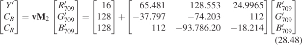
As R′, G′, and B′ range from 0 to 1, the value Y′ ranges from 16 to 255, while CB and CR go from 128 – 112 = 14 to 128 + 112 = 240.
If you happen to have R′, G′, and B′ ranging from 0 to 255 (as you might in some computer representations of images), you’ll need to first scale them appropriately (dividing by 255) before converting using Equation 28.48.
There is another standard for video—studio video—that requires a different transformation (albeit similar in form). Before converting to or from video, you must know which video format is in use.
28.17. HSV and HLS
The RGB cube is not ideal as a color-selection tool. For one thing, with its limited range (0 to 1 in R, G, and B) it’s best suited to selecting reflectances in three wavelength bands, that is, it’s well suited to “material colors” but not “colored lights,” where the intensity can be arbitrarily large. Even for selecting reflectance colors, RGB is not very convenient; the individual controls don’t match our sense of the “independent” characteristics of a color like “how light it is” or “how saturated it is” or “what hue it is.” As you adjust from red toward orange by slightly increasing the green component, your color also gets brighter, when all you really wanted was to change the hue.
Two alternative interfaces are widely available for color selection: the hue-saturation-value (HSV) interface, and the hue-lightness-saturation (HLS) interface. In each, hue is varied independently of the other qualities of color (such as how light it seems). These are useful tools, and they are somewhat more intuitive for users of paint programs than RGB mixes, but they’re the wrong tool to use when you need to specify a colored light for rendering, or even need to specify a color for printing, since the conversion from HSV to RGB produces only an RGB specification; without a precise definition of RGB (sRGB might be a good choice), such a specification is ambiguous. The web material for this chapter contains a discussion of the conversion among RGB, HSV, and HLS.
28.17.1. Color Choice
No single color specification system is best for all users; even among systems designed for usability like HSV and HLS, preferences vary. Many programs wisely allow the user to pick colors with a dialog that can be toggled among several different modes, allowing direct RGB specifications with sliders or typed-in text values (typically 0 to 255), HSV selection via sliders, click-to-pick selection from a disklike display of colors (often adjustable with a third slider to adjust from dark to light), etc.; users quickly find which method best suits them in various circumstances.
28.17.2. Color Palettes
Our discussion of color has concentrated almost entirely on the description and selection of single colors. But when multiple colors are displayed together, interactions between them can be important. A number of peculiar optical illusions are based on “tricking” our color-perception system. For example, it’s well known that the color surrounding a particular region can influence our perception of the color of that region (see Figure 28.26).

Figure 28.26: The simultaneous contrast effect. The two gray squares at the top appear to be different colors, but are in fact identical. The gray stripe on the bottom is a single color across its whole length.
When one chooses colors for a user interface, for instance, it’s important to choose them so that they are harmonious, and so that effects like the simultaneous contrast artifacts of Figure 28.26 don’t mask important design decisions. If, for instance, we’re creating a drawing program, and all interface elements relating to drawing are in one color and all elements relating to text are in another, there will be a problem if some elements of each kind are displayed on different backgrounds that makes them appear to be unrelated.
Meier et al. [MSK04] have studied this problem extensively, and have developed interfaces for selecting color palettes rather than individual colors.
28.18. Interpolating Color
We often need to interpolate between colors in graphics, in situations ranging from simple design (“I’d like a color gradient from aqua to magenta on this background rectangle”) to rendering (“I know the colors of this triangle at the three vertices, but I need to interpolate colors along the edges and at the interior points”). Unfortunately, this isn’t easy. For colors that are very similar (e.g., when their difference is just a little more than the just-noticeable difference), almost any interpolation scheme will work, including interpolating the RGB coefficients (or whatever other tuples you might be using to represent the colors). But for distant colors (e.g., a saturated green and a medium-brown), there are many possibilities, and no one of them is right for all circumstances.
![]() You can even show that certain reasonable assumptions about color interpolation cannot be met by any interpolation scheme on any three-dimensional color space.
You can even show that certain reasonable assumptions about color interpolation cannot be met by any interpolation scheme on any three-dimensional color space.
If, for instance, one insists
• That the color C(α, C1, C2), interpreted as “α of the way between colors C1 and C2,” be a continuous function of α, C1, and C2, and should be C1 when α = 0 and C2 when α = 1
• That two colors of equal saturation and brightness should be interpolated by intermediate colors of equal saturation
• And that the color interpolated as “α of the way from C1 to C1” should always be C1
then one has a contradiction. If we restrict our attention to colors of saturation 1 and brightness 1, we have a circle, which we’ll denote S1, and which we’ll parameterize by hue, ranging from 0 to 1 (so a hue of 0 and a hue of 1 both denote totally saturated red, for example). Restricting the function C to just this circle gives a function from [0, 1] × S1 × S1 to S1; the properties above translate to
• C :[0, 1] × S1 × S1 ![]() S1 is continuous
S1 is continuous
• C(0, x, y) = x for all x, y εS1
• C(1, x, y) = y for all x, y ε S1
• C(α, x, x) = x for all x ε S1
Now consider the functions
p0 : [0, 1] ![]() S1 : t
S1 : t ![]() C(0, 0, t), and
C(0, 0, t), and
p1 : [0, 1] ![]() S1 : t
S1 : t ![]() C(1, t, t).
C(1, t, t).
The second property tells us that p0 is a constant, that is, its winding number around the circle is zero. The final property tells us that p1 wraps once around the circle. But these two loops can be joined together by a family of intermediate curves,
ps : [0, 1] ![]() S1 : t
S1 : t ![]() C(s, st, t), s ε [0, 1]
C(s, st, t), s ε [0, 1]
each of which starts and ends at the same place. This is impossible, for t ![]() ps(t) is a continuous function of both s and t, and hence the winding number of ps is a continuous function of s. But a continuous integer-valued function is constant, so the winding number cannot change from 0 to 1 as we vary s.
ps(t) is a continuous function of both s and t, and hence the winding number of ps is a continuous function of s. But a continuous integer-valued function is constant, so the winding number cannot change from 0 to 1 as we vary s.
This is not to say that color interpolation is impossible or wrong; it merely indicates that many seemingly natural constraints cannot be met. It’s therefore often best to carefully consider the application domain, and ask what’s actually needed: Do you really need to be able to interpolate between colors of opposite hue without passing through white? Will the colors you’re interpolating between ever be far apart, or will they generally be close together? Indeed, an interesting experiment to perform when you want to write a color-interpolating program is to create some sample inputs for your program, and try to approximate the outputs that you’d like to get. If you can’t approximate the output, you’re unlikely to be able to write a program that does so.
28.19. Using Color in Computer Graphics
We use color for aesthetics, to establish tone or mood; for realism, to identify associated groups of entities; and for coding of types of interaction. With care, color use is effective in many of these roles. Careless use of color, however, can be disastrous; in one experiment, the introduction of meaningless color to a monochrome interface reduced user performance by about two-thirds [KW79]. Color should be employed conservatively; decorative uses should be subordinate to functional uses so that color cannot be misinterpreted as having functional meaning. The use of color, like any other aspect of a user interface, must be tested with real users to identify and resolve problems. One conservative approach is to design first for a monochrome display, which ensures that the color use is purely redundant (and guarantees usability by color-deficient users).
There are many books about the use of color for aesthetics, including [Bir61]; we state here just a few of the simpler rules to produce color harmony. The most fundamental rule is to select colors according to some method, typically by traversing a smooth path in some color model, or by restricting colors to a plane in some color space. This might mean using colors of constant saturation or value, for instance. Furthermore, it’s wise to choose colors at equal perceptual spacing, which is not the same as equal coordinate distance in whatever color model we’re using: Conversion to CIE L*u*v*coordinates, or some other system in which perceptual distances are accurate, is essential.
A random selection of hues and saturations is usually quite garish; grouping colors so that those of similar hue or similar saturation are nearby is more attractive (but the distinction between colors may be less obvious).
If a chart or table contains just a few colors, the complement of one of them makes a good choice for the background; a neutral gray is a good background for photographic or similar imagery. If adjoining colors are not harmonious, a thin black border between them will often help resolve the contrast. In general, a parsimonious approach to choosing a color palette is wise (except in the case of realistic images, of course).
Color can be used to code data (indeed, this is a standard tool in scientific visualization applications), but several cautions are in order. First, color codes can carry unintended meanings. If we display the earnings of company A in red and those of company B in green, we may suggest to the viewer that company A is in financial trouble because of our learned association of “red” with “in debt” in financial situations. Bright, saturated colors stand out more than dim, pastel colors; this may give unintended emphasis. And two unrelated elements of an interface that have similar colors may be perceived as related, even if the color was intended as purely ornamental.
A number of color-usage rules are based on physiological rather than aesthetic considerations. For example, because the eye is more sensitive to spatial variation in intensity than it is to variation in chromaticity, lines, text, and other fine detail should vary from the background not just in chromaticity, but in brightness (perceived intensity) as well—especially for colors containing blue, since relatively few cones are sensitive to blue. Thus, the edge between two equal-brightness colored areas that differ only in the amount of blue will be perceived as fuzzy.
Blue and black differ very little in brightness, so this is a particularly bad combination. Similarly, yellow on white is hard to distinguish.
The eye cannot distinguish the colors of very small objects, so color coding should not be applied to small objects. Judging the color of objects subtending less than 20 to 40 minutes of arc is error-prone [BCfPRD61, Hae76]; at a typical viewing distance of 24 inches, objects 0.1 inch (i.e., many pixels) tall subtend about this angle. The color of a single pixel on a modern monitor is almost impossible to discern.
The color of a region can affect our perception of its size. Cleveland and McGill discovered that a red square is perceived as larger than a green square of equal size [CM83]. This could well cause the viewer to attach more importance to a red object than to a green one of similar size.
If you stare at a large area of saturated color and then look away, afterimages appear. This effect is disconcerting and distracting, so the use of large areas of saturated colors is unwise.
For a number of reasons, red objects appear closer than do blue ones; therefore, simultaneously using blue to represent foreground objects and red to represent background ones is unwise. The opposite coding is fine (although the use of saturated red text on a saturated blue background is particularly annoying to many people).
With all these perils and pitfalls of color usage, is it surprising that one of our first rules was that you should apply color conservatively?
28.20. Discussion and Further Reading
The workings of the human eye and the human visual system, and they way in which they combine to provide the perception of color, cover many fields; the application of color for aesthetic or persuasive or communicative goals occupies others. For more information on the human eye, presented in a manner particularly suited to computer graphics researchers, see Glassner’s book [Gla94]; other useful references are [BS81, Boy79, Gre97, Hun05, Jud75, WS82] and [Poya]. For more background on artistic and aesthetic issues in the use of color for graphics, see [Fro84, Mar82, Mei88, Mur85, MSK04]. For more information on calibration and cross-calibration of displays, see [Cow83, SCB88, Con12, Int03].
28.21. Exercises
Exercise 28.1: You want to interpolate between two similar colors. They’re represented in RGB space. You’ve heard that XYZ space is more fundamental, so you convert to XYZ, interpolate there, and convert back. Explain why you get exactly the same result as if you’d interpolated in RGB. For which other color-description systems in this chapter will this turn out to be true, and why?
Exercise 28.2: The chapter claims that if you interpolate colors using whatever color triples they’re represented by, and if the colors are nearby, then it won’t matter what color system you’re using, in the sense that the results will be very similar. Verify this in the case of RGB and L*u*v* versions of the colors (r, g, b) = (0.7, 0.4, 0.3) and (r, g, b) = (0.7 + ![]() , 0.4 – 2
, 0.4 – 2![]() , 0.3 –
, 0.3 –![]() ), by finding the 50-50 mix of the two colors in both RGB and L*u*v* and comparing. Do this for
), by finding the 50-50 mix of the two colors in both RGB and L*u*v* and comparing. Do this for ![]() = 0.01, 0.05, and 0.25.
= 0.01, 0.05, and 0.25.
Exercise 28.3: Consider points with Y = 1 and chromaticity values that range over the entire CIE diagram. Compute the L*u*v* coordinates of these points, and plot them on axes labeled L*, u*, and v*.
Exercise 28.4: For 400 < λ < 700, consider two monospectral lights, with Y = 1, one with wavelength λ and one with wavelength λ + 1; they are separated by 1 nm in “wavelength space.” Plot their distance in XYZ-space as a function of λ; plot their distance in L*u*v*-space as a function of λ. At what wavelength is this latter difference largest? Smallest? Note: You’ll need to find a table of the xy-coordinates of the monospectral points on the CIE horseshoe.
Exercise 28.5: No three-color display can faithfully reproduce all color percepts. Suppose you wanted to design a three-primary display with the largest possible gamut (measured in terms of area on the chromaticity diagram).
(a) Argue why all three primaries should be on the boundary of the horseshoe.
(b) Find the xy-coordinates of the horseshoe boundary and then search for the optimal location for the three primaries.
(c) Approximately what percentage of the area can you cover with three primaries? With four? With five?
Exercise 28.6: Derive Equation 28.29 from Equation 28.26.
Exercise 28.7: (a) Suppose that the sensitivities of the receptors in the eye were not shaped like Gaussian bumps, but were instead triangular, the graph of the red receptor being an equilateral triangle with base between 600 nm, and 700 nm, the green having its base between 500 nm and 600 nm, and the blue having its base between 400 nm and 500 nm (all three equilateral triangles having the same heights). What would the CIE diagram look like? How many primaries would be needed for perfect color reproduction?
(b) Suppose instead that the domains overlapped so that red was defined on [500, 600], green on [450, 550], and blue on [400, 500]. What would the chromaticity diagram look like? How many primaries would be needed to faithfully reproduce every color percept?
Exercise 28.8: We said that if you’re asked to convert a source that’s 18 W m–2 sr–1 to nits, it’s impossible. Suppose you were told in addition that it was a blackbody source at a particular temperature. Describe how you could compute the corresponding number of nits in this case (given a tabulation of the luminous efficiency function).
Exercise 28.9: Write formulas to convert L*a*b* coordinates for a color back to the XYZ triple for the color. You may assume that Xw, Yw, and Zw are known.
Exercise 28.10: We claimed above that a colorimeter could be used to measure the XYZ values for each of the red, green, and blue primaries of a display. Suppose, though, that the colorimeter only produces the CIE xy-values, but you can also measure the luminances Yr, Yg, and Yb of the full-brightness red, green, and blue primaries. Express the XYZ coefficients of a color with RGB coefficients r, g, and b in terms of the observed xy-values and the full-brightness luminosities.
Exercise 28.11: (Peripheral color perception.) Stand with one arm pointing outward, and fixate on a point in front of you. Have a friend place a playing card in your outstretched hand so that the card faces toward your head. Move your hand to gradually bring the card into your field of vision. (Continue fixating straight ahead.) Try to tell whether the card is red or black. Move it so that it’s 45° off-axis, and try again. Move it to about 30° and try again. Continue until you are certain of the color, and then confirm that you’re correct. (Thanks to Pascal Barla for suggesting this exercise.)