
Chapter 2. Introduction to 2D Graphics Using WPF
2.1. Introduction
Having presented a broad overview of computer graphics, we now introduce a more immediately practical topic: application programming using a commercial graphics platform. After an overview of the history of 2D platforms, we examine a specific one, Microsoft Windows Presentation Foundation (WPF).
We chose WPF because it is one of the few modern graphics platforms that support both 2D and 3D applications, providing user-interface as well as rendering functionality using a consistent programmer’s model. In addition, it is an excellent rapid-prototyping platform for experimenting with the principles of 2D and 3D graphics. Its Extensible Application Markup Language (XAML) is a declarative language (in the style of HTML) that provides a concise way to construct scenes, and XAML interpreters provide virtually instantaneous testing/debugging cycles. This allows us to introduce you rapidly to a number of fundamental concepts in 2D and 3D graphics and to let you experiment almost immediately without a time-consuming learning curve.
Of course, declarative languages have their limitations, particularly in support for conditionality and flow of control, so WPF developers can extend XAML with procedural code written in an imperative programming language such as C#. This hybrid strategy is simplified by WPF’s cross-language consistency; for example, each XAML element type corresponds to a WPF class, and the element’s properties correspond to data members of that WPF class.
Our dedication of a chapter to 2D may surprise you. First, we feel that many 3D concepts—such as specification and transformation of geometric shapes, hierarchical modeling, and animation—are easier to understand when initially presented in a 2D context, free of complex 3D-related requirements such as simulating the interaction between lights and materials. Second, we note the dominance of 2D graphics in applications across all platforms from smartphone to tablet to desktop, and the common integration of 3D renderings together with 2D user interfaces and visualizations such as maps, schematics, data grids/charts, etc.
This chapter and its 3D continuation (Chapter 6) form a sequence, so a good understanding of this material and comfort with XAML are a prerequisite to Chapter 6. Thus, we strongly suggest that you perform the associated exercises using the accompanying lab software, which presents small XAML programs inside an integrated editor/interpreter providing instant feedback, thus reducing the learning curve and making experimentation easy and stimulating.
2.2. Overview of the 2D Graphics Pipeline
In Chapter 1, we saw that a graphics platform is an intermediary between the application and the display hardware, providing functionality related to both output (instructing the GPU to display information) and input (invoking callback functions in the application to respond to user interaction). To prepare for a discussion of the various types of graphics platforms, let’s take a high-level view of a 2D graphics application, shown in Figure 2.1.
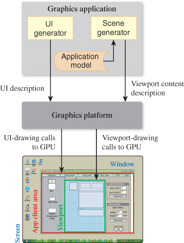
Figure 2.1: Graphics platform as an intermediary between a 2D application and display-device screen-space resources allocated by the window manager.
It is rare that an application’s purpose is only to paint pixels. Usually some data—which we call the application model (AM)—is being represented by the rendered image and manipulated via user interaction with the application. In a typical desktop/laptop environment, the application is running in conjunction with a window manager, which determines the area of the screen allocated to each application and takes care of the display of and interaction with the window chrome (i.e., the title bar, resize handles, close/minimize buttons, etc., shown in pale green in Figure 2.1). The application’s focus is on drawing inside the client area (red in Figure 2.1) that is the interior of the window, by making calls to the graphics platform API. The platform responds to those calls by driving the GPU to produce the desired rendering.
Typically the application uses the client area for two purposes: Some portion of the area is devoted to the application’s user-interface (UI) controls, and the remaining area contains the viewport that is used to display the rendering of the scene, which is extracted or derived from the AM by the application’s scene generator module. As you can see in the diagram, the UI generator module that generates the user interface is distinct from, and operates very differently from, the scene generator, even though they both use the underlying 2D platform to drive the display.
Our use of the terms “scene” and “viewport” for 2D may surprise those with experience in 3D graphics, in which those terms have 3D-centric usages. In the 2D domain, we use the term “scene” analogously to mean the collection of 2D shapes that will be rendered to create a particular view of the AM. Note that the 2D scene generator corresponds directly to the scene generator for 3D applications that feeds a 3D platform to produce a rendering. Similarly, our 2D use of the term “viewport”—to mean an area in which the scene’s rendering will appear—is consistent with 3D usage.
Consider an interior-design application that displays and enables editing of a furniture layout. The application model records all data associated with a given furniture layout, including nongraphical data such as manufacturer, model number, pricing, weight, and other physical characteristics. Some of this information is needed to produce a graphical view of the model, and some is used only for nongraphical functionality (e.g., purchasing). It is the task of the application’s scene generator to traverse the application model, extract or compute the geometric information relevant to the desired scene, and invoke the graphics platform API to specify the scene for rendering.
The scene may contain a visualization of all the geometry described in the application model or it may represent a subset (e.g., showing only one room of the house being designed). Moreover, analogous to multiple views of databases, the application may be able to provide multiple views using different presentation styles for the same geometric information (e.g., showing furniture either as outlines or as shapes filled with textures simulating fabric or wood).
In the above example, the application model is inherently geometric. However, in other applications the AM may contain no geometric data at all, as is typical in information visualization applications. For example, consider a database storing population and GDP statistics for a set of countries. In this case, the scene will often be a chart or graph, derived from the AM by the scene generator and designed to present these statistics in an intuitive visualization. Other examples of data visualization applications include organizational charts, weather data, and voting patterns superimposed on a map background.
2.3. The Evolution of 2D Graphics Platforms
Graphics platforms have experienced the same low- to high-level evolution (depicted in Figure 2.2) that has taken place in programming languages and software development platforms. Each new generation of raster graphics platform has offered an increasingly higher level of abstraction, absorbing common tasks that previously were the responsibility of the application.

Figure 2.2: Evolution in level of abstraction in commercial 2D graphics platforms—from immediate mode to retained mode.
2.3.1. From Integer to Floating-Point Coordinates
We’ll start with the state of the art of raster graphics in the 1980s and early 1990s. The typical popular 2D raster graphics platform (e.g., Apple’s original QuickDraw and Microsoft’s original GDI) provided the ability to paint pixels on a rectangular canvas, using an integer coordinate system. Instead of painting individual pixels, the application painted a scene by calling procedures that drew primitives that were either geometric shapes (such as polygons and ellipses) or preloaded rectangular images (often called bitmaps or pixmaps, used to display photos, icons, static backgrounds, text characters extracted from font glyph sets, etc.). Additionally, the appearance of each geometric primitive was controlled via specification of attributes; in Microsoft APIs, the brush attribute specified how the interior of a primitive should appear, and the pen attribute controlled how the primitive’s outline should appear.
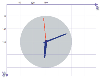
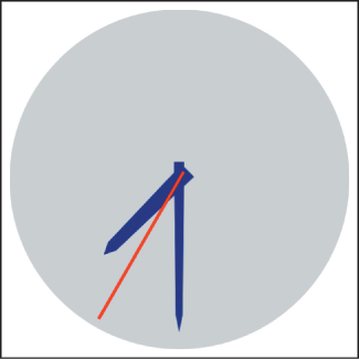
For example, the simple clock image shown in Figure 2.3 is composed of four primitives: an ellipse filled using a solid-gray brush, two polygons filled using a solid-navy brush for the clock’s hour and minute hands, and a red-pen line segment for the second hand.
In the original GDI’s simplest-usage scenario, the application uses integer coordinates that map directly (one-to-one) to screen pixels, with the origin (0,0) located in the upper-left corner of the canvas, and with x values increasing toward the right and y values increasing toward the bottom.
The application specifies each primitive via a function (e.g., FillEllipse) that receives the integer geometry specifications along with appearance attributes. (The GDI source code for this example application is available as part of the online material for this chapter.) The specification is reminiscent of plotting on graph paper; for example, the geometry of the gray circular clock face is passed to the FillEllipse function via this data pair:
Center point: (150,150)
Bounding box (smallest axis-aligned enclosing rectangle): upper left at (50,50), dimensions of 200 × 200
How large will this clock face appear when rendered onto the output device? There’s no definitive answer to that question. The displayed size depends on the resolution1 (e.g., dots per inch, or dpi) of the output device. Suppose our clock application was originally designed for a 72dpi display screen. If the application were tested on a higher-resolution device (e.g., a 300dpi printer or screen), the clock’s image would be smaller and possibly illegible. Conversely, if the target display were changed to the small, low-resolution screen of an early-generation smartphone, the image might become too big, with only a small portion of it visible.
1. This use of the term “resolution” contrasts with another common usage, the total number of display pixels (e.g., “LCD monitor with 2560 × 1440 resolution”).
The raster graphics community solved this problem of resolution dependence by borrowing ideas long present in vector graphics, using floating point to support alternative coordinate systems that insulate geometry specification from device-specific characteristics. In Section 2.4, we’ll introduce and compare two such coordinate systems: physical (based on actual units of measurement like millimeters and typographic points) and abstract (with application-determined semantics).
2.3.2. Immediate-Mode versus Retained-Mode Platforms
The evolution from integer-based specification to floating point was shared by all major 2D graphics platforms, but eventually a “split” occurred, creating two architectures with different goals and functionality: immediate mode (IM) and retained mode (RM).
The former category includes platforms (like Java’s awt.Graphics2D, Apple’s Quartz, and the second-generation GDI+) that are thin layers providing efficient access to graphics output devices. These lean platforms do not retain any record of the primitives specified by the application. For example, when the FillEllipse function of GDI+ is invoked, it immediately (thus the term “immediate mode”) performs its task—mapping the ellipse’s coordinates into device coordinates and painting the appropriate pixels in the display buffer—and then returns control to the application. At its most basic, the programmer’s model for working in IM is straightforward: To effect any change in the rendered image, the scene generator traverses the application model to regenerate the set of primitives representing the scene.
The lean nature of IM platforms makes them attractive to application developers who want to program as close to the graphics hardware as possible for maximum performance, or whose products must keep as small a resource footprint as possible.
But other application developers look for platforms that offload as many development tasks as possible. To satisfy these developers, RM platforms retain a representation of the scene to be viewed/rendered in a special-purpose database that we call a scene graph (discussed further in Chapters 6 and 16). As shown in Figure 2.4, the application’s UI and scene generators use the RM platform’s API to create the scene graph, and can specify changes incrementally by simply editing the scene graph. Any incremental change causes the RM platform’s display synchronizer to automatically update the rendering in the client area. Because it retains the entire scene, the RM platform can take on many common tasks concerning not only the display, but also user interaction (e.g., pick correlation, the determination of which object is the target of a user click/tap, as described in Section 16.2.10).
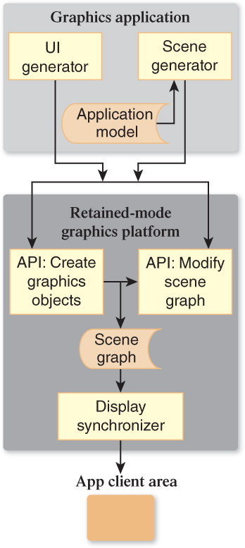
Figure 2.4: Schematic of a graphics application atop a retained-mode platform storing a scene graph.
All RM packages can be traced back to Sketchpad [Sut63], Ivan Sutherland’s pioneering project from the early 1960s, which launched the field of interactive graphics. Sketchpad supported the creation of master templates, which could be instantiated one or more times onto the canvas to construct a scene. Each template was a group of primitives and possibly instances of subordinate templates, bundled to compose a single unified graphics object. Each instance could be geometrically transformed—that is, positioned, oriented, and scaled—but in all other respects, the instance retained the appearance of its master, and changes to the master would immediately be reflected in all instances.
These key ideas from Sketchpad survive in all modern RM packages, making these platforms excellent foundations for creating user interfaces. UI controls (also known as widgets) are templated objects that, as an integrated collection, have an inherent, consistent look and feel. In this commonly used phrase, the word “look” refers to the graphical design/appearance (size, shape, font, coloring, drop shadow, etc.). The word “feel” pertains to the controls’ dynamic behaviors, typically in response to user interaction, which can be subdivided into built-in automated feedback behaviors and semantic/application behaviors. Examples of built-in feedback include the graying-out of a control that is currently disabled, the glow highlighting of a button when the pointer enters its region, and the display of a blinking cursor when the user is typing into a control’s text box. These feedback behaviors often include nice-looking animations, performed by the platform with no application involvement. Of course, the application must get involved when the user initiates an application action (e.g., clicks a button to submit a form for processing). To spark such activity, the RM simply invokes the application callback function attached to the manipulated control.
Most RM UI platforms also include layout managers that spatially arrange controls in a pleasing and organized way, with consistent dimensions and spacing, and that provide for automatic revision of the layout in reaction to programmatic or user-initiated changes in the size or shape of the UI region.
A well-designed set of UI controls requires significant work by a team with expertise in graphic and UI design; it is no small feat to construct a pleasing and intuitive UI framework. Rendering and laying out the UI, and handling user interaction, make up a large portion of the work involved in building an interactive application, so it should be no surprise that the use of RM UI platforms, which offload many tasks as described above, is pervasive. Indeed, it would be hard to find a modern 2D application that does not use an RM UI platform to handle virtually all of its needs for interaction through components such as menus, buttons, scroll bars, status bars, dialog boxes, and gauges/dials.
In contrast with retained mode’s high popularity in the 2D domain, its use in 3D is less pervasive. Even though 3D RM platforms offer powerful features—such as simplifying hierarchical modeling and rigid-body animation—these features carry a high resource cost. We address this topic in greater detail in Chapter 16.
2.3.3. Procedural versus Declarative Specification
Traditionally, each graphics platform has provided one of the following techniques to developers for the purpose of specification of user interfaces and/or scenes:
• Procedural code written in an imperative programming language (typically, but not necessarily, object-oriented), interfacing with the display devices via any of dozens of graphics APIs, such as Java Swing, Mac OS X Cocoa, Microsoft WPF or DirectX, Linux Qt or GTK, etc.
• Declarative specification expressed in a markup language, such as SVG or XAML
One of WPF’s distinguishing characteristics is that it offers developers a choice of specification techniques, as shown in Figure 2.5 and described below.
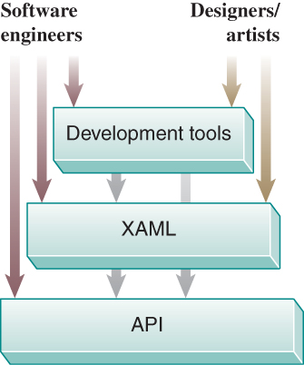
2.3.3.1. Lowest Layer: Object-Oriented API
The core layer is a set of classes providing all WPF functionality. Programmers can use any of the Microsoft .NET languages (e.g., C# or Visual Basic) or Dynamic Language Runtime languages (such as IronRuby) to specify application appearance and behavior at this level. A WPF application can be created via this layer alone, but the other two layers provide improvements in developer efficiency and convenience, and the ability to include designers and implementers in less technical roles.
2.3.3.2. Middle Layer: XAML
The middle layer provides an alternative way to specify a large subset of the functionality of the API, via the declarative language XAML, whose syntax is readily understandable by anyone familiar with HTML or XML. Its declarative nature facilitates support for rapid prototyping via interpreted execution, and it is more conducive to use by nonprogrammers (in the same way that HTML is more approachable than PostScript).
2.3.3.3. Highest Layer: Tools
As with any language, there is a learning curve associated with adopting XAML. The highest layer of the WPF application/developer interface comprises the utilities that designers and engineers can use to generate XAML, including tools for drawing graphics (e.g., Microsoft Expression Design or Adobe Illustrator), building 3D geometric models (e.g., ZAM 3D), and creating sophisticated user interfaces (e.g., Microsoft Expression Blend or ComponentArt Data Visualization).
2.4. Specifying a 2D Scene Using WPF
As explained earlier, WPF provides for both the construction of user-interface regions and the specification of what we call “2D scenes.” The former is beyond the scope of this textbook, so our focus here is on the specification of 2D scenes.
2.4.1. The Structure of an XAML Application
Throughout Section 2.4, we’ll be building a simple XAML application that displays the analog clock shown in Figure 2.6.
If you are familiar with HTML syntax, XAML should be instantly accessible. An HTML file specifies a multimedia web page by creating a hierarchy of elements—with the root being <HTML>, its children being <HEAD> and <BODY>, all the way down to paragraph and “text-span” elements for formatting, such as <B> for boldface and <I> for italics. Other elements provide support for media presentation and script execution.
An XAML program similarly specifies a hierarchy of elements. However, the set of element types is distinct to XAML, and includes layout panels (e.g., a Stack-Panel for arranging tightly packed controls/menus, and a Grid for creating spread-sheetlike layouts), user-interface controls (e.g., buttons and text-entry boxes), and a rectangular “blank slate” scene-drawing area called the Canvas.
In a fully formed application, like the one shown in Figure 2.1, the application’s appearance is specified via a hierarchy of layout panels, UI controls, and a Canvas element acting as the viewport displaying the application’s scene; however, for our first simple XAML example, let’s just create a standalone Canvas:
1 <Canvas
2 xmlns=
3 "http://schemas.microsoft.com/winfx/2006/xaml/presentation"
4 xmlns:x=
5 "http://schemas.microsoft.com/winfx/2006/xaml"
6 ClipToBounds="True"
7 >
8 </Canvas>
The setting of ClipToBounds to True is almost always desired; it simply ensures that the canvas is bounded, that is, it does not display any data outside its assigned rectangular area.
We have not specified the size of the canvas, so its size will be controlled by the application in which it appears. For example, the lab software for Sections 2.4 and 2.5 (provided as part of the online materials) includes a “split-screen” layout with the WPF canvas in one pane, vertically stacked on top of a second pane displaying the XAML source code. The lab uses WPF layout managers to allocate space between the two panes, and uses a draggable-separator control to allow the user to exert some control over that allocation.
You will note that XAML has syntactic idiosyncrasies (such as the strange xmlns properties in the Canvas tag shown above), but they rarely obscure the semantics of the tags and properties, which are well named for the most part. If you choose to investigate the more cryptic parts of the syntax, just use the lab software: Click on any maroon-highlighted XAML code to request a brief explanation.
2.4.2. Specifying the Scene via an Abstract Coordinate System
Our sample application’s scene—the simple clock—is a composite of several objects: the face and three individual hands. The face object is a single ellipse primitive filled with a solid-gray color. Two of the clock hands (minute and hour) are navy-filled polygons, similar in shape but differing in size. Finally, there is the red line forming the second hand.
Note that thus far in our simple scene graph, all the components are primitives, but in a more complex scenario (introduced in Section 2.4.6), there may be a hierarchy in which components may be composed of lower-level subcomponents.
With our list of components in hand, we now refine our specification by detailing the precise geometry of each primitive.
Take a blank sheet of graph paper, choose and mark the (0,0) origin, and draw the x-axis and y-axis—the result is the 2D Cartesian coordinate system. One of its characteristics is that any two real numbers form an (x, y) coordinate pair that uniquely identifies exactly one point on the plane.
But there’s a limit to the lack of ambiguity of a graph-paper coordinate system. People asked to draw a 4×4 square on graph paper will all produce a square shape encompassing 16 grid squares, but these shapes will not have an identical areas in terms of physical units (e.g., cm2), because there is no single standard grid/ruling size for graph paper.
Indeed, a sheet of graph paper is, by itself, an abstract coordinate system in that it does not describe positions or sizes in the physical world. Using an abstract system for geometry specification is perfectly fine—in fact, we are about to construct our clock using one. But the “real world” must be reckoned with when it’s time to display such a scene, and at that point the abstract system must be mapped to the display’s physical coordinate system. We’ll describe that mapping shortly, but first let’s start the process of geometric specification. We will use the abstract coordinate system shown in Figure 2.7.
Which primitive should we draw first? By default, the order of specification does matter, so an element E, constructed after element D, will (partially) occlude D if they overlap.2 The term “two-and-a-half dimensional” is sometimes used to describe this stacking effect.
2. This default order-dependent stacking order can be overridden by the optional attribute Canvas.ZIndex.
Thus, we should work from back (farthest from the viewer) to front (closest to the viewer), so let’s start with the circular clock face.
Figure 2.8 shows a simple single-circle design for the face. We’ve arbitrarily chosen a radius of ten graph-paper units, because that size is convenient on this particular style of graph paper. This decision is truly arbitrary; there is no one correct diameter for this clock, since the coordinate system is abstract.
The syntax for specifying a solid-color-filled circular ellipse is:
1 <Ellipse
2 Canvas.Left=... Canvas.Top=...
3 Width=... Height=...
4 Fill=...
5 />
where Canvas.Left and Canvas.Top specify the x- and y-coordinates for the upper-left corner of the primitive’s bounding box, and Fill is either a standard HTML/CSS color name or an RGB value in hexadecimal notation (#RRGGBB—e.g., #00FF00 being full-intensity green).
We now are ready to construct a WPF application that places this primitive on a canvas:
1 <Canvas ... >
2 <Ellipse
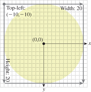
3 Canvas.Left="-10.0" Canvas.Top="-10.0"
4 Width="20.0" Height="20.0"
5 Fill="lightgray" />
6 </Canvas>
(Note: In this and the remaining XAML code displays in this chapter, we highlight the new or modified portion for your convenience.)
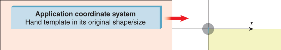
Although this specification is unambiguous, it’s not obvious what this ellipse will look like when displayed. What is the on-screen size of a circle of diameter 20 units, where our unit of measurement was determined by an arbitrary piece of graph paper?
We suggest you run the lab software (available in the online resources), and select V.01 to see the result of the execution of the above XAML. A screenshot of the rendered result (shown in Figure 2.9, along with a mouse cursor for scale) shows that the result is not acceptable for two reasons: The gray circle is too small to act as a usable clock face, and we are only seeing one quadrant.

Figure 2.9: Rendered result of revision V.01 of our XAML clock application, exhibiting problems with both image size and positioning.
The schematic view shown in Figure 2.10 depicts this ellipse specification, with the left side (light-pink box) representing the abstract geometric data that lives in the application with no physical representation, and the red arrow representing the rendering process that produces the displayed image.
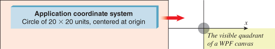
Here, we are seeing the effect of delivering abstract coordinates directly to the graphics platform. It is OK to use abstract coordinates to design your scene, but when it’s time to worry about how it will appear on the display, we must consider (1) characteristics of the display device, such as size, resolution, and aspect ratio; (2) how we want the rendered image to be sized and positioned in consideration of the form factor’s constraints; and (3) how to specify the geometry to the graphics platform in order to achieve the desired result.
In Section 2.6, we will discuss these considerations in the scope of full-featured applications. Here, for our simple clock application, let’s assume that the canvas will be displayed on a laptop screen, that the clock should be an “icon-sized” 1 inch in diameter, and that the clock should appear in the upper-left corner of the canvas. How can we revise our application to achieve this desired appearance?
2.4.3. The Spectrum of Coordinate-System Choices
We now have a specific physical size (one inch in diameter) in mind for our clock scene. So, should we reconsider our decision to design the geometry using an abstract coordinate system? To answer this question, let’s consider two alternative coordinate systems we might choose for scene description.
We could consider using an integer-pixel-based coordinate system like that described in Section 2.3.1, but that is not appropriate given our need to control the displayed size of our scene, independent of screen resolution.
Alternatively, we can consider designing our scene using the WPF canvas coordinate system, which is “physical”—the unit of measurement is 1/96 of an inch—and not resolution dependent. For example, an application can draw a rectangle of size 1/8 × 1/4 inches by specifying a width of 12 units and a height of 24 units.3 Thus, we can create a circle that is 1 inch in diameter by specifying the diameter as 96 units.
3. There are limitations to physical coordinate systems. Perfect accuracy in the sizes of displayed shapes cannot be guaranteed due to dependencies on disparate parts, including the device driver and the screen hardware.
Although direct use of the WPF coordinate system does provide resolution independence, we do not recommend that strategy, for there are two other kinds of independence worthy of pursuit.
• Software-platform independence: By using the coordinate system of a specific graphics platform, we are unnecessarily tying portions of our application code to that platform, potentially increasing the work that would be necessary to later “port” the application to other platforms.
• Display-form-factor independence: The display screens on today’s devices come in a huge variety of sizes and aspect ratios (also known as form factors). To ensure compatibility with a large variety of form factors, from phone to tablet to desktop, a developer should keep scene geometry as abstract as possible and nail down the geometry at runtime using logic that considers the current situation (form factor, window size, etc.). For example, in deciding on a 1-inch diameter for our clock, we were thinking about icons on a laptop form factor; we might well choose a different optimal size for a smartphone device. An abstract coordinate system allows for runtime decision making on actual physical sizing. For further discussion on this important topic, see Section 2.6.
We now see that the use of an abstract coordinate system is advantageous in several ways, so let’s continue with that strategy.
There’s a further advantage to the abstract coordinate system: It’s often easier to specify a shape using small numbers—for example, to say, “I want a disk that goes from –1 to 1 in x and y, and then I want to move it to be centered at (37, 12),” rather than saying, “I want a disk that goes from 36 to 38 in x and from 11 to 13 in y.” In the former specification, it’s easy to see that the radius of the disk is 1, and that it’s a circular disk rather than an elliptical one. This idea—that it’s easier to work in some coordinate systems than in others—will arise again and again, and we embody it in a principle:
 The Coordinate-System/Basis Principle
Always choose a coordinate system or basis in which your work is most convenient, and use transformations to relate different coordinate systems or bases.
2.4.4. The WPF Canvas Coordinate System
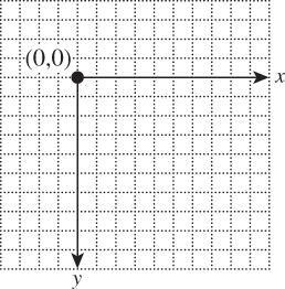
At this point, you have been informed of only one characteristic of WPF canvas coordinates. Figure 2.11 demonstrates the other important features: The origin (0,0) lies at the upper-left corner of the canvas, the positive x-axis extends to the right, the positive y-axis extends downward, and the canvas is “bounded” on all four sides (represented by the light-blue rectangle in the figure). That is to say, each WPF canvas has a definitive width and height (usually controlled by layout logic as described previously). In the common case of ClipToBounds="True", these bounds are strictly enforced, so any visual information lying outside the bounds is invisible.4
4. As we implement this application throughout Section 2.4, we’ll assume the canvas is large enough to show the entire clock, but Inline Exercise 2.5 will invite you to investigate what happens when it’s not.
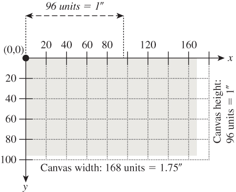
Figure 2.11: A WPF canvas of size 168 × 96 units, with ClipToBounds=True. Note the hardwired location of the origin and the hardwired semantics of 96 units to the physical inch. On the display device, when rendered by an accurate device driver, this canvas will appear with a size of 1. 75 × 1 inches. The canvas is bounded on all four sides and displays only the visual information lying within the bounds.
With this information, we can now return to developing our clock application. Let’s prepare by reviewing the sequence of “spaces” through which the scene’s geometry travels from abstract to physical to device, shown in Figure 2.12. We already discussed the application and WPF canvas coordinate systems, and in Section 2.4.5 we show you how the former system is mapped to the latter. So here we’ll briefly address the final transition shown in the sequence, the mapping of the WPF canvas to actual pixels on the display device. This part of the pipeline is not fully under application control; rather, it is performed by a collaboration between a number of modules: the WPF layout managers (created and configured by the application to control the location and size of all components in the client area, including the canvas), the window manager (controlling the location and size of the application’s client area), and the low-level rasterization pipeline (composed of a sequence of modules such as an immediate-mode package like DirectX or OpenGL, a low-level device driver, and the graphics hardware itself).
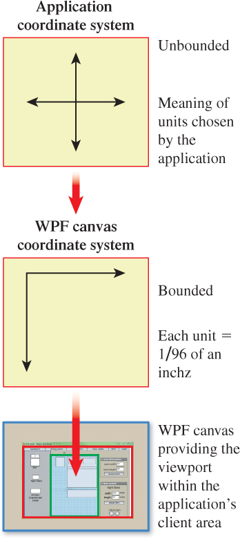
Figure 2.12: Progression from an application’s abstract coordinate system, then into the WPF canvas coordinate system, and finally onto the display device as a part of the application window’s client area.
2.4.5. Using Display Transformations
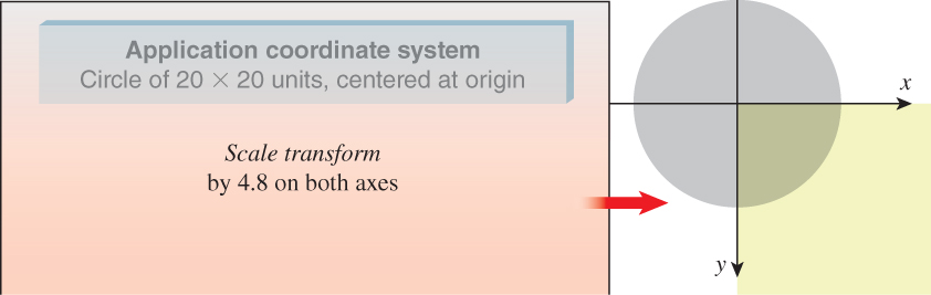
At last, we now understand why our clock face, as defined in our abstract system, produces the unacceptable result of Figure 2.9.
• The circle has a radius of 20 units. We now know that 20 units on the WPF canvas is less than 1/4 inch, unacceptably small.
• The circle is specified with its center at the origin. We now know that the WPF canvas shows only data in the (+x, +y) quadrant, so most of our circle is hidden.
To repair our application, we will set up a display transformation to mathematically adjust the entire scene’s geometry from the abstract application coordinate system to the WPF canvas system in a way that (a) makes the clock completely visible and (b) makes it the right size.
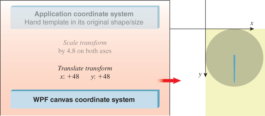
First, consider the need to resize. Our clock’s diameter is 20 units in our abstract system. We would like that to map to 1 inch on the WPF canvas; thus, we want it to map to 96 WPF units. Consequently, we want to multiply each graph-paper coordinate by 96/20, or 4.8, on both axes. To request that the canvas perform this scale transformation, we attach a RenderTransform5 to the canvas to specify a geometric operation that we want to be applied to all objects in the scene:
5. WPF’s use of the term “RenderTransform” for a transformation is somewhat misleading since it implies it is used only to control display. A better name would be “GeometricTransform” since this element type performs 2D geometric transformations to achieve a wide variety of purposes, for both modeling and display control, as is demonstrated throughout this chapter.
1 <Canvas ... >
2
3 <!- THE SCENE ->
4 <Ellipse ... />
5
6
7 <!- DISPLAY TRANSFORMATION ->
8 <Canvas.RenderTransform>
9 <!- The content of a RenderTransform is a TransformGroup
10 acting as a container for ordered transform elements. ->
11 <TransformGroup>
12 <!- Use floating-point scale factors:
13 1.0 to represent 100%, 0.5 to represent 50%, etc. ->
14 <ScaleTransform ScaleX="4.8" ScaleY="4.8"
15 CenterX="0" CenterY="0"/>
16 </TransformGroup>
17 </Canvas.RenderTransform>
18
19 </Canvas>
Note that when you specify a 2D scale operation, you must specify the center point, which is the point on the plane that is stationary—all other points move away from (or toward) the center point as a result of the scale. Here, we use the origin (0, 0) as the center point.
The effect of our new revision (V.02 in the laboratory) is depicted in Figure 2.13. Clearly, we have solved the size problem, but still only one quadrant of the circle is present on the visible portion of the canvas.
Thus, we want to add another transform to our canvas, to move our scene to ensure full visibility. We will use a translate transformation:
1 <TranslateTransform X="..." Y="..."/>
How many units do we need to translate? Since our scale transform has ensured that our circle has a 1-inch diameter on the WPF canvas, and we’re seeing only one-half of the circle on each dimension, we need to move the circle a half-inch down and a half-inch toward the right (i.e., 48 canvas units on each axis) to ensure full visibility.
Here is the revised XAML (V.03 in the lab); its effect is depicted in Figure 2.14.
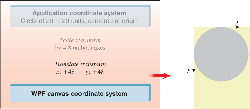
Figure 2.14: Schematic view of our application now enhanced with a two-step display-transform sequence (scale and translate).
1 <Canvas ... >
2 <!- THE SCENE ->
3 <Ellipse ... />
4
5 <!- THE DISPLAY TRANSFORM ->
6 <Canvas.RenderTransform>
7 <TransformGroup>
8 <ScaleTransform ScaleX="4.8" ScaleY="4.8" ... />
9 <TranslateTransform X="48" Y="48" />
10 </TransformGroup>
11 </Canvas.RenderTransform>
12 </Canvas>
Note
Animated versions of all of the application schematic views in this chapter are provided as part of the online material.
To review: We have used a sequence of transforms, attached to the canvas, to perform what we call a display transformation to execute the geometric adaptations necessary to make our scene have the desired spatial appearance on the display device. The display transformation maps our application coordinate system to WPF’s canvas coordinate system; we indicate this goal state by highlighting the coordinate system’s representation with a drop shadow.
Because the display transformation is attached to the canvas, it operates on the entire scene, no matter how large or complex. At this point our scene is a single primitive, but as we continue developing this application and the scene becomes more complex, the value of this display transformation will be more apparent.
Performing the scale before the translate is one way to accomplish this display transformation; however, the reverse order will work as well, with different values for the numeric properties. Using the laboratory, visit V.03 and edit the XAML code to reverse the order of the two transforms. First, change the order without adjusting the numeric properties, notice how the rendered scene changes, and then change the properties as needed to restore the desired target rendering.
Note that the circle is “hugging” the top and left side of the canvas. Edit V.03 to move the circle 1/8 of an inch to the right and 1/8 of an inch down, to give it some “breathing room.” Here again, the correct numeric values will depend on the order of the transforms.
In Inline Exercise 2.1, you noted the order dependency of a transformation sequence: Scale followed by translate doesn’t yield the same results as translate followed by scale. The reason for the order dependency is based on laws of linear algebra. As you will discover in Chapter 12, each transformation, like rotation and translation, is represented internally by a matrix. Sequencing a number of transformations is implemented via matrix multiplication, a noncommutative operation. Thus, it should be no surprise that the order of sequential transformations is important.
2.4.6. Creating and Using Modular Templates
These same transformation utilities are also used for the purpose of constructing a scene by positioning and adjusting copies of reusable stencils called control templates.6 Unlike physical templates that cannot change their size, graphics templates can be rotated, translated, and scaled.
6. WPF’s use of the word “control” in its template nomenclature refers to a typical use of this kind of template: the construction of reusable custom GUI controls.
Consider how we might approach defining the hour and minute clock hands. We would like both to share a similar shape, but we’d like the hour hand to be shorter and stouter, a variation that can be achieved via a nonuniform scaling of the same polygon that generates the minute hand. So let’s consider how we might construct and place those two hands by defining and using the template shown in Figure 2.15.
The WPF element type Polygon is used to create an outlined or filled polygon via a sequential (either clockwise or counterclockwise) specification of the vertices. Here is the XAML specification of our canonical clock hand, to be filled with a navy color; note the use of spaces to separate coordinate pairs. Also notice that we define the clock hand using our application’s abstract coordinate system.
1 <Polygon
2 Points="-0.3, -1 -0.2, 8 0, 9 0.2, 8 0.3, -1"
3 Fill="Navy" />
We want this Polygon element to be a reusable template, defined once and then instantiated (added to the scene) any number of times. A control template is specified in the resource section of the root element (in this case, the Canvas element). Each template must be given a unique name (using the x:Key attribute) so that it can be referenced for the purpose of instantiation.
1 <Canvas ... >
2
3 <!- First, we define reusable resources,
4 giving each a unique key: ->
5 <Canvas.Resources>
6 <ControlTemplate x:Key="ClockHandTemplate">
7 <Polygon ... />
8 </ControlTemplate>
9 </Canvas.Resources>
10
11
12 <!- THE SCENE ->
13 <Ellipse ... />
14
15 <!- THE DISPLAY TRANSFORM ->
16 <Canvas.RenderTransform> ... </Canvas.RenderTransform>
17 </Canvas>
If we were to execute our application now, with this new template specification, we would not detect any change. Still, only the gray clock face would be visible. We must instantiate this template to actually change the displayed scene.
To do so, we add a Control element—which instantiates by reference to the ClockHandTemplate resource—to our scene, resulting in revision V.04:
1 <!- THE SCENE ->
2
3 <!- The clock face ->
4 <Ellipse ... />
5
6 <!- The minute hand: ->
7 <Control Name="MinuteHand"
8 Template="{StaticResource ClockHandTemplate}"/>
How will this new revision of our application look on the screen? Because the display-transformation sequence is attached to the entire canvas, the minute-hand polygon will be subjected to the entire display sequence—in essence, it will “tag along” with the circle through the transformation sequence, as shown in Figures 2.16 through 2.18.

Thus far, it may seem that our use of a template did nothing but make the XAML more complicated. After all, we could have simply specified a Polygon after specifying the Ellipse. But now, as we build the hour hand—and later, when you perform the suggested exercises—you will appreciate this template strategy.
We will now construct the hour hand via the same approach—instantiating the template—but we are going to make two adjustments.
First, we want to adjust its shape to distinguish it from the minute hand. To do so, we attach a scale transformation to the instance. Although we used scale transforms earlier in this chapter, here we pursue a different goal. Whereas our previous use of a transform sequence was to control our scene’s size and placement on the output device—a display transformation—here we are using scaling to construct a component of the scene—what we call a modeling transformation. This distinction between two uses of transformations has meaning to us as developers, but is unknown to the underlying platform since the same mechanism—RenderTransform—is used for both. (It’s a “what-for” distinction, not a “how-to” distinction.)
Second, to make it easy to distinguish between the two clock hands when the full scene is composed, we want to adjust the scene so that they don’t both lie on the y-axis overlapping each other. Thus, we are going to rotate the hour hand 45° clockwise, so the clock will show the time of 7:30. To do so, we need the third WPF transformation type, RotateTransform:
1 <RotateTransform Angle=... CenterX=... CenterY=... />
To instantiate the hour hand, we use the same Control tag we used for the minute hand; however, we attach a RenderTransform to this instantiation to perform our modeling transformation sequence. This results in the code shown in revision V.05 in the lab.
1 <!- The hour hand: ->
2 <Control Name="HourHand" Template="{StaticResource ClockHandTemplate}">
3 <Control.RenderTransform>
4 <TransformGroup>
5 <ScaleTransform ScaleX="1.7" ScaleY="0.7" CenterX="0" CenterY="0"/>
6 <RotateTransform Angle="45" CenterX="0" CenterY="0"/>
7 </TransformGroup>
8 </Control.RenderTransform>
9 </Control>
Note that to specify a rotation, you must provide not only the amount of rotation (clockwise, in degrees), but also the center of rotation, which is the point around which the rotation is to occur. One of the nice features of our custom coordinate system is that (0,0) represents the center of the clock, so the origin conveniently serves as the center of rotation for the clock hands (and also as the center point for the scaling operation).
Our scene’s XAML specification now has two uses of RenderTransform elements: one acting as a modeling transformation (built from two basic transformations) to “construct” the hour hand, and one acting as the display transformation that maps the entire scene to the canvas for display.
1 <Canvas ... >
2 <!- RESOURCES ATTACHED TO THE CANVAS ->
3 <Canvas.Resources>
4 <ControlTemplate x:Key="ClockHandTemplate">
5 <Polygon ... />
6 </ControlTemplate>
7 </Canvas.Resources>
8
9 <!- THE SCENE ->
10 <!- The clock face: ->
11 <Ellipse ... />
12 <!- The minute hand: ->
13 <Control Name="MinuteHand"
14 Template="{StaticResource ClockHandTemplate}"/>
15 <!- The hour hand: ->
16 <Control Name="HourHand"
17 Template="{StaticResource ClockHandTemplate}">
18 <Control.RenderTransform>
19 The modeling transform for the hour hand should be here.
20 </Control.RenderTransform>
21 </Control>
22 <!- THE DISPLAY TRANSFORM ->
23 <Canvas.RenderTransform>
24 The display transform for the scene should be here.
25 </Canvas.RenderTransform>
26
27 </Canvas>
Let’s watch the hour hand’s progress through the modeling transformation. In Figure 2.19, we see the hand template instantiated with its original geometry; the hand’s image is tiny, since this is prior to display transformation, so our schematic includes a magnification callout for clarity.
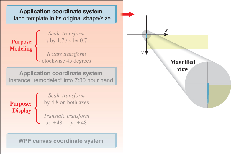
The first modeling transform is a nonuniform scale that produces the desired shorter, wider shape. The effect of this transformation is the desired hour-hand shape, as shown in Figure 2.20.
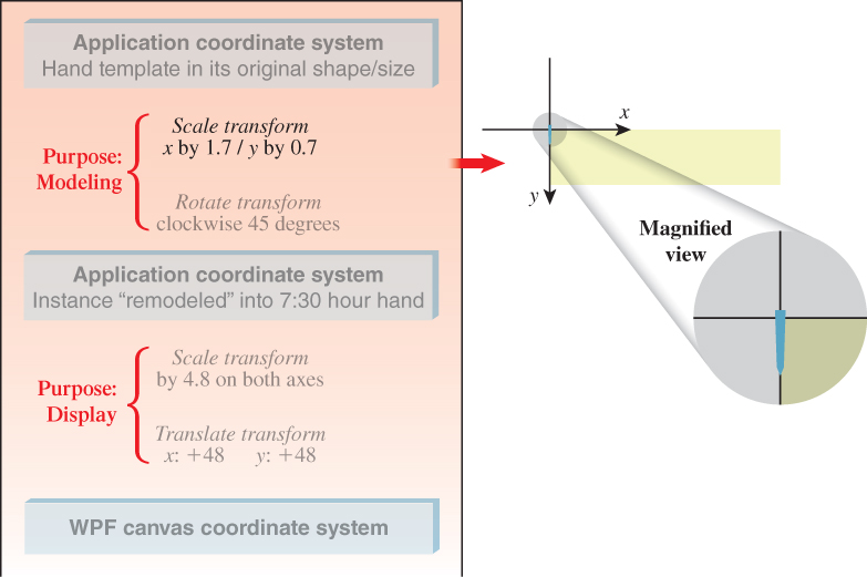
The second modeling transformation rotates it into the desired 7:30 location, as shown in Figure 2.21.
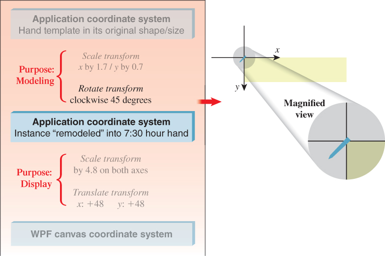
The hour hand is now ready to be exposed to the display transformation. It effectively “tags along” with the other members of the scene (clock face and minute hand) through the display-transformation sequence. The result is the full clock image, depicting the time of 7:30. Note that this chapter’s online resources include an animation showing the complete operation of this sequence of modeling and display transformations.
To ensure your complete understanding of how we’ve built the entire static clock scene, launch an XAML development environment and start with just a blank canvas. Add all the XAML code necessary to build a clock scene showing the time of 1:45. Add a 12:00 dot if you wish.
When using the WPF canvas in the recommended manner (ClipToBounds="True"), visual information that would lie outside the canvas’s bounds is hidden; that is, the image is “clipped” to the canvas boundary.
(a) To see what happens when the canvas is too small to show the entire clock image, use your window manager to radically reduce the size of the window in which the lab software runs.
(b) Jump ahead to read Section 2.6, which describes a couple of the ways a full-featured application might adapt to situations in which the canvas is forced to be too small to show the entire scene. Think about how an application could use WPF display transformations to implement either the zoom-out or the pan/scroll solutions presented in that section.
Construct a thin, red-colored second hand by creating a new resource template with its own distinct polygonal shape. Instantiate it on top of your solution to Inline Exercise 2.4 to test your work. Our solution is in the lab (V.06).
The more complex a template is, the more value its reusability provides. Add some additional visual elements to the clock-hand template (e.g., a thin line bisecting it longitudinally), or give it a more complex shape . . . and watch how its instances automatically adapt to show the template’s new definition.
Hint: The ControlTemplate will complain if you put more than one primitive inside it, so you’ll need to wrap its contents in a Canvas element. (Indeed, Canvas is used for multiple purposes, including acting as a general-purpose wrapper around multiple primitives.) Don’t put any attributes in the Canvas start tag for this usage.
Our use of this simple clock-hand template is a very basic, single-level example of hierarchical modeling, which is a sophisticated technique for constructing highly complex objects and scenes. See Chapter 6 for a proper introduction to, and example of, this technique.
2.5. Dynamics in 2D Graphics Using WPF
A retained-mode architecture supports the implementation of simple dynamics; the application focuses on maintaining the scene graph (including keeping it in sync with the application model if one is present), and the platform carries the burden of keeping the displayed image in sync with the scene graph. In this section, we examine two types of dynamics available to WPF applications:
• Automated, noninteractive dynamics in which 2D shapes are manipulated by animation objects specified in XAML
• And traditional user-interface dynamics, in which methods written in procedural code (callbacks) are activated by user manipulation of GUI controls, such as buttons, list boxes, and text-entry areas
2.5.1. Dynamics via Declarative Animation
WPF provides the ability to specify simple animations without procedural code, via XAML animation elements that can force object properties to change using interpolation over time. The application creates an animation element, connects it to the property to be manipulated, and specifies the animation’s characteristics: starting value, ending value, speed of interpolation, and desired behavior at termination (e.g., that the animation should be repeated when the ending value is reached). Lastly, the application specifies what event should trigger the start of the animation. Once set up, the animation element works automatically, without the need for intervention by the application.
Virtually every XAML element property can be the target of an animation. Examples include the following.
• The origin point of a shape (e.g., the upper-left corner of an ellipse) can be manipulated by an animation element to make the shape appear to vibrate.
• The fill-color, edge-color, and edge-thickness properties of a shape primitive can be manipulated by an animation element to perform feedback animations, such as glowing or pulsing.
• The angle property of a rotation transform can be manipulated by an animation element to make the affected objects rotate.
That last example is of interest to us as clock builders. We can use three animation elements, one for each hand, to provide for the clock’s movement.
Let’s look at the current status of our hour hand’s modeling transform, as designed previously.
1 <Control.RenderTransform>
2 <TransformGroup>
3 <ScaleTransform ScaleX="1.7" ScaleY="0.7" />
4 <RotateTransform Angle="45"/> <!- for 7:30 ->
5 </TransformGroup>
6 </Control.RenderTransform>
The instance transform already contains a RotateTransform placing the hand into a 7:30 position. It would be best to have 12:00 be the hour hand’s “normalized” default position, now that we’re looking into adding time semantics to our application, so let’s change that rotate transform:
1 <!- Rotate into 12 o’clock default position ->
2 <RotateTransform Angle="180"/>
Additionally, to prepare for automated manipulation of the hand’s position, let’s add another RotateTransform and give it a tag (ActualTimeHour) to allow its manipulation by an animator. With these two changes, the TransformGroup becomes this:
1 <TransformGroup>
2 <ScaleTransform ScaleX="1.7" ScaleY="0.7" />
3 <!- Rotate into 12 o’clock default position ->
4 <RotateTransform Angle="180"/>
5 <!- Additional rotation for animation to show actual time: ->
6 <RotateTransform x:Name="ActualTimeHour" Angle="0"/>
7 </TransformGroup>
Now, let’s look at the declaration of the animation element that will rotate the hour hand. WPF provides one animation element type for each data type that one might want to automate. To control a rotation’s angle, which is a double-precision floating-point number, use the element type DoubleAnimation:
1 <DoubleAnimation
2 Storyboard.TargetName="ActualTimeHour"
3 Storyboard.TargetProperty="Angle"
4 From="0.0" To="360.0" Duration="1:00:00.0"
5 RepeatBehavior="Forever"
6 />
7
The animation is connected to the hour hand through the setting of the TargetName and TargetProperty attributes, which point to the Angle property of the target RotateTransform element. The From and To attributes determine the range and direction of the rotation, and Duration controls how long it should take to move the property’s value through that range. Duration is specified using this convention:
1 Hours : Minutes : Seconds . FractionalSeconds
The RepeatBehavior="Forever" setting ensures that the clock hand will continue moving as long as the application is running; as soon as the value reaches the “To” destination, it “wraps around” to the “From” value and continues the animation.7
7. Other available behavior types include reverse motion (i.e., “bouncing back”) and simply stopping (for “one-shot” motions).
The final step is to install the animation in the XAML code. We want the animation to start as soon as the clock face is made visible. Thus, we create an EventTrigger and use it to set the Triggers property of the canvas. A trigger must specify what type of event launches it (in this case, as soon as the canvas’s content has been fully loaded) and what action it performs (in this case, a set of three simultaneous animation elements, encapsulated into what WPF calls a Storyboard):
1 <Canvas ... >
2
3 The specification of the clock scene should be located here.
4
5 <Canvas.Triggers>
6 <EventTrigger RoutedEvent="FrameworkElement.Loaded">
7 <BeginStoryboard>
8 <Storyboard>
9 <DoubleAnimation
10 Storyboard.TargetName="ActualTimeHour"
11 Storyboard.TargetProperty="Angle"
12 From="0.0" To="360.0"
13 Duration="01:00:00.00" RepeatBehavior="Forever" />
14
15 Two more DoubleAnimation elements should be located
16 here to animate the other clock hands.
17
18 </Storyboard>
19 </BeginStoryboard>
20 </EventTrigger>
21 </Canvas.Triggers>
22
23 </Canvas>
Revision V.07 of the laboratory shows this animated clock, but its XAML has been modified to make the hour hand move unnaturally fast to make it easier to notice and test the animation’s movement. We recommend the following exercises to those who want to test their understanding of this section.
Study the XAML code of revision V.07, and then do the following.
a. The minute hand is currently instantiated into the scene with no modeling transformation. Add the necessary tagging to attach a transform group to it and install the two rotation transforms (one to place it in the default 12:00 position, the other to facilitate animation). Add the necessary tagging to the storyboard to animate it to rotate once per minute.
b. Set up animation of the second hand similarly.
c. Repair the animation of the hour hand so that it is accurate.
d. If you’d like to demo the clock to a friend, manually change the “default position” rotate transformations to initialize the hands to better approximate the actual time at your location, and then commence execution and watch the clock keep accurate time.
e. The ultimate solution for the clock-initialization problem is to use procedural code to initialize the clock. If you have access to Visual Studio software and tutorials, take this XAML prototype and “productize” it by adding initialization logic to create a fully functional WPF clock application that shows the correct local time.
For a more thorough exercise in template-based modeling and animation, visit the online resources to download instructions for the “Covered Wagon” programming exercise.
2.5.2. Dynamics via Procedural Code
Obviously, there is a limit to the richness of an application built using XAML alone. Procedural code is necessary for the performance of processing, logic, database access, and sophisticated interactivity. WPF developers use XAML for what it’s best suited (scene initialization, resource repository, simple animations, etc.), and use procedural code to complete the specification of the application’s behavior. For example, in a real clock application, procedural code would be used to determine the correct local time, to support alarm features, to respond to user interaction, etc.
2.6. Supporting a Variety of Form Factors
The wide variety of raster display devices—ranging from small smartphone screens to wall-size LCD monitors—poses a challenge to applications. These problems are similar to the ones faced by a desktop application when its window’s size is decreased beyond a certain reasonable limit. In both cases, the application needs to adapt to changes in form factor.
A well-designed application uses logic to examine its current form factor and adapt its appearance as needed. Let’s look at adaptation strategies for both of the key areas in a typical application: its UI area and its scene-display area.
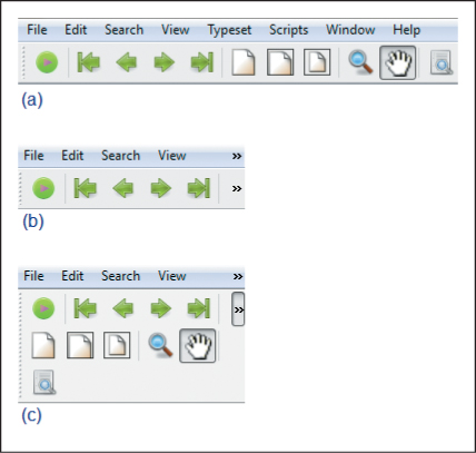
When the screen area allocated for a set of UI controls becomes limited, it is rarely wise to adapt by zooming out (scaling down) the controls. The usability of UI controls, and the user’s reliance on “spatial memory” for quick access to commonly used controls, are adversely affected by such a technique. An application can instead respond by elision (e.g., hiding controls that are less often used) or by rearrangement of the layout.
An example of the latter is shown in the three-part Figure 2.22. Part (a) shows the menu bar and toolbar in their optimal layout. If the window’s width is reduced significantly, the bars are clipped at the right side, as shown in part (b), and “expansion” buttons labeled “ ” are revealed to provide access to the menus and controls that had to be hidden. Part (c) shows the result of the use of an expansion button to reveal the remainder of the toolbar.
A different set of strategies should be considered for scene display when the viewport’s size is restricted. Potential solutions include the following.
• The application can zoom out (scale down) the rendering to make more of (or all of) the scene fit within the viewport.
• The application can clip the rendering to the viewport’s boundaries and provide an interface supporting panning (scrolling) to access any part of the scene.
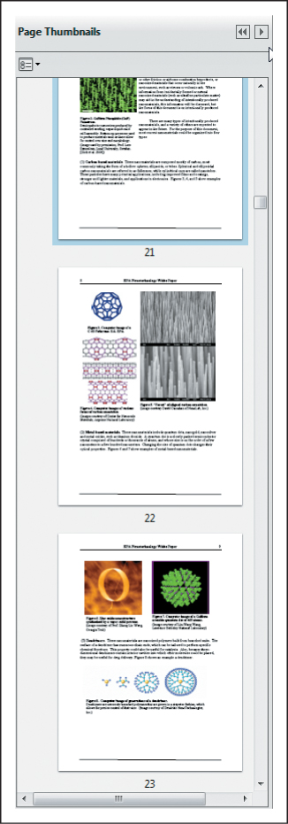
These choices are by no means mutually exclusive, and applications often employ a combination of both scaling and clipping; an example, the Adobe Reader thumbnail pane, is shown in Figure 2.23. In this example, the selected document is a long PDF document; think of it as a very tall and narrow scene, one standard page width in width, and 136 standard page heights in height. This application uses a different approach for handling height versus width. For the former, it “clips” the scene and shows only a few pages at a time, providing scrolling features for navigation. For the latter, it uses a zoom-out/scale-down strategy to adapt the scene so that its width exactly matches the width of the pane. The user can choose to widen the thumbnail pane, thus increasing the thumbnails’ width, and reducing the intensity of the downscaling, making the thumbnail more “readable”.
In both of these example adaptations, the application is responsible for the logic to determine the policy to use for a particular form factor/screen size, but the WPF platform provides much of the mechanism needed to implement the policy. For example, WPF’s UI layout tools simplify UI adaptations like the one described above. And, for scene adaptations, transformations are of great service: Scaling facilitates zooming in/out, and translation facilitates scrolling/panning effects.
2.7. Discussion and Further Reading
In this chapter we’ve seen how to create collections of primitives in the abstract application coordinate system that is our 2D world, and how to reuse primitives as instances of defined templates. Although we haven’t shown templates composed of simpler templates, we will treat that common form of geometric modeling in our discussion of WPF 3D in Chapter 6. We have made use of transforms, both for modeling and for mapping from abstract application coordinates to WPF canvas coordinates and then on to physical device coordinates; we will discuss the underlying mathematics of transformations in subsequent chapters. Finally, we have seen the advantages of a retained-mode graphics platform for factoring out a number of tasks that are common to many applications, including simple animations. Most importantly, we’ve introduced the basic features of declarative programming useful for rapid prototyping that can be conveniently extended to do geometric modeling and rendering in WPF 3D.
We have not discussed UI callbacks in response to user interactions like button presses. If such interactions change the thing to be drawn, we must redraw it, just as we must change the application model’s state if they change that. Such a callback response is now fairly standard for any program that has a UI, which means most modern programs, and we do not discuss it further.
There’s also a second kind of interaction to consider: interaction within the viewport, that is, the clicks and drags that the user may perform on the displayed scene. To respond appropriately to these, we often need to know things like which object in the scene the user clicked on, and where the drag started and ended. Determining which object was clicked is known as pick correlation, and we discuss this in the context of 3D in Chapter 6. Responding to click-and-drag operations in a 3D scene often requires careful work with the modeling transform hierarchy; we discuss some examples in Chapter 21.
There are a great many other graphics packages in the world, and you’re likely to encounter at least a few as you work with computer graphics. We encourage you to browse the Web and read about OpenGL, for instance, and Swing, to get a sense of the variety of features provided by various packages and some of the commonality and differences among them.