
The dashboard is a graphical representation of a report. It will show data from the source report as a graphical component, which can be a metric chart, gauge, donut chart, and so on. Components provide a glimpse of the key metrics and performance meters of your organization. Use this when you are interested in knowing about the numbers and comparisons based on the same fields.
A user will be able to see all the details in a dashboard whether they have access to the records or not; however, once they drill down to the report, they will only be able to see records that he or she has access to. Dashboard components can be a metric chart, gauge, donut chart, table, or another component that you can create with Visualforce. A description of each component is as follows:
- Chart: You can use a chart when you want to display data graphically. It also allows you to choose from a variety of chart types.
- Gauge: You can use a gauge when you have a single value that you want to show within a range of custom values. For example, to create a dashboard that would measure where your current lead amounts would fall within a range of values, set Minimum Value, Breakpoint #1 Value, Breakpoint #2Value, and Maximum Value for the gauge. The ranges that you set can indicate poor, acceptable, or good performance. You can set appropriate colors for each of these ranges to visually indicate progress.
- Metric: You can use a metric when you have one key value to display. For example, consider you have a report that shows the total amount of all the leads from the origin web, phone, or newspaper for the current month. If this is the case, you can name this value and use it as a potential revenue target for the month displayed on the dashboard.
- Table: You can use a table to show a set of report data in column form, similar to what you see in Microsoft Excel, for example, to see the top 20 accounts based on revenue.
- Visualforce Page: You can use a Visualforce page when you want to create a custom component or when your requirement is not fulfilled by the component available.
- Custom S-control: Use Custom S-control when you want to display any type of content in a browser, for example, a Java applet, an Active-X control, an Excel file, or a custom HTML web form.
Dynamic dashboards display the data of the users viewing it, rather than the data of a specified running user. The system administrator or users who have Run Reports and Manage Dashboards permission can create dashboards. We can only create dashboards from the Summary and Matrix report. Let's start with a business use case.
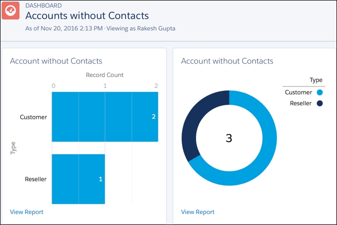
Say David Guzman is working as a System Administrator at Universal Containers. He has created a summary report called Account without Contacts. Now he wants to create a dynamic dashboard for it.
- Navigate to the Dashboards tab and click on the New Dashboard button.
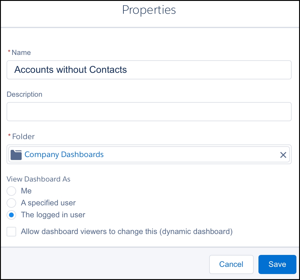
- It will redirect you to a page where you will need to enter the dashboard name. In this case, enter
Accounts without Contacts, select the folder to store the dashboard as Company Dashboard, then click on Create, as shown in the following screenshot:
- Click on + Add to insert a component into your dashboard.
- It will prompt you a window to select the Report and Chart type for the new component. For Report, select Accounts without Contacts, and for Chart, select Horizontal Bar Chart, as shown in the following screenshot:

- Once you are done, click on Add. Once you add a component, it will also allow you to resize it, change its position, and delete or change it from the report.
- You can add multiple components to your dashboard. Each component will show data from one report. Add one more donut chart component to your dashboard. Use the drag-and-drop feature to reposition your components.
- Once you are done, click on Save.
At the end, it will look like the following:
- To create a dynamic dashboard, click on the Edit | Gear Icon button available on the dashboard page.
- You can set View dashboard as filter; there are three possible options provided by Salesforce:
- Me: Dashboard readers see data in the dashboard according to your access to data.
- A specified user: By using this setting, all users will see data in the dashboard according to the data access level of whomever you specify.
- The logged in user: If you select this, the user will see data according to their access. If you select this option, you will not be able to schedule a dashboard.
In this case, select The logged in user option, as shown in the following screenshot:
- Once you are done, click on Save. Then click on Save.
A dashboard filter allows users to change the data visible on the dashboard by selecting a filter value from a drop-down list. You can have maximum three fitters in a dashboard, each with up to ten filter values. Let's start with a business use case.
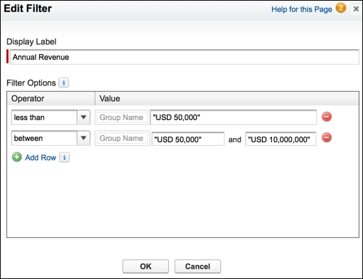
Say David Guzman is working as a System Administrator at Universal Containers. He has created a dashboard for the Accounts without Contacts Aloha summary report. Now he wants to add dashboard filters based on the Account Annual Revenue field, mentioned as follows:
- Less than 50,000
- Between 50,000 and 10,000,000
As of Spring'17 release, the dashboard filter feature is not available in Salesforce Lightning Experience. You can't dashboards filters in Lightning Experience. Lightning Experience users can view filtered dashboards. It's possible to apply or clear filters that were added in Salesforce Classic.
To create a dashboard filter, we would need to switch back to Salesforce Classic UI. Use the switcher to switch back to Salesforce Classic. Perform the following steps to solve the preceding business requirement:
- Navigate to the Reports tab and create a new dashboard with the same chart (which we created in Creating a dynamic dashboard section) in Salesforce Classic. Use
Accounts without Contacts Alohaas the new dashboard name.
- Navigate to the Reports tab and click on Edit for the Accounts without Contacts Aloha dashboard in Salesforce Classic.
- To add a filter to the dashboard, click on the Add Filter button.
- Now select the field to filter on from the Field dropdown, that is, Annual Revenue in this case.
- The next step is to define the condition as shown in the following screenshot:
- Once you are done, click on OK. Then click on Save.
From the next time onward, whenever this dashboard is run, the user will see the option to filter dashboard data, similar to the following screenshot:
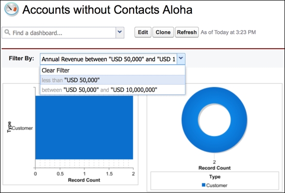
We can have maximum three filters in a dashboard, and each filter can have up to 10 filter values.