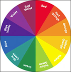
Figure 15-1: Sample color wheel, a great way to visualize colors for your site.
Building Great Calls-to-Action
One of the first hurdles you face when trying to engage visitors to your site or social streams is deciding what you’ll ask them to do after you get their attention. Most people who are new to developing calls-to-action get overwhelmed and default to a simple Email Us — or just list their e-mail without even making it a link.
Going beyond clarity, you have to make your calls-to-action easy to see as well. You won’t have anything to measure at all if people can’t figure out where to do what you want them to do.
Color
Calls-to-action often appear in the form of buttons or icons. Color is important (see Figure 15-1). Did you know that there have been psychological studies on what colors motivate people to do or feel different things? You can apply this information to your marketing and measurement efforts.

Here’s a quick color reference guide:
![]() Blue creates a feeling of safety, security, and calm and is often used when the goal is to get people to trust you. (It’s no accident that one of the Internet world’s biggest privacy violators, Facebook, is blue.)
Blue creates a feeling of safety, security, and calm and is often used when the goal is to get people to trust you. (It’s no accident that one of the Internet world’s biggest privacy violators, Facebook, is blue.)
![]() Green creates a feeling of confidence, wealth, and, in certain shades, calm and is often used when you want people to shell out cold, hard cash. Sometimes the calming effect can backfire. (For example, hospitals are often green, but rarely calming.)
Green creates a feeling of confidence, wealth, and, in certain shades, calm and is often used when you want people to shell out cold, hard cash. Sometimes the calming effect can backfire. (For example, hospitals are often green, but rarely calming.)
![]() Red creates a feeling of power, a sense of vibrancy, energy, and vigor and is often used when you want to show that you’re an authority in a subject matter area. Caution: Overuse of red can trigger agitation and anger (and can also be hard to read).
Red creates a feeling of power, a sense of vibrancy, energy, and vigor and is often used when you want to show that you’re an authority in a subject matter area. Caution: Overuse of red can trigger agitation and anger (and can also be hard to read).
![]() Yellow creates a sunny sense of optimism and cheer and is often used to imply that a company or product is fun and energetic. Like red, overuse of yellow can agitate people and push them away. Use sparingly.
Yellow creates a sunny sense of optimism and cheer and is often used to imply that a company or product is fun and energetic. Like red, overuse of yellow can agitate people and push them away. Use sparingly.
![]() Pinks and purples create a soft sense of romance or indicate a dreamy, comforting feel. They’re often (over)used if the target customer is a female in the age 18 to 24 bracket. The color pink has been somewhat co-opted by cancer causes, as well.
Pinks and purples create a soft sense of romance or indicate a dreamy, comforting feel. They’re often (over)used if the target customer is a female in the age 18 to 24 bracket. The color pink has been somewhat co-opted by cancer causes, as well.
![]() Orange creates a feeling of youth and a general sense of action. A popular color in social media, orange is often used to indicate that a company is fresh and hip and that the customer should act quickly to book its services. Like yellow and red, orange can be hard to read if overused in design.
Orange creates a feeling of youth and a general sense of action. A popular color in social media, orange is often used to indicate that a company is fresh and hip and that the customer should act quickly to book its services. Like yellow and red, orange can be hard to read if overused in design.
![]() Black creates a sense of wealth or aggression. Often used to entice people to spend money on more expensive items or to demonstrate power, black can be off-putting to some people or, if done poorly, make a site look outdated.
Black creates a sense of wealth or aggression. Often used to entice people to spend money on more expensive items or to demonstrate power, black can be off-putting to some people or, if done poorly, make a site look outdated.
So out of all of those colors, which ones are the best colors for your calls-to-action?
If you look at Google+, Facebook, and other sites with notification indicators when you have new messages and so on, you’ll notice that the predominant color for these chiclet indicators is red. You’ll probably notice that you feel compelled to click, as well. If you guessed red as a great choice for a call-to-action button, you’d be right.
If you can’t — or don’t want to — default to red, you’ll want to choose a color that is contrasting to your site theme. If you’ve worked with a color wheel, you remember that contrasting colors are the ones directly across from each other on the wheel. So, on a predominantly blue site, an orange button would stand out.
Placement
So where do you put the button(s) after you know what you want them to look like? This burning question faces everyone with a website and a need for customers.
In this case, it’s important to use metrics to help with placement. Do A/B testing on page placement. Run versions of your landing page that have the button(s) in different places. I recommend running two versions at a time, but I’ve had clients who ran as many as five test placements at once, delivering randomly.
Your metrics can help you determine which versions get the most clicks overall, which parts of the page get the most clicks, and which button colors and placements get the most conversions from clicks (for example, filling out a form or other further action).
If you’re using some of the new page insights, you can even look at click percentages on the pages you’re testing. This number not only gives you a visual of the data for your button placement, it puts it in context with the other clickable elements on the page: navigation bar, logos, creative content, and other calls-to-action. Having that perspective will help you make a more educated decision on which version of your page to use.
What to say
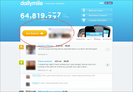
What should your calls-to-action say? As a general rule, ambiguity is never going to be in your best interests. People respond well to clarity. Go ahead: Tell them what to do (see Figure 15-2).
There is a reason so many brand pages on Facebook have a landing tab that has a huge graphic pointing to a Like button and directly tell folks to Like This Page! for [insert reward here]. It works!
Your calls-to-action should have short, direct language that tell your customer or potential customer what you want them to do. The copy surrounding the call-to-action is important also. It should get people excited for the reward or result they’ll get from clicking and converting.
In addition, here are a few more do’s and don’ts of button text:
![]() Don’t be vague. Submit and Click Here are vague.
Don’t be vague. Submit and Click Here are vague.
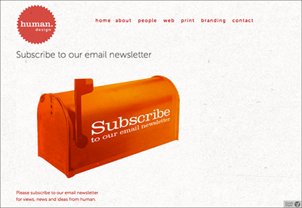
![]() Do create task or result-oriented text. Register Free!, Subscribe Now, Create Account, Send E-Mail, and Get Event Notices are all specific, good call-to-action text options (see Figure 15-3).
Do create task or result-oriented text. Register Free!, Subscribe Now, Create Account, Send E-Mail, and Get Event Notices are all specific, good call-to-action text options (see Figure 15-3).
Figure 15-2: Daily Mile offers a call-to-action with clear instruction for the visitor.

Figure 15-3: Human Design has a clear call-to-action for its e-mail list.


 A good call-to-action won’t ask your visitors or social media followers to think too much about how to do what you’re asking. In fact, they won’t have to wonder too deeply about what it is you really want them to do, either. Clarity is key.
 Some people find that running different versions of the landing page with calls-to-action for each incoming link source is effective. Just as you design a landing page for, say, a Twitter audience, you can tailor the buttons on that page as well. There is nothing wrong with keeping that A/B rotation up permanently, triggered by referral source.
 Humor sells, but bad humor pushes people away. If you’re going to use humor in your calls-to-action, make sure that you give it the human test before launching. In this case, use your metrics to A/B test a serious versus funny version of the call-to-action or two different versions of the funny idea.