Testing for Normality with PROC UNIVARIATE
The normal distribution is a symmetrical, bell-shaped distribution of values. The shape of the normal distribution is shown in Figure 5.1.
Figure 5.1. The Normal Distribution

To understand the distribution in Figure 5.1, assume that you are interested in conducting research on people who live in retirement communities. Imagine for a moment that it is possible to assess the age of every person in this population. To summarize this distribution, you prepare a figure similar to Figure 5.1: the variable AGE is plotted on the horizontal axis, and the frequency of persons at each age is plotted on the vertical axis. Figure 5.1 suggests that many of your participants are around 71 years of age, since the distributions of ages “peaks” near the age of 71. This suggests that the mean of this distribution will likely be somewhere around 71. Notice also that most of your participants’ ages are between 67 (near the lower end of the distribution) and 75 (near the upper end of the distribution). This is the approximate range of ages that we would expect for persons living in a retirement community.
Why Test for Normality?
Normality is an important concept in quantitative analyses because there are at least two problems that can result when data are not normally distributed. The first problem is that markedly non-normal data can lead to incorrect conclusions in inferential statistical analyses. Many inferential procedures are based on the assumption that the sample of observations is normally distributed. If this assumption is violated, the statistic might give misleading findings. For example, the independent groups t test assumes that both samples in the study were drawn from normally distributed populations. If this assumption is violated, then performing the analysis can cause you to incorrectly reject the null hypothesis (or incorrectly fail to reject the null hypothesis). Under these circumstances, you should instead analyze the data using a procedure that does not assume normality (e.g., some nonparametric procedure).
The second problem is that markedly non-normal data can have a biasing effect on correlation coefficients, as well as more sophisticated procedures that are based on correlation coefficients. For example, assume that you compute the Pearson correlation coefficient between two variables. If one or both of these variables are markedly non-normal, this can cause your obtained coefficient to be much larger (or much smaller) than the actual correlation between these variables in the population. Your obtained correlation is essentially misleading. To make matters worse, many sophisticated data analysis procedures (such as principal component analysis) are actually performed on a matrix of correlation coefficients. If some or all of these correlations are distorted due to departures from normality, then the results of the analyses can again be misleading. For this reason, many experts recommend that researchers routinely check their data for major departures from normality prior to performing sophisticated analyses such as principal component analysis (e.g., Rummel, 1970).
Departures from Normality
Assume that you draw a random sample of 18 participants from your population of persons living in retirement communities. There are several ways that your data can display a departure from normality.
Figure 5.2 shows the distribution of ages in two samples of participants drawn from the population of retirees. This figure is somewhat different from Figure 5.1 because the distributions have been “turned on their sides” so that age is now plotted on the vertical axis rather than on the horizontal axis. (This is so that these figures will be more similar to the stem-and-leaf plots produced by PROC UNIVARIATE, discussed in a later section.) Each small circle in Figure 5.2 represents one participant in a given distribution. For example, in the distribution for Sample A, you can see that there is one participant at age 75, one at age 74, two at age 73, three at age 72, and so forth. The ages of the 18 participants in Sample A range from a low of 67 to a high of 75.
Figure 5.2. Sample with an Approximately Normal Distribution and a Sample with an Outlier

The data in Sample A form an approximately normal distribution (called approximately normal because it is difficult to form a perfectly normal distribution using a small sample of just 18 cases). An inferential test (discussed later) will show that Sample A does not demonstrate a significant departure from normality. Therefore, it probably is appropriate to include the data in Sample A in an independent samples t test, for example.
In contrast, there are problems with the data in Sample B. Notice that its distribution is very similar to that of Sample A, except that there is an outlier at the lower end of the distribution. An outlier is an extreme value that differs substantially from the other values in the distribution. In this case, the outlier represents a participant whose age is only 37. Obviously, this person’s age is markedly different from that of the other participants in your study. Later, you will see that this outlier causes the dataset to demonstrate a significant departure from normality, making the data inappropriate for some statistical procedures. When you observe an outlier such as this, it is important to determine whether it should be either corrected or simply deleted from the dataset. Obviously, if the outlier exists because an error was made in entering the data, it should be corrected.
A sample can also depart from normality because it displays kurtosis. Kurtosis refers to the peakedness of the distribution. The two samples displayed in Figure 5.3 demonstrate different types of kurtosis:
Figure 5.3. Samples Displaying Positive versus Negative Kurtosis

Sample C in Figure 5.3 displays positive kurtosis, which means that the distribution is relatively peaked (tall and skinny) rather than flat. Notice that, with Sample C, there are a relatively large number of participants who cluster around the central part of the distribution (around age 71). This is what makes the distribution peaked (relative to Sample A, for example). Distributions with positive kurtosis are also called leptokurtic. A mnemonic device to remember the meaning of this word is to think of the distribution leaping upward (i.e., a leptokurtic distribution leaped up).
In contrast, Sample D in the same figure displays negative kurtosis, which means that the distribution is relatively flat. Flat distributions are described as being platykurtic. A mnemonic device to remember the meaning of this word is to think of the distribution as flat as a plate.
In addition to kurtosis, distributions can also demonstrate varying degrees of skewness, or sidedness. A distribution is skewed if the tail on one side of the distribution is longer than the tail on the other side. The distributions in Figure 5.4 show two types of skewness:
Figure 5.4. Samples Displaying Positive versus Negative Skewness
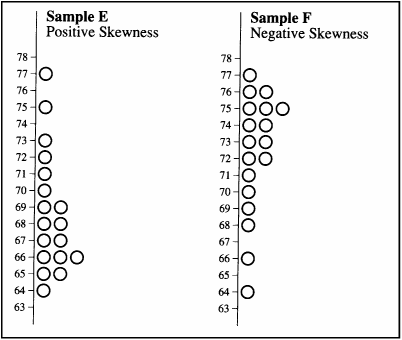
Consider Sample E in Figure 5.4. Notice that the largest number of participants in this distribution tends to cluster around the age of 66. The tail of the distribution that stretches above 66 (from 67 to 77) is relatively long, while the tail of the distribution that stretches below 66 (from 65 to 64) is relatively short. Clearly, this distribution is skewed. A distribution is said to be positively skewed if the longer tail of a distribution points in the direction of higher values. You can see that Sample E displays positive skewness, because its longer tail points toward larger numbers such as 75, 77, and so forth.
On the other hand, if the longer tail of a distribution points in the direction of lower values, the distribution is said to be negatively skewed. You can see that Sample F in Figure 5.4 displays negative skewness because in that sample the longer tail points downward, in the direction of lower values (such as 66 and 64).
General Form for PROC UNIVARIATE
Like the MEANS procedure, PROC UNIVARIATE provides a number of descriptive statistics for quantitative variables, including the mean, standard deviation, kurtosis, and skewness. However, PROC UNIVARIATE has the added advantage of printing a significance test for the null hypothesis that the data come from a normally distributed population. The procedure also provides plots that will help you understand the shape of your sample’s distribution, along with additional information that will help you understand why your data depart from normality (if, indeed, they do). This text describes just a few of the features of PROC UNIVARIATE. See the SAS/STAT User’s Guide for a more complete listing.
Here is the general form for the PROC UNIVARIATE statements that produce the output discussed in this chapter:
PROC UNIVARIATE   DATA=dataset-name   NORMAL   PLOT;
   VAR variable-list;
   ID identification-variable;
RUN;
In the preceding program, the NORMAL option requests a significance test for the null hypothesis that the sample data are from a normally distributed population. The Shapiro-Wilk statistic is printed for samples of 2000 or less; for larger samples, the Kolmogorov statistic is printed. See the SAS/STAT User’s Guide for details.
The PLOT option in the preceding program produces a stem-and-leaf plot, a box plot, and a normal probability plot, each of which is useful for understanding the shape of the sample’s distribution. This book shows how to interpret the stem-and-leaf plot.
The names of the variables to be analyzed should be listed in the VAR statement. The ID statement is optional but is useful (and recommended) for identifying outliers. PROC UNIVARIATE prints an “extremes” table that lists the five largest and five smallest values in the dataset. These values are identified by the identification variable listed in the ID statement. For example, assume that AGE (participant age) is listed in the VAR statement, and SOCSECURITY (for participant Social Security number) is listed in the ID statement. PROC UNIVARIATE will print the Social Security numbers for the participants with the five largest and five smallest values on AGE. This should make it easier to identify the specific participant who represents an outlier in your dataset. (This use of the extremes table is illustrated here.)
Results for an Approximately Normal Distribution
For purposes of illustration, assume that you want to analyze the data that are illustrated as Sample A of Figure 5.2 (the approximately normal distribution). You prepare a SAS program in which participant age is entered as a variable called AGE, and participant identification numbers are entered as a variable called PARTICIPANT. Here is the entire program that will input these data and analyze them using PROC UNIVARIATE:
 1           DATA D1;
 2              INPUT   #1   @1   PARTICIPANT  2.
 3                           @4   AGE          2.   ;
 4           DATALINES;
 5            1 72
 6            2 69
 7            3 75
 8            4 71
 9            5 71
10            6 73
11            7 70
12            8 67
13            9 71
14           10 72
15           11 73
16           12 68
17           13 69
18           14 70
19           15 70
20           16 71
21           17 74
22           18 72
23           ;
24           RUN;
25           PROC UNIVARIATE   DATA=D1   NORMAL   PLOT;
26              VAR AGE;
27              ID PARTICIPANT;
28           RUN;
The preceding program requests that PROC UNIVARIATE be performed on the variable AGE. Values of the variable PARTICIPANT are used to identify outlying values of AGE in the extremes table.
This output would contain the following:
a moments table that includes the mean, standard deviation, variance, skewness, kurtosis, and other statistics;
a table of basic statistical measures that provide indices of central tendency and variability estimates;
tests of normality such as the Shapiro-Wilk statistic;
a quantiles table that provides the median, 25th percentile, 75th percentile, and related information;
extreme observations that provides the five highest values and five lowest values on the variable being analyzed;
a stem-and-leaf plot, box plot, and normal probability plot.
Output 5.4 includes the Moments table, basic statistical measures, tests for normality, quantiles table, extremes table, and a stem-and-leaf plot for Sample A.
Output 5.4. Tables from PROC UNIVARIATE for Sample A
                    The UNIVARIATE Procedure
                         Variable:  AGE

                            Moments

N                          18    Sum Weights                 18
Mean                       71    Sum Observations          1278
Std Deviation      2.05798302    Variance            4.23529412
Skewness                    0    Kurtosis            -0.1357639
Uncorrected SS          90810    Corrected SS                72
Coeff Variation    2.89856764    Std Error Mean      0.48507125


                   Basic Statistical Measures

         Location                    Variability

     Mean     71.00000     Std Deviation            2.05798
     Median   71.00000     Variance                 4.23529
     Mode     71.00000     Range                    8.00000
                           Interquartile Range      2.00000


                      Tests for Normality

   Test                  --Statistic---    -----p Value------

   Shapiro-Wilk          W     0.983895    Pr < W      0.9812
   Kolmogorov-Smirnov    D     0.111111    Pr > D     >0.1500
   Cramer-von Mises      W-Sq  0.036122    Pr > W-Sq  >0.2500
   Anderson-Darling      A-Sq  0.196144    Pr > A-Sq  >0.2500


                    Quantiles (Definition 5)

                     Quantile      Estimate

                     100% Max            75
                     99%                 75
                     95%                 75
                     90%                 74
                     75% Q3              72
                     50% Median          71
                     25% Q1              70
                     10%                 68
                     5%                  67
                     1%                  67
                     0% Min              67

                      Extreme Observations

-----------Lowest-----------        -----------Highest-----------

Value   PARTICIPANT      Obs        Value   PARTICIPANT       Obs

   67             8        8           72            18        18
   68            12       12           73             6         6
   69            13       13           73            11        11
   69             2        2           74            17        17
   70            15       15           75             3         3


        Stem Leaf                     #             Boxplot
          75 0                        1                |
          74 0                        1                |
          73 00                       2                |
          72 000                      3             +-----+
          71 0000                     4             *--+--*
          70 000                      3             +-----+
          69 00                       2                |
          68 0                        1                |
          67 0                        1                |
----+----+----+----+ |
At the top of Output 5.4, the note “Variable: AGE” indicates that AGE is the name of the variable being analyzed by PROC UNIVARIATE. The moments table is the first table reproduced in Output 5.4. On the upper-left side of the moments table is the heading “N”; to the right of this, you can see that the analysis is based on 18 observations. Below “N” are the headings “Mean” and “Std Deviation.” To the right of these, you can see that the mean and standard deviation for AGE are 71 and 2.06 (rounded to two decimal places), respectively.
To the right of “Skewness,” you can see that the skewness statistic for AGE is 0. In interpreting the skewness statistic, keep in mind the following:
A skewness value of 0 means that the distribution is not skewed. In other words, this means that the distribution is symmetrical, that neither tail is longer than the other.
A positive skewness value means that the distribution is positively skewed, that the longer tail points toward higher values in the distribution (as with Sample E in Figure 5.4).
A negative skewness value means that the distribution is negatively skewed, that the longer tail points toward lower values in the distribution (as with Sample F in Figure 5.4).
Since the AGE variable of Sample A displays a skewness value of 0, we know that neither tail is longer than the other in this sample.
A closer look at the moments table in Output 5.4 shows that it actually consists of two columns of statistics. The column on the left provides statistics such as the sample size, the mean, the standard deviation, and so forth. The column on the right contains headings such as “Sum Weights,” “Sum Observations,” and “Variance.” Notice that in this right-hand column, the fourth entry down has the heading “Kurtosis” (just below “Variance”). To the right of “Kurtosis,” you can see that the kurtosis statistic for AGE is approximately –.14. When interpreting this kurtosis statistic, keep in mind the following:
A kurtosis value of 0 means that the distribution displays no kurtosis. In other words, the distribution is neither relatively peaked nor is it relatively flat compared to the normal distribution.
A positive kurtosis value means that the distribution is relatively peaked, or leptokurtic.
A negative kurtosis value means that the distribution is relatively flat, or platykurtic.
The small negative kurtosis value of –.14 in Output 5.4 indicates that Sample A is slightly flat, or platykurtic.
Further down, in the third grouping of information, the Shapiro-Wilk statistic appears at the top of the left column. As you will recall from earlier in this chapter, this statistic tests the null hypothesis that the sample data are normally distributed. To the right of the “W,” you can see that the value for the Shapiro-Wilk statistic is 0.98. To the immediate right of this statistic is its corresponding p value. This p value appears as the first value in the right column, to the right of the heading “Pr < W.” In this instance, the p value is 0.98. Remember that this statistic tests the null hypothesis that the data are normally distributed. This p value is very large at .98, meaning that there are approximately 98 chances in 100 that you would obtain the present results if the data were drawn from a normal population. Because this statistic gives so little evidence to reject the null hypothesis, you can tentatively accept it. This makes sense when you review the shape of the distribution of Sample A in Figure 5.2 as the sample data clearly appear to be normally distributed. In general, you should reject the null hypothesis of normality when p values are less than .05.
Results for a Distribution with an Outlier
The data of Sample A in Figure 5.2 displayed an approximately normal distribution. For purposes of contrast, assume that you now use PROC UNIVARIATE to analyze the data of Sample B from Figure 5.2. You will remember that Sample B was similar in shape to Sample A except that Sample B contained an outlier. The lowest value in Sample B was 37, which was an extremely low score compared to the other values in the sample. (If necessary, turn back to Figure 5.2 at this time to verify this.)
The raw data from Sample B follow. Columns 1 to 2 contain values of PARTICIPANT, the participant identification number, and columns 4 to 5 contain AGE values. Notice that these data are identical to those of Sample A, except for participant 8. In Sample A, participant 8’s age was listed as 67; in Sample B, it is listed as 37.
     1 72
     2 69
     3 75
     4 71
     5 71
     6 73
     7 70
     8 37
     9 71
    10 72
    11 73
    12 68
    13 69
    14 70
    15 70
    16 71
    17 74
    18 72
When analyzed with PROC UNIVARIATE, the preceding data would again produce the following output. Some of the results of this analysis are presented in Output 5.5.
Output 5.5. Selected Tables from PROC UNIVARIATE for Sample B
                    The UNIVARIATE Procedure
                         Variable:  AGE

                            Moments

N                          18    Sum Weights                  18
Mean               69.3333333    Sum Observations           1248
Std Deviation      8.26758376    Variance             68.3529412
Skewness           -3.9049926    Kurtosis             16.0332475
Uncorrected SS          87690    Corrected SS               1162
Coeff Variation    11.9243996    Std Error Mean       1.94868818


                   Basic Statistical Measures

         Location                    Variability

     Mean     69.33333     Std Deviation             8.26758
     Median   71.00000     Variance                 68.35294
     Mode     71.00000     Range                    38.00000
                           Interquartile Range       2.00000


                      Tests for Normality

   Test                  --Statistic---    -----p Value------

   Shapiro-Wilk          W     0.458117    Pr < W     <0.0001
   Kolmogorov-Smirnov    D     0.380384    Pr > D     <0.0100
   Cramer-von Mises      W-Sq  0.696822    Pr > W-Sq  <0.0050
   Anderson-Darling      A-Sq  3.681039    Pr > A-Sq  <0.0050

                    Quantiles (Definition 5)

                     Quantile      Estimate

                     100% Max            75
                     99%                 75
                     95%                 75
                     90%                 74
                     75% Q3              72
                     50% Median          71
                     25% Q1              70


                    The UNIVARIATE Procedure
                         Variable:  AGE

                    Quantiles (Definition 5)

                     Quantile       Estimate

                     10%                  68
                     5%                   37
                     1%                   37
                     0% Min               37


                      Extreme Observations

-----------Lowest-----------        -----------Highest-----------

Value   PARTICIPANT      Obs        Value   PARTICIPANT       Obs

   37             8        8           72            18        18
   68            12       12           73             6         6
   69            13       13           73            11        11
   69             2        2           74            17        17
   70            15       15           75             3         3


        Stem Leaf                     #             Boxplot
           7 5                        1                |
           7 0001111222334           13             +-----+
           6 899                      3                +
           6
           5
           5
           4
           4
           3 7                        1                *
             ----+----+----+----+
Multiply Stem.Leaf by 10**+1 |
By comparing the moments table in Output 5.5 (for Sample B) to that in Output 5.4 (for Sample A), you can see that the inclusion of the outlier has had a considerable effect on some of the descriptive statistics for AGE. The mean of Sample B is now 69.33, down from the mean of 71 found for Sample A. More dramatic is the effect that the outlier has had on the standard deviation. With the approximately normal distribution, the standard deviation is only 2.05. With the outlier included, the standard deviation is much larger at 8.27.
Output 5.5 shows that the skewness index for Sample B is –3.90. A negative skewness index such as this is just what you would expect. The outlier has, in essence, created a long tail that points toward the lower values in the AGE distribution. You will remember that this generally results in a negative skewness index.
Output 5.5 shows that the test for normality for Sample B results in a Shapiro-Wilk statistic of approximately .46 (to the right of “W”) and a corresponding p value of less than .01 (to the right of “Pr < W”). Because this p value is below .05, you reject the null hypothesis and conclude that Sample B data are not normally distributed. In other words, you can conclude that Sample B displays a statistically significant departure from normality.
The extreme observations table for Sample B appears just below the quantiles table in Output 5.5. On the left side of the extremes table, below the heading “Lowest,” PROC UNIVARIATE prints the lowest values observed for the variable specified in the VAR statement (AGE, in this case). Here, you can see that the lowest five values were 37, 68, 69, 69, and 70. To the immediate right of each value is the identification number for the participant who contributed that value to the dataset. The participant identification variable is specified in the ID statement (PARTICIPANT, in this case). Reviewing these values shows you that participant 8 contributed the AGE value of 37, participant 12 contributed the AGE value of 68, and so forth. Compare the results in this extremes table with the actual raw data (reproduced earlier) to verify that these are, in fact, the specific participants who provided these values on AGE.
On the right side of the extremes table, similar information is provided; though, in this case, it is provided for the five highest values observed in the dataset. Under the heading “Highest” (and reading from the bottom up), you can see that the highest value on age was 75, and it was provided by participant 3, the next highest value was 74, provided by participant 17, and so forth.
This extremes table is useful for quickly identifying the specific participants who might have contributed outliers to a dataset. For example, in the present case you were able to determine that it is participant 8 who contributed the low outlier on AGE. Using the extreme observations table might not be necessary when working with a very small dataset (as in the present situation), but it can be invaluable when dealing with a large dataset. For example, if you know that you have an outlier in a dataset with 1,000 observations, the extreme observations table can immediately identify outliers. This saves you the tedious chore of examining data lines for each of the 1,000 observations individually.
Understanding the Stem-and-Leaf Plot
A stem-and-leaf plot provides a visual representation of your data with conventions somewhat similar to those used with Figures 5.2, 5.3, and 5.4. Output 5.6 provides the stem-and-leaf plot for Sample A (the approximately normal distribution):
Output 5.6. Stem-and-Leaf Plot from PROC UNIVARIATE for Sample A (Approximately Normal Distribution)
Stem Leaf                     #              Boxplot
  75 0                        1                 |
  74 0                        1                 |
  73 00                       2                 |
  72 000                      3              +-----+
  71 0000                     4              *--+--*
  70 000                      3              +-----+
  69 00                       2                 |
  68 0                        1                 |
  67 0                        1                 |
----+----+----+----+ |
To understand a stem-and-leaf plot, it is necessary to think of a given participant’s score on AGE as consisting of a “stem” and a “leaf.” The stem is that part of the value that appears to the left of the decimal point, and the leaf consists of that part that appears to the right of the decimal point. For example, participant 8 in Sample A had a value on AGE of 67. For this participant, the stem is 67 (because it appears to the left of the decimal point), and the leaf is 0 (because it appears to the right). Participant 12 had a value on age of 68, so the stem for this value is 68, and the leaf is again 0.
In the stem-and-leaf plot in Output 5.6, the vertical axis (running up and down) plots the various stems that could be encountered in the dataset (these appear under the heading “Stem”). Reading from the top down, these stems are 75, 74, 73, and so forth. Notice that at the very bottom of the plot is the stem 67. To the right of this stem appears a single leaf (a single 0). This means that there was only one participant in Sample A with a stem-and-leaf of 67 (i.e., a value on AGE of 67). Move up one line, and you see the stem 68. To the right of this, again one leaf appears (i.e., one 0 appears), meaning that only one participant had a score on AGE of 68. Move up an additional line, and you see the stem 69. To the right of this, two leaves appear (that is, two 0s appear). This means that there were two participants with a stem-and-leaf of 69 (two participants with values on AGE of 69). Continuing up the plot in this fashion, you can see that there were three participants at age 70, four participants at age 71, three at age 72, two at age 73, one at 74, and one at 75.
On the right side of the stem-and-leaf plot appears a column headed “#”. This column prints the number of observations that appear at each stem. Reading from the bottom up, this column again confirms that there was one participant with a score on AGE of 67, one with a score of 68, two with a score of 69, and so forth.
Reviewing the stem-and-leaf plot in Output 5.6 shows that its shape is very similar to the shape portrayed for Sample A in Figure 5.2. This is to be expected, since both figures apply similar conventions and both describe the data of Sample A. In Output 5.6, notice that the shape of the distribution is symmetrical (i.e., neither tail is longer than the other). This, too, is to be expected since Sample A demonstrated 0 skewness.
In some cases, the stem-and-leaf plot produced by UNIVARIATE will be somewhat more complex than the one reproduced in Output 5.6. For example, Output 5.7 includes the stem-and-leaf plot produced by Sample B from Figure 5.2 (the distribution with an outlier). Consider the stem-and-leaf at the very bottom of this plot. The stem for this entry is 3, and the leaf is 7, meaning that the stem-and-leaf is 3.7. Does this mean that some participant had a score on AGE of 3.7? Not at all.
Output 5.7. Stem-and-Leaf Plot from PROC UNIVARIATE for Sample B (Distribution with Outlier)
Stem Leaf                     #             Boxplot
   7 5                        1                |
   7 0001111222334           13             +-----+
   6 899                      3                +
   6
   5
   5
   4
   4
   3 7                        1                *
     ----+----+----+----+
Multiply Stem.Leaf by 10**+1 |
Notice the note at the bottom of this plot, which says “Multiply Stem.Leaf by 10**+1.” This means “Multiply the stem-and-leaf by 10 raised to the first power.” Ten raised to the first power (or 101), of course, is merely 10. This means that to find a participant’s actual value on AGE, you must multiply a stem-and-leaf for that participant by 10.
For example, consider what this means for the stem-and-leaf at the bottom of this plot. This stem-and-leaf was 3.7. To find the actual score that corresponds to this stem-and-leaf, you would perform the following multiplication:
3.7 X 10 = 37
This means that, for the participant who had a stem-and-leaf of 3.7, the actual value of AGE was 37.
Move up one line in the plot, and you come to the stem “4”. Note, however, that there are no leaves for this stem, which means that there were no participants with a stem of 4.0. Reading up the plot, note that no leaves appear until you reach the stem “6.” The leaves on this line suggest that there is one participant with a stem-and-leaf of 6.8, and two participants with a stem-and-leaf of 6.9. Multiply these values by 10 to determine their actual values on AGE:
6.8 X 10 = 68
6.9 X 10 = 69
Move up an additional line, and note that there are actually two stems for the value 7. The first stem (moving up the plot) includes stem-and-leaf values from 7.0 through 7.4, while the next stem includes stem-and-leaf values from 7.5 through 7.9. Reviewing values in these rows, you can see that there are three participants with a stem-and-leaf of 7.0, four with a stem-and-leaf of 7.1, and so forth.
The note at the bottom of the plot tells you to multiply each stem-and-leaf by 10 raised to the first power. However, sometimes this note will tell you to multiply by 10 raised to a different power. For example, consider the following note:
Multiply Stem.Leaf by 10**+2
This note tells you to multiply by 10 raised to the second power (i.e., 102), or 100. Notice what some of the actual values on AGE would have been if this note had appeared (needless to say, such large values would not have made sense for the AGE variable):
6.8 X 100 = 680
6.9 X 100 = 690
All of this multiplication probably seems somewhat tedious at this point, but there is a simple rule that you can use to ease the interpretation of the note that sometimes appears at the bottom of a stem-and-leaf plot. With respect to this note, remember that the power to which 10 is raised indicates the number of decimal places you should move the decimal point in the stem-and-leaf. Once you have moved the decimal point this number of spaces, your stem-and-leaf will represent the actual value of interest. For example, consider the following note:
Multiply Stem.Leaf by 10**+1
This note tells you to multiply the stem-and-leaf by 10 raised to the power of 1; in other words, move the decimal point one space to the right. Imagine that you start with a stem-and-leaf of 3.7. Moving the decimal point one space to the right results in an actual value on AGE of 37. If you begin with a stem-and-leaf of 6.8, this becomes 68.
On the other hand, consider if the plot had included this note:
Multiply Stem.Leaf by 10**+2
It would have been necessary to move the decimal point two decimal spaces to the right. In this case, a stem-and-leaf of 3.7 would become 370; 6.8 would become 680. (Again, these values do not make sense for the AGE variable; they are used only for purposes of demonstration.) Finally, remember that, if no note appears at the bottom of the plot, it is not necessary to move the decimal points in the stem-and-leaf values at all.
Results for Distributions Demonstrating Skewness
Output 5.8 provides some results from the PROC UNIVARIATE analysis of Sample E from Figure 5.4. You will recall that this sample demonstrated a positive skew.
Output 5.8. Tables and Stem-and-Leaf Plot from PROC UNIVARIATE for Sample E (Positive Skewness)
                    The UNIVARIATE Procedure
                         Variable:  AGE

                            Moments

N                          18    Sum Weights                 18
Mean               68.7777778    Sum Observations          1238
Std Deviation      3.62273143    Variance             13.124183
Skewness           0.86982584    Kurtosis            0.11009602
Uncorrected SS          85370    Corrected SS        223.111111
Coeff Variation    5.26729933    Std Error Mean      0.85388599


                   Basic Statistical Measures

         Location                    Variability

     Mean     68.77778     Std Deviation            3.62273
     Median   68.00000     Variance                13.12418
     Mode     66.00000     Range                   13.00000
                           Interquartile Range      5.00000


                      Tests for Normality

   Test                  --Statistic---    -----p Value-------

   Shapiro-Wilk          W     0.929575    Pr < W      0.1909
   Kolmogorov-Smirnov    D      0.14221    Pr > D     >0.1500
   Cramer-von Mises      W-Sq  0.074395    Pr > W-Sq   0.2355
   Anderson-Darling      A-Sq  0.465209    Pr > A-Sq   0.2304


                    Quantiles (Definition 5)

                     Quantile      Estimate

                     100% Max            77
                     99%                 77
                     95%                 77
                     90%                 75
                     75% Q3              71
                     50% Median          68
                     25% Q1              66


                    The UNIVARIATE Procedure
                         Variable:  AGE

                    Quantiles (Definition 5)

                     Quantile      Estimate

                     10%                 65
                     5%                  64
                     1%                  64
                     0% Min              64

                      Extreme Observations

-----------Lowest-----------        -----------Highest----------

Value   PARTICIPANT      Obs        Value   PARTICIPANT      Obs

   64            18       18           71             5        5
   65            17       17           72             4        4
   65            16       16           73             3        3
   66            15       15           75             2        2
   66            14       14           77             1        1


        Stem Leaf                     #             Boxplot
          76 0                        1                |
          74 0                        1                |
          72 00                       2                |
          70 00                       2             +-----+
          68 0000                     4             *--+--*
          66 00000                    5             +-----+
          64 000                      3                |
----+----+----+----+ |
Remember that when the approximately normal distribution was analyzed, it displayed a skewness index of 0. In contrast, note that the skewness index for Sample E in Output 5.8 is approximately .87. This positive skewness index is what you would expect, given the positive skew of the data. The skew is also reflected in the stem-and-leaf plot that appears in Output 5.8. Notice the relatively long tail that points in the direction of higher values for AGE (such as 74 and 76).
Although this sample displays positive skewness, it does not display a significant departure from normality. In the moments table in Output 5.8, you can see that the Shapiro-Wilk statistic (to the right of “W”) is .93; its corresponding p value (to the right of “Pr < W”) is .19. Because this p value is greater than .05, you need not reject the null hypothesis. With small samples such as the one examined here, this test is not very powerful (i.e., not very sensitive). This is why the sample was not found to display a significant departure from normality, even though it was clearly skewed.
For purposes of contrast, Output 5.9 presents the results of an analysis of Sample F from Figure 5.4. Sample F displayed negative skewness, and this is reflected in the skewness index of –.87 that appears in Output 5.9. Once again, the Shapiro-Wilk test shows that the sample does not demonstrate a significant departure from normality.
Output 5.9. Tables and Stem-and-Leaf Plot from PROC UNIVARIATE for Sample F (Negative Skewness)
                     The UNIVARIATE Procedure
                          Variable:  AGE

                            Moments

N                          18    Sum Weights                 18
Mean               72.2222222    Sum Observations          1300
Std Deviation      3.62273143    Variance             13.124183
Skewness           -0.8698258    Kurtosis            0.11009602
Uncorrected SS          94112    Corrected SS        223.111111
Coeff Variation    5.01608967    Std Error Mean      0.85388599


                   Basic Statistical Measures

         Location                    Variability

     Mean     72.22222     Std Deviation            3.62273
     Median   73.00000     Variance                13.12418
     Mode     75.00000     Range                   13.00000
                           Interquartile Range      5.00000


                      Tests for Normality

   Test                  --Statistic---    -----p Value------

   Shapiro-Wilk          W     0.929575    Pr < W      0.1909
   Kolmogorov-Smirnov    D      0.14221    Pr > D     >0.1500
   Cramer-von Mises      W-Sq  0.074395    Pr > W-Sq   0.2355
   Anderson-Darling      A-Sq  0.465209    Pr > A-Sq   0.2304


                    Quantiles (Definition 5)

                     Quantile      Estimate

                     100% Max            77
                     99%                 77
                     95%                 77
                     90%                 76
                     75% Q3              75
                     50% Median          73
                     25% Q1              70


                    The UNIVARIATE Procedure
                         Variable:  AGE

                    Quantiles (Definition 5)

                     Quantile      Estimate

                     10%                 66
                     5%                  64
                     1%                  64
                     0% Min              64

                       Extreme Observations

-----------Lowest-----------        -----------Highest----------

Value   PARTICIPANT      Obs        Value   PARTICIPANT      Obs

   64            18       18           75             5        5
   66            17       17           75             6        6
   68            16       16           76             2        2
   69            15       15           76             3        3
   70            14       14           77             1        1


        Stem Leaf                     #             Boxplot
          76 000                      3                |
          74 00000                    5             +-----+
          72 0000                     4             *--+--*
          70 00                       2             +-----+
          68 00                       2                |
          66 0                        1                |
          64 0                        1                |
----+----+----+----+ |
The stem-and-leaf plot in Output 5.9 reveals a long tail that points in the direction of lower values for AGE (such as 64 and 66). This, of course, is the type of plot that you would expect for a negatively skewed distribution.