Example with a Significant Interaction
When the interaction term is statistically significant, it is necessary to follow a different procedure when interpreting the results. In most cases, this consists of plotting the interaction in a figure and determining which of the simple effects are significant. This section shows how to do this.
For example, assume that the preceding study with 30 participants is repeated, but that this time the analysis is performed on the following dataset:
 5               DATALINES;
 6              1 1 08
 7              1 1 13
 8              1 1 04
 9              1 1 11
10              1 1 05
11              1 2 17
12              1 2 12
13              1 2 20
14              1 2 14
15              1 2 16
16              1 3 31
17              1 3 24
18              1 3 37
19              1 3 30
20              1 3 32
21              2 1 16
22              2 1 10
23              2 1 25
24              2 1 15
25              2 1 14
26              2 2 21
27              2 2 13
28              2 2 16
29              2 2 12
30              2 2 17
31              2 3 18
32              2 3 23
33              2 3 19
34              2 3 18
35              2 3 18
36              ;
37              RUN;
Analyzing this dataset with the program presented earlier would again result in five pages of output, with the same type of information appearing on each page. The results of the analysis of this dataset are reproduced here as Output 10.2:
Output 10.2. Results of Two-Way ANOVA Performed on Investment Model Data, Significant Interaction


Steps in Interpreting the Output for the Omnibus Analysis
This most recent dataset was constructed to generate a significant interaction between type of rewards and type of costs. The steps to be followed in interpreting this interaction are as follows:
1. Determine If the Interaction Term Is Statistically Significant
The analysis of variance table for the current analysis appears on page 2 of Output 10.2. As before, interpret the information that appears toward the bottom of the page, in the section that provides the Type III sum of squares. The interaction term is the REWGRP*COSTGRP term that appears as the last line on output page 2. You must first determine whether this interaction term is significant before reviewing any other results.
The last line on output page 2 shows that the REWGRP*COSTGRP interaction term displays an F value of 15.29 which, with 2 and 24 degrees of freedom, is associated with a p value less than 0.01. The interaction therefore is clearly significant. Because of this, you do not interpret the main effects for REWGRP or COSTGRP; instead, you plot the interaction and test for simple effects.
2. Plot the Interaction
Interactions are easiest to understand when they are represented in a figure that plots the means for each cell in the study’s factorial design. The design used in the current study involved a total of six cells. (This design was presented in Figure 10.7.) The mean commitment scores for these six cells are presented on page 5 of Output 10.2.
There are actually three tables of means on page 5 of this output. The first table provides the means for each level of REWGRP, the second provides the means for each level of COSTGRP, and the third provides the means for the six cells that represent every possible combination of REWGRP and COSTGRP. It is this third table that will be used to create the figure.
The first line of the third table provides the mean score displayed by the cell that is coded with a “1” on REWGRP and a “1” on COSTGRP. Given the values that are used in coding levels of REWGRP and COSTGRP, you therefore know that the first line provides the mean for the participants who experienced the “low-reward” condition under REWGRP and the “low-cost” condition under COSTGRP. Notice that this line shows that this subgroup displayed a mean COMMIT score of 8.20.
The second line of the table provides the mean score displayed by the cell that is coded with a “1” on REWGRP and a “2” on COSTGRP. Given the values that are used to code the variables, you therefore know that this second line provides data for the participants who experienced the “low-reward” condition under REWGRP and the “high-cost” condition under COSTGRP. Notice that this line shows that this subgroup displayed a mean COMMIT score of 16.00. The remaining lines in the table can be read in the same way.
It is very difficult to understand a two-way interaction by simply reviewing cell means from a table such as the third table on output page 5. Interactions are much easier to understand if the means are instead plotted. Therefore, the cells means from Output 10.2 are plotted in Figure 10.8.
Figure 10.8. Mean Levels of Commitment as a Function of the Interaction between Type of Rewards and Type of Costs

The vertical axis in Figure 10.8 is labeled “Commitment,” to convey that this figure plots mean commitment scores. Notice that scores can range from a low of 4 to a high of 36.
The two different lines that appear in Figure 10.8 represent the different conditions under independent variable B (the type of costs independent variable). The solid line represents means commitment scores displayed by the low-cost group, and the dotted line represents mean commitment scores from the high-cost group.
The horizontal axis of the figure labels the three conditions under independent variable A (the type of rewards independent variable). For example, directly above the label “Low Reward,” you see the mean scores displayed by participants in the low-reward condition. Notice that two mean scores are plotted: a small circle plots the mean commitment scores of those who are in the “low reward/low cost” cell; and a small triangle plots the mean commitment scores of participants who are in the “low reward/high cost” cell. The same system was used to plot mean scores for participants in the remaining cells.
When there is an interaction between two variables, it means that at least two of the line segments in the resulting figure are not parallel to each other. You can see that this is the case in Figure 10.8. Notice that the line for “Low-Cost Group” (the solid line) displays a steeper angle than is displayed by the line for “High-Cost Group” (the dashed line). This suggests that the type of rewards independent variable had a stronger effect on “Low-Cost Group,” compared to the “High-Cost Group.” Another way of stating this is to say that type of costs moderates the relationship between type of rewards and commitment.
This figure is also useful for again illustrating the definition of an interaction. Earlier, it was said that an interaction involves a situation in which the effect of one independent variable on the dependent variable is different at different levels of the second independent variable. In Figure 10.8, you can see that the effect of the rewards independent variable on commitment is stronger in the low-cost group than it is in the high-cost group.
Preparing a figure that plots an interaction (such as Figure 10.8) can be confusing. For this reason, this section presents structured, step-by-step guidelines to make the task easier. The following guidelines describe how to begin with the cells means from page 5 of Output 10.2, and transform them into the figure represented in Figure 10.8.
Label the vertical axis with the name of the criterion variable (in this case, COMMITMENT). On this same axis, provide some midpoints of scores that were possible. In Figure 10.8, this is done by using the midpoints of 4, 8, 12, and so forth.
Label the horizontal axis with the name of predictor A (type of rewards, in this case). On the same axis, provide one midpoint for each level of this independent variable and label these midpoints. For this variable, this is done by creating three midpoints labeled low-reward (1), mixed-reward (2), and high-reward (3).
Now, draw small circles on the figure to indicate the mean commitment scores of just those participants in the low-cost group. First, plot the mean for participants who are in the low-cost group under the type of costs predictor, and are also in the low-reward group under the type-of-rewards predictor. Go to the means provided on page 5 of Output 10.2 and find the entry for the group that is coded with a “1” under “COSTGRP” (1 stands for “low-cost”) and is also coded with a “1” under “REWGRP” (1 stands for “low-reward”). It turns out that this is the first entry, and the mean COMMIT score for this subgroup is 8.20. Therefore, go to the figure and draw a small circle that is directly above the “low-reward” midpoint and directly to the right of where 8.20 would be on the COMMITMENT axis.
Next, plot the mean for participants who are in the low-cost/mixed-reward subgroup. On output page 5, find the entry for the subgroup that is coded with a “1” under “COSTGRP” and a “2” under “REWGRP.” This is the third entry down, and their mean commitment score is 15.80. Therefore, draw a small circle that is directly above the “mixed-reward” midpoint and to the right of where 15.80 would be on the COMMITMENT axis. Finally, find the mean for the low-cost/high-reward subgroup, coded with a “1” under “COSTGRP” and a “3” under “REWGRP.” This is the fifth entry in the table and the mean for this subgroup is 30.80. The circle representing this score goes above the high-reward midpoint on the figure. As a final step, draw a solid line connecting these three circles.
Now repeat this procedure. This time, you will draw small triangles to represent the scores of just those in the high-cost group. Remember that these are the subgroups coded with a “2” under “COSTGRP.” The mean for the high- cost/low-reward group is 16.00, and it is the second entry in the table on page 5 of Output 10.2. To represent this score, a small triangle is drawn above the “low-reward” midpoint in the figure. The mean for the high-cost/mixed-reward subgroup is 15.80, and the mean for the high-cost/high-reward subgroup is 19.20. Note where triangles are drawn on the figure to represent these means. Once all three triangles are in place, they are connected with a dotted line. With this done, the figure is now complete.
Using this system, you will know that whenever you see a solid line connecting circles, you are looking at mean commitment scores from participants in the low-cost group, and whenever you see a dotted line connecting triangles, you are looking at mean commitment scores from the high-cost group.
Testing for Simple Effects
When there is a simple effect for independent variable A at a given level of independent variable B, it means that there is a significant relationship between independent variable A and the dependent variable at that level of independent variable B. As was stated earlier, the concept of a simple effect is perhaps easiest to understand by again referring to Figure 10.8.
First, consider the solid line (the line representing the low-cost group) in Figure 10.8. This line displays a relatively steep angle, suggesting that there might be a significant relationship between rewards and commitment for participants in the low-cost group. In other words, there might be a significant simple effect for rewards at the low-cost level of the “type of costs” independent variable.
Now, consider the dashed line in the same figure that represents the high-cost group. This line displays an angle that is less steep than the angle displayed by the solid line. It is impossible to tell by simply “eyeballing” the results in this way, but this might mean that there is not a simple effect for rewards at the high level of the “type of costs” independent variable.
Testing for simple effects is fairly straightforward. In simplified terms, this procedure involves dividing your sample into two groups (the low-cost group and the high-cost group): using only the low-cost group, performing a one-way ANOVA in which the predictor is type of rewards and the criterion is commitment; and using only the high-cost group, performing another one-way ANOVA where the predictor is type of rewards and the criterion is commitment.
In truth, the preceding description actually oversimplifies the process of testing for simple effects. The actual process is more complicated because you must use a special error term in computing the F tests of interest, rather than the F term that is provided with the one-way ANOVAs. The meaning of this is explained after first presenting the SAS program to test for simple effects.
Writing the SAS Program
The general form for the SAS program that will allow the testing of simple effects is shown here:
PROC GLM  DATA=dataset-name;
   CLASS  predictorA predictorB;
   MODEL  criterion-variable = predictorA  predictorB
          predictorA*predictorB;
   MEANS  predictorA predictorB   / TUKEY;
   MEANS  predictorA predictorB   predictorA*predictorB;
RUN;

PROC SORT   DATA=dataset-name;
   BY predictorB;
RUN;

PROC GLM;
   CLASS  predictorA;
   MODEL  criterion-variable = predictorA;
   MEANS  predictorA / TUKEY;
   MEANS  predictorA;
   BY     predictorB;
RUN;
Here are the statements needed to test for simple effects with the present study:
 1        PROC GLM DATA=D1;
 2           CLASS REWGRP COSTGRP;
 3           MODEL COMMIT = REWGRP COSTGRP REWGRP*COSTGRP;
 4           MEANS REWGRP COSTGRP / TUKEY;
 5           MEANS REWGRP COSTGRP REWGRP*COSTGRP;
 6        RUN;
 7
 8        PROC SORT DATA=D1;
 9           BY COSTGRP;
10        RUN;
11
12        PROC GLM DATA=D1;
13           CLASS REWGRP;
14           MODEL COMMIT = REWGRP;
15           MEANS REWGRP / TUKEY;
16           MEANS REWGRP;
17           BY COSTGRP;
18        RUN;
Lines 1 through 6 of the preceding program request the standard “omnibus” two-way ANOVA, identical to that performed earlier. Lines 8 through 10 request that SAS sort the data by the variable COSTGRP, so that all participants with a COSTGRP score of 1 are together and those with a COSTGRP score of 2 are together. Lines 12 through 18 ask for a standard one-way ANOVA with REWGRP as the predictor. However, line 17 asks SAS to perform this ANOVA once for each level of COSTGRP. That is, perform one ANOVA for participants with a COSTGRP score of 1 and a separate ANOVA for those with a COSTGRP score of 2.
Interpreting the Output
The preceding program would produce 13 pages of output and would actually perform three ANOVAs. The first would be the omnibus ANOVA, identical to the ANOVA that was reproduced as Output 10.2. The second ANOVA would result from the PROC GLM in which COMMIT was the dependent variable, REWGRP was the independent variable, and the analysis involved only participants with a score of “1” on COSTGRP (the low-cost group). Finally, the third ANOVA would result from the PROC GLM in which COMMIT was the dependent variable, REWGRP was the independent variable, and the analysis involved only participants with a score of “2” on COSTGRP (the high-cost group).
Because the omnibus ANOVA (based on all 30 participants) has already been presented in Output 10.2, it is not reproduced here. Instead, here is the output that was created by lines 8 through 18 of the preceding program (i.e., the two one-way ANOVAs). The information appearing in this part of the output is summarized below:
Page 6 provides class-level information and the number of observations in the dataset for the low-cost subsample.
Page 7 provides the ANOVA summary table for the low-cost subsample.
Page 8 provides the results of the Tukey multiple comparison procedure for the low-cost subsample.
Page 9 provides the mean commitment scores observed for the various levels of REWGRP for the low-cost subsample.
Finally, pages 10 through 13 provide information corresponding to the information appearing on pages 6 through 9, except that the information on pages 10 through 13 is based on the analysis of data from the high-cost subsample.
Output 10.3. Results of One-Way ANOVA Procedures Necessary for Testing Simple Effects
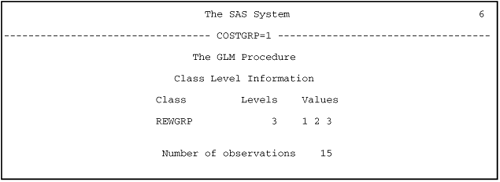
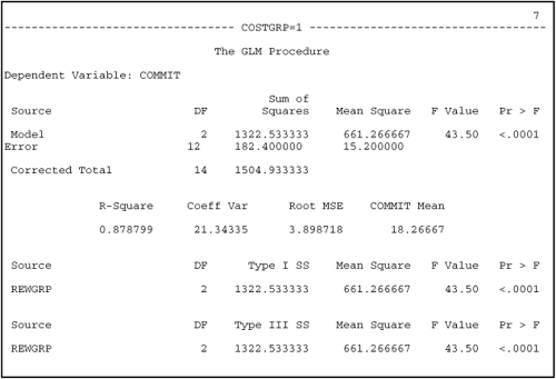


Page 7 of Output 10.3 provides the analysis of variance table from the ANOVA in which COMMIT served as the dependent variable, REWGRP was the independent variable, and the analysis involved only participants with a score of “1” on COSTGRP (the low-cost group). Output pages 6 through 9 are identified with the header “COSTGRP=1” at the top of each page, and this informs you that these pages provide results for only the low-cost group. Information from this output will be used to determine whether there was a simple effect for type of rewards at the low-cost level of the type of costs independent variable.
The last line of page 7 of Output 10.2 provides the F test for the ANOVA in which the independent variable was type of rewards and the analysis was based on only the low-cost participants. It can be seen that the F value of 43.50 is significant at p < .01. However, this is not the F value for the simple effect of interest. To compute the F for the simple effect, you must take the appropriate mean square from this table, and insert it in the following formula:
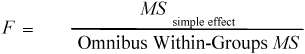
In the preceding formula, the MSsimple effect is the mean square from the last line of page 7 of Output 10.2. In the present case, it can be seen that this mean square is 661.27; this value is now inserted in your formula:
![]()
But where do you find the “Omnibus Within-Groups MS” for the preceding formula? This comes from the omnibus two-way ANOVA that is based on the entire sample and included both type of rewards and type of costs as independent variables. The ANOVA summary table for this analysis is presented earlier on page 2 of Output 10.2. The omnibus MS is simply the “Error Mean Square” from Output 10.2 (middle of page 3). It can be seen that this Omnibus Within-Groups MS is 15.58; this term is now inserted in your formula:
![]()
With both values now in the formula, you can compute the F ratio that will indicate whether there is a significant simple effect for type of rewards in the low-cost group:
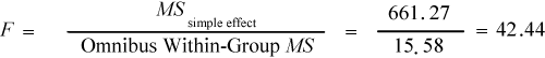
This is a large value of F, but is it large enough to reject the null hypothesis? To know this, you have to find the critical value of F for this analysis. This, in turn, requires knowing how many degrees of freedom are associated with this particular F test. In this case, you had 2 and 24 degrees of freedom for the numerator and denominator respectively. The “2” degrees of freedom for the numerator are the 2 that went into calculating the MSsimple effect. See the bottom of page 7 of Output 10.3, where the row for “REWGRP” intersects with the column for “DF,” you see that there are 2 degrees of freedom associated with the type of rewards variable.
The “24” degrees of freedom for the denominator are the 24 degrees of freedom associated with the mean square error term from the omnibus ANOVA. These degrees of freedom can be found in Output 10.2, page 2. Look under the heading “DF” to the right of “Error.”
Now that you have established the degrees of freedom associated with the analysis, you are free to find the critical value of F by referring to the F table in Appendix C at the back of this text. This table shows that, when p = .05 and there are 2 and 24 degrees of freedom, the critical value of F is 3.40. Your obtained value of F is 42.44, which is much larger than this critical value. Therefore, you can reject the null hypothesis and conclude that there is a simple effect for type of rewards at the low-cost level of the type of costs factor.
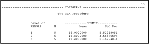
With this done, you now repeat the procedure to determine whether there is a simple effect for type of rewards with the high-cost group of participants. The MSsimple effect necessary to perform this test may be found on page 11 of Output 10.3. (Notice that the top of each output page indicates “COSTGRP=2”; this informs you that the results on this page come from the high-cost group.)
To find the information necessary for this test, see the bottom of page 11 from Output 10.2 in the section for the Type III sum of squares. To find the MSsimple effect for this subgroup, look below the heading “Mean Square.” It can be seen that, for the high-reward participants, the MSsimple effect equals 18.20. You can now insert this in your formula:
![]()
The error term for the preceding formula is the same error term used with the previous test. It is the Omnibus Within-Groups MS from Output 10.2. With both terms inserted in the formula, you can now compute the F ratio for the simple effect of type of reward in the high-cost group:
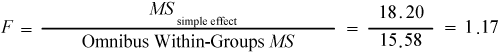
This test is also associated with 2 and 24 degrees of freedom (same as the earlier test for a simple effect), so the same critical value of F described earlier (3.40) still applies. Your obtained value of F is 1.17, and this is not greater than the critical value of 3.40. Therefore, you fail to reject the null and conclude that there is not a significant simple effect for the type of rewards at the high-cost level of the type of costs factor.
Formal Description of Results for a Paper
Results from this analysis could be summarized in the following way for a scholarly paper:
Results were analyzed using two-way ANOVA, with two between-subject factors. This revealed a significant Type of Rewards × Type of Costs interaction, F(2, 24) = 15.29, p < .01, R2 = .27. The nature of this interaction is displayed in Figure 10.8.
Subsequent analyses demonstrated that there was a simple effect for type of rewards at the low-cost level of the type of costs factor, F(2, 24) = 42.44, p < .05. As evident from Figure 10.8, the high-reward group displayed higher commitment scores than the mixed-reward group, which, in turn, demonstrated higher commitment scores than the low-reward group. The simple effect for type of rewards at the high-cost level of the type of costs factor was nonsignificant, F(2, 24) = 1.17, ns.
Two Perspectives on the Interaction
The preceding example presents a potential simple effect for the type of rewards at two different levels of the type of costs factor. If you had chosen, you could have also investigated this interaction from a different perspective. That is, you could have studied possible simple effects for the type of costs at three different levels of the type of rewards factor.
To do this, you would have drawn the preceding figure so that the horizontal axis represented the type of costs factor and had two midpoints (one for the low-cost group, and one for the high-cost group). Within the body of the figure itself, there would have been three lines, with one line representing the low-reward group, one representing the mixed-reward group, and one representing the high-reward group.
In writing the SAS program, you would have sorted the dataset by the REWGRP variable. Then you would have requested an ANOVA in which the criterion was COMMIT and the predictor was COSTGRP. You would add a BY REWGRP statement toward the end of the PROC GLM step and this would cause one ANOVA to be performed for the low-reward group, one for the mixed-reward group, and one for the high-reward group. The hand calculations to determine the simple effects would have followed in a similar manner.
When a two-factor interaction is significant, you can always view it from these two different perspectives. Furthermore, the interaction is often more interpretable (i.e., makes more sense) from one perspective than from the other. In many cases, therefore, you should test for simple effects from both perspectives before interpreting the results.