
Chapter 34. Expressive Rendering
34.1. Introduction
In the early days of computer graphics, researchers sought to make any picture that resembled our eyes’ view of a real object; photographs were considered completely realistic, and hence the goal of photorealism emerged. With further thought, one realizes that each photograph is just one possible condensation of the light field arriving at the camera lens; different lens and shutter and exposure settings, film or sensor types, etc., all change the captured image. Nonetheless, the term “photorealism” survives. When researchers began to think about other forms of imagery, they used the term “nonphotorealistic rendering” or NPR to describe it. Stanislaw Ulam said that talking about nonlinear science is like talking about nonelephant animals; we correspondingly prefer the term expressive rendering, which captures the notion of intent in creating such a rendering: The picture is meant to communicate something more than the raw facts of the incoming light.
Most traditional “rendering” (as in “an artist’s rendering of a scene”) has not aimed for strict photorealism. Given the wealth of experience gathered by artists and illustrators about effective ways to portray things, we can learn much by examining their work. In doing so, we must consider the artists’ intent: while some have aimed for photorealism, others have tried to convey an impression that some scene made upon them, while still others have aimed for condensed communication (think of illustrators of auto-repair manuals) or highly abstract representations (see Figure 34.1). The intent of the work influences the choices made: The stylistic choices made by Toulouse-Lautrec, conveying the mood of a Parisian nightclub, are very different from those made by Leonardo depicting the musculature of the human arm.
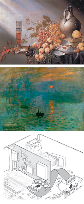
Figure 34.1: Various styles of art and illustration (top to bottom): photorealism (Harmen Steenwyck, Still Life with Fruit and Dead Fowl, 1630), impressionism (Monet, Impression, Sunrise, 1872), and technical illustration.
We characterize expressive rendering as work that is concerned with style, intent, message, and abstraction, none of which can be easily defined precisely. Scene modeling can also create a style or support an artistic intent (think of set design in theatre or scene design in films), and careful composition can convey intent or exhibit abstraction even in photographs. So there’s no clear line of demarcation between “expressive rendering” and “photorealism.” Nonetheless, there are things that seem to fall naturally into one or the other category, and this chapter discusses several techniques that fit the “expressive” mold. Broadly, work that focuses on abstraction and intent falls in the category of “illustration,” while “fine art” may include work that emphasizes style, message, or media as well. Thus, much work in scientific visualization involves abstraction and intent; an illustration tries to convey the flow of blood, not the color of the cells nor the flow of any one particular cell. Herman and Duke [HD01] make a strong case for such use of expressive rendering in visualization applications.
There is naturally a certain overlap between photorealistic solutions to the rendering equation and artistic technique. Illustration books, for instance, teach students about various kinds of shadows (see Figure 34.2), each of which corresponds to some part of the solution to the rendering equation. Direct shadows, for instance, correspond to the first visibility term in the series expansion solution of the rendering equation, while curvature shadows correspond to the first bidirectional reflectance distribution function (BRDF) term (and subsequent ones, to a lesser degree). But aside from this, a choice is made in everything a human does in creating a picture. The choices all influence what the picture communicates to the viewer. Sometimes the choices are about style—the characteristics of the work that make it personal, or the work of that particular person, or something that conveys a certain tone or mood in a work—but mostly they’re about abstraction, a mechanism for representing the essence of an object with no unnecessary detail.
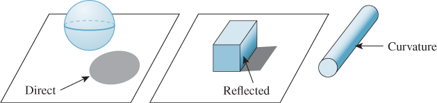
Figure 34.2: Three kinds of shadows (left to right): direct shadow, reflected shadow, and curvature shadow.
When pictures fall into this second category, they indirectly tell us something about what matters to our visual systems: Just as when we are telling a story we try to give pertinent details and leave out the irrelevant, in making a picture there’s good reason to omit the things that have less impact, or might have large impact but are not what’s important. Thus, various simplified picture-making techniques reveal to us something about perception: People often communicate shape by drawing outlines or contours, suggesting that these are important cues about shape. They sometimes draw stick figures, suggesting that poses may be well communicated by relatively simple information about bone positions. To indicate relative positions (is he standing on the ground, or in mid-jump above it?), they sometimes use shadows, although the precise shape of the shadow seems less important than its presence, as we saw in Chapter 5.
Perceptual relevance is only one influence in expressive rendering. The most important is abstraction, the removal of irrelevant information and the consequent emphasis of what is important (to the creator of the image). There are three kinds of abstraction to consider in expressive rendering [BTT07].
• Simplification: The removal of redundant detail, such as drawing only a few bricks in a brick wall, or the largest wrinkles in a wrinkled shirt that’s far from the viewer.
• Factorization: Separating the generic from the specific. In drawing a picture of a short-tailed Manx cat, you can either draw a particular cat or you can draw a generic cat—one that’s recognizable as a Manx, but not as a particular one. In this case, you have factored out the identity of the cat from its type.
• Schematization: Representing something with a carefully chosen substitute that may bear little relation to the original, as in the schematic representation of a transistor in an electrical circuit (Figure 34.3) or a stick-figure drawing of a human.
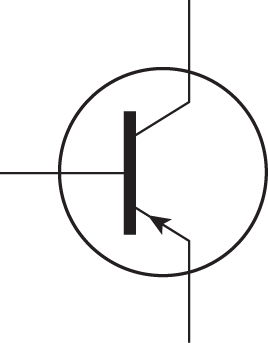
Figure 34.3: The schematic representation of a transistor encodes function and the fact that there are three conductors, but little else.
As Scott McCloud [McC94] observes, “By stripping down an image to its essential ‘meaning,’ an artist can amplify that meaning in a way that realistic art can’t.... The more cartoony a face is, for instance, the more people it could be said to describe.”
Research in expressive rendering is relatively new. Many early papers concentrated on emulating traditional media—pen-and-ink, watercolor, stained glass, mosaic tiles, etc. Some of the pictures produced were rather surprising, when considered as computer graphics, but disappointing when considered as art: They managed to capture only the surface veneer of the art. Nonetheless, there was considerable value in this work, not only as a foundation for later work where intent and abstraction were incorporated, but in immediate applications as well. For instance, rendering with a rough pencil-sketch appearance conveys implicitly the idea that the rendering (or the thing being rendered) is incomplete, or that details are not important. A user-interface mockup drawn in a pencil-sketch style for initial testing can help get users to say, “I really need a brightness knob,” rather than “I don’t like the glossy highlights on the knobs,” for instance.
34.1.1. Examples of Expressive Rendering
Before discussing style and abstraction further, we’ll examine some early examples of expressive rendering (see Figure 34.4). These use various kinds of input, from imagery to purely geometric models to human-annotated models.
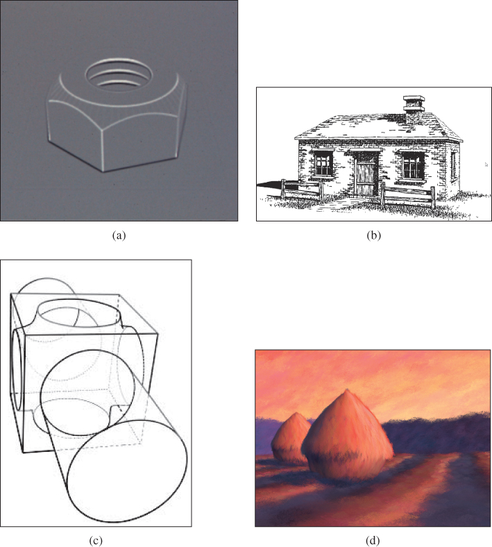
Figure 34.4: Four examples of expressive rendering. (a) Saito and Takahashi’s depth-image approach is used to enhance contours and ridges with dark and light lines, respectively. (b) In Winkenbach and Salesin’s [WS94] pen-and ink rendering, indication (the omission of repeated detail) is used to simplify the rendering of the roof and the brick walls. (c) In the work by Markosian et al. [MKG+97], contour curves are rapidly extracted and then assembled into longer strokes that can be stylized. (d) In Meier’s painterly rendering work [Mei96], a back-to-front rendering of brush strokes, each attached to a point of some object in the scene, gives excellent temporal coherence as the viewpoint is altered. ((a) Courtesy of Takafumi Saito and Tokiichiro Takahashi, ©1990 ACM, Inc. Reprinted by permission. (b) Courtesy of David Salesin and Georges Winkenbach. ©1994 ACM, Inc. Reprinted by permission. (c) Courtesy of the Brown Graphics Group, ©1997 ACM, Inc. Reprinted by permission. (d) Courtesy of Barbara Meier, ©1996 ACM, Inc. Reprinted by permission.)
The first example comes from the work of Saito and Takahashi [ST90], who recognized that in the course of rendering an image, one could also record at each pixel a depth value for the object visible at the pixel, or the texture coordinates on the object at that point, or any other property. Using image-processing methods to detect discontinuities in depth allowed them to extract contours of shapes; similarly, searching for derivative discontinuities allowed them to detect edges (like the edges of a cube). By rendering these contour and edge pixels in highlight colors over the original, they created renderings that they characterized as “comprehensible,” indicating their belief that the additional lines helped the visual system to better understand the thing being seen. The second example—a pen-and-ink rendering made from a more complex model—shows the application of indication, a technique in which something recurrent (like the pattern of shingles on a roof, or bricks in a wall) is suggested to the eye by just drawing a small portion of it. The third shows both the visible and the hidden contours of a polyhedral model; these have been extracted at real-time rates and assembled into long arcs, and then these arcs have been rendered with a “style” giving a richer appearance than a simple pen stroke. The fourth shows an example of stylistic imitation: The rendering starts from geometric models that have been enhanced with finely randomly sampled points; attached to each point is a brushstroke (one of several scanned images of actual oil-paint strokes) and a color (determined by a reference image, a lighted and shaded rendering of the original scene). Rendering consists of drawing (i.e., compositing into the final image) the strokes in a back-to-front order. There are many details remaining (the orientation of strokes, the creation of reference images, etc.), but the essential result is to give the appearance of a painting. If the strokes are similar to Monet’s, and the reference image’s coloring is similar to Monet’s, and the chosen scene is similar to something that Monet might have painted, the final result will resemble a Monet painting.
34.1.2. Organization of This Chapter
Because expressive rendering is comparatively new, the overarching principles and structures for the area have not yet become apparent. The remainder of this chapter therefore consists of some general material that applies to enough different techniques that it deserves discussion, and a tour of some specific techniques that we think illustrate various important points, followed by some brief conjectures about future directions and related work.
34.2. The Challenges of Expressive Rendering
While expressive rendering involves style, message, intent, and abstraction, the first of these is particularly ill-defined, which presents a serious problem. It’s used to describe medium (“pen-and-ink style”), technique (“a stippled style”), mark-making action (“loose and sketchy style”), mark grouping or structure (“a textured style” or “a patterned style”), and broader notions like mood (“a film-noir style”) or even personality (“a lighthearted style”). Unfortunately, all of these things are loosely related. It’s hard to imagine making an image that used, say, mosaic tiles, conveying a film-noir mood, but with a lighthearted style. A clear definition and characterization of style at all these levels remains elusive, but for problems like transferring style from one rendering to another, it’s an essential ingredient.
At a more operational level, much expressive rendering work has concentrated on renderings of single objects, or scenes in which objects have similar sizes. Abstraction tends to operate on a scale of no more than an order of magnitude. Few expressive rendering systems have a broad enough range of application to be able to make an effective rendering of, say, Dorothy, from The Wizard of Oz, on the yellow brick road, surrounded by hilly fields, with the Emerald City in the distant background drawn with a few indicative strokes. Thus, scale remains an important challenge in expressive rendering.
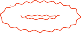
Coherence is a general term for the relatedness of nearby items, whether in a single image (spatial coherence) or in a sequence of images (temporal coherence). Spatial coherence in expressive rendering arises in multiple contexts. For instance, if we decide to render object outlines using a wiggly line, we need to displace adjacent points of the outline by about the same amount, as in Figure 34.5. (If we displaced them by random amounts, the result would not be a line!) But as you can see in the figure, if we simply start making a wiggle at some point of an outline, when we return to that point the displacements may not match, and the failure to match manages to particularly attract the viewer’s attention.
Temporal coherence is closely related. When we animate an expressive rendering, the strokes or other marks (e.g., tiles in a mosaic) vary over time. If the marks change rapidly from one frame to the next, the eye can be easily distracted. Proof of this can be seen by watching static on a broadcast (rather than cable) television. The average “frame” is a neutral gray, but as you watch, your eyes will detect patterns, notice things crawling or running across the screen, etc. If the marks in a rendering are something like stippling (a pattern of dots used to convey darkness or lightness) or a texture composed of short strokes, then even if the stipples or strokes have some temporal coherence (i.e., each stipple changes position slowly over time, or else disappears or appears, or each short stroke’s endpoints move slowly over time), their motion can become a stronger perceptual cue than the marks themselves. For longer strokes, like long, thin pen-and-ink lines, the motion percept tends to be aligned perpendicular to the stroke; if the stroke corresponds to a contour, then such motion is consistent with contour motion, while motion along the stroke, as might appear when a small stroke that’s part of a large contour shrinks before disappearing, is inconsistent with contour motion.
34.3. Marks and Strokes
Much expressive rendering is done with primitives that can be called marks or strokes. In stippling, for instance, each mark is a pen dot; in oil painting, each motion of the brush across the canvas is a stroke. In pen-and-ink rendering, a mixture of marks and strokes often serves to create texture, boundaries, etc. Not every form of expressive rendering uses marks and strokes (see Section 34.7), but many do. Why? First, many expressive rendering approaches mimic artistic techniques, and the use of strokes probably originated when some primitive human first picked up a stick and drew a shape in the dirt. So the simplest reason for marks and strokes is the ease with which we can create them. More important, though, is their power at triggering a response in the visual system. When we draw a stick figure, or just a circle on a page, our minds can rapidly interpret this as the representation of a 3D shape—a human form, or a sphere. In fact, the tendency to see shape is almost overwhelming. Although when we look at a drawing we see pencil strokes on a piece of paper, when asked about it we always describe the thing depicted rather than saying, “I see a piece of paper with pencil strokes on it.” This interpretation of strokes as representing shapes appears to be closely tied to our perceptual processes, in which edge detection is a first step. The strokes seem to manage to convey “edge-ness” directly, although each stroke, in principle, ought to convey two edges, one on either side of the stroke, as light transitions to dark and again as dark transitions to light.
Marks and strokes in expressive rendering systems are created by several approaches.
First there’s the scanning/photography approach: An individual paint stroke on a canvas of contrasting color is photographed, and using the contrasting color, an α-value for each pixel near the boundary of the stroke is estimated. This is done for many example strokes, and then when it comes time to place strokes on the virtual canvas, the scanned strokes are recolored as needed and composited onto the canvas. The same approach has been used with charcoal and pencil marks, and can clearly be used with mosaic tiles, pastels, etc., as well. This approach may seem to be the simplest, but the actual scanning and processing of oil-paint strokes, for instance, turns out to be quite difficult.
Second, there’s imitation of artistic technique, such as the pen-and-ink strokes used by Salisbury et al. [SWHS97], in which the core system determined the need for a curved stroke following some general path, and then the stroke-generating system created a spline path that approximated the general path, but had small perturbations in the normal direction to emulate the wiggliness of hand-drawn lines (the degree of wiggle was user-controllable), and which tapered to a point at each end, with the length of the taper also being user-controllable. Similar approaches were used by Northrup et al. [NM00] for a watercolor-like rendering. The idea of expanding or varying a stroke in the normal direction is a good one, but problems arise at focal points, where nearby normal lines cross (see Figure 34.6). These problems can be mostly addressed by adjusting the notion of “normal lines” to allow some bending and compression; Hsu et al. took this approach in their work on skeletal strokes [HLW93].
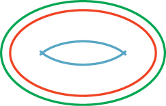
Figure 34.6: A small offset from the central red curve results in the smooth green outer curve; at the focal distance in the other direction, where nearby normals meet, we get a degeneracy—the sharp ends of the blue inner curve.
Finally, there’s the physical simulation of media and tools. Physical simulation, of course, depends on a model of the thing being simulated, and such models may range from very accurate to somewhat informal. Curtis [CAS+97] used fluid simulation to model the flow of water and pigment in watercolors (see Figure 34.7); Strassmann [Str86] used a minimal physical model of a brush (a linear array of bristles of slightly varying lengths, each of which responds to both paper texture and pressure applied by the user), paper, and ink to allow a user to create sumi-e paintings like the one shown in Figure 34.8; Baxter and Lin [BL04] extended this model to handle far greater complexity, including interbristle coherence and physically based deformation of the brush and bristles.
Figure 34.7: A watercolor produced with Curtis’s system. (Courtesy of Cassidy Curtis. ©1997 ACM, Inc. Reprinted by permission.)
Figure 34.8: A sumi-e painting created with Strassmann’s system. (Courtesy of Steve Strassmann. ©1986 ACM, Inc. Reprinted by permission.)
34.4. Perception and Salient Features
As we discussed in Chapter 5, the human visual system is sensitive to certain characteristics of arriving light, and not so sensitive to others. Those to which it’s most sensitive are good candidates for inclusion in an expressive rendering.
Candidates for important features are silhouettes, contours on geometric models, apparent contours, suggestive contours, and places where the light field can be condensed to one line. All of these fit under the general category of edges, as the term is used in computer vision, that is, places where the brightness changes rapidly. Such edges can exist at multiple scales, in that something that presents a gradual change in brightness, seen up close, may represent a rapid transition when seen from farther away. There’s some evidence [Eld99] that edges, considered at all scales, completely characterize an image. This idea, in reverse, is at the heart of recent work on gradient-based expressive rendering techniques, which we discuss in Section 34.7.
An alternative to reasoning about where lines should be drawn is to observe where they actually are drawn. Cole et al. [CGL+12] have performed a carefully constructed experiment to see where artists draw lines in single-object illustrations, given several views of the object to look at during the drawing process. They find that occluding contours and places with large image gradients are strongly favored, but these do not by any means account for all the lines that are drawn.
There are larger-scale issues in expressive rendering as well. In drawing a picture of two people standing on a bridge in Paris, we’re likely to concentrate on the bridge and the people, sketch the general shapes of the buildings in the background, and perhaps include some added detail on the Eiffel Tower. These choices represent the features in the scene that are salient to us, but there’s no way to algorithmically determine saliency from the image data without an understanding of the full scene; in larger-scale imagery, expressive rendering at present must rely on additional user input to determine the saliency of even details that may be strongly significant in terms of perception.
34.5. Geometric Curve Extraction
Because geometric characteristics of objects, like their boundaries, arise in expressive rendering, and because these have also often been studied in geometry, there’s a well-defined vocabulary in place; unfortunately, usages differ between mathematics and graphics. We’ll adhere to the mathematical conventions.
First, when an object sits in front of a background, the silhouette is the boundary between the object’s image and the background (see Figure 34.9). For a smooth object like a sphere, if S is a silhouette point, then the tangent plane at S contains the ray from the eye to S; points where the tangent contains the view direction are called contour points; the set of all contour points is called the contour. Thus, for a smooth object, every silhouette point is a contour point, or, equivalently, the silhouette is a subset of the contour. But there may be many other contour points as well, as seen in Figure 34.9 (bottom) where the contour extends into the interior of the surface.
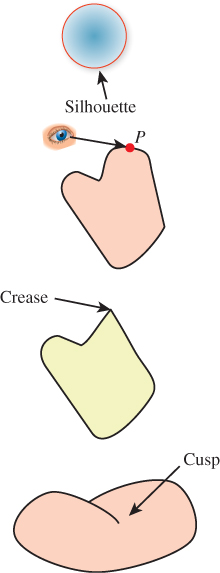
Figure 34.9: (Top) The silhouette separates foreground from background. (Top middle) P is on a contour if the ray from the eye to P is tangent to the surface at P. (Lower middle) A crease is a point at which nearby tangent planes converge to two different limits; the definition can be weakened to give a notion of a crease at a certain scale. (Bottom) A cusp is a point Q of a contour curve C at which the tangent line to C is the same as the line from the eye to Q.
The condition for a point P of a smooth surface to be a contour point, as viewed from an eyepoint C, is that
that is, that the surface normal be orthogonal to the view vector.
Unfortunately, contour points have been called silhouettes in several graphics papers, blurring the distinction between the two notions. Note that a contour point S may be visible or not: All that’s required is that the ray from the eye to S be contained in the tangent plane at S. There are two other conventions: In the first, what we have called the contour is sometimes called the contour generator, and the term “contour” is reserved for what we would call the visible contour; in the second, the thing we call the contour is called the fold set, although the definition for the fold set is somewhat more general, extending to polyhedra as well as smooth surfaces [Ban74].
In the case of nonsmooth objects like polygonal meshes, notions like “tan-gent plane” and “normal vector” must be adjusted. One approach is to create a smoothly varying normal vector field on the surface, one that agrees with the facet normal at facet centers, for instance, but smoothly blends between them, away from the centers. This approach works decently, although with this approach it’s easy to have a silhouette point (on the boundary between object and background) that is not a contour (view ray perpendicular to normal vector), which can lead to problems. Another approach is to say that at each edge between two facets there is a whole set of normal vectors, filling in between the normal vectors of the two facets. A simple version of this is shown in Figure 34.10: Looking end-on at an edge e, we treat the two adjacent facet normals n1 and n2 as points of the unit sphere; we then find a great-circle arc between them, and say that all vectors along this great-circle arc are normals to the edge e. The only time there’s an ambiguity about which great-circle arc to pick is when the adjacent normals are opposites; in this case the polyhedral surface is degenerate (the interiors of adjacent facets intersect), and the approach fails for such surfaces (just as we cannot, in the smooth-surface case, handle normal vectors at nonsmooth points).
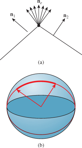
Figure 34.10: (a) The collection of normals at an edge e of a mesh interpolates between the normals n1 and n2 of the adjacent facets. (b) Drawing n1 and n2 at the origin, so their tips are on the unit sphere, we use great-circle interpolation to create the set of normals for the edge e.
This approach can be extended to define a set of normals at a vertex as well: The normal arcs for each edge adjacent to the vertex link together into a chain (on the unit sphere); we declare the normal at the vertex to be the interior of this loop. Once again, there are degenerate cases: Since any simple closed curve on the sphere is the boundary of two different regions, we must make a choice between these. If the polyhedral surface is nearly flat at the vertex, then all adjacent normals are near each other, and we can simply choose the region whose area is smaller. The degeneracy arises when the two areas are equal. In practice, in meshes derived from reasonably uniform and fine sampling of smooth surfaces, such vertices do not often arise.
Polygonal meshes are, generally speaking, a bad starting point for things like contour extraction, because almost every edge of a mesh represents a sharp change in the normal vector. In some cases, this results from the polygonalization of a smooth object. In others, the sharp edge is modeling a sharp edge on the original object (e.g., a cube). Without further information, it’s impossible to tell which kind of edge is intended. Various researchers have experimented with various thresholds, but you need only consider a finely faceted diamond to realize that there’s no obvious threshold that can work for all objects. It’s probably best, as a practical matter, to allow the modeler of an object to mark certain edges as crease edges, that is, those across which the normal is supposed to change rapidly, and then treat all others as smooth edges, or those across which the normal is to be interpolated smoothly. This is an instance of the principle stated in the introduction, that you should understand the phenomena and goal of your effort, and only then choose a rich-enough abstraction and representation to capture the important phenomena. The “polygonal model” representation of shape was chosen before the advent of expressive rendering, and it lacks sufficient richness. It’s also an instance of the Meaning principle: The “numbers” in the polygonal model don’t have sufficient meaning attached to them.
With that in mind, Listing 34.1 is a simple algorithm for rendering the visible contours and crease edges of a smooth polygonal shape that represents a surface with no self-intersections so that each edge is either shared by two faces or on the boundary.
Listing 34.1: Drawing the visible contours, boundary, and crease edges of a polygonal shape from the point Eye.
1 Initialize z-buffer and projection matrix
2 Clear z-buffer to maximum depth
3 Clear color buffer to all white
4 Render all faces in white
5
6 edgeFaceTable = new empty hastable with edges as keys and faces as values
7 outputEdges = new empty list of edges
8
9 foreach face f in model:
10 foreach edge e of f:
11 if e is a crease edge:
12 outputEdges.insert(e)
13 else if e is not in edgeFaceTable:
14 edgeFaceTable.insert(e, f)
15 else:
16 eyevec = e.firstVertex - Eye
17 f1 = edgeFaceTable.get(e) // get other face adjacent to e
18 if dot(f1, eyevec) * dot(f, eyevec) < 0:
19 outputEdges.insert(e)
20 edgeFaceTable.remove(e)
21
22 foreach edge in edgeFaceTable.keys():
23 outputEdges.insert(edge)
24
25 Render all edges in outputEdges in black
The key ideas in this algorithm are that boundary edges are those that appear in only one polygon, and hence they are left in the table after all pairs have been processed, and that a pair of faces that are adjacent at some edge make a contour edge if one face normal points toward the eye and the other points away. Thus, the list of output edges consists of all contour, crease, and boundary edges. The rendering of the surface in white as an initialization prevents hidden output edges from being seen (i.e., it generates occlusions). In practice, we often draw each contour edge slightly displaced toward the eye so that it is not hidden by the faces it belongs to. This slight displacement can unfortunately let a very slightly hidden contour be revealed, but in practice the algorithm tends to work quite well. Chapter 33 gives a rather different approach to generating a contour rendering that does not suffer from this problem, but that does not handle boundary edges or crease edges.
Note that the preceding algorithm generates a list of edges to be drawn, but it does not try to draw a stroke along the contour; it merely renders each edge as a line segment. If you want to draw a long smooth curve (perhaps using the vertices of the edges as control points for a spline curve, or even making a slightly wiggly curve to convey a hand-drawn “feel”) you need to assemble the edges into chains in which each edge is adjacent to its predecessor and successor in the list. For a smooth closed surface, such chains exist, and for a generic view, the chains form closed curves on the surface (i.e., cycles). (The crease edges may form noncyclic chains, however.) Unfortunately, for a polygonal approximation of a smooth surface, there’s no such simple description of the contours. As Figure 34.11 shows, it’s possible for almost every edge to be a contour from some points of view, in which case forming chains by the obvious greedy algorithm (“search for another edge that shares this vertex, and add it to my cycle”) can fail badly, generating contour cycles that intersect transversely, for instance.
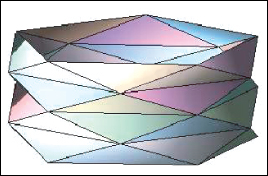
Figure 34.11: A triangulated cylinder in which every edge is a contour edge when viewed from directly overhead.
You may object that this example is contrived, but even a randomly triangulated cylinder, when viewed end-on, can have a great many contour edges (see Figure 34.12). Fortunately, all of these project to the same circle in the final image, but attempting to make coherent strokes on the contours remains problematic [NM00].
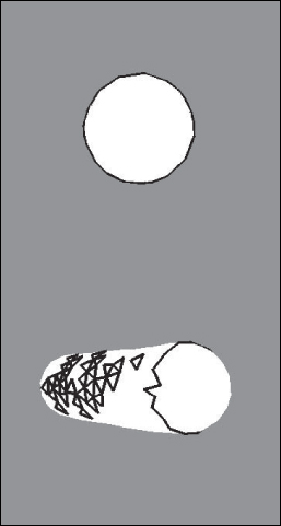
Figure 34.12: The contours of a lozenge shape, viewed endon, appear to form a circle, but from a different view they are quite complex. (Courtesy of Lee Markosian, ©2000 ACM, Inc. Reprinted by permission.)
The problem of multiple contours, and contours that are not smooth, as well as other artifacts of polygonal contour extraction, are largely addressed by the work of Zorin and Hertzmann [HZ00], who observe that “no matter how fine the triangulation is, the topology of the silhouette of a polygonal approximation to the surface is likely to be significantly different from that of the smooth surface itself.” They have the insight that the function
can be computed at each mesh vertex and interpolated across faces, and then the zero set of this interpolated approximation of g can be extracted and called the contour. By slightly adjusting the value of g at any vertex where it happens to be zero, they ensure that the contour curves so formed consist of disjoint polygonal cycles, which are ideal for stroke-based rendering. Figure 34.13 shows an example of such a contour rendering with “hatching” used to further convey the shape.
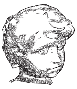
Figure 34.13: A shape whose contours are rendered via the Zorin-Hertzmann algorithm, with interior shading guided by curvature. (Courtesy of Denis Zorin, ©2000 ACM, Inc. Reprinted by permission.)
We now move on to suggestive contours, ridges, and apparent ridges. To discuss these features, we must discuss curvature. Recall from calculus that the curvature of the graph of y = f(x) at the point (x, y) is given by
In the case of a parametric curve t ![]() (x(t), y(t)), the formula is
(x(t), y(t)), the formula is
For a polygonal curve, which is often what we have in practice, there are simple approximations to these formulas, although you may be better off fitting the polygonal curve with a spline and then computing the spline’s curvature.
Confirm that if we take the graph y = f(x) and make it into a parametric curve using X(t) = t and Y(t) = f(t), the two curvature formulas agree.
For a surface, curvature is slightly more complex. If you think of a point P on a cylinder of radius r, there are many possible directions in which to measure curvature (see Figure 34.14): In the direction parallel to the axis, the curvature is zero, while perpendicular to it, the curvature is 1/r. To measure each of these, we intersect the cylinder with a plane through P containing the normal vector n and direction u in which we want to measure the curvature. The intersection is a curve in this plane, whose curvature at P we can measure using Equation 34.3 or Equation 34.4.
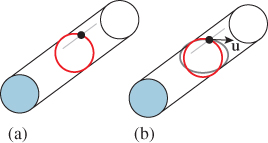
Figure 34.14: (a) The two principal curvatures on a cylinder: Along the axis of the cylinder, the curvature is zero; in the perpendicular direction, the curvature is 1/r, where r is the cylinder radius. (b) To measure the curvature in some direction u at P, we intersect the surface with the plane through P containing u and n, the normal to the surface. The result is a curve (gray) in a plane, whose curvature we can measure.
For the cylinder, the two curvatures we’ve described are in fact the maximum and minimum possible over all surface directions u at P. Because of this, they are called the principal curvatures, typically denoted κ1 and κ2, with the associated directions being called the principal directions. (One approach to expressive rendering for surfaces involves drawing strokes aligned with one or two principal directions [Int97].) The two principal directions are orthogonal; this turns out to be true at every point of every surface (except when the principal curvatures are the same, in which case the principal directions are undefined; such points are called umbilic). Furthermore, the principal directions u1 and u2 and their associated curvatures κ1 and κ2 completely determine the curvatures in every other direction; if
then the curvature in the direction u (or directional curvature in direction u) is
Note that this formula does not depend on the orientation of u1 or u2: If we negate u2 (giving an equally valid “principal direction”), for instance, the sign of θ changes, which alters the sign of sin(θ), but leaves sin2(θ) unchanged.
34.5.1. Ridges and Valleys
The principal direction u1(P) corresponding to the maximum directional curvature at each point P is used to define the notion of a ridge or valley: The principal directions can be joined together into a curve called a line of curvature1 (see Figure 34.15). As we traverse a line of curvature, the principal curvature κ1 changes from point to point. Local minima and maxima of the principal curvature along a line of curvature are called ridges and valleys, respectively (see Figure 34.16). These curves have been used to help communicate shape, but they suffer from two problems. The first is that, in practice, algorithms for computing ridges and valleys tend to be “noisy,” that is, they tend to produce lots of short segments, which are distracting rather than informative. The second is that ridges and valleys often occur in pairs, so we end up with two lines where an artist would draw only one (see Figure 34.18 for an example).
1. More explicitly: We can find a curve t ![]() γ(t) on the surface with the property that γ′(t) = u1(γ(t)) for every t, and γ(0) = P; this is the line of curvature through P.
γ(t) on the surface with the property that γ′(t) = u1(γ(t)) for every t, and γ(0) = P; this is the line of curvature through P.
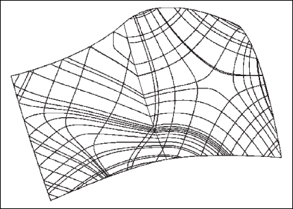
Figure 34.15: The curves in this diagram have tangents that are in the direction of either greatest or least curvature. The “bends” near the center occur because the surface is defined by two adjacent spline patches. (Courtesy of Nikola Guid and Borut ![]() alik. Reprinted from Computers & Graphics, volume 19, issue 4, Nikola Guid,
alik. Reprinted from Computers & Graphics, volume 19, issue 4, Nikola Guid, ![]() rtomir Oblonšek, Borut
rtomir Oblonšek, Borut ![]() alik, “Surface Interrogation Methods,” pages 557–574, ©1995, with permission from Elsevier.)
alik, “Surface Interrogation Methods,” pages 557–574, ©1995, with permission from Elsevier.)
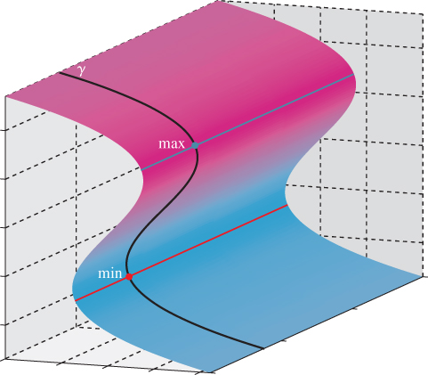
Figure 34.16: As we traverse the line of curvature γ, the directional curvature of the surface S in the direction of γ varies from point to point. We’ve marked a local maximum and minimum; these are ridge and valley points, respectively. Shown in red (valley) and blue (ridge) lines are the rest of the ridge and valley points of the surface.
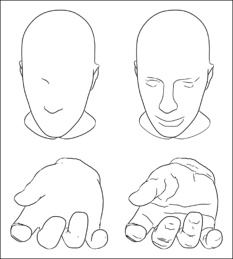
Figure 34.17: Contours of two shapes (left) together with suggestive contours (right). (Courtesy of Doug DeCarlo. ©2003 ACM, Inc. Reprinted by permission.)
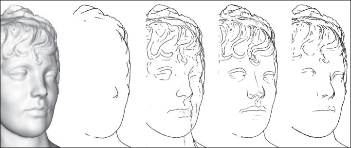
Figure 34.18: Shaded view, contours, suggestive contours, ridges and valleys, and apparent ridges for a single model. Courtesy of Tilke Judd and Frédo Durand, ©2007 ACM, Inc. Reprinted by permission.)
34.5.2. Suggestive Contours
Instead of using the principal curvature directions on a surface to define curves along which to find local maxima and minima, as we did for ridges and valleys, we can use a different vector field, one that depends on our view of the surface rather than being intrinsic to the surface itself, independent of view, as are ridges and valleys. This is the approach taken by DeCarlo et al. [DFRS03]. We’ll follow their development.
We let v(P) = E – P denote the view vector at each point of the surface. Notice that this vector points from P toward the eye E. And we let w(P) denote the projection of v(P) onto the tangent plane at P; omitting the argument P, w is defined by
where n = n(P) is the unit normal to the surface at the point P. The curvature in the direction w is called the radial curvature κr. Note that the radial curvature depends both on the point P and on the location of the eye: It’s not an intrinsic property of the surface.
Suggestive contours are the places where the radial curvature is zero, with the additional constraint that the derivative of κr, in the w direction, must be positive (i.e., if we move from P to P + ![]() w(P), and then project the resultant point back to the surface and call it Q, then κr(Q) must be positive for small enough values of
w(P), and then project the resultant point back to the surface and call it Q, then κr(Q) must be positive for small enough values of ![]() ). DeCarlo et al. use the term “suggestive contour generator” for these points, restricting “suggestive contours” to what we would call “visible suggestive contours.” Suggestive contours can be characterized in two other ways. First, they are local minima of n · v in the w direction; if we consider ordinary contours as places where n · v is zero, then suggestive contours are the points where n · v got closest to zero before increasing again. This is closely related to the second characterization: If we move the eyepoint E, the contours appear to slide along the surface (think of the edge of night moving along the Earth as it rotates). But sometimes, in the course of such a motion, a new piece of contour appears; points of that new contour lie on the suggestive contour for the original eyepoint. As DeCarlo et al. describe it, suggestive contours are “those points that are contours in ‘nearby’ viewpoints, but do not have ‘corresponding’ contours in any closer views.” In short, they might be characterized as places that are almost contours, or, if you prefer, as places that, if the surface were lit by a light source near the eyepoint, would be at the boundary between dark and light. As such, they are natural places to put lines to help indicate shape (see Figure 34.17).
). DeCarlo et al. use the term “suggestive contour generator” for these points, restricting “suggestive contours” to what we would call “visible suggestive contours.” Suggestive contours can be characterized in two other ways. First, they are local minima of n · v in the w direction; if we consider ordinary contours as places where n · v is zero, then suggestive contours are the points where n · v got closest to zero before increasing again. This is closely related to the second characterization: If we move the eyepoint E, the contours appear to slide along the surface (think of the edge of night moving along the Earth as it rotates). But sometimes, in the course of such a motion, a new piece of contour appears; points of that new contour lie on the suggestive contour for the original eyepoint. As DeCarlo et al. describe it, suggestive contours are “those points that are contours in ‘nearby’ viewpoints, but do not have ‘corresponding’ contours in any closer views.” In short, they might be characterized as places that are almost contours, or, if you prefer, as places that, if the surface were lit by a light source near the eyepoint, would be at the boundary between dark and light. As such, they are natural places to put lines to help indicate shape (see Figure 34.17).
34.5.3. Apparent Ridges
In the examples discussed so far, there are a range of characteristics: Contours are view-dependent, while ridges and valleys are view-independent (except that we only draw the visible ones, of course). Suggestive contours are view-dependent as well, while capturing some of the “where do we expect to see lines?” character: If the surface is wiggly enough somewhere, then that point’s likely to be on a suggestive contour. There is another kind of line—apparent ridges [JDA07]—that is also view-dependent (see Figure 34.18). In this case, however, the view dependence has an interesting character: It takes into account the projection of the surface to a particular view plane, and performs measurements in that view plane rather than on the surface itself. Since the projection of the object to the view plane captures what we can see, measurements made in this plane correspond to operations that our eyes could possibly perform. Thus, a slight curvature near a contour is drawn, while the same amount of curvature in a frontal region of an object is not.
34.5.4. Beyond Geometry
While geometric characteristics are important for determining which lines to draw, other characteristics may matter as well, such as texture: The lines between stripes on a plaid shirt should be drawn along with the contours of the shirt. This is essentially a reversion to the computer-vision notion of edges, discontinuities in brightness at some scale. This idea was implemented as an expressive rendering scheme by Lee et al. [LMLH07]. They first rendered a scene with traditional shading, and then used this preliminary rendering as a source for the final rendering. They searched in the preliminary rendering for brightness discontinuities, which were then rendered as lines in the final rendering, typically representing contours or texture changes like the stripes on a shirt. They also searched for thin, dark regions, which were rendered as dark lines, and thin, light regions, which were rendered as highlight lines (see Figure 34.19). The large-scale shading in the final rendering was done with two-tone shading [LMHB00], created by thresholding the preliminary image on brightness.
Figure 34.19: Abstracted shading with highlights. (Courtesy of Seungyong Lee, ©2007 ACM, Inc. Reprinted by permission.)
34.6. Abstraction
The representation of a shape by lines is a kind of abstraction. Of the three kinds of abstraction we mentioned (simplification, factorization, and schematization) this form of shape representation falls into the first or second category, involving the elimination of detail, which in some cases may move the object depicted from the specific toward the general.
But even when we represent a shape by its contours or other lines, we may have far more detail than we want. A rough lump of granite has a great many contour edges, but we may want to draw just the outline, ignoring all the tiny interior contours provided by individual protrusions from the surface. Thus, there’s a relation between scale and abstraction. One rule of thumb is that objects of equal importance in a scene should be represented with a number of strokes that is proportional to their projected size (or perhaps the square root of the projected size, since a circle of area A has an outline whose length is ![]() ). Regardless, it’s evident that there’s a need to not only determine lines that represent a shape, but also to determine a line-based representation with a given budget for lines—to remove or simplify lines to give a less dense representation.
). Regardless, it’s evident that there’s a need to not only determine lines that represent a shape, but also to determine a line-based representation with a given budget for lines—to remove or simplify lines to give a less dense representation.
Two approaches immediately come to mind. The first is to simplify the object itself (e.g., if it’s a subdivision surface, move up one level of subdivision to get a less-accurate but simpler representation) and then extract lines. The second is to extract the lines and then simplify them.
Think of shapes for which each method would give results that don’t match your intuition. Which method was harder to “break”?
The second approach was carried out by Barla et al. [BTS05]. Their algorithm takes, as input, a set of lines (in the sense of line drawing, i.e., curves) in some vector representation, and produces a new set of lines using two criteria that are intended to create perceptually similar sets of lines.
1. New lines can be created only where input lines appear.
2. New lines must respect the shape and orientation of input lines.
The idea is then to form “clusters” of input lines that are perceptually similar at a specified scale and replace these with fewer lines, thus simplifying the drawing.
The second criterion is formulated to allow merging two nearly parallel curves into a single curve that’s approximately their average, but not into a single curve with a hairpin bend at one end, for example. Figure 34.20 shows this. The hairpin bend in the pink line in the drawing on the left is a bad simplification of the input black lines, while the two pink lines in the drawing on the right are a better simplification.
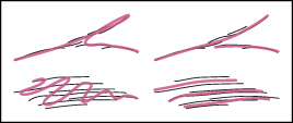
Figure 34.20: The thick pink lines at right are good simplifications of the thin black input lines; those at left are bad. (Courtesy of Pascal Barla. From “Rendering Techniques 2005” by Bala, Kavita. Copyright 2005. Reproduced with permission of Taylor & Francis Group LLC - BOOKS in the format Textbook via Copyright Clearance Center.)
The algorithm proceeds by first finding clusters of lines that are similar at the chosen scale, and then replacing each cluster with a single line. The replacement strategy may be as simple as selecting a single representative from the cluster, or as complex as creating some kind of “average” line from the lines in the cluster. Figure 34.21 shows the results using the second approach.
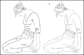
Figure 34.21: A total of 357 input lines are simplified to 87 output lines. (Courtesy of Pascal Barla. From “Rendering Techniques 2005” by Bala, Kavita. Copyright 2005. Reproduced with permission of Taylor & Francis Group LLC - BOOKS in the format Textbook via Copyright Clearance Center.)
At a higher level, it makes sense to take a whole scene and abstract out those parts that are not important to the author or viewer. Determining what might be important is impossible without either an understanding of the full scene or knowledge of the intent (i.e., a priori markup of some kind). The latter approach can be used as part of an authoring tool to guide the scale of simplification in algorithms like that of Barla et al. DeCarlo and Santella [DS02] have taken the former approach, using a human viewer to implicitly provide scene understanding. Their system takes an image as input and transforms it to a line drawing with large regions of constant color and bold edges between regions, representing an abstraction of the scene according to the parts-and-structures kind of hierarchy present in many computer-vision algorithms. To effect this transformation, they use an eye-tracked human viewer. Broadly speaking, the eye tracking allows them to determine which elements of the image are most attention-grabbing, and thus deserve greater detail. Figure 34.22 shows a sample input and result.
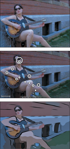
Figure 34.22: (Top to bottom) The input photograph, the eye-tracker fixation record, and the resultant image for DeCarlo and Santella’s abstraction and simplification algorithm. (Courtesy of Doug DeCarlo and Anthony Santella, ©2002 ACM, Inc. Reprinted by permission.)
It’s also possible to consider a stroke-based rendering of a scene over time, and try to simplify its strokes in a way that’s coherent in the time dimension; to do so effectively requires a strong understanding of the perception of motion (for strokes that vary in position or size) and change (for strokes that appear or disappear).
34.7. Discussion and Further Reading
The two abstraction techniques presented in this chapter fall into the simplification and factorization categories. Is it possible to also do schematization? Can we learn schematic representations from large image and drawing databases, for instance? This remains to be seen.
Much of what’s been done in expressive rendering until now has emulated traditional media and tools. But the computer presents us with the potential to create new media and new tools, and thinking about these may be more productive than trying to imitate old media. Two examples of this are the diffusion curves of Orzan et al. [OBW+08] and the gradient-domain painting of McCann and Pollard [MP08]. Each relies on the idea that with the support of computation, it’s reasonable for a user’s stroke to have a global effect on an image.
In the case of gradient-domain painting, the user edits the gradient of an image using a familiar digital painting tool interface. A typical stroke like a vertical line down the middle of a gray background will create a high gradient at the stroke so that the gray to the left of the stroke becomes darker and the gray to the right becomes lighter, and the stroke itself ends up being an edge between regions of differing values. (This is an “edge” in the sense of computer vision, by the way.) By adjusting the stroke width and the amount of gradient applied, the user can get varying effects. The user can also grab a part of an existing image’s gradient and use that as a brush, allowing for further interesting effects. To be clear: The image the user is editing is not precisely the gradient of the final result; rather, an integration process is applied to the gradient to produce a final image with the property that its true gradient is as near to the user-sketched gradient as possible. Figure 34.23 shows an example of photo editing using gradient-domain painting with a brush whose gradient is taken from elsewhere in the image.
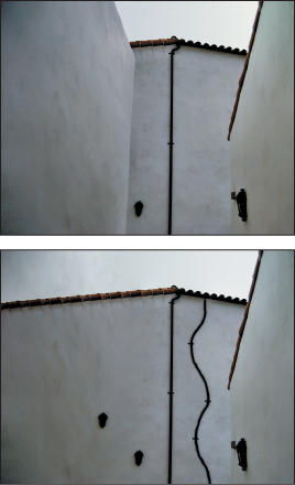
Figure 34.23: Photo editing with gradient-domain painting. The roof tiles and drain pipe have been altered, and the left wall eliminated, all in just a few strokes. (Photo courtesy of Christopher Tobias, ©2009; Courtesy of Nancy Pollard and James McCann, ©2008 ACM, Inc. Reprinted by permission.)
In diffusion curves, the user again has a familiar digital painting interface, but in this case each stroke draws boundary conditions for a diffusion equation: In the basic form, on one side of the stroke the image is constrained to have a certain color; on the other side it has a different color. The areas in between the strokes have colors determined from the stroke values by diffusion (i.e., each interior pixel is the average of its four closest neighbors). Again, a single stroke can drastically affect the whole image’s appearance. But if we think instead about perceptually significant changes, we see the effects are quite local: In the nonstroke areas, the values change very smoothly so that there are no perceptually significant edges. Thus, the medium of diffusion curves allows the artist to work directly with perceptually significant strokes. Figure 34.24 shows an example of the results.
Figure 34.24: A figure drawn with just a few diffusion curves. (©L. Boissieux, INRIA) (Courtesy of Joelle Thollot.)
In both of these media, animation is quite natural. As strokes interpolate between specified positions at key frames, the global solutions for which they prescribe boundary conditions also change smoothly. Temporal coherence is almost automatic. The exception is in handling the appearance and disappearance of strokes, which still must be addressed. Nonetheless, the global effect of each stroke means that animation in one portion of an image can generate changes elsewhere, which may distract the viewer. By the way, temporal coherence in stylized strokes—things like wiggly lines in pen-and-ink renderings—remains a serious challenge as of 2013.
Video games are now often using deliberately nonphotorealistic techniques to establish mood or style, but maintaining a consistent feel throughout a game requires high-level art direction as well as an expressive rendering tool. There’s a need for tools to assist in such art direction, and for authoring tools for scenes to be nonphotorealistically rendered so that modelers can indicate objects’ relative importance (and how these change over time) as cues to simplification algorithms.
Tools like gradient-domain painting and diffusion curves let artists work with what might be called “perceptual primitives,” but at the cost of global modifications of images, which may be inconvenient. It would be nice to find semilocal versions of these tools, ones whose range of influence can be conveniently bounded.